Suitin' Up: NFL's Worst to Best Uniforms
By (Correspondent) on September 7, 2009
9,312 reads
To prime everyone for the college football season last month, I submitted an article on college football's top 25 uniforms.
Well, with NFL kickoff weekend just around the corner, I figured I should use my insight on NFL equipment to give a rundown of the NFL's best and worst attires.
The NFL is a melting pot of fresh new designs, and timeless looks that actually really intrigue. Some teams pull of masterful uniforms, while others fail miserably.
But, without further ado, here is my confidently fair list. Enjoy!
#32- Buffalo Bills
The Bills would likely get a unanimous vote for having the worst uniforms in any random panel of people possible. The atrocious threads were released by the team in 2002 as more and more NFL teams started to go for that modern look.
Modern uniform changes have often featured darkening the colors, and Buffalo actually did not go wrong there in my book. The new dark blue is intimidating. However, the sporadic design is what just kills the Bills.
First off, the helmet stripe is insanely complicated (white, royal blue, nickel, navy blue, nickel, royal blue, white). Also, the helmet logo never was updated, so it is still royal blue.
The jersey numbers feature double outlines, which only look good when done correctly (in this case, not done correctly). The royal blue piping that wraps around the front and back is definitely...different.
But the worst part is when you look at them from the side. The red side panel translates into a red, nickel, and white side panel (no royal blue?). Gosh, this really does not add up well.
The team looked okay when the unis were first being worn, but the Bills have gone monochrome (all-blue) at home for the past five years.
Not even their beautiful throwbacks could save them from falling to last place.
Primary Home Combo: red/navy/navy/
Primary Road Combo: red/white/white
Alternates: two sets of throwback uniforms
# 31- Seattle Seahawks
The Seahawks uniforms are just gross! Their uniforms were originally unveiled with Seahawk-blue helmets, jerseys, and white pants. White pants were intended to be worn with the home uniform.
So much for that idea. The Seahawks have gone with a completely monochrome look since 2003, with disastrous results.
The electric green and two shades of blue make for a really cool color scheme, but the execution fails. The numbers are also way too plain and could use some of that green for outline.
I think everyone can agree these are barf-worthy. Oh, and remember to buy your sunglasses, because the Seahawks are rumored to wear green jerseys on occasion this season.
#30- Cincinnati Bengals
I personally think the Bengals uniforms look cool, but when analyzing and giving criticism, there is no way you can place them anywhere but here on this list.
The home uniform option shown above is hands down the cleanest look they have, but the Bengals are the Oregon Ducks of the NFL.
They can never decide what color jersey, pants, or even socks they want to wear, translating into some awful results.
Aside from having a flawed design, which would be that huge white side panel on the colored jerseys, and the stupid translation of colors on the pants pattern (near the waist), the worst part is the mixing and matching they do.
The white jersey also has an orange shoulder yoke (shoulders are colored rather than white), but that makes zero sense considering the home jersey is black.
These uniforms are actually a personal guilty pleasure, but no one in their right mind would rank these above any of the others.
Primary Home Combo: orange, black, white
Primary Road Combo: orange, white, white
Alternates: orange jersey, black pants, orange socks
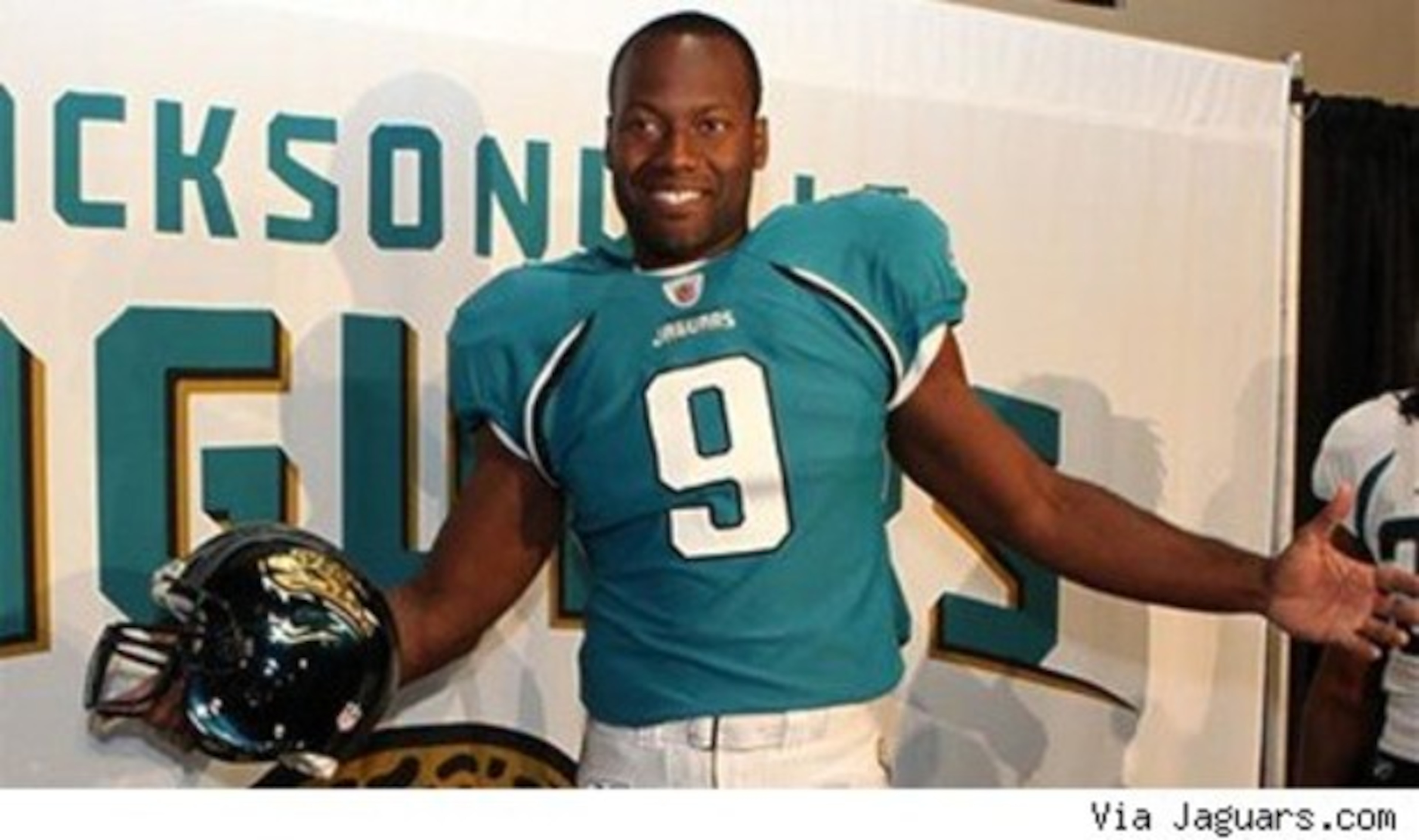
#29- Jacksonville Jaguars
The Jaguars older uniforms were not the most progressive looking, the pants stripes were uninspired, and the color consistency was way off. However, I think a lot of people miss those right now.
The Jaguars' owner thought a solution came in the form of their new uniforms, but the logic behind them baffles me.
Jacksonville's colors are teal, black, and gold. Their uniforms originally had teal jerseys with gold trim. Their road jerseys were white with teal numbers and gold trim. They used to wear white pants with teal and gold trim. Good right?
Well, a few years back, Jacksonville began to wear black pants with their white jersey. Then, they changed the teal numerals to black on the white jersey. So, their road uniforms were mainly black and gold, while their home uniforms were mainly teal.
This bothered the heck out of people. So when Jacksonville announced they were releasing new uniforms this year, many thought they were going to drop all of that black and get a consistent dose of teal and gold.
Wrong. The owner said he wanted to give the team an identity. Giving them the same overall look, minus gold, was not the answer.
That is right, the only place on the uniform with gold is the helmet logo. The new jerseys and pants feature zero. The new numerals are way too generic, and the piping (stripes) is hideously executed on the jerseys (it wraps around and then just stops on the back).
Oh, by the way, the road jersey still has black numbers, and still is intended to be worn with black pants.
Upgrade? The old uniforms look like solid gold compared to these, no pun intended. The only good part is that the helmets use reflective paint that makes them glow teal in the sun.
One word to describe the Jag's latest look: fail.
Primary Home Combo: black/teal/white
Primary Road Combo: black/white/black
Alternates: none
#28- Tennessee Titans
The Titans original uniform with the modern helmet stripes, the cool colors, the huge shoulder panels, and so forth, looked really cool back in 1999.
However, their look is starting to really wear off, which has also been hampered by some insanely inconsistent changes in the past few years.
The Titans added a Carolina-blue jersey back in 2003, and added Carolina-blue pants as well just a few years ago.
Those additions would evolve into a pretty bad uniform set. Last year, Tennessee decided to make the alternate lighter blue jersey their primary uniform.
That move would have been okay, had they not decided navy blue pants would always be worn with it!
A white on light blue on white look would be fantastic! Their primary road uniform is white on light blue, not white on navy, so why in the world are the navy pants being worn with the home jersey?
Of course, there is the occasional alternate look, like the all light blue they wore vs Indianapolis last year.
But, the Titans really could revert back to their old look.
Primary Home Combo: white/light blue/navy blue
Primary Road Combo: white/white/light blue
Alternates: navy jersey, white pants (white pants not worn last year), Oilers throwbacks
#27- San Francisco 49'ers
The Niners wanted to shift from their modernized dark red, gold, and black look to a more classic uniform this year.
Results: so-so.
First off, the helmet logo is still that stylized, bold logo. It also features a big black ring. Nowhere else on the uniform is there black.
The helmet logo really contrasts with the new gray face mask, and the classic red, white, red stripe on the helmet and pants.
The sleeve stripes are terrible! They get cut off by the cuffs because they were placed too low (to better reflect the old longer sleeves). The red is good, but the new gold is flat rather than metallic, and looks really outdated.
Overall, this uniform turned out to just look like a really bad attempt at a throwback. Minus the current logo, that is all this uniform really is. A red face mask, logo tweak, and a fix on the sleeve stripes could take this uniform a long way.
Primary Home Combo: gold/red/gold
Primary Road Combo: gold/white/gold
Alternates: none
# 26- New Orleans Saints
The Saints have one of the best, if not the best, logo in the NFL. Nothing beats it.
However, the uniforms are a different story. While they may not be an eyesore, it is the plain look that bores me.
The jerseys are plain, and so are the paints. The Saints use regular block font, wear solid black pants regularly, and have solid black socks.
The primary logo shows up on the side of the pants, and the side of the jersey. Redundant?
Their uniform is definitely the most boring uniform in all of the NFL. The gold pants, which sport a solid black stripe, do not do much justice either because the helmet stripe contrasts with that.
When you think of New Orleans, you think of a place with a lot of character. The Saints could do a ton of stuff to give their uniform some of that character.
Primary Home Combo: gold/black/black
Primary Road Combo: gold/white/black
Alternates: gold pants
#25- Arizona Cardinals
The Cardinals uniforms, which were released in 2005, are another that I actually kind of like but others despise.
And, I guess rightfully so. This image above shows the better of the two combinations. The white jersey features a huge red side panel and red shoulder yoke, which really kills the uniform.
The uniforms were even worse when they were first released with red pants as an option. Those got shut down almost immediately.
The numbers are a lot like Jacksonville's new numbers, very generic looking.
The Cardinals pull off a good modern design, at home anyways. The road uniforms are so terrible the Cards fall all the way back to 25 on this list.
Primary Home Combo: white/red/white
Primary Road Combo: white/white/white
Alternates: none
# 24- Baltimore Ravens
The Ravens uniforms are just nothing special. The jerseys are pretty plain, minus the rather cool Maryland flag/ Logo hybrid patch.
The color of purple and an almost greenish gold is nothing exciting, and the helmet logo is kind of wimpy.
The worst part is the purple stripes on the helmet, which get drowned out in all of that black.
And, the road pants are now a set of solid black pants, something that is way too uninspiring. The black alternate jersey is the only bright spot in my book.
Primary Home Combo: black/purple/white
Primary Road Combo: black/white/black
Alternates: black jersey
# 23- St Louis Rams
The Rams are another example of teams who started the modern uniform craze when they changed from athletic gold to Vegas-gold back in 2000.
Their uniforms have always been solid since, until the past few seasons. St Louis decided to experiment with white pants and blue pants, and messed up the whole uniform!
Luckily, we caught a glimpse of the gold pants this preseason, but last year St. Louis did not wear the gold britches.
The home uniform looks dumb, white numbers would work with white pants, but gold numbers need gold pants. The good thing about the uniform is of course the helmet, which is classic.
Ram's might be farther up the list if they trashed the white pants all together.
Primary Home Combo: blue/blue/white
Primary Road Combo: blue/white/blue
Alternates: gold pants
# 22- Detroit Lions
The Lions were one of the three teams to change uniforms this offseason, but they seem to have come out with the best look.
The problem is, only subtle changes were made, and Lions fans are still upset with the all of the black.
Shoulder stripes, pants stripes, and helmet stripes were changed. The collar is a bit different, and the number font is actually really cool.
The helmet stripe is pretty thin though. And, of course, the black face mask and black trim still exists.
A lot of fans want to see the black go. The Lions had potential with this redesign, but for some reason they did not make many changes. Personally, blue pants and the subtraction of black would take these a long ways. Also, the black jerseys are gone.
Primary Home Combo: silver/blue/silver
Primary Road Combo: silver/white/silver
Alternates: throwback uniform
# 21- Carolina Panthers
The Panthers are another team that is fairly inconsistent, and their uniforms look just a tad outdated.
Here is another team that uses their primary logo on the helmet, sleeve, and pants (the picture is a great example).
The colors are good, but something about the silver helmets and pants makes them scream "our uniforms were designed in the 90's!" (their uniforms have not been redesigned since 1995, when they first wore them)
The Carolina-blue alternate jersey, despite most opinions, is an eyesore for me. And, the white road jersey is worn with white pants and light blue socks. The colored jerseys are always worn with silver pants and black socks.
Choose one or the other Carolina, both look fine. Also, black pants would be really cool.
Primary Home Combo: silver/black/silver
Primary Road Combo: silver/white/white
Alternates: Carolina-blue jersey
# 20- Minnesota Vikings
The Vikings helmet was vastly improved with their latest update in 2006, however the uniforms were not. The issue is with the translation from the side panel on the jersey to the pants.
There is a gap, so that the jersey and pants could be interchangeable (they originally unveiled purple pants as an alternate).
Now, they are stuck with a really odd looking uniform feature. A few tweaks could make this uniform one of the best, but until that is done, these are a design disaster.
Primary Home Combo: purple/purple/white
Primary Road Combo: purple/white/white
Alternates: throwback uniform
# 19- Atlanta Falcons
The Falcons uniforms actually looked amazing back in 2003 when they were released.
However, changes since then have turned them sour. The original home uniform was a black jersey. In 2004, Atlanta declared their previously intended alternate jersey as their new home uniform.
Atlanta basically wears an alternate uniform...every home game. You see, the road uniform they wear is mainly black. The home uniform, now, is mainly red.
The best combination in their arsenal, the black on black on white look, has not been worn since the 2003 season.
Waddup?!
They have two pairs of white pants, one with red piping and one with black, to go with the respective jerseys. The black pants really do not flow at all with either jersey, but of course are worn only with the black jersey.
So you have three combinations that feature black, but the primary combination is drowned in red?
The NFL states you are not allowed to wear your alternate uniform more than twice a year. Well, Atlanta basically has gotten away with this for the past five years (I know, they declared the red set as their primary, but still).
The 1966 throwbacks they are wearing this year will actually replace the all black uniform they usually wear twice a season.
Primary Home Combo: black/red/white (1)
Primary Road Combo: black/white/white (2)
Alternates: black jersey (will not be worn in 2009), black pants, throwback uniform
# 18- Denver Broncos
The Broncos uniforms were one of the sets that started the whole modernization craze to begin with, all the way back in 1997.
The cool number font, sleek new logo, and uniform design looked completely in a league of it;s own back in the mid 1990s.
Boy have times changed. That side panel design became a generic look adopted by tons of college teams and high school teams around the country.
They could maybe use a change, but it was their idea to begin with right? The fact they wear two sets of white pants is kind of annoying, and the side panel design really just is not that cool anymore. A few additions to the uniform in the past decade have enhanced the look a tad.
However the helmet logo and number font is outstanding to this day. Also, the Broncos will wear yellow and brown throwbacks this season with vertical striped socks...beware!
Primary Home Combo: blue/blue/white (1)
Primary Road Combo: blue/white/white (2)
Alternates: orange jersey, blue pants, throwback uniform
# 17- Dallas Cowboys
Yeah, they are the Cowboys.
But, get this. Their helmet is silver and navy blue.
The jersey is white and royal blue.
And, the pants are greenish, bluish, whatever silver with royal blue. And, the socks are royal blue.
Oh, and their navy blue jersey is nothing like their white one. They also have silver pants for that jersey only that match the helmet.
But, they are too stubborn to make changes. Hmmm...why did I not rank these guys last?
History saves you here Dallas. Their throwback uniform with the stars on the shoulders is my favorite in the entire NFL.
Primary Home Combo: silver/white/silver (1)
Primary Road Combo: silver/white/silver (1)
Alternates: silver pants (2), navy blue jersey, and throwback uniform
# 16- Miami Dolphins
The Dolphins all white uniforms are classic. The colors are great, the logo is distinct.
But, they could do a few things to help the uniform out. The navy blue drop shadow on the numbers have to go. The addition of navy blue actually looks really good, but the numbers could use just an extra thin blue outline rather than that ugly drop shadow.
The aqua pants and jerseys can be a little too much, but thankfully the Fins prefer the classic all white look.
Primary Home Combo: white/white/white
Primary Road Combo: white/white/aqua
Alternates: aqua jersey, orange jersey? (have not worn orange jersey since 2004?)
# 15- Washington Redskins
The Redskins also boast a classic uniform. The logo is untouchable (in my book), the gold face mask is unique in a day where teams never go with lighter colored face masks.
The jerseys and pants have been basically the same for the past thirty plus years.
The Skins have gotten into trouble though by wearing solid red socks with the red pants, instead of the striped socks.
That has really hurt their look. Also, I cannot help but think that the modernized throwback-esque uniforms from 2002 were one of the best NFL uniforms ever invented.
Primary Home Combo: red/white/red
Primary Road Combo: red/white/red
Alternates: white pants, red jersey
# 14- Kansas City Chiefs
Simplicity at it's finest. The Chiefs centerpiece of their uniform is the fantastic helmet. The logo is in a league of it's own, and the jerseys and pants are just as toned down as can be.
Results: good.
The Chiefs do not mess around either. No crazy alternates or monochrome combinations. They wear the same stuff every time they go out and play, for the most part. Nothing special here, but a respectful look.
(if the McDonalds All-Americans played football instead of basketball, they would look...well...a lot like this)
Primary Home Combo: red/red/white
Primary Road Combo: red/white/red
Alternates: white on white combo
# 13- Oakland Raiders
The black and silver wear the simplest NFL uniform, and one of the best. The jerseys are as plain as can be. The pants and helmet feature that single stripe. Socks are always solid black. You cannot say anything bad about this uniform.
The logo may look a little outdated, and the uniforms are nothing of genius, but they are effective.
Primary Home Combo: silver/black/silver
Primary Road Combo: silver/white/silver
Alternates: throwback
# 12- Tampa Bay Buccaneers
The Bucs used to get made fun of all of the time for wearing the "popsicle" uniforms. In 1997, the Bucs made the switch to these bad boys.
Tampa's current uniform get's my vote for the most intimidating uniform in the NFL. The helmet logo is fierce, and the colors are incredible!
Try to find another sports team in the country that wears pewter, cherry, and orange?
Tampa took four colors and masterfully executed them into a solid uniform. My only gripe is that the white pants look horrible with the red jersey. However, the all white look they like to sport early in the year is amazing.
Also, they have been selling really cool black jerseys on the shelves for years, but never have worn black on the field. I keep waiting for that to happen, but I doubt it ever will.
Primary Home Combo: pewter/red/pewter
Primary Road Combo: pewter/white/pewter
Alternates: white pants, throwback uniform
# 11- San Diego Chargers
The Chargers latest uniforms, which debuted in 2007, are as sharp as can be.
They went for a combination of old and new, wearing the classic white helmets with an enhanced navy blue jersey. I love the numbers, the sleeve design, and the beautiful new powder blue alternates!
The only knock on the Chargers uniform is the fat pants stripe, and the leotard look they get when they go on the road.
Primary Home Combo: white/navy/white (1)
Primary Road Combo: white/white/navy
Alternates: powder blue alternate uniform (powder jersey, white pants (2)), throwback
# 10- Philadelphia Eagles
Nothing beats the winged helmet. Nothing beats the Eagles primary logo. These threads are awesome.
A lot of people tend to knock these uniforms down because of the black, the darker green they use, the numbers, and the strange charcoal hints on the pant stripe and numerals.
For me, the Eagles uniforms are perfect. I even like their black alternate jersey, which should be illegal considering their primary jersey is already that dark.
The Eagles did a great job of creating an exclusive identity, and yes, these are in fact the FIRST modernized uniforms that started it all.
Primary Home Combo: green/green/white
Primary Road Combo: green/white/green
Alternates: white on white combination, black jersey
# 9- Houston Texans
The Texans did a good job of unveiling a simple yet effective uniform back in 2002. I rank them here a lot higher than I think most would.
Why? They have gotten into some trouble with red pants and red jerseys, as well as ditching the red socks most of the time.
But, their original home and away combinations are so incredibly good that I had to give them a slide and rank them here.
The Texans original white on blue set with the red socks was absolutely beautiful. The darker uniform shown above is just as good. And, the helmet logo is BETTER then the Cowboys.
These are the best uniforms in Texas, and considering that claims Dallas victim, how can I not rank them here?
But, someone please tell Houston they are really hurting their look with all of the dumb combinations they are putting out.
Primary Home Combo: blue/blue/white
Primary Road Combo: blue/white/blue
Alternates: blue on blue, white on white, red on red, throwback
# 8- New York Jets
The Jet's uniforms are awesome because they let white become a dominant part of their home uniform.
No other team pulls that off. The white shoulders, white pants, and white helmet, along with the consistent double stripe look gives these uniforms an amazing combination of timelessness and modernization.
The throwbacks they are wearing recently...hideous...but their regulars make up for it.
Primary Home Combo: white/green/white
Primary Road Combo: white/white/white
Alternates: green pants, throwback
# 7- New England Patriots
Some people hate the Patriots uniforms. How?!
The colors are awesome, perfectly balanced, and the template is unique. The logo also looks great, and makes for a great helmet.
The socks they use on the road are far superior to the solid socks most teams wear these days.
Their problem is the silver alternate jersey. Why they never went with a red one is beyond me, but the alternate uniform looks like the away uniform dunked in grease.
Primary Home Combo: silver/blue/silver
Primary Road Combo: silver/white/blue
Alternates: silver jersey, throwback
# 6- Pittsburgh Steelers
Pitt's uniforms are way too classic, and will likely never change. You have to love the one sided helmet logo, the numbers on the front of the helmet, and the overall look.
The Steelers don't mess around with alternates either, which works in their favor. Even their throwback looks really really good in action.
Primary Home Combo: black/black/gold
Primary Road Combo: black/white/gold
Alternates: throwback
# 5- Cleveland Browns
The Browns uniform does a great job of balancing a different colored helmet, jersey, and pants. That feat alone gets them near the top of the list.
The simplicity with the solid helmet, simple jersey style, and simple pants works together to make a very complete looking uniform.
However, their new brown pants, which do not have stripes, look like tootsie rolls. Let us hope those do not make the field often, but they do look really good with striped socks. Stripes on those brown pants would make those just as good.
I kind of miss the orange alternate jersey from the early 2000's however.
Primary Home Combo: orange/brown/white
Primary Road Combo: orange/white/white
Alternates: brown pants, throwback
# 4- Indianapolis Colts
These uniforms are another one of the untouchables. They might have actually improved their look when they switched to solid colored socks.
The shoulder stripes look so good with the pants, and they can get away with the single stripe on the helmet. The logo is classic, and the uniforms pop despite featuring just one real color.
The Colts do not have any type of alternate either. Blue pants could be used here.
Primary Home Combo: white/blue/white
Primary Road Combo: white/white/white
# 3- New York Giants
What I love about New York is that they are not afraid to go against the grain. They have two pairs of gray pants, and their jerseys are completely different.
The home jersey is just a plain jersey and is nearly all blue and white. The road jersey features sleeve stripes, and nothing but white and red.
Yet, both uniforms come together to look really, really good. The red alternate jersey is terrible however; it looks like a QB no-contact jersey.
Gotta love the helmet, with the front numbers.
Primary Home Combo: blue/blue/gray (1)
Primary Road Combo: blue/white/gray (2)
# 2- Chicago Bears
Original numbers, great colors, iconic logo, etc. The list goes on and on.
The Bears' uniform looks awesome.
The way they match the sleeve stripes with the socks, on both the home and away uniform, is my favorite part.
The away uniform however definitely is the best. A lot of concepts show a more consistent approach to the striping, but I think it should never be touched.
Even their orange alternate jerseys look good.
Primary Home Combo: blue/blue/white
Primary Road Combo: blue/white/white
Alternates: blue pants, orange jersey
# 1- Green Bay Packers
Do I really have to say anything about this one?
Primary Home Combo: gold/green/gold
Primary Road Combo: gold/white/gold
What is the duplicate article?
Why is this article offensive?
Where is this article plagiarized from?
Why is this article poorly edited?
Flag This Article


15 Comments
Loading comments...
This comment and all replies have been deleted This comment has been deleted Undo delete