Logos: The Best (and Worst) Sports Logos in America
![]() Logos are important. They represent the team. And in some cases (The Cowboy's Star; the Yankees NY) they can become iconic and represent something more than just the franchise.
Logos are important. They represent the team. And in some cases (The Cowboy's Star; the Yankees NY) they can become iconic and represent something more than just the franchise.
Here, in no particular order, are some of the best and worst. Rate them and write back with some of your own.
Washington State Cougars
TOP NEWS

Re-Grading Offseason's Biggest Moves 🔠

Shams: Wizards Sign Middleton

Ranking Top Kuminga Landing Spots 📍
Excellent Design, incorporating the "W" and "S" into a Cougar profile. Nice.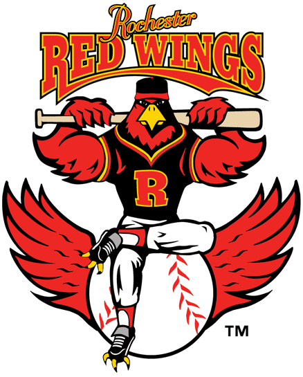
Rochester Red Wings
How can you not like a steroid-juiced bird flexing?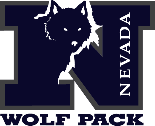
Nevada Wolf Pack
Much better than the silly growling NC State logo.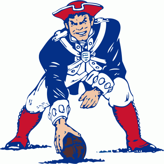
Old New England Patriots Logo
A lot of people hate this old one. I love it. A bad-ass Patriot ready to rumble. Awesome.
Also, love the fact that this was red, white and blue. No stupid silver (how is silver a patriot color?) to help sell jerseys. Very 70s. Very cool.
Another discontinued one. Look at this grizzled dude. Needs a shave. Angry. Totally cool.
I would definitely wear him with pride if I lived in Idaho.![]()
Army Black Knights
Great name. Great logo. Nothing else to say. I mean, check it out. He's got a cape.
New Orleans Voodoo
New Arena Football team. Uses city lore. Cool. Bonus points for the skeleton wearing sunglasses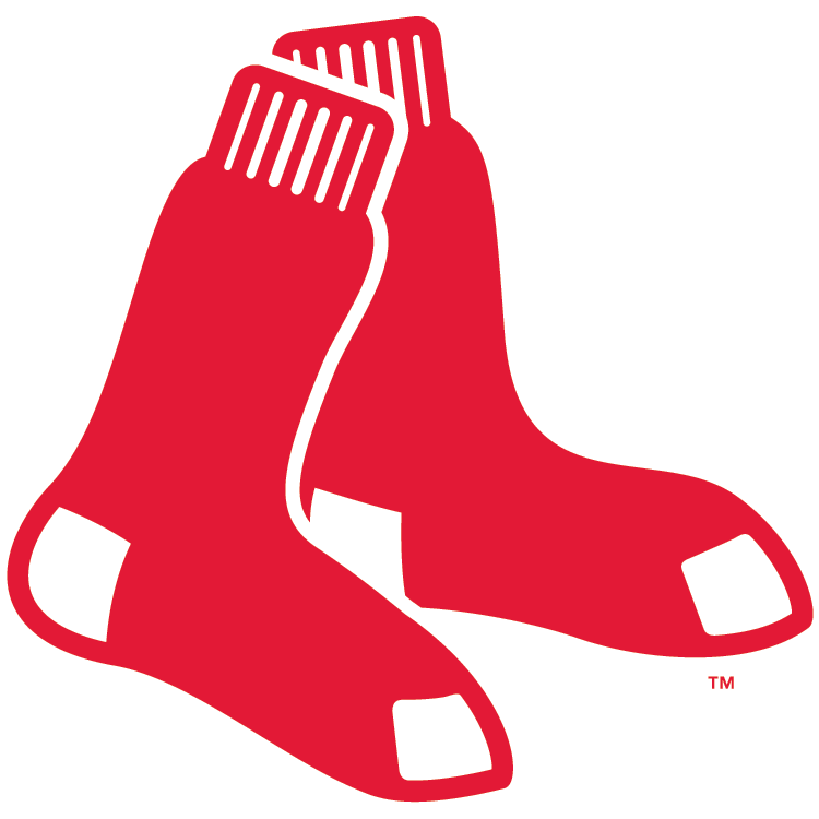
Boston Red Sox
I am a sucker for tradition and simplicity, and this Red Sox logo is awesome. Big ups to Boston for going back to their old logo. Nice.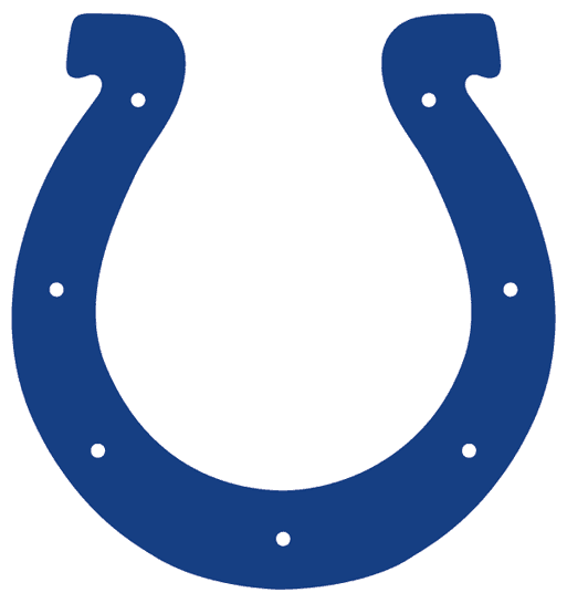
Indianapolis Colts
Speaking of simplicity. Love the simple horseshoe on the Colts here. Only two colors to their uniform. no stupid gray or black added—just the two colors. Simple, iconic. Awesome.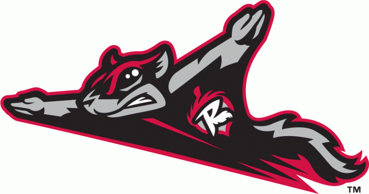
Richmond Flying Squirrel
There's simple and elegant, and then there's this. Kudos to the designer for making a logo that's actually kinda neat for team with the name "Flying Squirrels."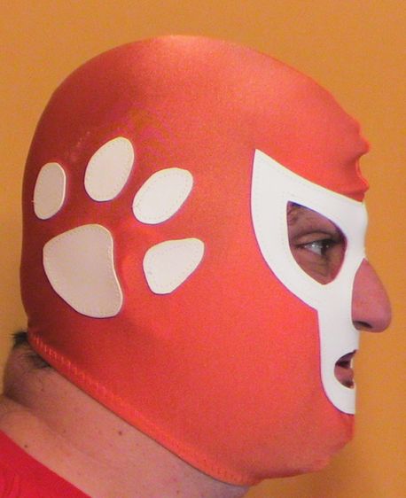
Clemson Tigers
I'm tired of cats names in college sports. How many Wildcats or Tigers names are there. Come on, be more imaginative. That said, the simple paw print is elegant and cool. And of course, major cool for making it a Mexican wrestling mask.
Now, some of the worst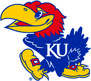
Kansas Jayhawks
A goofy bird with a sweater. Not exactly imposing.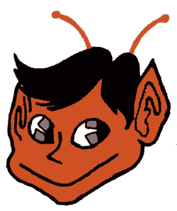
Old St Louis Browns
Brownie the Elf. Right.
Western Kentucky University
It's a towel. Their logo is a towel.
Old New York Nets
Did CBS get residuals for this logo?
Lakeland Flying Tigers
What the hell is a flying tiger? A tiger head with giant wings? Looks like a crappy heavy metal cover band logo.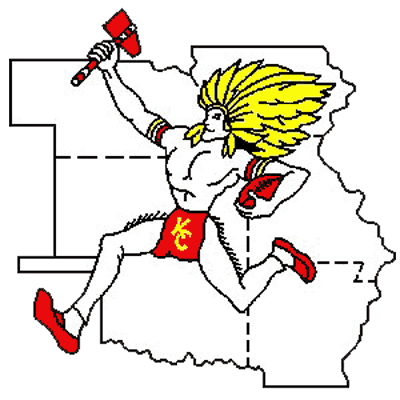
Old Kansas City Chief
Can't see why they got rid of this one? Who wouldn't want their logo to be a giant Indian running across a Midwest map with a tiny loincloth with KC on it?
And that's it for now. Suggest some of your faves and worst sport logos.


.png?w=600 "Top NBA Free Agents Left 📊")