Featured Video
England vs. Argentina is BIG 💪
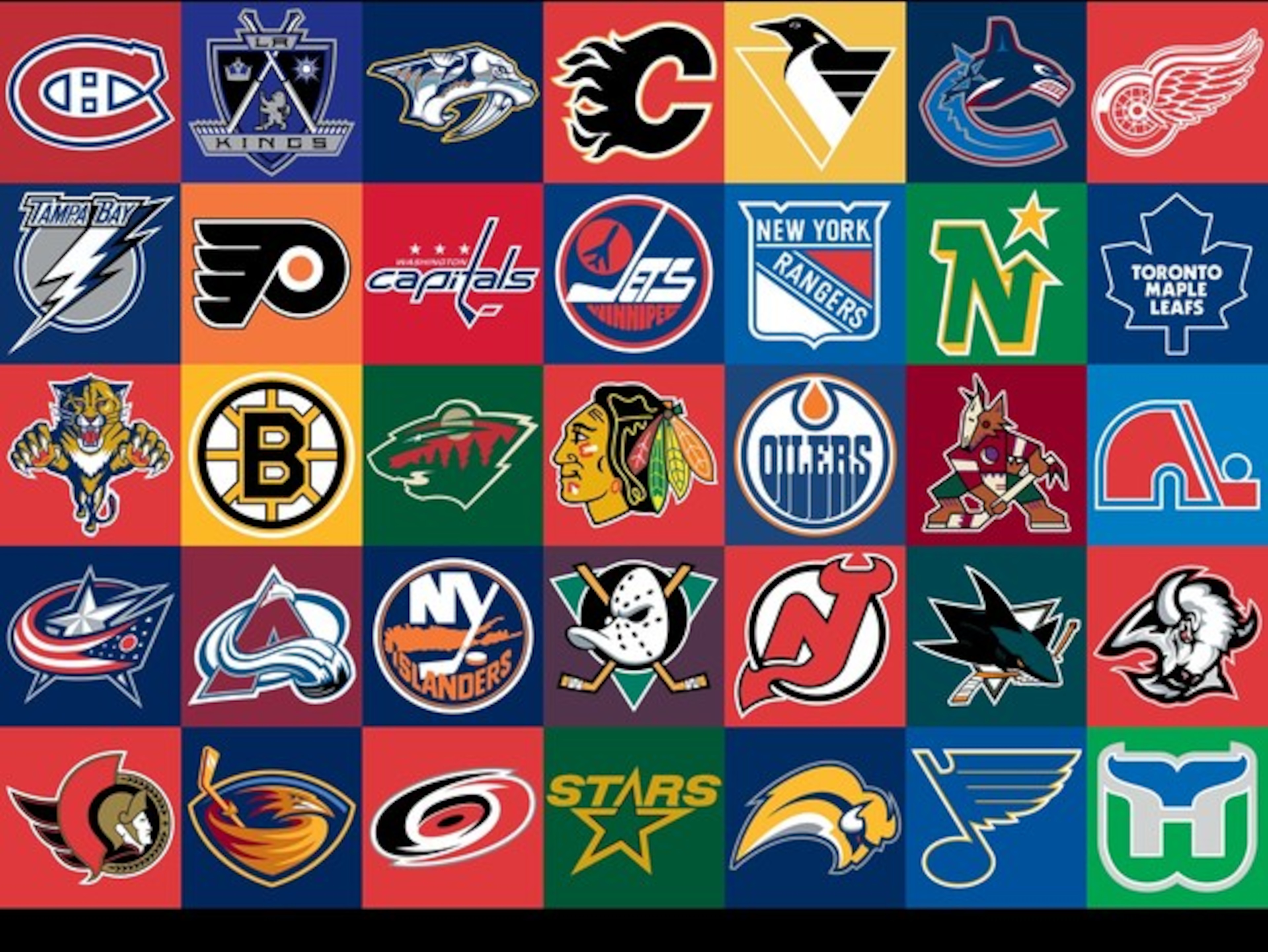
The NHL's 10 Greatest Logos of All Time
PuckpassionMay 9, 2009
#10 Ottawa Senators (1992-1997)
1 of 10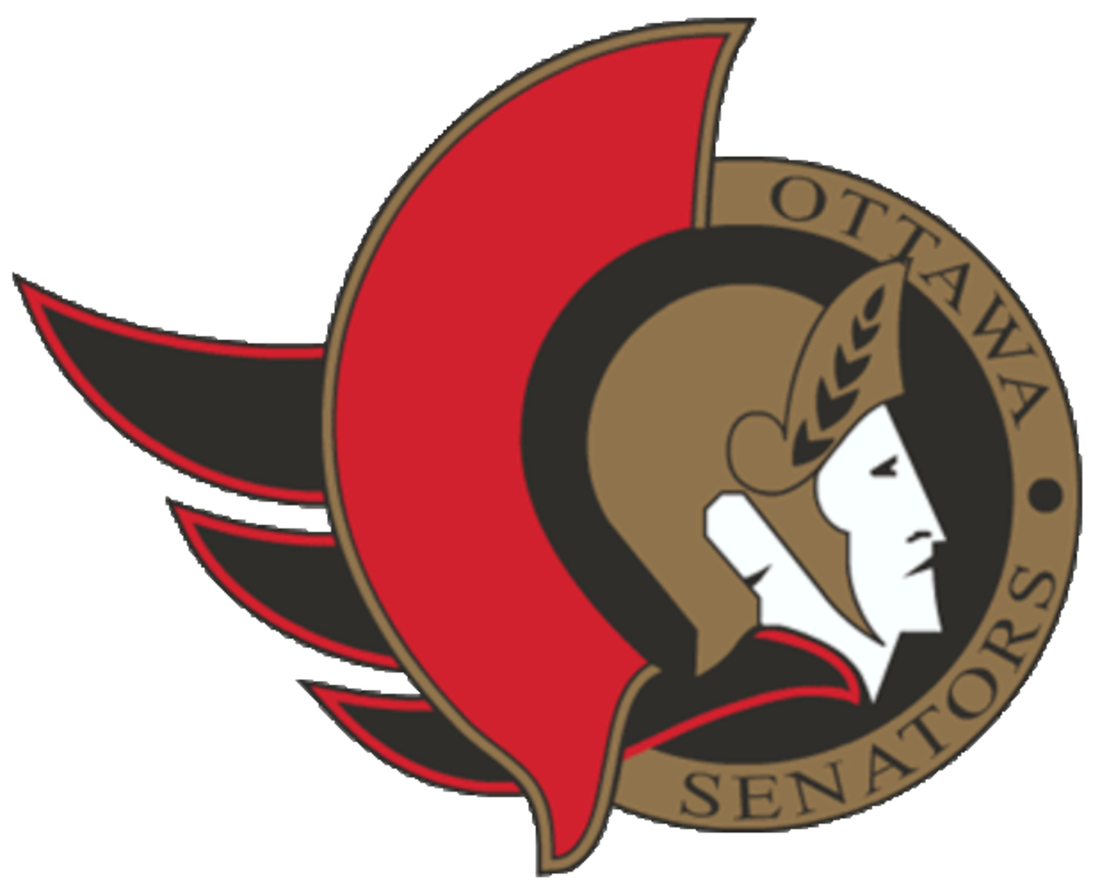
#9 Los Angeles Kings 3rd (1998-2002)
2 of 10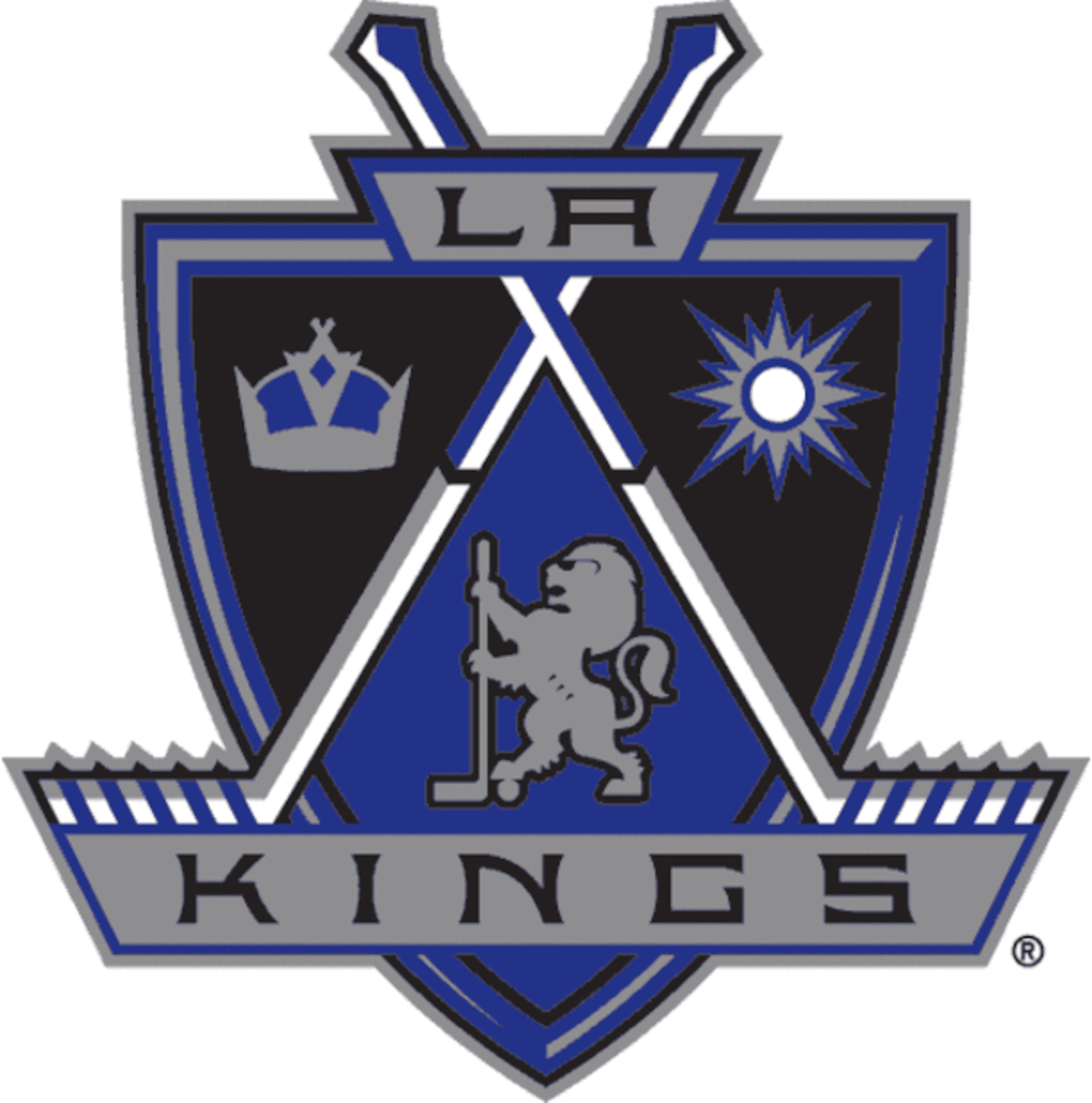
#8 New Jersey Devils (1992-Present)
3 of 10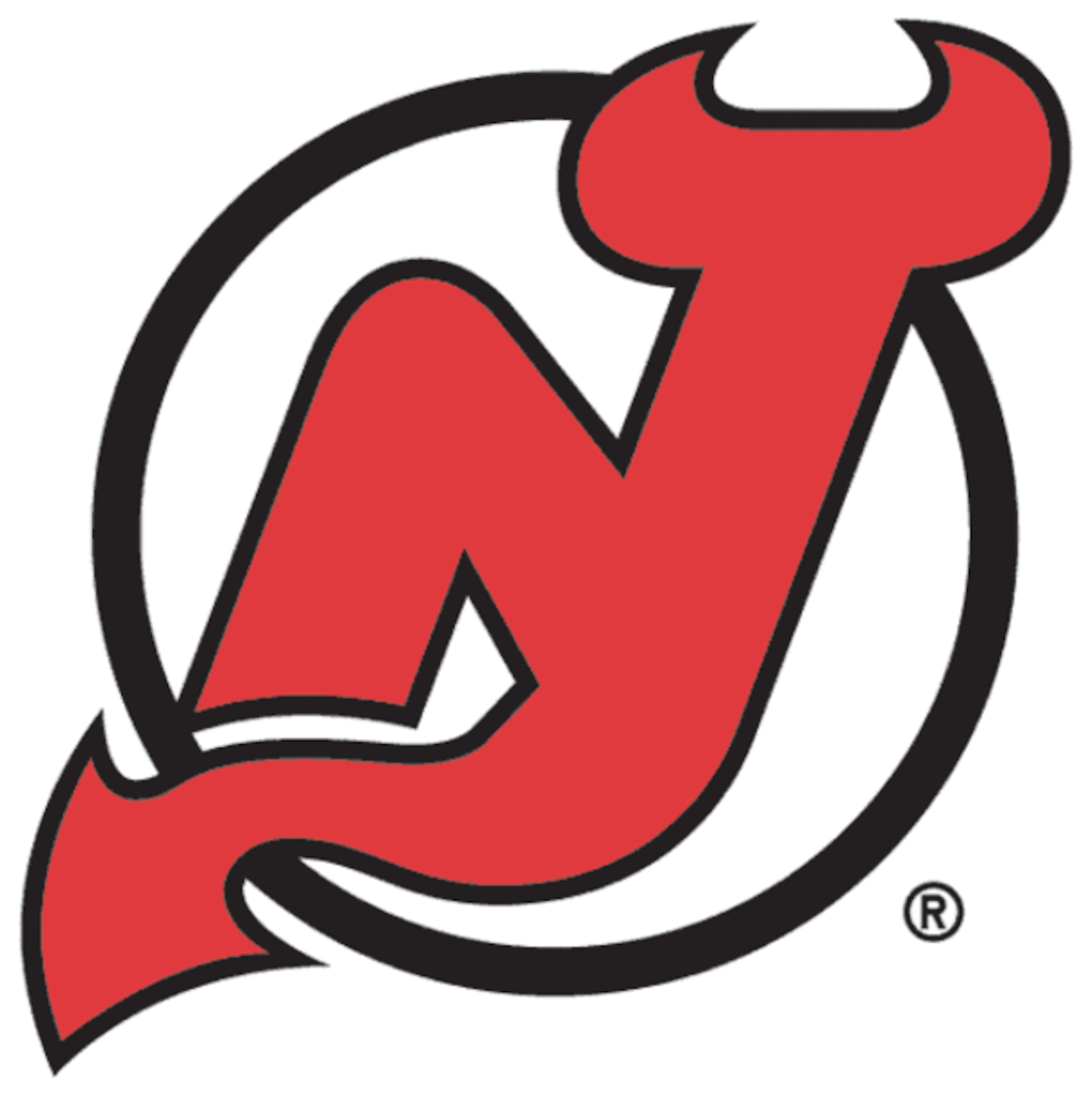


#7 Boston Bruins (2008-Present 3rd)
4 of 10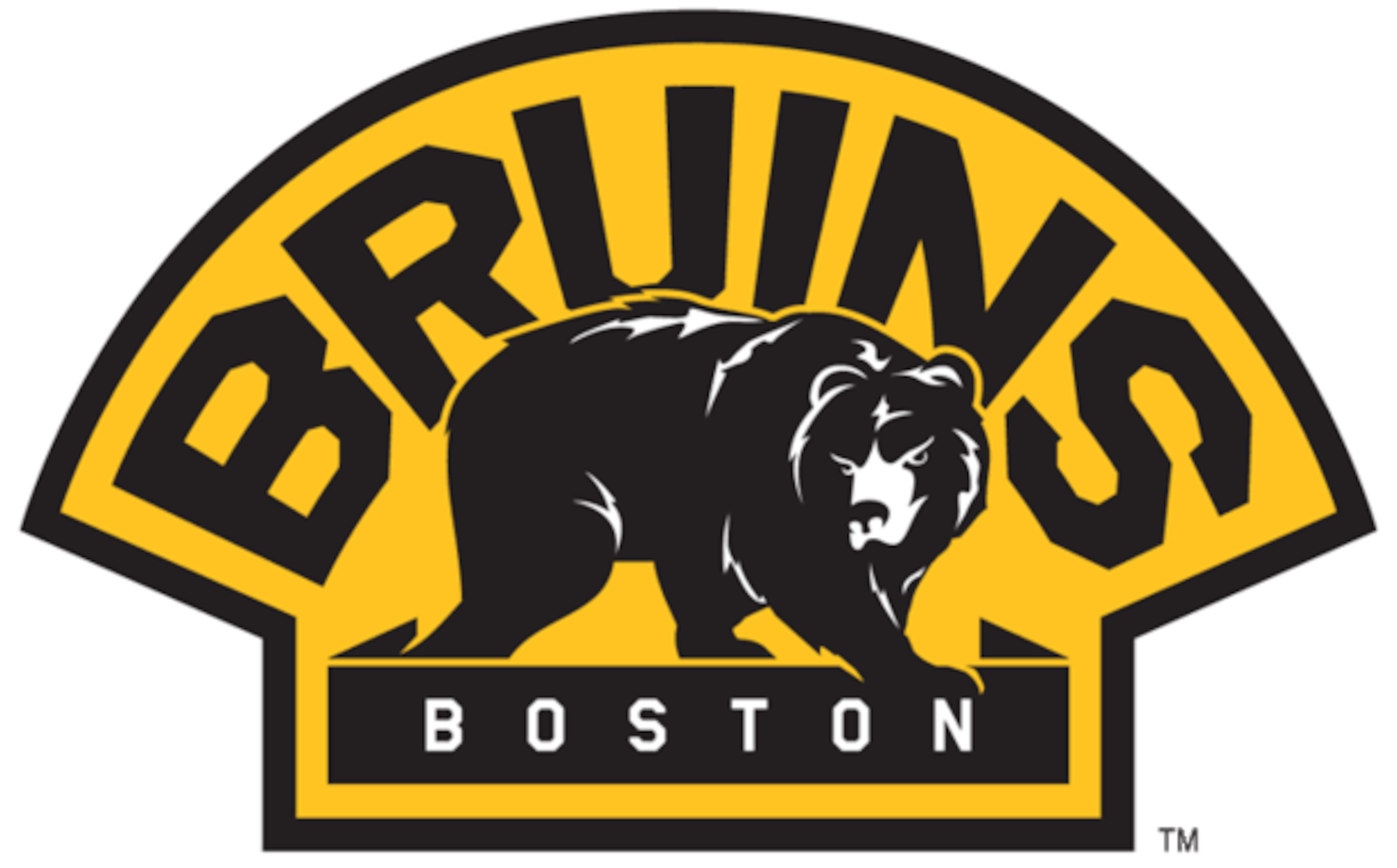
#6 New York Rangers 3rd (1996-2007)
5 of 10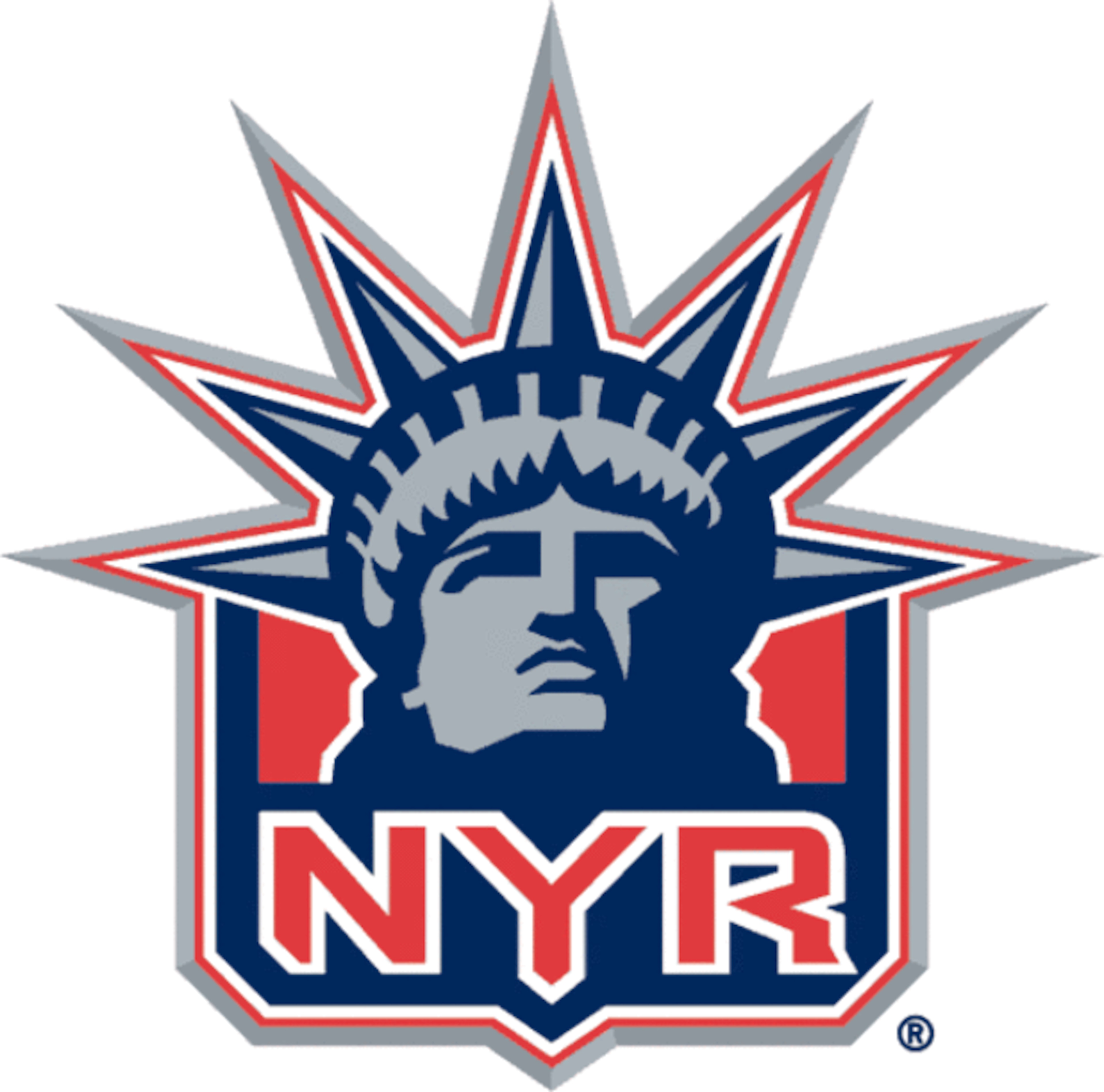
#5 Toronto Maple Leafs (1938-1967-Present 3rd)
6 of 10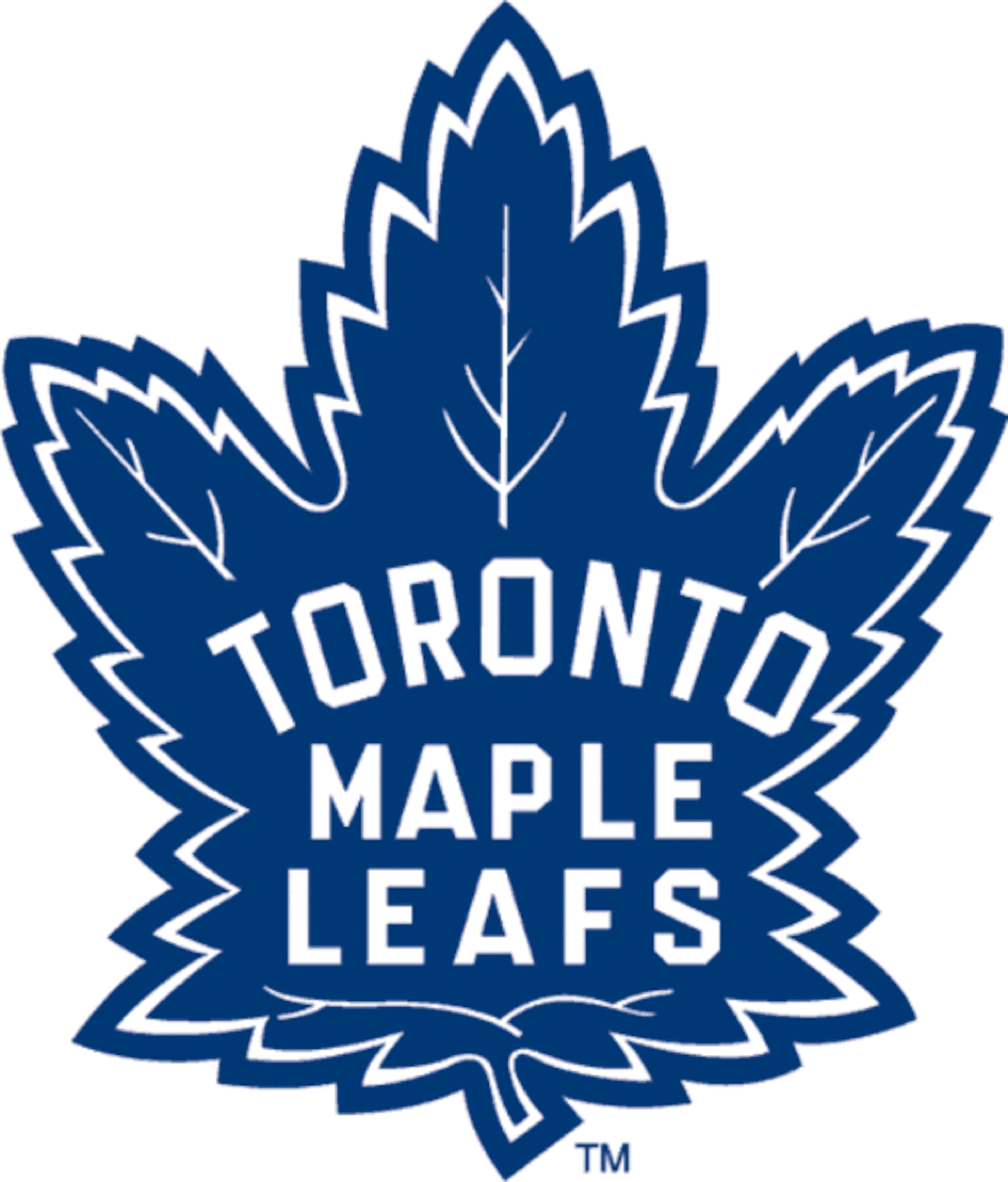
#4 Hartford Whalers (1979-1992)
7 of 10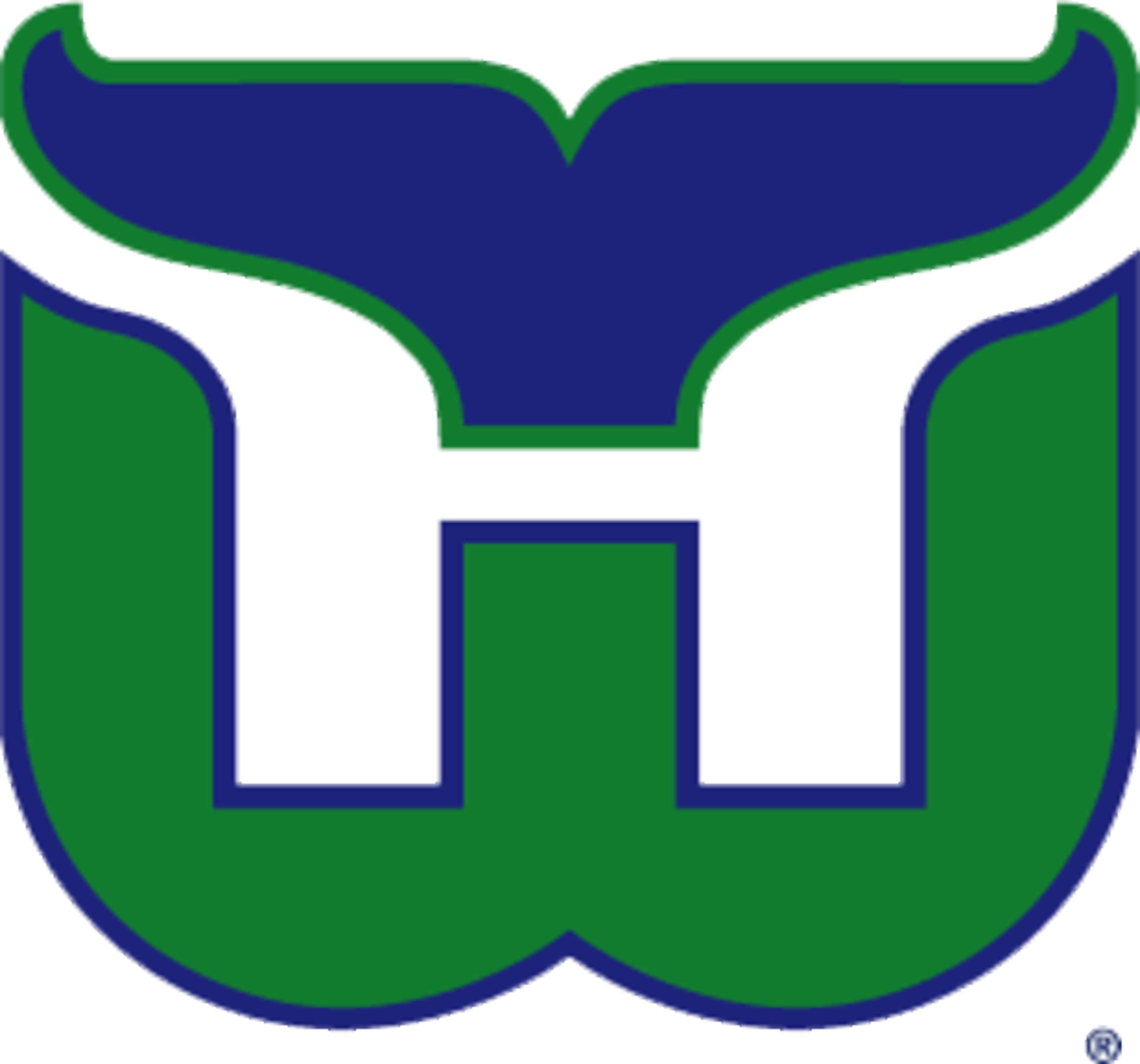
#3 Chicago Blackhawks (1937-1955)
8 of 10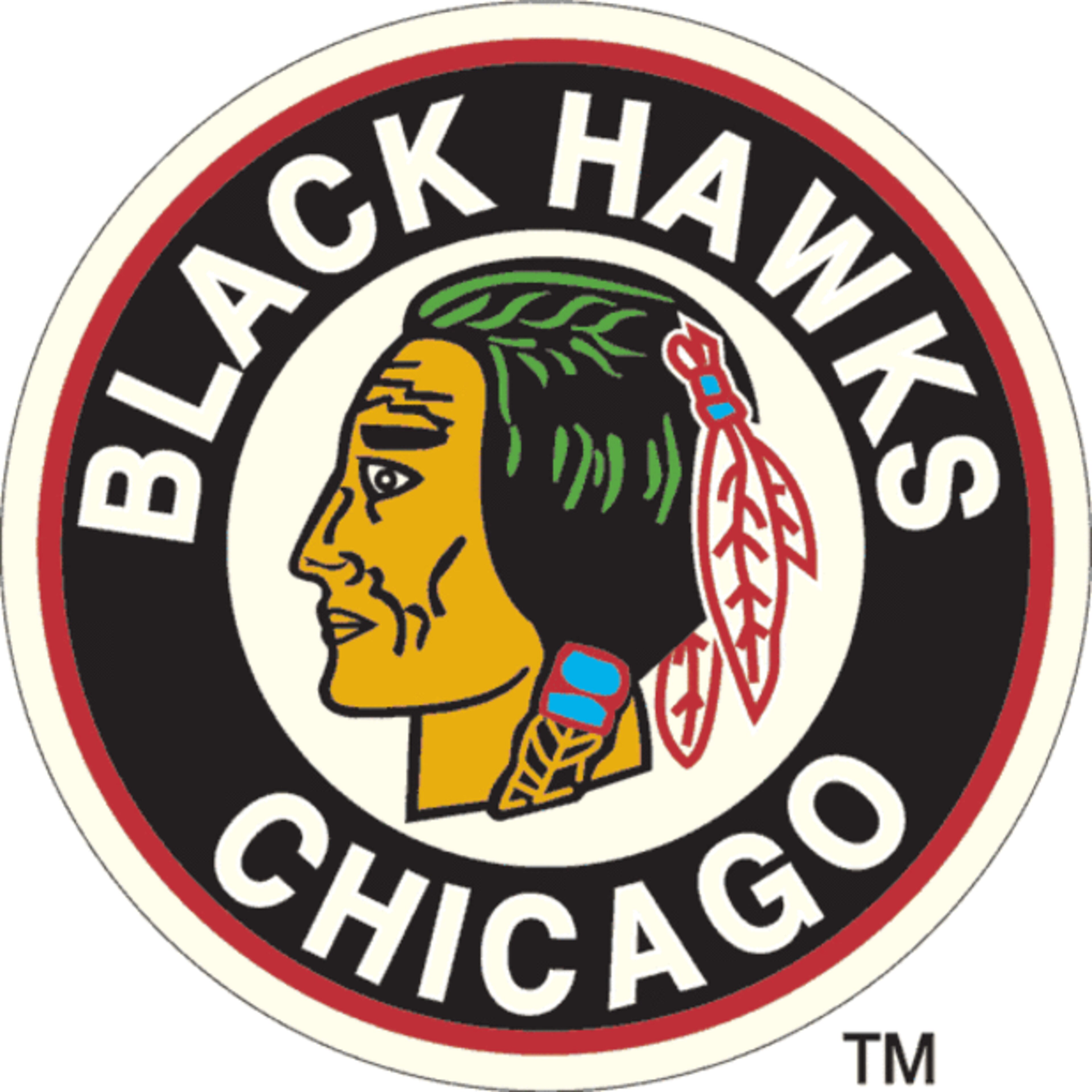
#2 Detroit Red Wings (1932-1934)
9 of 10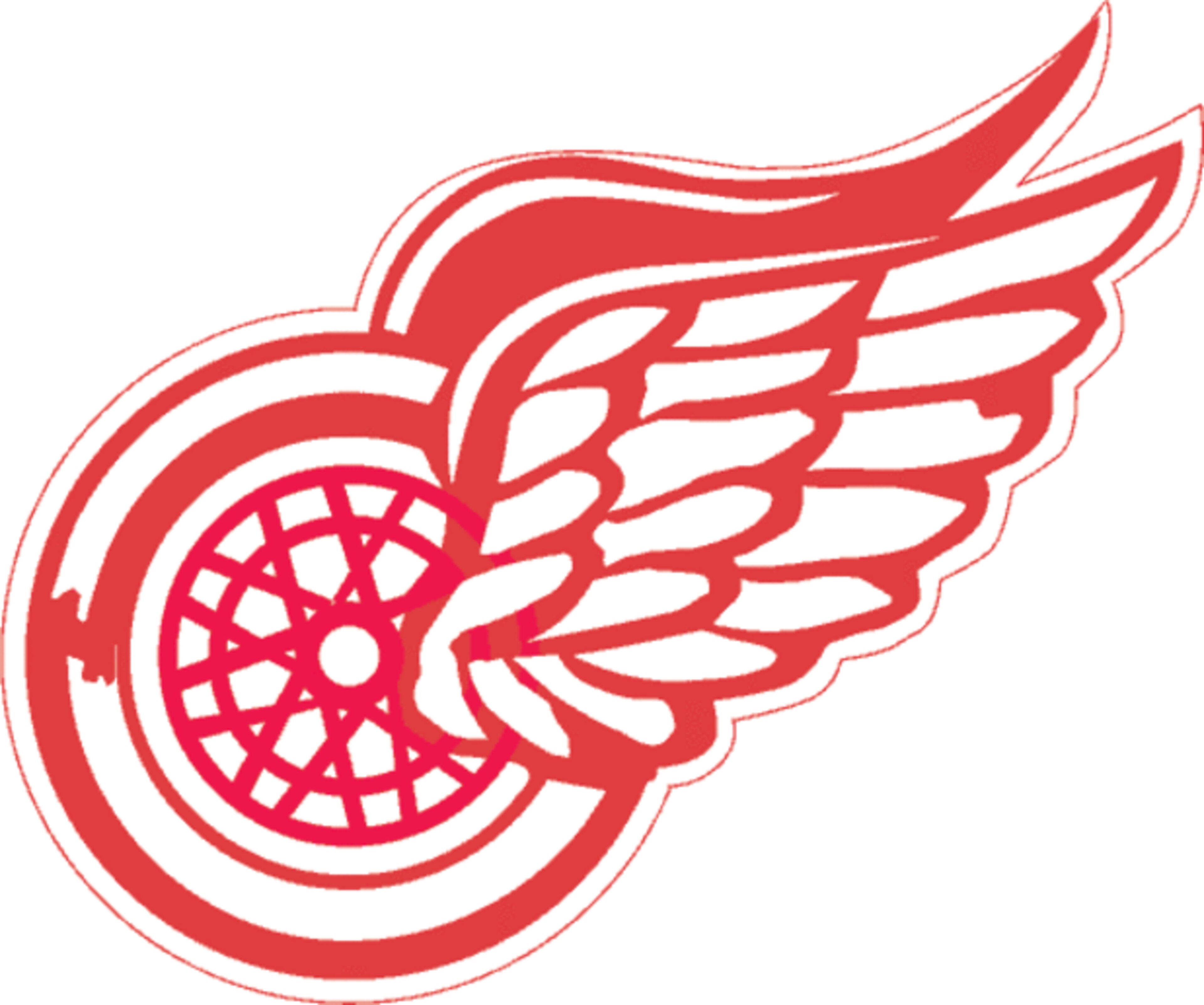
#1 Buffalo Sabres (1970-Present 3rd)
10 of 10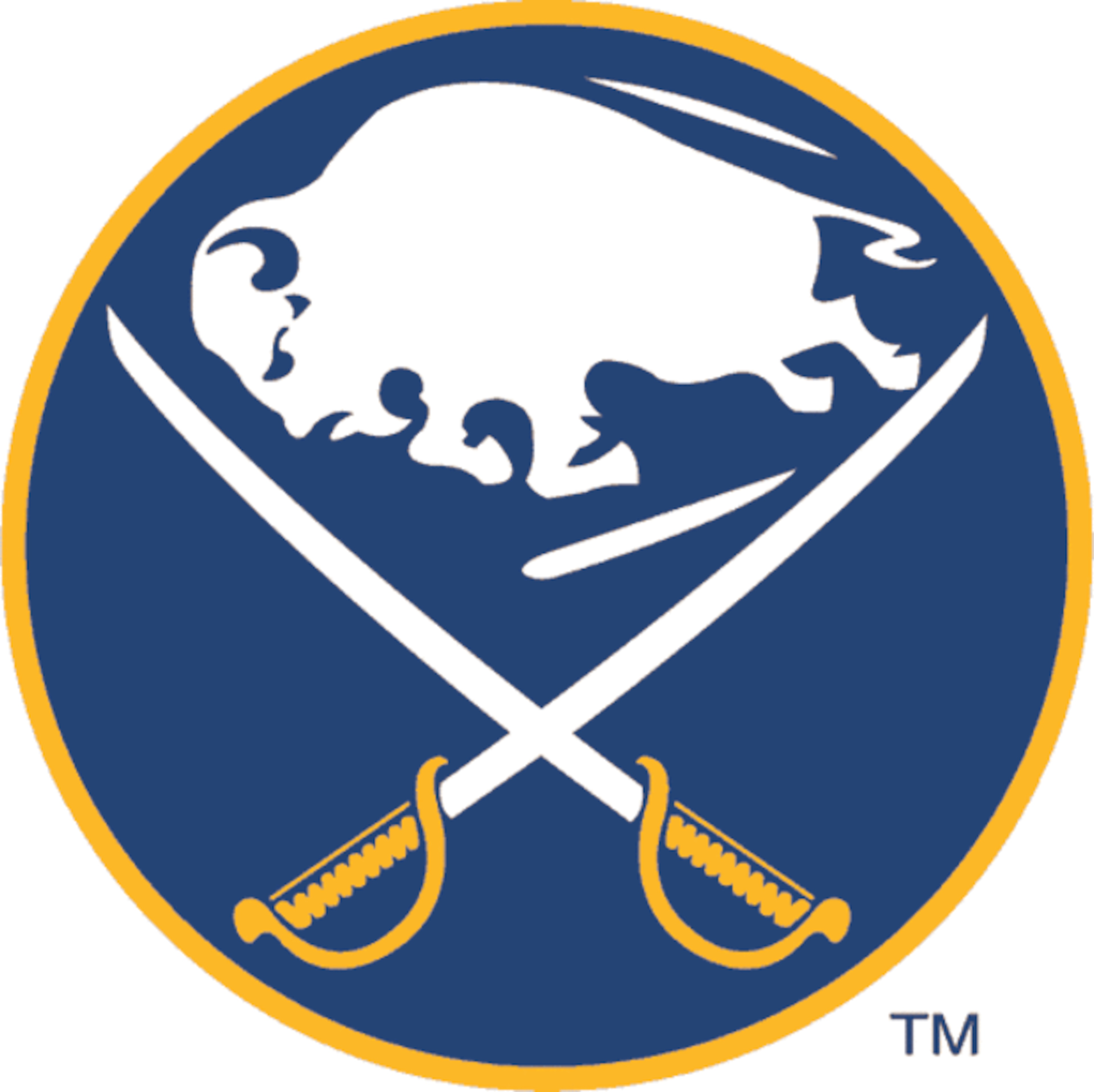

_1.png?w=3840 "B/R")


