2012 Summer Olympics Logo: How Does It Stack Up to Past Olympics'?
It's been bashed by critics, disregarded by fans and studied by artists. But no matter what angle one takes when dissecting the official '12 Olympics logo, it reeks of abstract art.
Whether it provides inspiration or perspiration seems irrelevant. The one question that needs answering is, does it provoke thoughts? Boom.
The only way to truly judge the new logo, which of course defines modern craziness and stinks of angular madness, is to compare it to past "masterpieces". Where do we start?
TOP NEWS
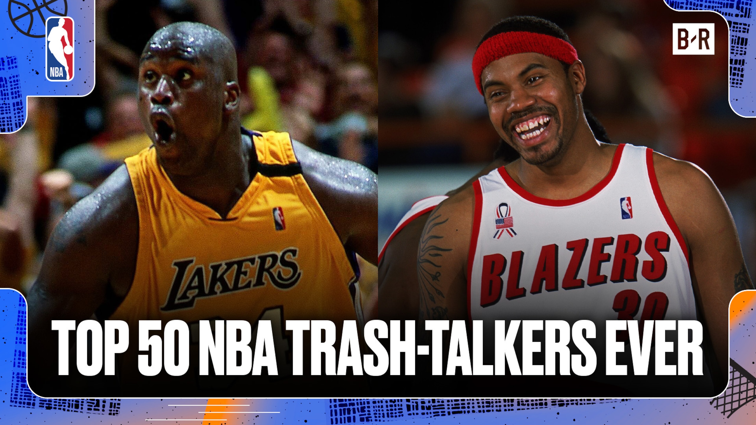
Ranking Best Trash-Talkers of All Time 🗣️
.png?w=2560)
Ranking the Best Shooters of All Time 🎯

Buzz: Mixon's Career May Be Over
Beijing in 2008. One image of a goofy competitor effortlessly lollygagging toward the finish line. Not quite motivational, but certainly creative. Moving on...
Salt Lake City in 2002. Sharp, precise, mundane. With simplicity comes extreme limitations, and that's exactly what happened in 2002.
Tokyo in 1964 (excuse the ridiculous order of years). A normal-sized circle and several smaller circles. Breathtaking.
Sydney in 2000. Changing the flow a bit, adding some chaos, even a little violence to a traditional emblem.
And finally, Vancouver in 2010. Aztec-esque building blocks forming quite the obtuse representation of a pantheon. Or so it seems.
While the Olympic front office has clearly tried new tactics in regards to their logo, they haven't come close to something acceptable, let alone aesthetically pleasing.
If nothing else surfaces, Rio in 2016 may be the best one yet. Time for a Jackson Pollack makeover.
Grab those paintbrushes and start waving those arms.


.jpg?w=2560 "UDFA's with Best Chance to Make Rosters")
