
ASU Football: New Uniforms—Fear the Fork in 2011
Among the Sun Devil fanbase, the team's overall look has been hotly debated for years.
Many felt that the distinctive maroon and gold colors and the Sparky the Sun Devil mascot logo (originally designed by the Walt Disney company) were as much a part of Arizona as cactus and 100-degree March days.
However, as times changed, the feeling that Arizona State's look was stagnant began to grow. So ASU began working with equipment sponsor Nike to re-brand the entire athletic program to bring the Sun Devils to the cutting edge of collegiate sports.
They began a beautifully-executed campaign of teaser videos, telling fans "It's Time."
Rumors and speculation ran rampant throughout the state as whispers of "all black" and "like Oregon" became common. Perhaps most controversially, the idea of Sparky being removed from the football helmets became a fierce battle of old vs. new school.
Today, it was finally time. At a well-run press event, the new look of ASU sports was unveiled. Let's take a look at the sleek new look of the football team as they head into their first season of Pac-12 play.
All images courtesy of ASU.
New Font
1 of 7
Nothing re-brands a program like a...font?
Well, it is a start.
Now, all ASU sports will utilize a brand new and proprietary font known as Sun Devil Bold.
It's simple, clean and echoes the sharp-edged pitchfork with its serifs.
It's certainly not a game-changer, but the consistency is welcome.
New Logo
2 of 7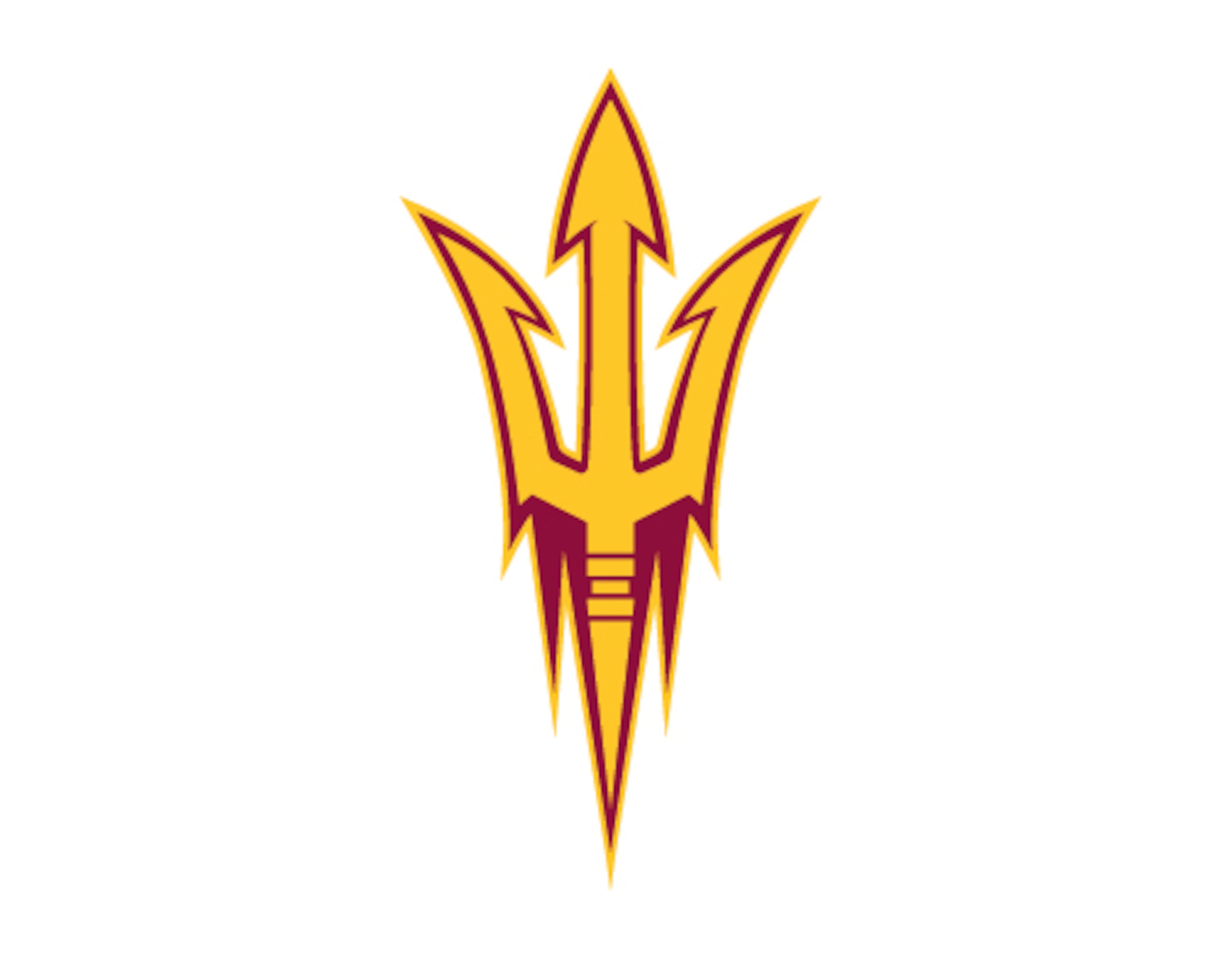
So, if Sparky was being left behind, what would take his place?
The answer came early in the event when the world was put on notice: "Fear the Fork."
Sparky's signature pitchfork would now become the logo of Sun Devil athletics.
The new pitchfork is a more expressive design than the old version, with more visual flair and a sharper, deadlier look. The prongs thrust out in a much greater fashion than before.
One element that could have been left behind was the flame points emanating below the pitchfork, which detract from the signature three-pronged look.
Home Maroon
3 of 7
Introduced first were the maroon home jerseys.
At first glance, you may think USC. I did.
The similarities are prominent: maroon jerseys with gold pants and yellow stripes around the shoulders.
However, a second look shows that these are certainly ASU's own.
On the jersey, yellow pitchfork prongs form the shoulder strips. Underneath, "ASU" is present in Sun Devil bold font.
The colored piping that plagued the most recent football jerseys is thankfully gone, leaving the jersey with a crisp, clean look. The "PT-42" patch at the neckline remains in honor of Pat Tillman.
The pants are solid gold with no stripes, again thanks to the wise decision to remove the piping. The pitchfork logo appears on each hip in maroon.
Don't be surprised if the Devils went to maroon pants, with gold hip pitchforks, at some point during the season.
The helmet is gold, with a maroon facemask. The pitchfork logo, which in several pre-release mockups was in various locations, including a Michigan-esque pattern, is maroon and facing forward.


Road White
4 of 7
The road uniforms take on a sleek monochromatic look.
The helmet remains the same gold with maroon pitchfork as on the home uniforms.
The white jersey has the maroon pitchfork prong shoulder stripes with maroon numbering outlined in gold. Under the stripe on the sleeve is "ASU" in Sun Devil Bold font.
Again, the removal of the piping allows for a clean and powerful look.
The pants debuted at the event are solid white, although don't be surprised if the gold pants are worn at some point.
Alternate Black
5 of 7
Now comes the game-changer.
For the first time since the 1950s, ASU is going to black helmets. In fact, they are going black from head to toe.
The jersey format remains the same as the other two sets.
They have a solid black jersey with gold numbers outlined in maroon. Yellow pitchfork prongs are on each shoulder with "ASU" in Sun Devil Bold underneath.
The pants are all black with golden hip pitchforks.
To top off this intimidating ensemble is a matte black helmet, similar to the designs Oregon and TCU wore last season. The pitchfork logo is in gold with maroon trim.
What's Missing
6 of 7
The most noticeable absence in the entire re-branding is that of the beloved mascot Sparky, who has adorned the team's helmets since 1986, although his pitchfork remains.
The removal of Sparky was one of the very first rumors to make the rounds when the re-branding efforts were announced and became a source of fierce debate among the Sun Devil faithful.
Despite his removal from the helmet, the venerable Sparky will most certainly still maintain his presence at all athletic functions and looked mighty daper in his tuxedo during the unveiling event.
Perhaps the most important things missing were the unnecessary flash and ornamentation that has made the Oregon Ducks' uniforms the most recognizable, and mocked, in the nation.
The uniforms remain clean, strong and free of ugly patterns such as the Ducks' feather and metal looks.
Verdict
7 of 7
So, what does this all mean?
In today's age, the look of your program can be a determining factor in whether a hotly sought after recruit signs with your school. It's been no secret that Oregon's Nike-fueled avant garde approach to uniforms has helped land some key players.
There was a growing perception that, despite the many wonderful factors ASU had in it's favor (location, conference, facilities...etc), it had taken on a stale reputation among recruiting bases nationwide.
This re-branding effort is meant to not only address that issue, but to solidify ASU's place as a top-flight destination as it heads into the new Pac-12.
Are these uniforms perfect? No.
Are they a step forward? Yes.
From the bold new helmets and introduction of black, there are elements to please the younger demographic.
By avoiding the eye sores of Oregon and melding classic elements with modern design, ASU has made this unveiling a success.
It's now time to take that momentum from the catwalk to the gridiron.
What do you think of the change? Post your comments on whether it was a hit or a miss.
Follow me on Twitter @ASU_Examiner for the latest updates and analysis on ASU athletics.


.png?w=2560 "Ranking the Best Shooters of All Time 🎯")


.jpg?w=2560 "UDFA's with Best Chance to Make Rosters")
