Featured Video
NBA Insiders at Summer League 👂

Ranking College Football's Top 50 Teams with Schedule Posters
Tom PerryJul 26, 2010
50. Virginia Tech
1 of 50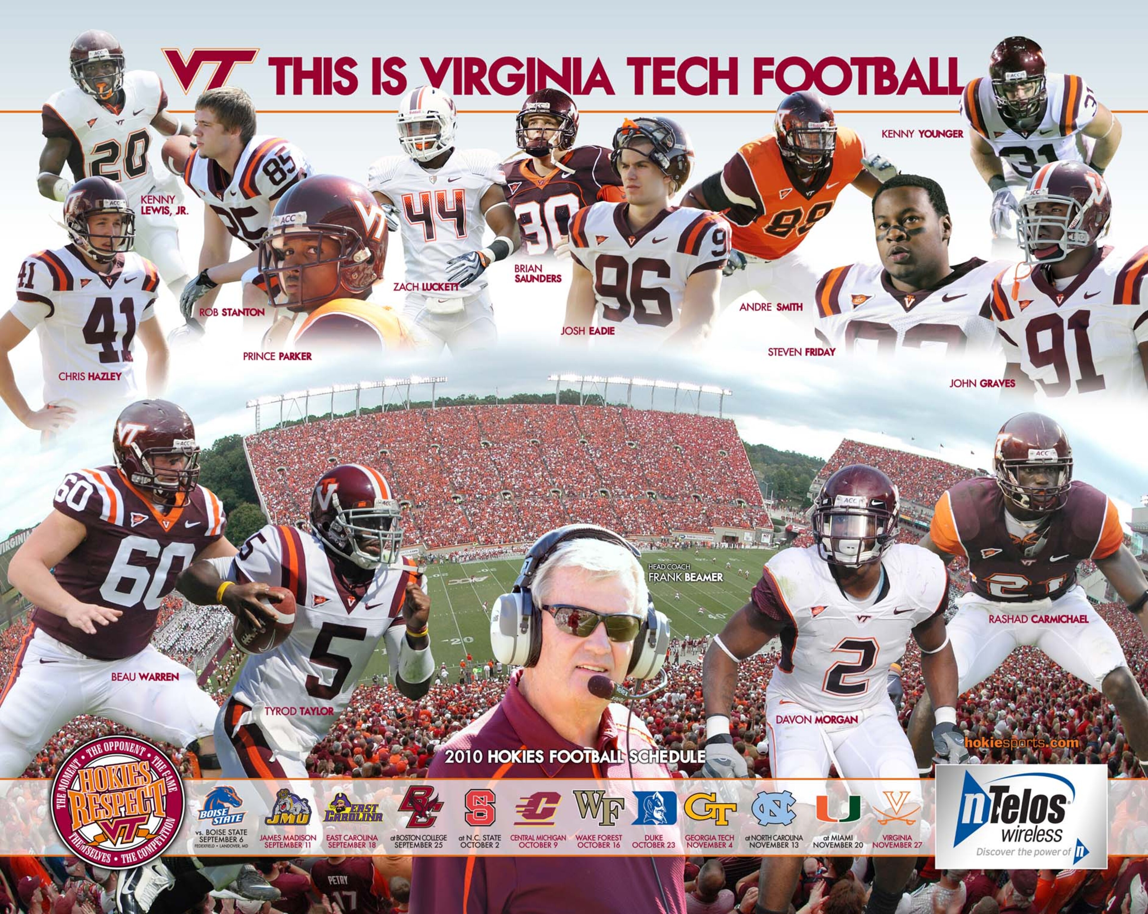
49. Colorado State
2 of 50


47. New Mexico
4 of 50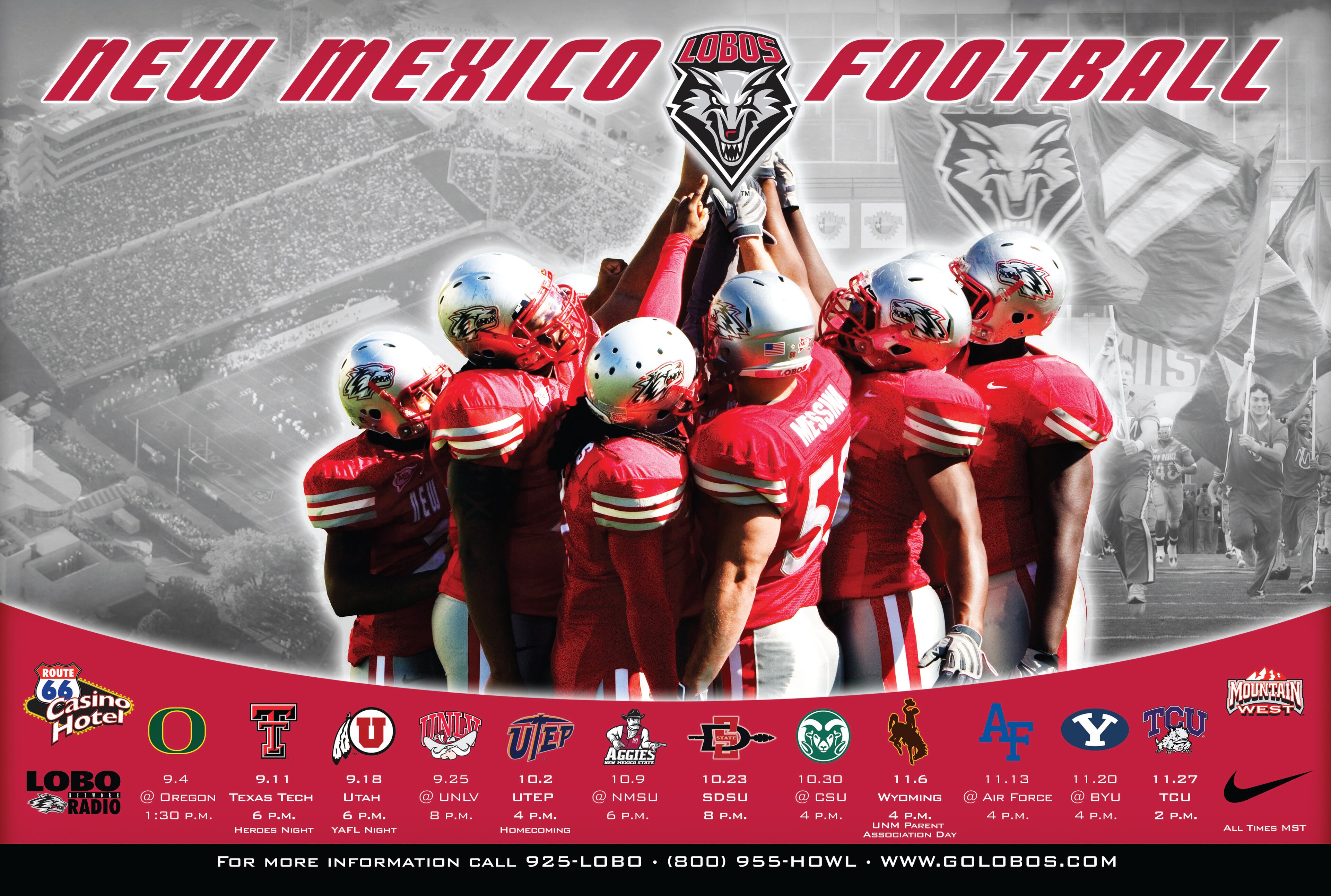
46. Temple
5 of 50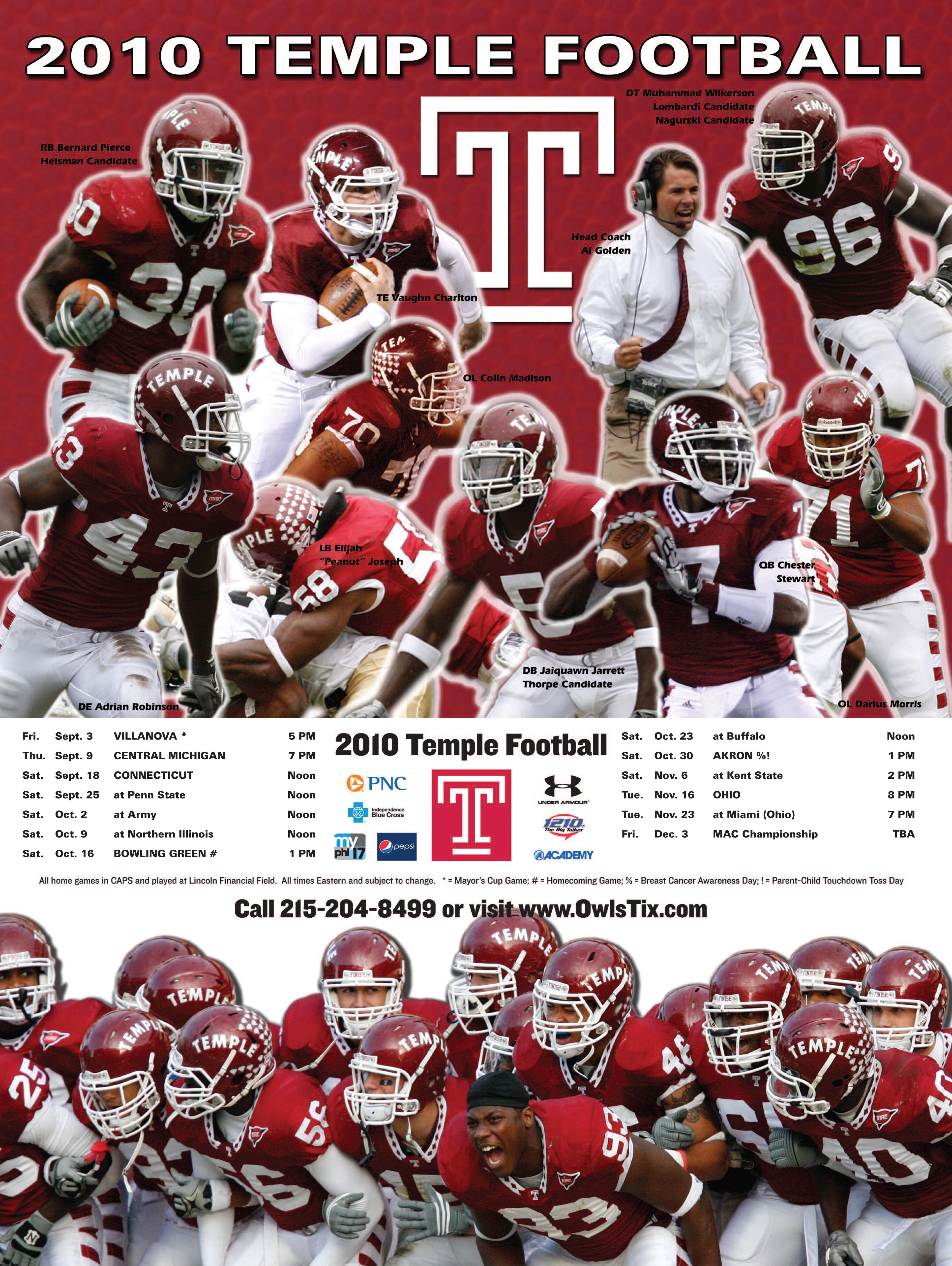
45. Texas Tech
6 of 50
44. Air Force
7 of 50
43. Wake Forest
8 of 50
42. Toledo
9 of 50
41. Arkansas
10 of 50
40. Army
11 of 50
39. Kent State
12 of 50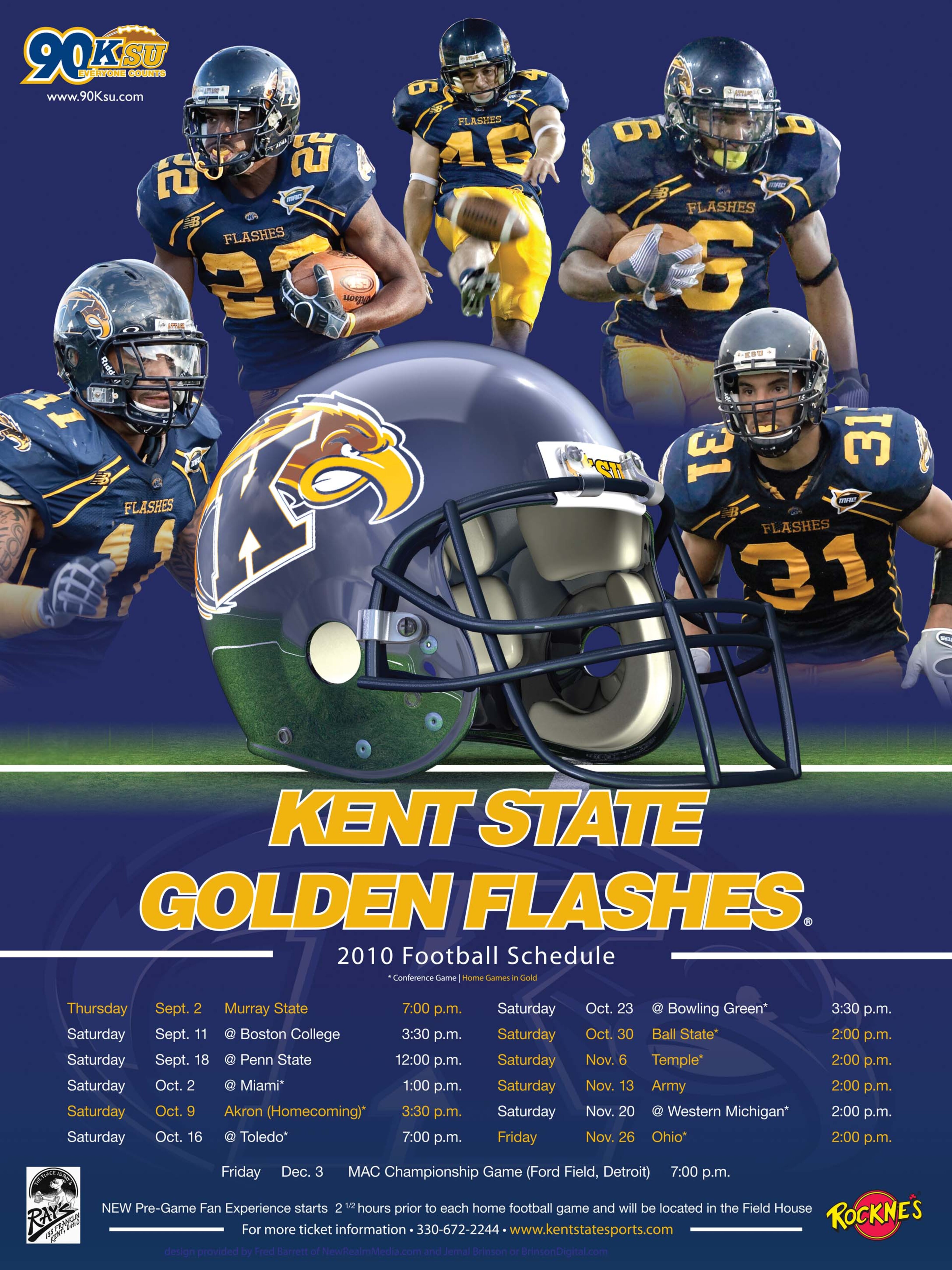
38. Kansas State
13 of 50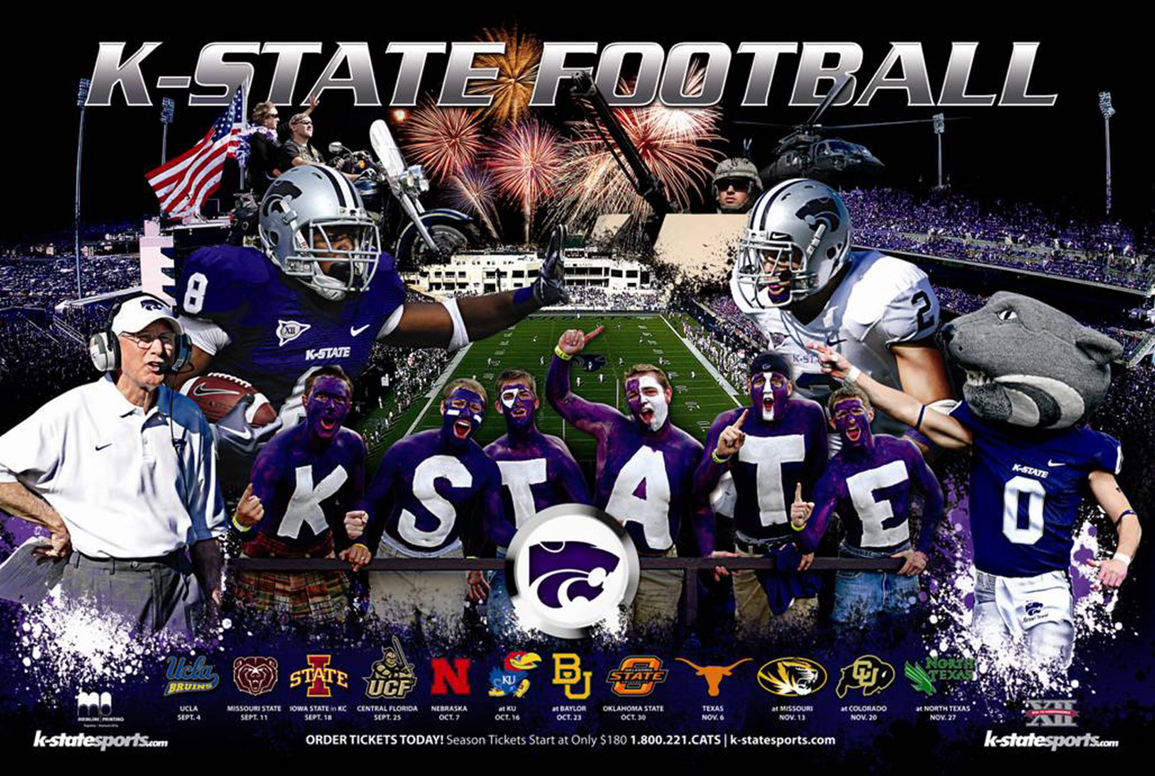
37. Houston
14 of 50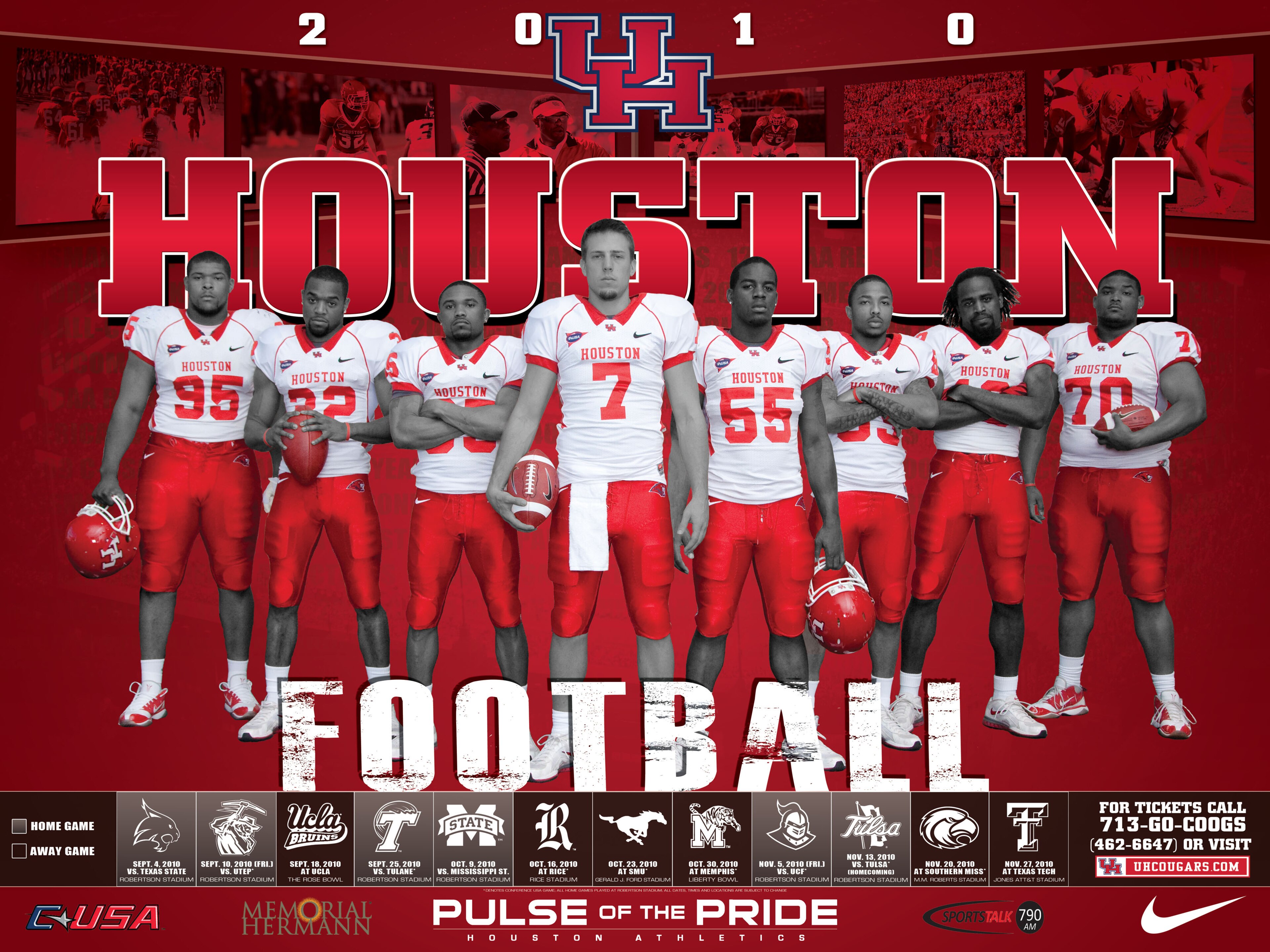
36. Akron
15 of 50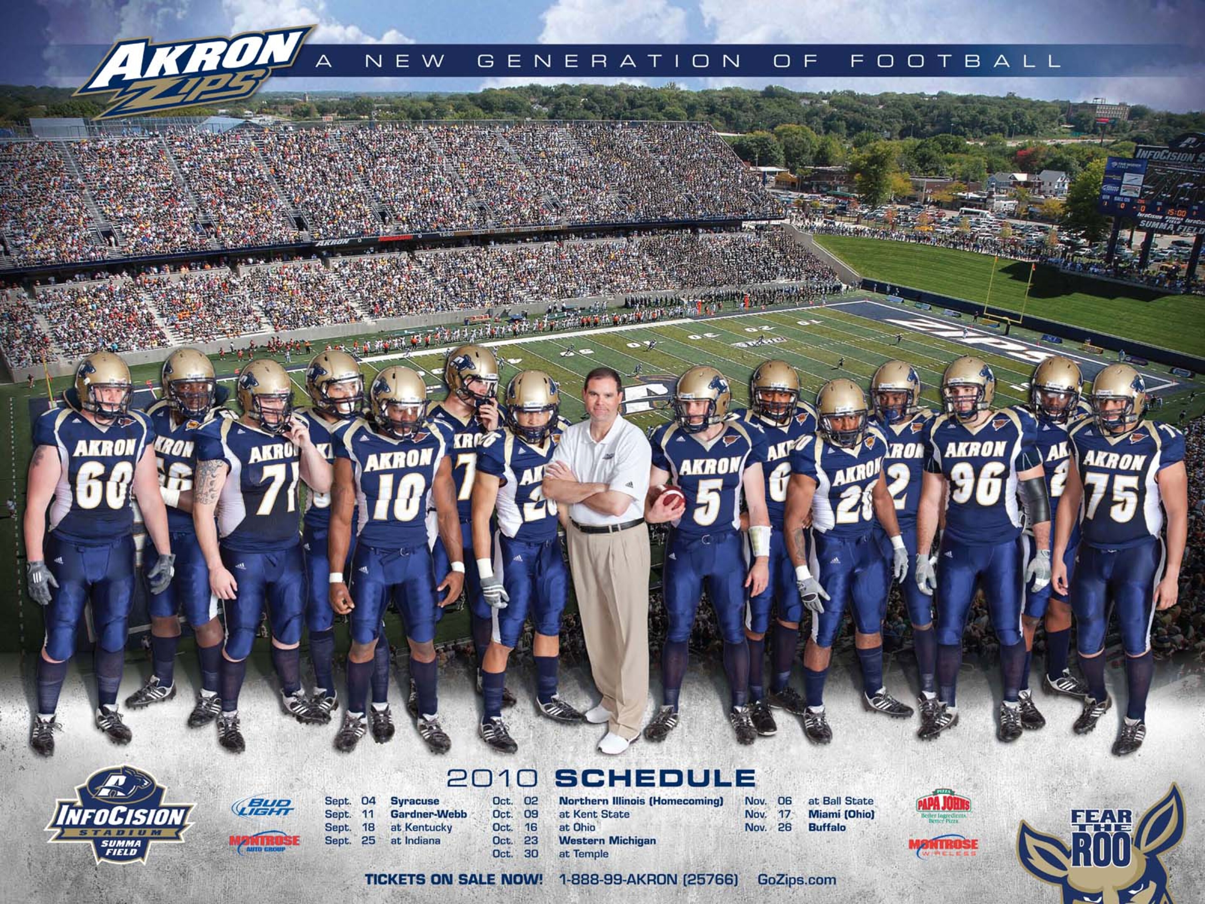
35. Baylor
16 of 50
34. South Florida
17 of 50
33. Western Kentucky
18 of 50
32. BYU
19 of 50
31. New Mexico State
20 of 50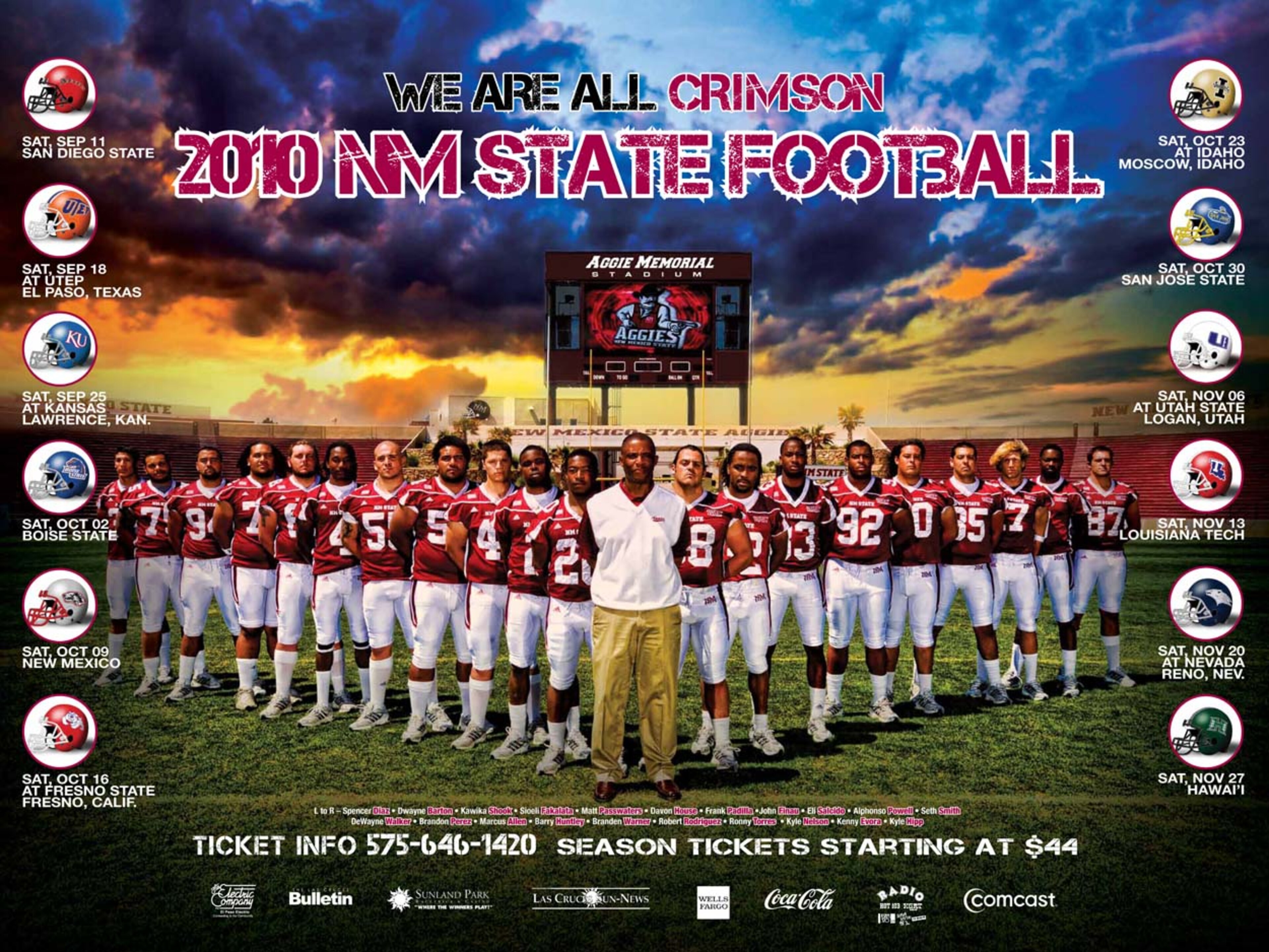
30. Louisiana Tech
21 of 50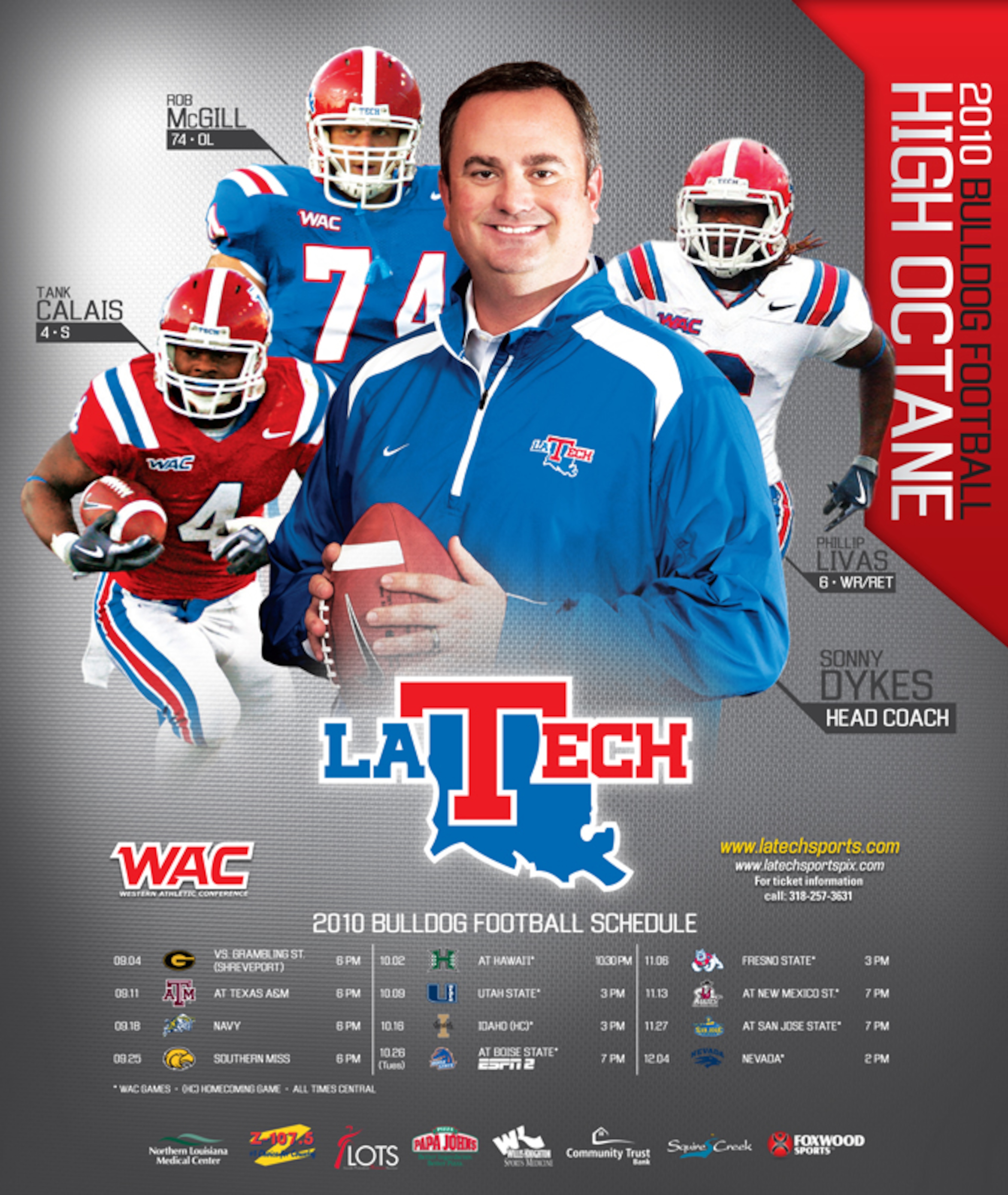
29. Ohio State
22 of 50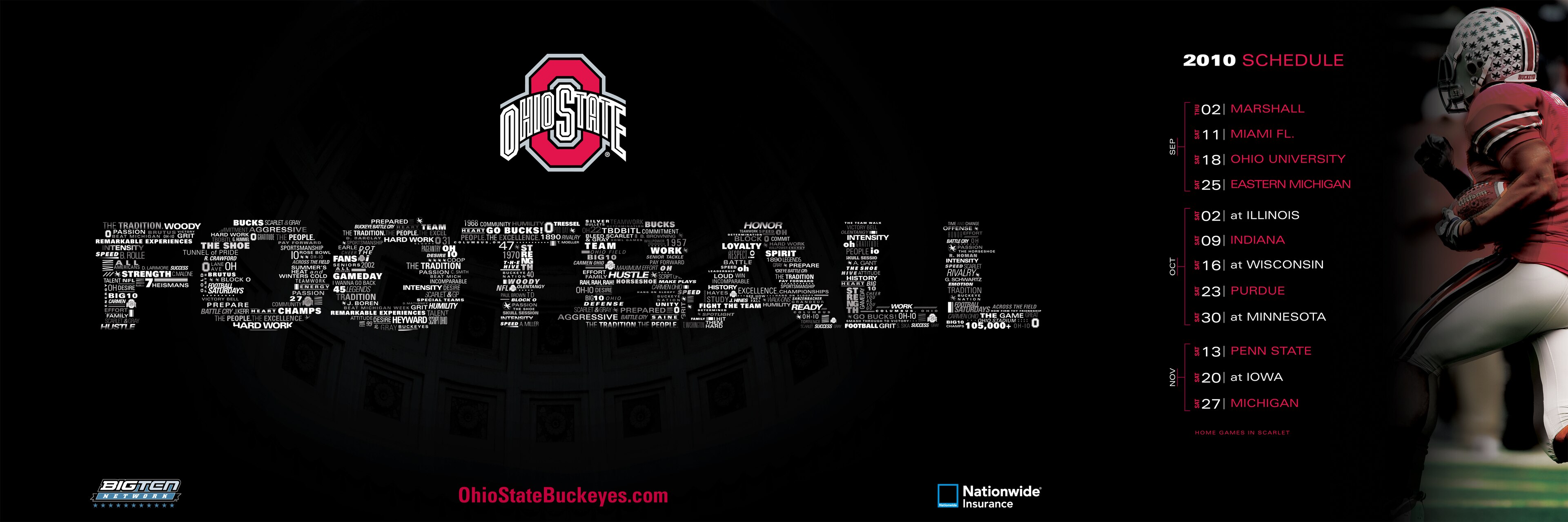
28. Washington State
23 of 50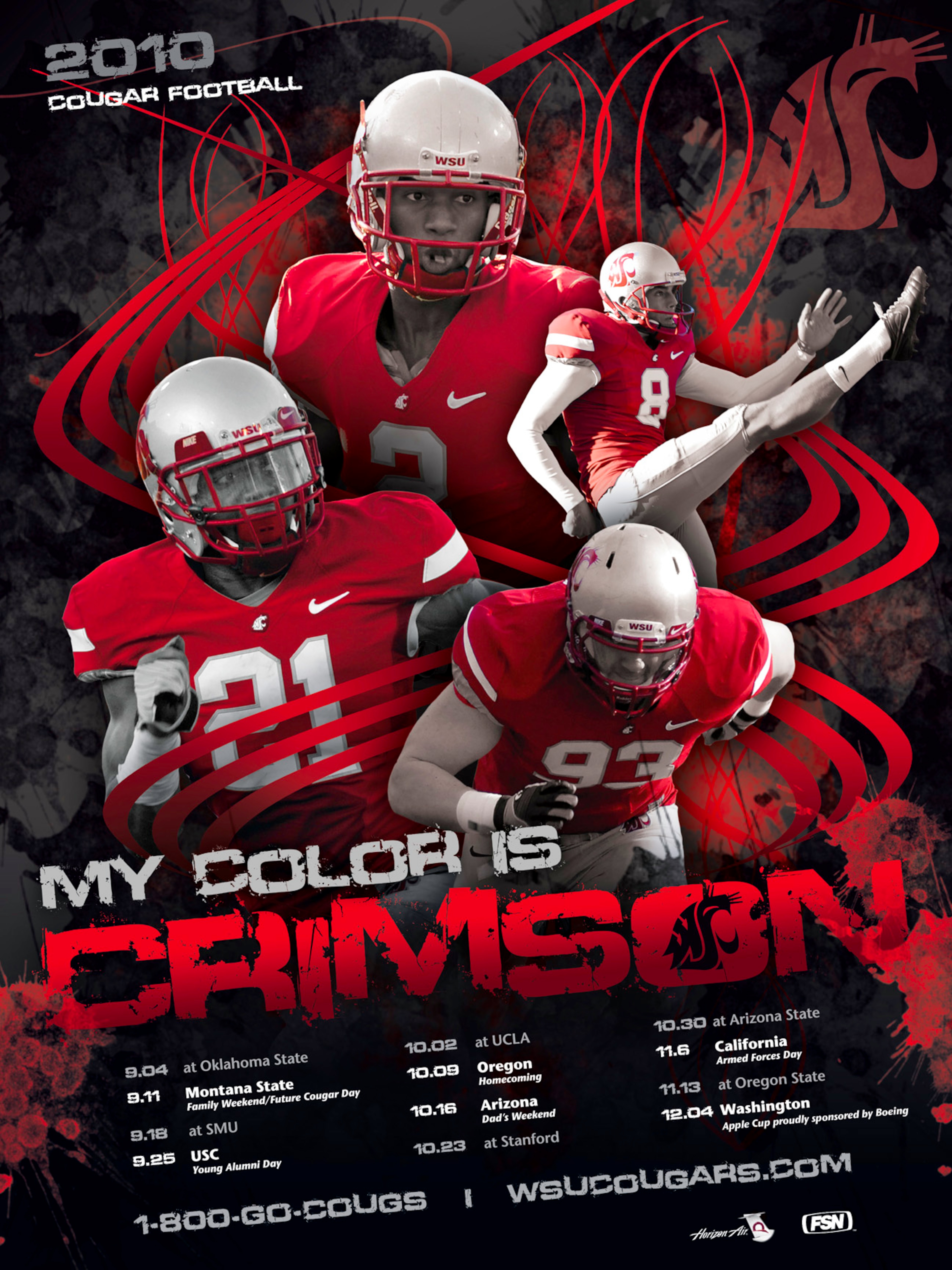
27. North Carolina State
24 of 50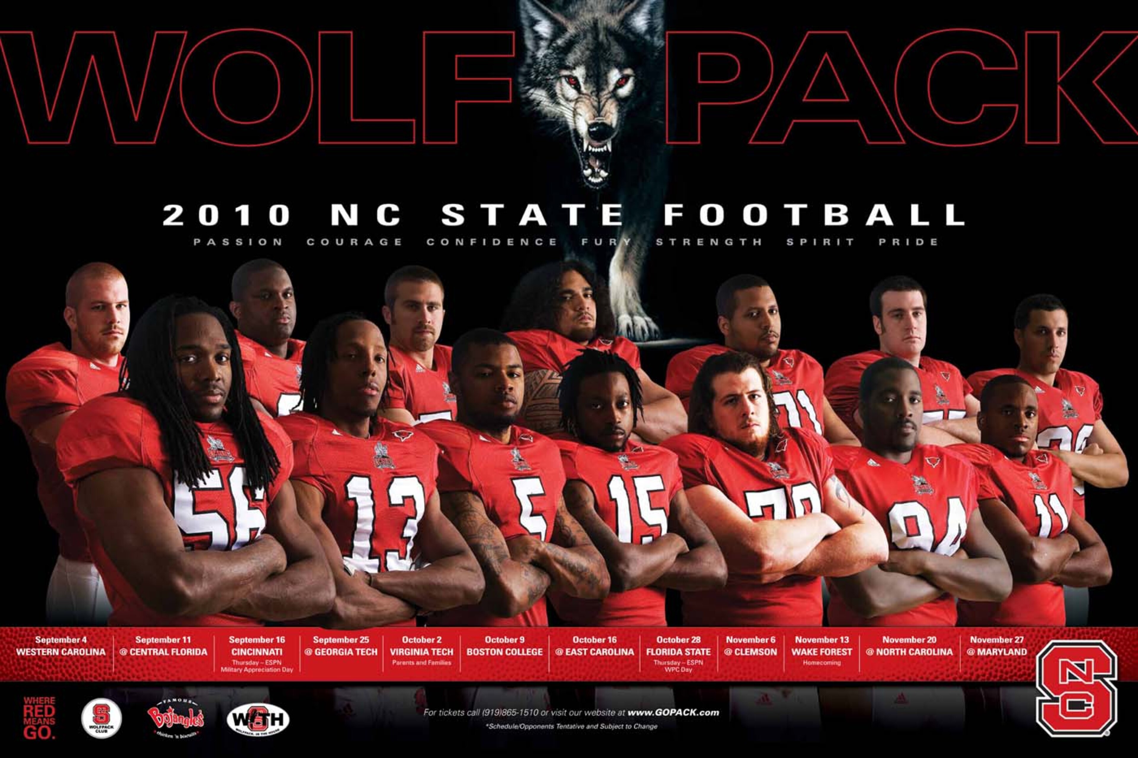
26. Louisville
25 of 50
25. Oregon State
26 of 50
24. Penn State
27 of 50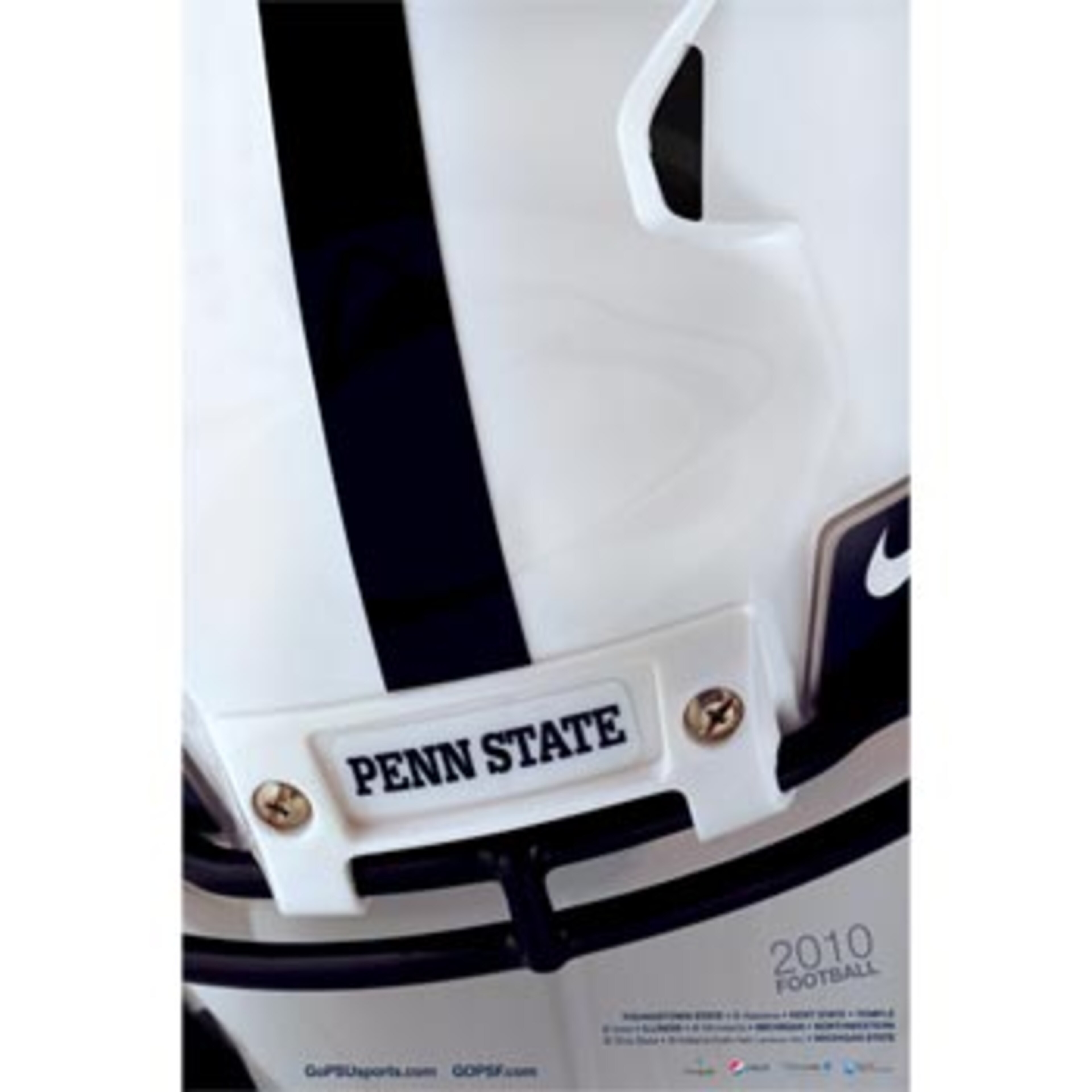
23. Virginia
28 of 50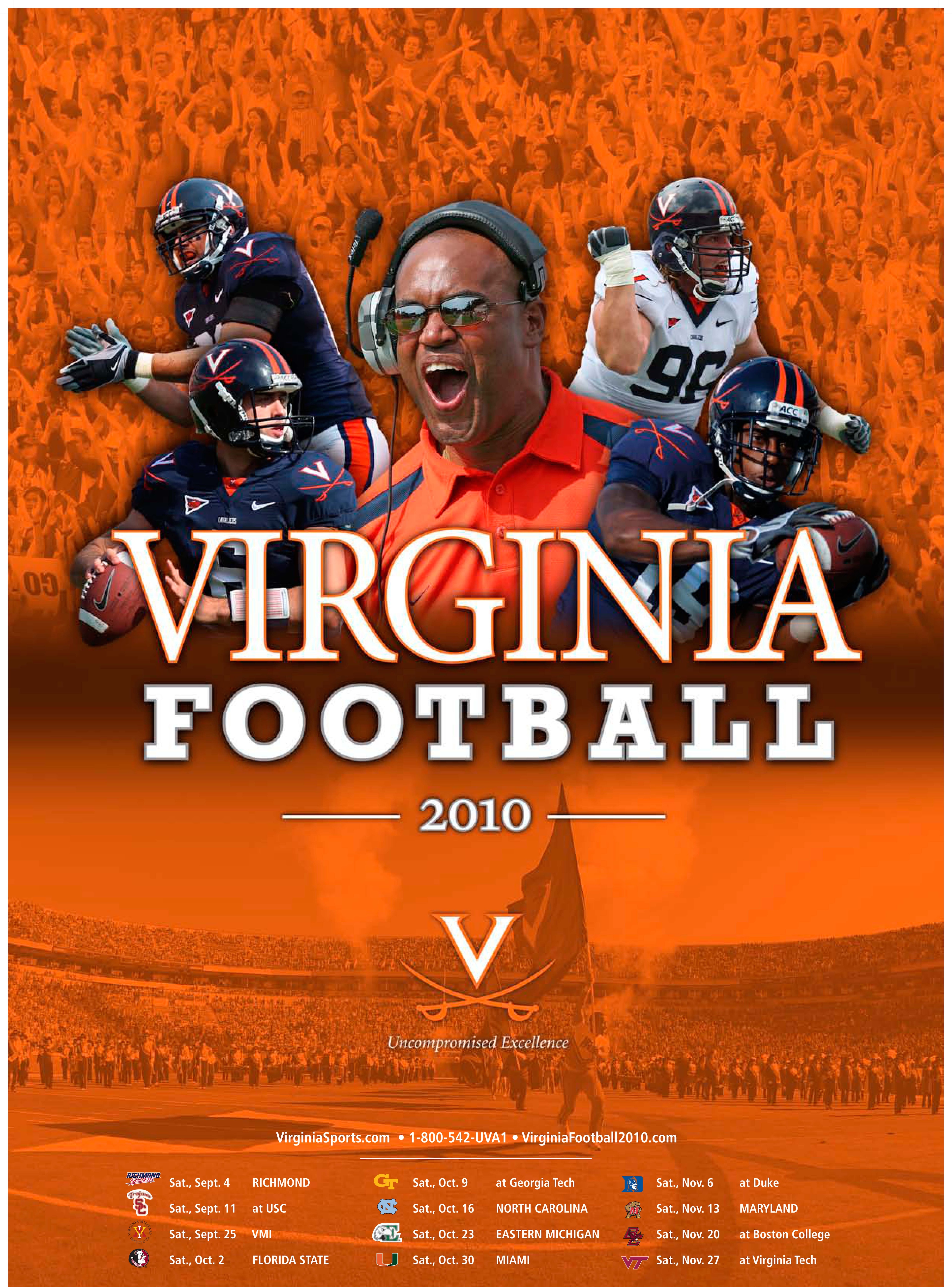
22. Purdue
29 of 50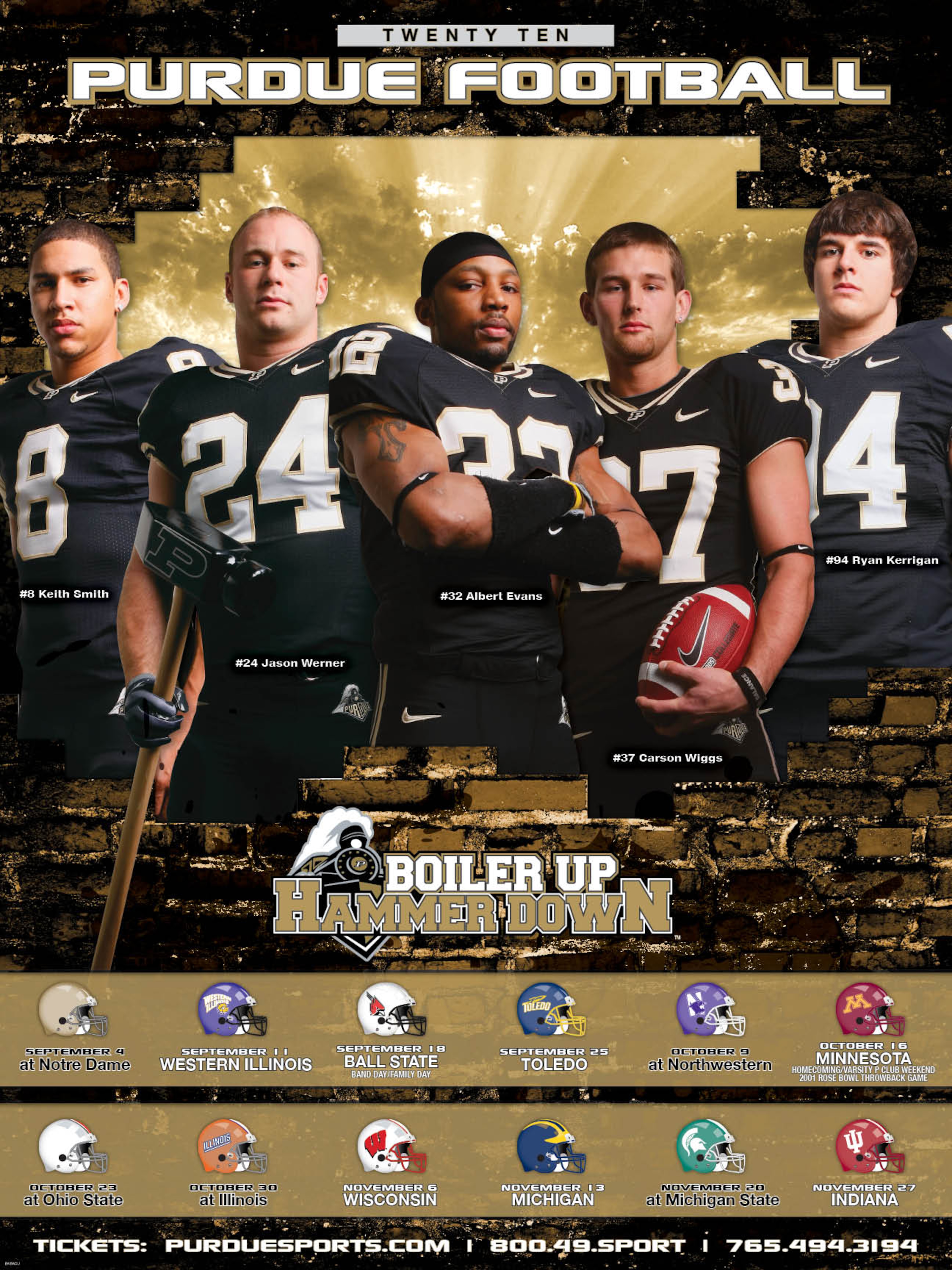
21. Northwestern
30 of 50
20. Syracuse
31 of 50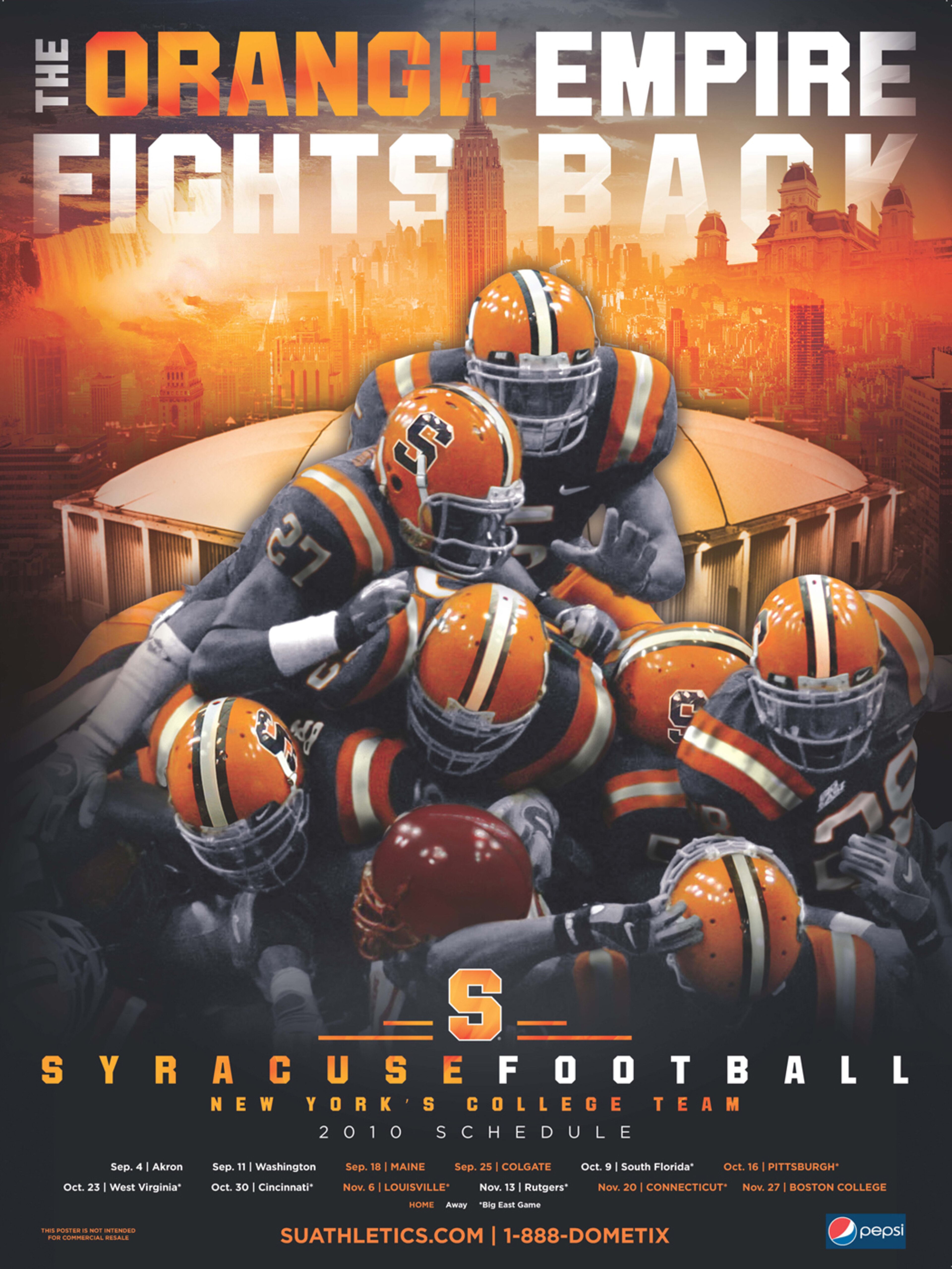
19. Colorado
32 of 50
18. Tennessee
33 of 50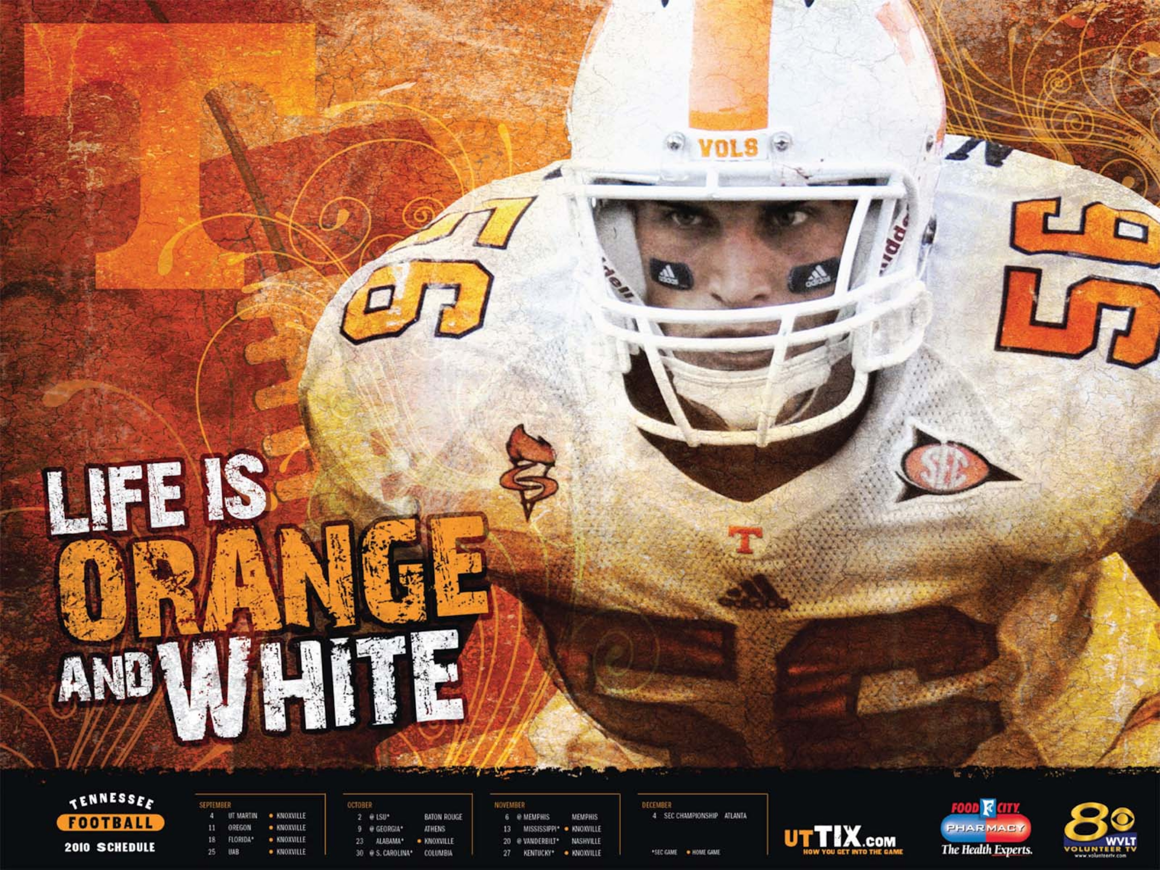
17. Southern Miss
34 of 50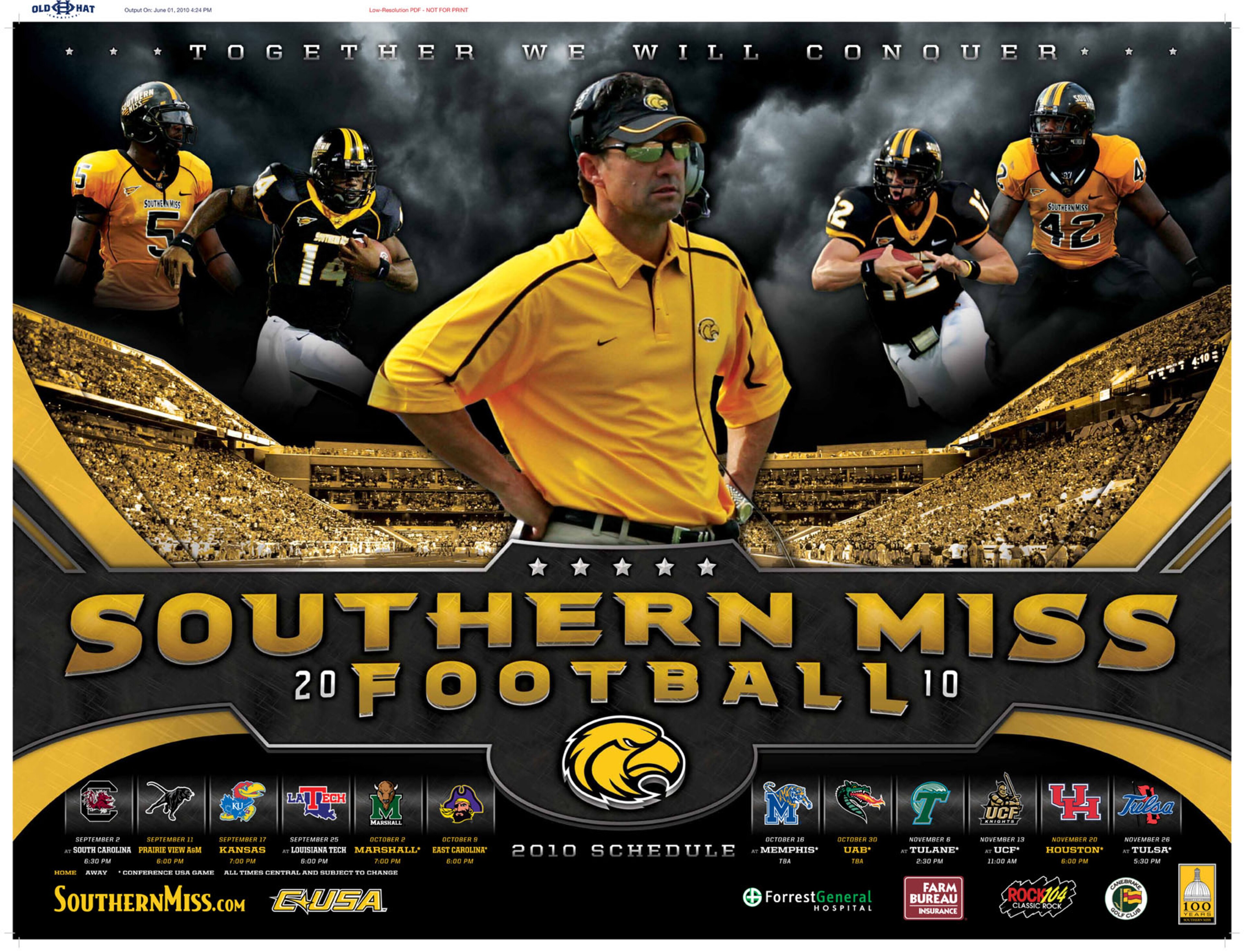
16. Florida State
35 of 50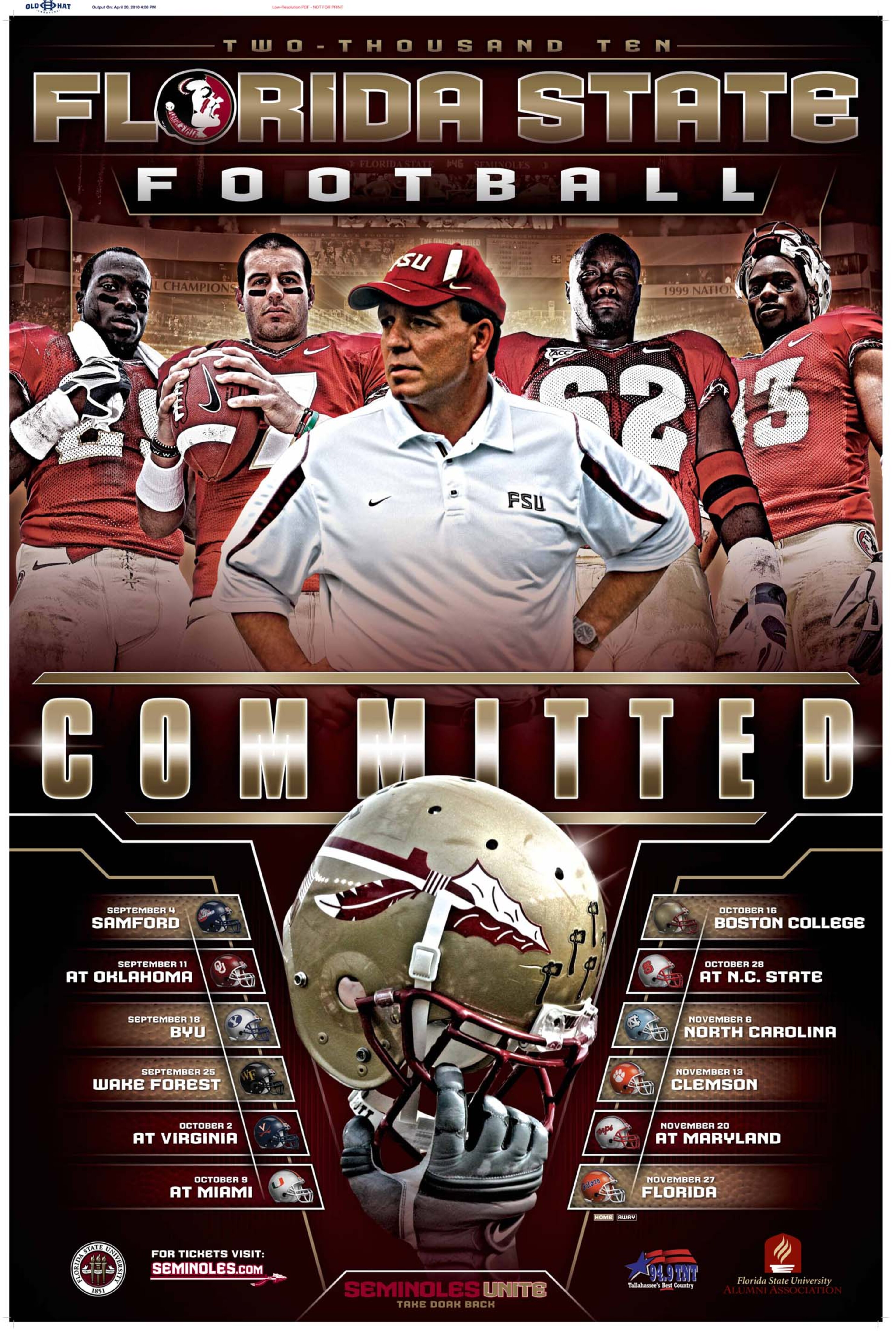
15. South Carolina
36 of 50
14. Missouri
37 of 50
13. Duke
38 of 50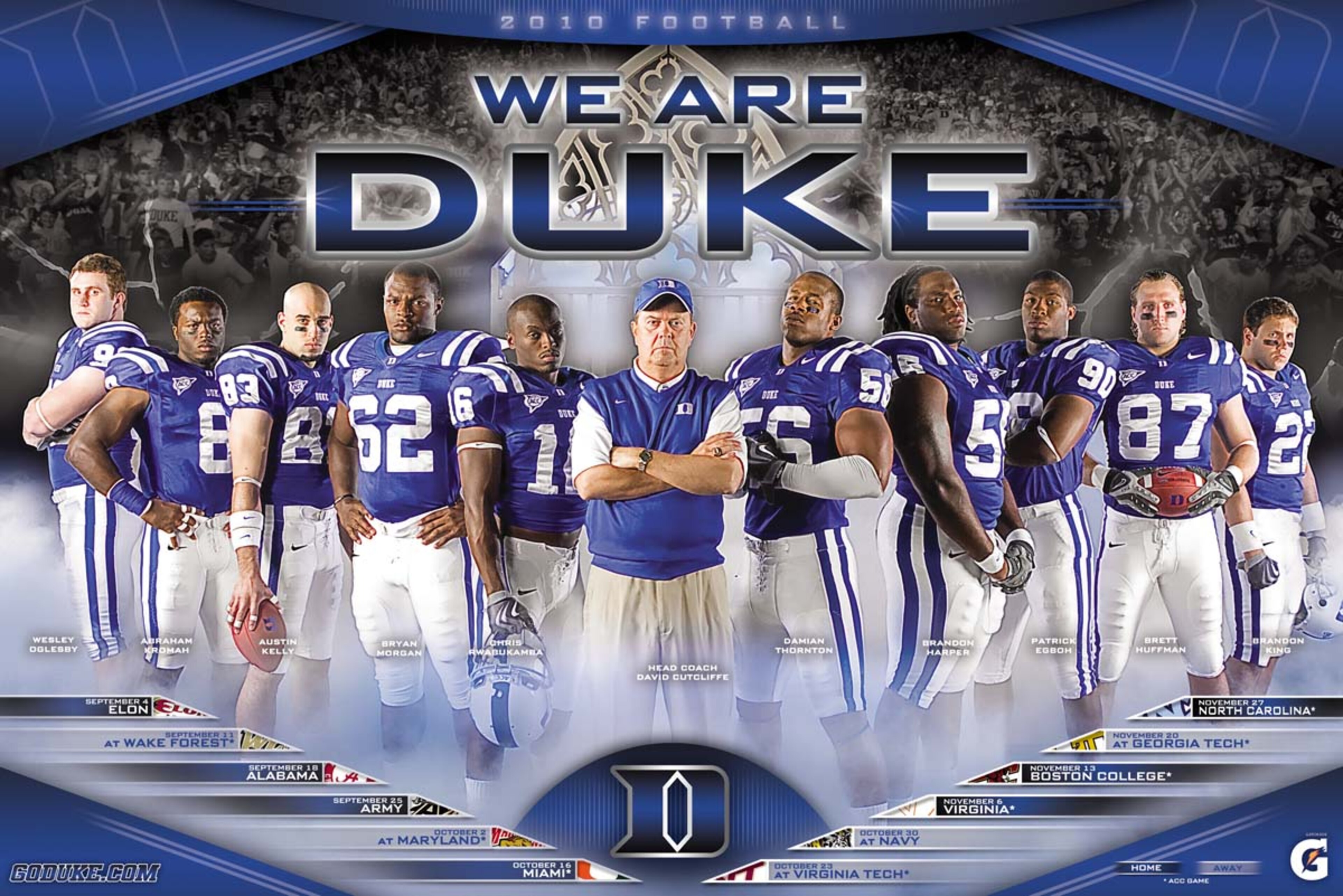
12. UCF
39 of 50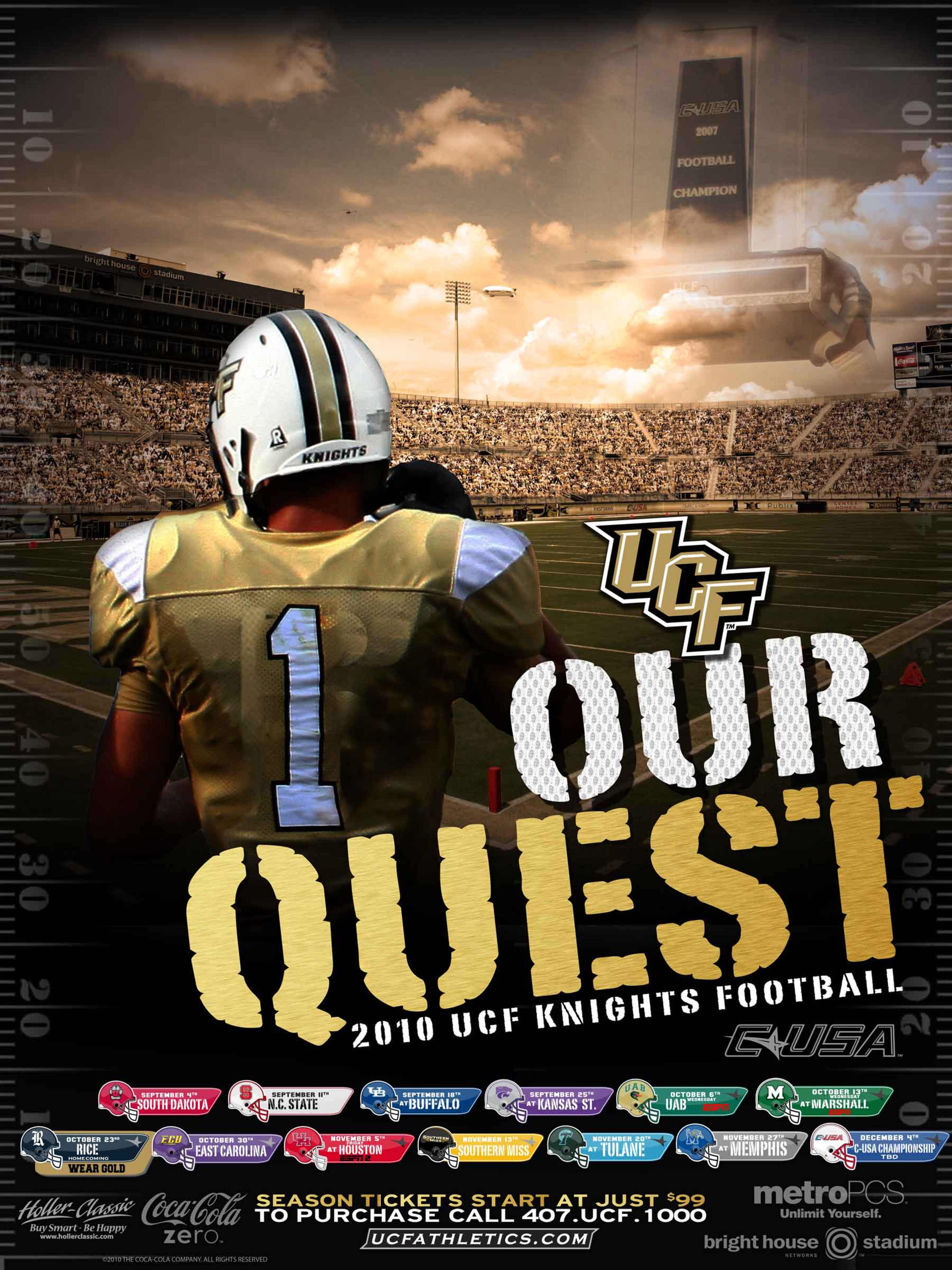
11. Pittsburgh
40 of 50
10. West Virginia
41 of 50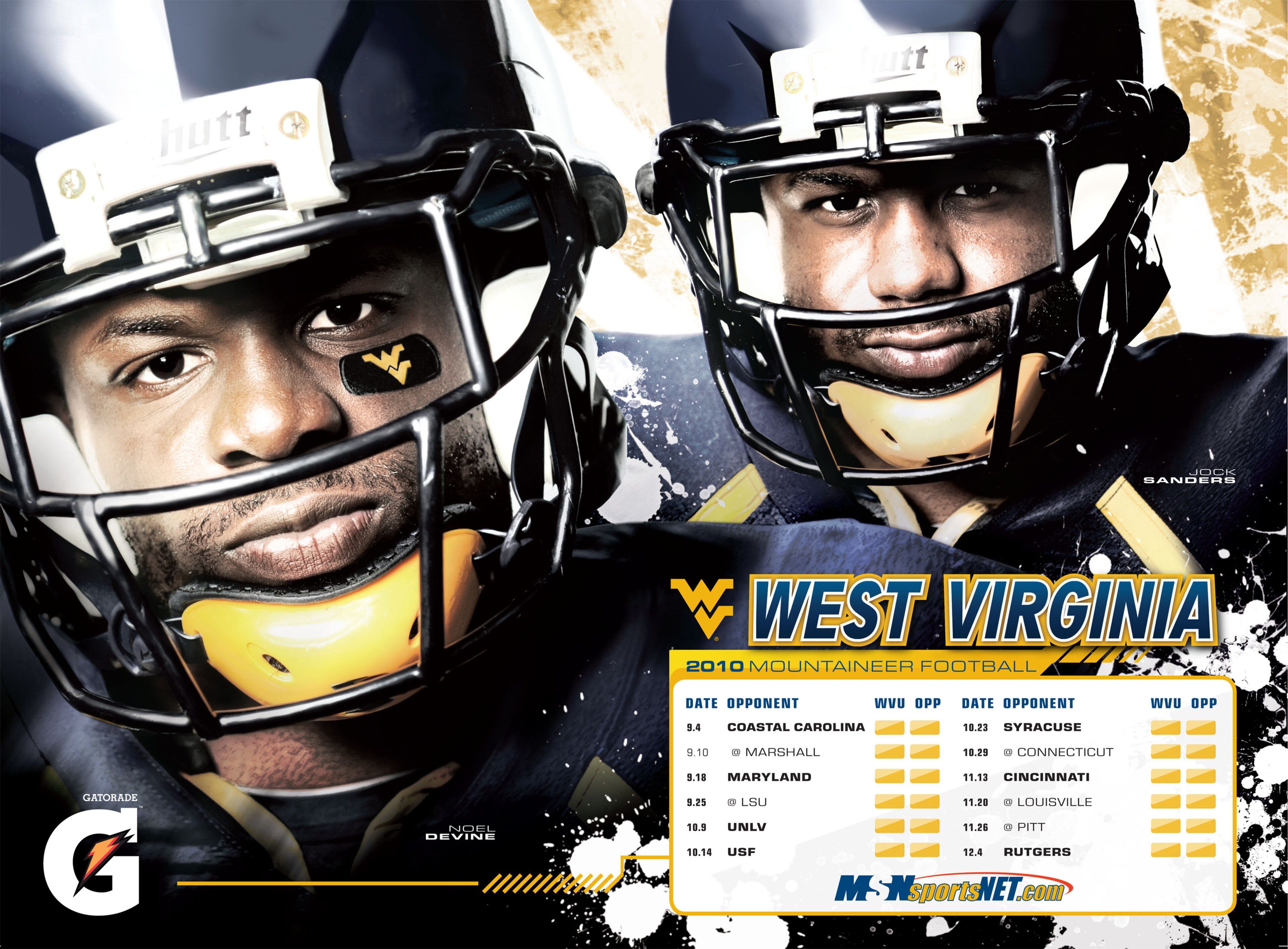
9. Marshall
42 of 50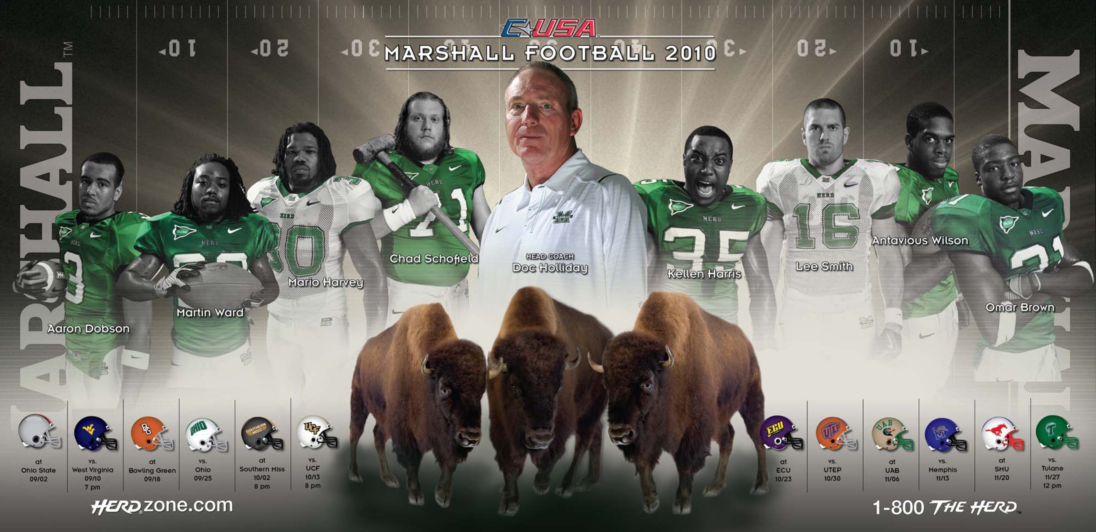
8. Wyoming
43 of 50
7. LSU
44 of 50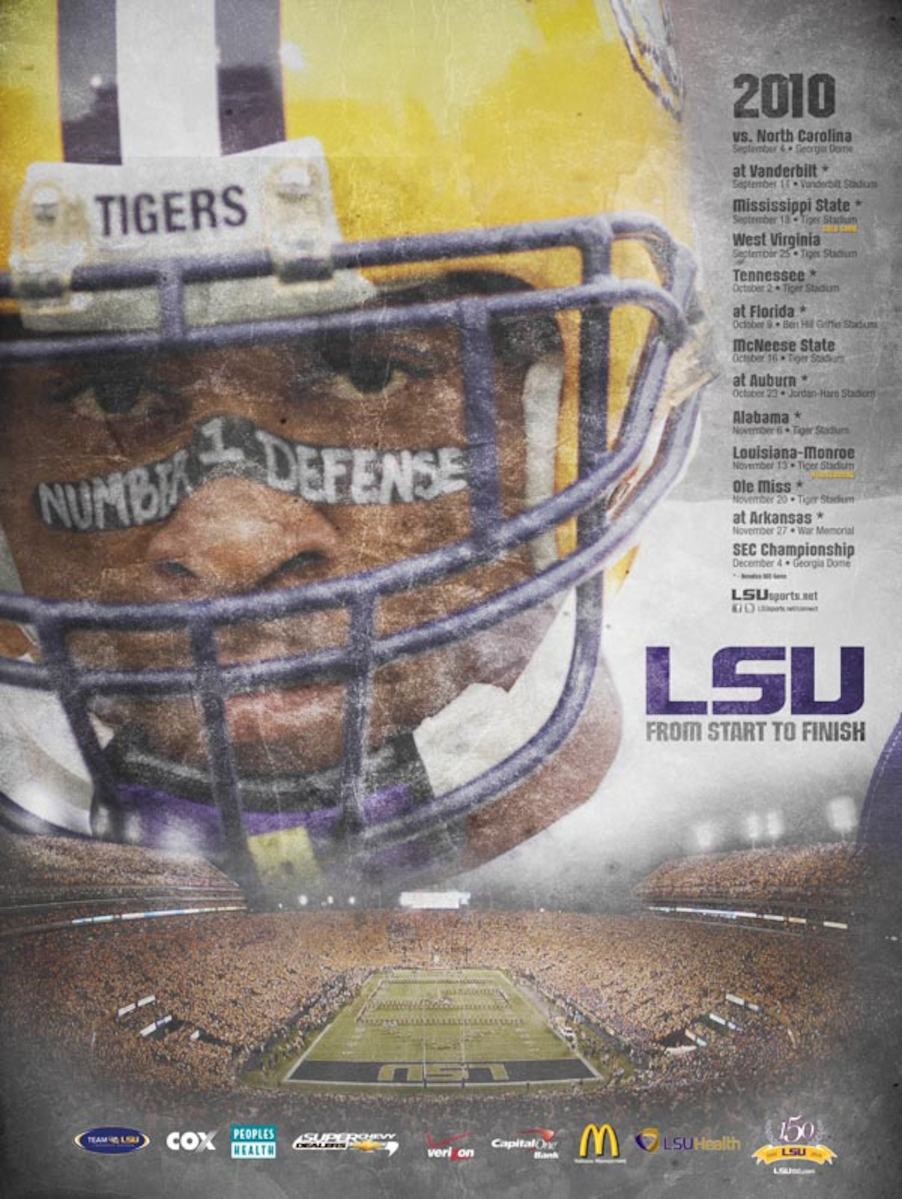
6. Nevada
45 of 50
5. Minnesota
46 of 50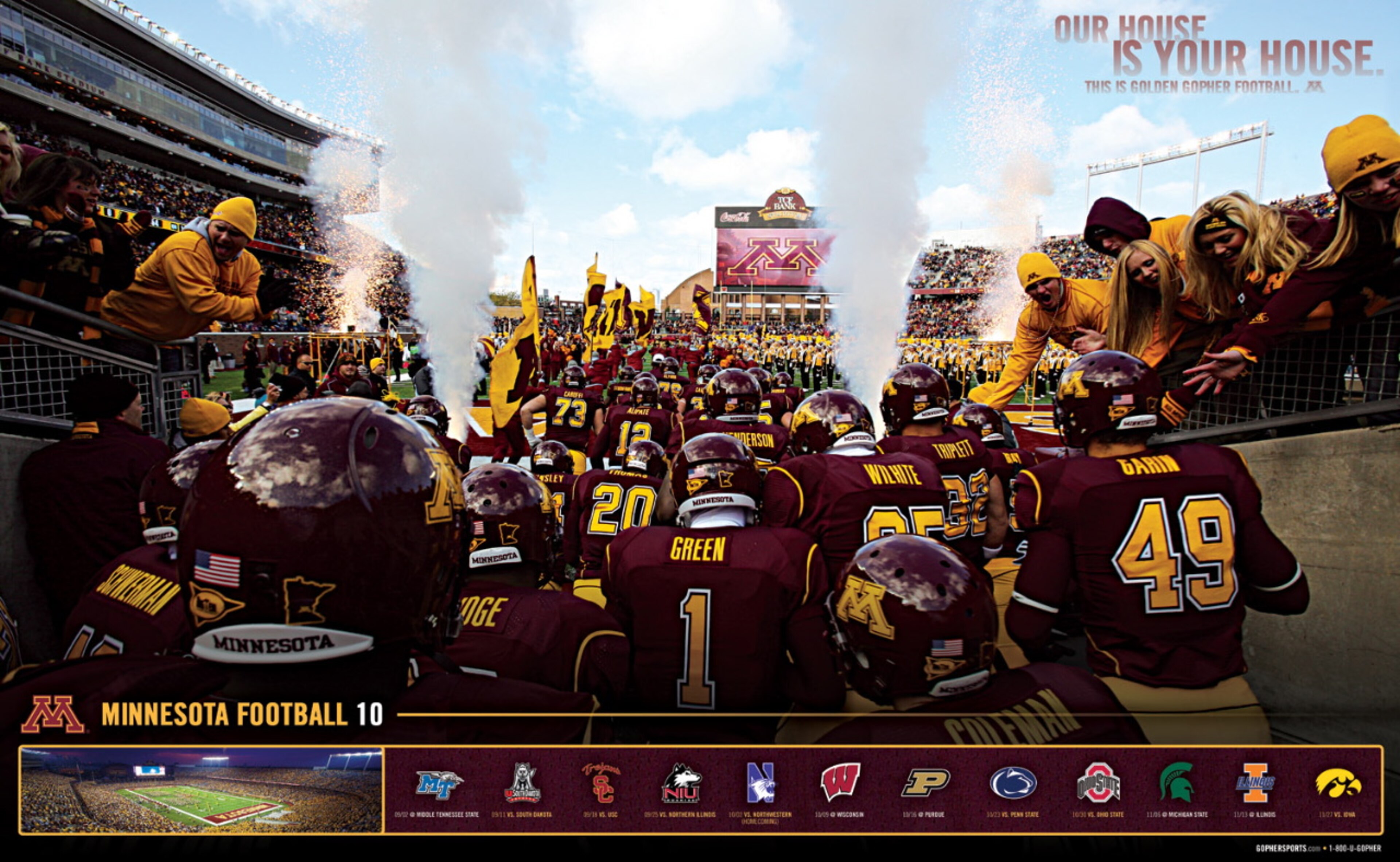
4. Iowa State
47 of 50
3. Bowling Green
48 of 50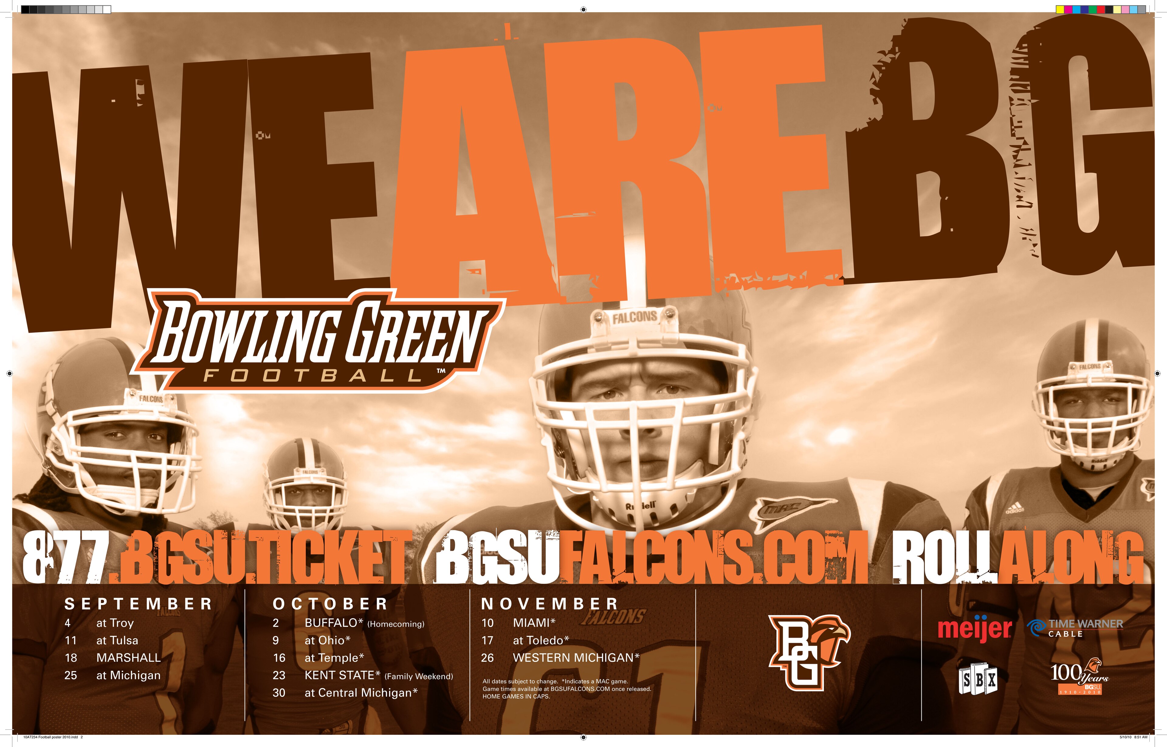
2. Georgia Tech
49 of 50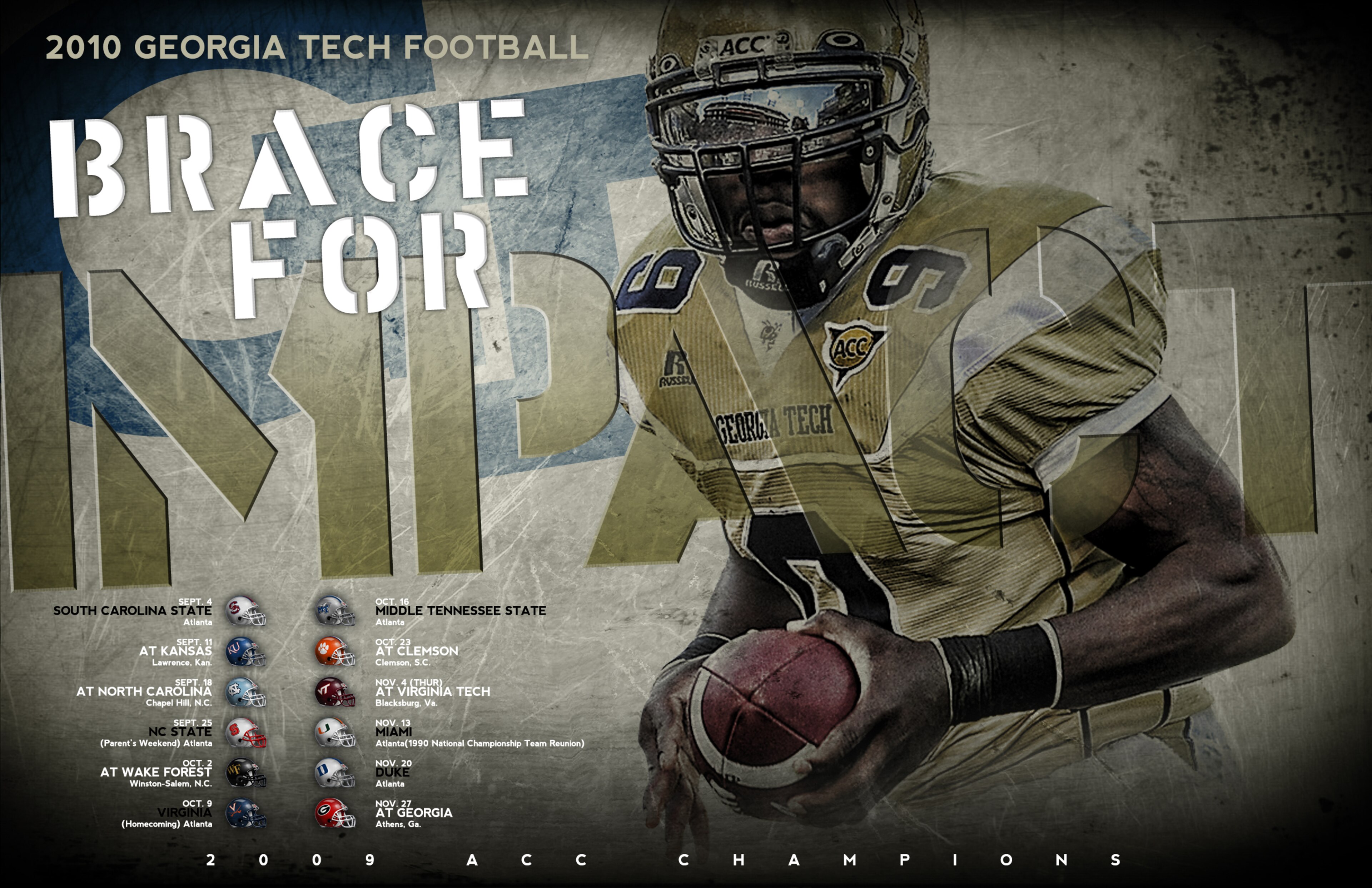
1. Vanderbilt
50 of 50


.jpg?w=3840 "Biggest FA Mistakes of the Century 💸")
.jpg?w=3840 "Overlooked Rookies to Watch in Camp 🔎")


