Washington Wizards New Uniforms: Best & Worst NBA Uniforms in the Last 25 Years
The John Wall era of Washington Wizards basketball didn't get off to the smoothest start, but now that Agent Zero is gone and the team is all his for the next few years, it's only fitting that the Wizards refresh their look.
On Tuesday, Washington released its new jerseys to an anxious group of fans and media, and while we didn't know what to expect, we came away surprised and pleased.
It reminds us of the old Washington Bullets jerseys and enters the league as yet another new addition to the ever-changing wardrobe of the NBA.
Where does it rank amongst the best and worst NBA jersey unveils of the last 25 years, though?
Worst: Denver Nuggets Skyline, 1981-1993
1 of 16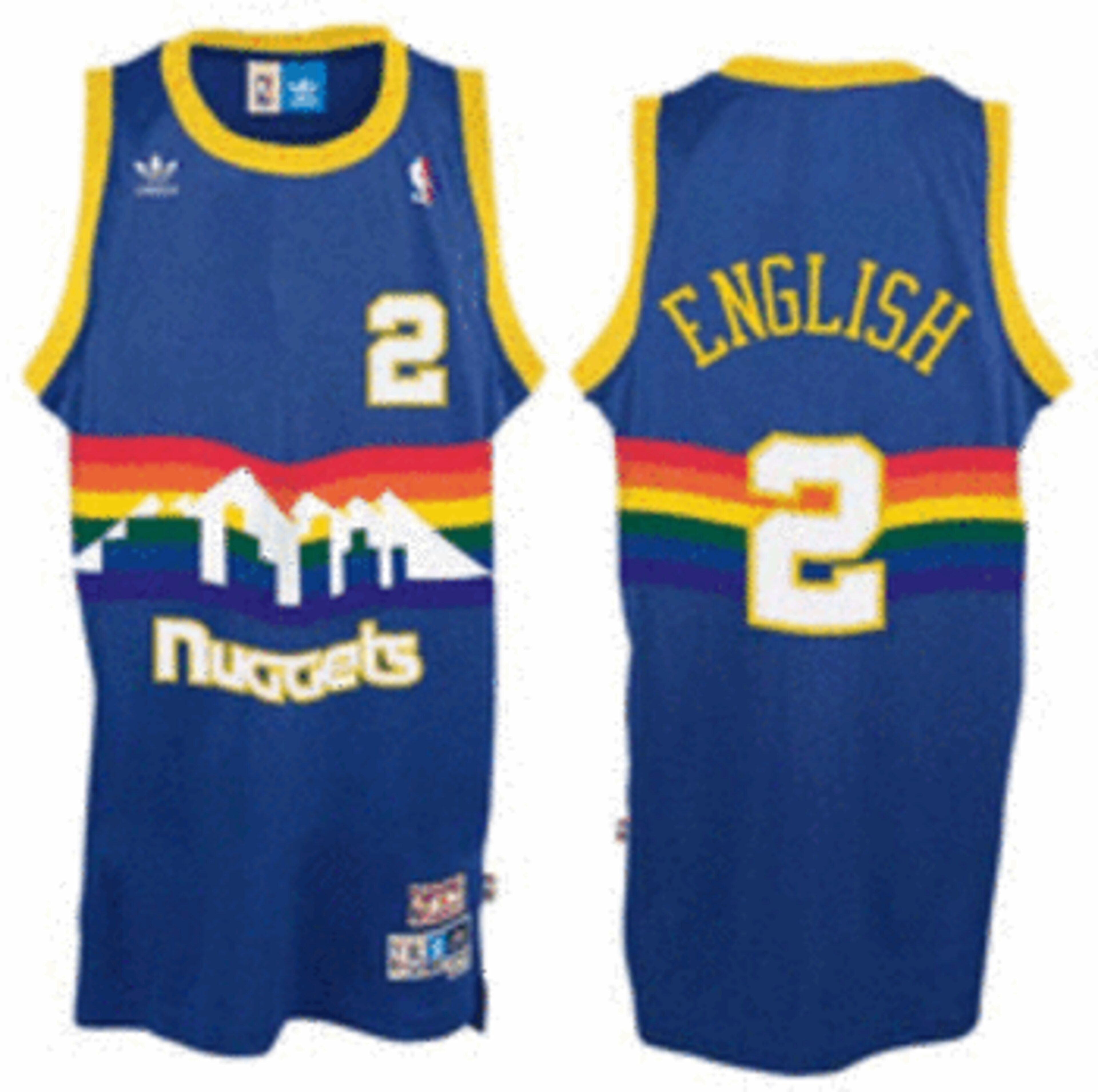
To think that Denver wore these jerseys from 1981 to 1993 is an accomplishment in and of itself.
It really makes you appreciate the baby blues the Nuggets bring to the court nowadays. But then again, there's something to be said about a 1980s jersey design.
They just don't make them like that anymore.
Best: Golden State Warriors Go Back to School, 2010
2 of 16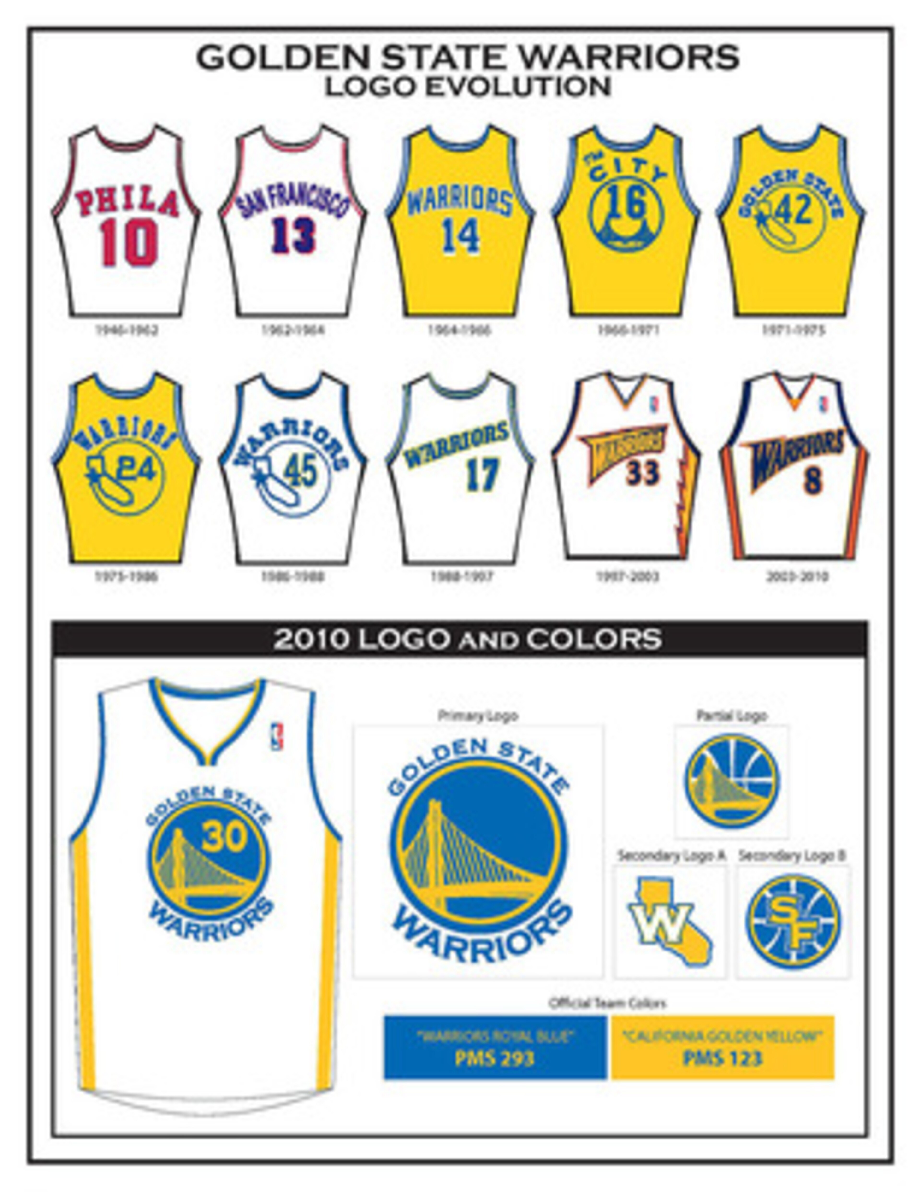
Warriors jerseys over the years are a study of evolution and throwback. At the beginning of the 2010 season, Golden State went back to the classic look of the 1960s.
It's simple, pays tribute to the Bay Area and became an instant hit amongst a younger fanbase that's long forgotten the digs of the '60s.
Worst: Detroit Pistons Teal Horse, 1996-2001
3 of 16
Even Pistons fans have to admit it: Teal and flaming horses just don't work, in any combination, on any piece of clothing.
Ironically, Detroit's hideous 1990s jersey will forever be a classic. The golden years of Grant Hill were played wearing it, and Hill always found a way to look good playing in it.


Best: Toronto Raptors Black Is the New Red, 2008-Present
4 of 16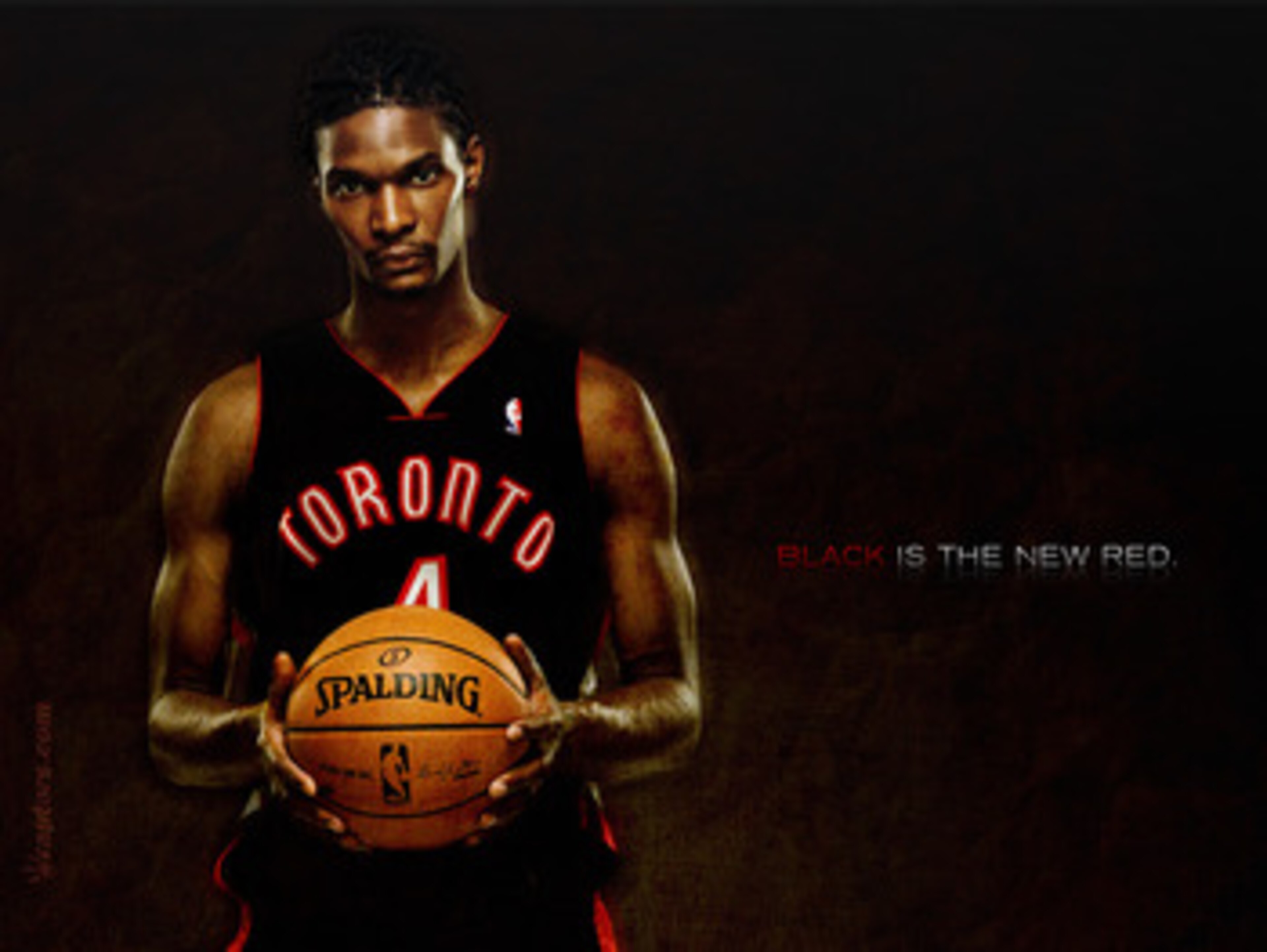
We'll get to the other end of the spectrum of Raptors jerseys shortly, but for now, here's "black is the new red."
That was the catchphrase attached to Toronto's black alternate jerseys released before the 2008 season. The ad campaign is now is just a hollow reminder that the Raptors no longer have a player to so easily slap on the release photo of their next jersey release.
Worst: Washington Wizards Short-Lived Gold Alternates, 2006
5 of 16
Really just one of the worst ideas in NBA jersey design history, Washington released its gold alternate uniforms before the 2006 season.
It was a very short-lived venture, though, with the Wizards unsurprisingly retiring the eyesore in under three years.
Best: Cleveland Cavaliers Post-LeBron Digs, 2010
6 of 16
Cleveland went basic in the post-LeBron James era, but basic is always classy, and the Cavs needed an old-school look for this new-school team.
Unveiled before the start of the season, the new jerseys signaled the start of a new world of Cleveland basketball.
Worst: Atlanta Hawks Ketchup and Mustard, 2004-2007
7 of 16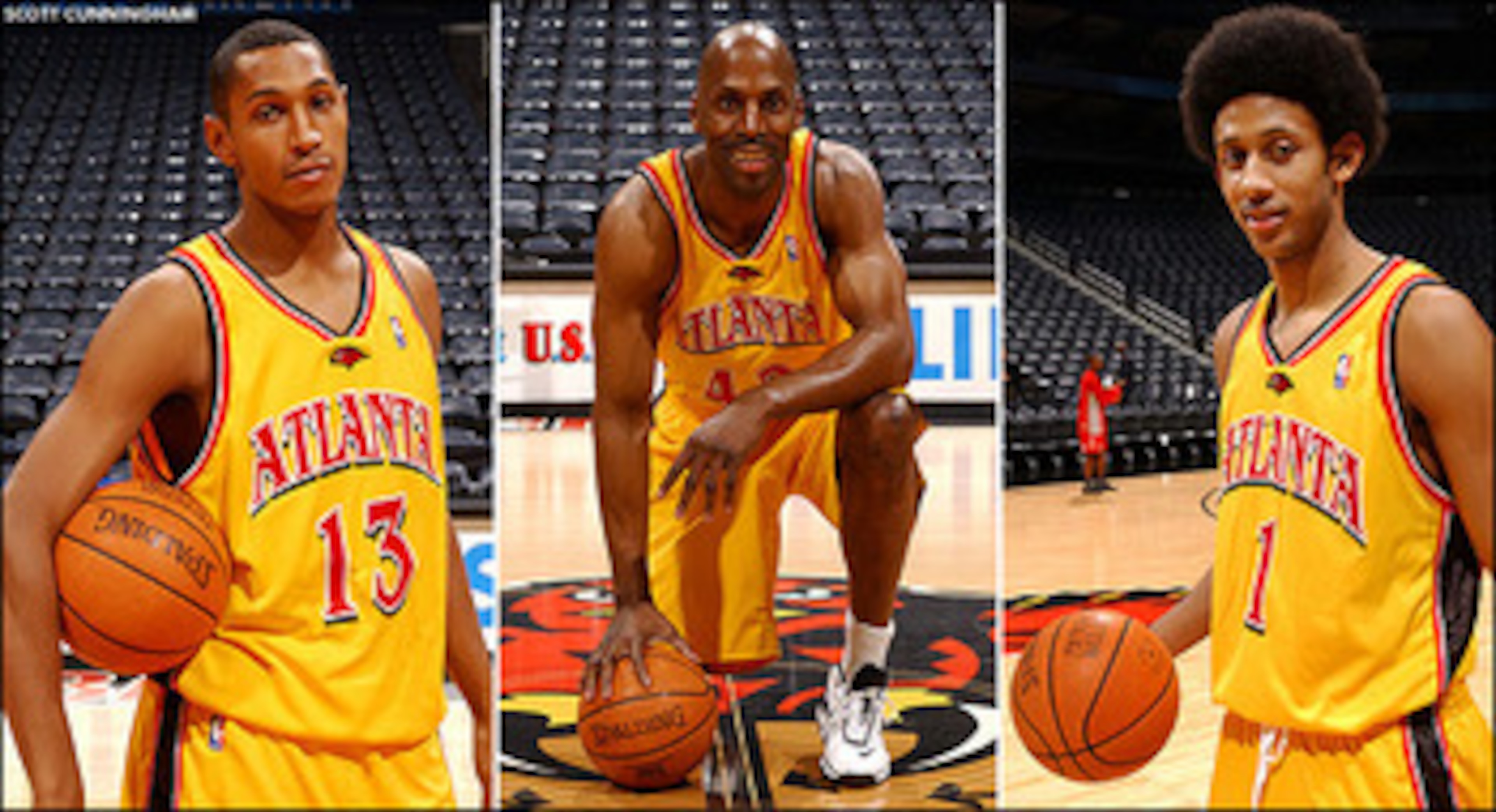
Atlanta went three years with these yellow alternates, ditching them in 2007.
How it took the Hawks three seasons to figure out that bright yellow and red jerseys are a terrible idea is something you'd have to direct to the folks who were okay with this in the first place.
Best: Orlando Magic Pinstripe Black, 2010
8 of 16
A new addition debuted in November of 2010, the Magic's alternative pinstripe black jerseys are simply sleek.
Whether it'll look quite the same should Dwight Howard not be wearing it in a couple years is a debate we'll reserve for Orlando fans.
Worst: Sacramento Kings Don Royal Colors, 2005
9 of 16
Not that Sacramento's current purple jerseys are much better, but the royal purple and gold get-ups of 2005 were on another level.
We get it—kings and purple make sense as a combo. But the real kings of the left coast are the Lakers, and that's why they're the only team that looks fitting in royal colors.
Best: Indiana Pacers Classics, 1990-1999
10 of 16
Released in 1990, the Pacers wore the iconic jersey of the Reggie Miller Era from 1990 to 1999.
Maybe it was all those classic moments throughout the decade or the simplicity of the jersey in an age when uniform design was running wild, but either way, Indiana's get-up of the 1990s is one of the all-time greats.
Worst: Philadelphia 76ers Patriotic and Odd, 1991-1994
11 of 16
Released in 1991 and fortunately relieved of duty in 1994, the 76ers' star-spangled red, white and blue jerseys were what happens when an American flag explodes onto a 1990s design.
Even Charles Barkley couldn't make this thing look good.
Best: Portland Trail Blazers Rip City, 2009-Present
12 of 16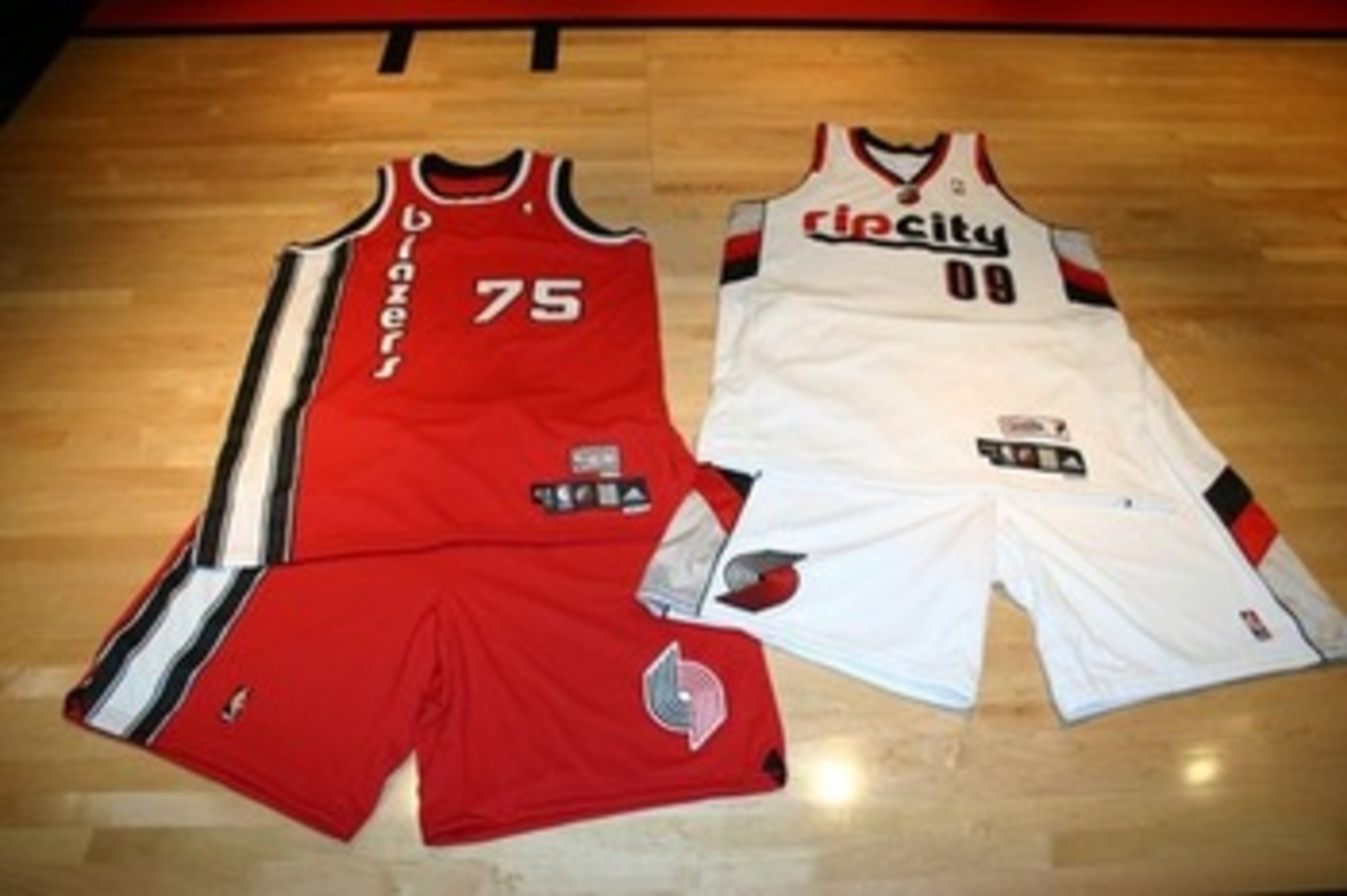
The Blazers' new jerseys released in 2009 pay homage to the past and the city they represent.
With a classic 1970s Blazers logo on the red uniforms and Rip City, Portland's nickname, plastered on the white, these are some of the best new additions to the NBA.
Worst: Toronto Raptors Jurassic Cartoon, 1995
13 of 16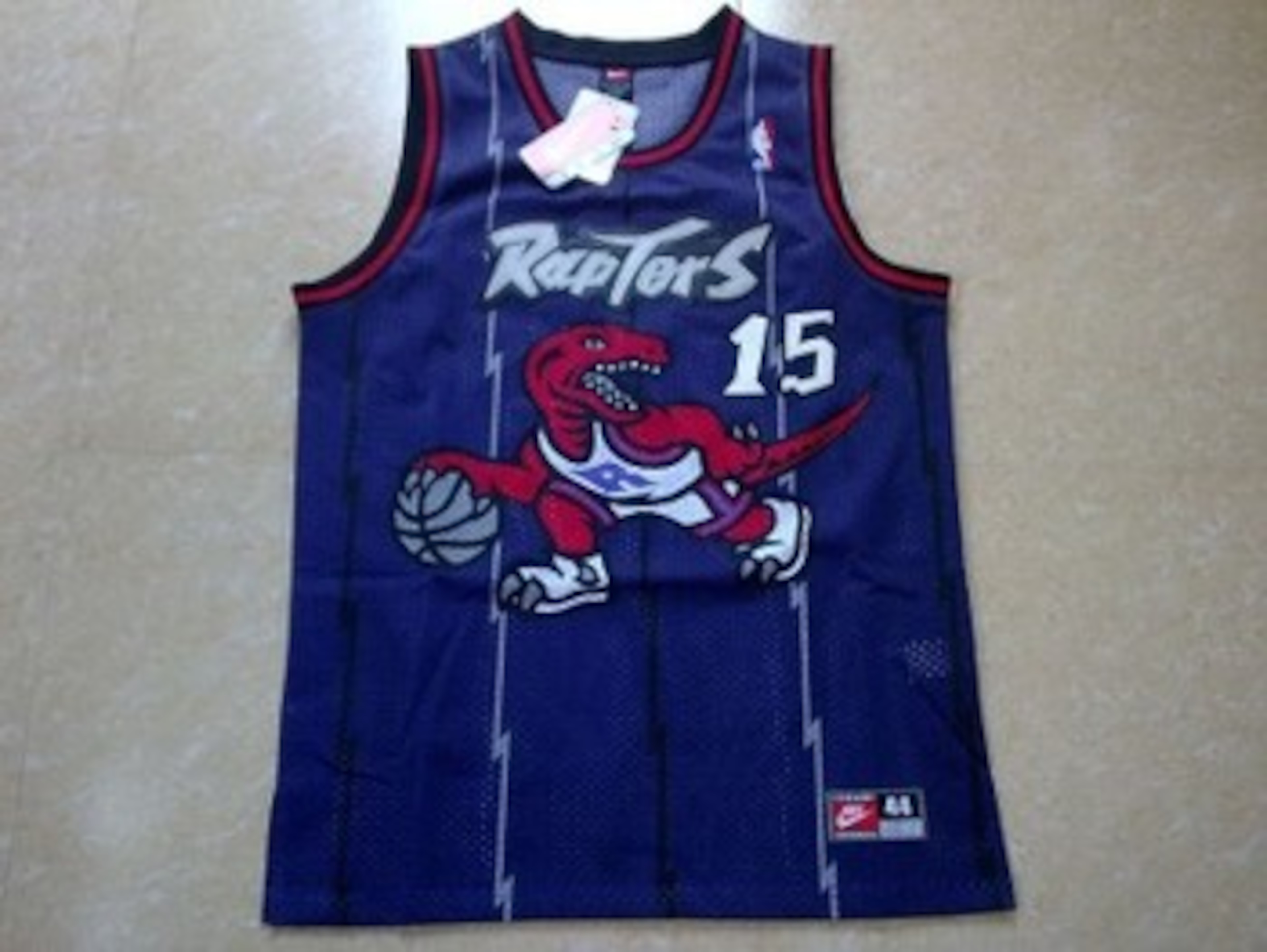
We told you we'd get back to Toronto. Now you know why we like the black jerseys so much, and maybe it is just because it's a far cry from this.
Can anyone say there's anything remotely intimidating about this Disney-style cartoon raptor?
Best: Dallas Mavericks Give Us the Mavs, 2009-Present
14 of 16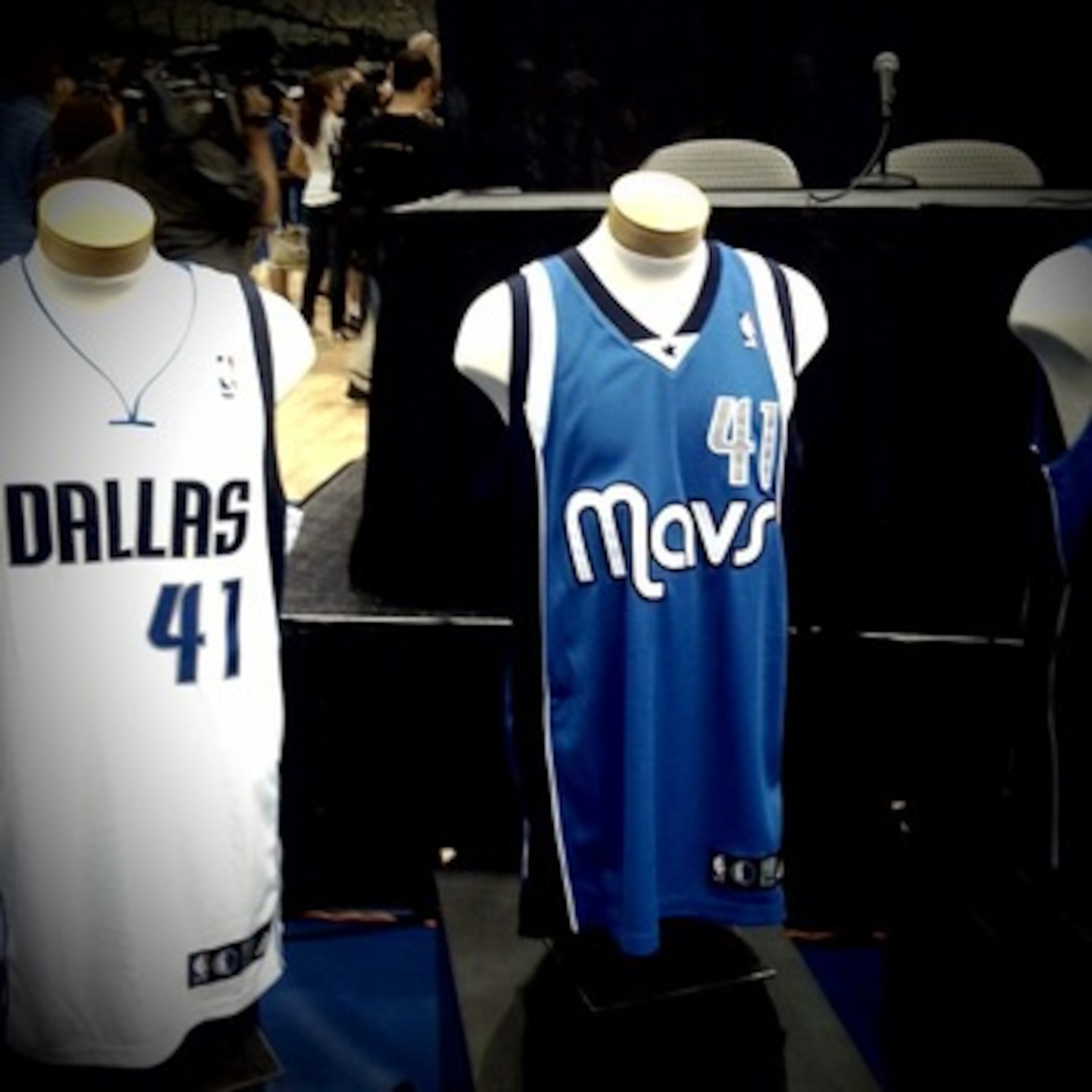
Dallas released its alternate "Mavs" jersey in 2009, though at the time most fans were more concerned with the simultaneous release of a new depth chart that had Erick Dampier coming off the bench and Drew Gooden starting.
My, how far we've come since then. But more to the point, these alternates replaced the green and blue ones that weren't quite worthy of being labeled amongst the worst.
Worst: Vancouver Grizzlies Standout Expansion, 1995
15 of 16
When the Vancouver Grizzles came into the league as an expansion team back in 1995, they brought with them arguably the ugliest jersey in NBA history.
Sure, there are some bad ones from previous teams, but to enter the league wearing that doesn't exactly make you wonder why this team plays in Memphis now.
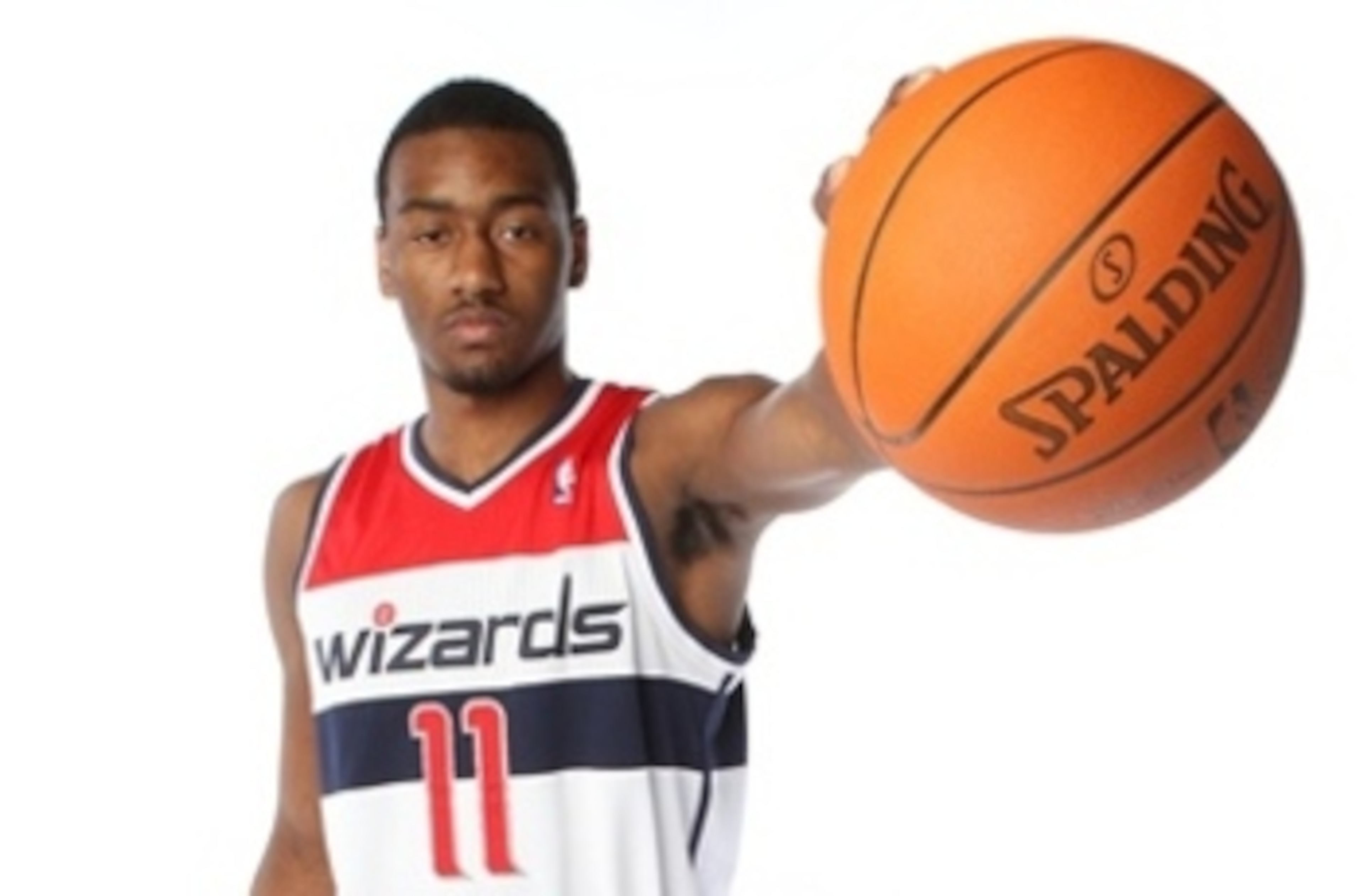
Best: Washington Wizards Pay Tribute to the Bullets, 2011
16 of 16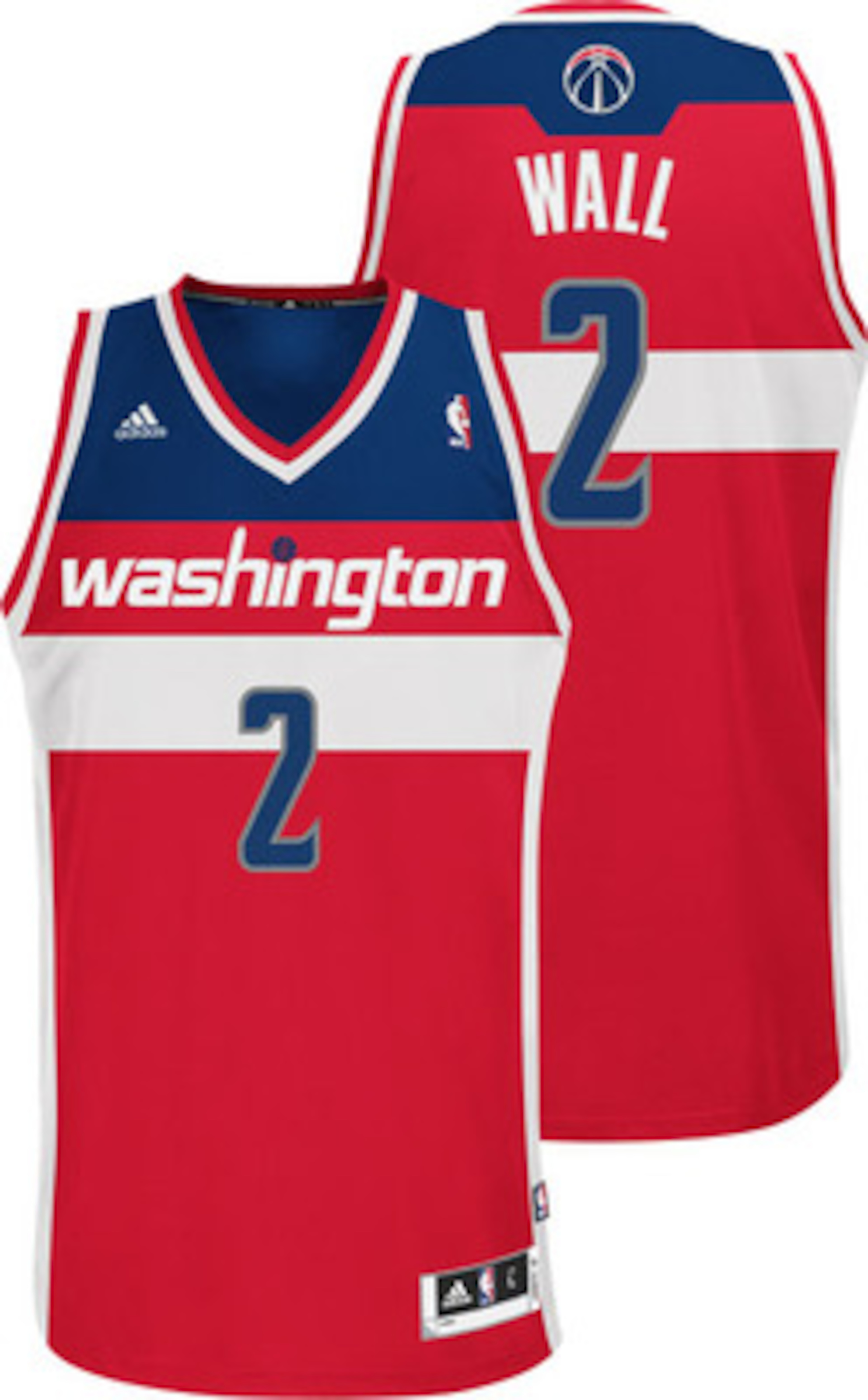
The away jersey didn't get quite the buzz that the home gear received, but Washington's new Bullets-style jerseys should be great for the John Wall era.
In a time where where plenty of NBA teams are paying tribute to the past, Washington hit this one on the mark. After the gold uniforms of 2006, you knew they had to.
.png?w=3840)


