Fake "Nike" NFL Uniforms: Photos and Analysis
Editor's Note: According to the NFL, the images in this slideshow are "artist renderings" unaffiliated with either the NFL or Nike. For analysis of Nike's official uniform release, click here.
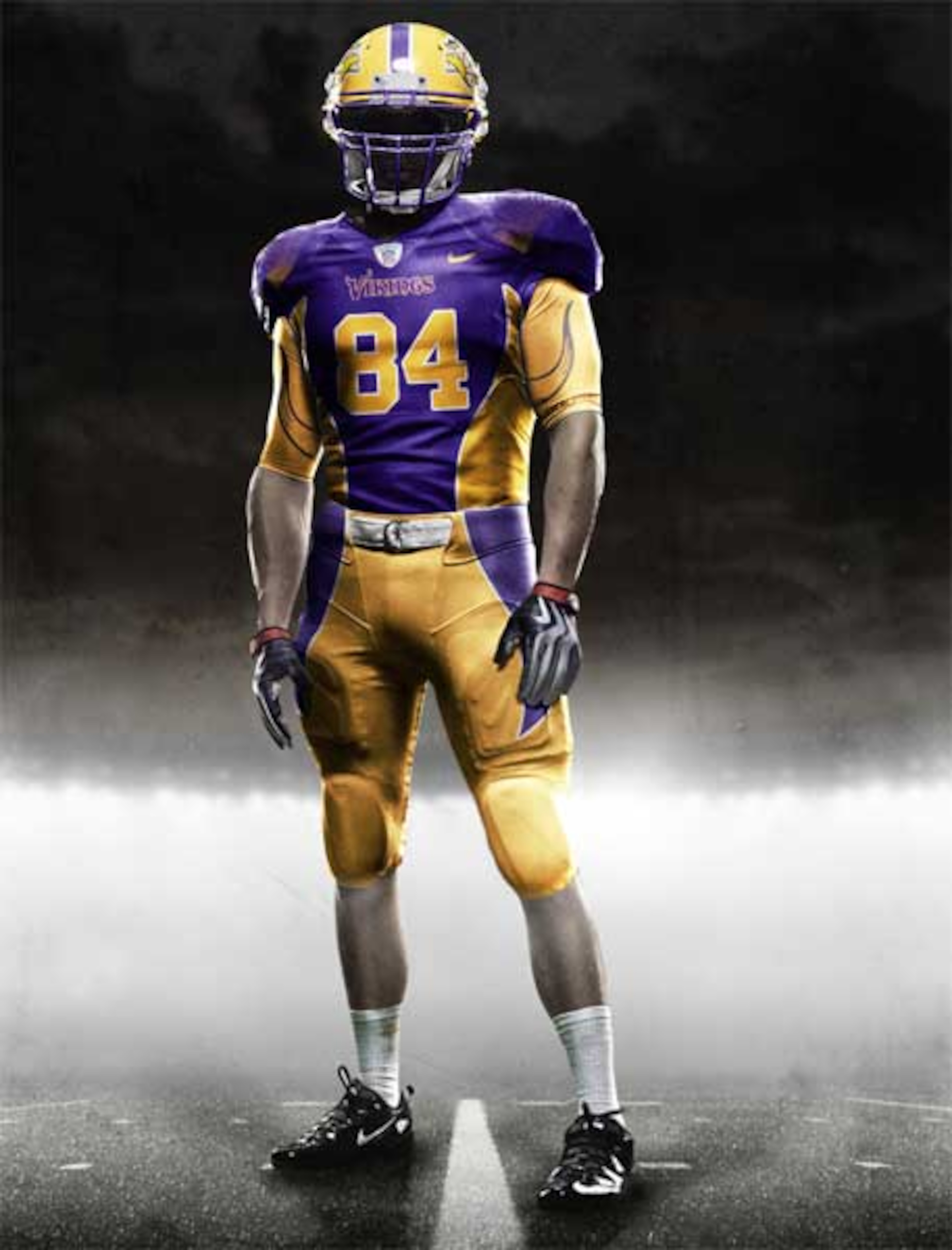
In 2012, Nike is set to get the uniform design license for all 32 NFL teams. Although these jerseys have yet to be confirmed by Nike or the NFL, numerous news sources have displayed them as potential future jerseys for the 2012 NFL season.
As always, leave a comment on what you think about the idea of having these jerseys as your team’s new uniforms.
Also, leave a comment voting on your favorite uniform. I wanted to make a poll, but 32 choices would be a little much.
49ers
1 of 32
I don’t like the 49ers new gear. It reminds me of the Chiefs a little too much. Not that the Chiefs have bad jerseys, it’s just that when fans see your home jersey, you don’t want them to resemble some other team too easily. Teams need to have their own identities and this jersey makes me think of current Kansas City too easily.
Bears
2 of 32
This actually reminds me a lot of the Bears current alternates that lack a logo. They’re OK in my book. I think the outfits fit the intended persona of the franchise. The Bears aren’t about flashy designs, they’re more about old school fundamentals, letting their actions on the field do the talking.
Bengals
3 of 32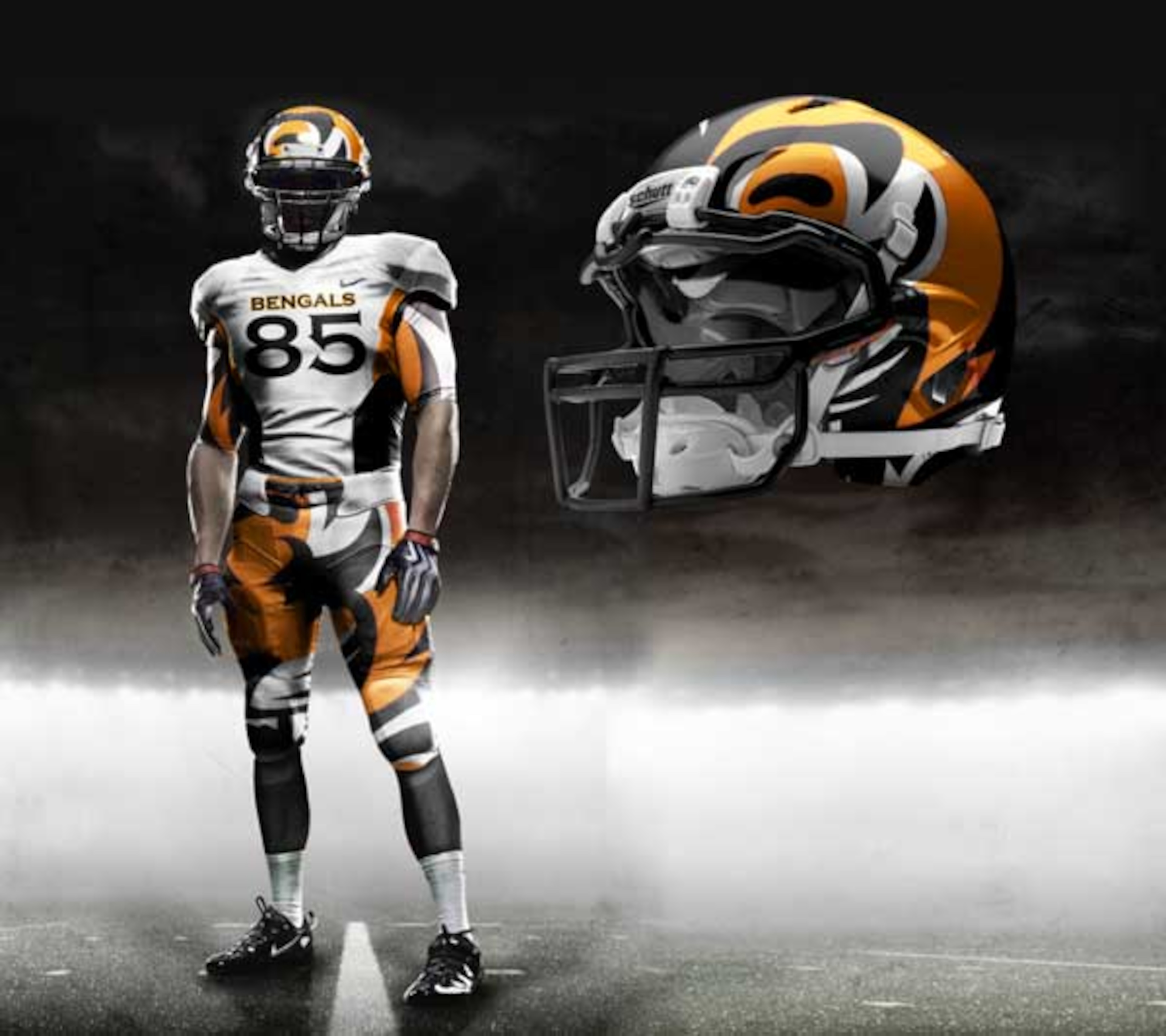
I see what they were trying to do here. The design isn’t a bad idea, but like the Bengals 2010 offense, it doesn’t quite come through. The helmet looks like a garbled mess, and the pants look like they tried but ultimately failed to get the entire logo on the outfit.
.jpg?w=3840 "Seahawks Packers Football")

.png?w=3840 "Rams Bears Football")
Bills
4 of 32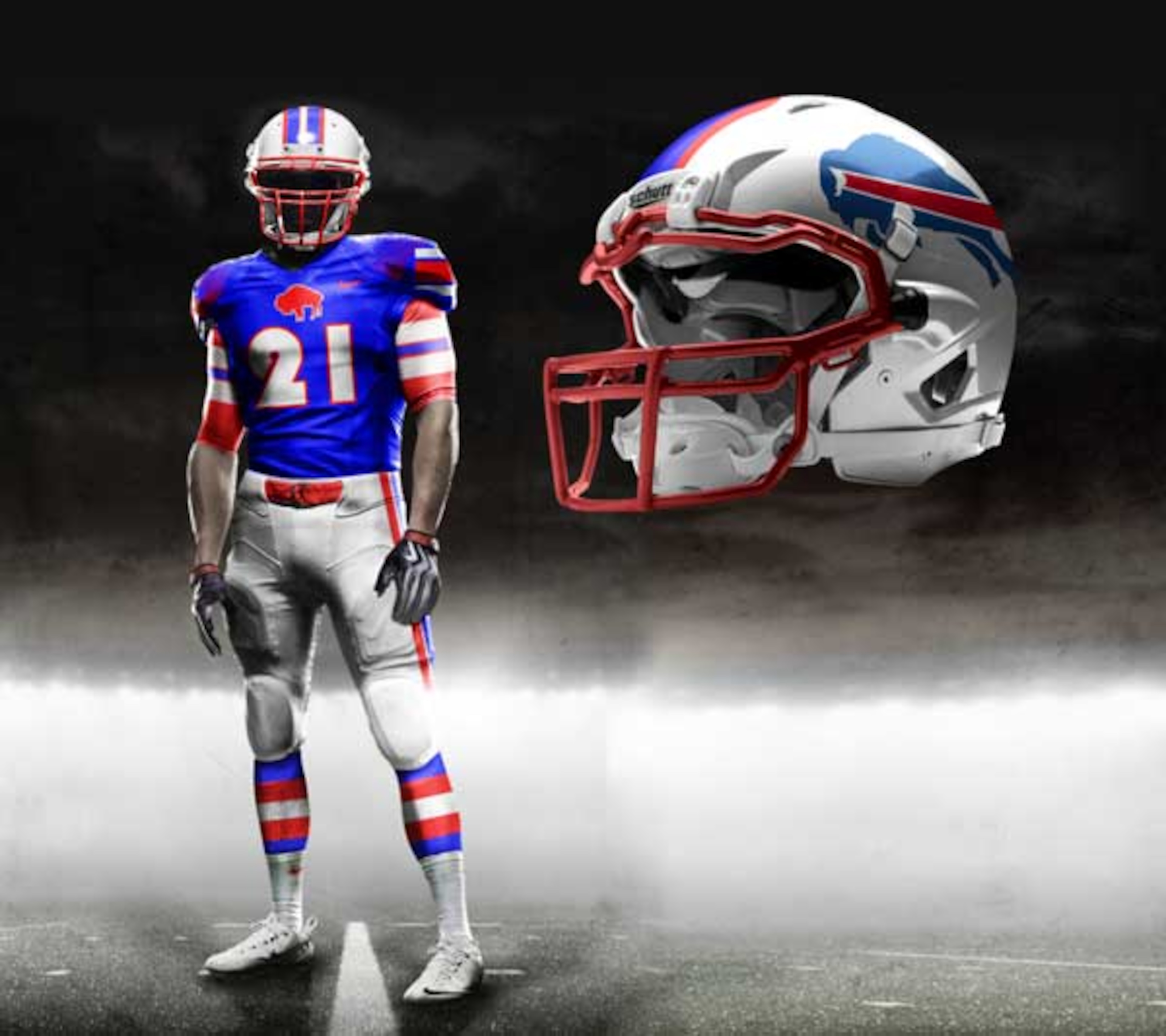
I’ve always thought the Bills had nice uniforms. Their throwbacks are pretty suave in particular. These new jerseys are a nice, modern, combination between past and present.
Broncos
5 of 32
This jersey is in the running for coolest on the list. I always thought the Broncos old logo was really neat, but looked like it was drawn by a 5th grader.
This uniform combines the nostalgic logo with a trendy design, which makes for a really cool looking 2012. How the team will play in them? I don’t know.
Browns
6 of 32
The Browns are another non-flashy franchise. Face it, Peyton Hillis would not look good running over defenders in a stylish outfit.
Best stick to what works, as the Browns clearly have very little change to their uniforms.
Bucs
7 of 32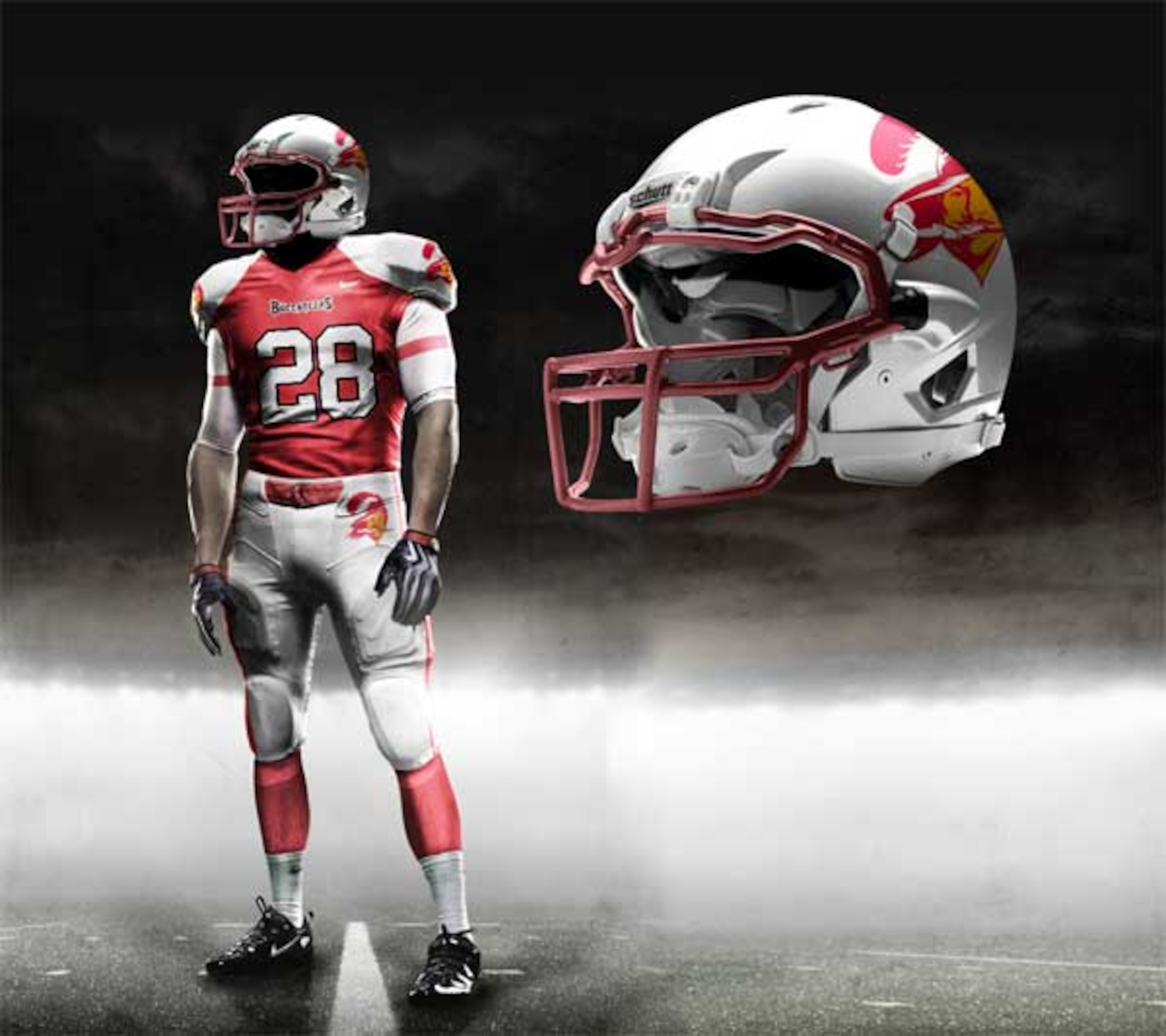
They’re not bad, but I don’t like them either. The outfit feels like it’s trying to combine old and new, but fails.
You have the old logo, coupled with the newer team font on the jersey. I suppose I’d maybe change my mind on a sunny day in Tampa Bay, but I’m still skeptical of this design.
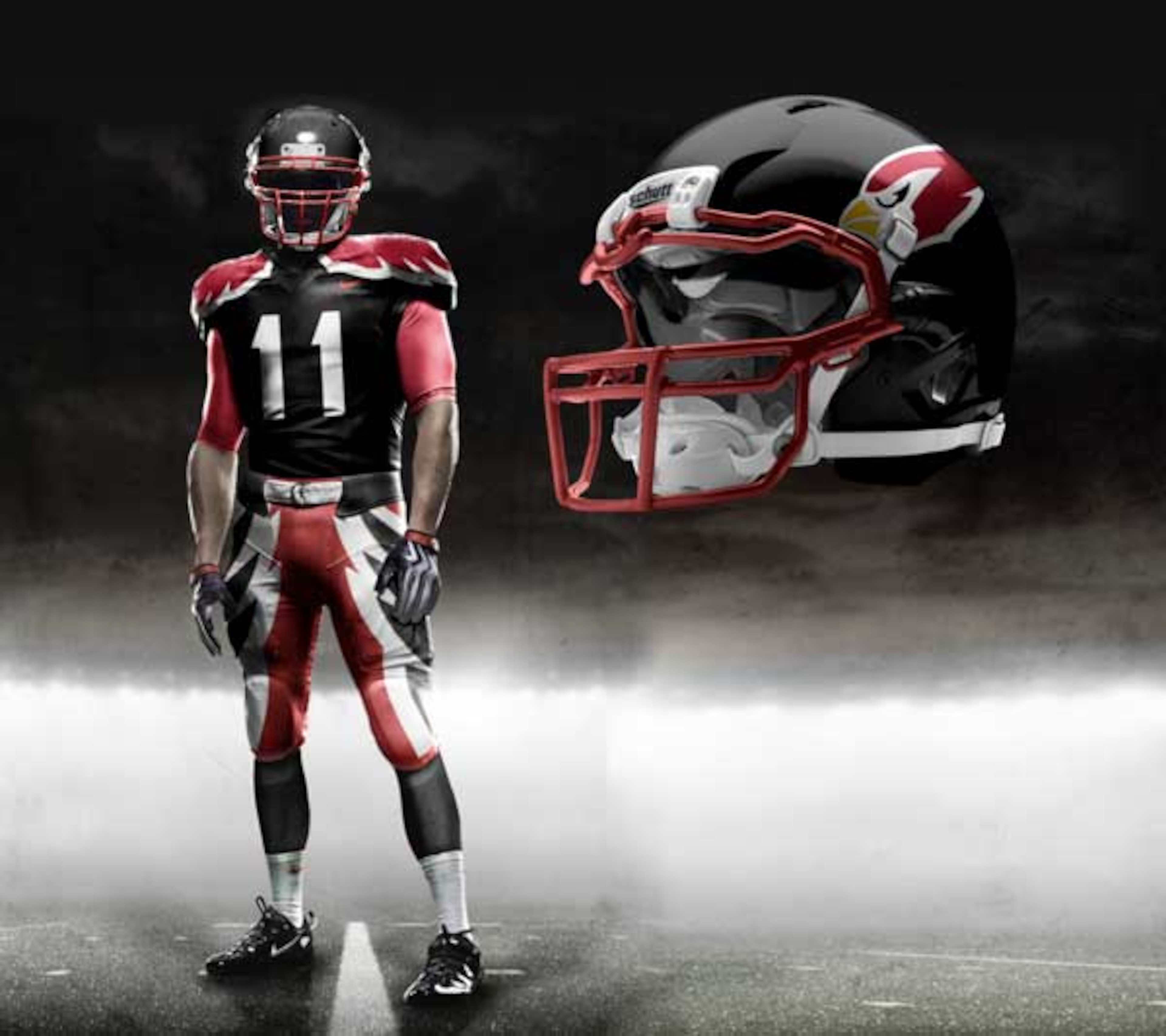
Cardinals
8 of 32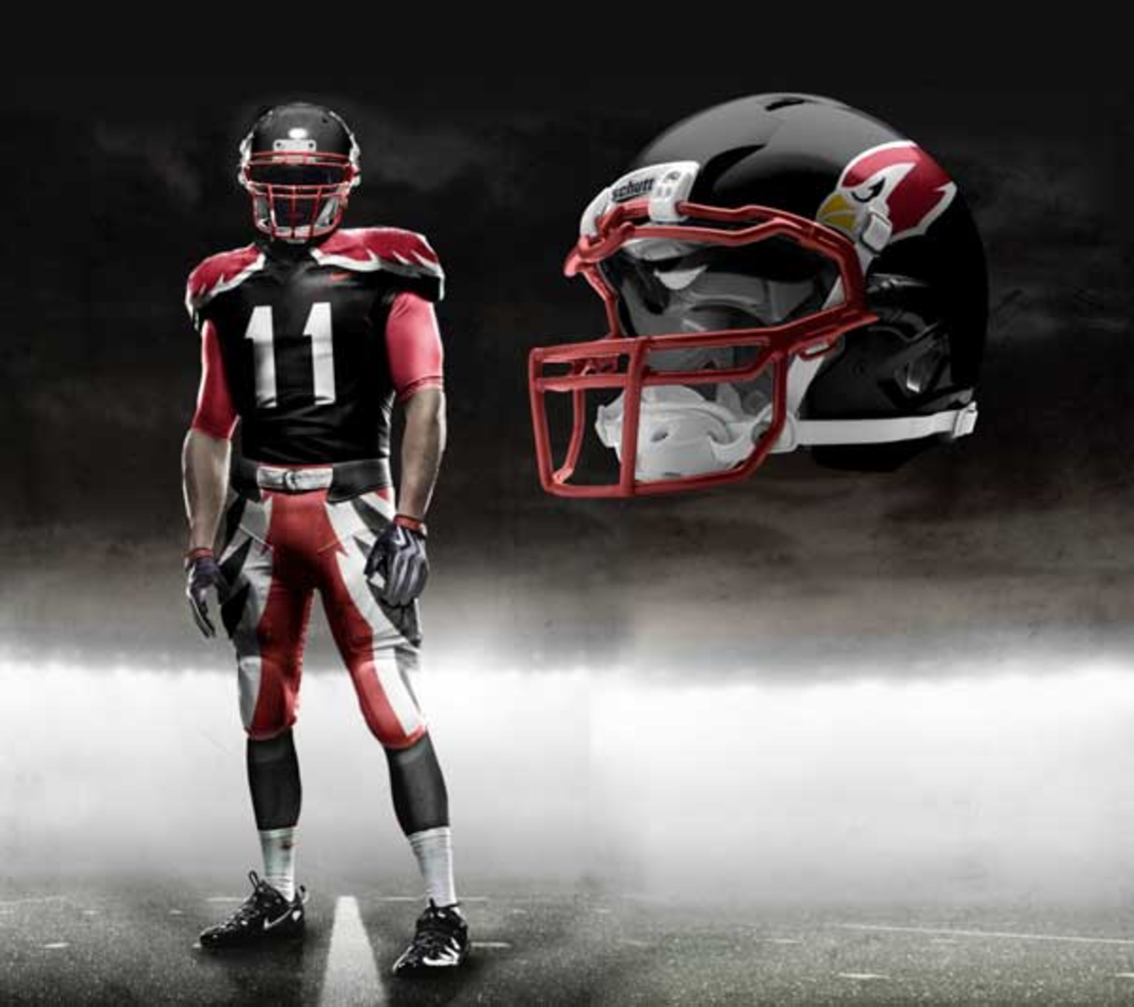
I’ve always like the Cardinals clean, cream-white helmet with the red bird. So it’s tough to see this uniform working.
The jersey has the winged design going down the legs of the players, which makes little sense to me.
I mean, wings on the torso is one thing, but you lose the bird metaphor when we see wings and legs mixed.
Chargers
9 of 32
I like the powder blue belt, but I feel like consistently wearing that tone of yellow makes them look like the Packers from the waist down. However, the Chargers have some nice colors, and almost any jersey design would look presentable.
This is another one of those teams where I liked the clean, white helmet coupled with a smaller logo design. Oh well, I guess the artist and I aren’t on the same page.
Chiefs
10 of 32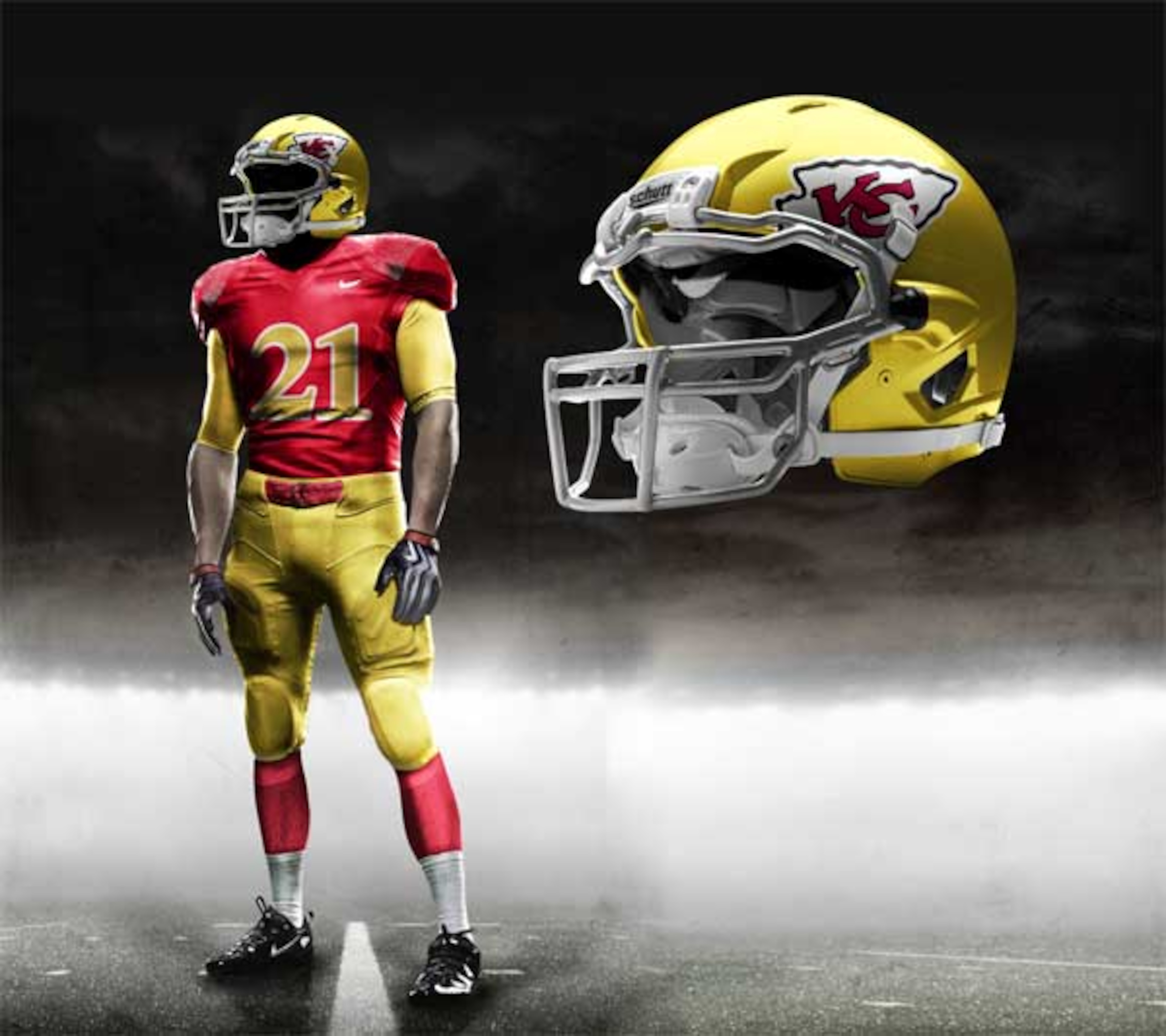
This jersey could carry with it a lot of swagger, or it could end up looking kind of stupid, especially after a mud soaked game at Arrowhead.
I’d have to see them in action, but I like the incorporation of yellow in this outfit.
Colts
11 of 32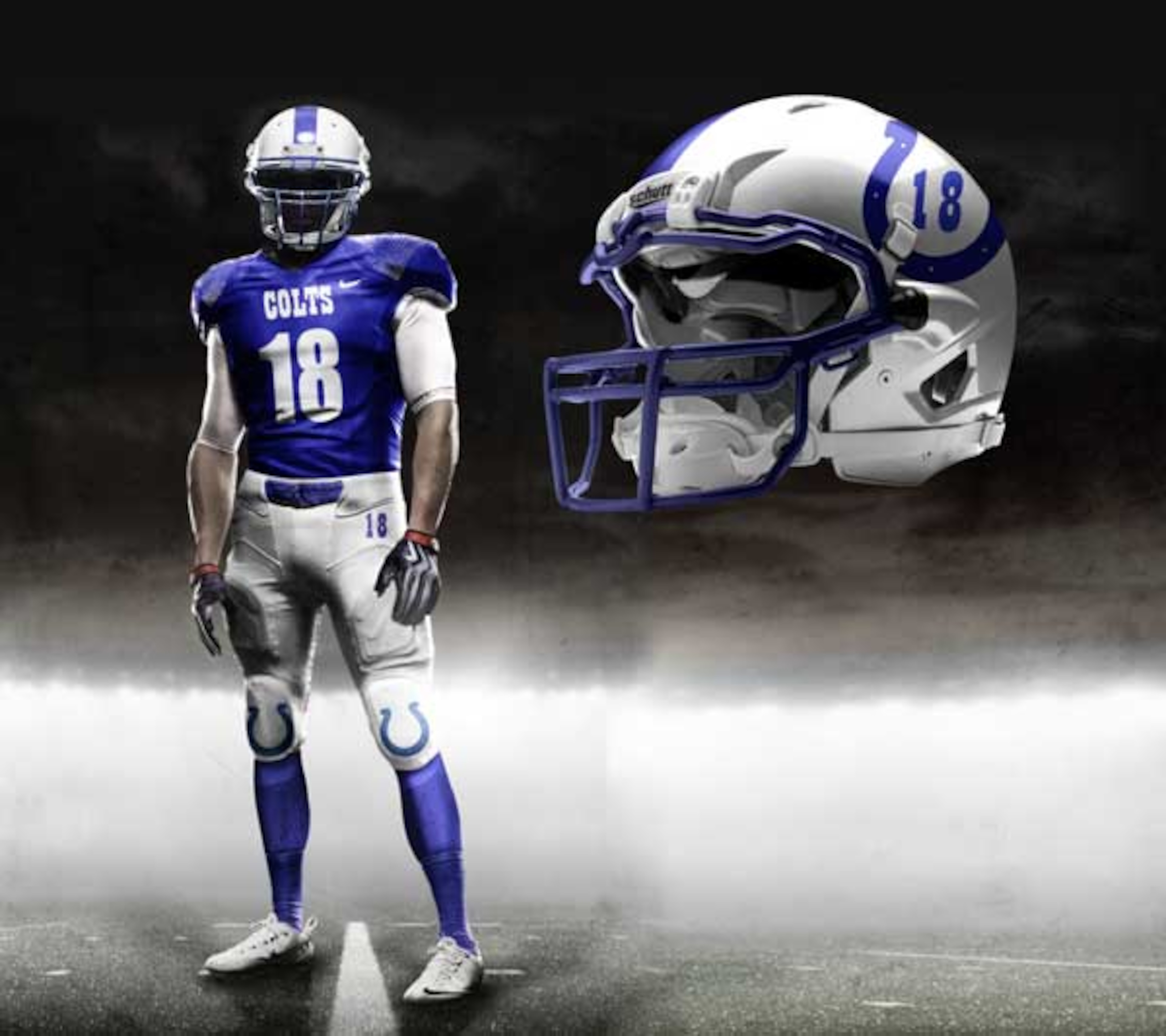
Another team that shouldn’t mess with a jersey that works.
The Colts should look good with the subtle number change on the helmet. Besides, what can you really do with that logo and the team’s colors?
Cowboys
12 of 32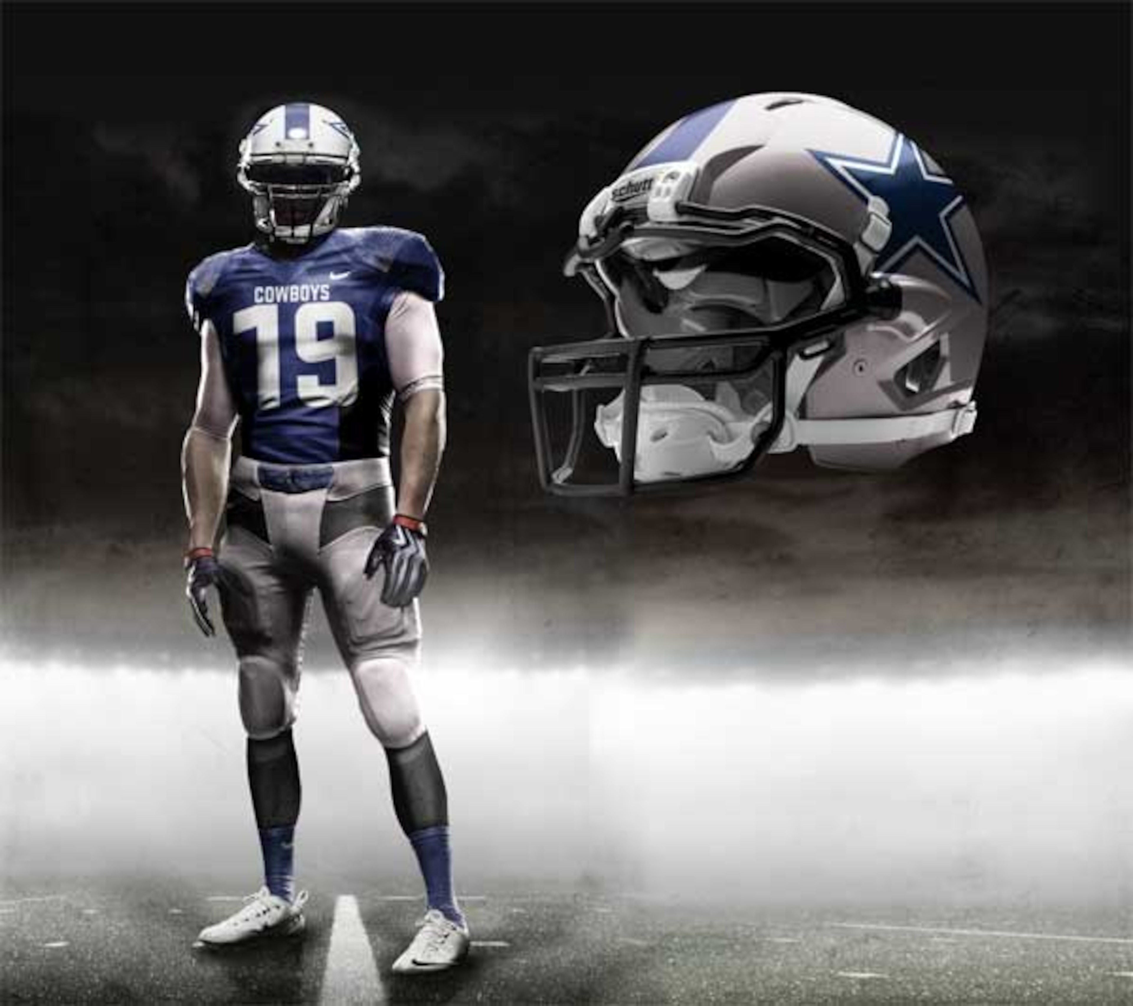
I expected the Cowboys to get a really flashy new uniform to match the owner’s and team’s persona, but they didn’t.
It looks OK, but nothing spectacular for “America’s team”.
For the official “America’s team” outfit, see Patriots, New England.
Dolphins
13 of 32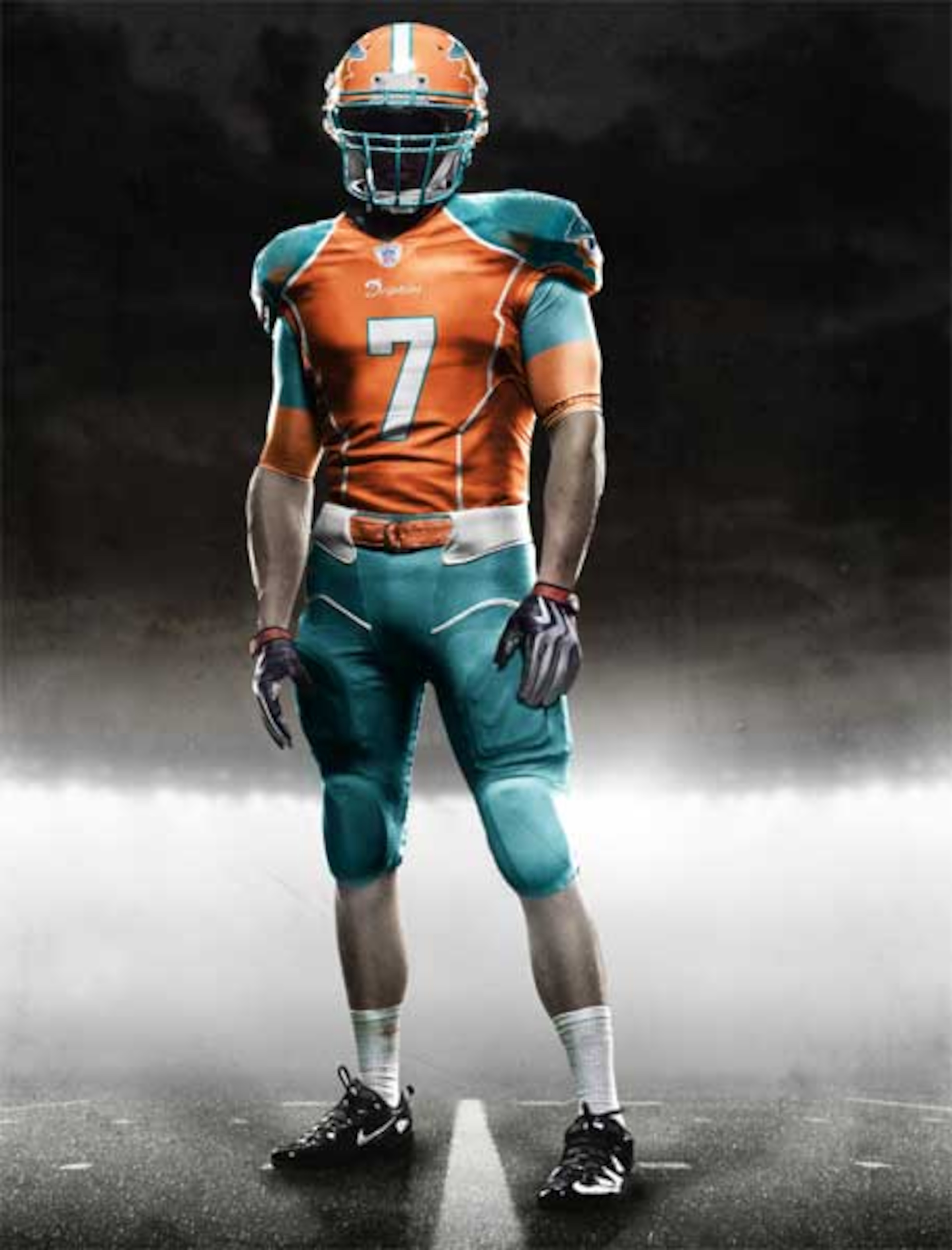
I was kind of waiting for the Dolphins to sport a uniform that used their team colors a lot more and used less white.
Although I see the benefit of having a cool uniform with a lot of white, seeing as how they play a majority of their games in balmy Miami.
Light colors would work best.
Eagles
14 of 32
Oregon University called, and they want their “shoulder-pad wings” back.
This uniform actually looks pretty nice. Can you imagine Mike Vick scoring four touchdowns in one quarter during Monday Night football with this cool outfit on?
Falcons
15 of 32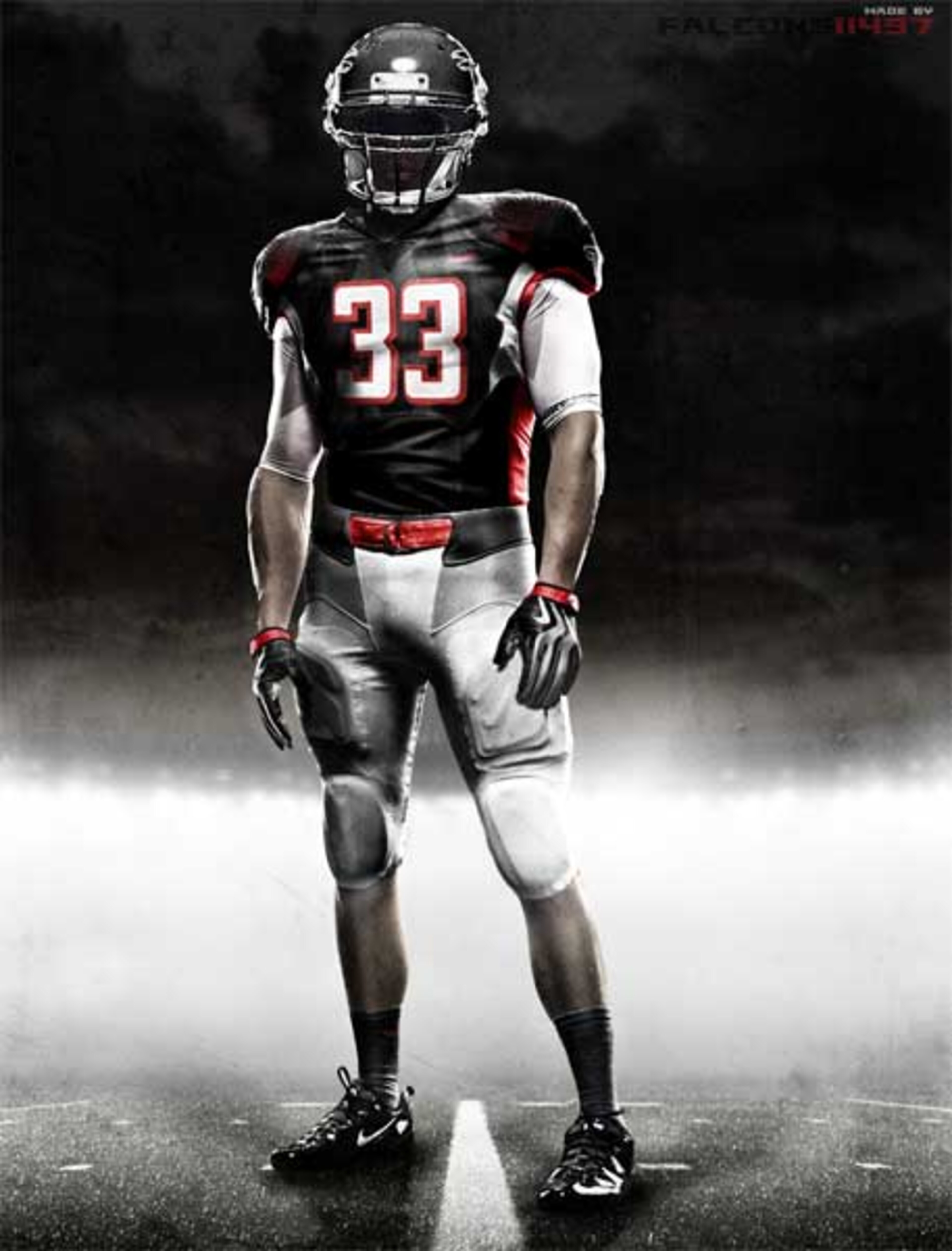
I felt like the Falcons added a ton of swagger to the franchise when they changed their logo and jerseys a while back. This 2012 version doesn’t offer much change, but definitely keeps the style.
Giants
16 of 32
Too much blue.
The Giants are another team that should have stuck with what worked. If they had to incorporate more color, why not use some red and white in there?
Jaguars
17 of 32
I can’t decide if the jaguar fur looks more like some single-celled amoebas or a fake leopard carpet from the 70’s.
The numbers look like they were spray-painted on. The helmet logo looks like it was spray painted, but whoever started it forgot to finish.
This uniform has less hope than Jacksonville keeping their franchise.
Jets
18 of 32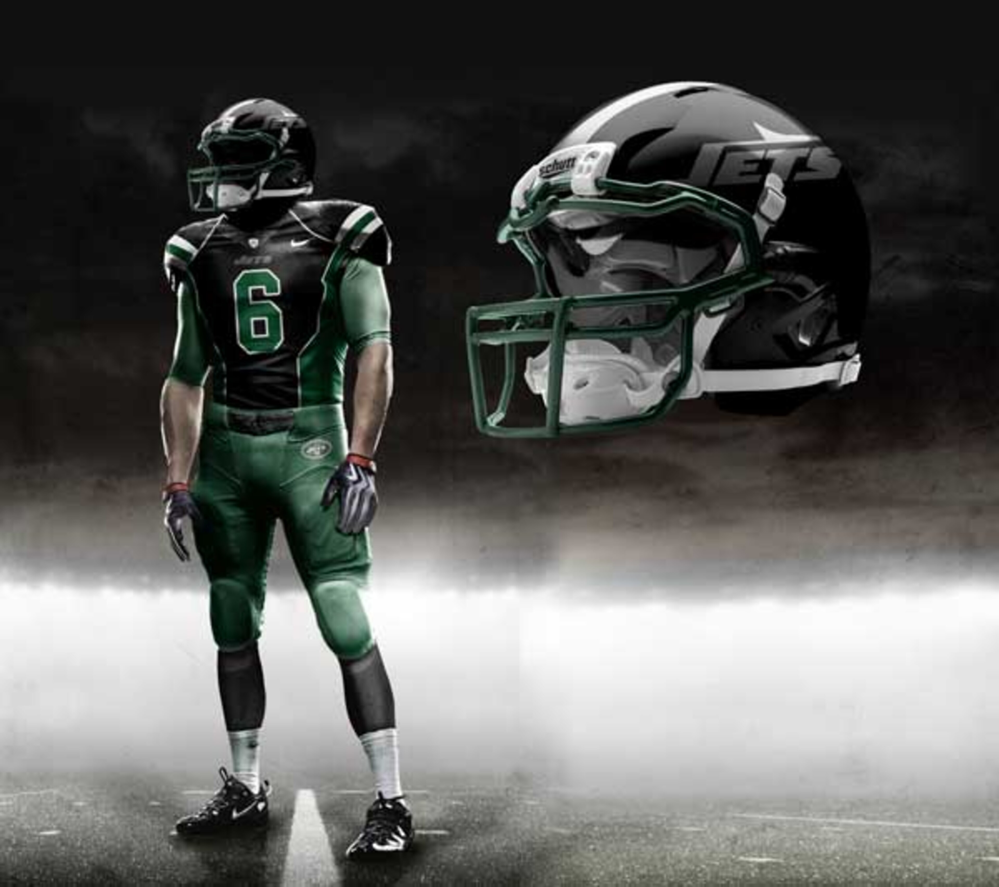
The black on black lettering on the helmet works well. The outfit fits the team’s persona as a tough looking, hard hitting team.
Lions
19 of 32
The Lions just got a uniform change that Nike expands slightly on.
The Lions will probably end up sending the jerseys back because Nike spelled their 2010 1st round pick Namdacaam Soo.
Packers
20 of 32
Can you imagine the reaction from most Packer fans had Nike completely changed the team’s appearance?
“The day you change our uniform is the day history dies.”
This was an actual quote from a couple Packer fan buddies of mine. Hey, this is another case of not messing with success.
Panthers
21 of 32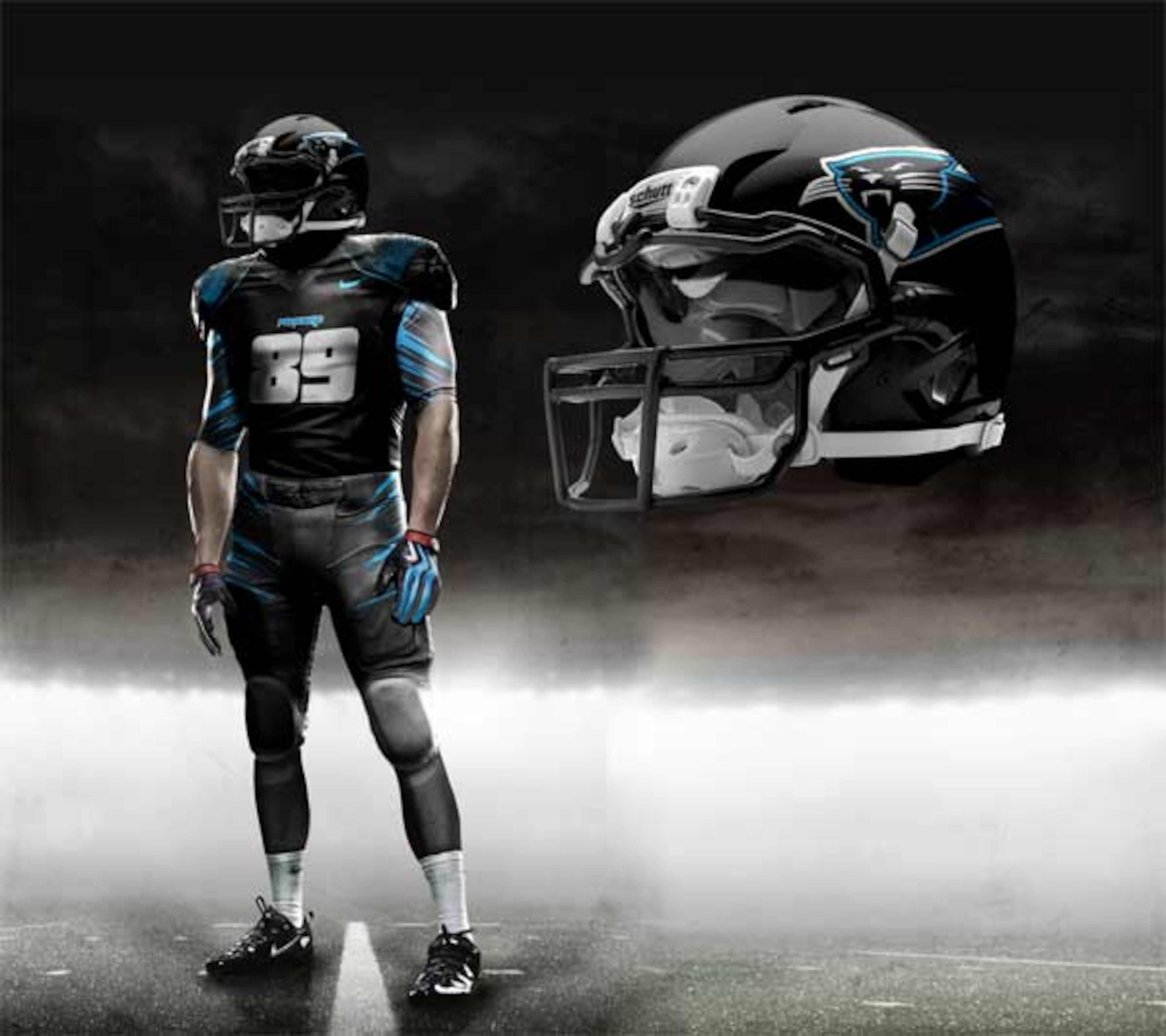
I feel like the artist just figured the Panthers didn’t have any fans left and just copied the Jets' jerseys.
This actually looks really nice, but will anyone be in the stands to see them by 2012?
Patriots
22 of 32
Very, very patriotic.
These jerseys are so good they inspired me to come up with that awful uniform slogan.
These jerseys are fantastic and add on to an already long list of reasons that guys go to play in New England.
Raiders
23 of 32
This is another fan base that would rip off Nike executives’ heads if they did something too outlandish to the team’s image.
Rams
24 of 32
Where’s the gold?
It’s almost as if the artist decided that the Rams colors didn’t click and just informed them that from now on you will be blue and white.
If the Colts just tell them that Sam Bradford is Peyton Manning 2.0 that will get them off your back about the uniforms.
Ravens
25 of 32
I thought the Ravens were one of those teams that really didn’t need to change anything about their uniforms, so any change to me is negative.
The backwards raven just adds insult to bad design.
Redskins
26 of 32
A buddy of mine thought that the helmet design looked a lot like Florida State’s newer logo.
I don’t know, I see potential in the design, but I just don’t see “Redskin pride” in this look.
Saints
27 of 32
Once again, this team means so much to the city they play for. I wouldn’t change too much about their look.
Seahawks
28 of 32
At first glance I thought very little of the Hawk’s new look.
Notice the subtle wings on the player’s arms. This is actually a pretty cool look for Seattle.
Steelers
29 of 32
I threw up a little after seeing the Steelers new look.
I don’t think Steelers fans would be all too accepting of this uniform, and that helmet.
I’m at a loss for words.
Texans
30 of 32
I can take or leave the uniform itself, but the helmet is a big improvement over their current style if you ask me.
Titans
31 of 32
Decent, although, I’d stick with the old logo.
It really won’t matter what they do with Chris Johnson’s uniform anyways. It’s usually pretty hard to critique the style of things traveling at the speed of sound.
.jpg?w=3840)


.jpg?w=3840 "MLB Draft Grades 🔢")


