Report Card Grades for New Orleans Pelicans' 2013-14 Jerseys
If we had to describe the New Orleans Pelicans' new uniforms in one word, it would have to be ordinary. Or pedestrian. Or bland. Take your pick.
The team unveiled their brand-spanking (not so) new look in front of a crowded, smoke-filled room overlooking a fashion-show-esque runway.
Aided by Jason Smith (the team's longest-tenured player), Ryan Anderson, Anthony Davis and All-Star point guard Jrue Holiday, New Orleans ushered in its next era of basketball attire with a bang—or tried, at least.
TOP NEWS
.png?w=2560)
Ranking the Best Shooters of All Time 🎯
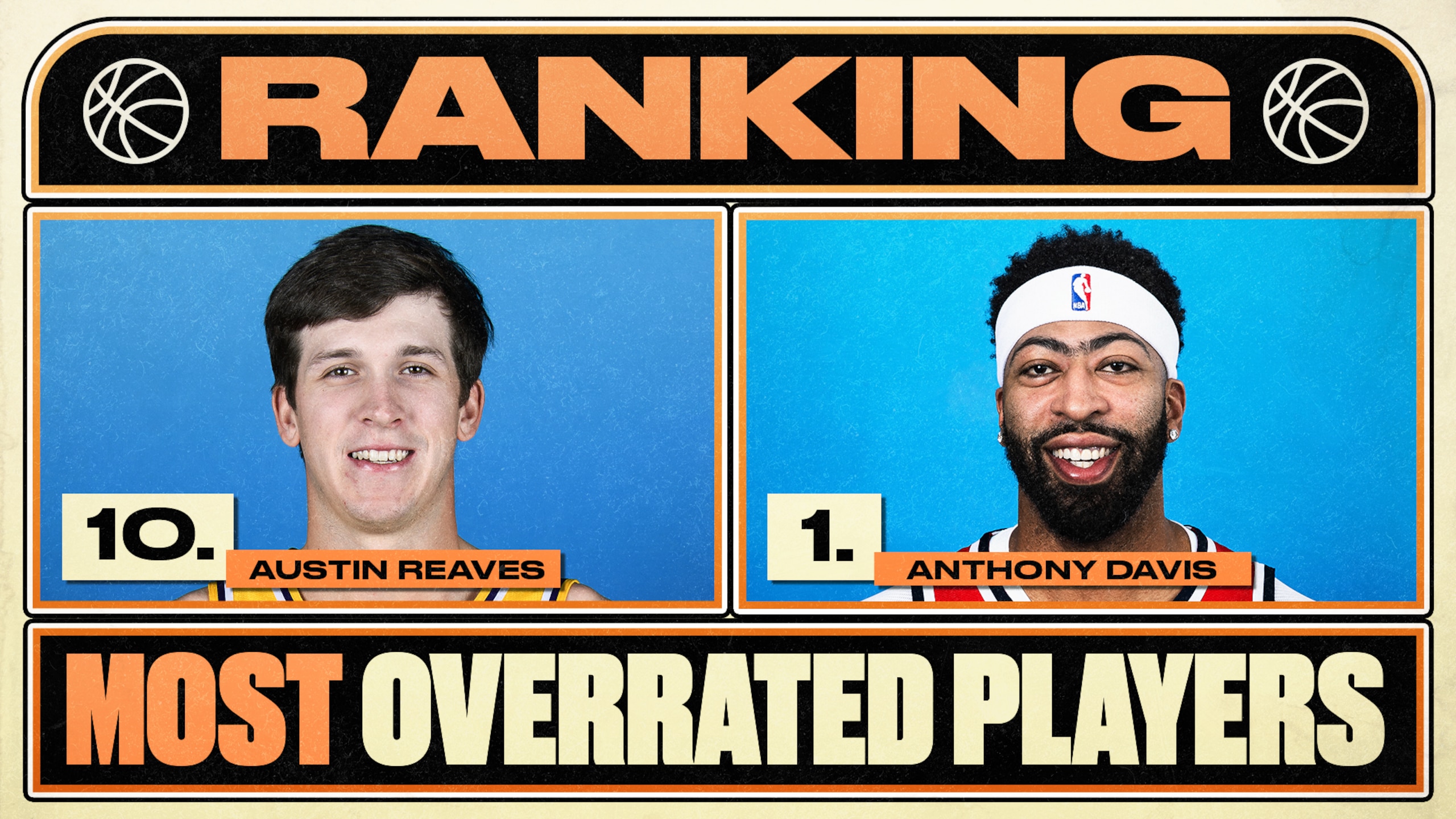
Ranking Most Overrated Players 📊
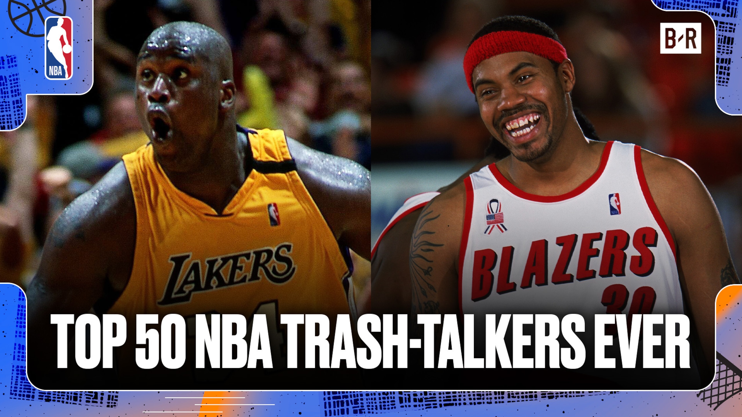
Ranking Best Trash-Talkers of All Time 🗣️
Lights flashed, smoke blew and the players smiled, but did the jerseys deliver?
Color: C-
I didn't know that the Pelicans had traded Anderson, Holiday, Davis and Smith to the Memphis Grizzlies and Cleveland Cavaliers!
What's that you say? They didn't? Could've fooled me.
The Pelicans' new away jerseys bear a striking resemblance to one version of the Cavs jerseys the team used to sport when LeBron James was in town, and their home threads look like something Marc Gasol will be wearing in Memphis next season.
A potential kidnapping of Cleveland and Memphis' uniform designers aside, New Orleans' new color scheme is flat-out boring.
Perhaps it's just because we've seen these color blueprints before, but nothing about them "pops" or is especially unique.
Too bad the Louisiana state bird isn't the flamingo instead of the Brown Pelican. Then the team could have incorporated a lively pink into what is right now a dreary combination of shades.
Seriously, if you stare into the dark-blue print long enough, you're either going to long for the days LeBron wore a Cavaliers jersey or allow yourself to drift into a really bad mood.
Nothing like a medley of humdrum colors to ruin your day and, in this case, team uniforms.
Lettering, Numbering and Logo: D
The Pelicans' new jerseys have letters. And numbers. They do not have pelicans. The end.
In all seriousness, it's difficult to be creative when it comes to digits and the alphabet. There's not much you can really do to the font at the risk of ruining any and all clarity.
I commend New Orleans for those random egg-shaped bumps, for they really liven up an oft-overlooked aspect of the uniform. They're unique, out of place and make me think of omelets. Job well done.
Not even a string of haphazard lumps are enough to prevent us from noticing the absence of a freaking pelican, though.
These are the Pelicans, are they not? The inclusion of the state bird somewhere, anywhere, on the jersey should have been a requirement. I mean, it doesn't even have the word Pelicans anywhere.
Deciding to run with New Orleans on the front is totally cool, but the absence of the bird itself or the word really diminishes the effectiveness of the branding.
Plus, you know, I really wanted to see a mini Pelican with a unibrow somewhere.
Fashion/Swagger: C
By now, you know there is nothing about New Orleans' new getup that really catches our eye. It's not intimidating or fun to look at, and you're only going to want to wear it in an attempt to fool your friends into believing Zach Randolph was shipped to New Orleans.
With such a peculiar, non-threatening name, I was really hoping the Pelicans were going to shock us all with something, well, crazy. Brighter colors, better-placed logos—anything.
They failed me. And you. And anyone who's a fan of representing teams that aren't imitating someone else.
To be fair, it's not like you can't wear this. Throw this jersey on with a pair of jeans and you're good to go. Not anywhere special, of course, but to the supermarket, laundromat or dentist, most definitely. Pelicans games, too—you can also wear them there.
I'm kidding, obviously. That's the one good thing about playing it incredibly boring safe when designing jerseys—they're not going to be hideous.
They're not going to look all that interesting either, but clothes devoid of miniature Pelicans never do.
Overall: C-
Let's be clear: New Orleans could have done worse.
These uniforms could have been all brown. That would have been worse. But they could have also been better. Much better.
Innovative design is an important aspect of what are supposed to be newfangled in-game garbs. You want them to be sleek, to be unique. This latest batch of jerseys is neither.
Putting an actual Pelicans logo somewhere would have gone a long way in brightening up what became a rather gloomy color scheme, specifically on the away jerseys. Differentiating between the Grizzlies and Cavs would have done wonders here as well.
For now, until the Pelicans can come out with an alternate jersey leading into the 2014-15 season, these will have to do.
Try to enjoy them as much as you can while anxiously awaiting what we hope will be a more exciting, tiny Pelican-shrouded set of threads.


.jpg?w=2560 "UDFA's with Best Chance to Make Rosters")

