
14 College Football Teams in Need of a Uniform Redesign
If uniforms don’t matter, then why is it difficult to find an Oregon game preview that doesn’t mention what the team will be wearing?
Though the Ducks definitely serve as the sport’s fashion trendsetter, there is a uniform style craze sweeping the nation.
While some schools have had great success in tweaking their kits, others have missed the mark. And then there are those teams whose time has come to try something, anything, to take their bland unis to the next level.
The teams highlighted here have issues across this broad spectrum, but all share one common denominator: It's time to call the fashion police.
Central Florida
1 of 14
Central Florida is arguably the most fearsome of the non-Power Five programs, posting a 31-9 mark since 2012—including back-to-back conference crowns.
Though their uniforms aren’t offensive, UCF deserves something that makes a bigger statement. The good news is with black and gold colors and the Knight mascot, they’ve got plenty to work with.
UCF would do well to take a page from Vanderbilt’s fashion guide—flat black or lustrous gold helmets with a more modern, bold play on the same color scheme. If nothing else, the Knights should turn up the volume on the color gold, leaving behind the watered-down version in their current unis.
South Florida
2 of 14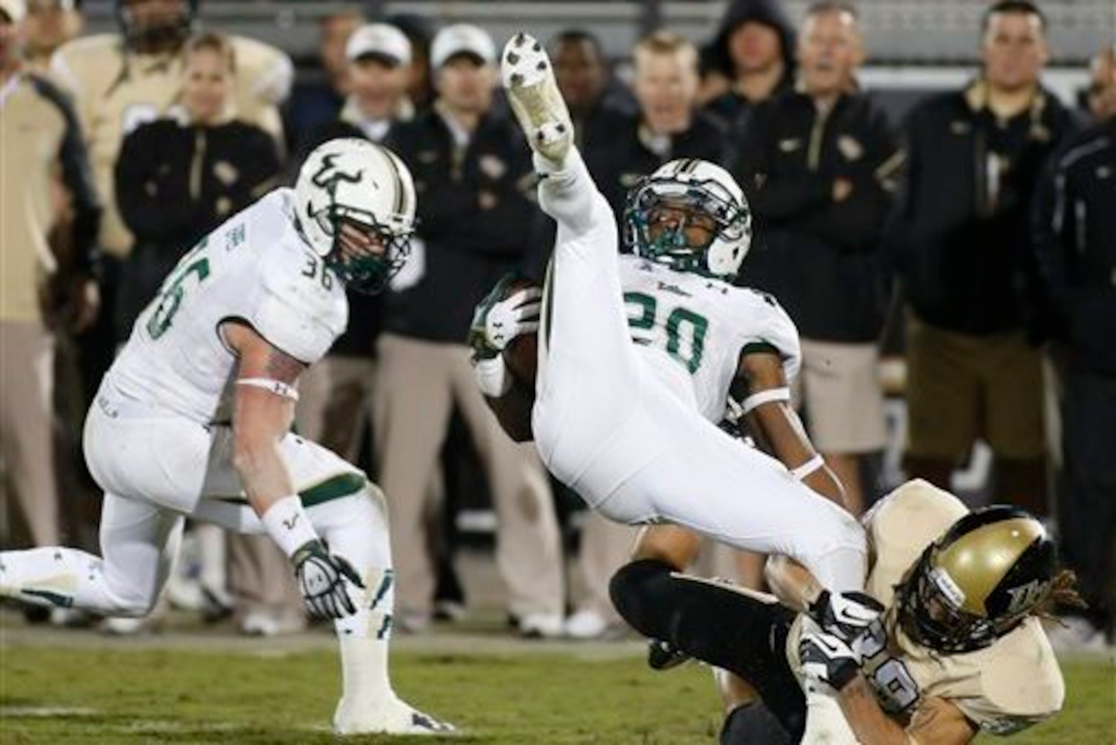
Green and gold is a great color combination for a football uniform. Think of what Baylor’s done with the scheme, combining the green with black and a lustrous gold, often leaving white completely out of the mix.
Unfortunately, South Florida hasn’t had the same success with the combo that the Bears have. What would help is a remix of the actual green the Bulls use, a hue that is somewhere between aqua and emerald. Though not noxious, it also does little to stir the soul.
Overall, both the green and the gold need to find brighter, bolder versions, then black needs to be played where white is now used.
On the plus side, USF has donned super-shiny gold helmets in the past; increasing the frequency of this practice wouldn’t hurt.
Indiana
3 of 14
While you can understand Indiana wanting to tweak their uniforms to avoid looking exactly like Oklahoma, the candy-striped helmets are a bridge too far.
The Hoosiers’ best recent variation came when they opted to make their traditional crimson “IU” helmets shiny. The use of the solid block “I” on the headgear was also visually pleasing.
Indiana would do well to use the color black rather than trying to do something in silver, achieving a similar splash without blinding or offending the viewer. Think of what teams like Louisville have done with the same color scheme.


Maryland
4 of 14
On the one hand, you can credit Maryland's uniform designers for cutting-edge state pride; on the other, you have to wonder who continues to sign off on the mock-ups before they go to the seamstress.
Where some programs need to liven it up, the Terps need to tone it down.
Maryland’s colors are red, white, black and gold, giving it lots to work with. Rather than emblazoning the state flag across the entire kit, or trying to reprint the lyrics to "The Star-Spangled Banner," it’s time to simplify.
Think of the Terrapins in all-blacks with gold and red accents. No banners, no songs, no stripes, no panache—just straight up, plain Jane.
It's a look they achieved in last season's Michigan State game, and it was stunning.
Arkansas
5 of 14
Really, there is nothing wrong with Arkansas’ football uniforms. The Hogs are just another team in a major conference with red and white unis (in this case, officially cardinal and white).
That said, ask yourself this: Do the Razorbacks have the major, national following of an Alabama, Texas, USC or Ohio State, where a major uniform transformation is totally unnecessary?
Arkansas would do well, and create a spark, if it showed up in all-black kits, or with shiny helmets, or with even the slightest variation on the traditional outfit.
If you’re thinking, “Didn’t they already try that with those gray uniforms?” you are correct. But, truthfully, the Hogs could do better. Think of what traditional-minded Stanford has done with the same color scheme.
Navy
6 of 14
Unlike a lot of programs, Navy is a team that doesn’t need extra flair in the uniform department.
First, you’ve got its special status as a military academy. Then, you’ve got a football history that includes two Heisman winners. Beyond that, there is Navy’s place in the greatest rivalry in the game, the annual grudge match with Army.
Navy is a special type of program that you expect to show up looking like, well, Navy. In other words, you shouldn’t ever have to ask yourself, “Which team is that?”
And this is exactly what has happened to the Midshipmen, who looked dandy in their “Anchors Away” kit and festive in their “Don’t Tread on Me” gear, but they didn’t look like themselves. That’s a shame.
Rice
7 of 14
Rice’s old-school, unaltered unis do a solid job representing a school that has been achieving non-Ivy League academic excellence since 1921.
The Owls’ traditional look—blue and white with Old English script in one or two simple combinations—makes sense for an institution that still values education over sport.
That said, this is a program that has blue and gray listed as its color scheme. That’s right, gray, a color many schools have gone rogue to use outside of their established palate. For Rice, it’s an option it can go to legally.
Don’t forget that the Owls have managed to go 18-9 over the last two seasons, a stretch that included the program’s first outright conference crown (the 2013 C-USA title) since 1957.
An upswing in performance is a great time to debut a flashy new look.
Boston College
8 of 14
When is old school too old school?
The answer is found in Boston College’s football uniforms, where comfortable tradition intersects with boredom.
The Eagles have mixed it up a bit recently, donning gold jerseys with maroon pants back in 2012, but other than that and a few other exceptions, it’s been all vanilla.
If BC were to replace the white in one of its combos with black, or just throw out the color white completely, the result would be a far bolder look.
Just because the Eagles are a traditional program that still gets it done in the trenches doesn’t mean they have to look like it.
Wyoming
9 of 14
Here’s the deal: Wyoming has a great football uniform, playing the questionable brown and gold color scheme about as well as could be expected.
So why are the Cowboys on this list? Because rather than spell out “Wyoming” on their jerseys, they consistently go with the abbreviation “WYO.”
Look, you’ve got a full, big-man chest size to work with here. In other words, this isn’t women’s golf or gymnastics, where the tailor has less fabric to work with.
Spell out the name of your state. If Washington State and Michigan State can manage to get their entire name on the front of the kit, so can Wyoming.
Florida State
10 of 14
Just because the geometric-patterned design has made such a splash in the fashion industry, it doesn’t mean it translates well to a college football uniform.
In other words, just because you can find the same motif on stretch pants or high-top leather boots, it doesn’t make it acceptable to wear on the gridiron on Saturday afternoons.
Florida State has a great color scheme, a long history of superior uniform design and a fantastic football tradition, but the pattern emblazoned on the neckline and sleeves of its jerseys needs to go.
Kansas State
11 of 14
In the same way that the K-State football program reflects the personality of its legendary coach, Bill Snyder, so do its unis.
Both are unchanging and traditional, but they still work.
While the Wildcats shouldn’t change what they are doing on the field—utilizing JUCO transfers to shock the world—they could use a tweak to their game-day kit. It’s basically the same get-up they’ve been wearing since the '80s.
Think of what Northwestern and TCU have done with the purple and white color scheme. It’s a lead that K-State could follow, potentially allowing them to look as good as they play.
Auburn
12 of 14
Like Arkansas, there is nothing offensive about Auburn’s football uniforms. That said, no program might benefit from an update like the Tigers would.
This is a team that is moving in the right direction, with plenty of national coverage, fan love and merchandising potential. Why not just delicately tweak a kit that has been the same since Bo Jackson won the Heisman in 1985?
Not so much a full-on Oregon transformation, but more like a Clemson makeover, using the colors you already own in a much bolder way.
When used correctly, orange (officially burnt orange in Auburn’s case) can be a wicked color on a football uniform. This is especially true when you find yourself consistently in the Top 10.
Wake Forest
13 of 14
Like UCF, Wake Forest’s football uniforms have all the potential in the world. It’s the same sort of setup: Old gold and black color scheme and a top-tier—and in this case unique—mascot in the Demon Deacon.
Presently, Wake combines all this goodness for a kit that does little to inspire.
Though the Deacons have done a solid job of mixing up the colors and using such tricks of the trade as flat-black helmets and the all-blacks, one error needs fixing.
It’s the classic “WF” that needs to change, a monogram that is just one “T” short of making its own point.
Wake’s “WF” isn’t just done in a questionable font—a big, skinny version of Times New Roman—it’s plastered not only on the helmet, but on both sleeves as well.
Replacing the monogram with an amped-up version of the Demon Deacon, a simple block “W" or even a bold “Wake” would take the uniform to the next level.
Utah State
14 of 14
Utah State may have the best uniform on this list. It’s a kit that has seen marked improvement over the last several years, adding gray to the navy blue and white scheme and updating the helmet logo with a bolder, tighter version.
But the Aggies are a team on the move, taking what used to be a 3-9 or 4-8 product to a 30-11 finish since 2012.
For inspiration, Utah State should look to programs like Duke and BYU, as both have taken the traditional blue and white combo to new heights. Think all-blacks with blue stripes paired with a flat-black helmet. Mix the gray back in and bam! It’s a head-turner.


.jpg?w=3840 "Ranking NFL's True Franchise Players")
.png?w=3840 "Offseason Moves Sure To Backfire 💥")
.jpg?w=3840 "Watch: Jerry Rice Chases After Heckler")
.png?w=3840 "Spida's Pitch to LeBron 🗣️")


