College Basketball: Power Ranking the Worst Uniform Failures in History
Over the years, college basketball uniforms have gone through many transformations.
Some of those changes have been for the better, but more times than not, they have failed miserably. College basketball teams have tried to change their look to flow with the modern age, but in the end, they keep coming up short.
Here is a list of the 16 worst uniform fails in college basketball history.
Georgia Tech Yellow Jackets
1 of 16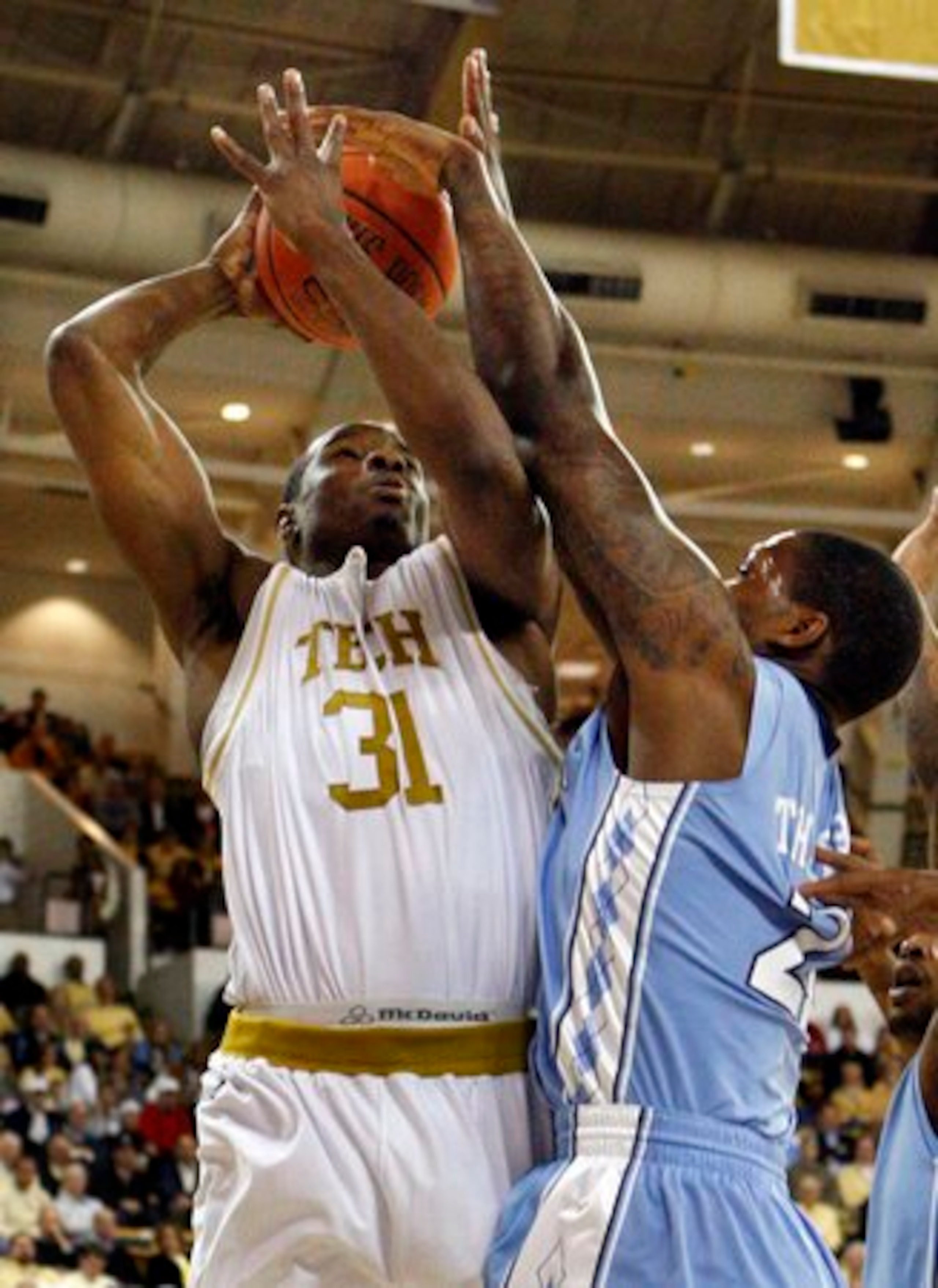
It’s rare a white jersey makes the cut, but this throwback needs to be thrown back. It has zero appeal to it and is hard to read.
Like most throwbacks it’s very basic—basically bad.
Florida Gators
2 of 16
Okay, it could have been worse.
They could have decided to go to a full orange look, but overall, this jersey is second-rate at best.
The Gators have one of the best programs in the country, but they need to spring for some new duds for the team.
Kansas State Wildcats
3 of 16
Purple rarely goes over well on a sports uniform. With all apologies to the Minnesota Vikings, it rarely works.
Kansas State has struggled so much with the combination that it seems like they are always changing it. They will mix it with grey and white, but they fail over and over again.
Unless there is a wholesale change, the Wildcats will always have a spot on this list.


Auburn Tigers
4 of 16
Cam Newton is glad the football team never adopted this look.
The team poured on the orange, but it was not enough to make this uniform get a passing grade.
They need to do a complete overhaul to make this uniform look decent.
Ohio State Buckeyes
5 of 16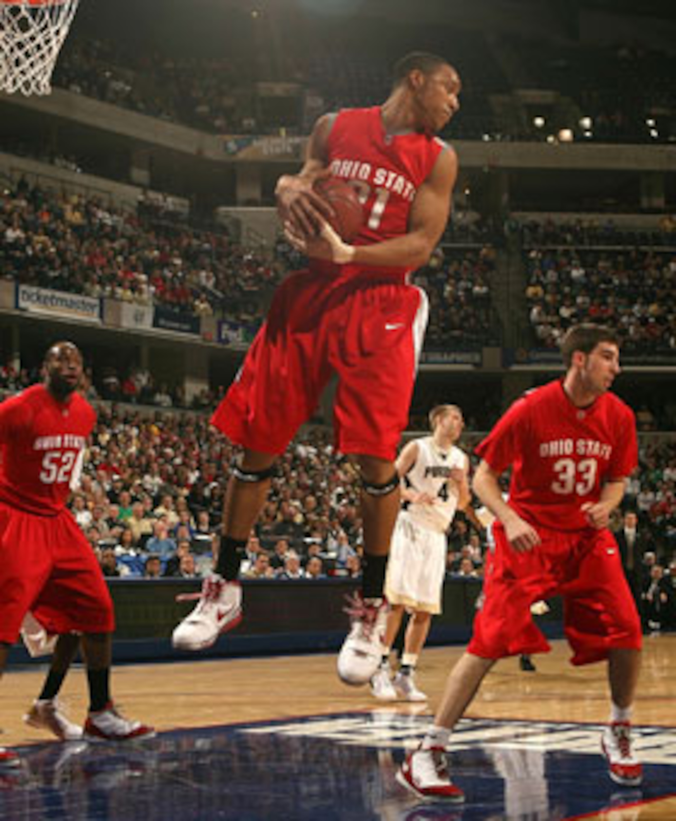
The jersey could be much worse, but way too much red. They have the look of an aggressive stop sign when they take the court.
Mixing in some other colors would make this look palatable.
Dayton Flyers
6 of 16
Dayton has a very good basketball team, but they failed with this jersey.
They really brought in the red for this jersey, and it takes away from everything else. It screams, "Sideshow" or "Harlem Globetrotters," and it just hurts to look at it.
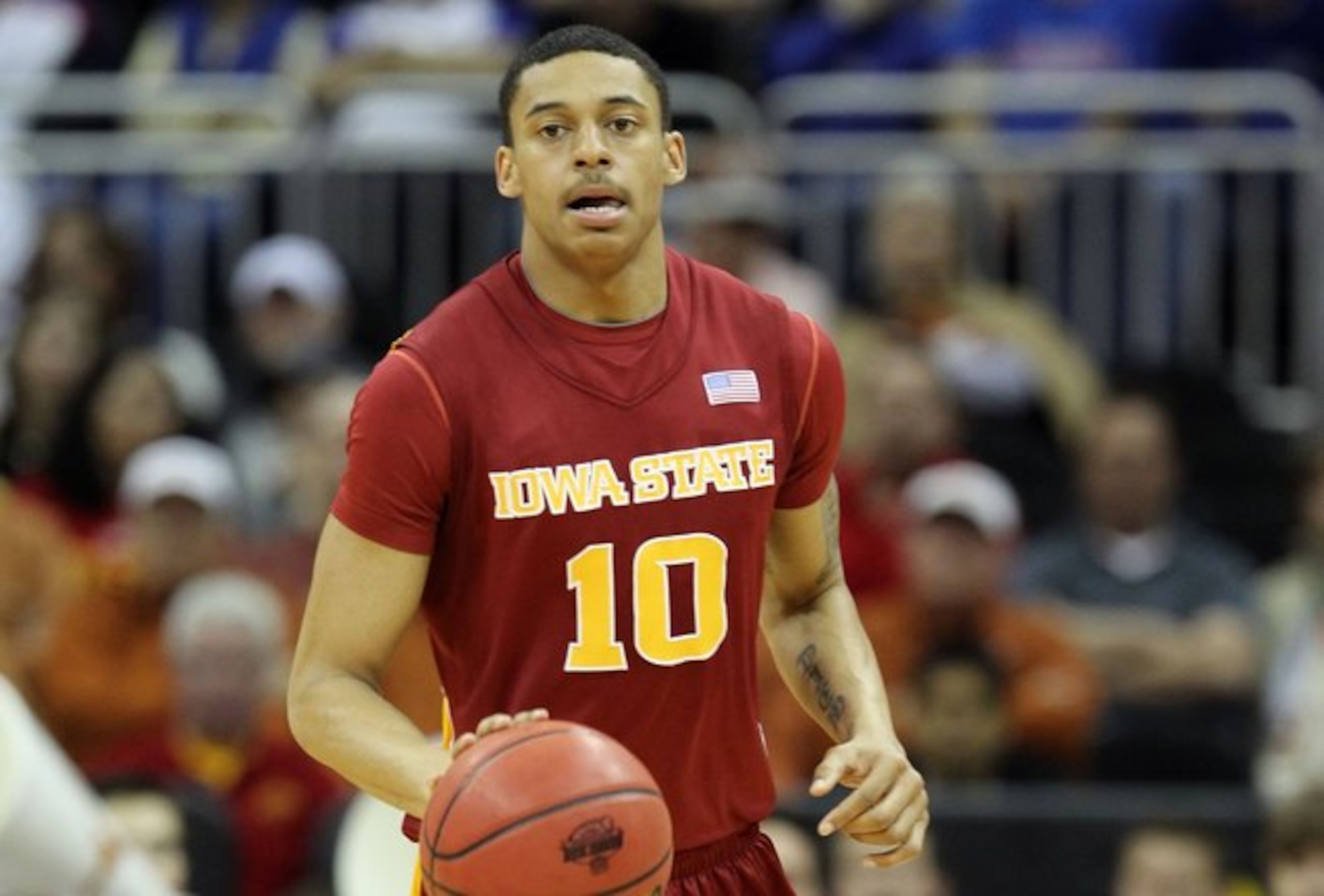
Iowa State
7 of 16
Thankfully Iowa State’s basketball team is not good enough to get too much prime time coverage. If they did, everyone would agree how horrible this jersey looks in this photo.
This jersey looks homemade, and I have seen high school teams with a better look.
Evansville
8 of 16
While Evansville may have one of the most interesting nicknames in college basketball, the Purple Aces fall short in the uniform department.
This clashing example is just one reason why this team is an eyesore.
Boise State Broncos
9 of 16
Boise State’s colors are legendary for the football team and the fact that the football field is the same color.
However, when it comes to basketball, it’s just loud, obnoxious and only gets worse when they match the socks and sneakers.
Georgetown
10 of 16
Give Georgetown credit because the jerseys have gotten better over the years.
This powder blue number has to stay extinct though because it was less than appealing for a Big East "tough" team.
LSU Tigers
11 of 16
Again with the purple overload.
It’s rare to see any team pull off the purple look, and LSU has failed here. The upsetting thing about this jersey is that it looks better than when LSU went with predominate yellow.
Marquette Golden Eagles
12 of 16
There came a brief moment when people believed that making a uniform loud made it better.
That is not the case when it comes to the Marquette Golden Eagles.
Call me old-fashioned, but blinding opponents with your uniform should not be the best way for a team to win basketball games. With a great mascot, Marquette should be able to do better than this.
Oregon State
13 of 16
With black and orange as your main colors, it seems easy to produce a good-looking jersey.
Not so fast.
The Beavers' basketball team failed miserably with this version, as they laid it on thick with the orange.
Thankfully there is another instate team that wins for the worst jersey.
Oregon Ducks
14 of 16
The Oregon Ducks took ugly jerseys one step further than other teams. As if the crazy color scheme was not bad enough, the Ducks had to go and mess up the court.
It seems like the harder Oregon tries, the harder they fail.
Maryland Terrapins
15 of 16
This tops the ACC in ugly jerseys. This is just way too bright, and the red lettering just seems to make it worse.
Many ugly jersey lists include the Duke Blue Devils representing the ACC, but this jersey blows it away.
Marquette…Again
16 of 16
Marquette was already mentioned, but they take the cake as the worst jersey(s) in college basketball.
There have been other teams that have had ugly jerseys and have attempted to make up for it with a new line, but Marquette just keeps pushing them out.
Please stop.
James Brown is a B/R Featured Columnist. Feel free to contact James at jtsneaks@gmail.com.


.jpg?w=2560 "NFL made $14.5B in revenue for 2025 season")


