
The Worst Olympic Logos Of All Time
The Olympics offer their host city a rare chance to be the center of the World's attention. Cities go to big expense and planning in hopes of impressing the rest of the world with their city, athletes, structures, art, planning and creativity.
While the Olympics come and go in two weeks, the planning can last for a decade. Aside from the actual moments that take place during the competition, the first thing that people usually identify with a particular Olympics is the logo.
A quick look at the different logos for the Olympics gives a glimpse into the dangers of over thinking a simple idea. There have been some excruciatingly bizarre and laughable logos.
No. 15: Moscow, 1980 Summer Olympics
1 of 15
Apparently the government was having a hard time moving red ink. We get it, Russia. You like red; it was kind of your thing.
It's not exactly the most inviting color, however. No wonder the USA boycotted the 1980 Olympics.
No. 14: St. Moritz, 1948 Winter Olympics
2 of 15
This is not a bad design--except I can't stop staring at it and sooner or later, I try to go towards the sun and I end up slamming my head into my computer screen.
Also, they spelled Olympics wrong and that seems really unprofessional.
No. 13: Torino, Winter 2006
3 of 15
In 1937, Torino knew they were going to land the Olympics. So, they set to work coming up with a logo that look futuristic enough to be relevant in 2006.
.png?w=3840)


No. 12: Squaw Valley, 1960 Winter Olympics
4 of 15
Wait, they had a Winter Olympics in California?
What's with the off-balanced star. It's like they had the artists spin in a circle 100 times and then try to draw a star.
No. 11: Salt Lake City, 2002 Winter Olympics
5 of 15
Salt Lake wanted to give off the impression that they may not sell full-size beers or allow caffeine in their city, but they are still edgy.
The motto for the design team, "Give us something with lots of angles...and two shades of orange-brown and a blue that doesn't match at all."
No. 10: Oslo, 1952 Winter Olympics
6 of 15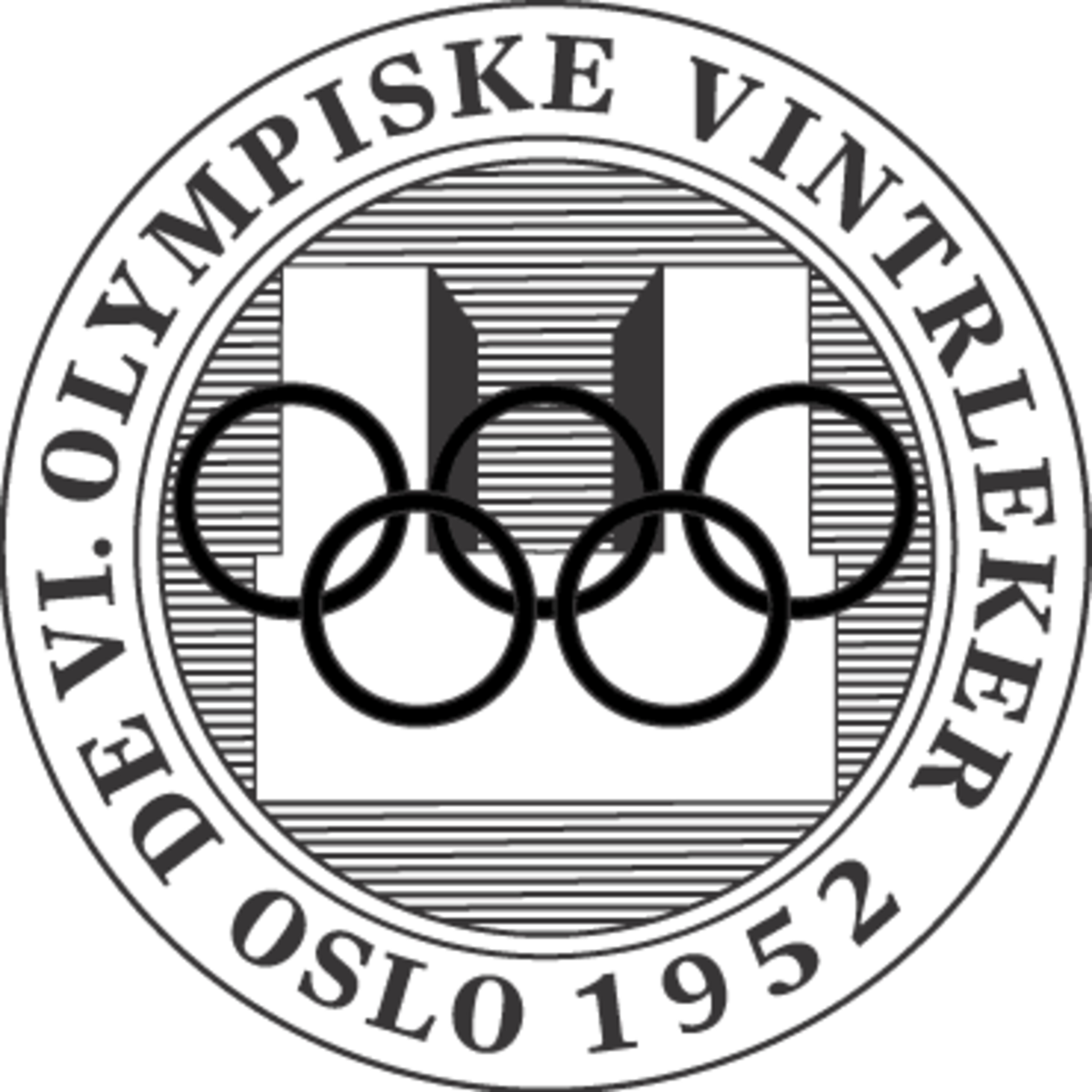
The unofficial slogan: This is going to be a very orderly and industrial Olympics.
No. 9: Lake Placid, 1980 Winter Olympics
7 of 15
Am I the only one that wants to grab a potato sack and slide down the Lake Placid logo?
No. 8: Munich, 1972 Summer Olympics
8 of 15
Munich was trying to erase the world's memory, via hypnosis, of their past atrocities perpetrated upon mankind.
No. 7: Barcelona, 1992 Summer Olympics
9 of 15
Do da do doo do...I'm lovin' it. With this color scheme, Barcelona was hoping to be know as the fast food host of the Olympics.
They do get props for employing their finest finger painter to craft this logo.
No. 6: Mexico, 1968 Summer Olympics
10 of 15
Wait, this isn't a logo. That's a word. You can't fool me with your fancy text Mexico. Also, why do they get to list a country? I thought the Olympics were held in a city.
No. 5: Lillehammer, 1994 Winter Olympics
11 of 15
Lillehammer 4.0 inside.
Make Lillehammer the first and last stop for all your copier needs.
No. 4: Berlin, 1936 Summer Olympics
12 of 15
A preschooler with a steady hand came up with the winning design for the 1936 Berlin Olympics.
No. 3: London, 2012 Summer Olympics
13 of 15I can't wait to see the world's top athletes under the age of eight battle it out in London in 2012.
No. 2: Montreal, 1976 Winter Olympics
14 of 15
Wait, is this logo flipping me off? I thought Canada was renowned for their politeness.
I guess that doesn't apply to French-Canada.
No. 1: Rome, 1960 Summer Olympics
15 of 15
Um...is that missing link babies sucking from the tit of that demon dog?


.jpg?w=3840 "Jerry Rice CHASES Heckler 😳")

.png?w=3840 "Offseason Moves Sure To Backfire 💥")