
The Definitive MLB Jersey Power Rankings For 2026 Season
There seems to be a movement away from gray road jerseys in baseball.
To get into compliance with Nike's 4+1 Rule, both the Seattle Mariners and Tampa Bay Rays ditched their road grays altogether ahead of the 2023 season. Now, the Milwaukee Brewers are following suit, as they won't be wearing gray at all in 2026.
Other clubs like the Atlanta Braves and Toronto Blue Jays still technically have gray as their primary color on the road, but seem to increasingly be wearing solid tops away from home as well.
Team USA didn't wear gray at all in the World Baseball Classic, instead going with whites for games they were designated as the home team, and navy blue as the away club.
At some point in the mid to late 1980s, powder blue went out of style as the primary road color for many clubs. Perhaps we're witnessing something similar with gray now, more and more teams opt for color in some or all road games.
It's one of the interesting trends to follow in the baseball uniform world not only this year, but moving forward.
With all that acknowledged, here is our 2026 ranking of all 30 teams uniform sets—even the ones who aren't so fond of gray.
30. Washington Nationals
1 of 30
Jerseys Worn Per Game in 2025: Gray — 65; Navy — 36; City Connect — 28; White — 22; Red — 11
Since winning the World Series in 2019, the Nationals have not only run their team into the ground, but also their wardrobe.
They reintroduced red tops as an alternate a season ago, but the tops—which do double as their Spring Training jerseys—felt more fitting for the Grapefruit League than the regular season.
It's not that the Nationals shouldn't have a red top, but these new ones need something more on the front ... piping, a number ... something. The red tops that the Nats wore as recently as 2023 maybe needed an update, but weren't nearly as bland as the new red tops:

The Nationals did introduce their second City Connect design in 2025, and the "District Blueprint" uniforms certainly weren't terrible:

However, while these caps still kept the cherry blossoms involved, the dark gray City Connects that the Nationals wore from 2022-2024 were much better. Even setting aside that these are a downgrade from the original CCs, it's fair to point out that the caps and jerseys are too similar in color, yet annoyingly not the same. The color of the hat should have matched the color of the top.
Still the biggest offense the Nationals have committed is the downgrade to lazy block lettering on their road grays ahead of the 2024 season:
Paul Taboni has been tasked with rebuilding the Nationals roster as the new president of baseball operations. Someone needs to be put into a similar role for enhancing the club's aesthetics.
29. Cincinnati Reds
2 of 30
Jerseys Worn Per Game in 2025: Red — 71; Gray — 46; White w/ number on front — 32; City Connect — 12; White w/out number on front: 1; White Motor Speedway Classic top; 1
Cincinnati's "Reds" tops—introduced in 2020—have become their go-to jerseys, as they were worn 71 times a season ago, with the flexibility to be donned both at home and on the road.
But while there are proponents of the black City Connects the Reds have worn the last three seasons, it feels beneath such a classic franchise. The "C" on both the cap and sleeve looks like it's made out of bacon:

Also, the primary home jerseys seen at the top of the slide and the road grays are each among the worst in baseball. Might we suggest a return to the franchise's heyday with both?


It can be hard to pull off V-neck jerseys, but if it worked for the "Big Red Machine," it can work for the modern iteration of the team led by Terry Francona.
28. Cleveland Guardians
3 of 30
Jerseys Worn Per Game in 2025: Gray — 51; White — 37; Red — 34; Navy — 30; City Connect — 10
The Guardians did a uniform refresh ahead of the 2025 season, in just their fourth campaign with their new nickname. But not much changed, really.
The City Connect jerseys that the Guardians introduced in 2024—which featured a three-toned cap and batting helmet—are the best look Cleveland has currently:

The worst is their red "Guardians" tops, although the gray "Cleveland" road jerseys lack inspiration too.
To their credit, Cleveland did improve their road alternates by going from "Cleveland" to the "C" on their navy blue tops:

Still, these feel a little like a batting practice top. If Cleveland really wants to lean into navy blue, they should make an updated "Guardians" top similar to these alternates worn from 1994-2011:

Still, it feels like the franchise hasn't entirely embraced their new identity. The "C" might feel classic, but it's boring. Lean into being the Guardians, and all the logos that do and could come with that.


27. Tampa Bay Rays
4 of 30
Jerseys Worn Per Game in 2025: Navy — 68; White — 59; Powder Blue: 13; City Connect — 12; Devil Rays Throwback — 10
As noted, the Rays haven't worn gray jerseys on the road since 2022, instead opting for the navy tops above and a powder blue uniform that feels like it should be left in the Grapefruit League on the road.
But the Rays recently asked fans to vote on four potential options for a road jersey that could be worn in the future:
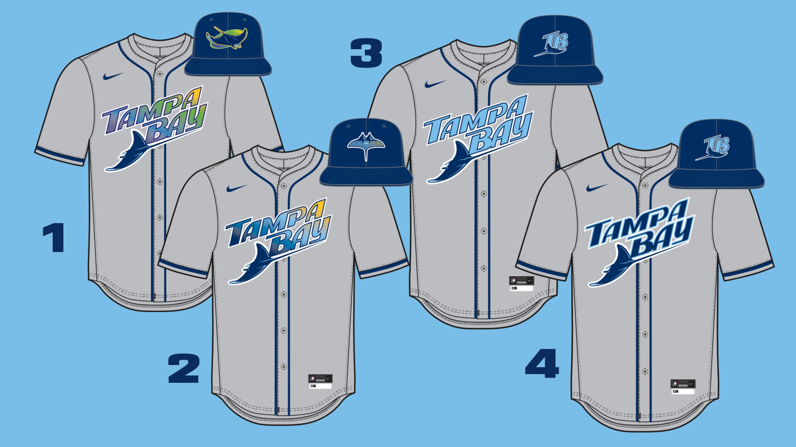
Option 1 was by far the most popular, receiving 60.7 percent of the vote. This would be very similar to the road jerseys the Devil Rays wore from 1998-2000, their first three seasons as a team.
The matching white tops with gradient writing reentered the mix as a home alternate in 2021, and have been extremely popular:

In 2008, the Rays dropped the "Devil" from their nickname. That's led to this weird ambiguity about whether they are named after stingrays or sun rays. Well, the former is much cooler.
The Rays aren't going become the Devil Rays again, but if they readopt the branding from that era, they'll shoot up this list.
26. Miami Marlins
5 of 30
Jerseys Worn By Game in 2025: Gray — 59; White — 43; Black — 36; Blue — 13; City Connect — 11
So far, we've learned that it's not a good time to be a uniform in either Ohio or Florida. The message for the Marlins will be a similar one to the Rays, although there is some movement in the right direction for the Fish.
First, though, there's plenty of negative.
The Marlins retired their beautiful Havana Sugar Kings City Connects—arguably the best that the program has ever produced—after the 2024 season. They replaced it with a hideous black top, which features "305" slapped on the caps and a softball-looking batting helmet:

The rest of the Marlins tops—their home whites, road grays, black alternates—are pretty bland. How can a franchise that entered the league with such a great color scheme in 1993 be this boring to look at?
There's good news, though. While it appears to have come at the expense of the blue tops the Marlins have worn as a Sunday alternate the past two seasons, arguably the greatest uniforms in franchise history are returning for Sunday games at loanDepot Park in 2026:

The quicker the Miami Marlins fully embrace the threads of the Florida Marlins, the quicker they'll climb out of the cellar on this list.
25. Houston Astros
6 of 30
Jerseys Worn By Game in 2025: Orange — 50; Gray — 42; White — 41; City Connect — 12; Los Astros — 1
While the Astros have had more success in the last decade than at any point in their franchise's history, they've definitely looked better at other points.
To be fair, their second attempt at a City Connect—which combined late-90s branding with the colors that we associate with much of the franchise's history—was lightyears better than their first, as you can see above.
Their orange, gray and white tops are all...just OK. The font across the chest could be upgraded:

The biggest thing their current uniform set is lacking is a wow factor. This is a team named after space, that gave us the iconic Tequila Sunrise jerseys in the 1980s. This template—introduced when they moved to the American League in 2013—isn't ambitious enough.
24. Los Angeles Angels
7 of 30
Jerseys Worn By Game in 2025: Red — 78; White — 64; City Connect — 10; Throwbacks — 7; Gray — 3
Red has always been a part of the Angels repertoire, but they really made it their main color in 2025, rocking their red tops in 78 of 162 games.
Specifically, the red tops have basically sent the gray road jerseys into retirement, as they only made three appearances a season ago. It is worth noting, though, that the Halos did wear gray Friday:

This isn't a dis of the red tops, but these grays—particularly when red long sleeves are worn underneath—really pop. They were one of the best primary road uniforms, and the Halos have basically phased them out.
It's possible the Angels will altogether get rid of the grays at some point in order to keep their tremendous surfboard City Connects—pictured below—even once they get a second CC design:

There's no inside information to be given out here regarding the future of uniforms in Anaheim, but this does seem like a club headed towards some sort of refresh.
Well, the best options might be in front of them:

The Angels have worn these throwbacks in three consecutive seasons, including for an entire homestand last July. They have a classic feel, with the best touch being the sleeve patch that features a halo over the outline of California.
The road grays that match with these uniforms that most associate with the 1980s are arguably even better. Perhaps a full-time return to these classics is in order.
23. Arizona Diamondbacks
8 of 30
Jerseys Worn By Game in 2025: Black — 51; White — 36; Gray — 31; Sedona Red — 28; City Connect — 16
When the Diamondbacks revealed that their second City Connect design would go back to the franchise's roots with purple and teal, there were plenty of happy consumers.
However, when you compare this version of purple and teal to what they wore from their franchise's inception in 1998 through the 2006 season, it feels a little too loud:

Of course, many younger fans like the super bright colors. If the goal of the City Connects was to get kids to like the jerseys, then the second "Serpientes" design has probably been successful.
However, if the goal is to rank higher on this list, returning to the Randy Johnson-Era purple and teal on a full-time basis would be the way to go.
In 2007, the Diamondbacks made "Sedona Red" their primary color. We regret to inform them that the current Sedona Red tops—which came as part of their 2024 uniform refresh–are bad:

Of their current uniforms, the black tops are by far the best. While perhaps impractical for summer games being played outdoors, the tops work both as a home and road alternate:

Ultimately, we won't rest until the old-school purple and teal is back on a full-time basis.
22. New York Mets
9 of 30
Jerseys Worn By Game in 2025: Gray — 66; White — 46; Black — 17; City Connect — 17; Blue — 16
The Mets introduced a new blue alternate jersey in 2025, which also doubles as their spring training jersey.
As you can see above, something is off about it. Maybe it's not as simple as filling in the numbers and letting orange, but if you're at a game in person, it's very difficult to read the orange-outlined names and numbers.
On a more positive note, the Mets tweaked their road grays last year. While there wasn't anything wrong with the predecessors, these have a classic feel to them:

Still, the biggest takeaway when evaluating the kit in Flushing is that the Mets destroyed their black alternate tops with the "update" they made to them ahead of the 2024 campaign:
New York's home pinstripes and road grays are very good. However, the blue alternates didn't make a strong first impression, the black alternates have gone from excellent to terrible and the "NYC" City Connects are, at best, passable.
The Mets should have a better overall uniform set than they currently do.
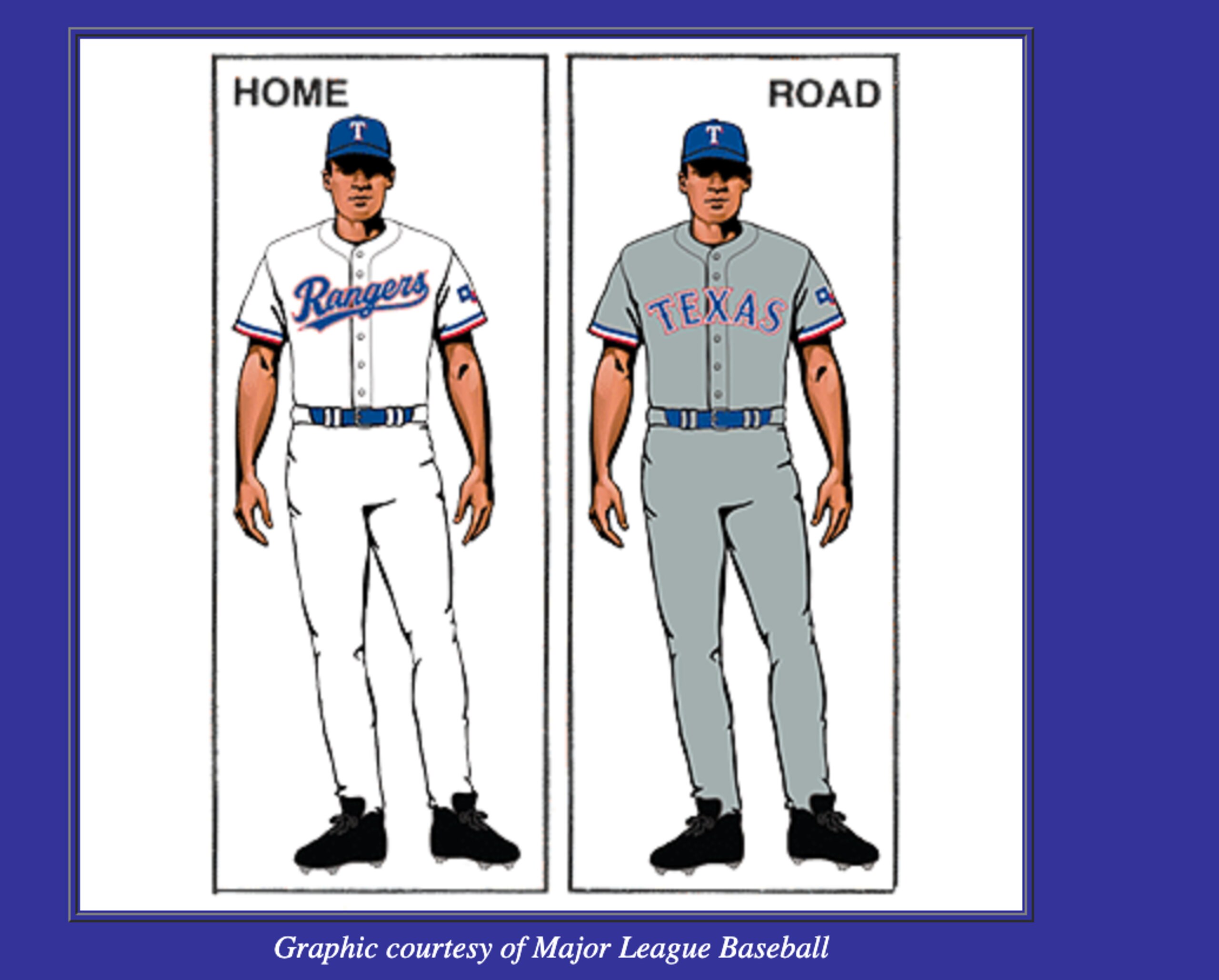
21. Texas Rangers
10 of 30
Jerseys Worn By Game in 2025: White — 53; Gray — 51; Blue — 30; Powder Blue — 14; City Connect — 14
The Rangers have one of the better road grays in the sport, with the Texas state flag on the sleeve—as you can see above on Corey Seager—giving it enough pop on top of a color that some consider boring.
Speaking of pop, the powder blues that the Rangers wear for Sunday games at Globe Life Field are probably the best threads in rotation currently for Texas:

Still, it's kind of annoying that the Rangers seem to be operating with a different template between home and the road, which they've done since the 2020 season:
The good news is there is room for the Rangers to move up this list next year. However, while their first City Connect design was bad, they may be retiring it for an even worse option.
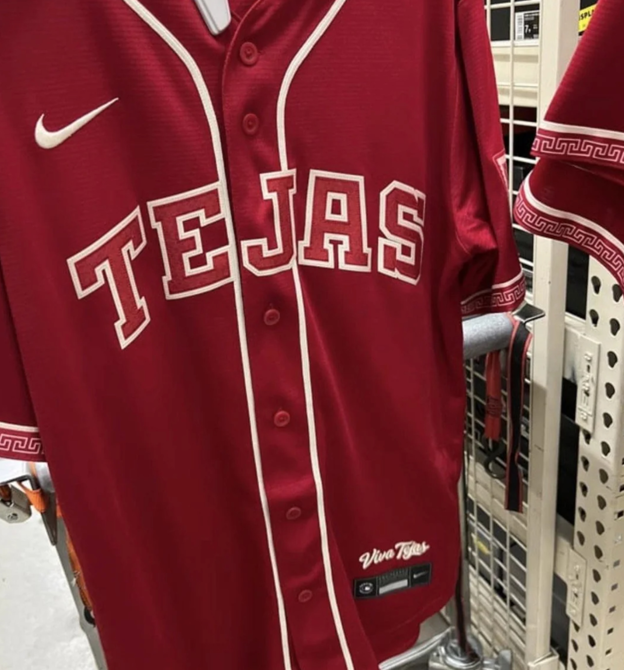
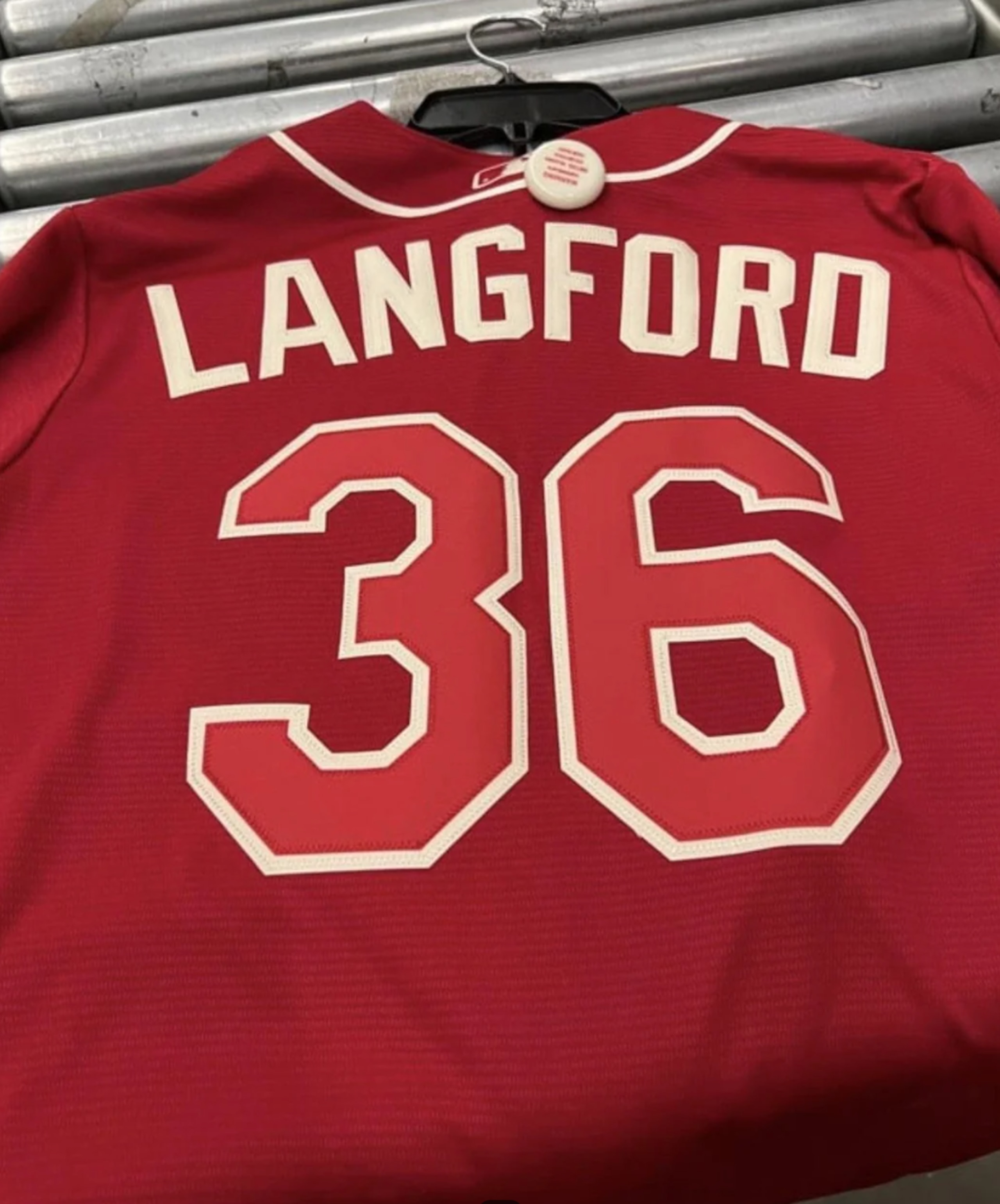
The above jersey leaked online—credit to Tha_Chadwick on Reddit—and appears to be the City Connect 2.0 design for the Rangers, which, if that's the case...woof.
20. Minnesota Twins
11 of 30
Jerseys Worn By Game in 2025: Gray — 55; White — 40; Navy — 28; Cream — 24; City Connect — 15
The Twins' current uniform set—introduced in 2023—is a mixed bag.
The home white uniforms—modeled at the top of the slide by Byron Buxton—are very good. The tri-colored helmet/cap is the best part of the look.
Minnesota's most-worn uniform in 2025 was their pinstriped road grays, but perhaps the team's navy blue alternates will cut into that in 2026. As Chris Creamer of SportsLogos.Net reported, they have gotten an update:
It may take some time to come to a conclusion on whether these navy blues are a good jersey, but they are an upgrade.
Teams like to try to put their city name across road jerseys, but "Minnesota" looks too long. Also, the outline of Minnesota is a much better sleeve patch than the Twin Cities logo that had been on the sleeve of the original navy jerseys.
Where we are still struggling is with the north star hats that the Twins wear with both their road grays and navy alternates. We get what they were going for, but the "M" still looks too close to the caps that the Marlins wore from 2012-2018:

As is done in this space every year, it's important to point out that the best jerseys the Twins have, by far, are their cream "Twin Cities" home alternates:

However, the worst are the 10,000 lakes inspired City Connects, which don't look good with the matching blue or white pants:

Realistically, the Twin Cities tops probably should have just been the City Connects. They are one of the best jerseys in baseball. Minnesota should find a way to wear them more than 15 times in 2026.
19. Chicago White Sox
12 of 30
Jerseys Worn By Game in 2025: Pinstripes — 68; Black — 53; Gray — 29; City Connect — 12
The White Sox introduced their second City Connect design last season (pictured above), a uniform that pays homage to the Bulls, who are also owned by Jerry Reinsdorf.
These might have been a cool mockup for someone to make for Instagram, but in practice, they feel very gimmicky. Also, the flying sock logo on the cap and sleeve is kind of cool, until you realize how much it resembles the GoodYear logo:

The White Sox do have three strong uniforms in their home pinstripes, road grays and black alternates. Those three, and the City Connects, will feature an ad patch for the first time in 2026:

But the White Sox are currently only using four of their five available uniform spots. Why don't think bring back their 1980s throwbacks or the popular first City Connect design to round out their rotation?


There's a lot to like with what Chicago has, but they could be even better if they eliminated their current City Connects and brought back one of the two above as alternates.
18. Chicago Cubs
13 of 30
Jerseys Worn By Game in 2025: Pinstripes — 66; Gray — 53; Blue — 30; Powder Blue — 13
While we're on the Windy City...
The Cubs introduced the powder blue alternates pictured at the top of the slide a year ago, mostly utilizing them for Friday games at Wrigley Field.
They are definitely better than the "Wrigleyville" City Connects that the Cubs wore from 2021-2024, though that's not saying much. But while there is a whole story to the powder blues, they don't really feel like a Cubs jersey. You could replace the Cubs logo with a Royals or Brewers logo and no one would bat an eye.
To be clear, the Cubs have excellent blue pinstriped jerseys that serve as their primary home uniforms, and blue alternate tops that are worn mostly on the road, but also occasionally at home.
But while those two are strong, Chicago's primary road jerseys aren't helping beat the allegations that road grays are boring:

Either there needs to be upgrades made to this top, or Chicago should wear the blues on the road more frequently.
One other note is that the Cubs will have a new jersey patch this season as they celebrate their 150th anniversary. Of course, that logo will be on whatever sleeve isn't facing the camera most, because the Motorola ad has to get the most exposure.
17. Boston Red Sox
14 of 30
Jerseys Worn By Game in 2025: Gray — 71; White — 54; Yellow — 14; Red — 11; City Connect — 11; Patriot Day "Boston" Whites —1
The Red Sox introduced a second City Connect uniform in 2025, with the Green Monster-inspired alternates (seen above) drawing rave reviews from just about everyone.
Boston did have to alter its jersey rotation to stay in compliance with Nike's "4+1" rule, though.
The Red Sox elected to keep their original Boston Marathon-inspired City Connects as a home alternate:

To do that, they had to eliminate their navy blue road alternates. That meant that the red alternate tops, previously worn at home, became a road alternate in 2025:

It does feel like the Red Sox should wear their classic home whites more often, but the locals wanted to keep the yellow and blue CCs, while the green CCs are one of the best in the history of the program.
So the way that the Red Sox are dispersing their jerseys now probably is the best arrangement.
16. Milwaukee Brewers
15 of 30
Jerseys Worn By Game in 2025: Navy — 45; White — 43; Gray — 36; Pinstripes — 24; City Connect — 14
The navy and yellow alternate tops (pictured above) that the Brewers have—which were actually their most-worn uniforms in 2025—are tremendous. Top it off with the ball-in-glove logo on the cap/helmet, and it's just great.
However, we were pretty fond of the road grays the Brewers had as part of this set, which they introduced in 2020. Those, however, are going the way of the dodo:

The Brewers have introduced a new powder blue top in this template, with Chris Creamer of Sportslogos.net saying that Milwaukee will be the first team who has a primary powder blue road jersey "since the Kansas City Royals and Montreal Expos both did so in 1991."
We got an early look at the powder blue tops in spring training:

It's a good jersey, although it can be argued that the powder blue clashes a bit with the darker shade of blue that is the primary color for the Brewers.
This is, however, very similar to the color scheme the Brewers donned from 1970-1985:

Also, while the Brewers have a matching powder blue spring training cap, it appears that when the regular season rolls around, they'll go with their two-toned road cap with the powder blues:
The grays were pretty good, but it's understandable that they were shelved for powder blue to return on the road. Hopefully, the navy blues don't see their usage scaled back dramatically with the arrival of the powder blues.
Additionally, a potential City Connect design 2.0 leaked over the weekend, courtesy of @SteveFreed13 on X:
Ultimately, we'll wait to see what the pants and caps look like with these, assuming they are the new City Connects.
Frankly, the bar is low to be an upgrade over the powder blue "Brew Crew" City Connects that the Milwaukee wore from 2022-2025.
15. Colorado Rockies
16 of 30
Jerseys Worn By Game in 2025: Purple — 61; Pinstripes: 44; Gray — 44; City Connect — 13
The Rockies introduced a second City Connect design in 2025, which is pictured above. The theme is supposed to be based on Denver sunsets. While they give off a bit more of an Arizona or New Mexico feel, they are a pretty cool alternate if you like something outside the box.
Unfortunately, they replaced one of the best City Connect designs, the Colorado license plate-themed alternates the Rockies wore from 2022-2024:

The Rockies only have four uniforms, so they presumably could use the original City Connects as an alternate, the way the Red Sox did with their first CC. Although considering how bold both are, it might be overkill to have both CC designs in rotation at the same time.
Colorado's look has actually become pretty classic, with home pinstripes and road grays that incorporate enough purple to not look like the Yankees or White Sox.
The purple alternate tops were the jerseys that the Rockies wore most last season, mixing them in both at home and on the road. Some people don't like purple, but these are sharp:

The Rockies don't have much of anything going for them on the field, but they have a nice uniform rotation that pops under the incredible Denver sunsets at Coors Field.
14. Kansas City Royals
17 of 30
Jerseys Worn by Game in 2025: Powder Blue — 62; Gray — 38; White — 33; Blue — 19; City Connect — 10
The Royals leaned all the way back into their powder blues a year ago, wearing the tops more frequently than any other. They looked the best on the road, when paired with matching powder blue pants and a tremendous tri-colored batting helmet, as pictured on Bobby Witt Jr. above.
Because the Royals wore the powder blue the most last season and the whites they wear at Kauffman Stadium are classic, they are above some other teams who perhaps have a deeper uniform set.
Not that there was anything wrong with the whites before, but Chris Creamer of Sportslogos.net did note that the Royals brightened the blue on them this season, which when compared to the prior shade does seem to be an improvement:
Where the Royals really need to upgrade is with the block lettering font that they switched to before the 2022 season:


Here's a couple pieces of feedback:

Our appreciation for Kansas City leaning into the powder blues is so strong that they are at this spot. With some additional tweaks, the Royals could potentially push to get into the top 10.
13. Philadelphia Phillies
18 of 30
Jerseys Worn By Game in 2025: Gray — 81; Pinstripes — 39; Cream — 22; City Connect — 13; Powder Blue — 7
The introduction of the Phillies' City Connect jerseys in April of 2024 was problematic on two fronts.
First of all, the gothic "Philly" front is brutal, and while the colors of the City Connect are based on Philadelphia's flag, no jersey in the history of the team has felt less connected to the franchise's lore:

Beyond the City Connect not being aesthetically pleasing, the Phillies had to ditch their red tops, which not only were their Spring Training jerseys, but also worn on "getaway days" on the road. But over the past two seasons, the Phillies have just been forced to wear their gray jerseys—pictured at the top of the slide—81 times.
As has been established by now, gray jerseys shouldn't be entirely dismissed. The Phillies road grays look particularly sharp early and late in the season when it's cold enough that players where long red sleeves underneath them.
At the same time, it makes no sense for the grays, the primary road jersey, to be wore 42 more times than the red pinstripes, the primary home jersey.
Under the current arrangement, the Phillies could have a four-game home series beginning on Thursday and not wear their primary home jerseys once because powder blues are worn on Thursdays, City Connects on Fridays and the creams for all non-Thursday day games.
There aren't enough slots for all the home jerseys, and yet players are unsatisfied by wearing gray for every road game.
So, when last postseason rolled around, the Phillies got special permission from MLB to wear their powder blue jerseys on the road in the NLDS against the Los Angeles Dodgers. It didn't help them to beat out the eventual World Series champions, but they looked pretty good in defeat:

The powder blues have been worn by the Phillies as a Thursday home alternate since 2018. But they were originally the club's primary road jersey from 1972-1988. They work as a road alternate, perhaps even more than at home.
As far as we can tell, though, the issue is that the Phillies have to pack an entire second uniform set when wearing powder blues on the road. When they wore the red alternates on the road, it was just a different jersey, but the same hats, pants, socks, cleats etc. Powder blue is an entirely different template.
At the time of publication, it isn't clear if the Phillies will wear powder blue at all during the regular season on the road. Because of the logistical concerns noted above, it's probably not likely they would be worn just on getaway days like the red tops were. But maybe the Phillies could get permission from MLB to have one or two roadtrips this season where they leave the grays at home and just wear powder blue. It's hard to deny how well the powder blues look when the Phillies wear them.
The Phillies will have All-Star Game patches on both their non-ad sleeves and caps this season:

One positive for Phillies fans is that chain stitching is back on the lettering of their pinstripes, road grays and creams after a two-year absence:

Also positive is that four of the five jerseys that the Phillies have in their set are really good.
The City Connects aren't, but if those are gone in a year or two and the Phillies are able to get a more balanced rotation between their other four unis, they'll move up on this list.
12. Pittsburgh Pirates
19 of 30
Jerseys Worn By Game in 2025: "Pittsburgh" Black — 68; Gray — 41; White — 39; City Connect — 12; "P" Black — 2
There's a reason Paul Skenes almost always wears the "Pittsburgh" black tops when he's pitching, regardless of whether it's at home or on the road—they are big, stupid fire.
The white home jerseys that the Pirates have are fine, but when they aren't wearing the black tops on the road, their primary grays are also very good:

Where many teams can't find a way to make their city name look good on the front of a jersey, the cursive "Pittsburgh" script utilized on the front of both the black and gray tops is about as good as it gets.
On the opposite end of things were the Pirates' original City Connect jerseys, which were retired after the 2025 season. For a franchise with such a great history of incorporating yellow into uniforms, the yellow "PGH" jerseys were very lazy. The spray-painted helmets make the two-toned helmets the Jacksonville Jaguars wore from 2013 to 2017 seem not so bad.
Reddit user DannoTheIceman posted the following jersey, which seems to be the second attempt at a City Connect for the Pirates:
Eh. We'll wait to see the full design with the pants and hat, but this doesn't do much on first glance. It's better than the original CC, but did the Pirates really need another black jersey?
One other note for the Pirates is that they should find a way to incorporate the Willie Stargell-inspired batting practice caps into the game rotation more often:

Like with Pennsylvania's other team, the Pirates have a largely good uniform set that is dragged down a bit by a poor City Connect. The difference for the Pirates is they have a strong alternate top that is consistently worn both at home and on the road.
11. Baltimore Orioles
20 of 30
Jerseys Worn By Game in 2025: White — 51; Gray — 42; Black — 32; Orange — 26; City Connect — 11
We gave the Royals credit for bringing back the matching powder blue pants with their powder blue jerseys.
As you can see above, the Orioles did something similar last season, mixing in the matching orange pants to go with their orange alternate tops. It would be overkill for this to be a full-time uniform, but it's an excellent alternate.
For as great as the orange tops, home whites and road grays are, it's the black alternate tops—paired with the black O's cap with an orange brim—that is the best look in Baltimore:

Orange and black is a tremendous color scheme, one that the Orioles are prepared to add to in 2026 with the addition of a cap that's stylized like the caps they've worn with their City Connect uniforms introduced in 2023.
This one, though, is orange and black, as opposed to being the CC cap being all black with the "B" in white:
As Chris Creamer of SportsLogos.Net pointed out, we're still waiting to hear exactly when the Orioles will wear these caps. Hopefully their addition doesn't mean the "O's" caps are being retired.
The Orioles are retiring their first City Connect uniform, and u/andrew_cosentino on Reddit seems to have posted the first picture of what may be the second CC design:
Perhaps a CC wasn't necessary given the four other uniforms are strong, but this would represent a clear upgrade over the original black CCs. "BMore" may feel a bit gimmicky, but the color scheme really makes you think of Camden Yards, arguably the nicest stadium in the sport.
10. Detroit Tigers
21 of 30Jerseys Worn by Game in 2025: Gray — 81; White — 70; City Connect — 11
There was something special about the Tigers, for many years, following the same model of the New York Yankees and just having a home white uniform and a road gray.
But Pandora's box was opened when they introduced their "Motor City" City Connect jerseys, which not only broke the two-jersey duopoly, but lowered the quality of the kit because they are so ugly:

Now, as you can see at the top of the slide, the Tigers have added two new alternates for 2026.
The first is a tremendous navy blue alternate that has looked great in Spring Training:

The second is a bright orange home alternate:

For our money, the navy blue alternates are well executed, while the orange ones look like a poor attempt to replicate what the Orioles and San Francisco Giants have made work. Just adding the navy, a color that can be worn at home and on the road, would have sufficed.
9. Toronto Blue Jays
22 of 30
Jerseys Worn By Game in 2025: Blue — 51; Powder Blue — 41; White — 35; Gray — 21; City Connects — 13; Red — 1
The Blue Jays made a deep playoff run last season, often wearing their blue and white alternate caps, as opposed to their primary all blue caps.
Additionally, it's become clear that while the white and gray jerseys may technically be their two primary uniforms, the Blue Jays are trending towards their two shades of blue—which both can be worn at home and on the road—being the base looks.


Both of these are excellent uniforms, but it's unfortunate that they seem to be getting worn more frequently at the expense of the road grays. The Montreal Expos had arguably the best road grays, but since they relocated and became the Washington Nationals in 2005, Canada's lone remaining team arguably took that crown:

Finally, there are a couple notes on uniform patches. First of all, the lime green "TD" ad patch is awful. It's such an eyesore on a template that's blue, white and red. The second note is more positive, as the Blue Jays will have a patch on the opposite sleeve this season that commemorates their 50th season of play:

Overall, the Blue Jays have a strong uniform set, which is highlighted by arguably the top script font in all of sports.
8. Atlanta Braves
23 of 30
Jerseys Worn By Game in 2025: White — 54; Gray — 40; Red — 30; Navy — 23; City Connect — 14; Navy Speedway Classic — 1
According to the excellent site Uniform Lineup, the Braves wore their gray road jerseys 13 times between March and April, but just 27 times the remainder of the season.
That's a shame because the road grays for the Braves feel classic, giving off the vibes of watching Greg Maddux, Tom Glavine, John Smoltz, Chipper Jones and Andruw Jones at Turner Field.

By the end of the season, it felt like a rare occurrence to see the Braves wearing their road jerseys during road games. Not only did they continue to don their navy blue alternate tops frequently on the road, but the red tops—which had mostly been worn for Friday home games in prior years—also were added heavily into the mix on the road, as you can see at the top of the slide.
The good news for the Braves is that even if we would like to see the grays more often, both the navy blue and red are strong alternate tops. It is fair to wonder if in the coming years the Braves will altogether ditch gray, opting for navy and red on the road.
That would leave them room for their classic home whites, their current City Connects and another alternate. Maybe it means their Hank Aaron Era-inspired "The A" City Connect jerseys just become a permanent alternate. Another option could be to bring back the cream alternates that the Braves last wore in their World Series winning season of 2021:

Our wish would be to see the Braves keep gray in the mix, even if it's not as often as it used to be. But their whole uniform set is good enough to overcome a dramatic drop usage of the grays.
7. San Diego Padres
24 of 30
Jerseys Worn By Game in 2025: Sand Brown — 65; Pinstripes — 56; Brown — 16; Camouflage — 14; City Connect — 11
The rebrand that the Padres did prior to the 2020 season has just the right amount of brown, with the home pinstripes that feature the swinging Friar sleeve patch among the best uniforms the sport has to offer today.
San Diego does have a brown top in rotation, which would probably be too much if it was worn regularly. But it was worn 16 times on the road last year, making it the perfect compliment to the Sand Brown pinstripes that the Padres usually sport away from Petco Park:

Where many teams have tried and failed at executing a camouflage uniform, the Padres have nailed it with their Sunday home tops that pay homage to the city's strong ties to the armed forces:

Regardless of how you felt about the polarizing pastel City Connect uniforms that the Padres wore from 2022-2025, they are now a thing of the past. San Diego has already teased their second City Connect design, which is set to be unveiled in April:
We'll see how the second CC comes out, but the four other jerseys the Padres have right now give them the best rotation in franchise history.
6. San Francisco Giants
25 of 30
Jerseys Worn By Game in 2025: Gray — 76; Cream — 50; City Connect — 14; Orange — 12; Black — 10
Whether it's their orange alternate tops or home creams, the Giants have at least two classic uniforms in their rotation. Really, the only uniform that probably should be upgraded are their road grays, but they aren't offensive either.
The Giants introduced their second City Connect design a year ago, which are worn on Tuesday games at Oracle Park and serve as "a tribute to the city's music scene":

The Giants probably could have opted out of the City Connect program altogether, but their second CC design is fun and certainly an improvement over the well-intended-but-poorly-executed fog over the Golden Gate bridge first design the team wore from 2021-2024.
New in 2026 is that the Giants are bringing back the "Gigantes" branding for an alternate top that will be worn for Saturday home games:

These feel unnecessary, specifically if they ultimately come at the expense of the team's "SF" black alternate tops. But they aren't enough to drag down what is an otherwise very strong rotation of unis.
5. Seattle Mariners
26 of 30
Jerseys Worn By Game in 2025: Navy — 63; White — 52; Northwest Green — 18; City Connect — 16; Creams — 13
Between Cal Raleigh's 60-homer season and finishing a win away from their first trip to the World Series in franchise history, the Mariners took center stage in 2025. They looked really good while doing so.
They do have new Sunday jersey in 2026, with the Seattle Steelheads Negro Leagues jerseys becoming their new Sunday threads:

These are excellent, but their addition is bittersweet, because they come at the expense of the cream Sunday jerseys which the Mariners had worn since 2015, which was arguably their top jersey:

Still, there's a ton to like, as the Mariners celebrate their 50th season of play with a pretty cool sleeve patch:

The "Northwest Green" alternates pictured on Raleigh at the top of the slide are one of the best alternates in the sport. When paired with the navy blue tops that are now the primary road jerseys, the M's have been able to pull off not having a road gray for the last three years:

Still, their home white jerseys are arguably the worst in their current rotation, and the Mariners have enough other jerseys that they could conceivably consider ditching white at some point. That probably won't happen, but the gray road threads that they last wore in 2022 were pretty good, as are the aforementioned creams.

We're just nitpicking, though. Seattle has a color scheme that really feels like it fits the city. It could be better, though.
4. Los Angeles Dodgers
27 of 30
Jerseys Worn By Game in 2025: White — 70; "Dodgers" Gray — 49; "Los Angeles" Gray — 31; City Connect — 10; Gold White — 2
The Dodgers are at their best when they keep things simple. Their home whites are iconic, arguably rivaling the Yankee pinstripes—more on them in a minute—as the most classic home uniform in baseball.
It's probably not necessary to have two different road gray jerseys, but the Dodgers have for some time, and they both look good:


The Pop-Tarts looking City Connects that the Dodgers unveiled in June of 2024 aren't as bad as the all-blue first design, but they aren't very good. Above all else, they just feel unnecessary.

The Dodgers also wore home jerseys with a gold script, number and name font for the first two games at Dodger Stadium last year, and opened with a different gold variation for the 2026 season as the two-time defending World Series Champions:

Can the Dodgers become the first team since the 1998-2000 Yankees to three-peat? If so, it will be interesting to see what gold updates they make for 2027.
3. New York Yankees
28 of 30
Jerseys Worn By Game in 2025: Pinstripes — 81; Gray — 81
The Yankees continue to keep things simple, and it continues to work for them.
81 times every regular season, they'll wear gray on the road. The Yankees went to a much simpler "New York" script in 2024, and as you can see on the picture above of Aaron Judge, it looks much better than when the script and numbers had white trim:

And, of course, what needs to be said about the home pinstripes, which are arguably the most iconic jersey in sports:

To this point, the Yankees have resisted adding a City Connect jersey or any alternate tops. We're not against most other teams having those, but there's no reason for the Yankees to alter what they've been doing.
2. Athletics
29 of 30
Jerseys Worn By Game in 2025: Gray — 67; White — 59; Yellow — 23; Kelly Green — 13
For all that John Fisher has done wrong as owner of the Athletics, he hasn't made dramatic changes to the team's iconic green and gold uniforms. Hopefully there isn't a temptation to do that whenever the team does wind up move to Las Vegas.
For now, the A's are calling Sutter Health Park in Sacramento their temporary home. The A's reintroduced yellow alternates last season for the first time since 2018. This year, they'll change the script on the yellows from "Athletics" to Sacramento":
Maybe it takes some getting used to—not that there will be much time to do that—but Sacramento is a little too long to look great on the front of a jersey. At least the fans being used as pawns in Sacramento will get something out of this.
The home whites remain legendary. The road grays looked better when they said "Oakland," as opposed to "Athletics," but they are still very good. (They'll also likely only have the team name on the road tops until they move to their permanent home.) Kelly Green is probably the best look that the A's have, so they need to ramp those back up this year. There's no scenario where it makes sense for yellow to be worn more frequently than Kelly Green.
One note for when they make their move back to Las Vegas: Can the dark green alternates that read "Athletics" in a cursive yellow script return? They were last seen in 2013.

Again, we're holding our breath that this franchise won't do a total rebrand when they move to Las Vegas. Right now, they're near the top. Pretty much any rebound would push them to the bottom.
1. St. Louis Cardinals
30 of 30
Jerseys Worn By Game in 2025: Gray — 70; White — 56; Creams — 12; City Connect — 12; Powder Blue — 10
Also in the mix for the most iconic home jerseys are the home whites of the Cardinals, which feature the perched birds on the baseball bat.
But what the Cardinals have been able to do better than most of the classic franchises is incorporate alternates that are as good, if not better, than their home white and road grays.
The powder blue jerseys—modeled by Masyn Winn at the top of the slide—are worn for Saturday road games. These were originally worn as the primary road jerseys from 1976-1984. You could make the case they are the best powder blues in baseball, although the Phillies might have something to say.
For Saturday home games, the Cardinals have equally impressive cream alternates:

Perhaps you can question whether the City Connect uniforms that the Cardinals introduced in 2024 are necessary, although the team is named after a red bird, so they probably should have a red top. The only real complaint from here is that the "STL" hats look like something from an airport gift shop. They should be swapped out for the classic Cardinal caps:

Overall, the Cardinals have the best uniform set in baseball.
.png?w=2560 "MLB Power Rankings")

.jpg?w=2560 "Vita Vea Requests Trade")
.png?w=2560 "Madden 99 Club Revealed")


.jpg?w=2560 "Bills Reveal New Unis")


.jpg?w=2560 "Fans' NBA Community GOATs 🐐")