
Ranking the Best and Worst Uniforms in Cleveland Cavaliers History
The Cleveland Cavaliers' uniform history, much like their play on the court, is a case study in extremes.
The Cavaliers' inaugural uniforms featured a feather. Then there were the checkers. Later, a basketball hoop lodged into a "V" in the 1980s and a blue streak in the 1990s.
Ironically, Cleveland's better uniform designs have been accompanied by winning teams. Think of the aesthetically pleasing unis worn by Cavalier greats Mark Price and LeBron James. To that end, some of the team's mediocre jerseys have been worn by plenty of mediocre players and teams.
There were rumblings this summer that a uniform redesign could be in store for the Cleveland Cavaliers in the next few years, given, presumably, a return to relevancy. After all, the Cavaliers have already unveiled a new floor design this preseason.
Here, we rank the three worst and then the three best uniform designs in Cleveland's 45-year history.
No. 3 Worst: Contemporary Home Whites, 2010-Present
1 of 7
In LeBron's first season in Cleveland, the Cavs debuted new uniforms. In LeBron's first season in Miami, the Cavs debuted new uniforms. Purely a coincidence.
These white uniforms, with the wine lettering and striped gold-and-wine neck and shoulder linings are fine. I like that the Cavs traveled back in time to embrace a more similar shade of wine to that used on the 1970s and early '80s uniforms. But those weren't particularly memorable, either.
When it comes to uniforms and team logos, I prefer understated to overstated. After all, Cleveland is very much a blue-collar, put-in-what-you-get-out kind of city. This is especially true when you're talking about a team that's wrapping up a miserable four-year stretch.
But now, with LeBron here again, perhaps the league's most potent Big Three and a flashy Israeli coach in David Blatt, maybe it's time for something bolder. The team has already beautifully redesigned The Quicken Loans Arena court, featuring Cleveland's skyline.
Hopefully the unis are next.
No. 2 Worst: Feathered ‘C,’ 1970-1974
2 of 7
I just don't get the appeal here. A feathered "C"? Cursive lettering that resembles a second-grader's mediocre penmanship. Nothing about this indicates an intimidating opponent. Let alone that putrid shade of shiny gold, which borders on a mustard yellow.
I'll give these uniforms a bit of a pass because they were among the team's first, and because I love Austin Carr, the current Cavs color analyst who was drafted No. 1 overall in 1971.
That "r," though, may wind up in my nightmares.
No. 1 Worst: Beige, Wine and Whites, 1981-1983
3 of 7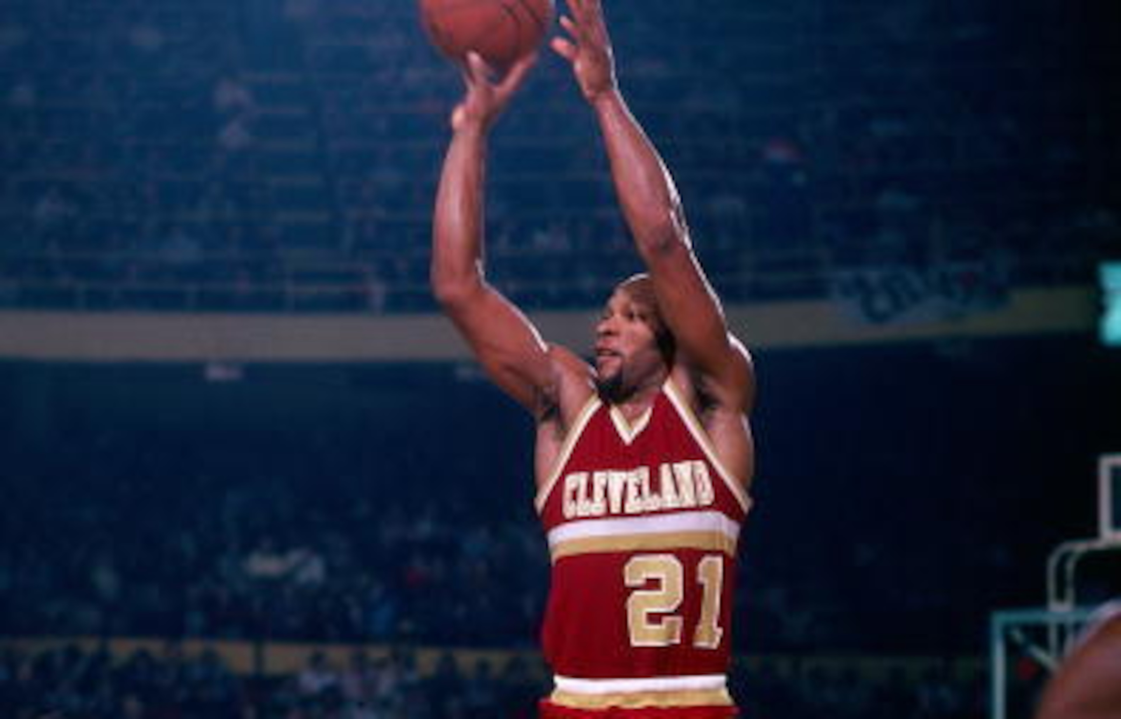
Imagine trading the wine on these jerseys for beige? That's what the Cavs wore; fortunately for your eyeballs, there are no photos of the beige in the B/R database. Click here to view them.
With that mental picture in mind, aren't these hideous? But what more could you expect from the stewardship of Ted Stepien, who traded away draft picks like Dunkaroos and tried to push the Cavaliers halfway across the Northeast. Stepien acquired the team in 1980, a year before these uniforms debuted.
The uniforms featured a darker shade of wine for the letters and numbers. The white used on the linings and middle stripe had only previously been used in the checkered formations under the arms of the 1974-81 uniforms. The dominant beige (yikes) had never previously been used.
Like all other pathetic uniforms in this team's history, the team found a way to be bad in them, finishing 66-180, according to the team’s website, before a much-needed redesign in 1983. Thankfully, a new owner, Gordon Gund, came along with the new look.


No. 3 Best: White, Orange and Blues, 1994-1997
4 of 7
My love for these jerseys is at least partially irrational. I mean, that's a pumpkin-orange outline.
Aside from the orange, the most notable aspect of these jerseys is the blue streak. I'm not entirely sure what the desired shape is here, though, the dip in that streak is similar to the sharp-edged dip in the "C" on the 2003-10 uniforms, which turned the "C" 90 degrees counterclockwise.
The orange, almost brown, that outlines the "CAVS" is much darker than the uniforms of the 1980s. It's almost Halloween-y.
These uniforms came at a good and bad time for the franchise. On one hand, the team was moving to a state-of-the-art downtown facility, Gund Arena. Terrell Brandon was on the cusp of emerging as one of the league's better young point guards. On the other, the days of Mark Price, Larry Nance, Brad Daugherty and those late-1980s, early-1990s winning clubs were winding down.
The Cavs traded these road unis in '97 for about an exact replica, albeit with the orange moving to the inside of the outline, for the 1997-99 seasons.
No. 2 Best: Orange and Blues, 1987-1989
5 of 7
These uniforms are straight-up awesome. They debuted in 1987 and were the same design scheme as the 1983-1987 jerseys, minus a color change. The '87 jerseys traded orange for blue as the dominant color, with orange lettering/numbering and a thin white outline.
The reasons I rank these over the orange predecessors is simply a matter of color preference. The blue is more understated, as opposed to the flashy orange. If Cleveland was, say, the Showtime Lakers in the 1980s, the orange would make more sense.
But those '83 jerseys introduced two pretty revolutionary concepts to Cleveland uniforms that were continued with these 1987-89 uniforms. For one, they featured "CAVS" as opposed to "Cavaliers," which would stick until the 2003-04 season. The shorter "CAVS" allowed for a bolder, larger, all-caps font. Secondly, they turned the "V" into a quasi-hoop, with a ball wedged in the middle.
Cleveland made the playoffs each of the two seasons the team wore these jerseys. In the 1988-89 campaign, the Cavs won 57 games and Mark Price was All-NBA Third Team.
No. 1B Best: Road Wine & Golds, 2003-2010
6 of 7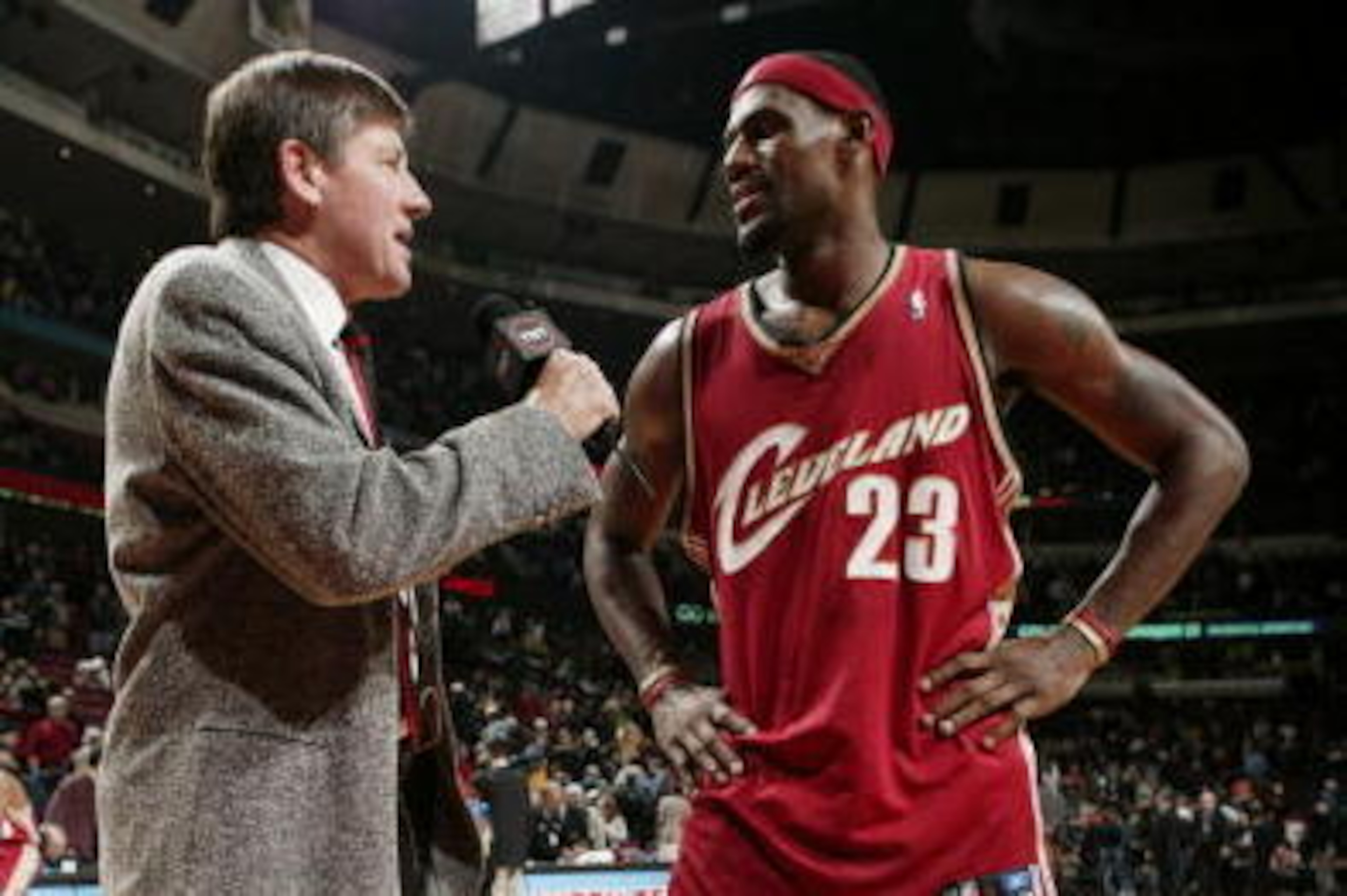
The best jerseys in Cleveland Cavaliers history. Well, kind of.
The Cavs wore these wine-and-gold uniforms from 2003-2010, otherwise known as the LeBron James era. As a consumer, I prefer the darker road jerseys to the home whites because, well, you never know where that pizza sauce is gonna land!
As with every jersey design since 1989, the darker unis featured "Cleveland" in bold type across the front, whereas the whites featured either "Cavs" or "Cavaliers," according to the team's website. I prefer the former, especially in an era marked by a hometown kid who talked openly about his relationship with the city and dreams of putting Northeast Ohio on everyone's map.
The dark shades of wine and gold are a beautiful contrast, with the gold columns running from beneath the armpit on to, ideally, the end of the shorts. The bold "C" on Cleveland seems a symbol from "Cleveland," "Cavaliers," C-Town or whatever other alliterative element you’d like it to be. Same for the smaller "C" above the player's last name on the back.
The placement of the number on the front of the jersey—strategically situated beneath the "Land" in "Cleveland" is another point of regional pride, serving as a precursor to LeBron's present-day #TheLand shtick. And the jerseys didn't completely ditch the blue from earlier eras, moving it to the neck and under-the-shoulder linings like the 1983-87 uniforms.
These jerseys, of course, also had the benefit of being worn during times of success. The Cavs were 349-225 from 2003-2010, easily the best winning percentage of any uniform period.
No. 1A Best: Alternate Navy Blues, 2003-2010
7 of 7
I also love these navy blues, though.
The alternates, like the road wines, were worn from 2003 to 2010. And a few of the positive attributes there, such as the bold "C" and "Cleveland" over "Cavaliers" on the front, carry over. The two Cleveland jerseys currently in my closet—an authentic No. 1 Daniel Gibson and No. 11 Zydrunas Ilgauskas, since retired—are of this variety.
The reason I give these uniforms a very slight edge over the road wines is the history. The checkered wine, gold and blue rectangles underneath the arms and on the neck lining pays homage to the 1974-1981 Austin Carr-era unis, even without copying the color scheme. Those jerseys featured dark red/wine, bright gold and white checkers.
The navy blues also had the benefit of being worn during two of the most iconic games of LeBron's first go-round in Cleveland: the close-out game at the Verizon Center in 2006, when Damon Jones hit a corner jumper in overtime to push Cleveland to Round 2, and LBJ's superhuman Game 5 takeover at The Palace during the 2007 Eastern Conference Finals.


.png?w=3840 "Every City's 2000s Mt. Rushmore 🤩")
.jpg?w=3840 "Watch: Jerry Rice Chases After Heckler")


