Ranking Every Premier League 2015-16 Home Kit
Long gone are the days when a Premier League team might keep a shirt design for longer than a season: It's all change in every campaign now as the manufacturers find different ways to keep the replica shirt revenue stream alive.
B/R has taken the liberty of ranking the home jerseys of every 2015-16 Premier League team in a campaign where retro touches, unusual trims and absurdly large sponsor logos appear to be the status quo.
Take a look at the ranking and leave your opinion in the comments...
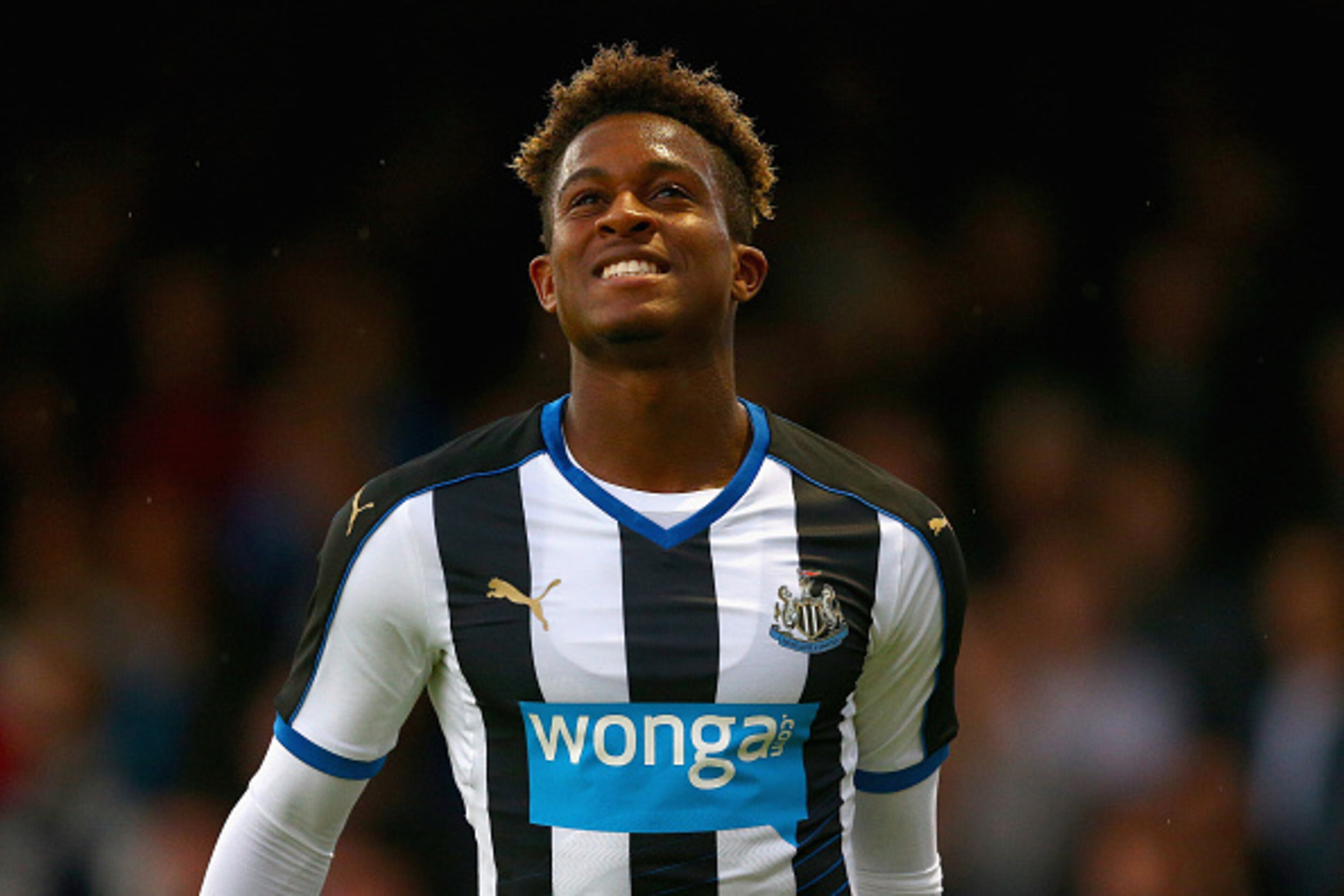
20. Newcastle United
1 of 20Oh, Newcastle. Where do we start with this one?
The Magpies' iconic stripes have been infiltrated by the blue hue of their controversial payday loan sponsor on the front and completely abandoned on the back. And you just know that the fit will be tighter than the sensation of being wrapped in cellophane.
It's no surprise that fans have started selling their own design that won't line owner Mike Ashley's pockets.
19. Watford
2 of 20
Puma are having a bit of a 'mare so far in this ranking. Newcastle's abomination is closely followed by Watford's strip that looks like they are taking the hornet motif a little too seriously.
Here's what you could have won, Watford fans.
18. Norwich City
3 of 20
There's nothing too offensive about Norwich City's unspectacular home kit, but one must look at it in context: Their away strip is green with yellow stripes, while their third kit is a horrendous striped concoction from the same colour palette, and it looks like a cross between a rugby shirt, a Christmas jumper and a McDonald's uniform.
Congratulations Norwich, you've produced three kits that are all basically the same colour!
What will you wear when you play all those other teams who have yellow and green strips? You might get drawn against the Green Bay Packers in the cup.


17. Crystal Palace
4 of 20
With its Barcelona colours and T-shirt collar, Crystal Palace's kit is an improvement upon last year.
But something isn't quite right about it: The two stripes on the front are wider, even though the stripes on the back are all the same width, and the sponsor actually appears to be a little off-centre.
Still, Yohan Cabaye could make a bin bag with holes cut in it look good. Vive la Croydon!
16. Liverpool
5 of 20
Warrior—the folks who put a "Gloryhole" in their boots—and their parent company New Balance have given Liverpool some fairly dodgy outfits in recent seasons.
The 2015-16 lineup is much less offensive, but the home shirt loses points for the needless faux collar and the strange mishmash of patterns on the famous red livery: Look closely and you see a check pattern on the top and stripes on the bottom.
15. Tottenham Hotspur
6 of 20
Never underestimate the lobbying ability of car safety campaigners. Such is their influence that they've managed to make Tottenham appear like they're wearing seat belts in 2015-16.
Buckle up for the new season, Spurs fans!
14. Aston Villa
7 of 20
Will Aston Villa have a thrilling season? When you consider an unremarkable Macron shirt design with a sponsor that makes accountancy software, the sartorial gods are not looking down kindly on Tim Sherwood's men.
13. Sunderland
8 of 20
With its black trim and use of white as the dominant colour, this is one of the better Sunderland kits in recent years. But its downfall is the problem that affects so many shirts in this league: an oversized unattractive sponsor's logo slapped in the middle of it. Shame.
12. Manchester United
9 of 20Manchester United's new deal with Adidas has allowed them to resurrect their classic designs of the 1980s.
The shirt is good-looking, but it is let down by the large tacky looking Chevrolet logo. It's definitely more Aveo than Corvette.
11. Bournemouth
10 of 20
Bournemouth have flirted with stripes on their kits for many years and have opted to become the first Premier League team to wear red-and-black ones on their home kit.
Dean Court is going to look like a Dennis the Menace convention for the next 10 months.
Also, it's worth noting that the Cherries clearly have one of the worst crests in British sports.
10. Arsenal
11 of 20
Arsenal's kit last season was a winner, even if its tightness cut off the circulation and exposed the pot bellies of the members of the fanbase who spend more time in the pub than the gym.
This season's design looks a little less "clingy," but it has added some unnecessary fussy details, like a new collar and gold piping. Presumably, the gold was a pre-emptive commemoration of their pre-season treble of Emirates Cup, Barclays Asia Trophy and the Community Shield.
9. Southampton
12 of 20
It's impossible to dislike Southampton. Unless you are from Portsmouth or you're a Liverpool fan wondering what happened to all those players you were sold by them.
It's also impossible to dislike this neat Adidas kit, which sees the Saints back in their traditional stripes once again.
8. Everton
13 of 20
Everton had a good-looking kit last season, and the main tweak here is the collar, which sees the reintroduction of the white triangle they sported in the 1980s.
Wayne Rooney has proven that the royal blue strip isn't slimming, but it's a great design.
7. Swansea
14 of 20
That's not gold trim and delusions of grandeur you spy on Swansea's new kit—it's copper, which gives a nod to the Welsh city's copper mining heritage.
The result is very tasteful, save for the large zany logo of the Hong Kong financial company sponsor.
6. Leicester City
15 of 20Sometimes, less is more.
Leicester will be fighting the drop in this campaign in bold and uncomplicated Azzurri blue in order to make Claudio Ranieri feel at home.
The second and third kits are also winners. Not that they'll win an awful lot of points wearing them, though...
5. West Bromwich Albion
16 of 20
West Brom's highly contentious pinstripe shirt of last season was about as popular as a hedgehog in a condom factory, so their 2015-16 is a strong return to form.
The Baggies' new threads feature an attractive red trim, and they've managed to make one of those highly-fashionable-but-meaningless-to-western-audience Asian betting sponsors fit well into the design.
4. Stoke City
17 of 20
Stoke's home jersey isn't a million miles from the one they sported last season, but a few subtle improvements have been made: The collar is rounded and the red stripes have some lovely pinstripes within them.
It's also a great example of how to make a sponsor's logo fit seamlessly into the design.
No wonder half of Barcelona's alumni want to wear one.
3. Manchester City
18 of 20
Manchester City had one of the best kits last season, and Nike have pulled it out of the bag once again, replacing the dark trim with a more traditional white and adding a neat collar.
Their away kit—with blue moon prints on each arm—is a bit of a looker, too.
So, it appears Raheem Sterling upgraded his bank balance and his work wardrobe.
2. Chelsea
19 of 20
Chelsea's home shirt brings back the red trim from the 1980s and 1990s and a collar with a couple of functional buttons for those balmy November nights in west London.
But the Blues' real kit coup is their white away kit. With tricolore stripes on the arms and a simple plain white body, it is a thing of beauty.
Plus, new sponsor Yokohama will give the tabloids plenty of tired/tyred puns during the run-in.
1. West Ham United
20 of 20This season, West Ham United have gone old school by hiring a popular former player as manager and by producing a strip that evokes memories of days gone by in their final season at Upton Park.
Umbro's clean and simplistic strip is absolutely spot on—it looks like the kind of uniform Bobby Moore and Geoff Hurst would have sported.
Bleacher Report is also reasonably assured that no taxpayer money was used to produce this kit.


.png?w=3840 "Offseason Moves Sure To Backfire 💥")

.jpg?w=3840 "Watch: Jerry Rice Chases After Heckler")

_0.png?w=3840 "Summer League Takeaways ✍️")

