")
The Definitive 2022 MLB Jersey Power Rankings
Between home and road uniforms, a number of alternate options, and the recent City Connect releases for several teams around the league, there is an abundance of jersey options for each of the 30 MLB clubs.
But which one is the best?
Ahead I've selected my personal favorite jersey that each team wore in 2022, then ranked each of the team bests from Nos. 1-30 for our definitive jersey power rankings of the 2022 MLB season.
This is as subjective as a list can possibly get, so it's unlikely everyone or even anyone is going to agree with these rankings. As such, I look forward to hearing what you, the reader, would have done differently.
Enjoy!
30. Cleveland Guardians: Home White
1 of 30")
The Cleveland Guardians were afforded a rare opportunity to completely overhaul their look with this year's name change, but they instead decided to go with an identical design.
I suppose there is something to be said for consistency and continuity, but across the board, their home, road, red alternate and navy alternate options were all extremely basic. Opting against an upgrade counts against them in these rankings.
29. Los Angeles Angels: Home White
2 of 30")
Plenty of teams have a white home jersey with the team mascot's name scrolled across their chest, but the inclusion of a halo around the "A" in Angels separates this one from the rest of the pack.
It's a subtle difference, but the tie-in to the hat and helmet logo gives this look a more cohesive feel.
28. Cincinnati Reds: Home White
3 of 30")
The Cincinnati Reds checked in at No. 20 in last year's rankings, but they were dragged down by their road uniforms which look cluttered on the front due to the length of "Cincinnati" and a font that blends together as a result of the tri-color design.
However, their home uniform is a classic, with the collared pinstriping and the dual number and logo at the same height across the chest. As far as basic white home jerseys go, this is one of the best and stands as the top choice for the Reds.

27. Arizona Diamondbacks: City Connect
4 of 30")
The Diamondbacks have revamped their jerseys multiple times in recent years, and their dive into the City Connect trend has provided yet another option for a team with seemingly countless jersey options.
The "Serpientes" wording across the chest and unique sand-colored jersey and pants combination certainly stand out in a sea of white and gray jerseys across baseball.
26. Minnesota Twins: Red Alternate
5 of 30")
The Minnesota Twins still feature the "TC" logo prominently on their hats, but their red alternate jerseys are the only ones that use it over the general "Minnesota" or "Twins" text across the chest.
It also has the old-school twins shaking hands logo over the state of Minnesota outline—one of the best old-school logos in MLB history—included on a sleeve patch. It's an underrated alternate option for a team generally sporting white, gray or navy.
25. Houston Astros: Navy Alternate
6 of 30")
Few teams have undergone more radical changes to their uniforms than the Houston Astros, from the rainbow jerseys of the 1980s to the gold-centric designs of the 1990s to the more toned-down looks of today.
The nod to those colorful 1970s jerseys in the side stripe of their navy alternates is what helps push that look ahead of their other current options, as it spices things up a bit without tipping into an over-the-top look.
24. Pittsburgh Pirates: Black Alternate
7 of 30")
The Pittsburgh Pirates would rank higher if they ever decide to bring back the vest jerseys that were worn throughout the primes of former superstars Roberto Clemente, Willie Stargell and others.
For now, their black alternates are the best of the bunch among current jersey options. The yellow secondary color really pops against the black backdrop, and the yellow text with a black interior gives it an interesting hollow look.
23. Seattle Mariners: Cream Alternates
8 of 30")
The yellow detailing and old-school yellow hat logo are what help separate this option from Seattle's more basic home white jersey, and those touches make a real difference in elevating the design.
The "northwest green" alternates were also a strong contender here, and they've been a great secondary option since Ken Griffey Jr. wore it during the mid-90s.
22. Boston Red Sox: Red Alternate
9 of 30")
I'm not a fan of the yellow City Connect jerseys that the Boston Red Sox unveiled last season, and their standard white and gray uniforms are as basic as it gets, so the choice here came down to their red home alternates or their navy road alternates.
Both are solid choices that provide a bit more pop than their standard alternatives, and it only seems fitting that red jerseys would be the go-to choice for the Red Sox.
21. Tampa Bay Rays: Light Blue Alternates
10 of 30 delivers a pitch to the plate during the MLB regular season game between the Cleveland Guardians and the Tampa Bay Rays on July 31, 2022, at Tropicana Field in St. Petersburg, FL. (Photo by Cliff Welch/Icon Sportswire via Getty Images)")
When the Tampa Bay Rays pivoted from being called the "Devil Rays," they also revamped their logo design, incorporating a sunburst logo into their jersey text.
While the sunburst is imposed over the "R" in "Rays" in their basic home and road jerseys, it is the focal point of their light blue alternate jersey. It's a great complement to their normal uniform options and stands as one of the best alternate options for any team.
20. Milwaukee Brewers: Navy Alternate
11 of 30")
The Milwaukee Brewers released their City Connect uniforms this year with a "Brew Crew" and a 414 area code theme, and while it's certainly not the worst of the City Connect options, it still slots behind their navy alternates as their best-looking jersey.
The navy and yellow hats with the terrific old-school glove and ball logo help take this one to another level, and the color combination gives this a unique feel relative to other navy alternate jerseys.
19. Texas Rangers: Powder Blue Throwbacks
12 of 30")
I'm a sucker for powder blue jerseys, and the Texas Rangers worked the color scheme into their regular rotation starting in the 2020 season when they wore them for Sunday home games.
The powder blue design is not a new one, as it's a throwback to their road jerseys that were worn in the late 1970s and early 1980s. I still think red when I think of the Texas Rangers, but these are a nice revisiting of a classic look.
18. New York Mets: Black Alternates
13 of 30")
The New York Mets used a black alternate uniform from 1998 through 2012, but the final four seasons of that stretch saw the organization slide from being a perennial contender to a sub-.500 team and an also-ran in the NL East.
The black design was dusted off for the 2021 season, and following this year's success, it might be around for the foreseeable future. It's a superior look to the white pinstripe home uniforms and basic gray road jerseys.
17. Baltimore Orioles: Orange Alternates
14 of 30")
The Orioles are one of just a handful of teams that incorporates orange into their uniforms, and their orange alternate jerseys with the multi-colored helmets and throwback logo easily rank as their best jersey option.
The overall look is similar to the pullover jerseys the team wore in the 1980s but with a number added to the front and a more standard button-down front to modernize things a bit.
16. Detroit Tigers: Home White
15 of 30")
The Detroit Tigers have had essentially the same home white jersey for the entirety of their existence, as the same uniform shown above can be seen in grainy old photos of Ty Cobb from the 1900s.
It's not the most exciting look, but it deserves a certain level of respect for being part of baseball culture for more than 100 years.
15. Washington Nationals: City Connect
16 of 30")
Nothing beats the rare instances when the Washington Nationals honor their franchise origins and wear a Montréal Expos throwback jersey, but those times are few and far between, and it seems like cheating for that to be the pick.
Instead, we'll go with the City Connect jerseys that were worn for the first time this year. The dark gray color, the bold "WSH" font and the region's signature cherry blossoms make it a unique approach for a team with extremely basic standard jerseys.
14. San Francisco Giants: Orange Alternates
17 of 30")
The San Francisco Giants revealed easily the worst City Connect jerseys to date in 2021, though the Golden Gate Bridge design on the sleeve is a cool touch. That leaves the throwback-inspired orange alternates as an easy choice for their best jersey.
The text and color scheme is reminiscent of the pullover uniforms they wore in the late 1970s and early 1980s, and it's far superior to their basic home and road options.
13. Colorado Rockies: City Connect
18 of 30")
This might be the most polarizing of all the City Connect uniforms that have been unveiled thus far, with a design reminiscent of the over-the-top "Turn Ahead the Clock" jerseys the Rockies wore in 1998.
The purple alternates are also a strong contender here, but I'm a fan of the green and white mountain design that stretches around to the back of the jersey. It's not a look that should be trotted out with any frequency, but it's a bold and unique design.
12. Los Angeles Dodgers: Home White
19 of 30")
Since moving from Brooklyn to Los Angeles before the 1958 season, the Dodgers have had the same basic look for their home and away jerseys. Names were eventually added to the back of their jerseys prior to the 1978 season, but other than that, not much has changed.
It's a classic for a reason, and the "LA" logo on the left sleeve to match the hat/helmet logo is a subtle detail that helps tie everything together.
11. Chicago Cubs: Home White
20 of 30")
The Chicago Cubs claimed the No. 4 spot in last year's jersey rankings, which focused solely on each team's standard home and road designs.
The blue pinstripe and large Cubs logo look have been a staple at Wrigley Field for decades, even remaining essentially unchanged when they joined the pullover jersey trend during the 1980s, and it will likely continue to be their home aesthetic for years to come.
10. Kansas City Royals: Powder Blue Throwbacks
21 of 30")
There is not a cooler MLB throwback than a Kansas City Royals powder blue Bo Jackson jersey.
There are a handful of teams with a powder blue option, but the first team that comes to mind when that color choice is mentioned is the Royals. The design itself is similar to a number of other teams around baseball, but the color simply takes it to another level.
9. Philadelphia Phillies: Powder Blue Throwbacks
22 of 30")
These jerseys immediately make me think of Mike Schmidt, and isn't that the point of throwback jerseys? To conjure up memories of past success and legends who once called the franchise home?
Unlike the Kansas City Royals, who generally wear white pants with powder blue alternates, the Phillies have matching blue pants that help set the design apart.
8. Toronto Blue Jays: Blue Alternates
23 of 30")
As I mentioned in last year's rankings while slotting them in the No. 5 spot, I'm a huge fan of the font the Toronto Blue Jays use on their jerseys, as it's unique to anything else found across the league.
While that font looks great on their home white jerseys, nothing beats their blue alternates that are a fitting representation of their Blue Jays namesake.
7. Chicago White Sox: City Connect
24 of 30")
The Chicago White Sox absolutely nailed their City Connect look, from the "Southside" text to the black jersey and white pinstripe look that simultaneously provides a throwback vibe and a modern feel.
Pairing that jersey with matching black pinstriped pants elevates the overall look even further, giving this one the edge over the great-looking 1980s throwbacks that were also a strong contender for this list.
6. New York Yankees: Home White
25 of 30")
One of the most iconic jerseys in all of sports, the New York Yankees have a timeless pinstriped look, and the absence of last names on the backs of jerseys helps tie the past to the present.
The fact that everyone from Babe Ruth to Lou Gehrig to Joe DiMaggio to Mickey Mantle to Derek Jeter to Aaron Judge have all worn essentially the same uniform provides a mystique that only adds to the franchise's storied tradition.
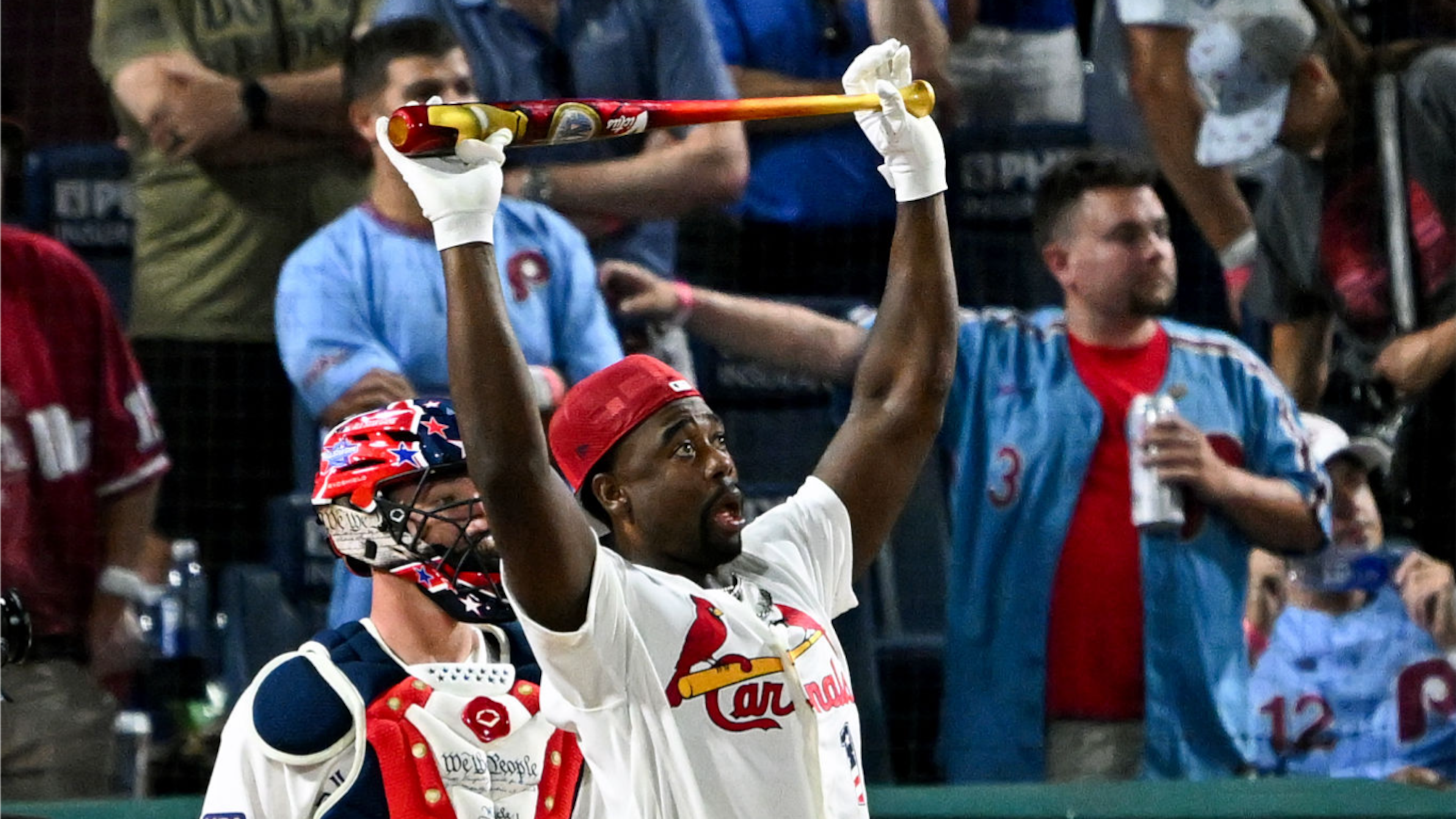
5. St. Louis Cardinals: Home White
26 of 30")
The birds on the bat are the best standard home jersey in baseball, and the St. Louis Cardinals claimed the No. 1 spot in our rankings a year ago.
All the greats over the years have worn this uniform, and the Cardinals have done an excellent job as an organization following the "if it ain't broke, don't fix it" mindset when it comes to their uniform design.
4. Oakland Athletics: Kelly Green Alternate
27 of 30")
There is not a better alternate jersey in baseball than the long-running kelly green option the Oakland Athletics use alongside their white home and gray alternate basic options.
If the team ever decides to leave Oakland and change its nickname, it should do everything in its power to keep green as at least a secondary color in its design, if only to keep this color scheme in the rotation.
3. Atlanta Braves: 1970s Throwbacks
28 of 30")
Hot take: These should be the Atlanta Braves' primary home jerseys.
Worn from 1972 to 1975 and sometimes known as the "Hank Aaron era" throwbacks, this is the jersey that Aaron was wearing when he broke Babe Ruth's all-time home run record in 1974.
It's a timeless look, and other details like the lowercase cursive "a" on the hat and the feather logo on both sleeves help elevate this design even further.
2. Miami Marlins: City Connect
29 of 30")
The Miami Marlins released their City Connect jerseys in 2021, and the story behind them is a big reason why this option ranks so high.
The design is a nod to the Cuban Sugar Kings, a minor league team based in Cuba that was a Triple-A affiliate of the Cincinnati Reds from 1954-60. Not only is it a great-looking uniform, but it's also the perfect hat tip to the surrounding community and Miami's large Cuban population.
1. San Diego Padres: City Connect
30 of 30")
These are my favorite City Connect jerseys.
Too many of the City Connect designs played it safe and were a narrow departure from the existing uniforms. This was a completely new spin on things for the Padres, and wasn't that the point?
"The Padres and Nike did the right thing in trying to tap into Mexican culture in Southern California and executed it well. Latin players are going to love these; a lot of them already wear these colors on cleats and wrist bands. They bear a stark resemblance to the "Miami Vice" uniforms the NBA's Miami Heat have been putting out, which is probably no coincidence given Miami's Latin influence," wrote Alden Gonzalez of ESPN.
I would be remiss to not make an Arizona Iced Tea reference here, but nevertheless, these were one of the uniform highlights of 2022.


.jpg?w=3840 "Grading Monday Night Raw 🔠")

.jpg?w=3840 "Inside Donald's Rams Workout")
