
Logo Wars: Ranking All 30 NHL Logos, Part I
Yesterday, I published an article ranking the top 10 jerseys, which led me to the bigger idea of ranking all 30 logos. After asking around various friends and hockey fans, I've formulated a complete list. The logo, I must add, is a completely different thing from the actual jersey. A great jersey can save a bad logo, and vice versa.
The ranking is based on its overall presentation, relevance, colors, size and 'feel'.
Here are the bottom 10 logos (30-21) as part one of this piece.
30. Florida Panthers
1 of 9The Florida Panthers have without a doubt the worst logo in the league. This has been unsurprisingly a unanimous decision from everyone I've asked. It's far too detailed to catch on or be memorable, and could use a good re-branding.
Fortunately for the Panthers, the logo on their third jersey is actually quite good, takes the very few good qualities from their main logo, and makes it work.
29. Anaheim Ducks
2 of 9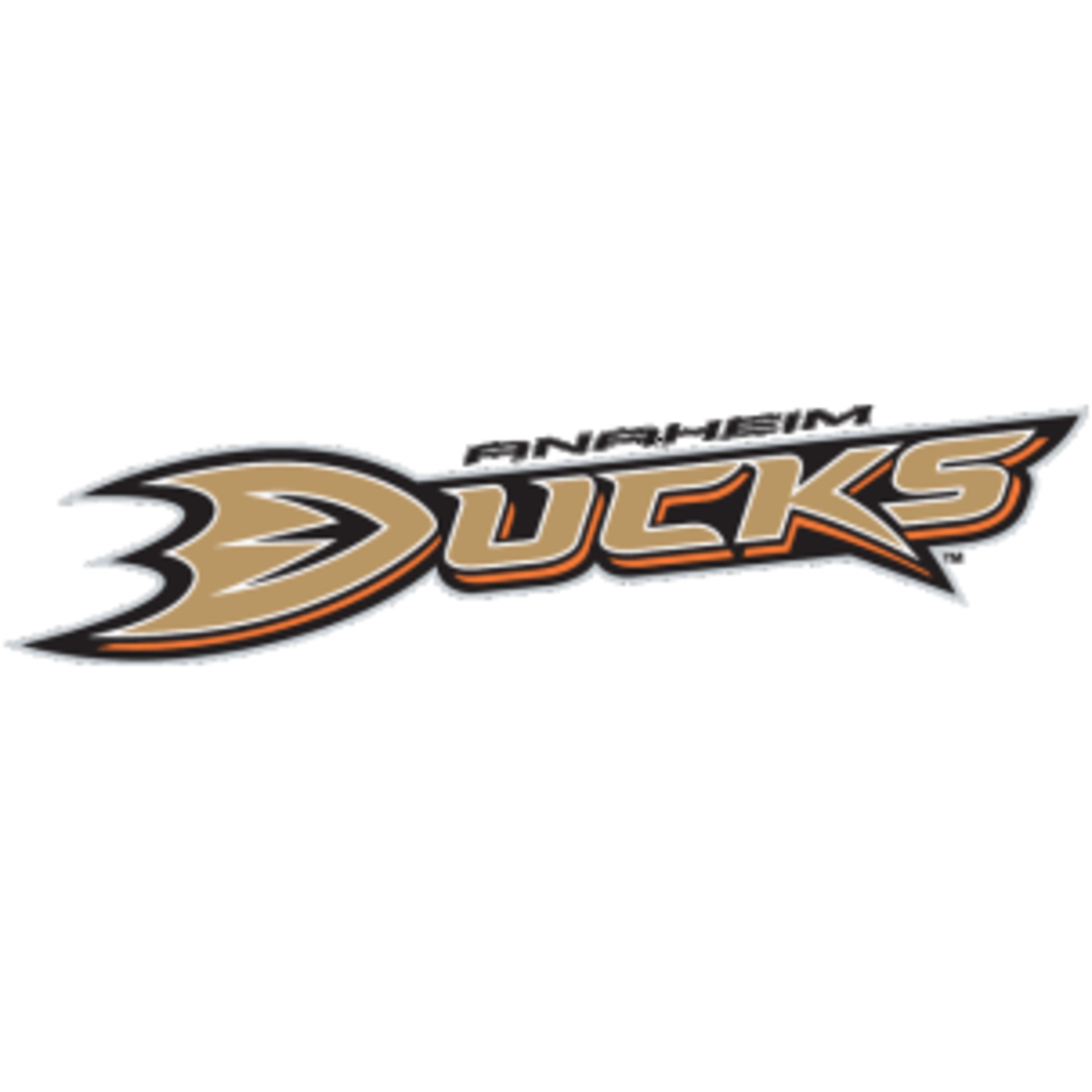
The Anaheim Ducks hold the league's second-worst logo. It's not bad in itself, but on the front of the jersey it's completely lost. It makes their already dreary jersey even worse, and almost makes them a hard team to watch.
Luckily, once again, they seem to have gotten it right on their third jersey. It takes the 'ucks' and anaheim out of the logo, leaving just the memorable webbed "D."
28. Ottawa Senators
3 of 9The Ottawa Senators have a bad logo. I honestly could just leave it at that, but that might not do it justice. It's uninteresting, not intimidating, and it doesn't look right on the front of a jersey. Their old logo was much better, and it's a shame they changed it to this mess of a logo.
Also, their third jersey logo is even worse, as it simply says "SENS." A very boring set indeed.


26. Nashville Predators
4 of 9
The Nashville Predators have another boring logo. Like many of the new logos, it tries too hard to be cool that it fails miserable. It's extremely over complicated, and is a waste of what a "Predator" logo could look like.
25. Vancouver Canucks
5 of 9Great jersey, awful logo. As an American kid, I grew up my whole life until I was 12 or so believing that "Canuck" was another word for Shark. (Obviously, it's slang for Canadian) But this still bothers me.The logo is absolutely irrelevant, besides the "C" the creature forms.
I later found out that it's an Orca, in reference to the ownership company Orca Bay, now known as Canucks Sports and Entertainment.
24. San Jose Sharks
6 of 9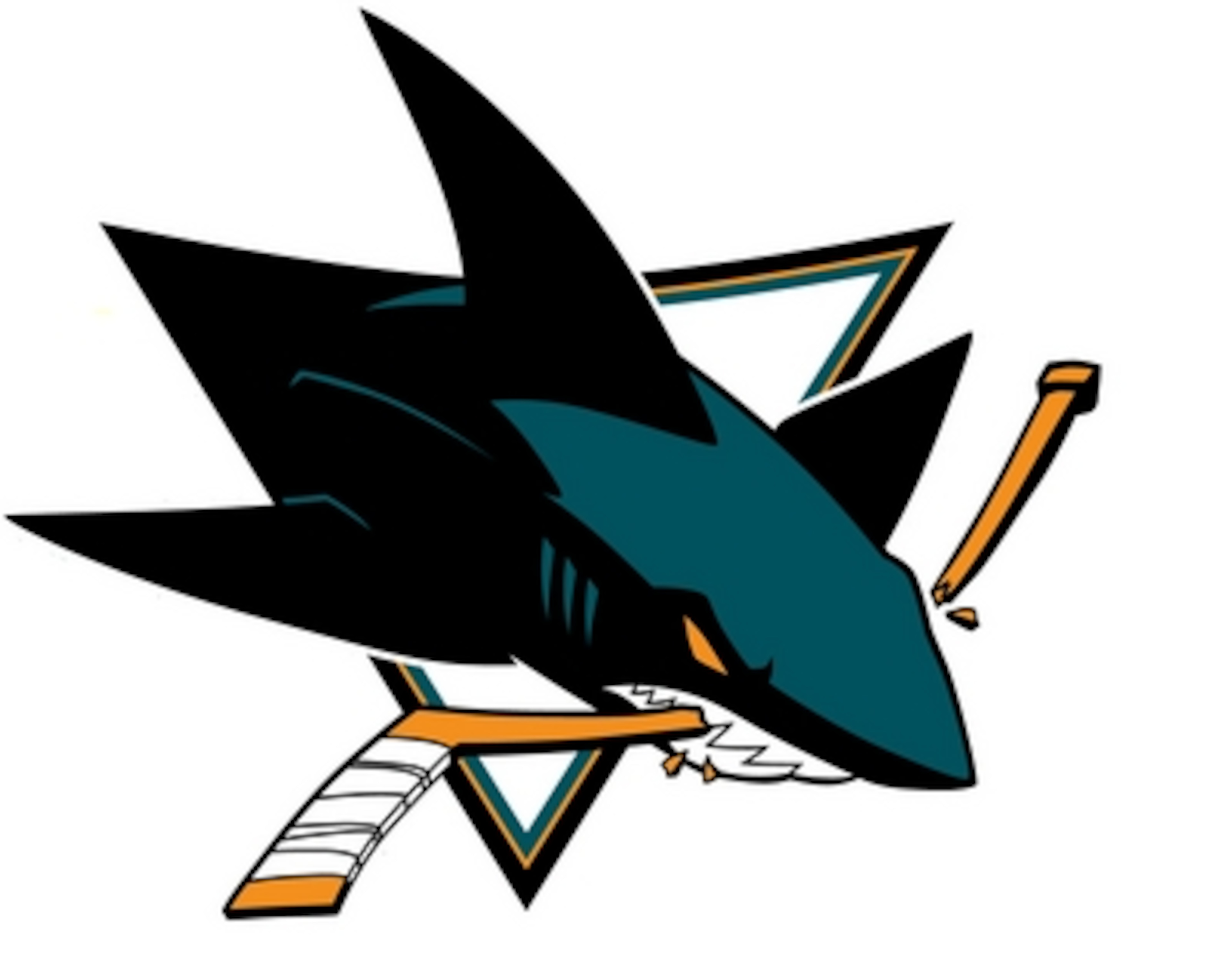
The San Jose Sharks have simply the campiest logo in the league. It's over colored, over-complicated and, dare I say it, Disney-fied? This is a logo a kid may love, but it's a man's game, and it can look simply embarassing out there.
Also, with a nickname like the Sharks we'd expect something a little more intimidating.
23. Los Angeles Kings
7 of 9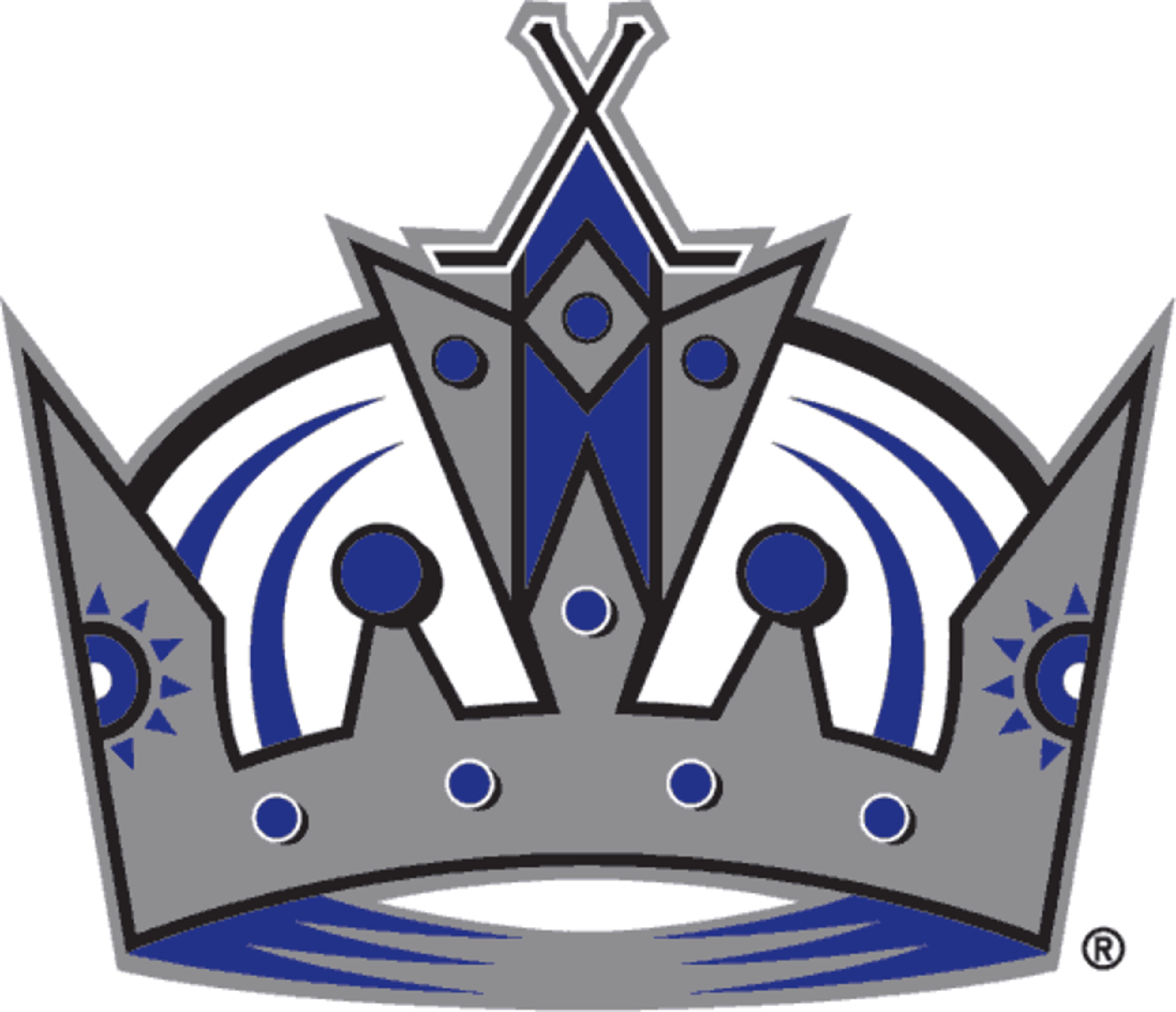
The Los Angeles Kings have as average a logo as you could have. While it's relevant, it's not memorable, and it doesn't necessarily stick out. The logo also suffers from being a bit more complicated than it needs to be.
But, they have one of the better third jersey logos, and if recent news is true, it'll be their full time logo come next season.
22. New York Rangers
8 of 9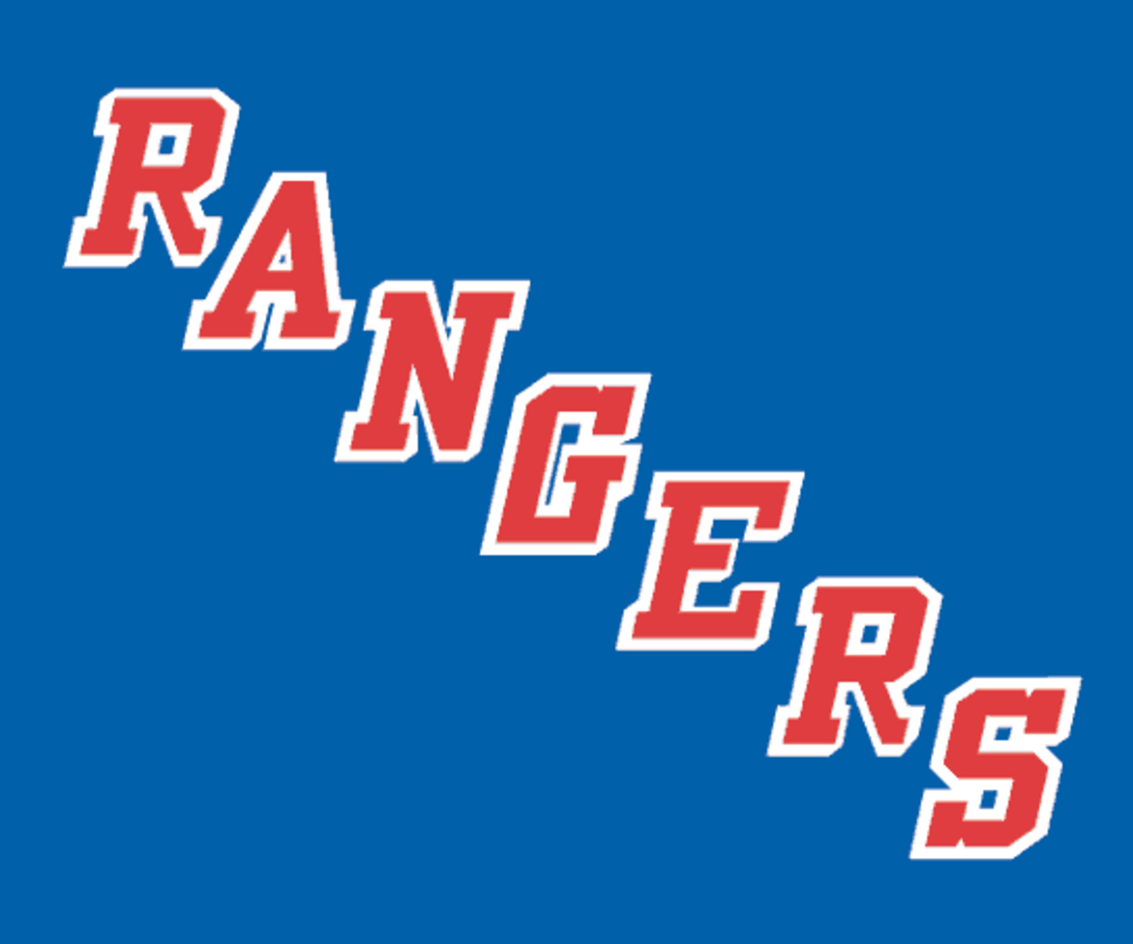
The New York Rangers would be much higher on this list if they actually used their shield logo. While everyone might use that as the Rangers primary logo for marketing and whatnot, it's not on the jerseys. What is are the seven letters diagonally shown above. Makes for a decent jersey, but an unimaginitive, boring logo.
21. Dallas Stars
9 of 9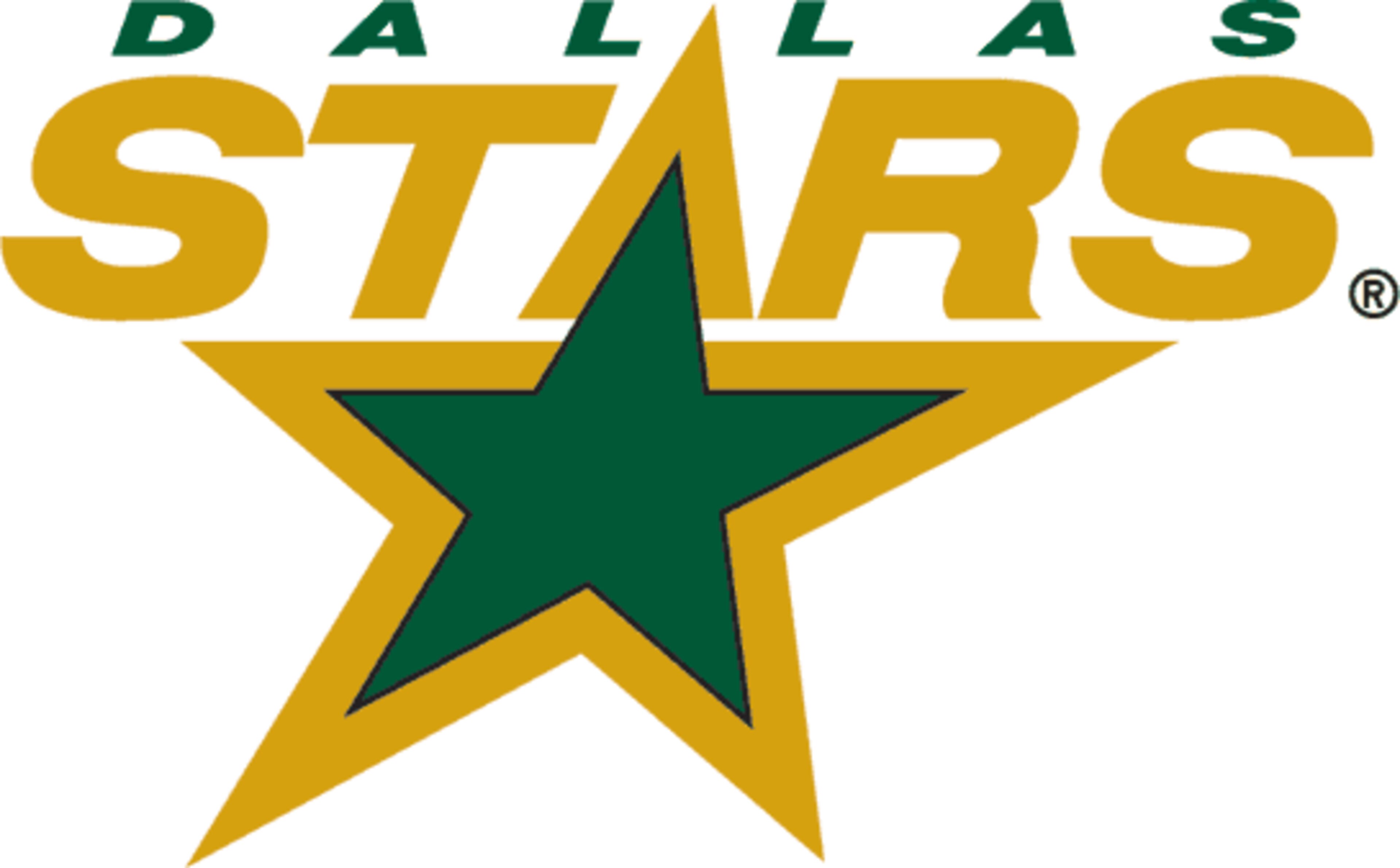
The Stars round out the bottom 10 here. Honestly, not a bad logo. It's on the worst jersey in the league, but not bad. I obviously also included the arched "DALLAS" logo in this ranking, but it's not enough to sink this logo. It fits the city, all in all, it works for them.
_1.png?w=3840 "B/R")

.jpg?w=3840 "Kickers Talk Proposed New Rule")


.jpg?w=3840 "Must-See NFL Offseason Moves ✍️")


.jpg?w=3840 "Aiyuk Rips NFLPA 😶")


.jpg?w=3840 "RGIII Shades Mike Shanahan 😳")