
Re-Ranking the 10 Best NHL 3rd Jerseys After Islanders Fan Submission Contest
For NHL fans who are also jersey nuts, the upcoming 2026-2027 season is about to be a treasure trove of new looks with a rumored set of new alternate sweaters on the way.
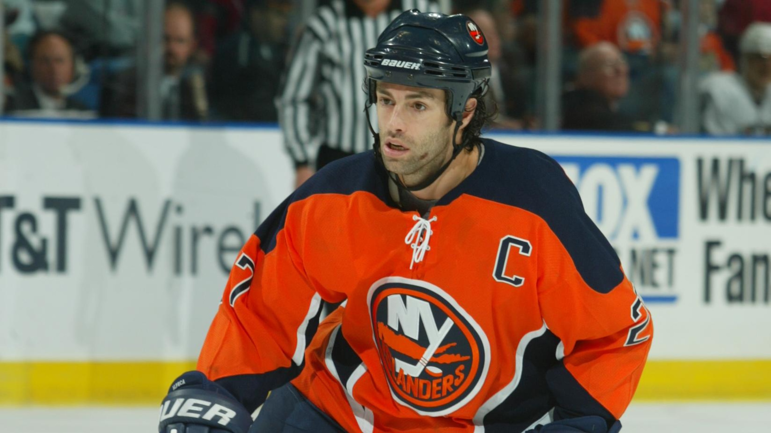
One team we know for sure that's adding a new third jersey is the New York Islanders, and they've asked fans to submit their own designs in a contest for the best new look. Considering how brutal the Islanders' past third- and special-game jerseys have been over the years, having fans design something new couldn't be any worse.
All this talk about new thirds got us digging into our memory banks with a purpose. The NHL has had alternate jerseys since 1995, and with more than 30 years to work with, we're narrowing down our 10 favorites of all time.
Some alternates were so good they became the main jersey, while others were so bad they were ditched as soon as possible. But the legacies of the best ones live on, even now; we only have to fight our hearts for loving some of the more sinfully terrible ones in favor of good taste.
10. Atlanta Thrashers 2003-2005 Alternate
1 of 10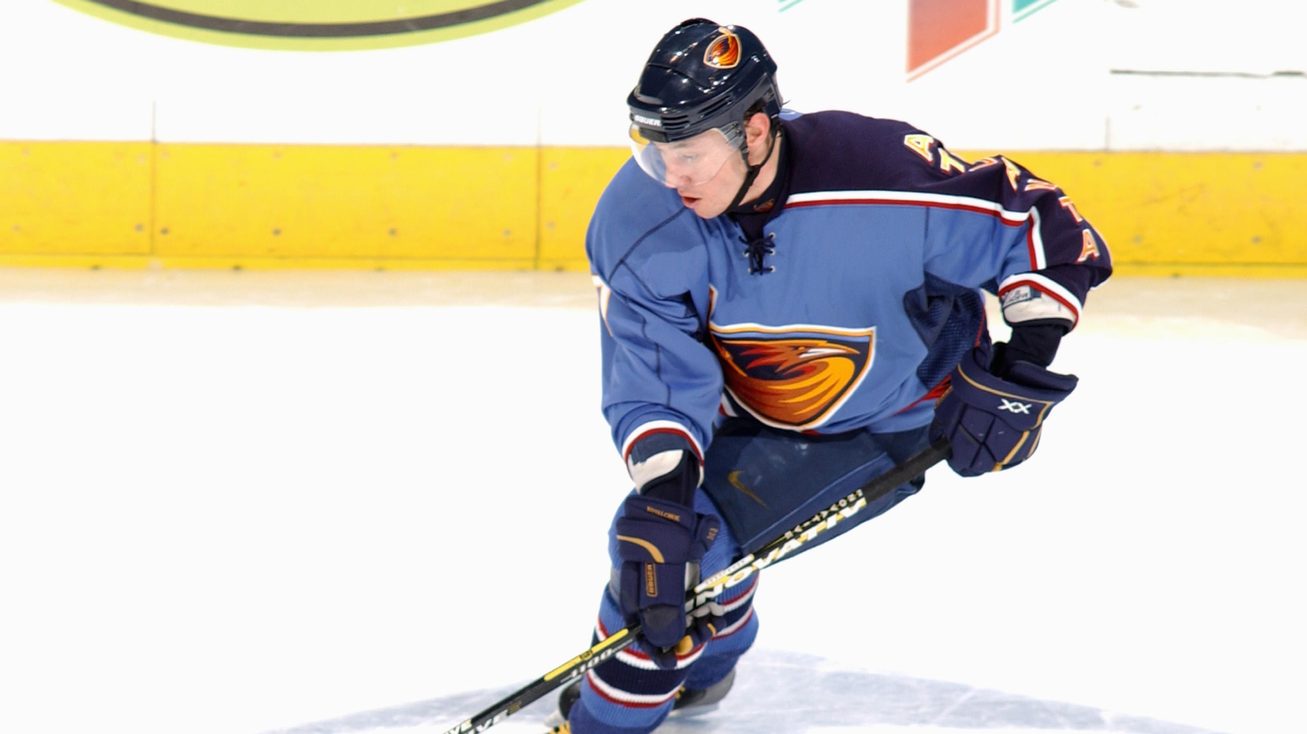
Remember the Atlanta Thrashers? Of course you do. When they added a third jersey in 2003, they went way off the map in the design and came up with something wholly unique.
Wearing a baby-blue jersey, they put their regular logo on the front but made one sleeve navy blue with "Atlanta" written on it.
It's a jersey that took some time to get used to, but once you did, it grew on you in a big way. It became so well-liked in Atlanta that it became the team's regular home jersey after the lockout in 2004-2005 and remained so until they moved to Winnipeg after the 2010-2011 season.
Its innovative, asymmetrical look has never really been copied, and the league has never brought anything quite like it back.
9. Pittsburgh Penguins Alternate (1995-1997)
2 of 10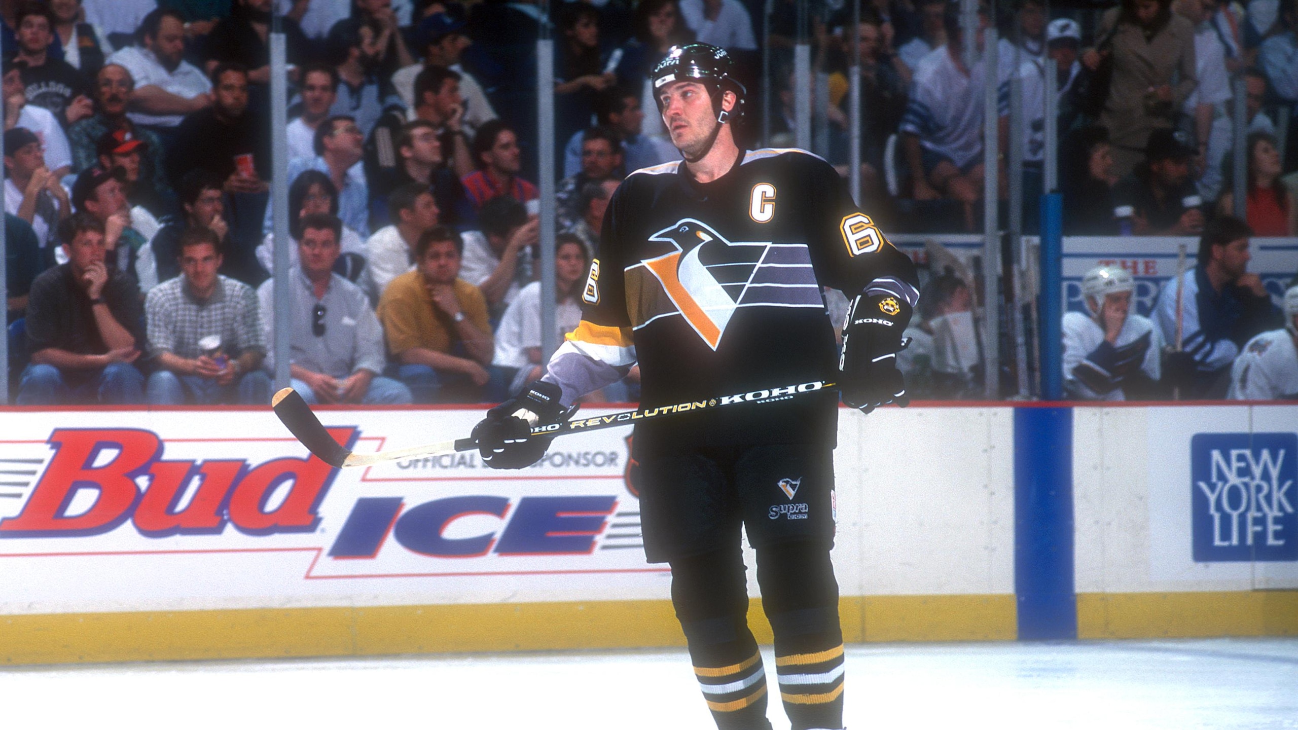
A lot of fans will tell you they always hated the "Robopenguin" style jerseys, especially the alternate they introduced in 1995, but this jersey, which later became the team's road jersey from 1997 until 2002, had a special kind of '90s uniqueness that makes it lovable today.
The Penguins' logo at the front, with its stoic look and the bizarre grey stripes trailing behind it all the way around the back of the jersey (and on the shoulders as well), made it confusing. But with Mario Lemieux and Jaromír Jágr roaring around the ice, they made it look elite. Perhaps it's the factor of the era or the eyes of nostalgia making it look better now, but this jersey was and is iconic.
8. Washington Capitals (Current Alternate)
3 of 10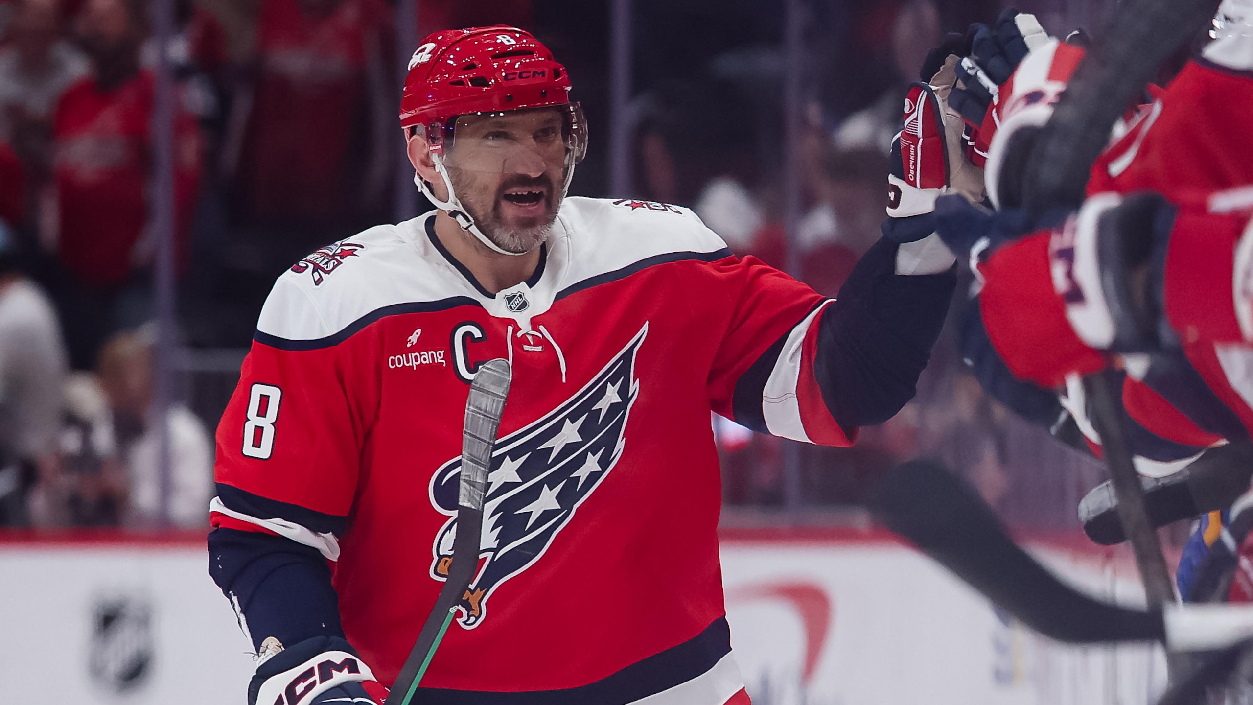
We've always barked about how much the Capitals needed to do something to shake up their look, and with the new alternate jersey they added this past season, they did so in a superb way.
The jersey blends elements of their past looks from the 80s and 90s with the jersey's style, along with the screaming eagle and shoulder logo, but in the current color set. It's familiar and unique and really looks good. If this jersey were to become their regular home sweater one day, that would be a great move.
.jpg?w=2560 "Simon Edvisson Landing Spots")
7. San Jose Sharks Alternate (current)
4 of 10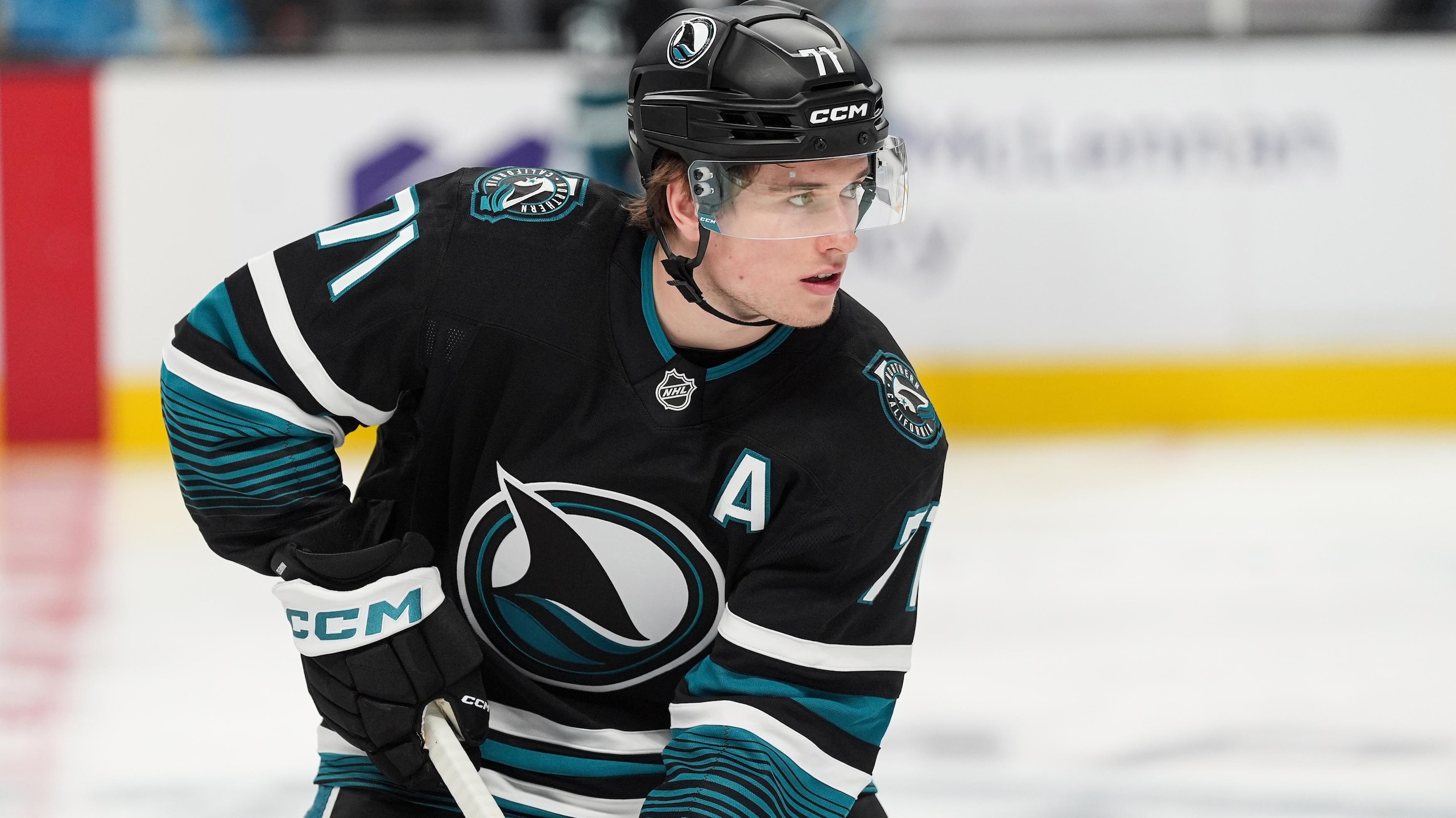
The Sharks have a long history of wearing black alternate jerseys, and their current iteration is by far the best.
While past versions of the black alternate were basically just the blackout version of their home jerseys, their current look makes it a bit more haunting, with teal and white stripes on the sleeves and the alternate shark-fin logo on the front. A black Sharks jersey should give off ominous vibes, and while some of the past ones were sort of able to hit on that, this one nails it.
And now with Macklin Celebrini being one of the best players in the league, they're about to get a lot scarier to deal with on the ice, too.
6. Dallas Stars Alternate (Current)
5 of 10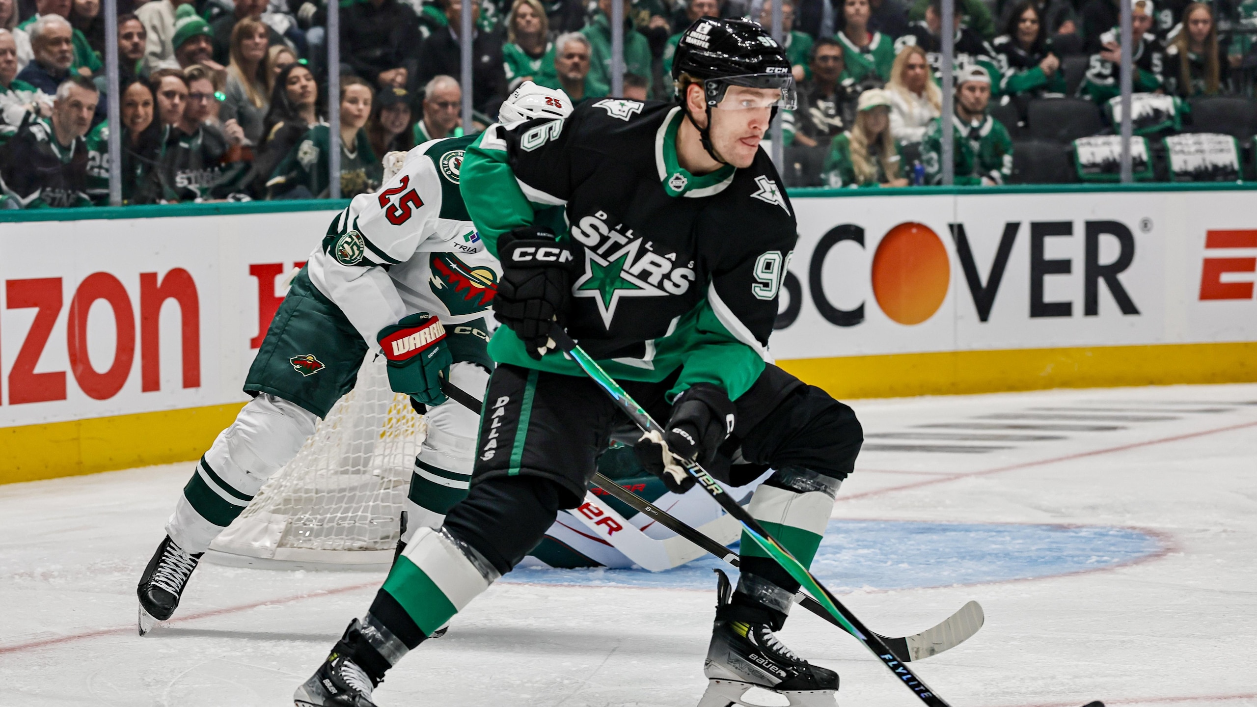
Seeing the Stars use their own past as inspiration for their current alternate jerseys could've gone badly, but by citing the jerseys they wore when they won the Stanley Cup in 1999, they nailed it perfectly.
The design of the jersey is a direct throwback to what they wore in '99, with the star outline built into it, the old logo on the crest, and their previous Texas shoulder logos. What's different is that it uses the Stars' current color scheme, which makes all the colors pop with a lighter green, along with a silver-and-white outline for the star instead of gold and white.
Taking an old look and making it look new is a great way to make everyone happy. Now, if they can manage to keep Jason Robertson long-term to play alongside Mikko Rantanen, that would make everyone that much happier.
5. Philadelphia Flyers Alternate (1997-2001)
6 of 10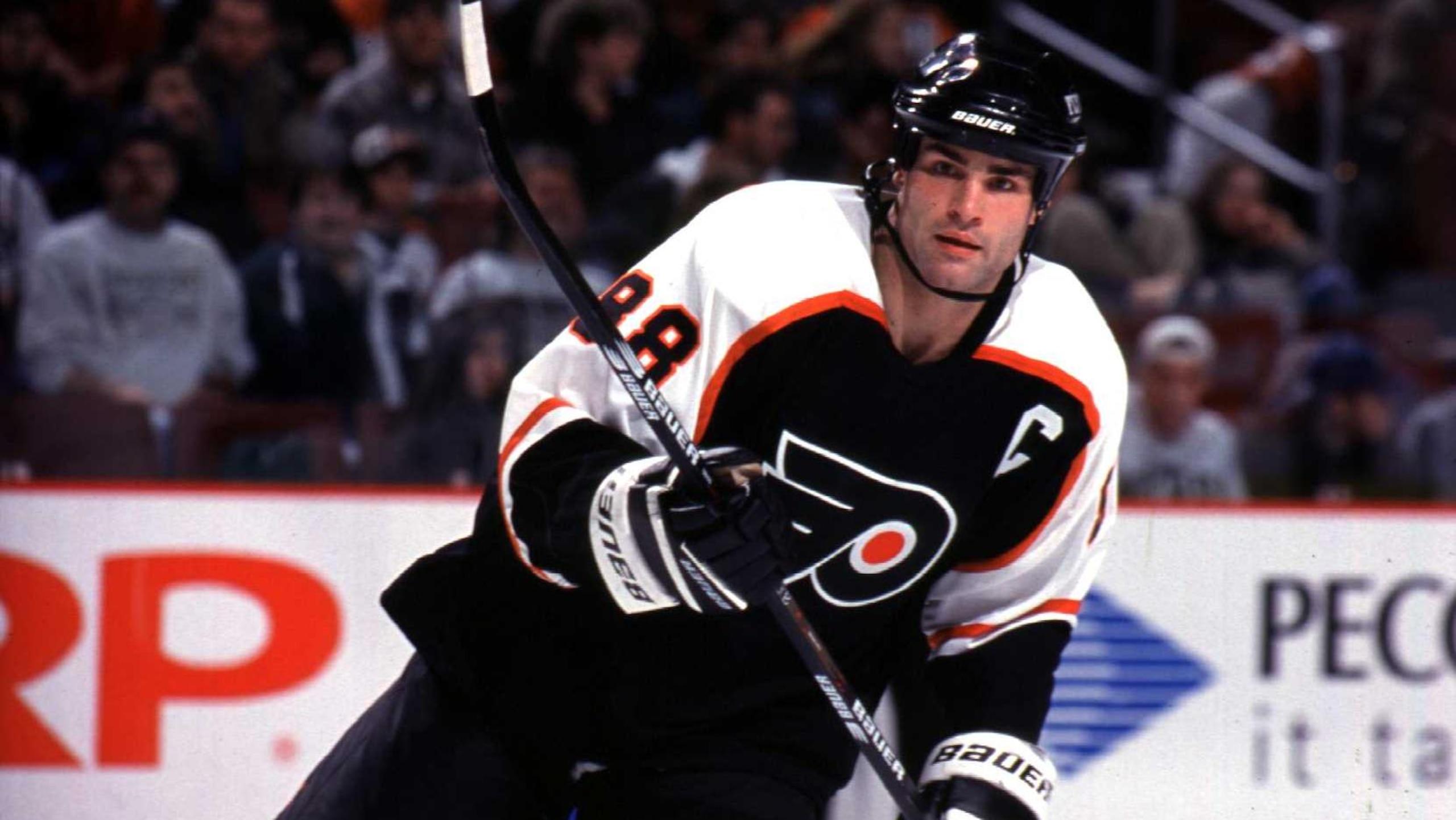
Back in the '90s, when the Philadelphia Flyers iced the "Legion of Doom" line with Eric Lindros, John LeClair, and Mikael Renberg, seeing them roar around the ice in orange and black was frightful enough.
But when the Flyers added a black alternate jersey done in the same style as their home and road set, it took "making it look mean" to another level.
The Flyers' reputation for playing physical and nasty has always existed, but the '90s version of them could punish teams physically and on the scoreboard with equal measure. Donning black jerseys made the "Broad Street Bullies" that much more intimidating.
The black jerseys were such a big hit that they became their regular road sweater from 2001 to 2007 and their home jersey color until 2010, before orange came back and stayed. This version of their black jerseys, however, remains the best one.
4. Seattle Kraken Alternate (Current)
7 of 10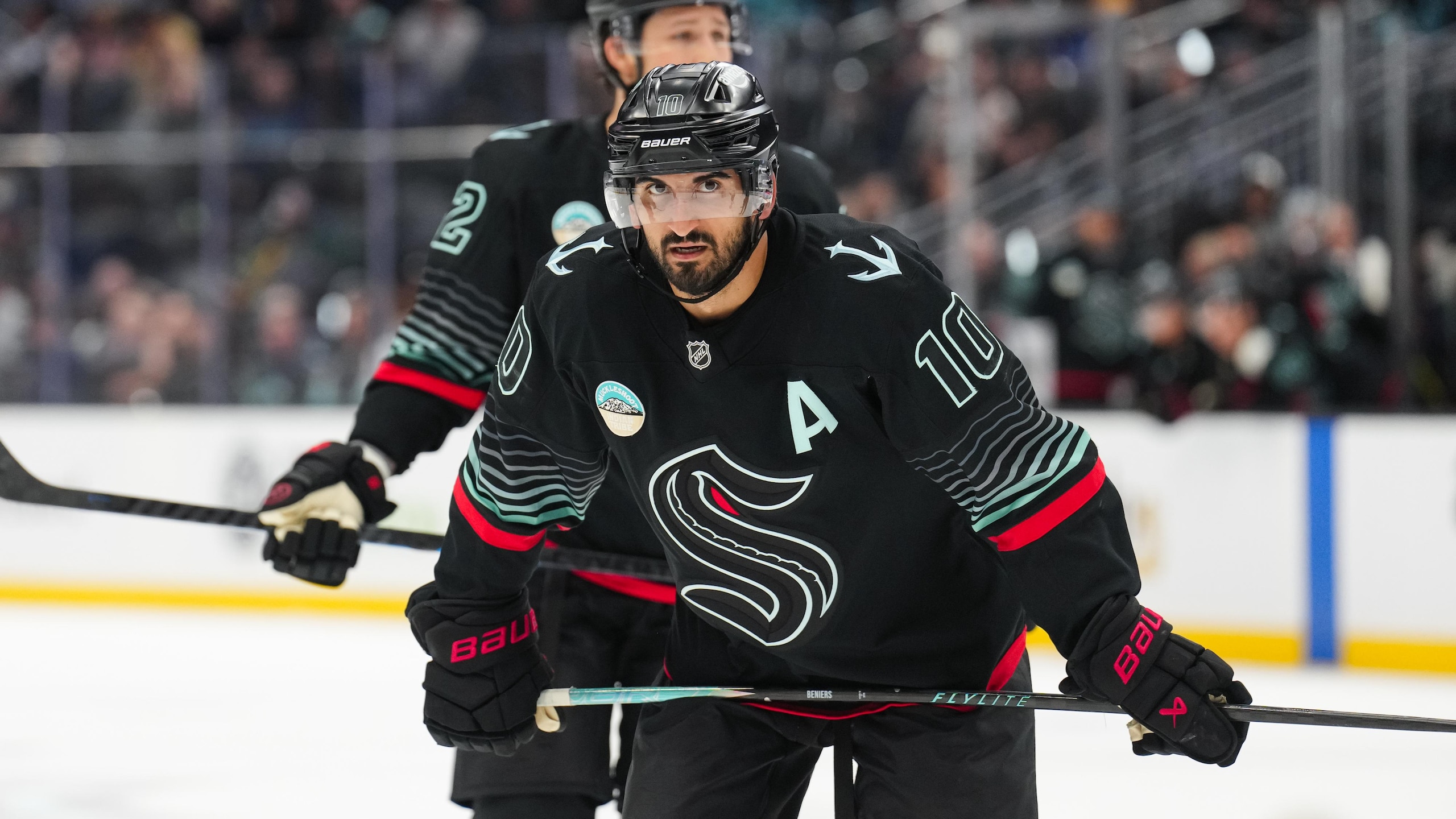
While the Kraken have had one of the best home and road jersey sets since they entered the league, we were all anticipating what they would do whenever they added an alternate sweater. When they unleashed their look inspired by the depths and horrors of the deep sea, we were all on board for it.
The black jersey with the Kraken logo in a sea-green outline (that also glows in the dark) is outstanding, and the gradient sea-green stripes on the sleeves, with the slashes of red striping, make it unnerving in a way, but fantastic nonetheless. It's a unique style, and while not the first to use glow-in-the-dark technology (Vegas' Reverse Retro jersey in 2022-2023 also featured it), it makes us think of the bioluminescent creatures of the deep, enough to make anyone feel uneasy and even more intrigued.
3. Minnesota Wild Alternate (Current)
8 of 10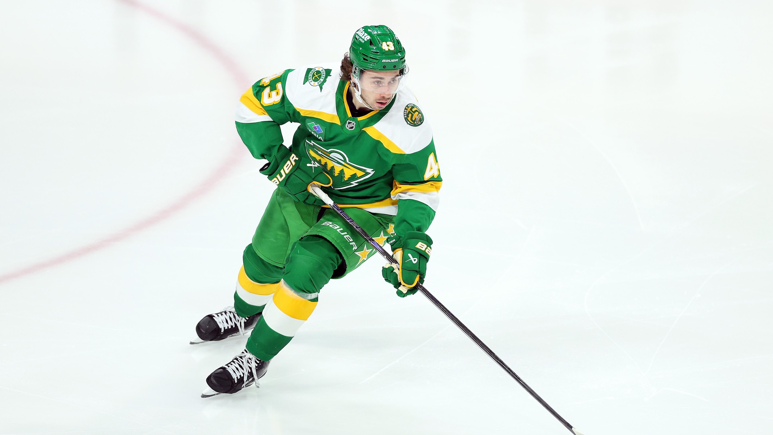
What started as a Reverse Retro jersey in 2022-2023 earned so much instant approval and love that it was instantly made the Minnesota Wild's alternate jersey the following season and remained so. Taking the Wild logo and giving it the same colors as the Minnesota North Stars, along with the design of past North Stars jerseys, was all it took to create a hit sweater.
Fans in Minnesota loved the North Stars, and when they bolted to Dallas, fans were heartbroken. Even though the Wild arrived not too many years later, the reverence for the North Stars never left. Having one of the best logos in hockey history played a role in that, but the Wild getting to bring back all those memories and creating new ones with Kirill Kaprizov, Matt Boldy, and Quinn Hughes with the current logo and former colors is a feel-good moment.
Is this alternate jersey fan service? It 100% is, but that's what alternate jerseys are for in the end, and, honestly, seeing those colors on the ice again is enough to make anyone feel warm and fuzzy.
2. Florida Panthers Reverse Retro 2022-2023
9 of 10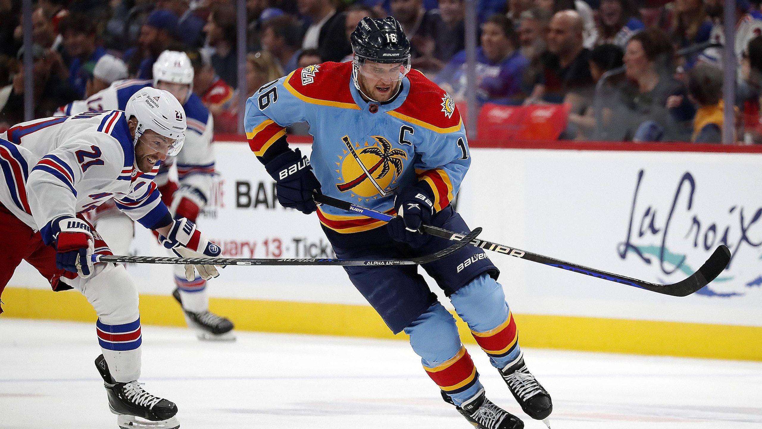
When Adidas and the NHL collaborated on the Reverse Retro jersey program for two seasons, there were a lot of hits and arguably even more misses, but one team that hit it out of the park and beyond was the Florida Panthers in 2022-2023.
The Panthers wore a baby-blue jersey featuring the design of their original jerseys, with one big exception. Instead of the leaping panther on the front, the Panthers' alternate logo with a palm tree and a hockey stick crisscrossed in front of the sun got the feature treatment and turned out a thing of beauty.
The Panthers' traditional colors still cut through in the striping, and the shoulder logo was another alternative wordmark, but the baby blue with the crest logo was all anyone needed to be wowed.
Sadly, the jersey lasted only one season, and while rumors of a new jersey program and alleged leaks suggest the Panthers might have another banger in the waiting, we'll be left wanting this one to make a comeback someday.
1. New York Rangers Alternate (1996-1998; 1999-2007)
10 of 10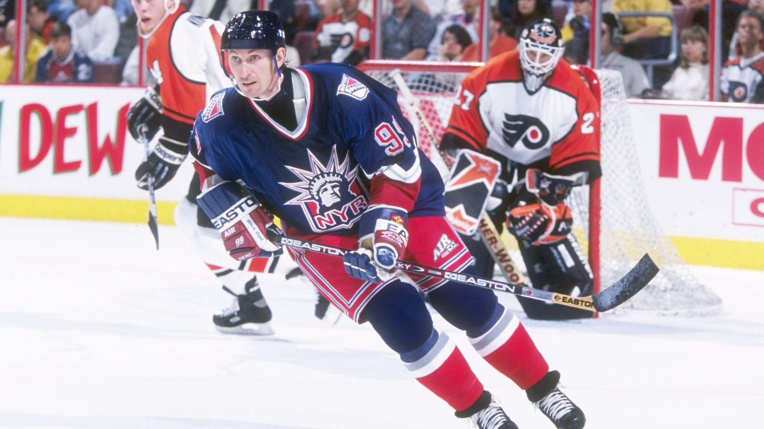
Call it East Coast bias if you like, but when an Original Six team such as the New York Rangers finally rolled out a third jersey and it became an instant hit with both fans and detractors, you knew they nailed it.
The Rangers' "Lady Liberty" alternates with the alternate logo featuring the head of the Statue of Liberty and a "NYR" wordmark, and a navy blue, red, white, and silver color mix immediately grabs your attention. The smooth-looking design and continued use of drop-shadowed numbers and letters still made it look like a Rangers jersey, even as it was something completely different.
The "Lady Liberty" look was so iconic that the Rangers used it for both of their Reverse Retro jerseys as well as a white alternate in 1998-1999, but none of those could come close to touching the original. When you make something that good, there's no replicating that kind of fervor with design unless you do it exactly.

.jpg?w=2560 "Terrell Owens Being Sued for Defamation")