NBA Power Rankings: The 20 Worst NBA Jerseys in NBA History
Whether you bleed purple and gold, green and white or red and blue, the excitement when seeing your teams colors fly proudly across the floor during games is a priceless asset that every fan strives for.
Sadly not every team has had the luck of choosing the right design, color or mix of both, and in result, some teams have become known not for how good their team was, but how bad their uniforms looked.
In this slideshow I will be listing the top 20 worst NBA jerseys in the history of the game from the bad to the unbearable. As always, feel free to comment and I hope you enjoy!
20. Indiana Pacers Home Uniform (1997-99, 2004-05)
1 of 20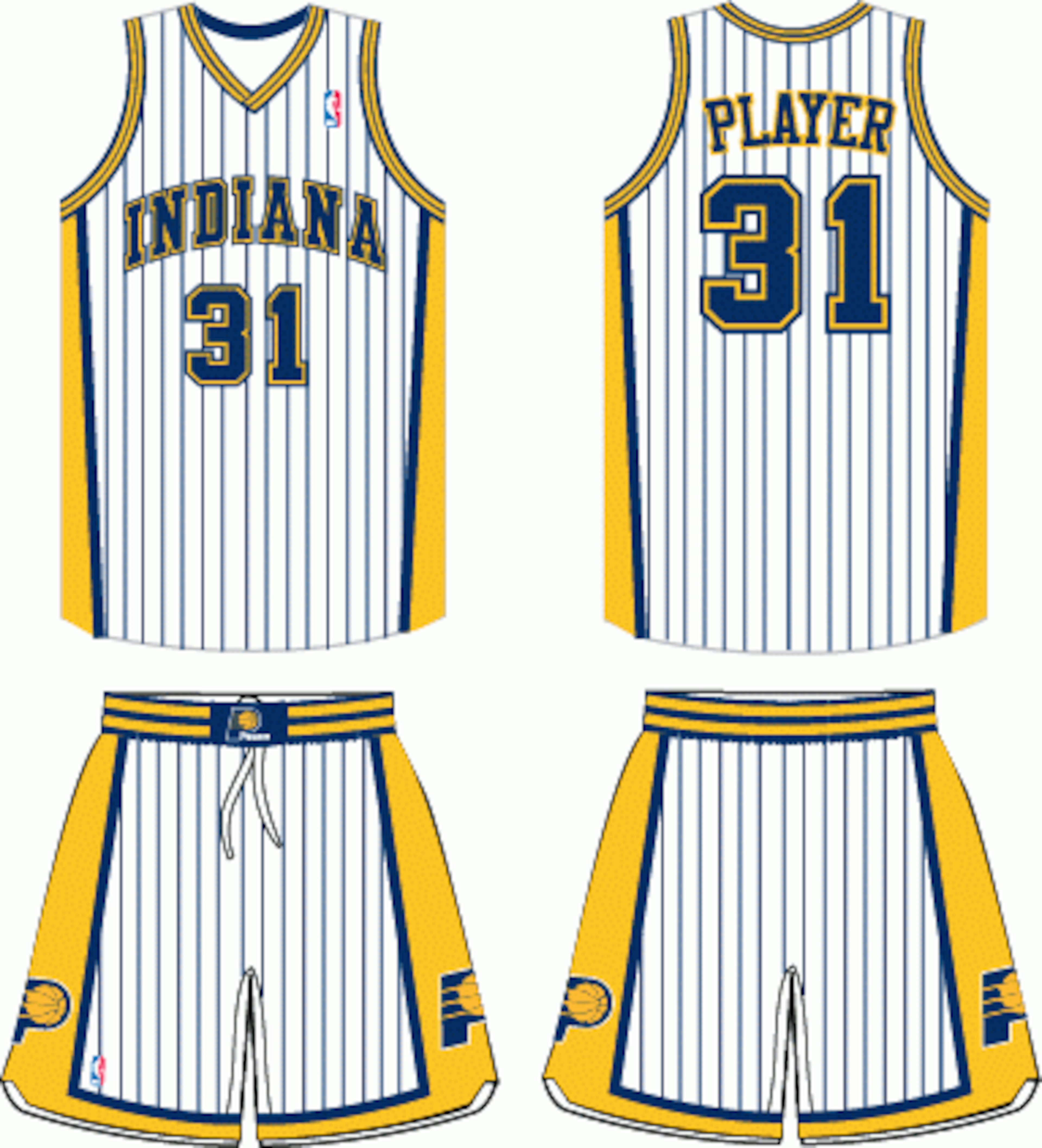
Similar to a persons pajamas, the Indiana Pacers home uniforms at this period in time just weren't nice to look at. Thankfully they had the great Reggie Miller to distract other fans from looking at their uniforms and instead forced people to look at him rather than Macy's latest pajama line.
The uniforms may have been intended to be a distraction for the opponents, but they actually confused people of having a bad television connection with all the lines running through their screen.
19. Houston Rockets Road Uniform (1995-96, 2002-03)
2 of 20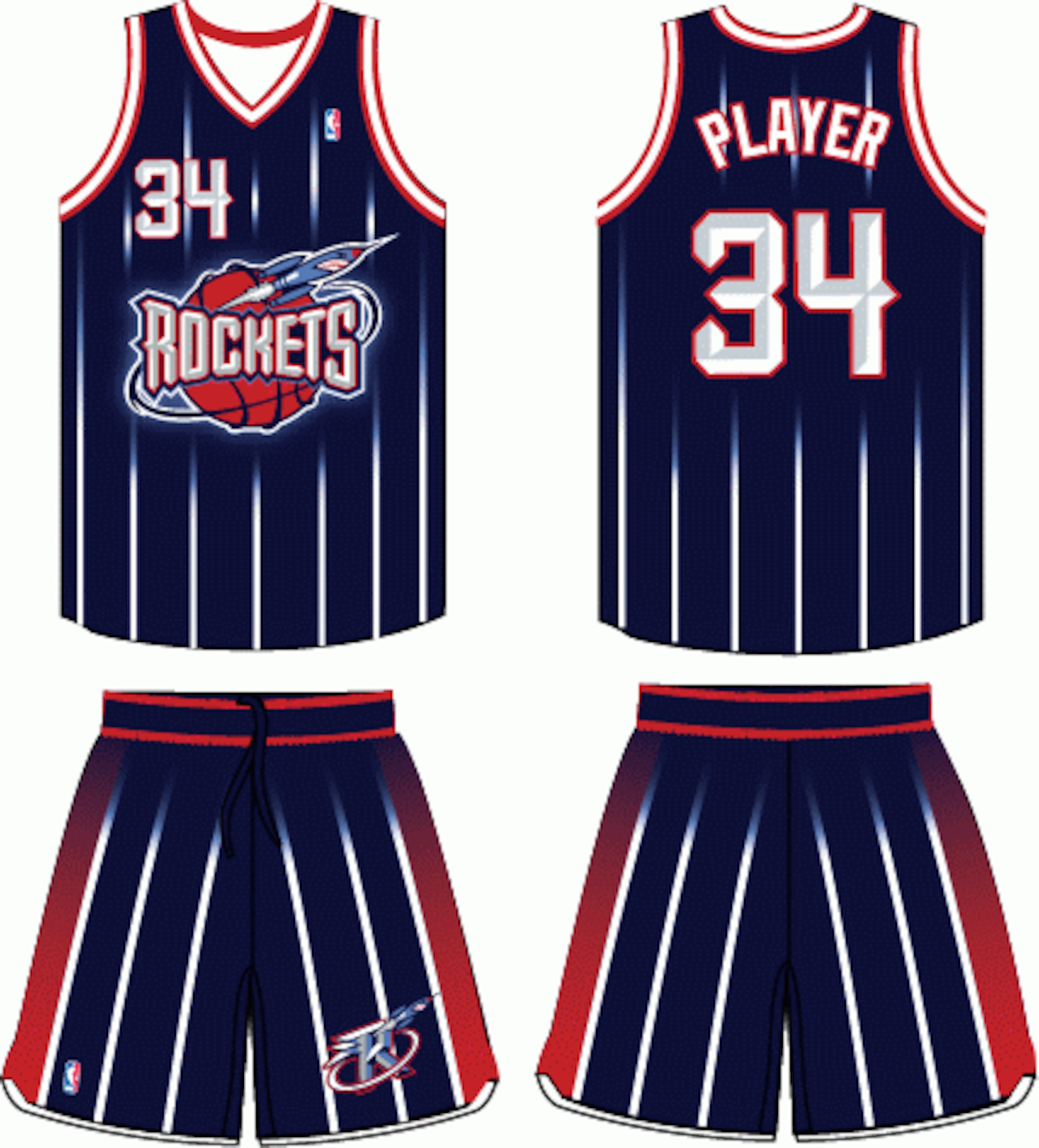
Player after player wore the infamous striped Rocket's jersey.
Kenny Smith, Charles Barkley and many others have had the "honor" of wearing this pajama-looking jersey, and though it was somewhat popular around the league for all the wrong reasons, there is no denying it's bad quality.
18. New York Knickerbockers Home Uniform (1979-80, 1982-83)
3 of 20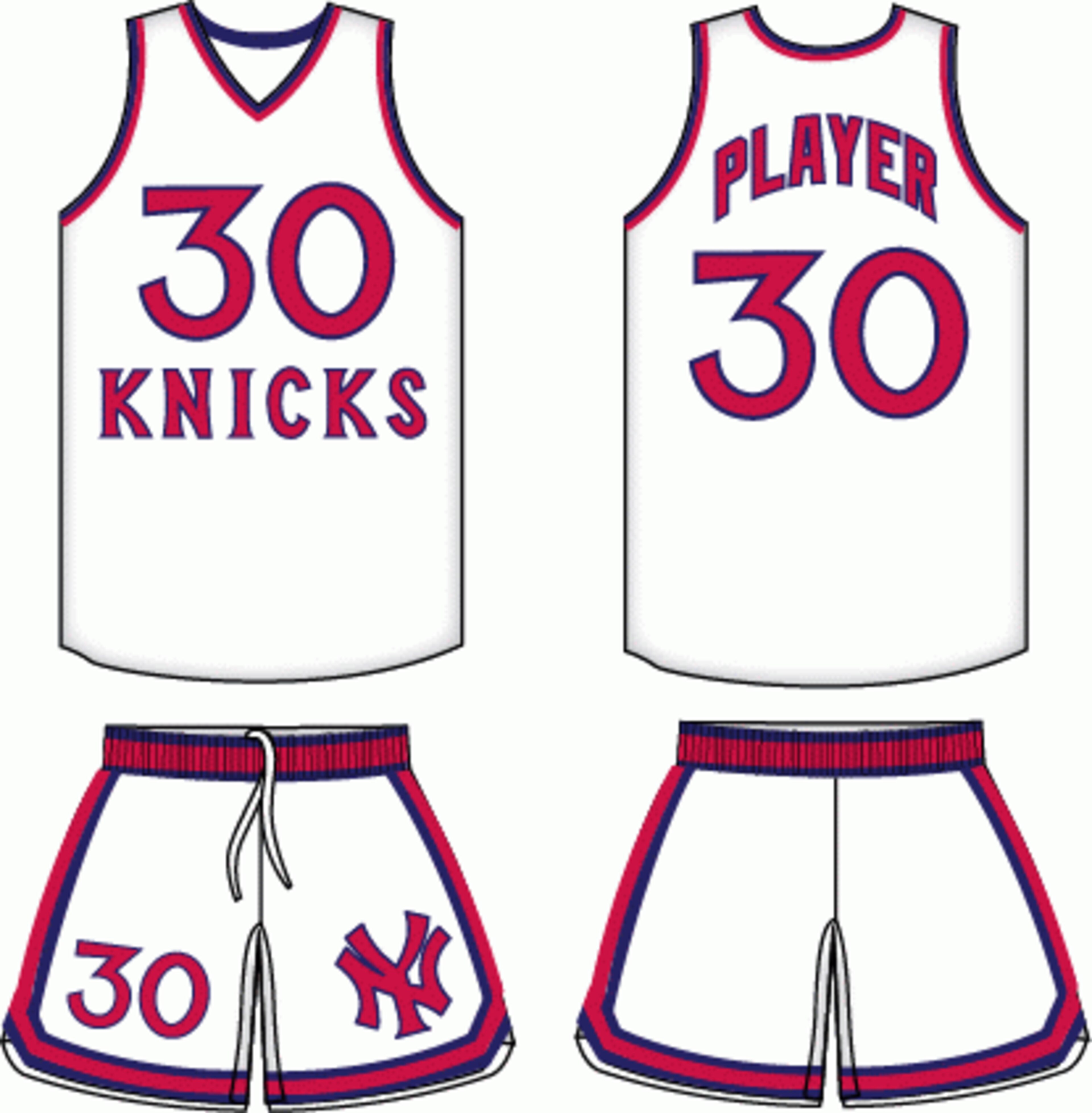
For those who can't see too well, here's the jersey for you. Apparently those living in the Big Apple, the majority wore glasses because the size of print on these jerseys could be seen literally for miles and miles.
Another negative is the color; these aren't obviously not the New York Knicks' colors that we are accustomed to, but nonetheless this was at one point part of New York basketball.


17. Charlotte Bobcats Road Uniform (2004-05)
4 of 20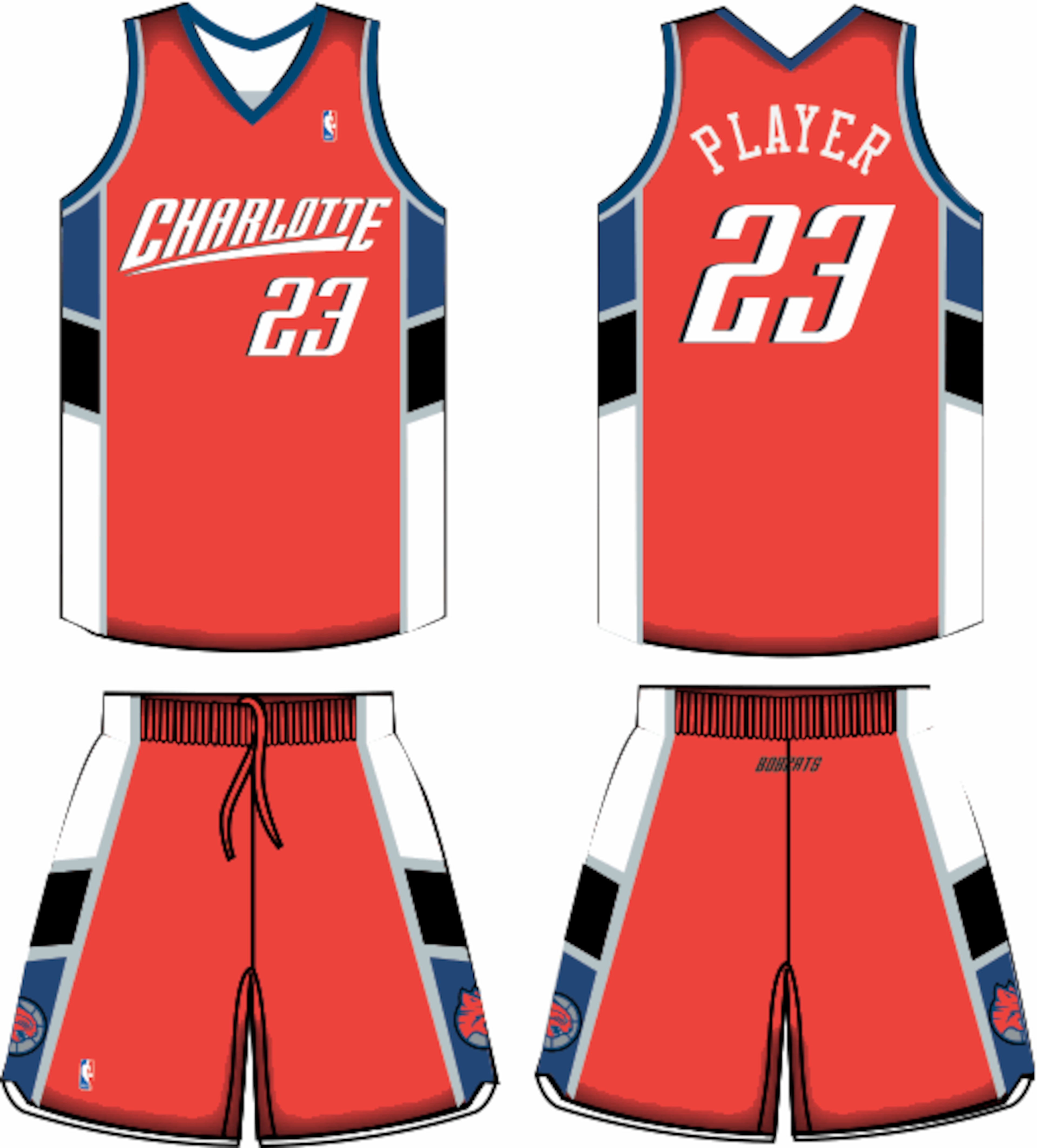
The Bobcats organization has only been around for less then 10 years, it has to be sad for Bobcat fans that their only road jersey in their history is among the worst in NBA history.
It isn't as bad as some, but when your original team colors are orange and blue, there really isn't much to work with.
16. Phoenix Suns Home Uniform (1992-93, 1999-2000)
5 of 20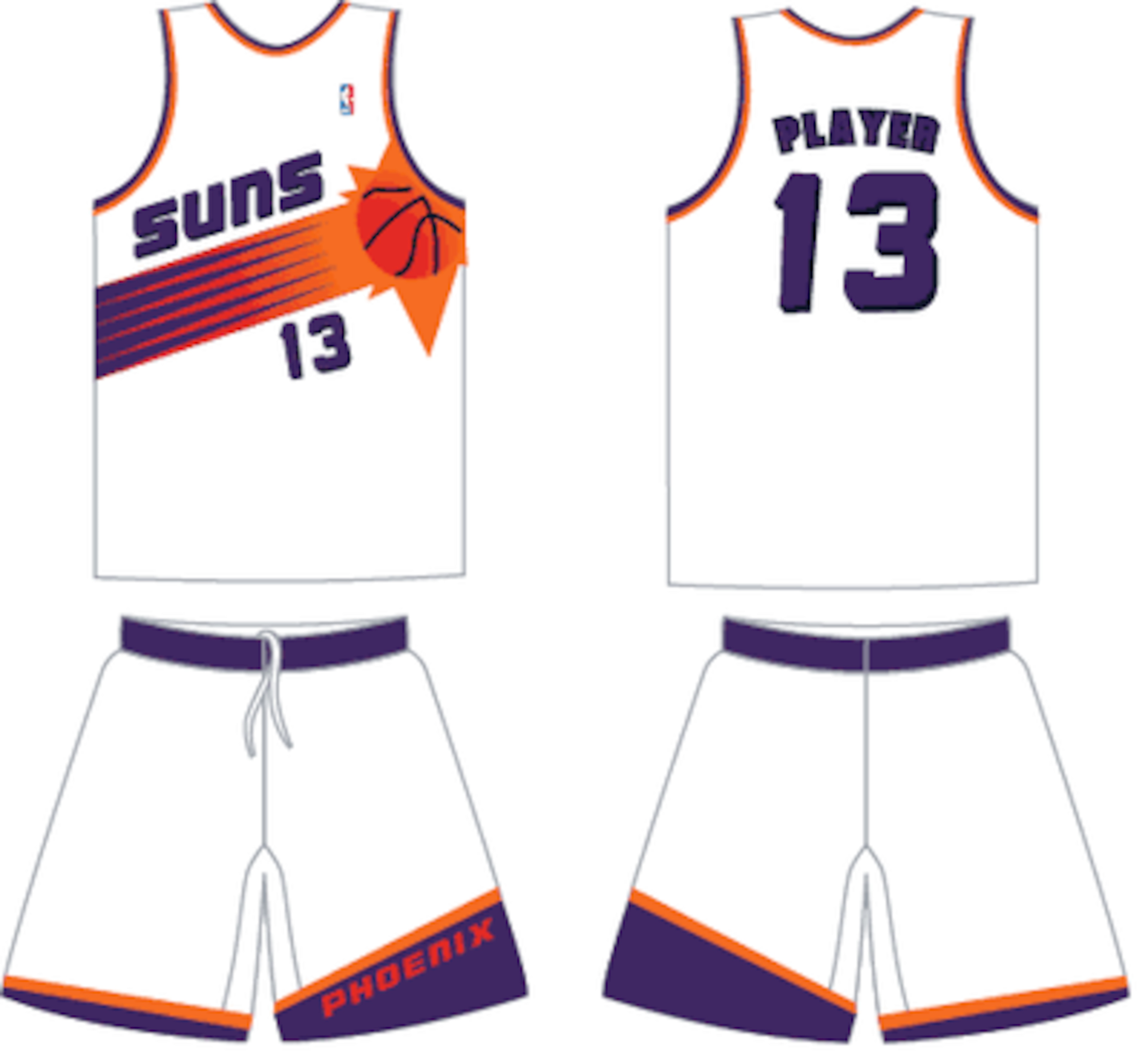
It's understandable to have this type of jersey during the time it was made, but what's with the basketball in the form of a sun going across the middle?
For all you Suns fans out there that experienced these wild jerseys, I have one question: Was the radical look really worth it, or do you see what I see as of now?
15. Atlanta Hawks Road Uniform (1995/96:1998/99)
6 of 20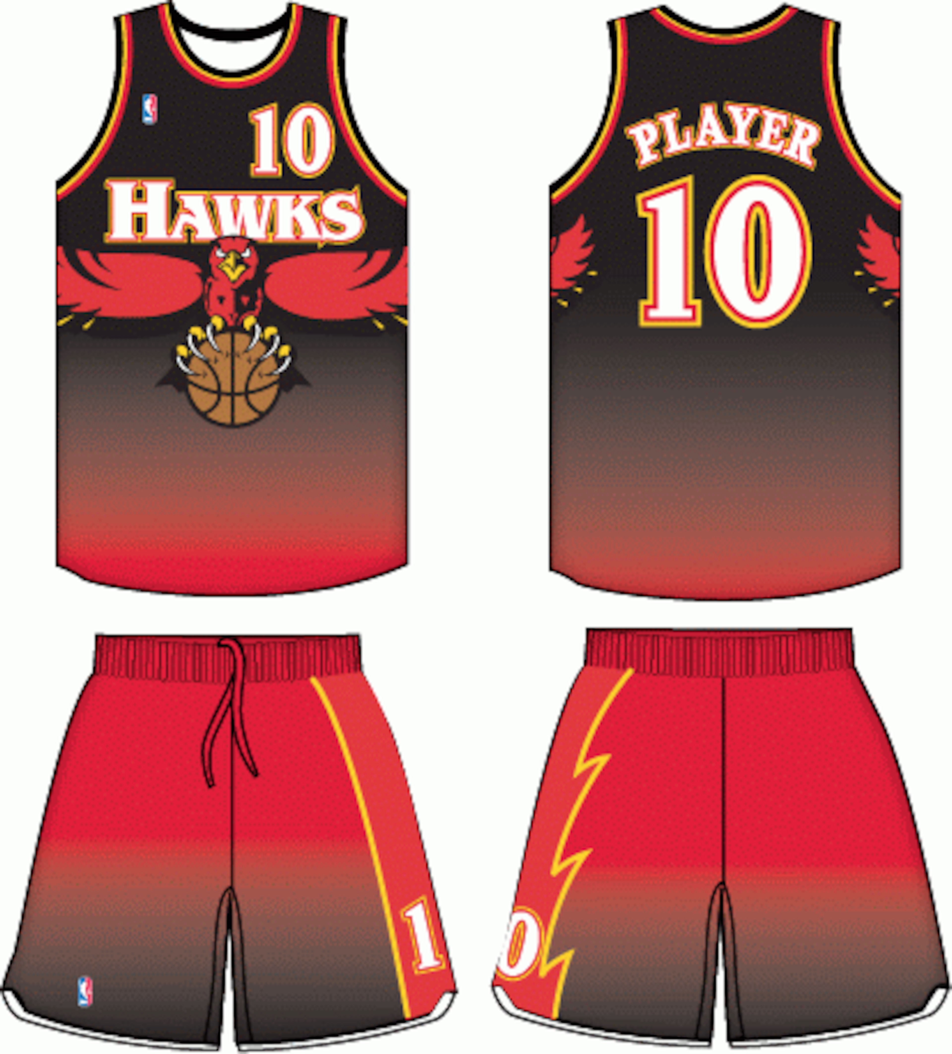
This is one of the few jerseys that is actually scary. The illusion of the colors is distracting by themselves, then there's the hawk that wants to not only take the ball away from the opponents, but to eat you.
This Hawks jersey is wild, literally, and it may not be the most ugly to look at, but it is the scariest to look at which is good enough for me to add it to this list.
14. Sacramento Kings Alternate Uniform (1994-95, 1996-97)
7 of 20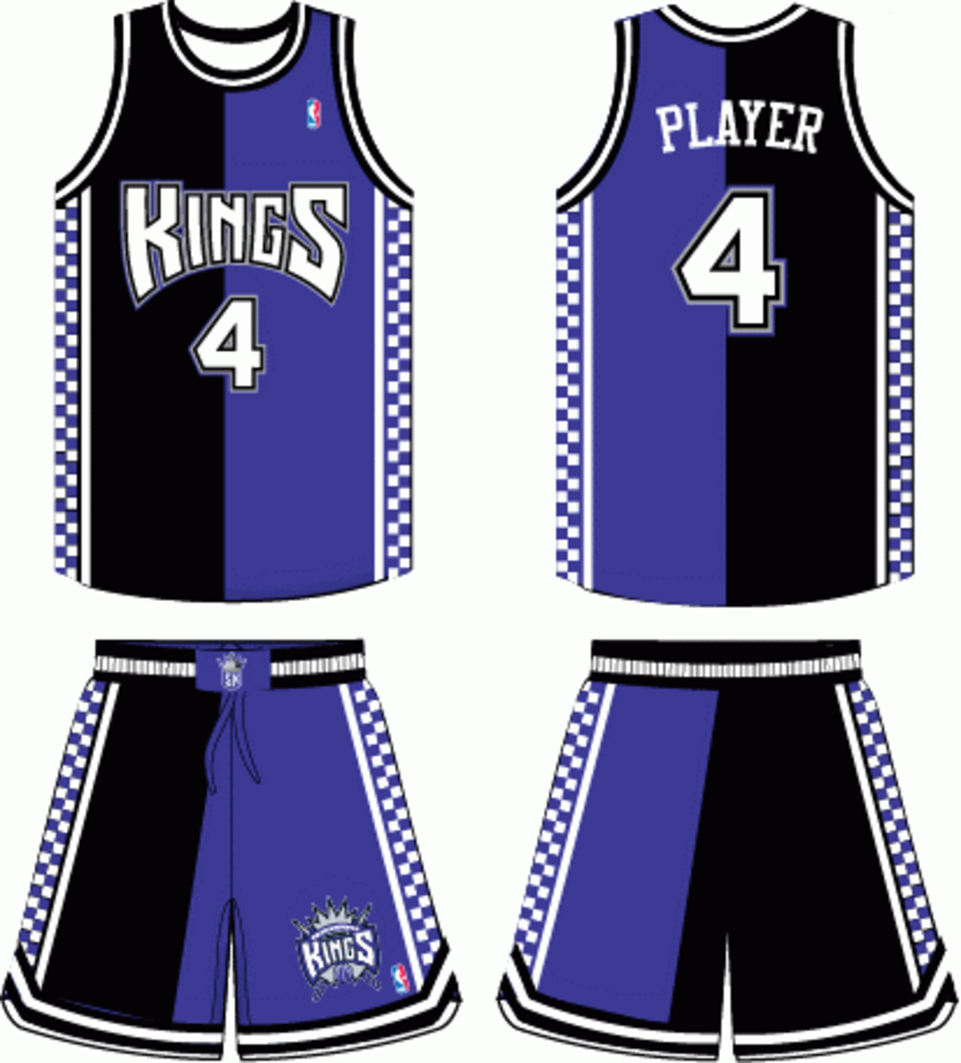
NASCAR fans living in the Sacramento area had to have loved these jerseys, but for others with any taste in basketball, these jerseys were just straight ridiculous.
Checkered designs can work with certain teams, but this Kings jersey tried too hard with the half-and-half colors along with the checkered sides.
13. Utah Jazz Road Uniform (1996-97, 2003-04)
8 of 20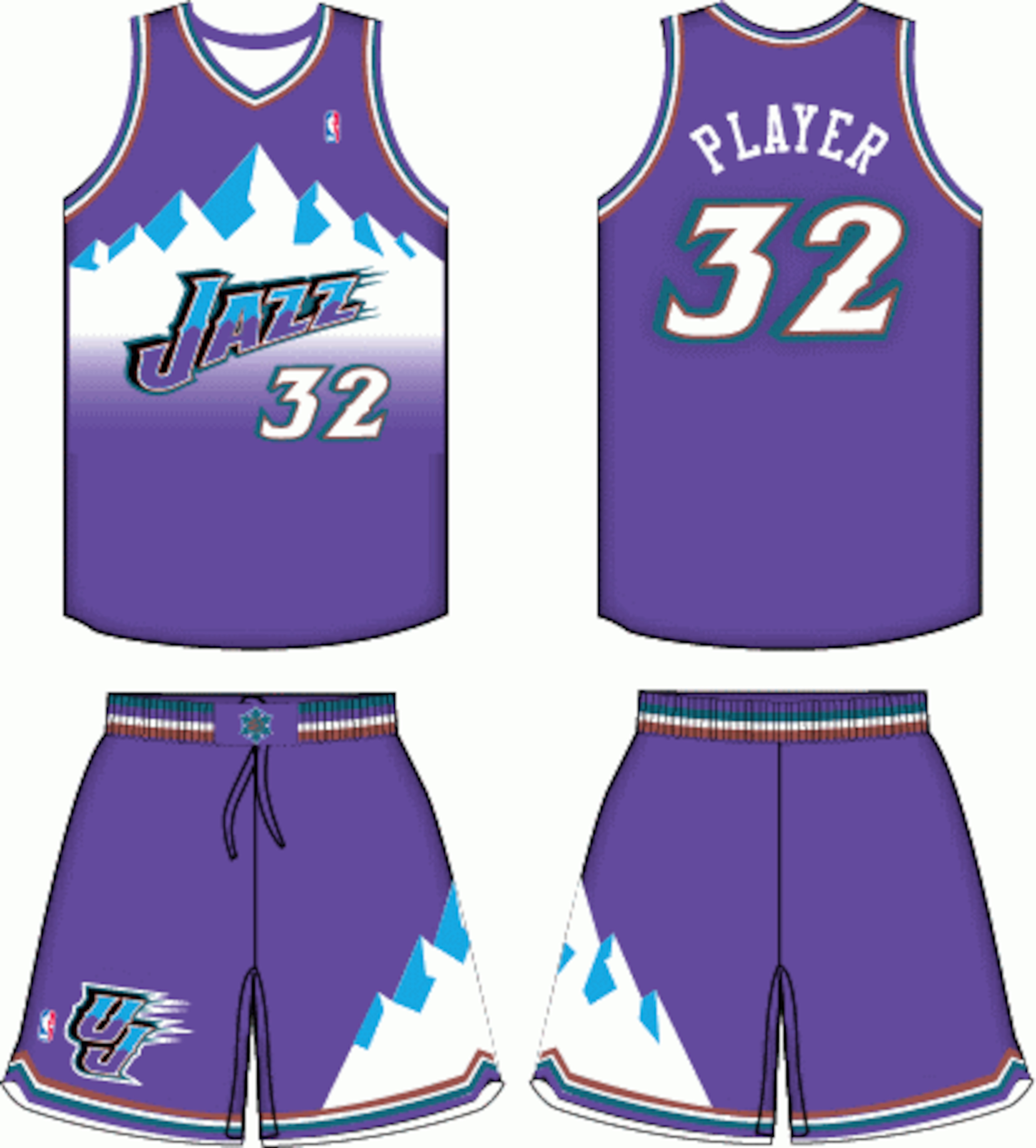
Everyone knows that Utah is a city surrounded by beautiful mountains, but you didn't have to remind us everyday.
The image of an icy mountain top isn't exactly nice to look at and thankfully the Jazz have recently gone back to the classy look of the musical note logo, which beats the "you know what" out of icy mountain tops.
12. Washington Wizards Alternate Uniform (2006-07, 2008-09)
9 of 20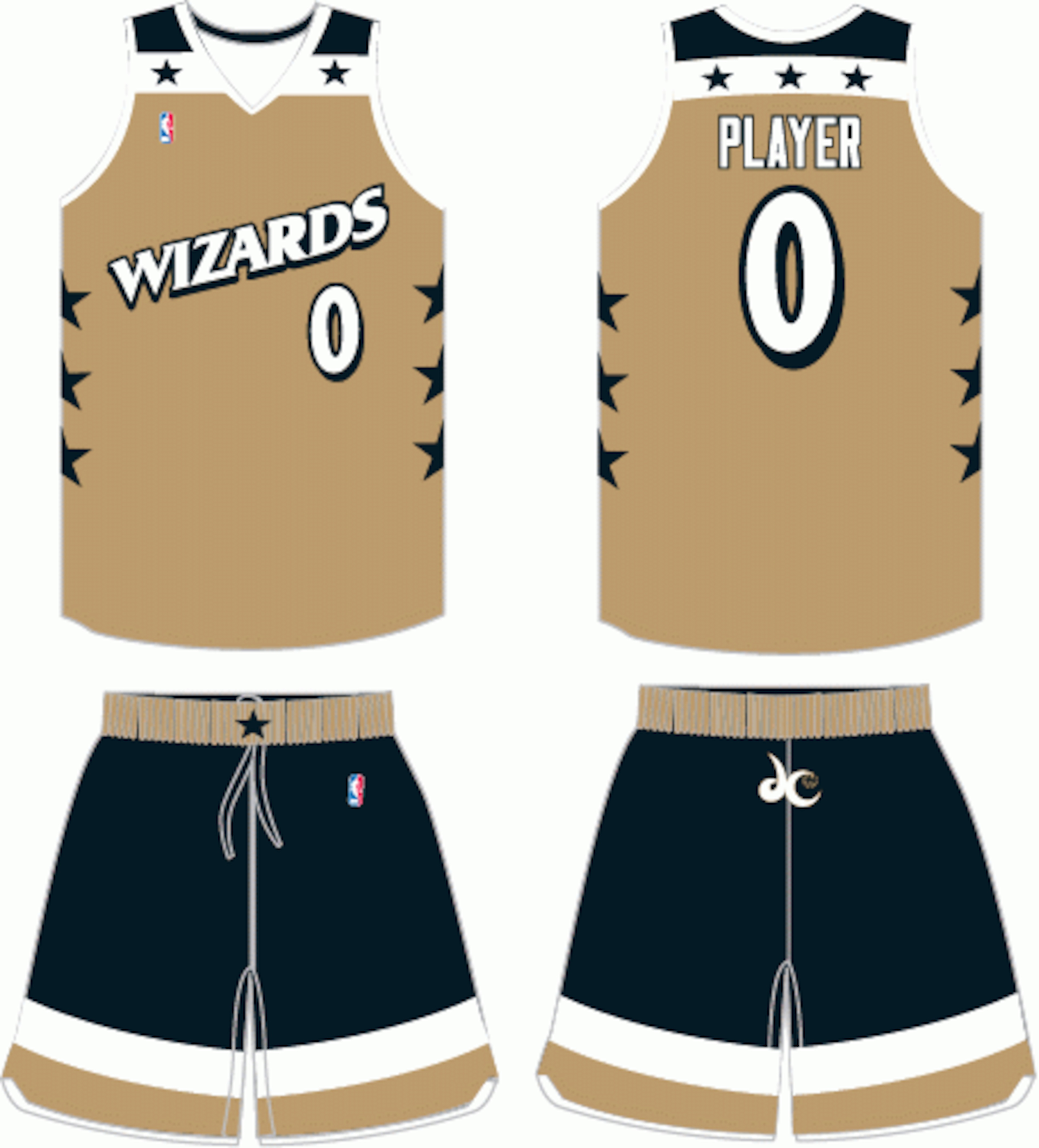
Who knows what the designer of this jersey was thinking—it obviously wasn't clever. This Washington Wizards jersey is a mix between a striped leopard and a gold flag.
This jersey is confused and disgusting. Sorry to all you Wizards fans who had to endure a bad season and a bad style.
11.NBA All-Star Game Road Uniform (2005-06)
10 of 20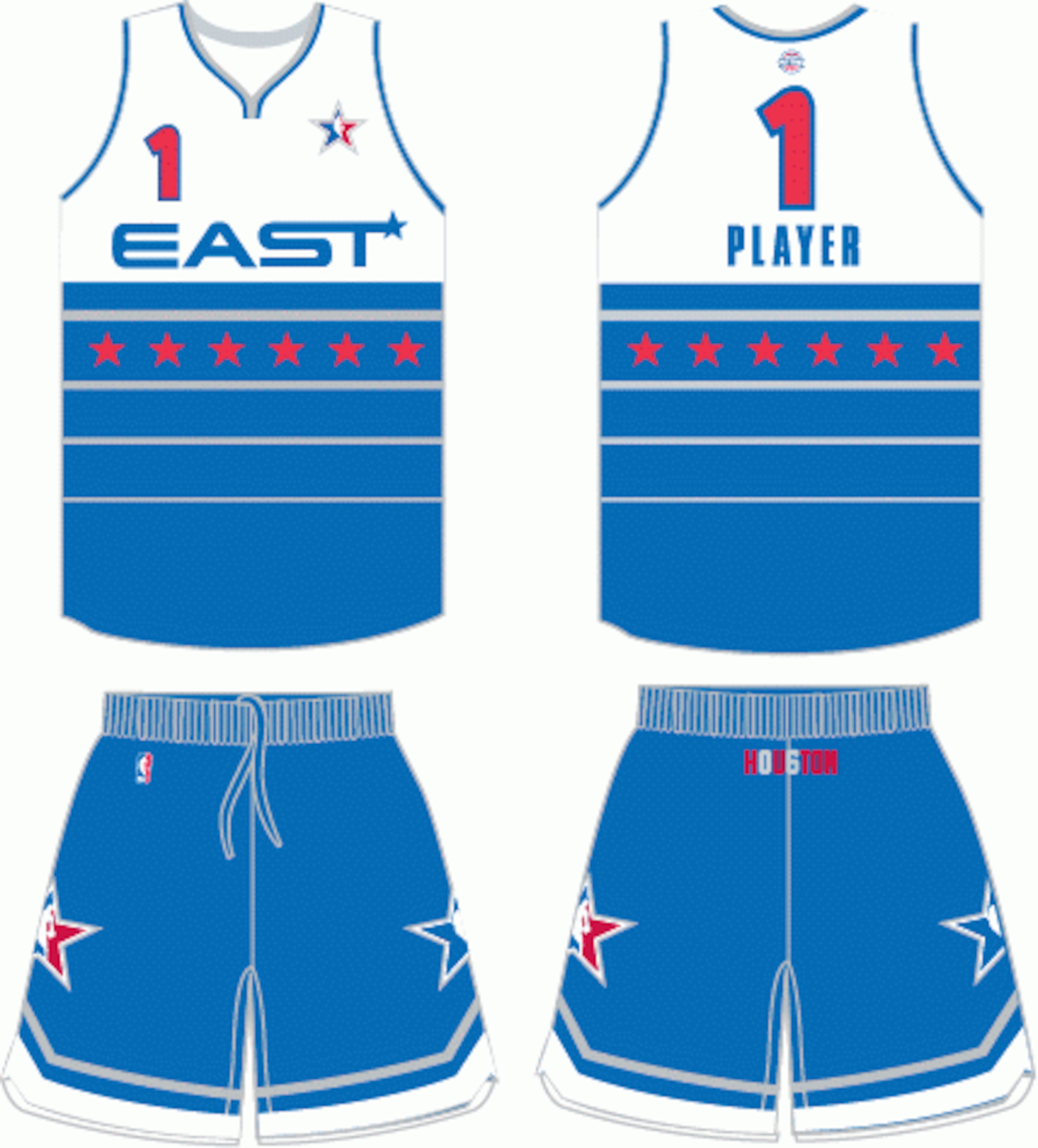
There isn't much to say about this jersey except "unbelievable."
Who in their right mind would design the All-Star jersey for the East like this? The lines mixed in with the stars doesn't look special, and honestly, this design looks lazy. This is incomparable to other East All-Star jerseys.
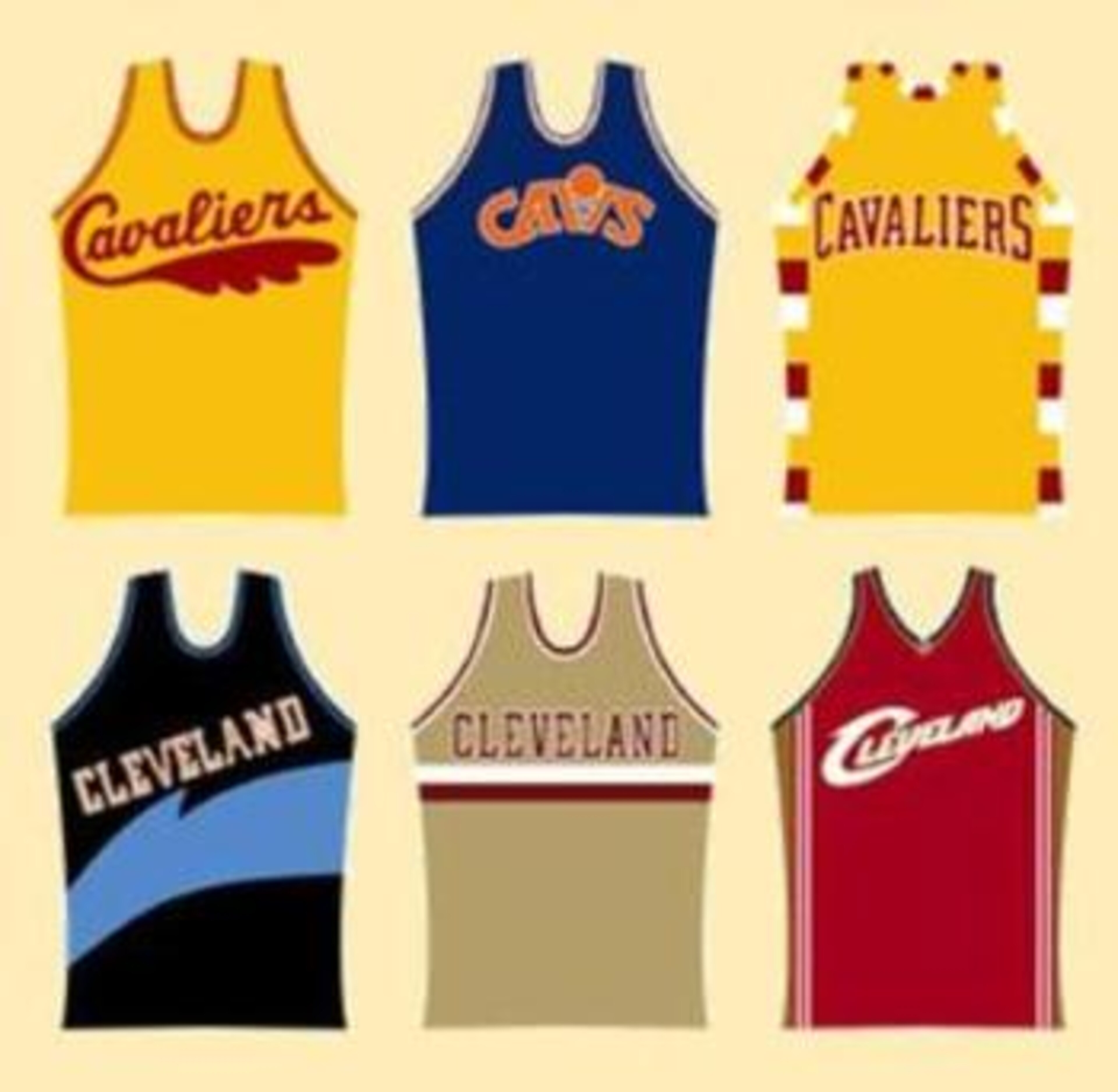
10.Cleveland Cavaliers Road Uniform (1994/95:1996/97)
11 of 20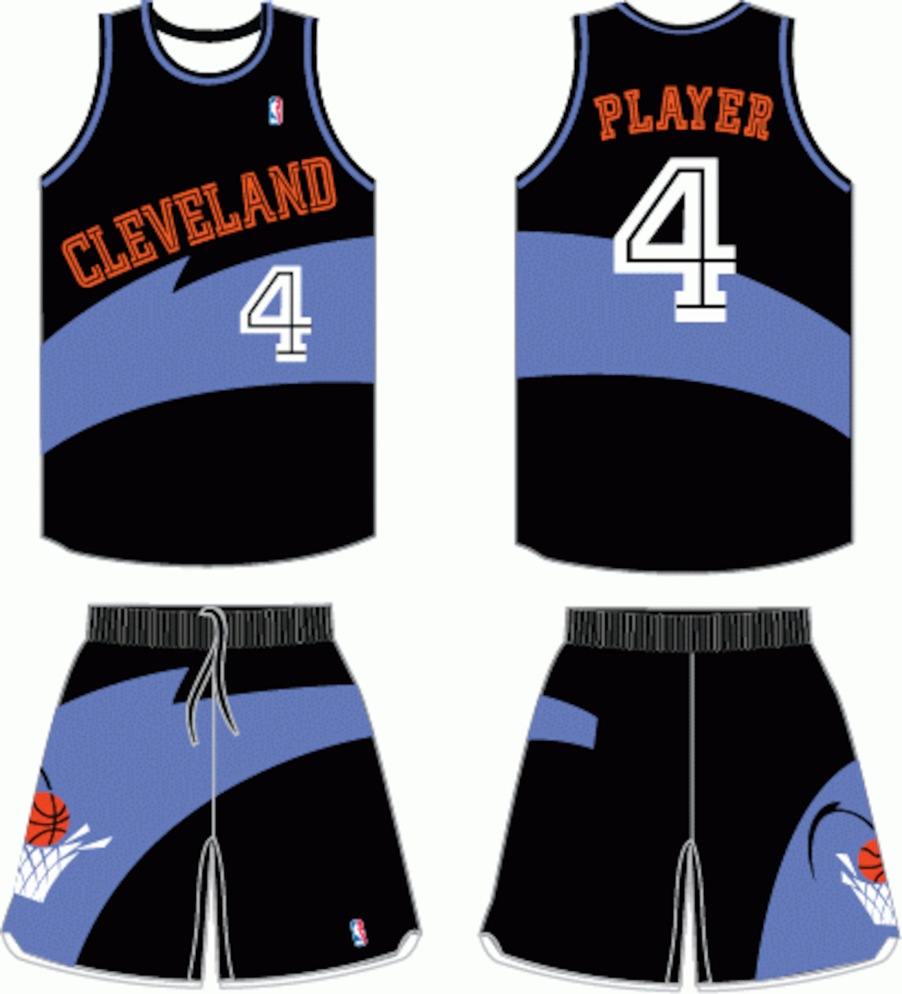
For whatever reasons, the Cavaliers kept with the questionable design; the stripe going across the middle. This is virtually the same jersey as the one previously shown, but this mixture is just as bad.
9. Minnesota Timberwolves Road Uniform (1989-90, 1995-96)
12 of 20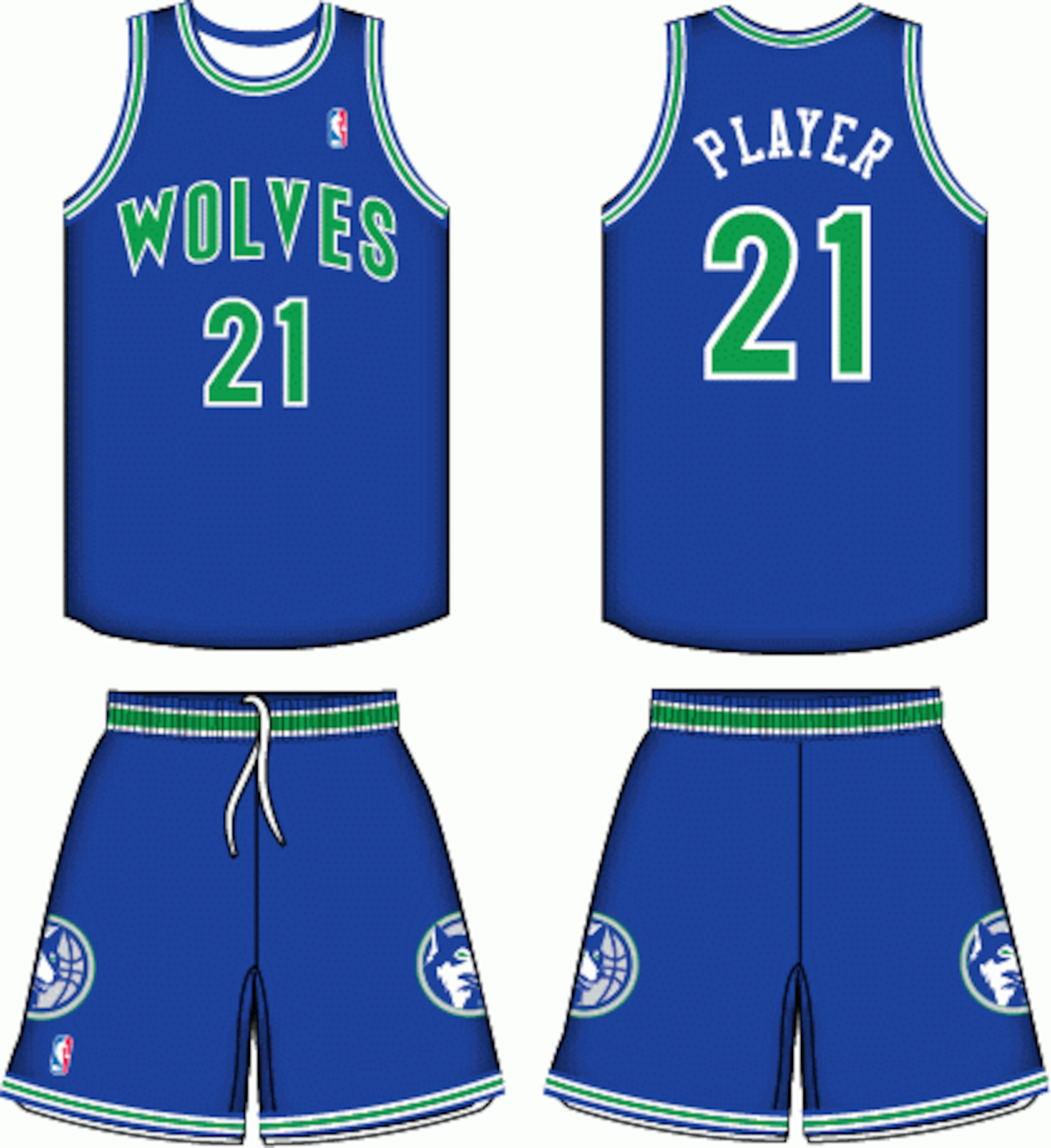
It's always interesting when teams make their own colors look bad.
The Timberwolves, during this time, obviously didn't mix their colors too well, though their original colors aren't too bad. At least they had their logo of a wolf on their shorts to make it seem somewhat intimidating.
8. Cleveland Cavaliers Home Uniform (1997-98, 1998-99)
13 of 20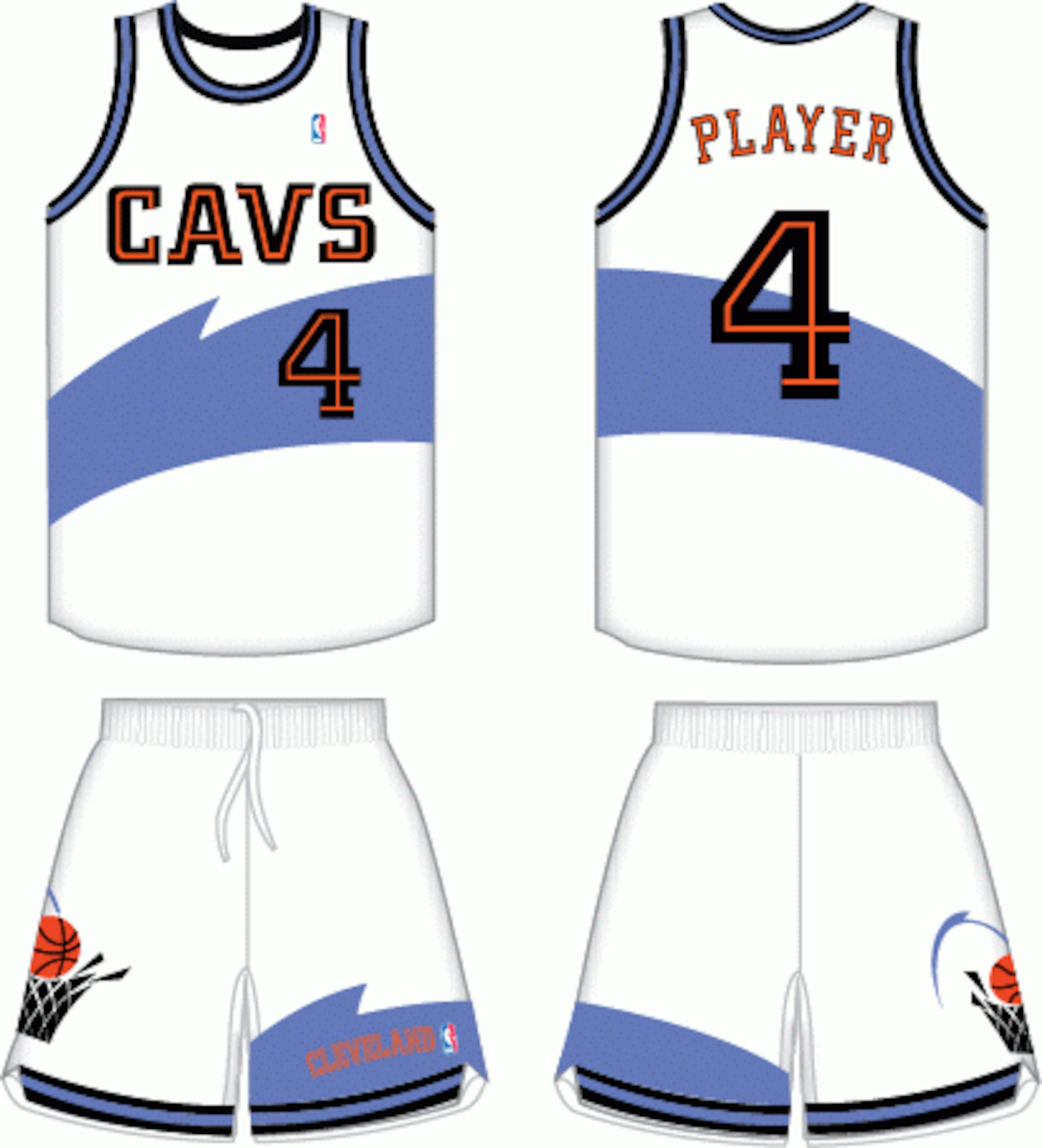
This jersey simply just has too much going on at once—the stripe across the middle and the ball going in the basket are too distracting and let's not get in depth about the color.
Though it was a good attempt to be original, the orange and light blue just aren't working and not to mention, the Cavaliers fans themselves had to deal with this for two seasons.
7. Toronto Raptors Alternate Uniform (2007-08)
14 of 20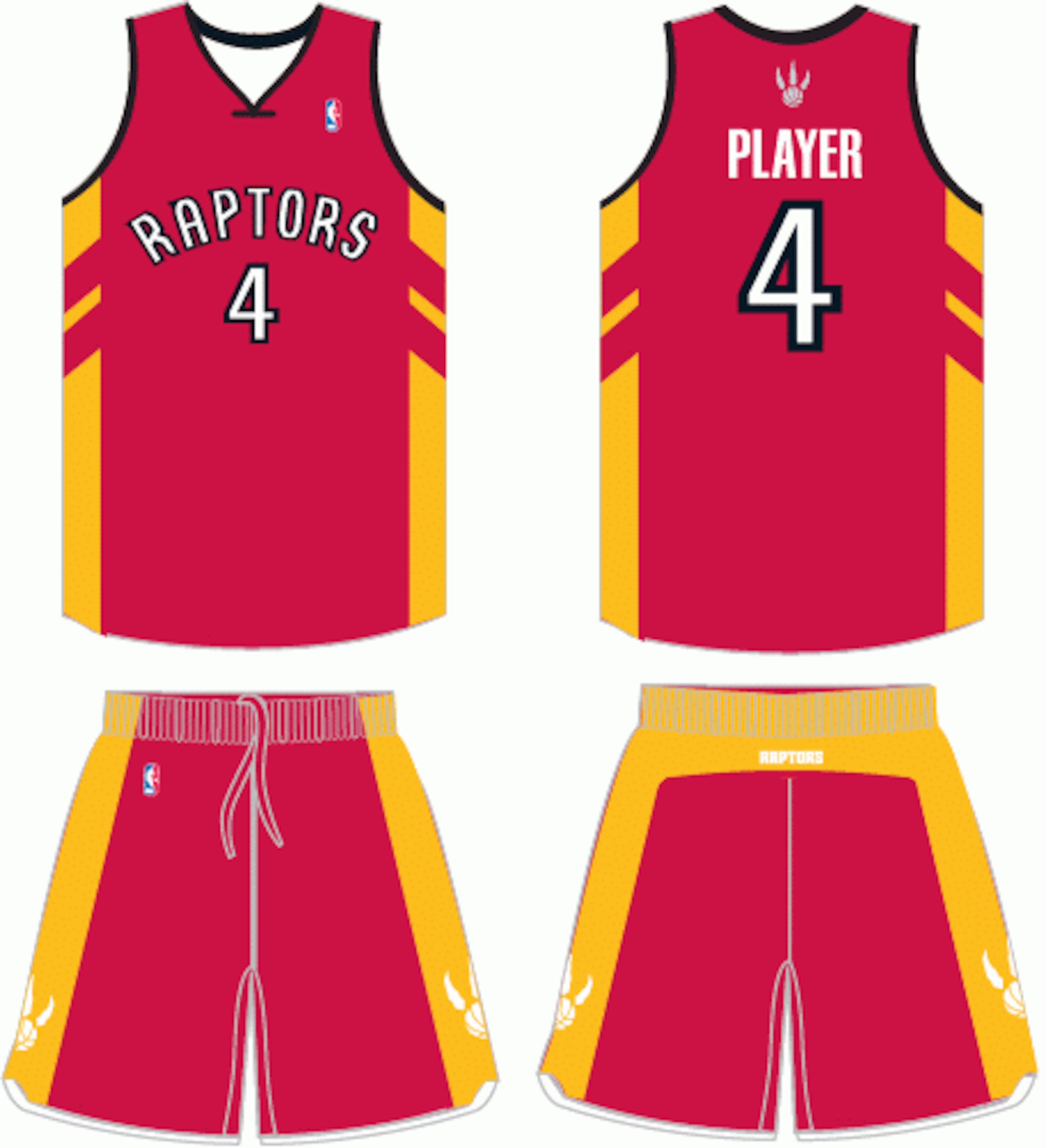
Similar to what Ronald McDonald wears, the Toronto Raptors must have made an attempt at a McDonalds theme.
Nothing to do with their colors, though an alternate jersey, the Raptors should automatically receive an A for effort.
6. Milwaukee Bucks Road Uniform (1973-74, 1975-76)
15 of 20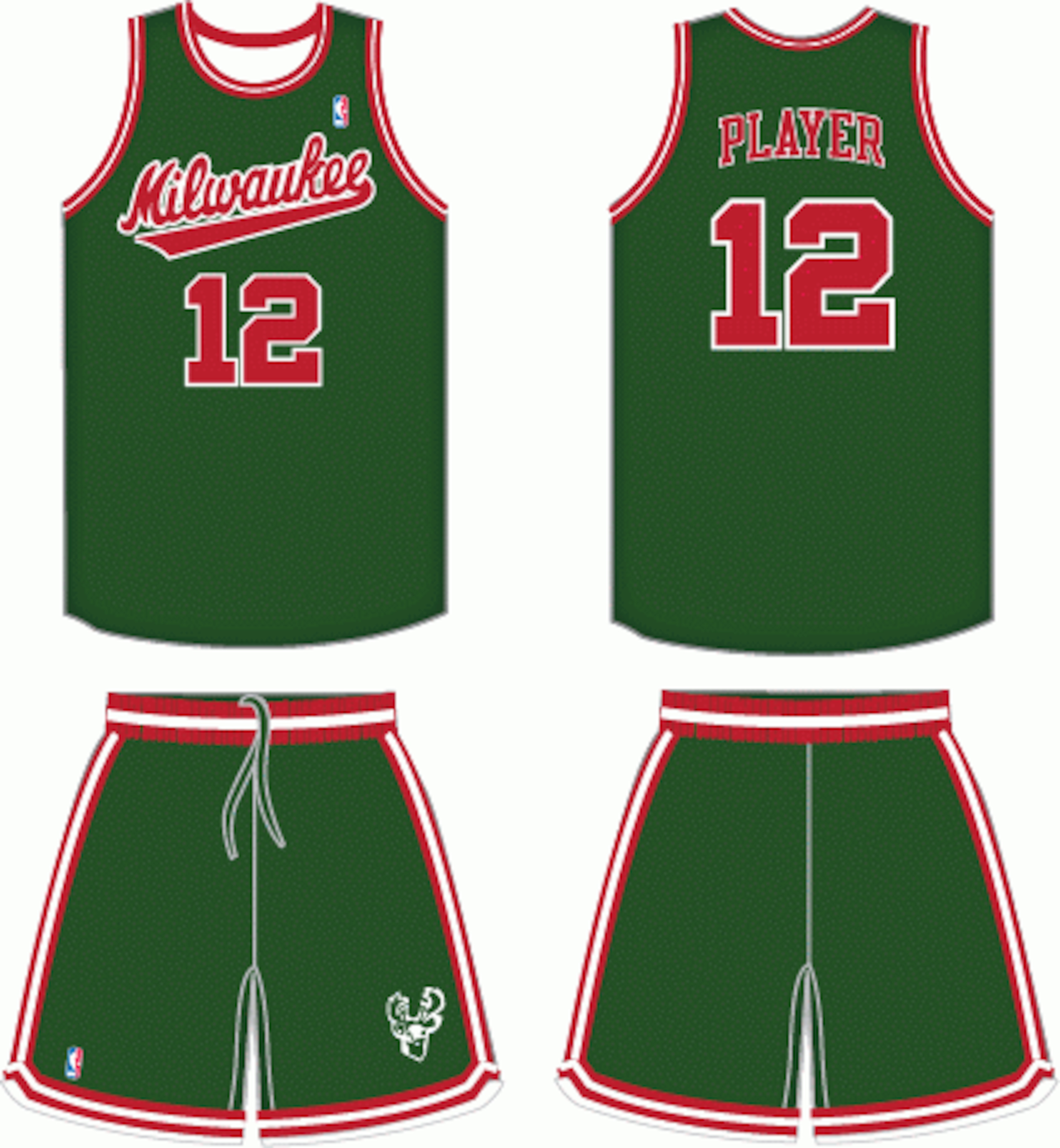
Ever prayed that Christmas would come early? Well, Milwaukee fans didn't have to, because they were in a festive mood every time they played at home, at least during this time period.
It isn't really relevant whether they would good or not, but they sure did look goofy, and isn't ironic that their logo is a buck? Some call it destiny others call it festive.
5. NBA All-Star Game Home Uniform (2007-08)
16 of 20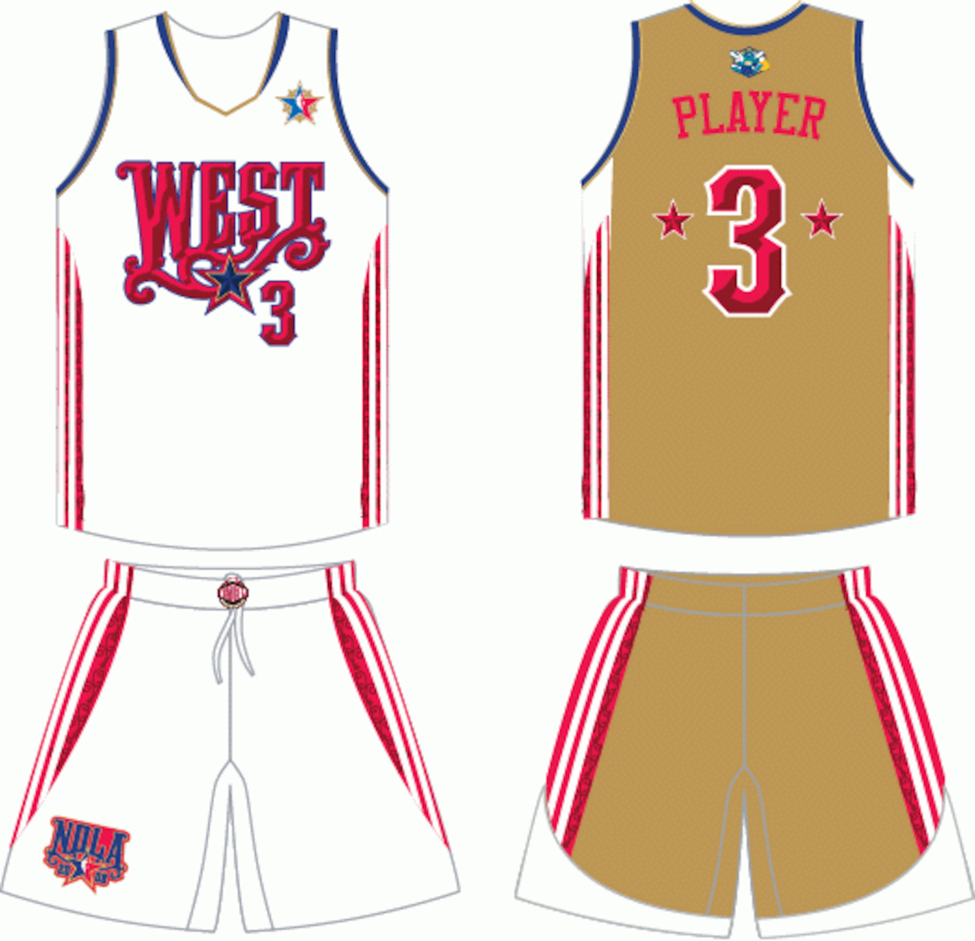
This has to be by far the worst looking NBA All-Star jersey in the history of the game.
It's a shame it had to be associated with an area (New Orleans) which was recovering from Hurricane Katrina, and of course, we know that New Orleans did indeed recover, but there might not be a chance at return for this jersey.
4. Sacramento Kings Alternate Uniform (2005-06, 2006-07)
17 of 20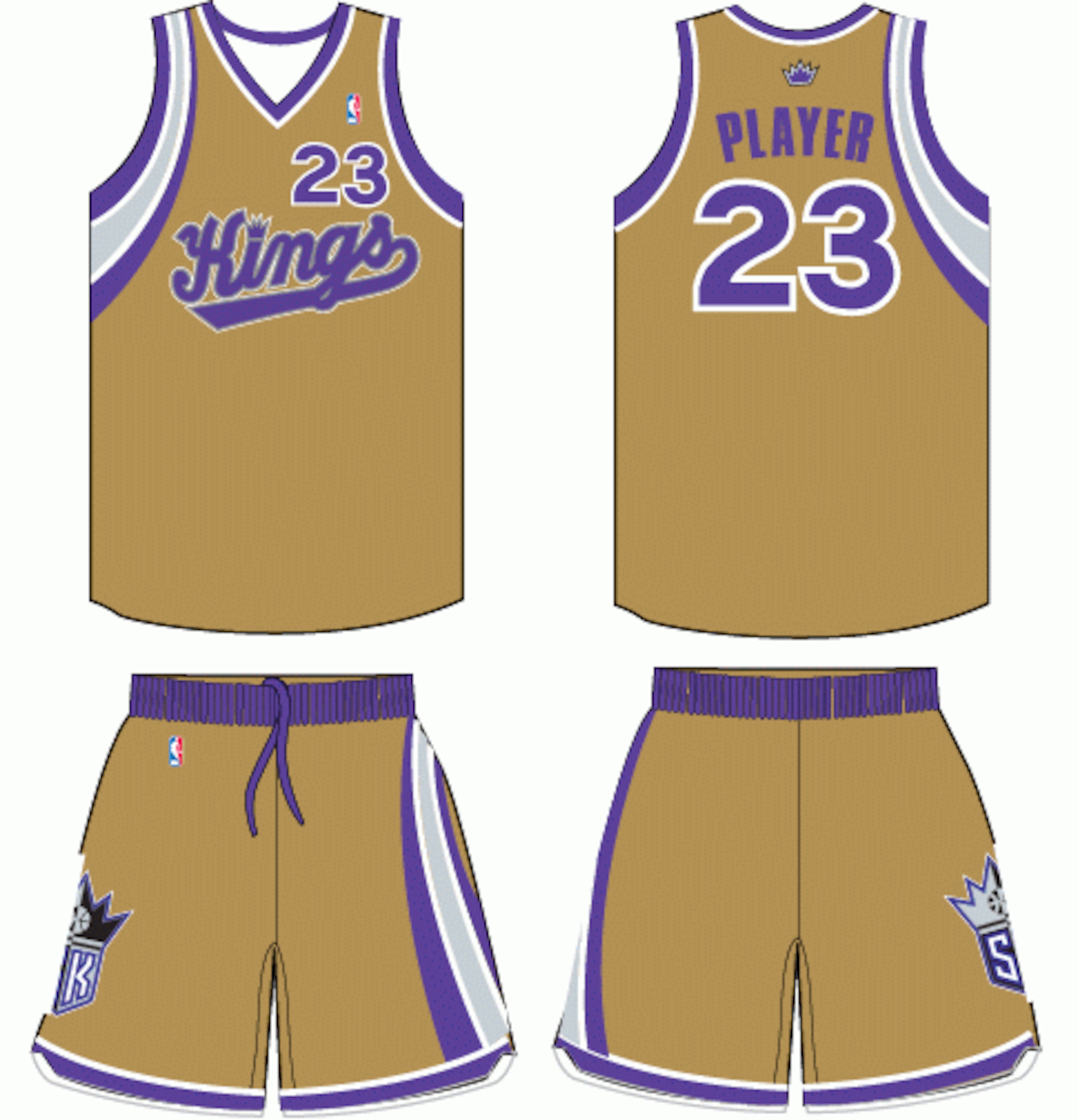
Though these jerseys were considered alternate for the Kings, the mix of gold and purple just doesn't work well.
When the Lakers are within driving distance of the Kings, Kings fans has to have envied the Lakers' classic purple and gold, because their attempt at gold just wasn't close.
3. Philadelphia 76ers Home Uniform (1991-92, 1993-94)
18 of 20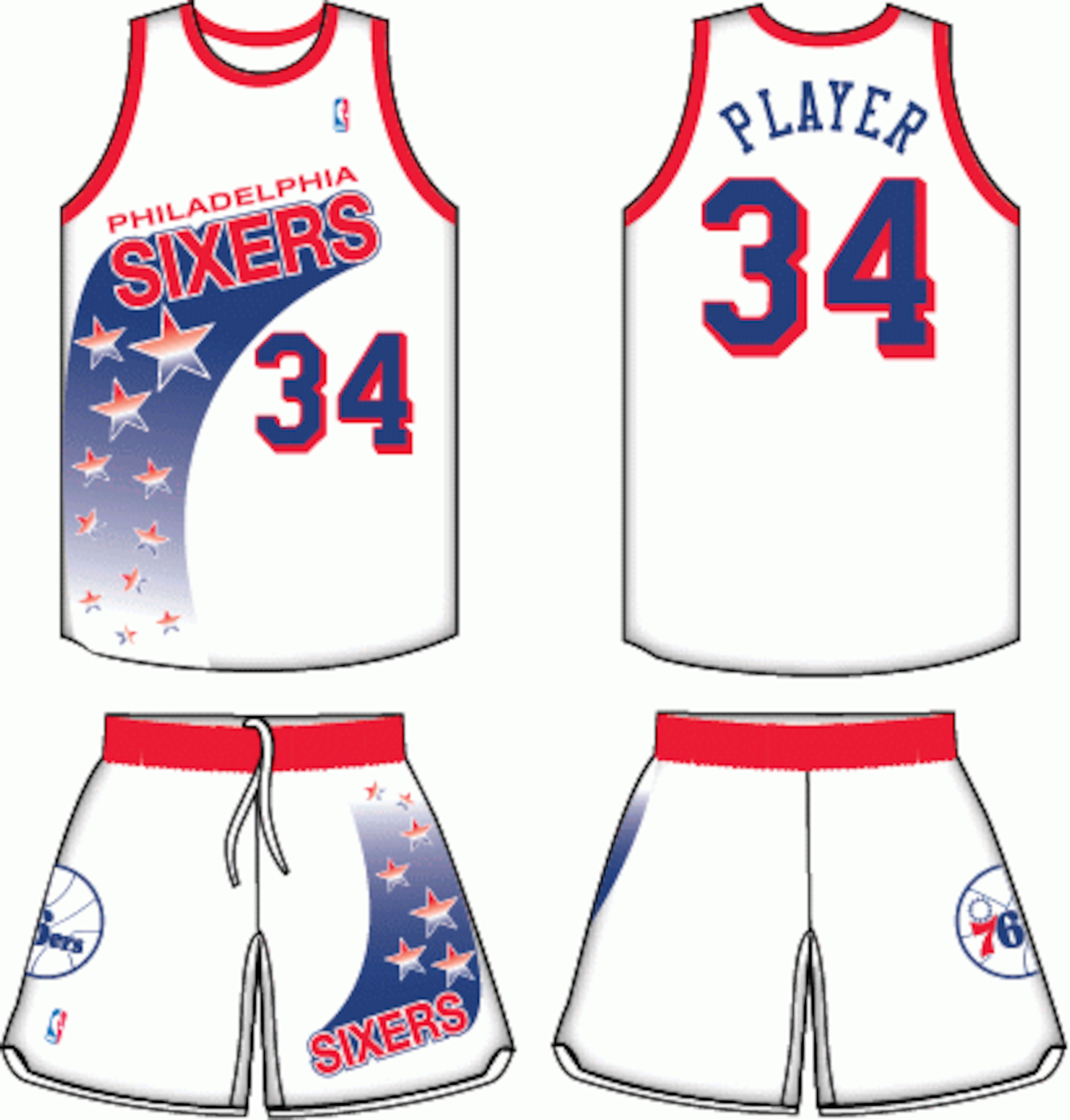
There is nothing wrong with red, white and blue, obviously being the colors of our nation, but when the Philadelphia Sixers came out with these jerseys, one has to question their thinking.
The colors are great, but the design really doesn't help make our nation look its best.
2. New Jersey Nets Road Uniform (1990-91)
19 of 20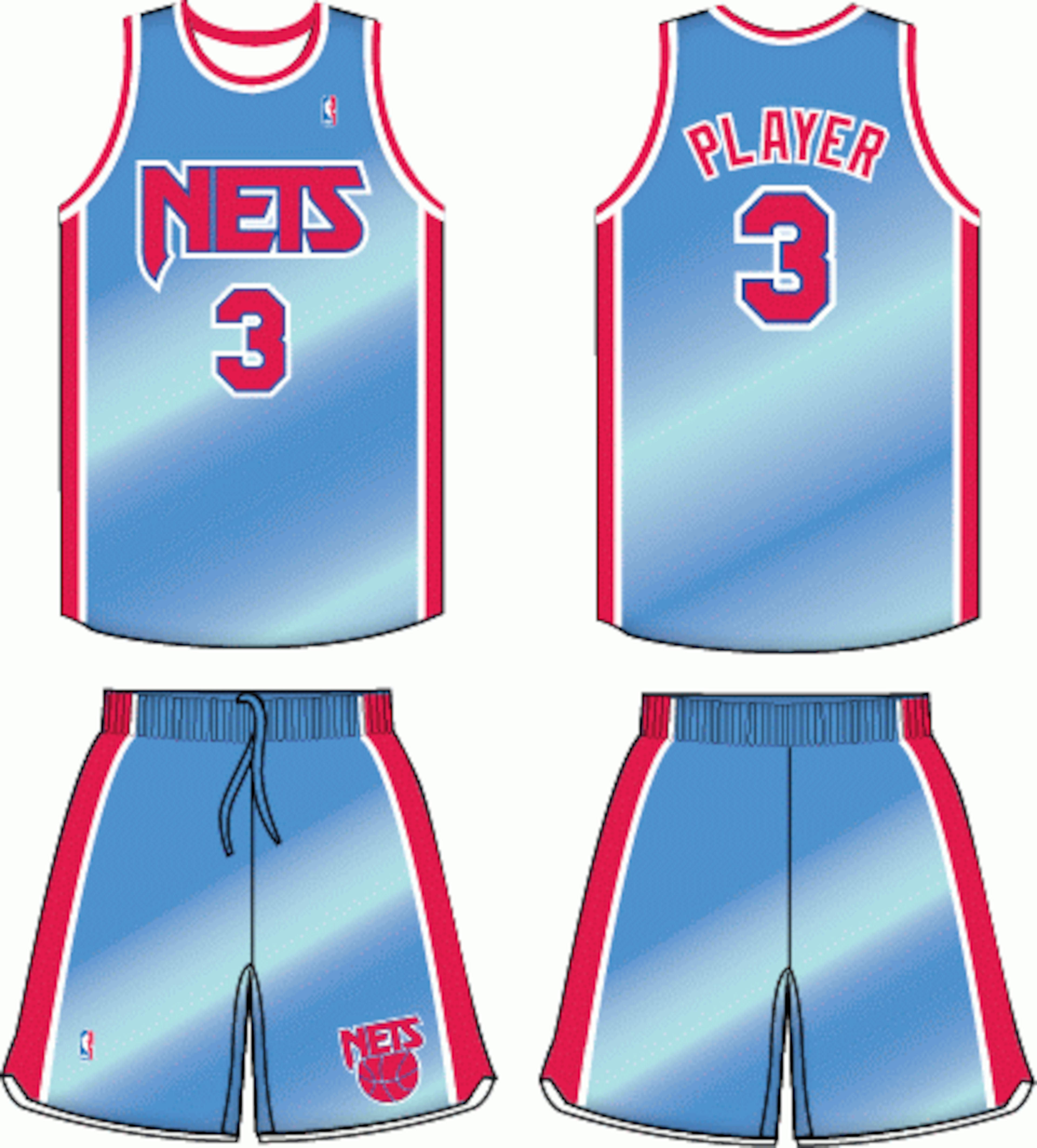
The defensive saying that every coach emphasizes is "Mirror the ball."
Well, the Nets didn't have to do this during this one year—instead their jersey's did the mirror imaging for them.
Of course, this came with negatives and positives: the opponents could stop and take a look at how they look simply by staring into the Nets jerseys, and the positive, well, actually there really wasn't any.
1. Cleveland Cavaliers Home Uniform (1980-81, 1982-83)
20 of 20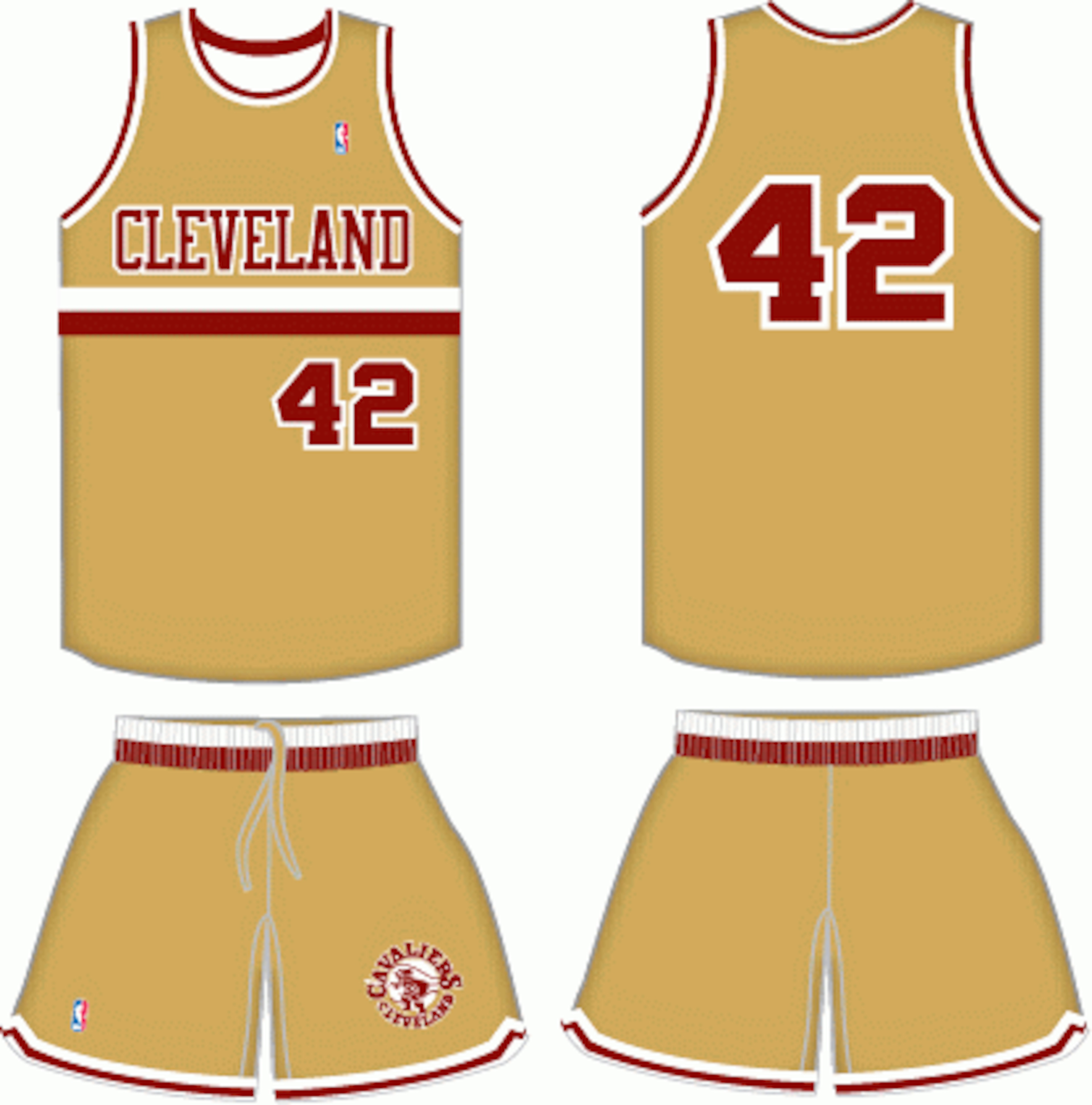
Whether you agree or not, this is the ugliest uniform in NBA history. For whatever reasons, the Cavaliers are owners of the most questionable looking jerseys in the history of the game, and it's only fitting they even hold the ugliest of them all.
This jersey isn't even something to laugh about, it is downright ridiculous and the designer of this jersey should be re-named LeBron James and be kicked out of the city of Akron, Ohio.
Sorry to say, but this jersey brings out the worst in everyone.


.png?w=3840 "Every City's 2000s Mt. Rushmore 🤩")
.jpg?w=3840 "Watch: Jerry Rice Chases After Heckler")


.jpg?w=3840 "Overlooked Rookie RBs Who Can Make NFL Impact in 2026")