Ranking The NFL Team Logos
Everyone has an affinity for their own team, but some of the leagues' logos can be pretty sweet; at the same time, some of them can seem pretty dated. Sometimes the older logos look better. Sometimes the alternate logos look better. Sometimes none of the logos work. Here is a countdown of all the NFL team's current, primary logos.
Indianapolis Colts, 1984-Present
1 of 32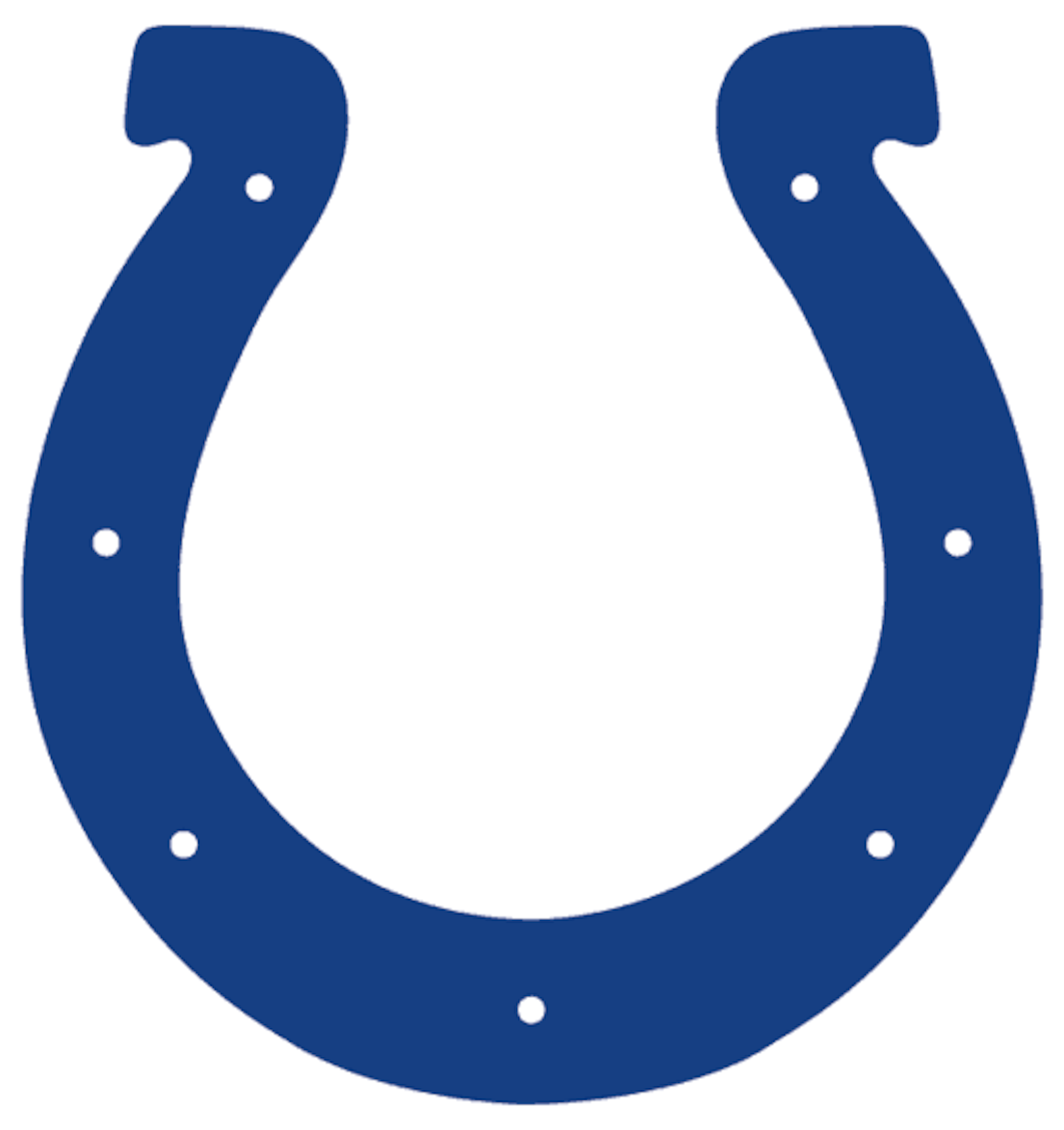
The Colts tweaked their blue this past season, but no one seemed to notice. The horseshoe design is an oldie, but not really a goodie. Very plain, only two colors (if you count the white spacing), and none of my friends who are Colts fans really like it either.
Cleveland Browns, 2006-Present
2 of 32
Perennially crappy logo for an equally crappy team. I still think the Browns should change their logo to a steamy pile of dog poo, at least sales for their merchandise will rise. Cleveland has had eight different logos since their inception in 1946; the first two being little leprechaun looking guys, the next six all different pictures of the helmet. The poo isn't sounding too bad now, is it?
New York Jets, 1998-Present
3 of 32
A perfect example of a team who should have left the original logo to run. The 1963 logo had the team name splattered across a jet, which made the team make sense. Now they don't even have the fancy "J" that the 1998 logo had. And the green is such a bad color it is almost brown.

.jpg?w=3840 "Falcons Cowboys Football")
.png?w=3840 "Rams Bears Football")
New Orleans Saints, 2000-Present
4 of 32
The Saints have an okay logo, the fleur de lis represents the enigma of the city of NO as well as the state of Louisiana, but aside from the sparkly gold there isn't much going on. I prefer the chunkier style of this logo over their original, lanky black fleur, however.
Jacksonville Jaguars, 1995-Present
5 of 32
The NFL has a lot of bird and large-cat logos, and the Jags have the worst one. The teal tongue is just off-putting, but is shadowed by the fact that the head of the animal is just defunct in itself. They forced the spots onto the top of the head, cluttering the design.
Carolina Panthers, 1995-Present
6 of 32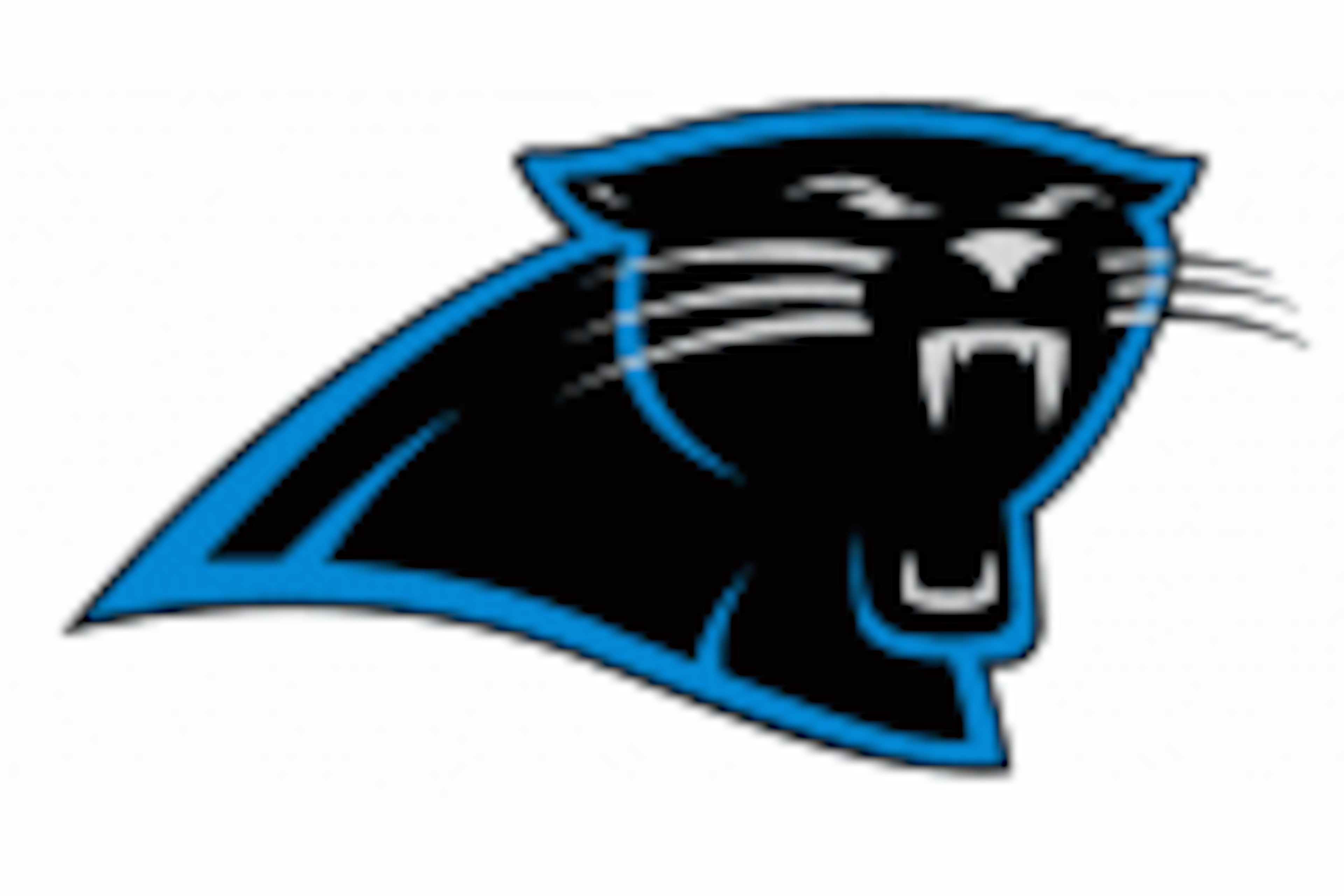
Carolina is another one of those big cats. I really want to like the logo more, simply because I think the baby blue / black team colors go really well together, and their jerseys are pretty sweet on the field. It isn't the Panther's fault; it is just hard to make a cat look intimidating. It still just looks like its yawning.
Baltimore Ravens, 1996-Present
7 of 32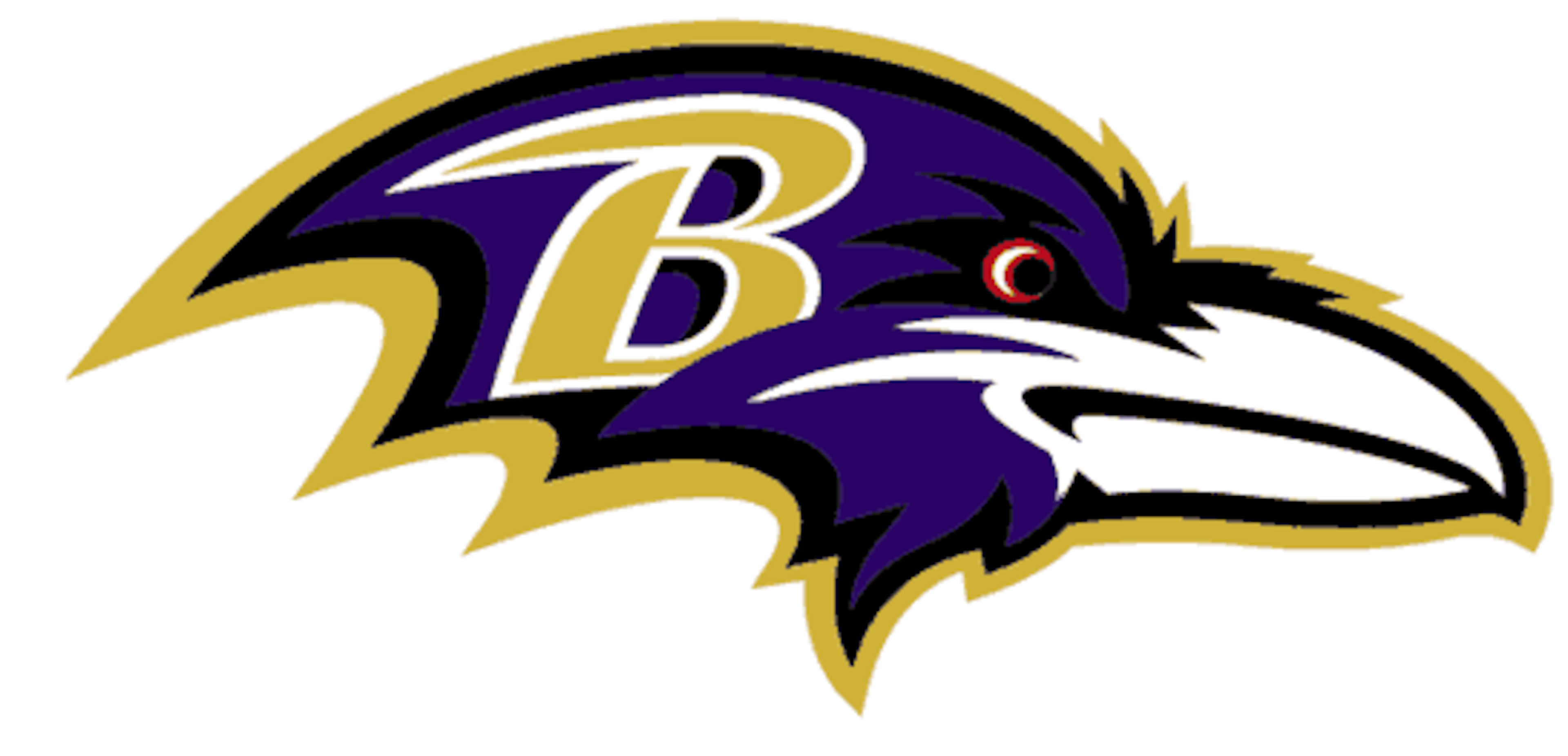
When the Atlanta Hawks of the NBA changed their logo to reflect a meaner looking bird, I figured the Ravens would be the first bird-logo team to follow suit. Instead, despite the great purple / gold color scheme, we have a casual looking bird with a beak way to big and cheeks that look like they're storing nuts for the winter. No team or team's fans want their logo to look like it has nuts in it's mouth, especially when it isn't a chipmunk. The secondary logo for the ravens is a head-on look at the animal, and makes it look a little less like a bird and a bit more like an old man with a bad hair day. The Ravens have had a great, intimidating defense for so long, they should have had a more aggressive logo to go with it.
New York Giants, 2000-Present
8 of 32
The G-Men have a logo I wish I could like more, but the styling is just too plain. I didn't much care for the logo from 1999 that looked exactly the same, but just spelled out 'GIANTS,' but looking back I think it was just a bit better. Like the Titans, a giant is just a hard thing to have a logo for.
Chicago Bears, 1974-Present
9 of 32
The Chicago Bears logo looks exactly like the Cincinnati Reds logo. Why? There's more than one font for lettering, do they really have to share it? I like the 'C' design, it is classic, but I hate teams sharing logos of other teams and sports, especially when they're not even in the same city, much less same state. I will say that Orange is a good color here mixing with the navy.
Cincinnati Bengals, 2004-Present
10 of 32
I honestly thought that this 'B' logo was the secondary logo to the actual Bengal picture, but I was wrong. Rounding out the bottom 10 is the Bengals, again, I dig the bright orange, but the logo itself is a bit unoriginal. Then again, just missing the second two-thirds of the ranking is typical Bungles, right?
Arizona Cardinals, 2005-Present
11 of 32
I have heard that bluebirds are the meanest of the smaller fliers, but the Cardinals logo just looks mean. The old logo that was used from 1994-2004 was decent, but adding the meaner eye to this one makes it so much better. We are still playing football. If your team is going to be named after a bird that weighs less than a pound, you should make it look pissed at least.
Seattle Seahawks, 2002-Present
12 of 32
Again, altered a classic logo to make it look a bit meaner, and I can't be the only one that likes the day-glo neon green these guys use. (Or can I?) I noticed that the 'Hawks do have an alternate logo that pictures the entire bird swooping down, which, with some tinkering, could improve their logo even more.
St. Louis Rams, 2000-Present
13 of 32
Before this logo, the St. Louis Rams just had their team name, with the St. Louis arch over it. This is the first logo in team history to use the actual animal for which the team is named. (Are there any rams in St. Louis?) I am still undecided on whether I like the gold and navy, or the yellow and navy. The gold seems to be more modern, but there's only so much you can do. As a Titans fan, I still see those yellow and navy uni's stopping Dyson on the 1 yard line. Ouch.
Miami Dolphins, 1997-Present
14 of 32
I actually was regretting using secondary logos in this review, because I like the Dolphins' one much better, where the animal is holding a football between his fins. I live in Florida, I know it is hot here. You don't need to remind me with the sun in the background. I also like the helmet sitting lower on the dolphin's head as opposed to the older logos where it pops way up in the air. The Fins have changed their logo six times - and all of them look pretty much the same. Time for a new direction, Miami.
San Francisco 49ers, 1996-Present
15 of 32
I wanted so much to place this logo higher; I have always been a fan of the burgundy and gold color scheme, but we're getting closer to crunch time. It is plain, yes; but it is also classy and one of the only good 'oval' logos left.
San Diego Chargers, 2007-Present
16 of 32
If I wasn't a Titans fan, I would be a Chargers fan. Who doesn't like lightning bolts? Really! The blues and yellow make for a great logo, and great color scheme that makes great jerseys. Even their throwback logos are pretty sweet. Hard to go wrong as a Bolts fan.
Dallas Cowboys, 1964-Present
17 of 32
I am in dire need of Yosemite Sam as the logo for the 'Boys, but that isn't going to happen. I know it is a classic, but... It is still just a star. It's roots made it this far, but here, it shall not pass. Any Cowboys fan who will get mad at me for this, just be happy you got ranked higher than the 49ers.
Philadelphia Eagles, 1996-Present
18 of 32
We are going to follow my track record when I say that I like the angry birds, and this is one angry looking bird. The silver and green go well, the eagle looks poised to attack, a good logo. I don't think I am alone when I say that the old Cunningham logo was the best Philly has produced, though.
Green Bay Packers, 1980-Present
19 of 32
It is a classic, and I don't see the Pack changing this one, ever. That being said, I don't think there is any better of a logo to be had when your team is named the Packers. Maybe a triangle of cheese. The last standing of the 'oval' logos.
New England Patriots, 2000-Present
20 of 32
The Pats changed their blue color to navy in 2000, but the logo has been unchanged since the Drew Bledsoe era in New England, about 1993. They have gone from patriotic red, white and blue to somewhat less than patriotic red, silver and navy, but the jerseys are better, so the fans let it squeeze.
Houston Texans, 2002-Present
21 of 32
I really like the originality of the Texans, which is why they're so high on this list. No one knows what a 'Texan' could be casted as, so they went with a unique bull logo that has shades of the Texas state flag in it. Awesome logo, which followed an awesome logo they lost in the old Houston Oilers.
Atlanta Falcons, 2003-Present
22 of 32
The Falcons logo reigns supreme as far as the bird logos go, mostly because it looks like a flying, bird-shaped razor blade, very modern and mean. It shows of intimidating eyes, sharp talons and beak, and just looks like it is going really fast thanks to the angles used. I still think they should go back to the red helmets, though.
Kansas City Chiefs, 1972-Present
23 of 32
KC has a unique design, like they wanted to be another 'oval' logo, but broke apart the constraints and chiseled it into an arrowhead. Any logo is better than their original logo, which had five different states on it and had what looked like an indian streaking naked through them all.
Detroit Lions, 2009-Present
24 of 32
The end of Millen, the Beginning of Stafford, the Lions had a lot to look forward to in 2009 when they altered their classic, Barry Sanders-era lion design. They added the inlays to give the creature some aggression and character, and the blue they use goes great with the silver. The new jerseys are pretty sweet as well. A great example of changing for the future, but remaining true to your roots; just what the Lions needed to do.
Buffalo Bills, 1974-Present
25 of 32
The modern look of the Bills logo really seems like it was ahead of it's time back in 1974, and still feels like it belongs now; withstanding the test of time is big for a logo, especially when the team may not have it after they move to Canada soon. Although, this logo could be tweaked a bit to look like a charging moose instead...
Tennessee Titans, 1999-Present
26 of 32
The Titans logo is a new, modern blend, and amazingly the only NFL logo that has fire depicted. The baby blue, silver and navy has always looked good on the uniforms, and the red gives them just enough contrast. Personally, if we were using secondary logos, the Titans would have won; the sword logo they use for the alternate on the sleeves of the jersey is my favorite.
Washington Redskins, 1983-Present
27 of 32
Another classic logo; though their name may be considered offensive to some, the image is very quaint. There is no war paint, no tomahawks, but this logo makes it work with the feathers attached to the emblem. An all-timer.
Minnesota Vikings, 1966-Present
28 of 32
How can anyone not like the Vikes' logo? Purple and gold on a blond Norse warrior all set beneath the legendary horned helmet. A great logo to go into battle with. The logo remained largely unchanged since 1961, just getting an about-face and a color face-lift in '66. The helmet of the logo bred some of the best football helmets ever.
Tampa Bay Buccaneers, 1997-Present
29 of 32
The flag on a sword is great, the Bucs could have gone so many ways with the pirate theme, but they got it right here. if the football wasn't under the skull and cross-bones, you would think it was a real band of pirates; a welcome change from the old neon orange 'Yucks' logo when they first entered the league. (The Buccaneer looked like a wuss, and he was winking at you.) The silver and maroon-ish red are great colors for the team as well.
Pittsburgh Steelers, 1963-Present
30 of 32
The old logo for Pittsburgh just said 'Steel' next to the diamonds, and it was like that for only a year. Not only do the Steelers have an awesome logo, it pays homage to their working class, which is always great. The Steelers' font is used the world over, and it is truly standing a time test after rotating through five prior logos since 1933.
Denver Broncos, 1997-Present
31 of 32
The Bronco's logos have been great since '68, but the newest one is the best. The crush orange mane flows down an angry looking steed as it looks like it is charging. (Take a note, last-place Colts.) This is the way a horse logo should look. Mean and sleek, the Broncos are looking good.
Oakland Raiders, 1995-Present
32 of 32
The Oakland Raiders. After a slight tweak from the 1964 design (that I can't even notice,) the Raiders have a logo that maintains their attitude and exudes from their fans. The swords, the football helmet tie-in, the smug but masculine face, and the eye-patch that says 'been there, fought that,' make the Raiders the best design in my mind. It is a stamp, set against a shield that helps make the team who they are, and give them the swagger that is ever-present when you see the mobs of fans celebrating in the Black Hole.
On Monday, I will take a look at the jerseys of the teams to see how they stack up!

.jpg?w=3840 "Commanders Football")


.jpg?w=3840 "AEW Dynamite Live Grades 🔠")