

The new season is finally here. Club football is back mere minutes after the 2026 FIFA World Cup finished, bringing with it a new set of awful kits to digest.
If you like bad colourways, questionable designs and big clubs just getting it wrong, this is for you.
Enjoy.
10. Tottenham Hotspur Away
1 of 10
A catfishing football kit.
The shirt is actually quite nice from far away, but get closer and the neon stripes start to look a lot more like claw marks. It has training-top energy, something bold enough to get people interested, but really should only be worn before matches.
The thing is, Spurs' purple third shirt would make quite a nice away kit. It's not great by any means, but it does seem more fitting than this Nike concoction, which looks weirder the longer you stare at it. What's that line above the sponsor?
9. FC Basel Away
2 of 10To be fair to FC Basel, they might have the two worst kits combined this year.
The home shirt's red and blue are so bold, it's like when you accidentally set hue and saturation to extremes when editing kits on the old Pro Evolution Soccer games.
The away kit goes the other way, appearing as if it's lost all sense of personality after a heavy wash. Yellow and white are a very flushed-out colour combination. So much so, you can't even really see the club badge.
8. Norwich City Third Kit
3 of 10Do you remember those optical illusions that force you to stare at an unbearable pattern in the hope an image pops out? Norwich City's third shirt is like that, but what appears is just short of a headache.
The purple-and-mint design looks just like the seats on old English buses. The Canaries launched the shirt with photos on a bus, so it's probably what they were going for…
Maybe more kits need to lean into old niches like that. Next season could be based on the parachute game or hopscotch.


7. Real Madrid Home
4 of 10
A good example of getting too creative for the sake of it.
Real Madrid's home shirt doesn't need green and red stripes; the latter are completely distracting. It's rare for Adidas to miss the mark for one of its big clubs, but this just isn't cutting it, as it doesn't come across as classic or particularly modern.
Instead, Los Blancos' new home kit looks like one your mate would pick up cheap in bulk ahead of your next five-a-side match against Dungdee United.
6. Kaizer Chiefs Away
5 of 10South African side Kaizer Chiefs have had some bangers over the years. They pretty much always try to do something different. That should be applauded.
This year's away kit silences those claps.
The spiky design is meant to mirror a lion's mane, but the way the sponsor sits on it is uneven. The top looks like a sports bra, and the bottom is so bare that it brings attention to the Charlie Brown vibe that dominates everything. Not good.
5. FC Luzern Away
6 of 10I have a theory that FC Luzern decided to put out an ugly away kit so their special anniversary shirt would look even better. The latter is beautiful—a classic design that could be worn away from the football pitch.
The away kit, though, is struggling under the pressure of that thick blue stripe with a smaller gold stripe inside.
There's interesting history behind the idea, which takes inspiration from the Jesuit church, but it's a heavy-handed design that isn't helped by the stripe and neckline combo looking like a Lego hand pointing upwards.
4. Celta Vigo Third
7 of 10
My grandad would have loved this kit.
There's an air of Only Fools & Horses about the chevron design on a shirt that is doing way too much.
Maybe it'd look good with a flat cap, down the betting shop. Maybe multiple blues on multiple reds, with a stripe on the collar and sleeves, stamped with a less-than-elegant sponsor isn't going to create the nicest shirt in the world.
3. Bournemouth Home
8 of 10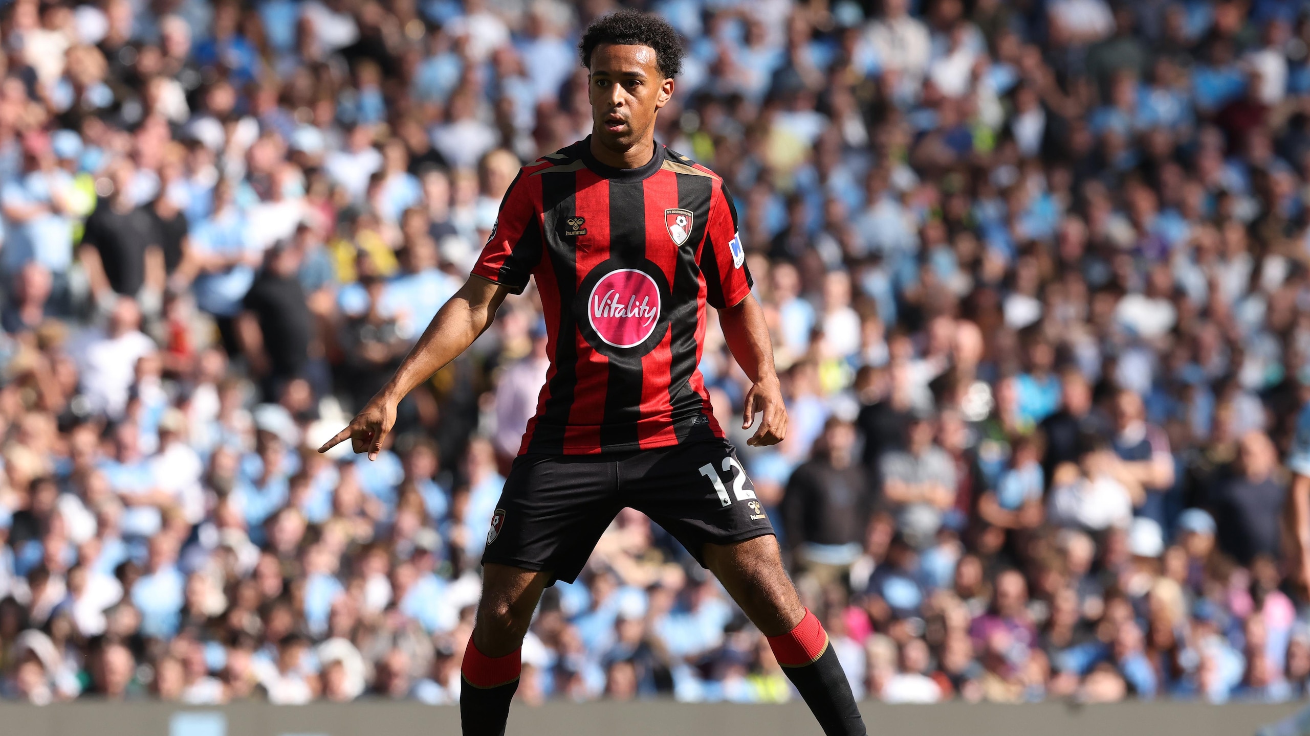
To stick with the old British comedy analogies…Bournemouth's home shirt is reminiscent of Kryten from Red Dwarf.
That middle circle, with the encased sponsor, looks like the perfect hole to slot in a hoover or whisk.
If you have no idea what I'm talking about, do yourself a favour and seek the show out. I promise it's funnier than this article.
2. Newcastle United Away
9 of 10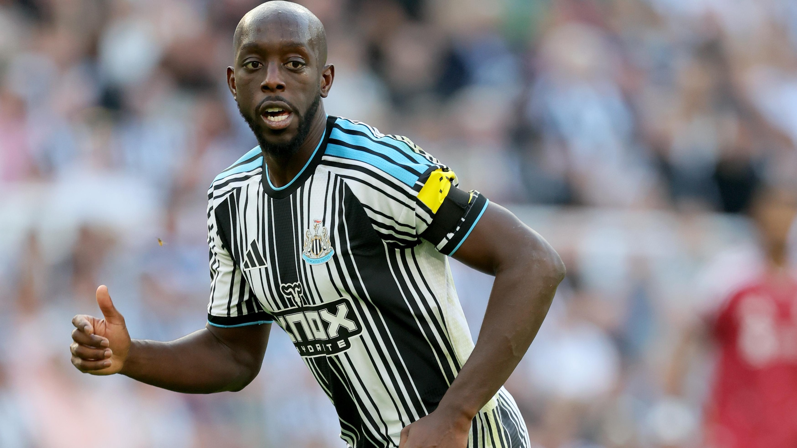
Adidas' brief for Newcastle's new shirt must have been: "Take the classic black and white stripes and absolutely batter them." We've got wide, we've got narrow. There's so much going on when, similar to iconic strips like Ajax, it just needs to be toned down.
To make things worse, the Magpies' rivals will be wearing one of the nicest home shirts of the season. Sunderland went ultra classic with it, rather than working to destroy an easy seller each year by dressing the team up as human barcodes.
1. TSV Hartberg—All of Them
10 of 10Austrian side TSV Hartberg collect sponsors like an old rocker collects stitched badges for their denim jacket.
Their kits are defined by commercial spew. All of the shirts are basic, aside from being packed with seemingly any company who will give the club money.
There can't be a world where fans will look at these and say, "Oh yeah, I'm spending money on that." But then, perhaps that's the point. The money could already be locked in, with the knowledge that any shirt featuring "Spermbooster" probably has its own special place in football history.
.jpg?w=2560 "Steelers Saints Football")
.jpg?w=2560 "Raiders Could Start Mendoza")
.jpg?w=2560 "🚨 Week 8 AP Top 25 Poll")
.jpg?w=2560 "Packers Safety Slams Refs 🤬")
.jpg?w=2560 "Lamar Being Out Shocked Ravens")
.jpg?w=2560 "Mahomes Told Teammate to Leave Meeting")