
8 MLB Jerseys That Need to Come Back
Last summer on B/R, we took a look at 10 classic MLB jerseys that should be brought back.
When you make a list like that, some are bound to be omitted.
With that in mind, here are eight more MLB jerseys not currently in rotation that should be brought back in some form.
San Diego Padres' Navy Blue Alternates
1 of 8
What basis should they return on? Alternate
The Padres' uniform refresh in 2020 gave them the best kit in franchise history, managing to reintroduce brown and gold on a full-time basis without going overboard the way they did at times in the 1980s:

Still, there's some room to pay homage to navy blue, their primary color from 1991-2019. May we suggest the jerseys in the picture at the top of this slide that were introduced in 1997 could be again worn as an alternate at home and on the road.
The Padres are retiring their polarizing pastel City Connect uniforms after the 2025 season, and the guess here is they'll probably get a second design. But these would be a more practical readdition to the rotation.
Texas Rangers' Red Alternate Tops
2 of 8
What basis should they return on? Alternate
From 2009-2022, the Texas Rangers wore red alternates at home. Though they've flirted with red being their primary color, they should be a blue team.
The red jerseys above—with matching red helmets and caps—were a nice change once in a while, and the Texas state flag on the sleeve really popped on them.
Sadly, the Rangers retired the jerseys after the 2022 season because they were going to get City Connect uniforms and needed to comply with Nike's "4+1" rule. The City Connects, well, they aren't great.

If past trends are any indication, the Rangers will need to wear their City Connect jerseys for at least three years before retiring them. This is the third season, so perhaps they could go back to the red tops next year.
The Actual Black Mets Uniforms (1998-2012 and 2022-23)
3 of 8
What basis should they return on? Alternate
This may be confusing to some, because the Mets black alternate tops remain very much in their current uniform mix.
However, one of the reasons they came in at No. 24 on this year's B/R MLB uniform rankings is because they removed the white outline that made both "Mets" and the "NY" logo on their caps pop prior to the 2024 season:
From 1998 to 2012 and then in 2022-2023, the Mets had tremendous black alternate tops. The ones they have now look cheap and unworthy of being worn by what's become a very serious franchise. Also, bring back the blue piping.


Colorado Rockies Turn Ahead the Clock Jerseys
4 of 8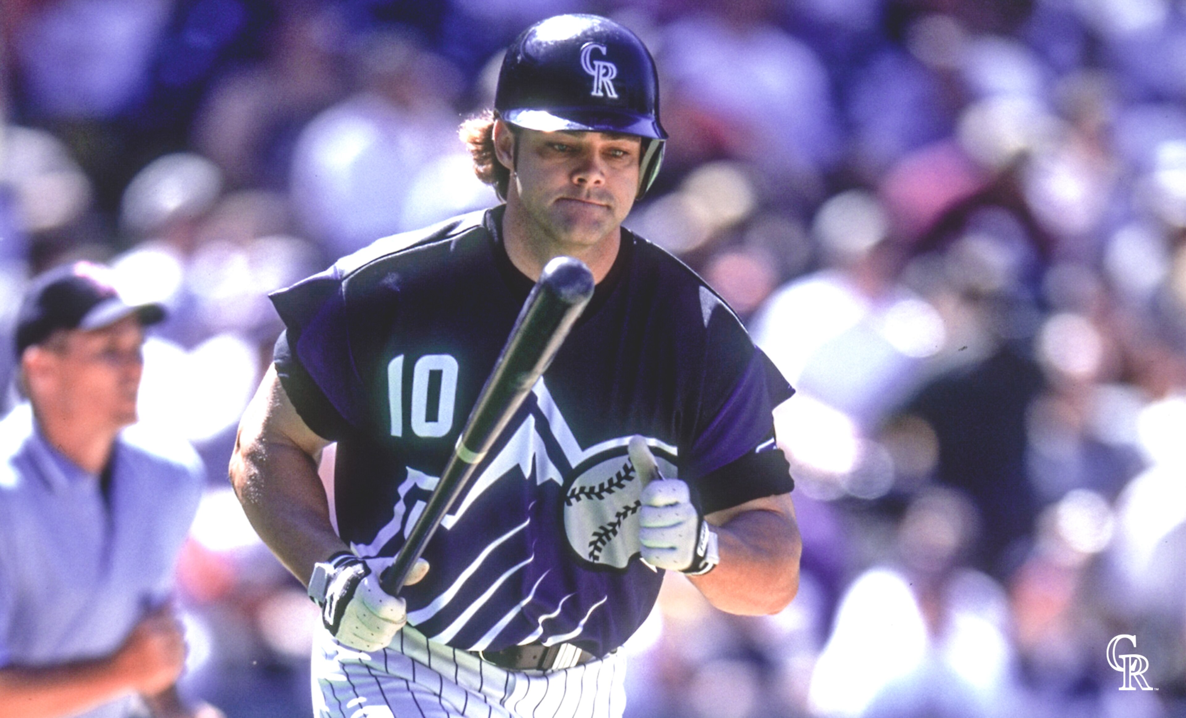
What basis should they return on? One-off weekend
Was MLB's "Turn Ahead the Clock" promotion during the 1999 season a little ridiculous? Yes. But was it fun? Also yes.
And while most of the jerseys the program produced were ridiculous, there were a few ones were revisiting. (We'll probably say the same thing about the City Connect program when that wraps up.) Among the coolest were those of the Colorado Rockies:
We're not saying everything about the Rockies' TATC jerseys should be recreated. Tank-top jerseys have thankfully gone the way of the dodo. And there's no reason that the name can't be above the number on the back of the jersey.
For a weekend, though, large purple mountains on the front of Colorado's uniforms reminiscent of a 1990s NBA jersey would be a fun promotion. Let's face it, there's not much else to get excited about at Coors Field right now.
Montreal Expos' Powder Blue
5 of 8
What basis should they return on? It's complicated
The Montreal Expos relocated and became the Washington Nationals in 2005, leaving behind one of the greatest logos and brands that North American sports has ever produced.
Since then, the only time we've seen Expos gear on an MLB field came when the Nationals wore throwback powder blues on July 6, 2019 to celebrate the 50th anniversary of the franchise's inception:

The tri-colored Expos caps are the icing on the cake to this look.
Truth be told, any Expos throwback would be a great one. But there is something that feels wrong about the Nationals wearing the throwbacks when the franchise was taken away from Montreal.
Yes, the Nationals own the history of the Expos. But it would be great if Montreal could get a second crack as an MLB city one day and we get to see the Expos brand on display 162 times per season again.
Chicago White Sox 1980s Throwbacks
6 of 8
What basis should they return on? Alternate
These were originally the primary home uniforms of the Chicago White Sox from 1982-1986, but they were too much to be worn every day.
With that said, the White Sox sported them as home alternates from 2013-2023, typically on Sundays. In that capacity, they were great. And it's not entirely clear why they stopped wearing them a year ago. As of last year, they had four uniforms: home white pinstripes, road grays, alternate black tops and Southside City Connects.

Chicago did just introduce a new City Connect, so perhaps it's hoping to keep the popular Southside CCs in the mix with the new ones. But is there anyone who thinks these new Bulls ripoff CCs are better than the 1980s throwbacks?
Correctly Colored Blue Brewers Throwbacks
7 of 8
What basis should they return on? Alternate
From 1978-1989, the Brewers donned one of the greatest home uniforms in MLB history above, topped off with the iconic ball-in-glove logo.
Fortunately, after mixing it in for years, the Brewers brought back the ball-in-glove logo on a full-time basis prior to the 2020 season:
The uniform third right is a modern take on the classic at the top of the slide, and they are pretty nice. However, the threads and cap both looked better with the lighter shade of blue, as opposed to the modern navy blue.
Fix that, maybe bring back the V-neck and the Brewers will really be in business.
Miami Marlins' Original City Connects
8 of 8
What basis should they return on? Alternate
The Marlins debuted their second City Connect uniforms over the weekend. Even an eventual walk-off home run by Kyle Stowers couldn't make these new threads seem cool:
As if just slapping a "305" on the hat wasn't bad enough, the Marlins managed to do it in a way that looks like it says "SOS," which is kind of fitting.
The Fish are a long way from their Havana Sugar Kings-inspired 1.0 City Connects which, despite ditching the franchise's traditional colors, very much felt representative of a franchise that plays their home games in Little Havana:

A year ago, B/R ranked the Marlins' initial City Connect uniforms as the top ones that the program has produced. The guess here is you haven't seen the last of them, even if they are no longer in rotation.


