Ranking the 50 Best Logos in Sports
A team's logo and colors won't make it better or be the difference between a championship or first-runner-up finish, but it doesn't hurt if the team's players and fans at least feel like winners when decked out head-to-toe in symbols and images that scream, "This is my team."
Some teams feature a logo that is a legitimate piece of sports history—instantly recognizable to both fans and non-fans alike. Others borrowed the best elements from the classics to create something familiar but unequivocally a part of their identity.
A bold few have bucked the tried and true to offer something completely new and unique, setting the new standard for future teams and franchises, or those looking to shake things up. What's obvious is that not all logos are created equal; even among the best, some just simply transcend the sport itself.
Here are the top 50 logos in sports.
50. Georgia Tech
1 of 50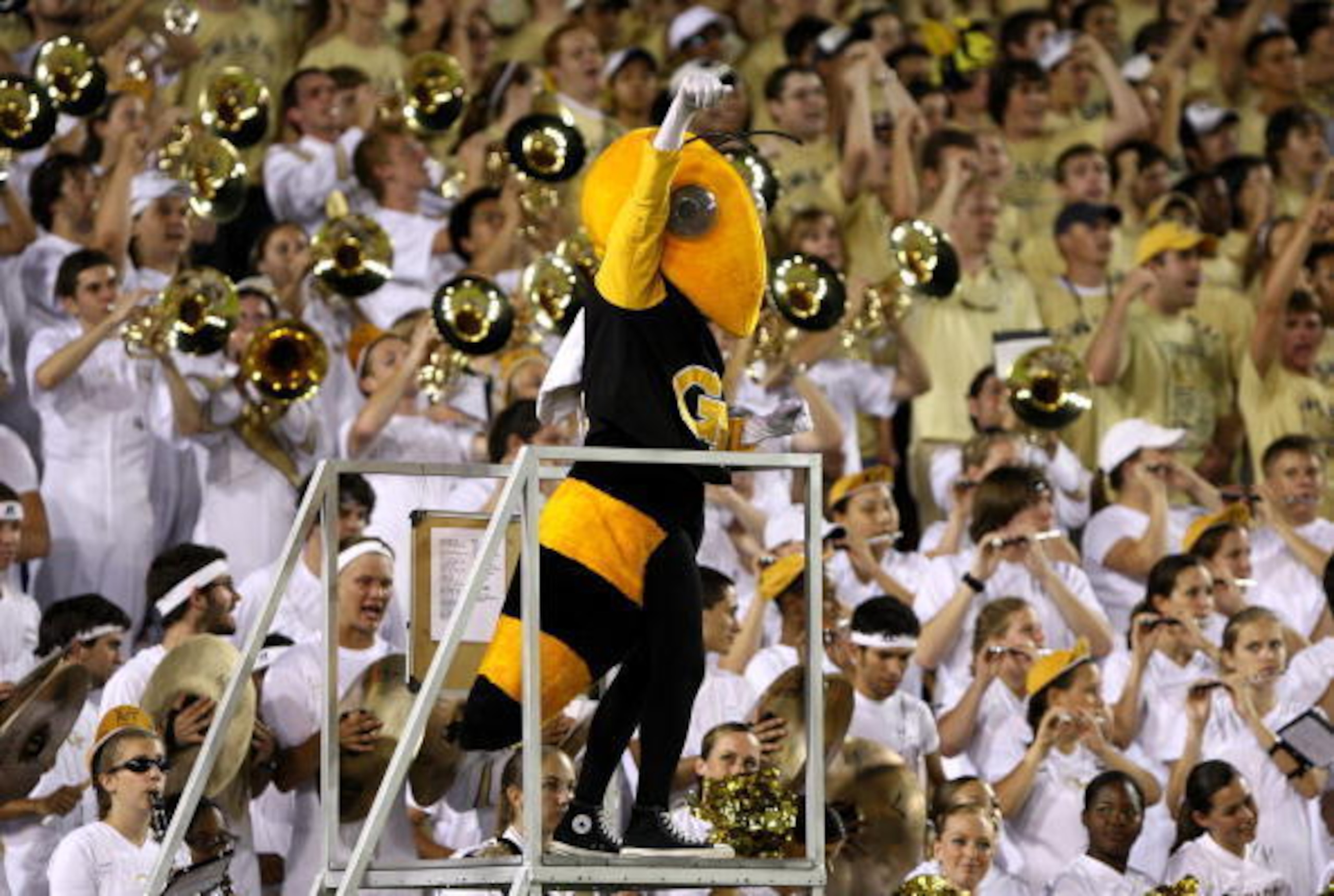
Georgia Tech’s grinning Yellow Jacket logo is cartoonishly cool, which is a marked departure from the creepily lifelike bees they favored prior to 1978—not a good look. Since the dramatic shift, it’s been one of the better mascots in college.
49. Chicago Cubs
2 of 50
The Cubs missed an awful lot before they finally hit on their current logo, which was adopted in 1979. It’s definitely classic, if not a little bit boring. Their alternate logos with the bear cub are always a welcome addition.
48. New York Knicks
3 of 50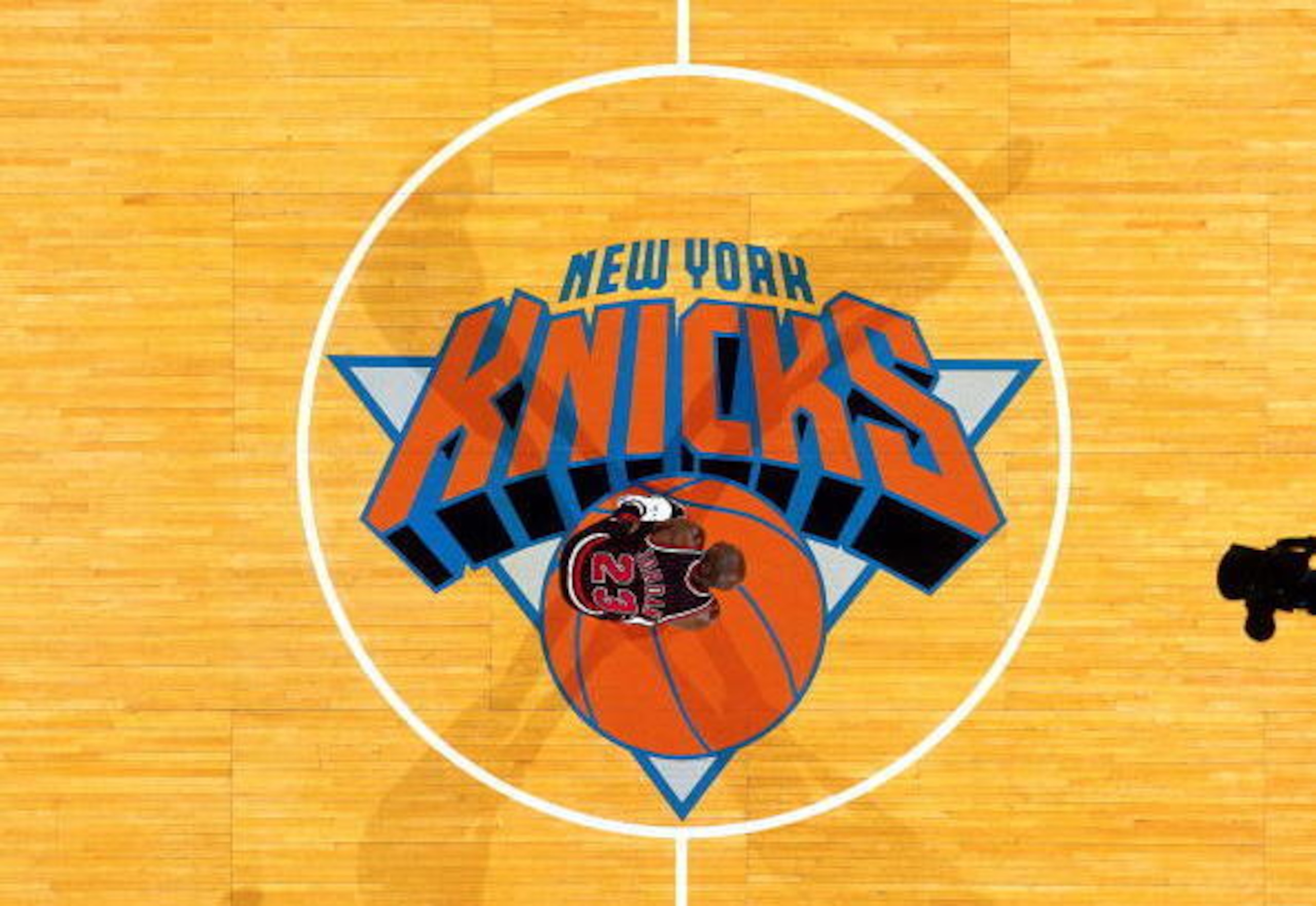
The Knicks logo is one of the few in sports that have slowly evolved over time, each time for the better. Although it’s not particularly creative, it’s classic and in no way excessive.

47. Pittsburgh Penguins
4 of 50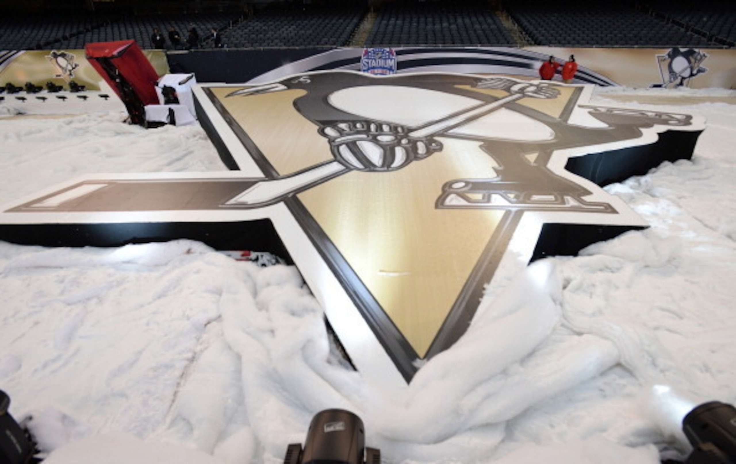
Like so many teams in the NHL, the Penguins logo suffered a very unfortunate corporate-looking redesign in the early '90s, which lasted an entire decade. Thankfully they saw the error of their ways in Pittsburgh and switched back to the classic penguin in 2002.
Although the colors are a bit more subdued than logos past, the current penguin is exactly the same design as the one adopted by the team in 1968.
46. South Carolina
5 of 50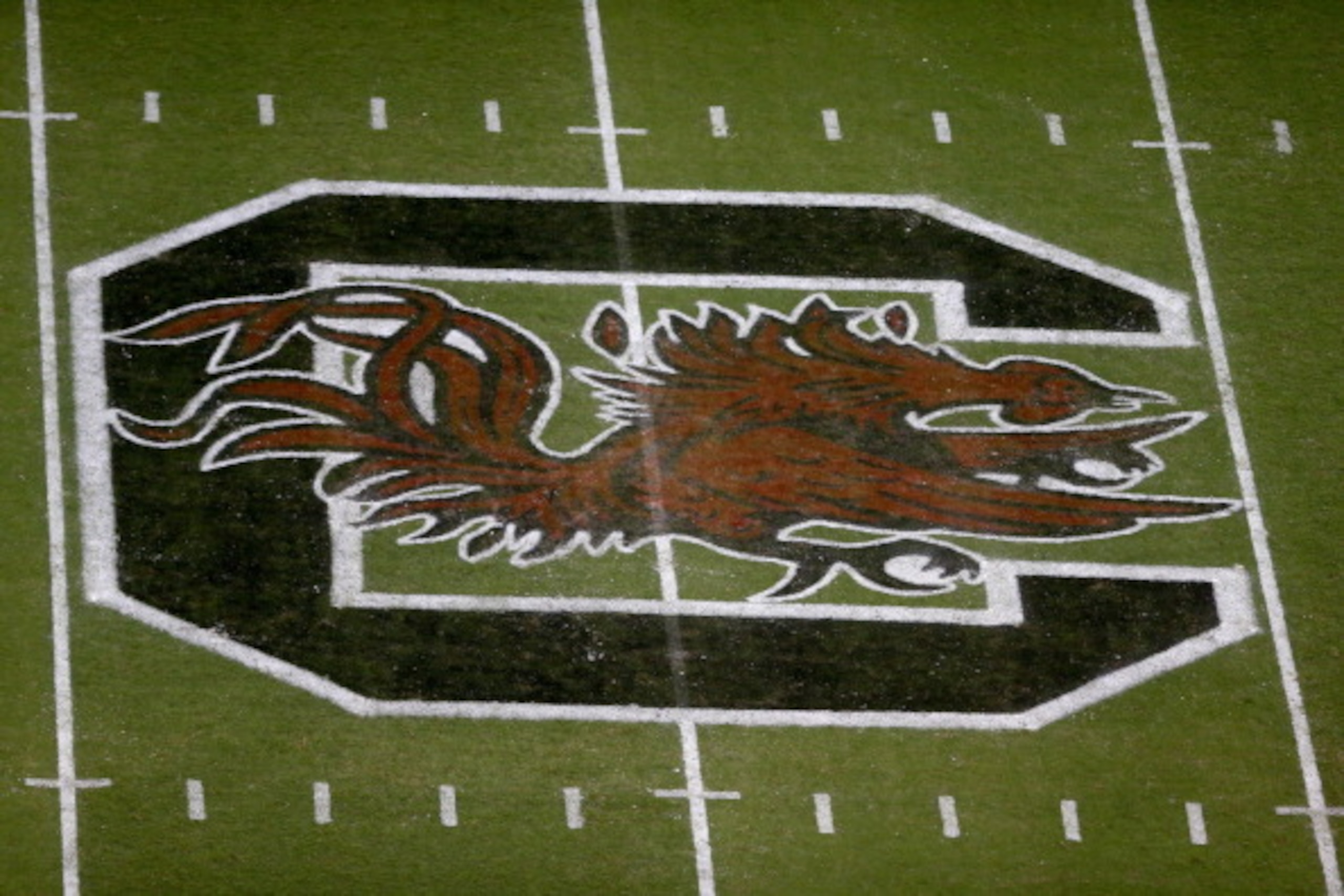
The first time I saw South Carolina’s logo, I distinctly remember asking what the hell it was. A “gamecock” is just a chicken, which they somehow manage to dress up like something legitimately intimidating.
And making that something garnet and black? Just perfect. The fact that it doesn’t seem like it would work in any colors is a testament to that.
45. Minnesota Lynx
6 of 50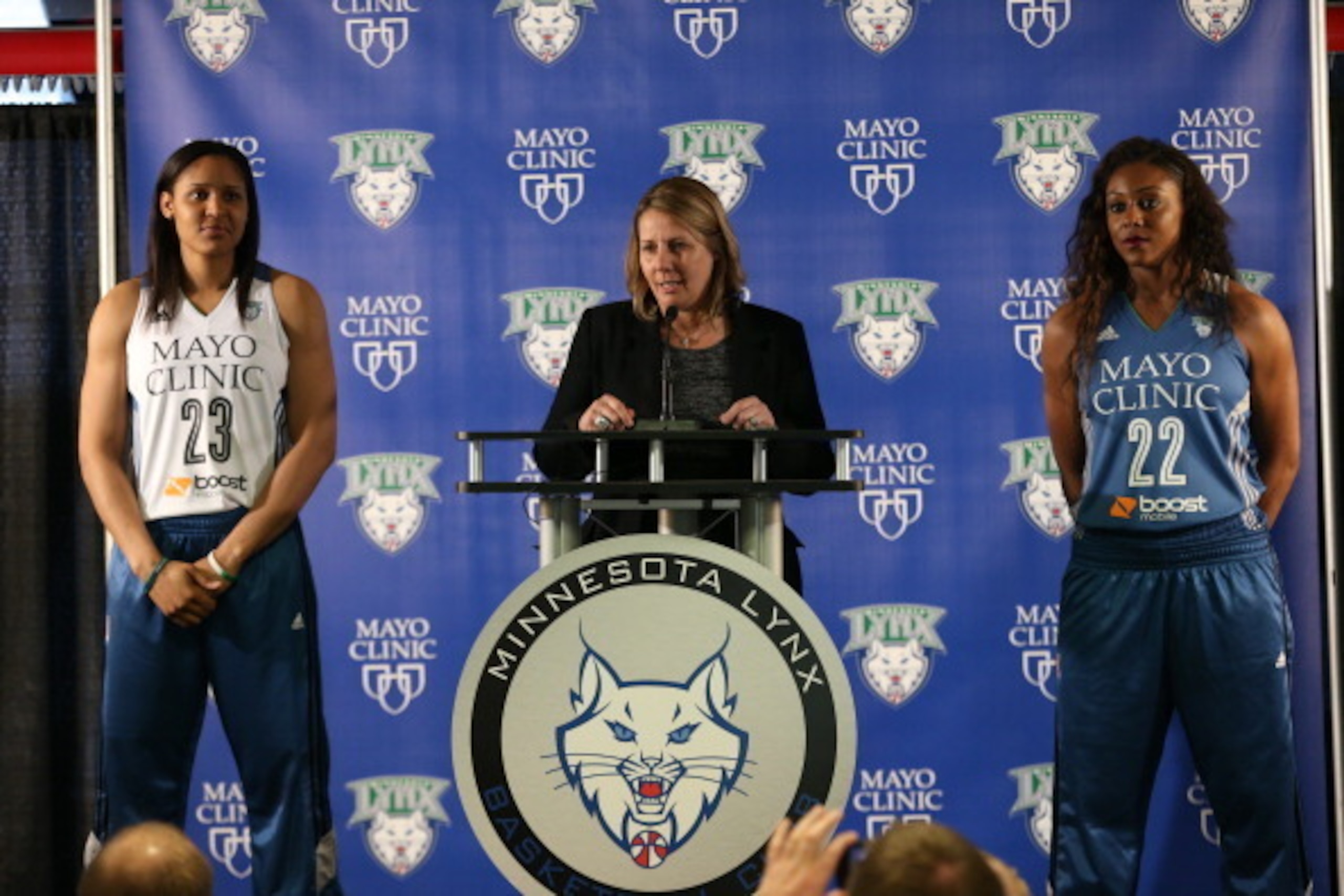
The WNBA’s Minnesota Lynx logo is actually a slightly better version of the Timberwolves logo, which is surrounded by too many trees to look truly ferocious. It’s pretty much the only passable logo in the league, which is dominated by cheap knockoffs of the men’s team in the same city.
44. Indianapolis Colts
7 of 50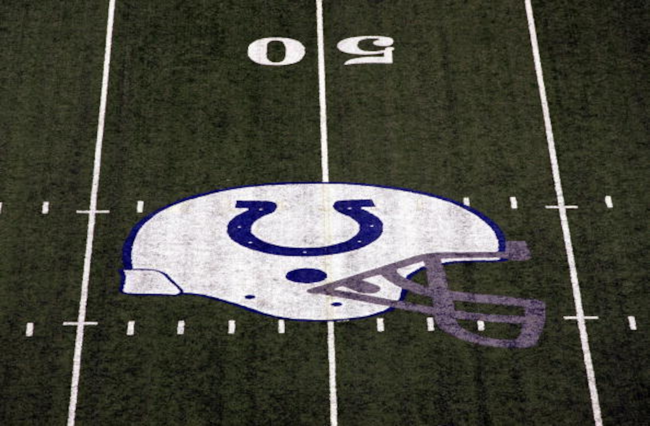
As annoying as it is when Colts owner Jim Irsay says things like,“everything’s about the horseshoe,” at least we know what he’s talking about. The Colts are one of the teams most easily identified by their unchanging logo. It was a very smart design decision because of its timelessness.
They could’ve gotten cutesy with the baby horse thing, which they would’ve just had to change anyway.
43. Oregon
8 of 50
Oregon’s logo might not be nearly as noteworthy if its football team didn’t accentuate it with its weekly spectacle of a uniform, courtesy of Nike. Then again, it’s hard to even remember a world before Oregon teamed up with Nike.
42. New York Rangers
9 of 50
Like the rest of the NHL’s Original Six teams, the Rangers have made almost no changes to their logo over the years—which is good, because it’s been the most consistently good part of the team for decades.
41. Atlanta Hawks
10 of 50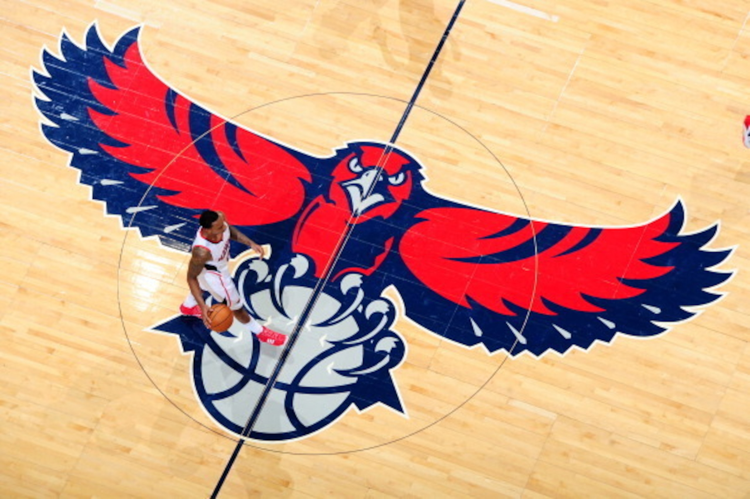
Unlike the team it represents, the Hawks logo doesn’t disappoint. Well, at least it hasn’t since the mid-'90s, when they finally found something that wasn’t stunningly ridiculous—like a crudely drawn sketch of a hawk playing basketball.
They barely edged out another Atlanta bird—the Falcons—for a place on this list.
40. DC United
11 of 50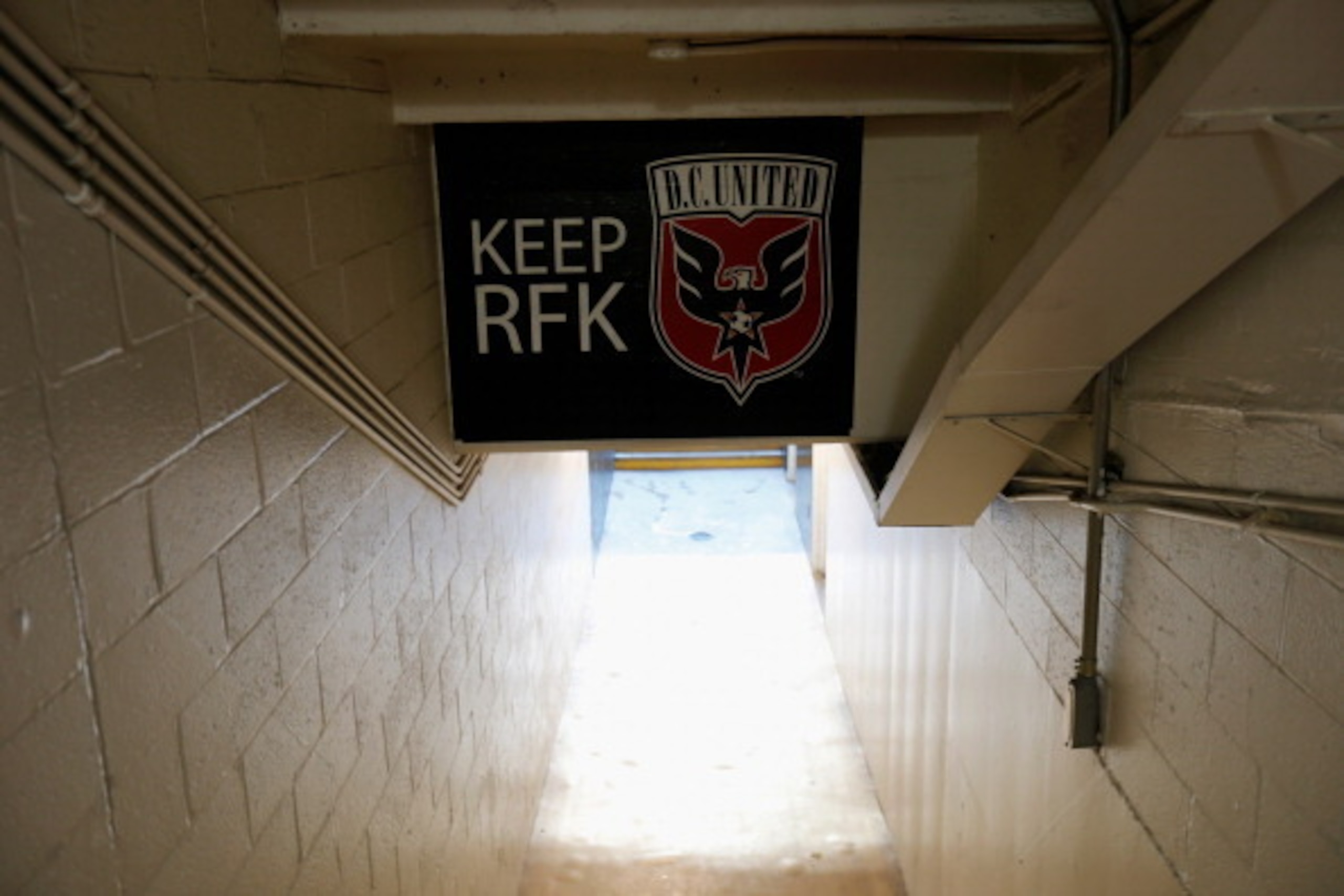
By and large, MLS logos are, in a word, terrible. Way too many of them took inspiration from abroad, adopting weird crests and shields. The one possible exception is the D.C. United logo.
Although it is modeled in the same crest style, it still stands out as distinctive. The bold colors, the embellished eagle and the font all really work together.
39. Butler University
12 of 50
There are, approximately, a bazillion college teams with a Bulldog as their mascot. Of those bazillion teams, Butler’s logo is the most simplistic of the bunch. There were no photos available of the actual logo, so here's an amazing photo of the team's mascot instead.
38. New York Giants
13 of 50
The Giants logo, like the Giants themselves, is solid and dependable. It’s not too fancy, but there’s just enough of a pop to turn heads.
37. University of North Carolina
14 of 50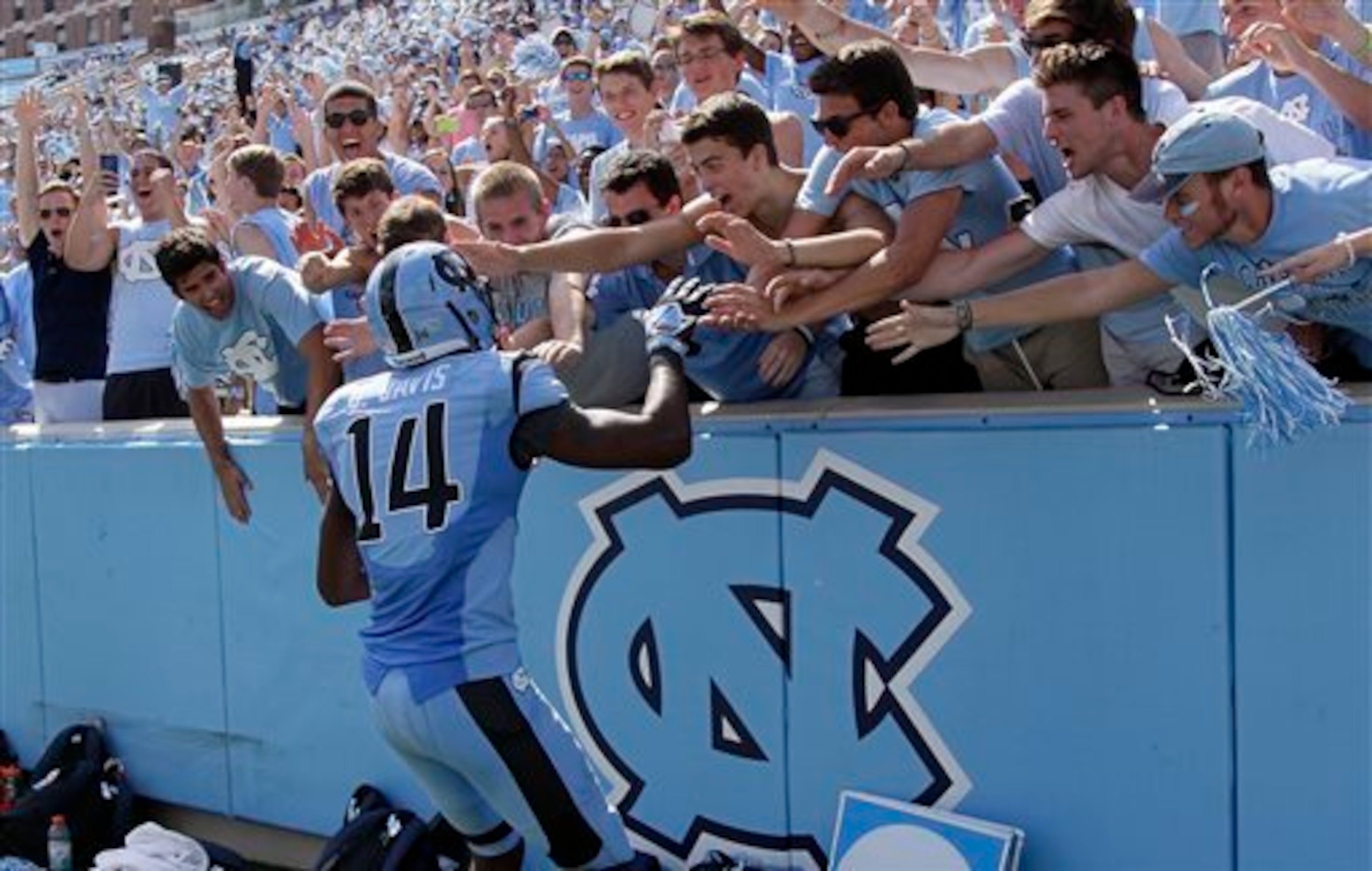
There are countless logos that are nothing more than interlocked initials, but UNC's is one that manages to really stand out. Maybe it’s because of that funky shade of blue, which is the perfect antidote to what Duke has going on.
36. Maine Red Claws
15 of 50
Maybe it’s because the NBA D-League’s Maine Red Claws’ official logo is too hot to handle, but for some reason none of the team’s uniforms seem to prominently feature the amazing lobster that’s the centerpiece of its amazing logo.
35. Edmonton Oilers
16 of 50
The Edmonton Oilers actually have a really great logo, which is largely hindered by some rather unfortunate team colors. Not incorporating black in the leaky oil seems like a real missed opportunity.
34. Clemson
17 of 50
Clemson did itself and its fans a real service by adopting the classic tiger paw logo in 1976, because the school is already taking enough chances with that unpleasant shade of orange. The ridiculous tiger Clemson had prior to that was an absolute disaster, making this one even better by comparison.
33. Golden State Warriors
18 of 50
The Warriors took a very weird path to get to the logo they have today, especially since they got it right on their second try in 1969 with a minimalist design featuring the Bay Bridge between San Francisco and Oakland. After a lot of ugly misfires, they finally went back to what works in 2010.
32. Los Angeles Dodgers
19 of 50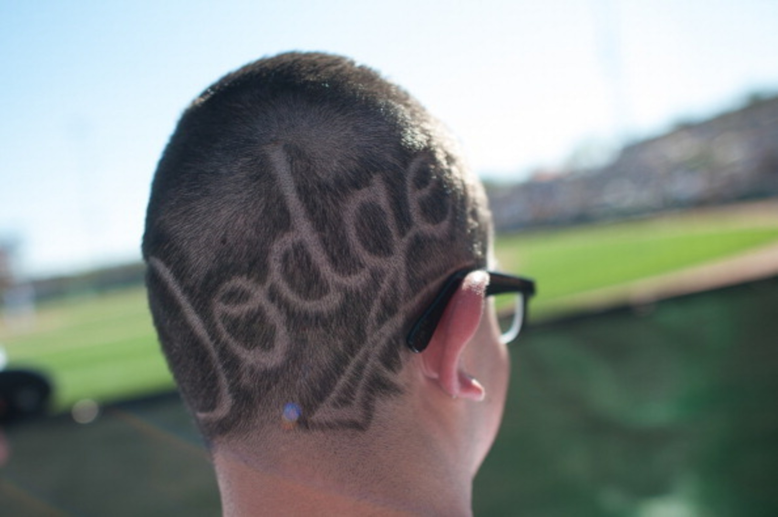
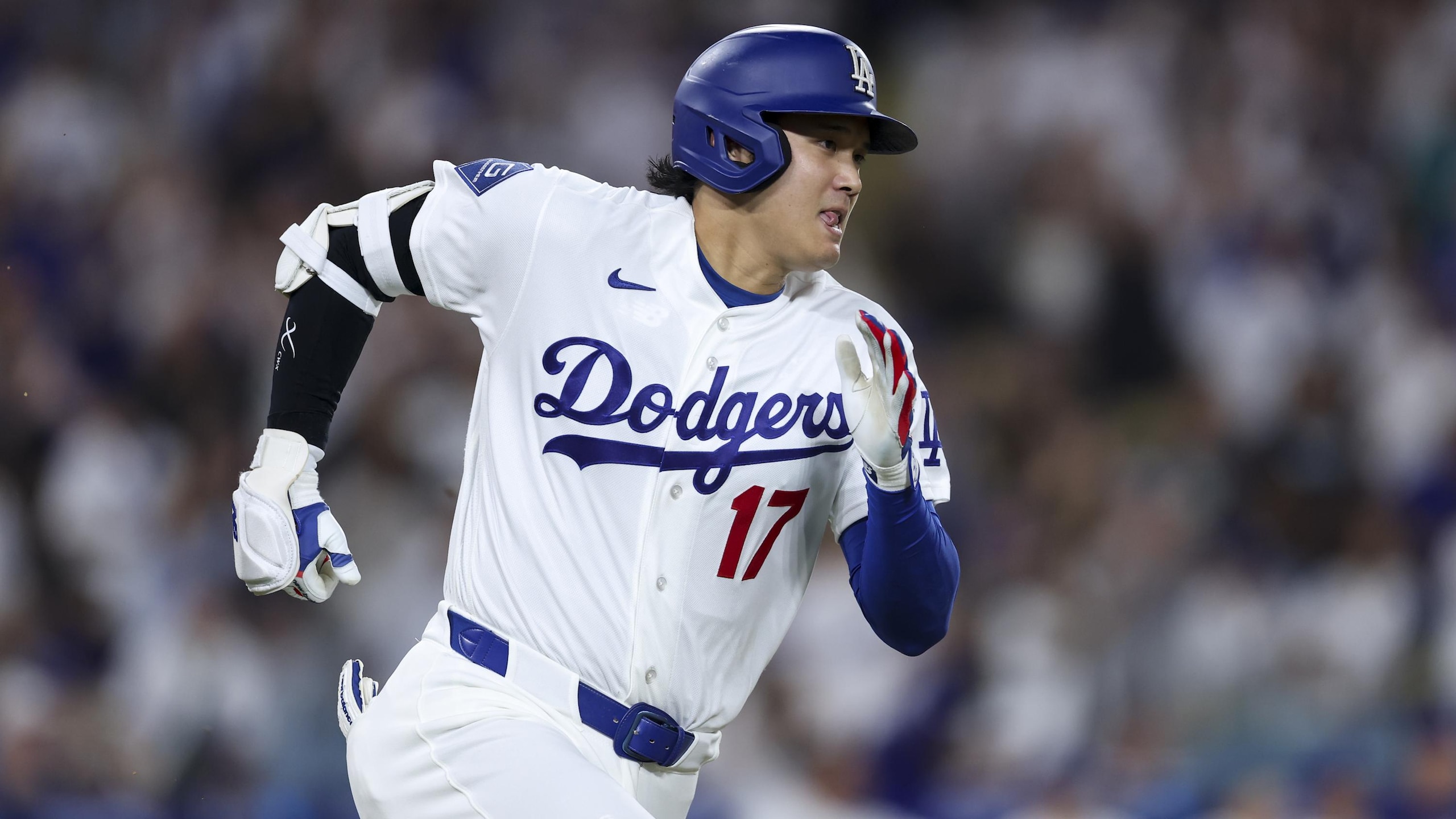
The Dodgers have just two vastly different logos in team history, which have been used together since 1958. They’re both simplistic and classic without being boring, and we already know red, white and blue look mighty fine together.
31. West Virginia University
20 of 50
Speaking as someone who’s been there many times, the WVU campus in Morgantown, W.Va., is about as subtle as a sledgehammer. The university logo, on the other hand, is very understated. The “WV” obviously represents the school, but it also mimics the mountains the state is famous for.
30. UCLA
21 of 50
UCLA sometimes throws in its classic bear logo to remind people what a bruin is, but for the most part it sticks to the winning look adopted in 1973. The university’s colors work very well together, and the Bruins are one of very few sports teams to use cursive in their logo—and they do it a lot better than Pac-12 rival Cal.
29. Buffalo Sabres
22 of 50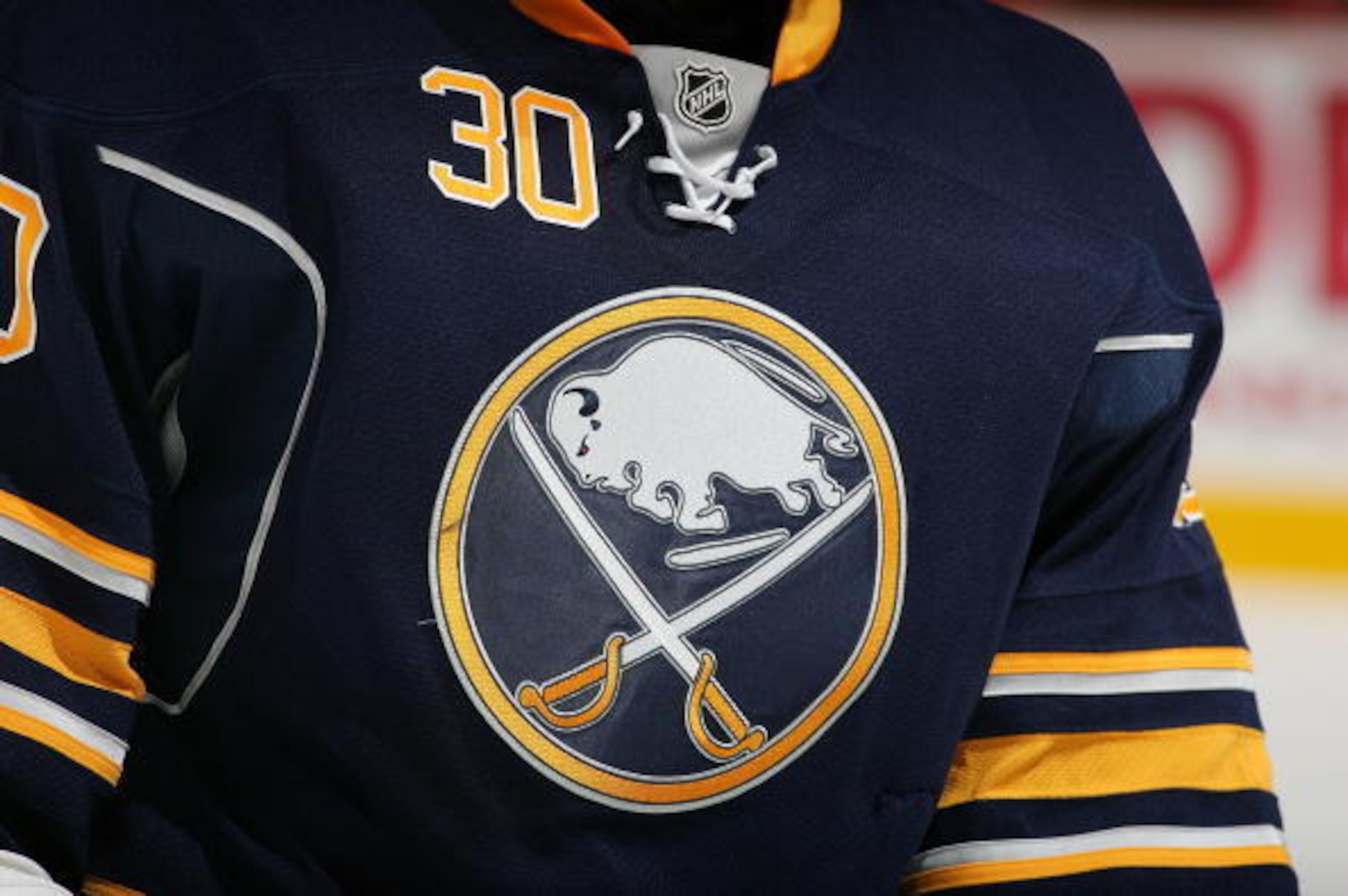
Apparently the Sabres logo originated from a name-the-team contest prior to the club's first season in the NHL in 1970. Though the design is very literal, it’s also very cool.
28. Arsenal FC
23 of 50
Arsenal F.C. of the Premier League first introduced a cannon as part of their logo in 1949. It’s a very literal interpretation of the team name, and there’s nothing wrong with that. They are one of the few international soccer teams easily identified by their logo.
The various incarnations of the logo over the years haven’t all been winners—until recently it looked too much like a flag or family crest. Arsenal really hit the nail on the head in 2012 when this no-nonsense, streamlined version debuted.
27. New Orleans Saints
24 of 50
New Orleans is the Saints, and the Saints are New Orleans. In the aftermath of Hurricane Katrina, city and sport became linked in an entirely different way. The fleur-de-lis represents the Saints as well as the city’s rich French heritage.
It's the only logo the team has ever had and the only one it'll ever have in the future.
26. St. Louis Cardinals
25 of 50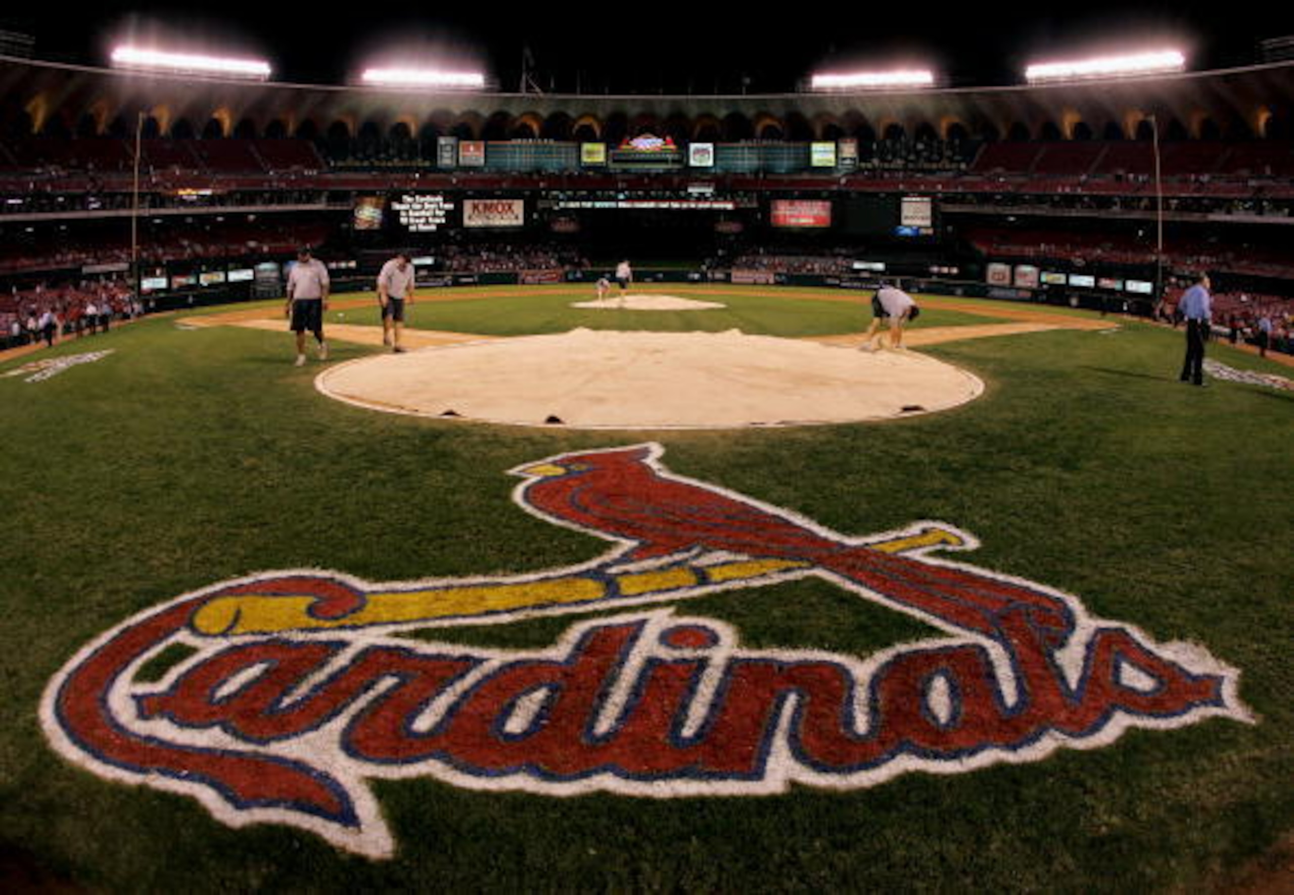
Unlike many teams that started off with a cartoonish logo and then turned serious, the Cardinals have favored a realistic rendering of the cardinal since making it a part of their logo in 1922. They’ve been through several iterations at this point, but the current one, which was adopted in 1998, is easily the best yet.
25. University of Florida
26 of 50
Florida's logo somehow manages to be menacing and cartoonish at once—much like the state of Florida itself! It’s bold, easily identified and utilizes the color orange in one of the least offensive ways in all of sports.
24. San Antonio Spurs
27 of 50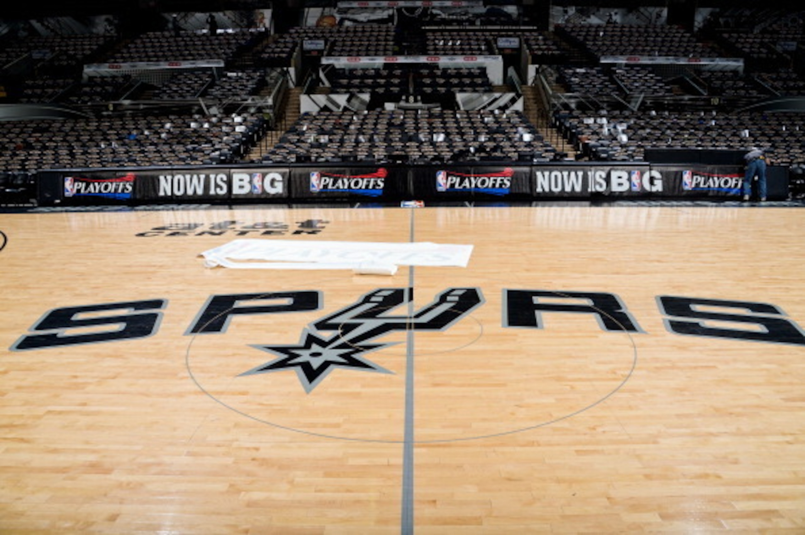
The Spurs organization went down an ugly road with its logo in 1989, switching to a weird pastel version that inexplicably lasted over a decade. Thankfully, the team really got it right with the redesign in 2002—you really can’t go wrong with silver and black.
23. Baltimore Orioles
28 of 50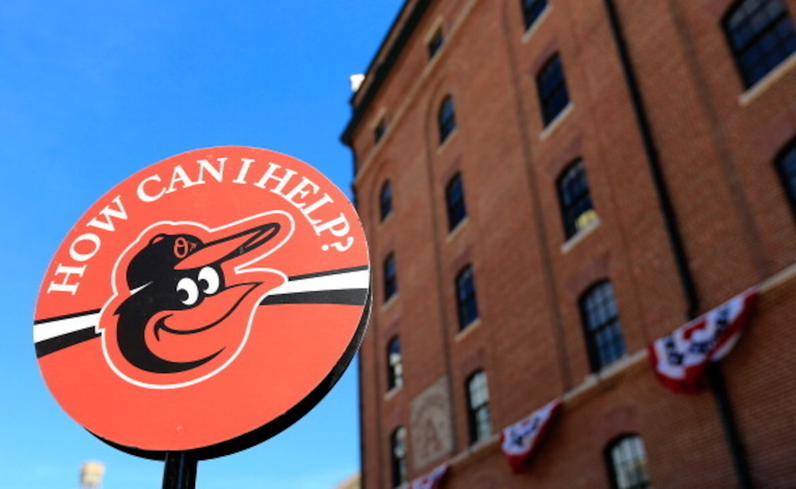
The Orioles have done a lot more tinkering with their logo than has ever been necessary. The cartoonish versions of the bird they started off with were pretty solid—much better than the various realistic renderings adopted over the years.
The O’s got back to basics with their logo in 2012, which is exactly what works best in baseball. It’s nostalgic and fun, just like the sport itself.
22. Iowa
29 of 50
Prior to 1979, the Iowa Hawkeyes logo was all kinds of terrible. It started off as a goofy cartoon and then transitioned to something more realistic in 1971—both of which were not at all good. By contrast, the current logo is so cool that it kinda reminds me of the ThunderCats logo.
21. Toronto Raptors
30 of 50
The Raptors logo might be a controversial choice, given the history behind the rest of the logos on this list—the team has only been in existence since 1995. Some may argue that the logo is not deserving because it’s going out its way to be ridiculous—which it is.
That’s exactly why it's here. Sports are too often treated as deadly serious stuff, when in reality they are anything but. Until recently, the Raptors have been comically bad for most of their existence. But thanks to that fantastically goofy logo, it always felt like they were in on the joke.
20. Oakland Raiders
31 of 50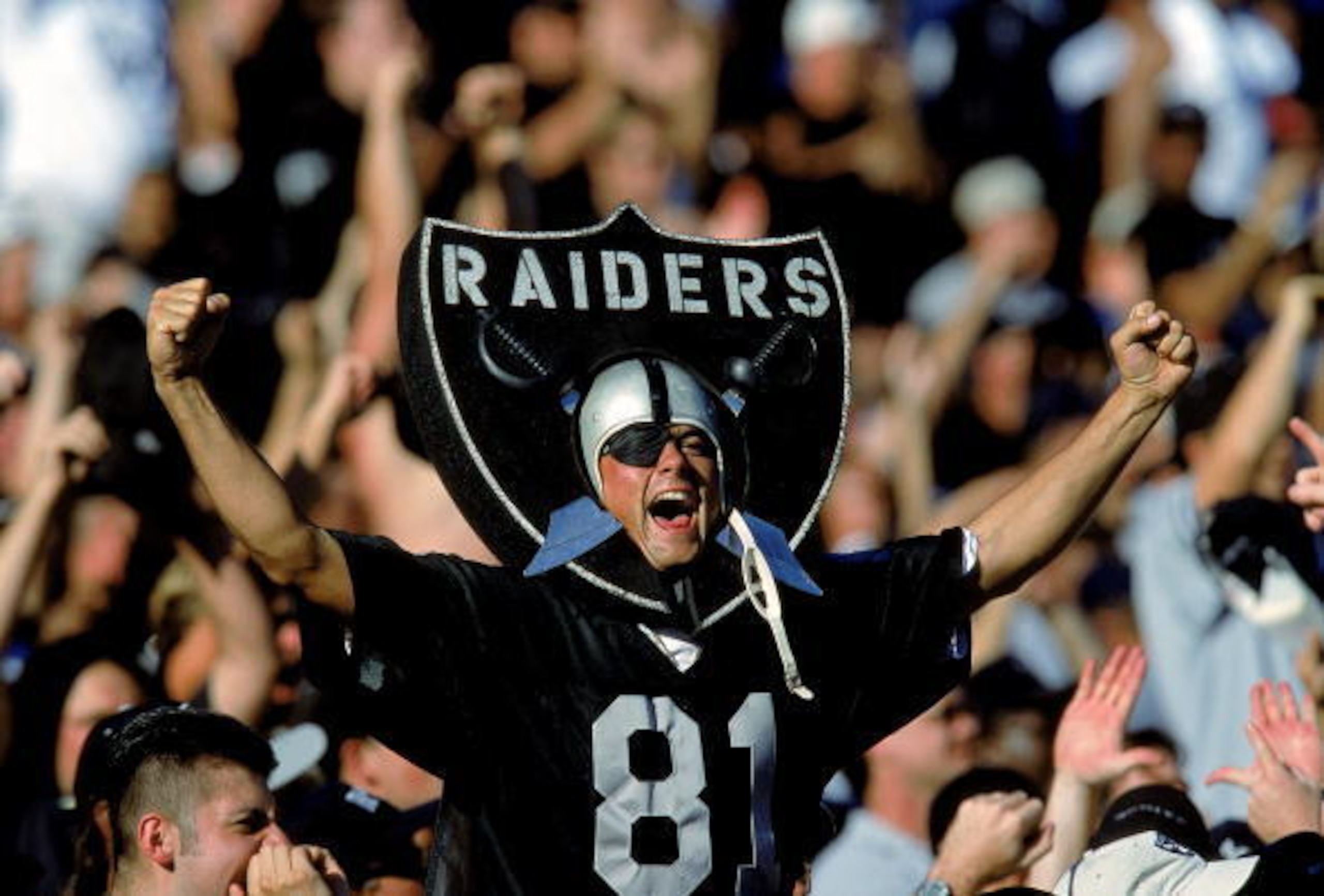
Is there a logo in professional sports that is more representative of a team’s fanbase than that of the Oakland Raiders? It has been virtually unchanged since 1984 for a reason—it’s classic and timeless in silver and black.
It’s also needlessly tough and sorta confrontational—kinda like Raiders fans themselves.
19. Chicago Blackhawks
32 of 50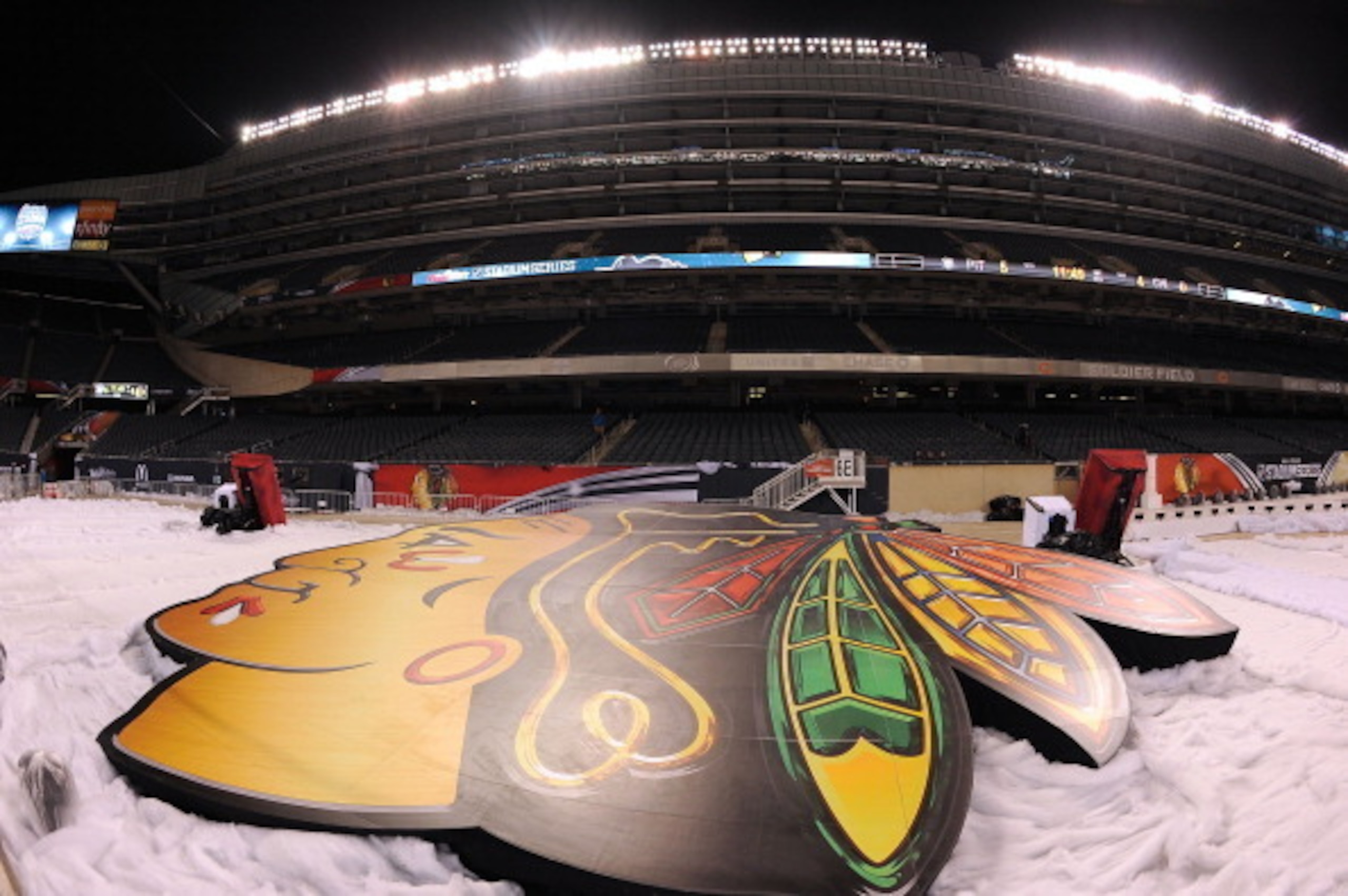
Unlike, for instance, say the Washington Redskins, the Blackhawks logo has not been subject to the same type of widespread criticism. Perhaps because it seems more like an homage of sorts rather than an offensive slur directed at Native Americans.
That being said, without taking a side on that debate one way or the other, there’s no question it’s a pretty great logo. Whether or not it's offensive is something that they're still trying to work out locally.
18. Kansas City Chiefs
33 of 50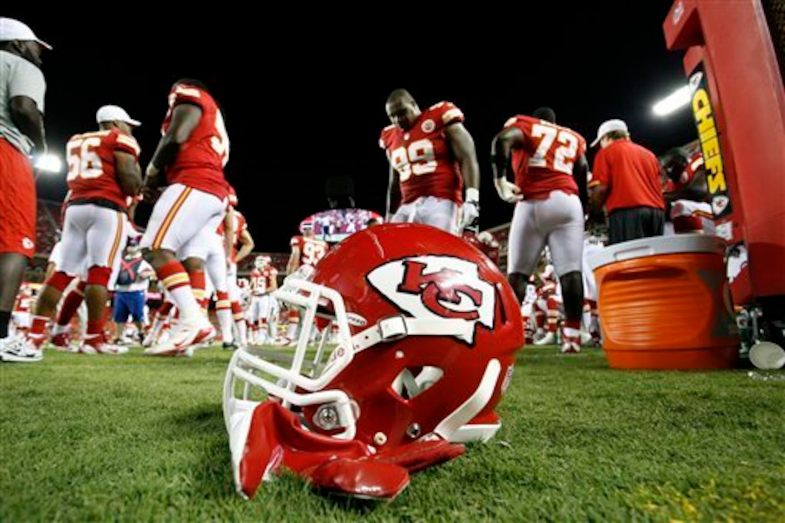
The Chiefs logo is classic in design and brilliant in its simplicity. The arrowhead shape is a reference to their earth-shaking stadium as well as a nod to the area’s Native American history. The “KC” is bright and distinctive, without being the least bit garish.
17. Penn State
34 of 50
Penn State’s logo and colors are streamlined and timeless. The initial Nittany Lion logo, adopted in 1983, is an excellent example of why thinking outside the box pays. In 2001 they regressed to a more lifelike cat, which was an inexplicably bad idea.
It only lasted three years before they moved back to the original logo, dropping “Penn State” and opting for a slightly darker shade of blue. It’s hard to imagine they’ll ever abandon such a good thing and make the same mistake twice.
16. Toronto Maple Leafs
35 of 50
The Maple Leafs logo is iconic, not only in that it easily identifies the most popular team in the most popular sport in the most populated city in Canada, but also because of the significance of the maple leaf itself in the country.
For those of you unawares (and please say there aren't many) the maple leaf is also featured on the Canadian flag.
15. Michigan State
36 of 50
Sure to attract the ire of the Michigan faithful, Michigan State’s Spartan logo is just better than the gold block “M” of its in-state rival. While there’s nothing understated about an actual Spartan, Michigan State stripped it down without losing any of the impact.
14. Philadelphia Flyers
37 of 50
On one hand, the Flyers logo is actually pretty aggressive in its ugliness—the weird “P” and that eye-sore orange aren’t classically attractive. Neither is Philadelphia, though. But much like the city itself, the logo is distinctive, gritty and memorable.
13. Boston Celtics
38 of 50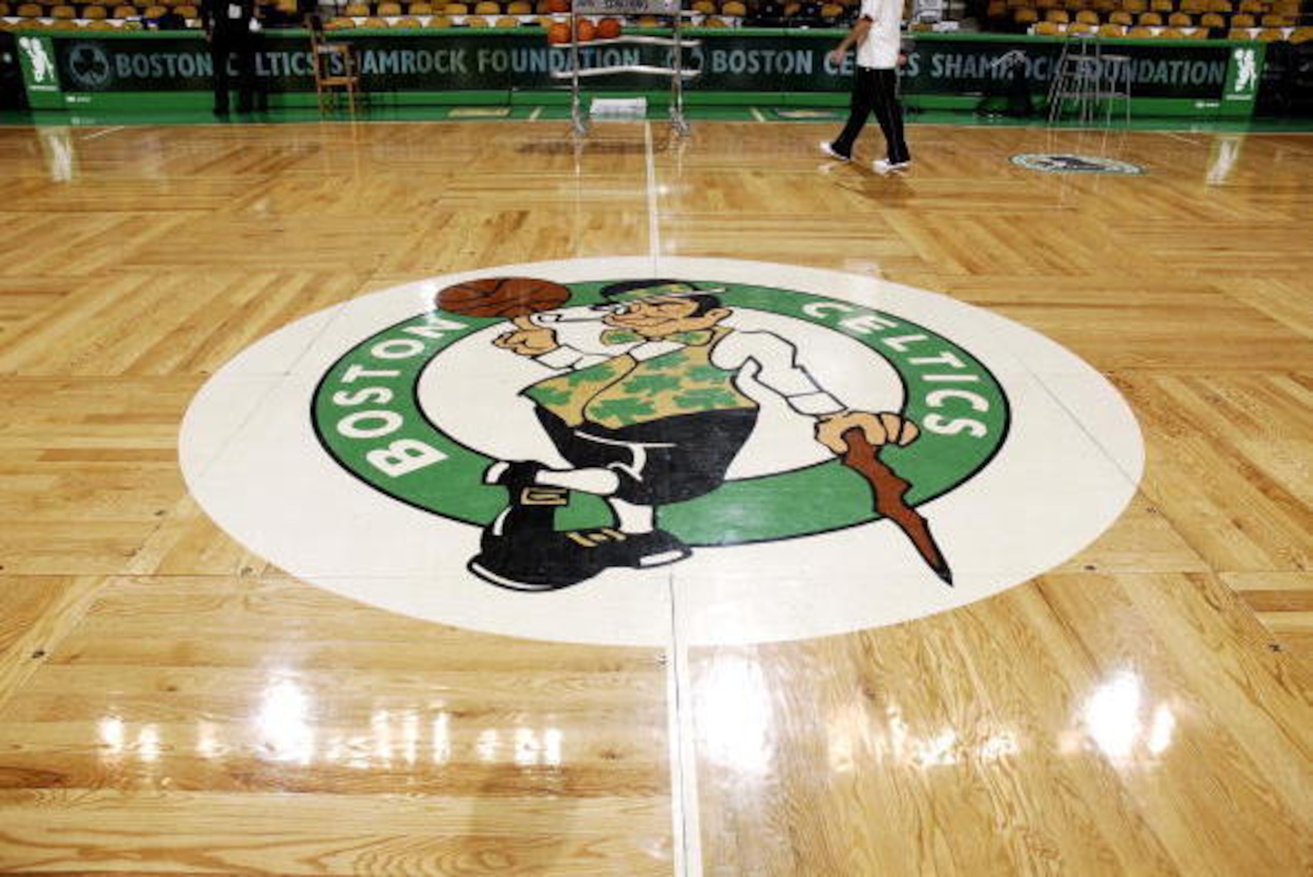
What's great about the Celtics logo is that, for as goofy as it is, it’s actually pretty sophisticated compared to what they started out with back in the '50s and '60s, which looked more like a trouble-making court jester than a leprechaun.
Lucky the Leprechaun is a playful nod to the Irish heritage the city of Boston is best known for.
12. Pittsburgh Steelers
39 of 50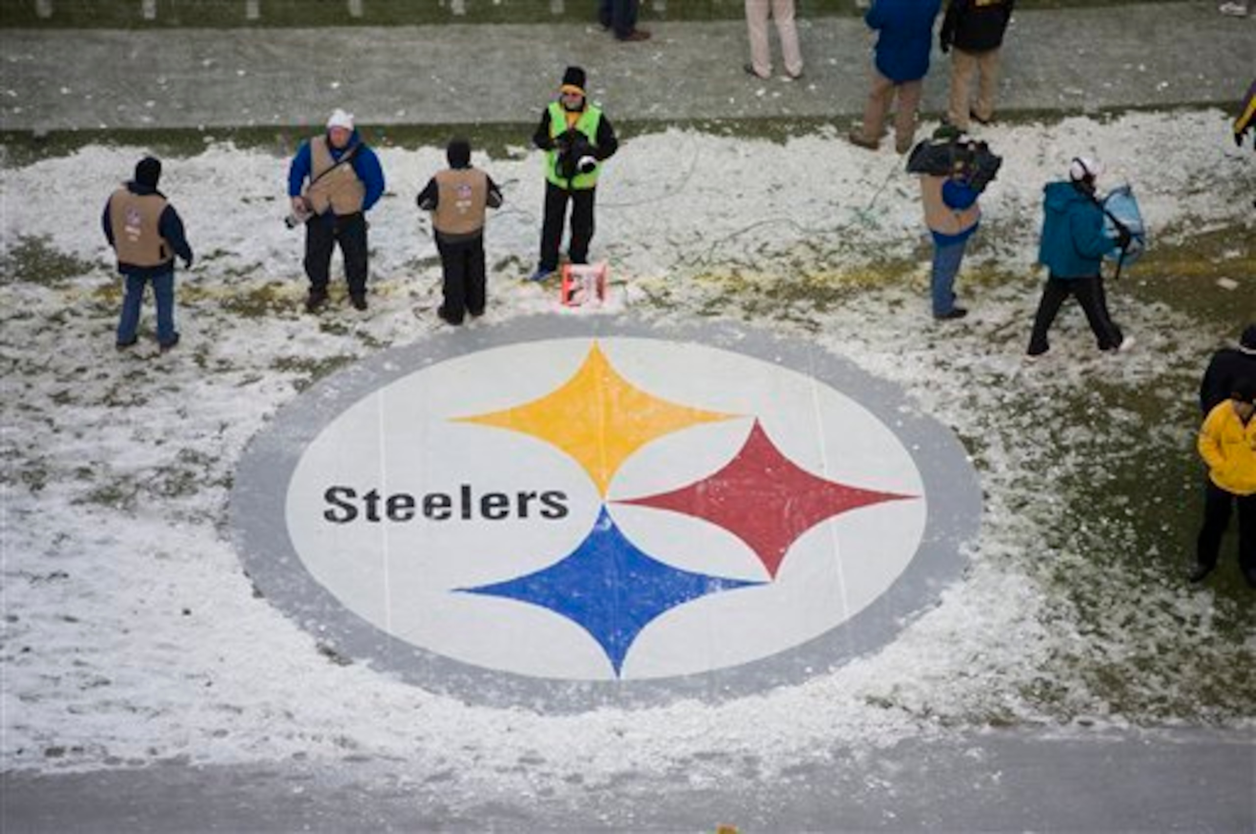
The Steelers logo is as classic and no-frills as the team itself. Adopted by the franchise in 1969, the logo is based on “the Steelmark logo belonging to the American Iron and Steel Institute,” which was created by U.S. Steel Corp, according to Steelers.com.
Pittsburgh has been a city in transition for decades now, with the Steelers and their logo serving as an anchor to the past and a symbol of the promise of the future.
11.University of Texas
40 of 50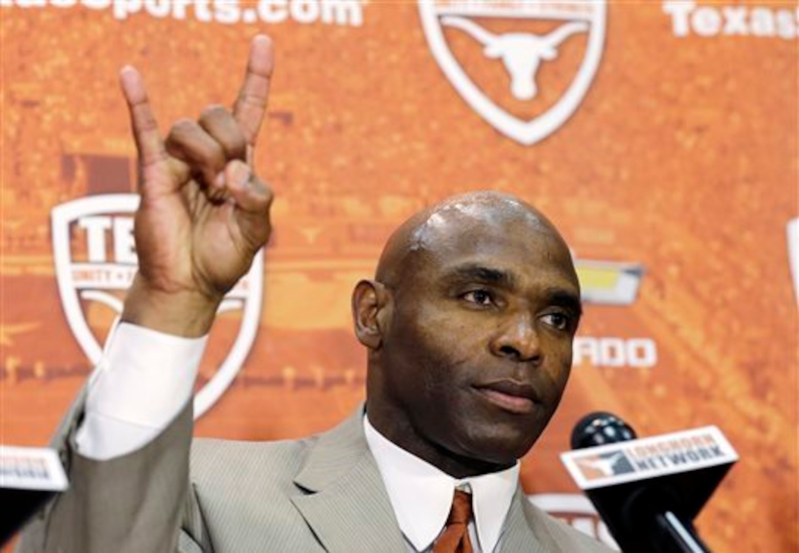
Texas’ logo hasn’t changed once since it was introduced in 1961—and why should it? The longhorn steer is perfectly representative of Texas—and it’s not just a logo, it’s also a rallying cry. Hook 'em horns, anyone?
10. Chicago Bulls
41 of 50
The Bulls logo is great example of how to do an animal logo right—it’s tough, representative and visually appealing. Compare that to the absurdity of the New Orleans Pelicans or Nashville Predators, both of which are exaggerated and weird.
9. Green Bay Packers
42 of 50
Logos that are nothing more than a letter aren’t usually anything to write home about—the Packers “G” is one of the few exceptions. With only one slight change since it was adopted in 1961, it’s hard to explain why, but the Green Bay logo just works.
It's probably for the same reason an NFL football team can be so successful in a “city” of just over 100,000 people.
8. Detroit Red Wings
43 of 50
The Red Wings logo is a pretty literal interpretation, with the tire representing the motor in the Motor City and the wing making the whole thing fly. Except for the shading and dimensions, Detroit’s logo hasn’t changed one bit since they came into existence as one of the NHL’s Original Six.
7. University of Miami
44 of 50
Miami adopted the bi-colored U logo in 1971, which was a substantial step up from its two previous incarnations—particularly the first one, which looked like an angry version of the Vlasic pickles bird.
The logo is also used to identify the university by its many high-profile alumni. On Monday Night Football, it seems like at least one player each week proudly proclaims “The U” during the opening drive.
6. Boston Red Sox
45 of 50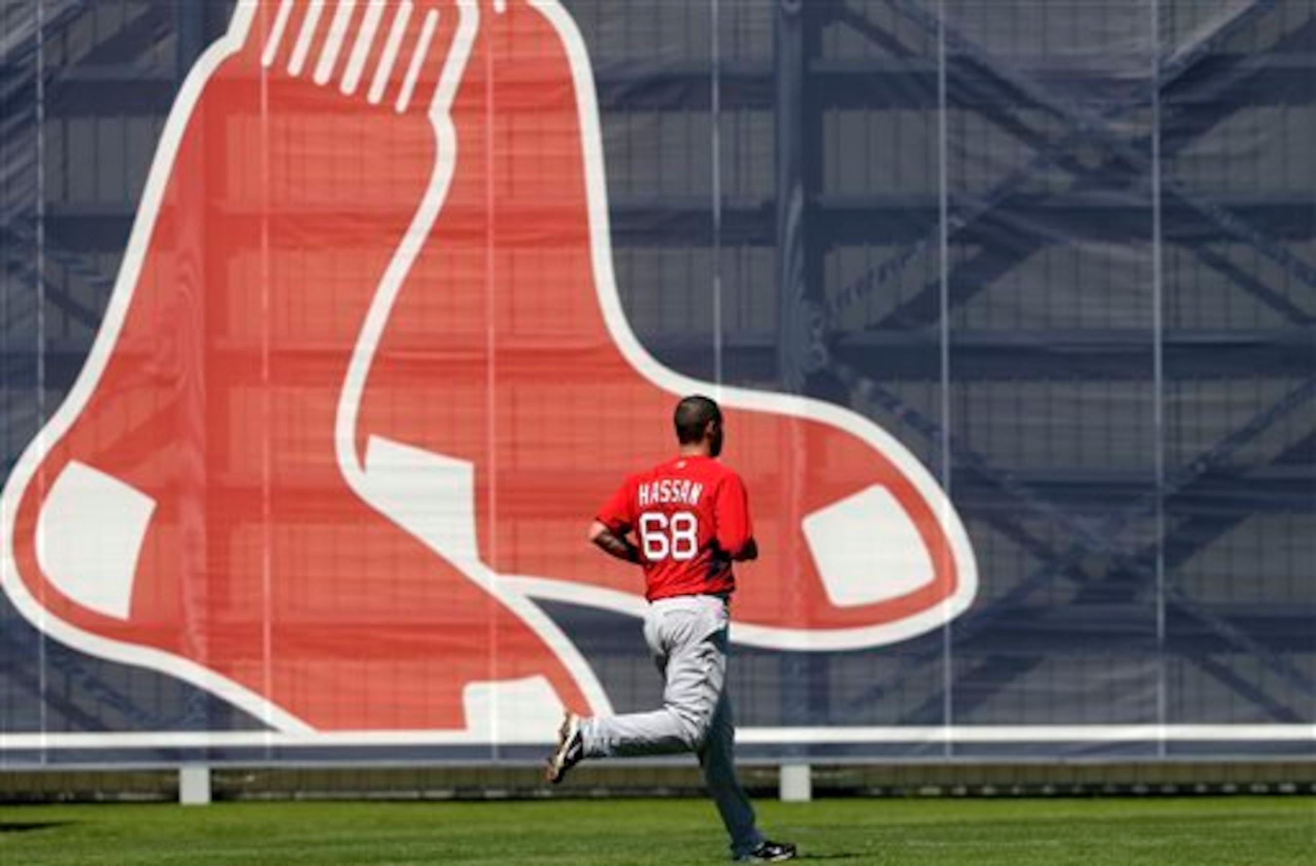
The Red Sox logos have bounced back and forth between a pair of actual red socks and the uppercase, embellished B.Though they’ve changed it up far more often than the hated division-rival Yankees, the Red Sox have remained remarkably consistent through the years.
5. Los Angeles Lakers
46 of 50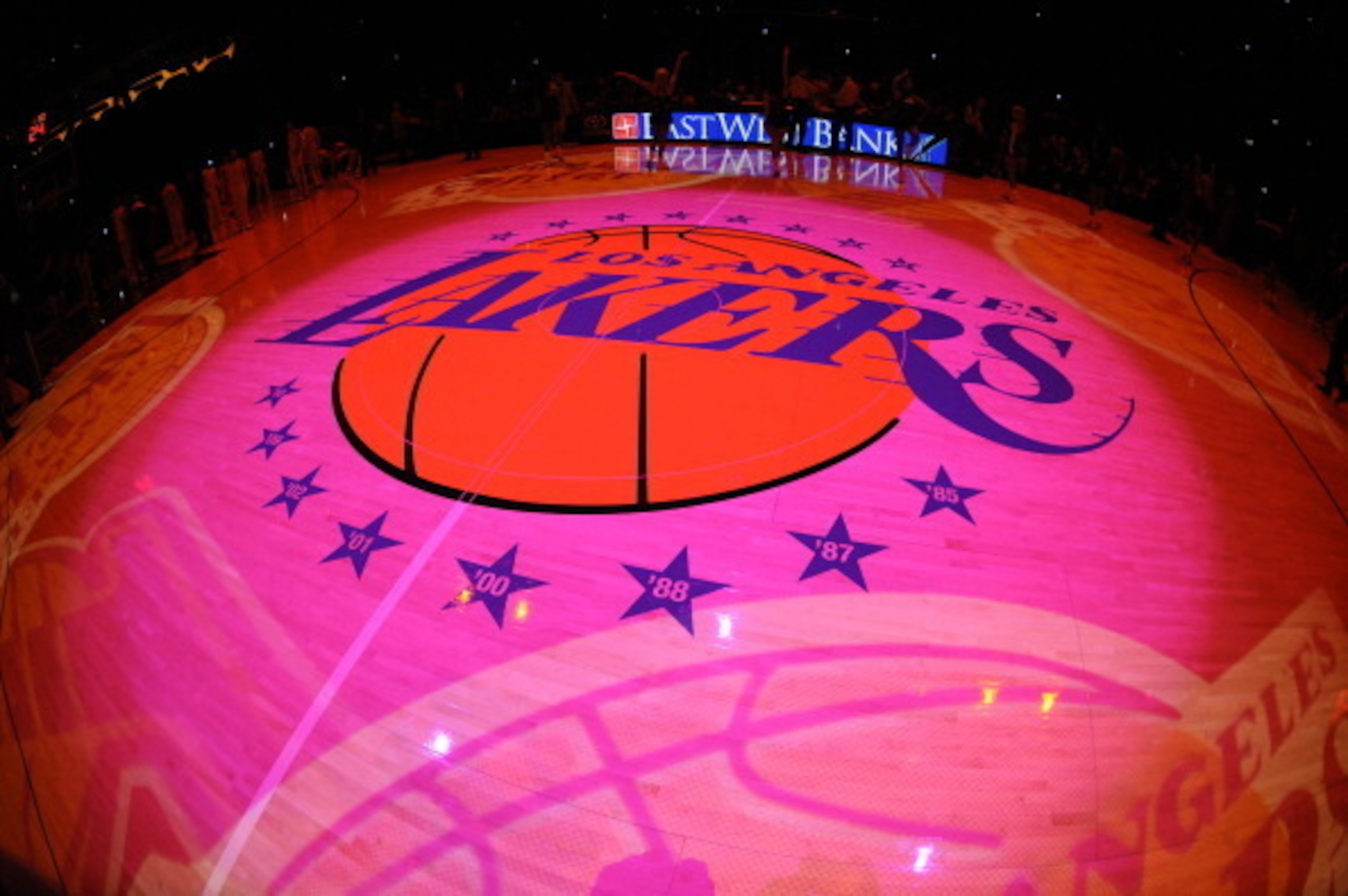
The Lakers logo is as flashy as the team that wears it and the city that lays claim to it. Purple and gold aren’t colors most of us would ever pair together, but together they make sense for this team.
They say purple is the color of royalty—they wear purple on their backs and gold on their heads and around their necks. They may be going through a rough stretch at the moment, but the Lakers are, without question, the royalty of the NBA.
4. Notre Dame
47 of 50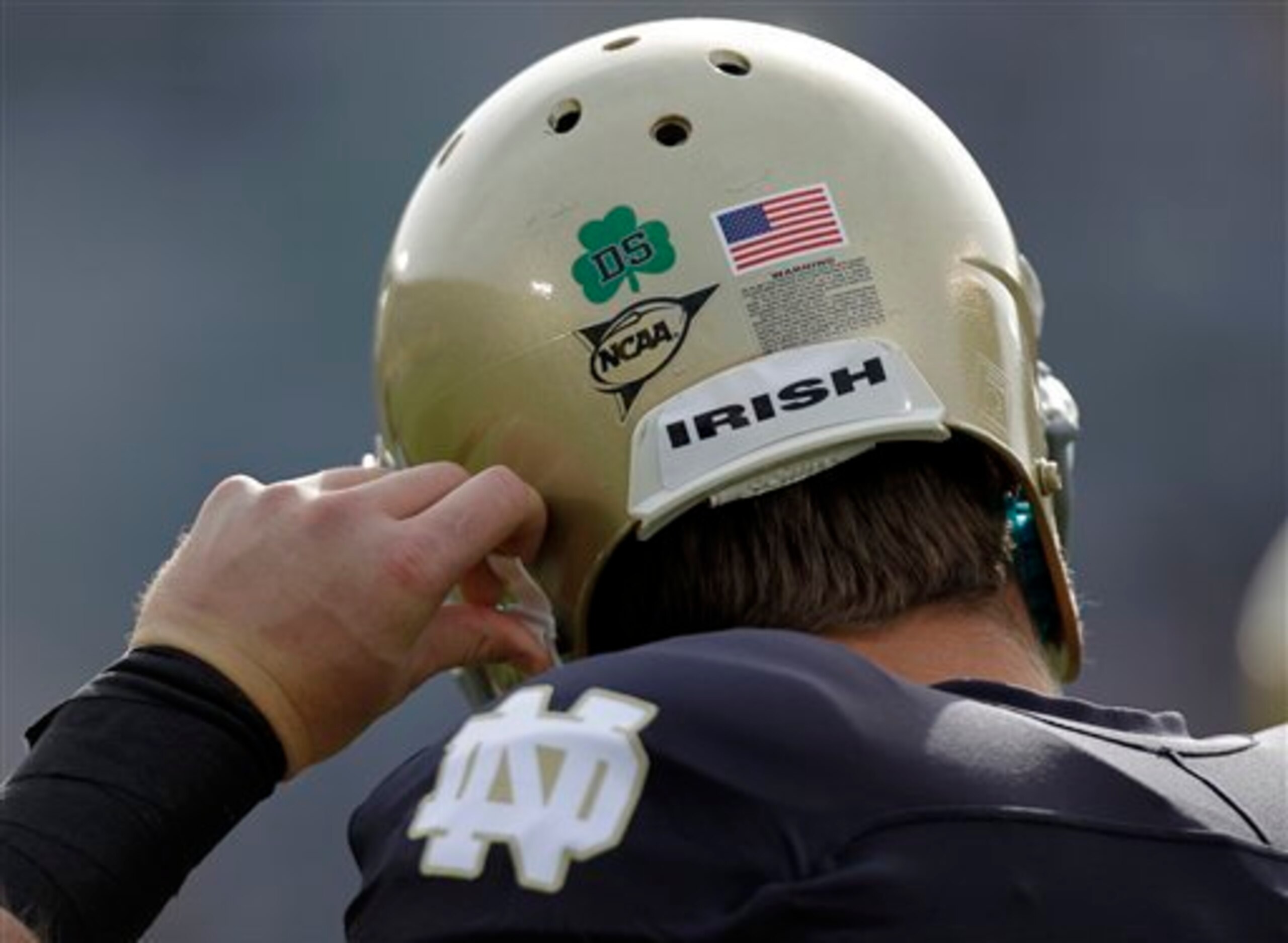
Iconic, classic, and equal parts beloved and bemoaned, Notre Dame’s various logos are just all kinds of great. The interlocked “ND,” the fantastic fighting leprechaun and anything with a shamrock are all instantly recognized as distinctively Irish.
3. Dallas Cowboys
48 of 50
As the second-most valuable franchise in American sports—second only to the Yankees, according to Forbes—the Cowboys know better than to mess with a winning formula—at least when it comes to branding.
And like the Yanks, the Cowboys haven’t made a single change to their logo since 1964, which was nothing more than the slightest of tweaks. You don't mess with perfection.
2. Montreal Canadiens
49 of 50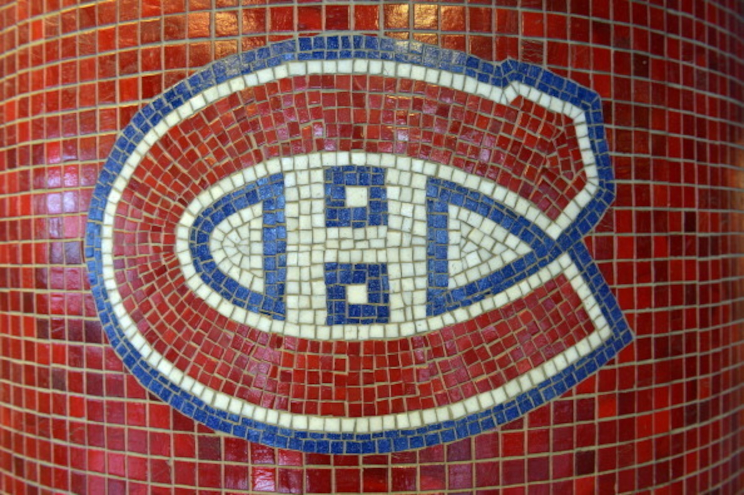
Perhaps the most enduring, unchanged logo in sports, the Canadiens jerseys have looked almost the same since 1917. Perfect in its simplicity, the H in the logo stands for hockey and the C for club.
As one of the NHL’s Original Six teams, I suppose they didn’t feel the need to differentiate themselves any further.
1. New York Yankees
50 of 50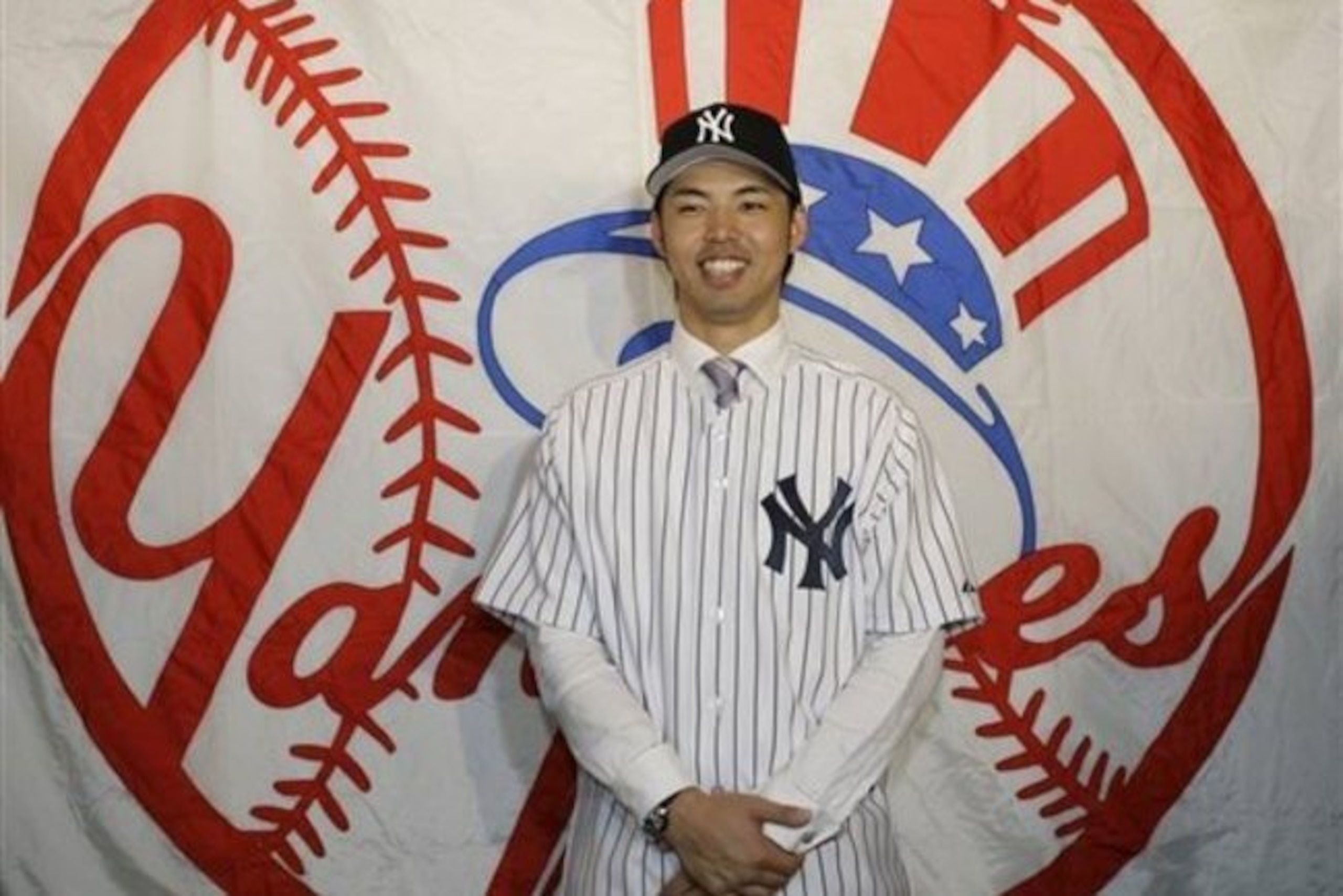
The Yankees boast what is arguably the most classically sophisticated logo in all of professional sports. The interlocking "NY" is the perfect fit with pinstripes, which are synonymous with this team.
Even the jazzier bat with a top-hat logo, which didn’t come about until 1947, works well when the Yanks opt for more standout signage.

.jpg?w=2560 "Don't Overlook These Teams")
.jpg?w=2560 "Breaking News")
.jpg?w=2560 "Aiyuk Airs Out 49ers")