Featured Video
Suns-Pistons SL Highlights
MWS Top 10: Ugly, Ugly Uniforms
Kyle W. BrownSep 8, 2010
Photo belongs to Steve Dykes/Getty Images via Bleacher Report
Photo belongs to FanNation
9. Detroit Pistons (Late 90's)
TOP NEWS

Grading Every Team's Summer-League Rookies 🔠

Kerr Trolls Dubs Fans

Vid of Oladipo's Private Workout
For some reason (maybe the new millennium coming up), the Pistons decided to fix something that wasn't broken, moving away from the traditional blue and red to this teal monstrosity.
Photo belongs to NBA.com
8. Toronto Raptors (Late 90s)
Often called the "Angry Barneys" during the time that the Raps wore these jerseys, they did anything but strike fear into their opponent's eyes. With a purple base (which can work, see Sacramento & even Raptors purple jerseys after these), and a cartoony looking dinosaur on the front, I don't know how the team ever sold one of these jerseys as merchandise, as I could not imagine entering any building wearing this thing.
Photo belongs to RaptorsForum.com
7. Denver Nuggets (Early 80's)
These jersey designers thought of a few ideas that could have maybe been cool, such as introducing the city skyline, or adding a couple different colours. Unfortunately, they tried to do way too much at once, making some weird horizontal-stripey rainbow-coloured skyline-including disaster.
Photo belongs to NBA.com
6. Wyoming Cowboys (Present)
Brown is usually never a good option to have as the primary colour in any uniform, but especially on a jersey (see Cleveland). Add that with some yellow pants that have wide brown and white stripes, and you get yourself this winner.
Photo belongs to UniqueScoop.com
5. Pittsburgh Pirates (Mid-70's)
Another uniform that just implemented the colour of yellow really poorly. It can be done in a good way, look at the Steelers or the Boston Bruins. Yet, Pittsburgh decided to wear these. Complete with the pill-box style hat with horizontal stripes. Brutal.
Photo belongs to Uniwatchblog
4. California Golden Seals (Mid-70's)
These jerseys were even more short-lived than the actual Golden Seals franchise. An absolutely moronic interesting idea featuring an aqua blueish-green with bright yellow combined to make this uniform. I don't even know what else to say about it.
Photo belongs to BeanBallinc.Blogspot.com
3. San Diego Padres (Present)
While I do respect the decision of the Padres' organization to honour the American military, coming out with these jerseys could not have been the best way to do so. Yep, they are camo. They have ones that are green and ones that are gold. They are hideous.

Photo belongs to ESPN
2. Tampa Bay Buccaneers (Mid-70's to Mid-90's)
Orange and white can sometimes go good together. Look at the University of Texas for an example. Unfortunately, the orange that the Bucs chose looks just awful. It's a bright, tangerine orange, that gave the uniforms the nickname of the "Creamsicles." At least they look better now.

Photo belongs to Sodahead.com
1. Houston Astros (Late 70's)
These rank as the ugliest of the ugly for this list. These jerseys alone caused the Astros mid-to-late 1970's years to be named as "The Rainbow Era." They feature a lot of horizontal stripes, with a huge star in the corner of the jersey. I'll just let them speak for themselves.
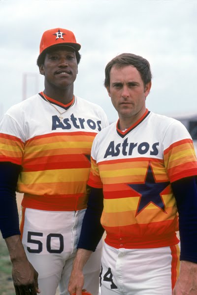
Photo belongs to DavidStagg.com

.png?w=3840 "B/R")


.jpg?w=3840 "AEW Dynamite Live Grades 🔠")