Re-Ranking the Top 16 Winter Classic Jerseys After Rangers and Panthers Reveal
With American Thanksgiving coming up soon, the NHL Winter Classic will be racing in right behind it, on Jan. 2, 2026, when the New York Rangers head to Miami to take on the Florida Panthers at LoanDepot Park, home of the Miami Marlins.
But the part that gets us most hyped ahead of the game is the release of the jerseys and uniforms the teams are wearing.
While the Rangers are using their outstanding centennial jerseys as inspiration for this year's game, the Panthers have created something that looks like a team would've worn 100 years ago to match it, and that is absolutely a compliment. Putting these two jerseys into the mix for the best Winter Classic jerseys we've seen is what we've got to do.
This is the 17th installment of the outdoor spectacle, so we've got a lot of different jerseys to rank.
Too many, really!
But with 34 different jerseys to compare, we can at least cut this field down into a top 16 and let everyone argue from there. Will the newest Rangers and Panthers jerseys make the cut? Will your favorites from the past get in there? Let's find out and get ready for a good time on South Beach after New Year's.
16. 2022 Minnesota Wild
1 of 16
In past years, we've panned the Minnesota Wild's Winter Classic jerseys when they hosted the game for the first time in 2022. We said it was too busy and tried too hard to be old-school, without taking into account the inspiration it drew from the St. Paul Saints in the 1930s, and yet we gave plenty of appreciation for other teams that did the same with their jerseys.
We're sorry about that, honest. The more we looked at these deeply reverential sweaters, the more they grew on us, and the fact that the game against the St. Louis Blues was played in frigid, nighttime conditions just really hammered home the old-school-ness of it all.
Is it busy? Yes. Does it have elbow patches like a suit coat from the 1980s? Absolutely. Does it look like something from an entirely different era altogether? It 100 percent does, and that's why we're putting it in our rankings at long last.
15. 2019 Boston Bruins
2 of 16
If you're going to sell us on a throwback jersey, having striped sleeves is a good way to win us over, and when the Bruins faced the Blackhawks at Notre Dame Stadium in 2019, that's exactly what they did.
The Bruins wore a throwback-style jersey with black (dark brown?) and gold sleeves, similar to what they had on their sweaters in the late 1920s and early 1930s, with a big block letter "B" on the front, like they had on their jerseys from 1932 to 1935. These jerseys are simple, no doubt, but they're unmistakably paying homage to the franchise's early days with their style.
These are great jerseys, but they get forgotten because the game featured a matchup between teams that have been in the Winter Classic so often that their appearances blend together.
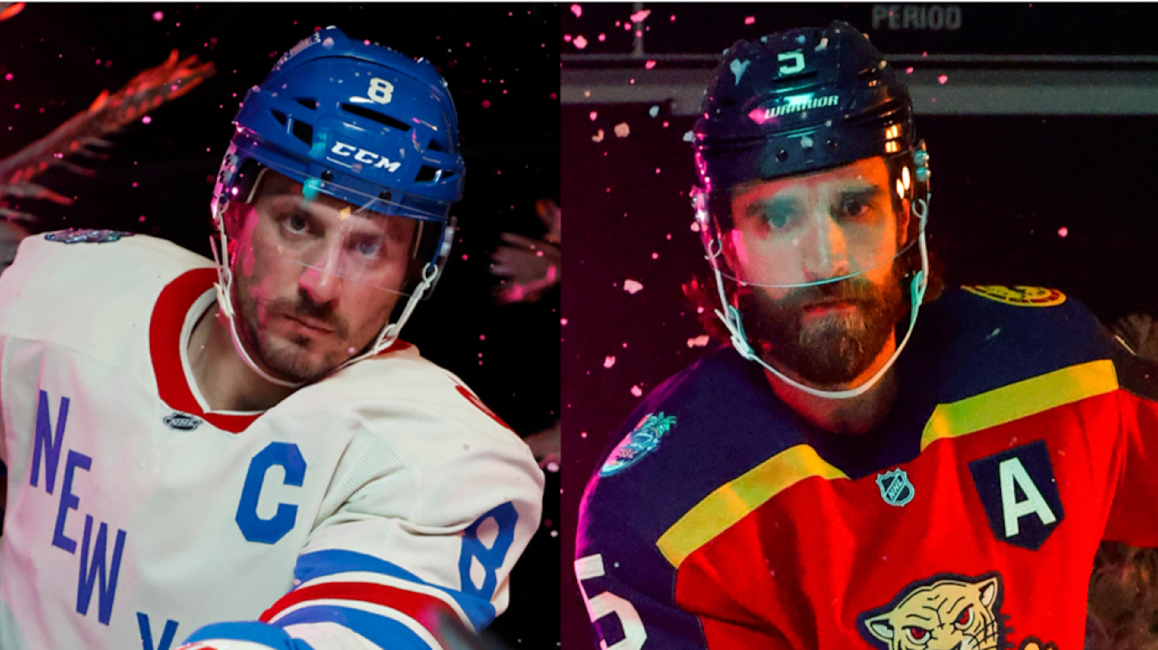
14. 2026 New York Rangers
3 of 16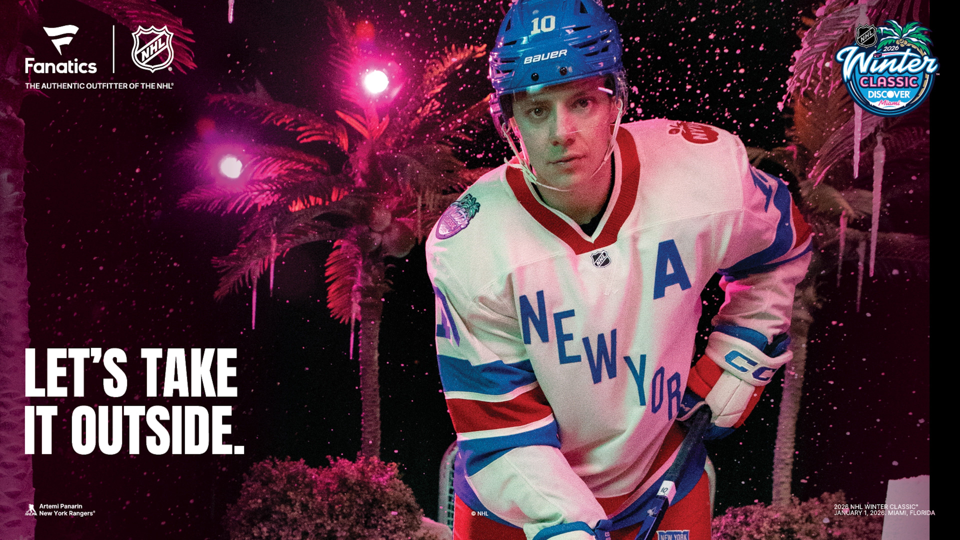
It's definitely different for anything from New York City to be understated, but the Rangers' Winter Classic jersey will be that way compared to what the Panthers are wearing, and that doesn't make it a bad thing.
The Rangers used their gorgeous light blue 100th Anniversary jerseys from this season as the inspiration for their Winter Classic jerseys. The white version of this, with "New York" written diagonally in that baby blue, is nice and easy on the eyes. We're fans of the "Big Apple" shoulder patch with "NYC" on it, and the red and blue stripes are wide and stand out.
This is a really good jersey, albeit not quite as nice as their centennial jerseys, and that it'll be so subdued up against the Panthers' jerseys works out well because contrasts are good to have in these situations.


13. 2020 Dallas Stars
4 of 16
It's easy to forget that the 2020 Winter Classic happened, which is deeply unfortunate, because the matchup between the Dallas Stars and Nashville Predators at the Cotton Bowl was an incredible setting for two teams that hadn't been in the event before. What helped make it look good were the uniforms the Stars broke out for the game.
Dallas used the city's hockey history to design the look with a green and white sweater and the big letter "D" on the front with a lone star and "STARS" spelled out across the "D." It was an old-school look for a jersey, but hockey in Texas had been around even before the Stars got to Dallas in the 90s.
The Stars and Predators each paid respect to their locales' hockey histories through their jerseys, but the simplicity and beauty of Dallas' jerseys made for a phenomenal look. The khaki hockey pants, however? Those are entirely different discussions.
12. 2023 Boston Bruins
5 of 16
Given how many times the Bruins have been in the Winter Classic (four) and the number of times they've cracked through in our rankings, it's a credit to them for figuring out ways to make proper throwback-style sweaters without doing something directly out of the past. When they faced the Penguins at Fenway Park in 2023, they stepped outside their comfort zone and did something old-fashioned, but entirely new.
The Bruins' black jersey with gold stripes was familiar enough, but they broke out an alternate logo from the '80s and '90s that then appeared on their shoulders to serve as the centerpiece this time. The wild-eyed, roaring bruin on the front is affectionately known as "meth bear," and with "BOSTON" emblazoned over the bear's head, it creates a simple look that could fool anyone into believing it came from the earliest days of the franchise.
It's a great sweater and one worthy of recognition over the years of the Winter Classic, not to mention the points for creativity earned for making something new that looks old-fashioned.
11. 2017 St. Louis Blues
6 of 16
When the Blues made their first appearance in the Winter Classic in 2017, they made the easiest call when it came to figuring out what to wear on home ice. Instead of overthinking things and maybe designing something that went too hard, they turned back the clock to their first season in the NHL in 1967 and did a direct throwback, and what a great idea that was.
The Blues' jersey with a lighter blue base, their iconic blue note logo on the front, and yellow and white stripes was just too good to pass up and looked great; they kept it as an alternate jersey, and now it's their current home jersey once again.
It's rare to see a team throw it all the way back the way the Blues did, do so directly, and then stick with it and own it for the current day. It was 100 percent the right call, mind you, but after years of trying to do something more modernized with a similar look, sometimes going back to what you used to have is the best choice.
10. 2012 Philadelphia Flyers
7 of 16
When the Flyers hosted the rival New York Rangers at Citizens Bank Park in 2012, they had the opportunity to lean into what makes the Flyers so iconic: orange and black.
The Flyers' jersey for the game was boldly and proudly orange with their iconic logo front and center. The black-and-white stripes were even interrupted by orange stripes to make sure they upped the level of orange as much as possible. The captains' patches were also in keystone shapes as a nod to Pennsylvania (The Keystone State), and the nameplate on the back was white, so it matched their jersey set at the time.
While the Rangers squared off against them in outstanding cream white jerseys, the dominant look of the game came from the Flyers, who looked every bit their part on the ice in what proved to be a dramatic game with an even more drama-filled lead-in to the event itself.
9. 2016 Montréal Canadiens
8 of 16
When Canadian teams land in the Winter Classic, it has to be a legendary rivalry, and that was the case for the Canadiens when they took on the Boston Bruins at Gillette Stadium in Foxborough, MA, in 2016. Much like when the Maple Leafs faced the Red Wings in 2014, the Canadiens came dressed to the nines on a massive stage.
The Habs broke out a throwback-style jersey that drew inspiration from their 1920s jerseys. The different style of the iconic "CH" logo, as well as the globes on the sleeves of a white jersey with baby blue and light red, was such a drastically different look for the Canadiens, but one that didn't look out of place at all in their lineage.
Although Montréal has done various throwback jerseys in the past, particularly during their centennial season, this one for the Winter Classic was a variation on a throwback that was both wholly new and deeply familiar.
8. 2026 Florida Panthers
9 of 16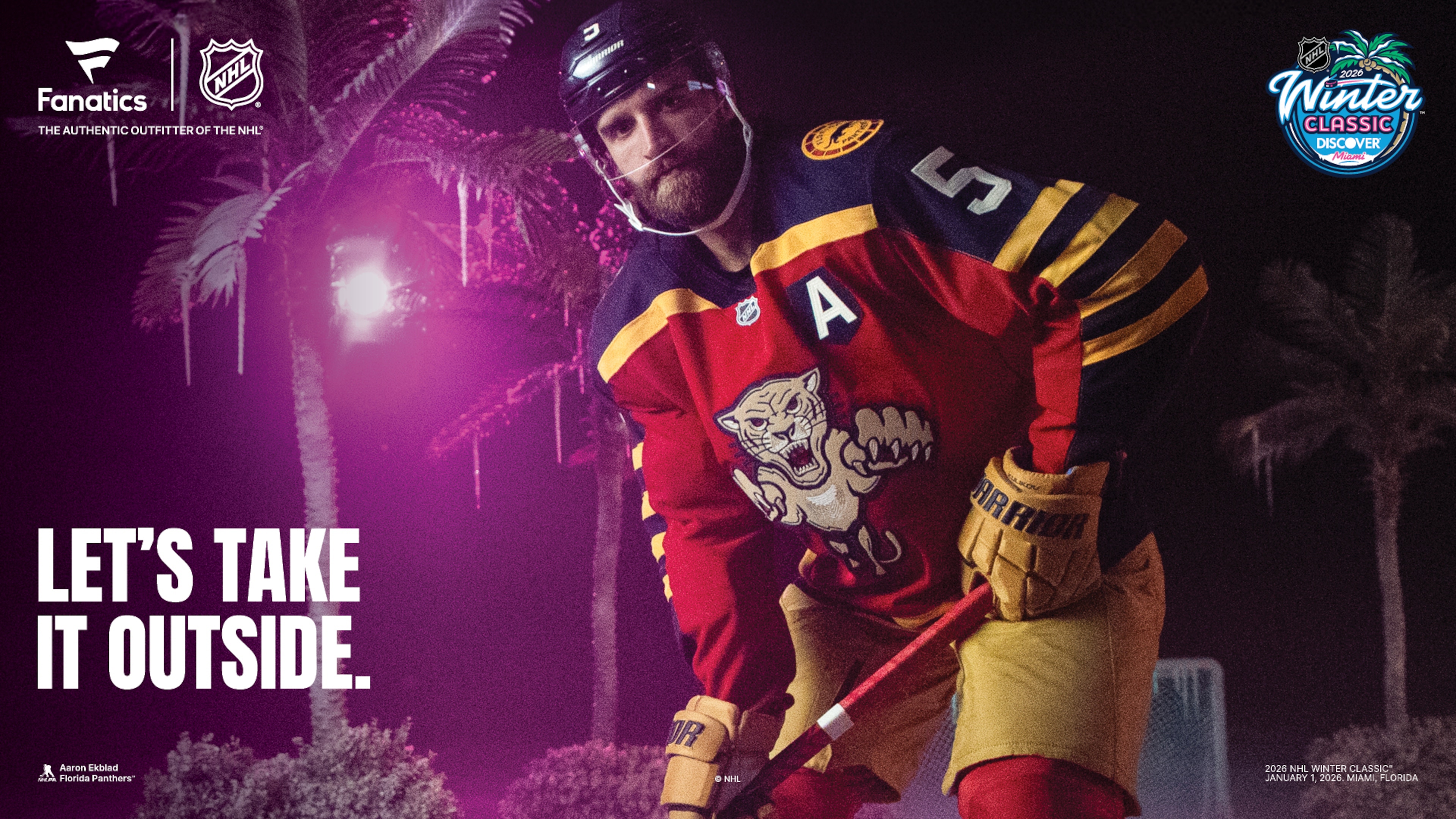
Writing this before soaking in the reaction to these jerseys on social media means it takes a lot of courage to speak boldly about them, so we'll just pat ourselves on the back right up front for it.
These absolutely rock.
The Florida Panthers don't have the 100 years of history that their opponents, the New York Rangers, do, so coming up with a concept that's old-fashioned in a fun, immediately eye-grabbing way takes guts.
Horizontal sleeve stripes stand out, and they're fantastic. The darker colors of red, blue, and gold, along with the gold hockey pants and red, blue, and gold-striped socks, make this a primary-color palette party that still, in its own way, reminds us of their original red jerseys.
The old-fashioned-style leaping panther crest looks like a throwback, but it's not their original '90s logo. The circular shoulder patch is cool, and there's even a nod to the rats stowed away elsewhere on the jersey.
We're absolutely giddy about these because creating something old-fashioned without going overboard is hard. We're betting a lot of you think this is too much, and we're happy to say we disagree with that strongly.
7. 2010 Boston Bruins
10 of 16
When the Bruins hosted the Philadelphia Flyers at Fenway Park in 2010 and played in the first of four Winter Classics, they created a gold jersey with a spoked-B crest from the late-40s and enough stripes to make you wonder whether they were black or brown.
Whatever the case, the jerseys absolutely popped on ice and looked phenomenal as they went on to beat the Flyers thanks to a goal from future head coach Marco Sturm. The jersey's funky old-school style was a big hit that year, and while the Bruins are known for being black and gold, whenever they opt for a gold-heavy look, it's always a fun change of pace.
6. 2011 Pittsburgh Penguins
11 of 16
Even though the Penguins are always known for being black and gold, as is customary in Pittsburgh, leaning so hard on blue for their first two Winter Classic appearances was a great tribute to the early years of the franchise. But their 2011 Winter Classic sweaters for their matchup against the Washington Capitals, at the height of their rivalry, were among their best.
The navy blue jersey with baby blue stripes, along with a circular Penguins logo featuring a skating penguin with a scarf and a hockey stick, was so delightfully throwback that it was really hard to hate anything about the look.
Although many Penguins fans grew to dislike this jersey after bad things happened when they wore it (like Sidney Crosby getting blindsided by David Steckel in the Winter Classic), it was such a great-looking jersey that it was hard to really hate it. It was kept around as their alternate jersey for a couple of years.
5. 2024 Seattle Kraken
12 of 16
Being a brand-new team in the NHL and needing to come up with a jersey that fits the Winter Classic mold, where throwback-style wear is a huge challenge. Fortunately, the Seattle Kraken had inspiration to draw from that was more than 100 years old.
The Kraken took their swing at styling their jerseys for the 2024 game in Seattle at T-Mobile Park by using the Seattle Metropolitans of the 1910s as their muse. The horizontal stripes in Kraken colors, with a bright salmon red Kraken logo with "SEATTLE" written through it like the Metropolitans' "S" logo did back then, was enough of a nod to that team that it even stirred up a lawsuit.
The fact that the jersey was so great-looking that it prompted a legal challenge is oddly complimentary in this day and age. That it looks so good makes us wish the Kraken would continue to use it as an alternate, which is true. Fortunately, they created an alternate this season that allows us to move on from that dream easily.
4. 2009 Chicago Blackhawks
13 of 16
A part of us wanted to avoid direct throwbacks from landing high in the rankings, but that would've been silly, because so much of what makes the Winter Classic look cool is teams paying respect to the past through their uniforms, and the Chicago Blackhawks have done that a lot.
Chicago's been in a ton of outdoor games (seven), and five of those have been Winter Classic games. It's a good thing they've got 100 years of history to work with, but when the looks don't change much over the years, it gets tough. That's what made their first appearance in the Winter Classic such a strong one, as they broke out their jerseys from 1935-1937 to celebrate it.
The black jersey with red and white center stripes and a circular Blackhawks logo was a classic throwback and a truly great old-time jersey. Although Chicago has had plenty of opportunities to mix things up over the years, it set a really high bar from the start.
3. 2008 Pittsburgh Penguins
14 of 16
The first Winter Classic in 2008 in Orchard Park, NY, set the standard for what the outdoor spectacle should look and play like. The game between the Pittsburgh Penguins and Buffalo Sabres had an iconic winter snow globe setting and then a fantastic game that ended in a shootout, finished off by the league's young phenom, Sidney Crosby.
What made it look even better was how both teams dressed. While the Sabres broke out their original white, blue, and gold home jerseys, the Penguins donned baby blue throwbacks from 1968-1971 that were just perfect.
The jerseys were so good they stuck around as an alternate for a short time, but for that game, in what was a bit of a risky move for the NHL at the time, it turned out to be a game that created a tradition.
2. 2014 Toronto Maple Leafs
15 of 16
It's rare for Canadian teams to land in the Winter Classic, and the fact that the Toronto Maple Leafs were the first team from Canada to land a spot in the game wasn't a surprise. That they came out on the ice in 2014 wearing throwbacks to one of their original jerseys after becoming the Maple Leafs in the 1920s helped hammer home the old-school nature of the game being played outdoors.
The throwback Leafs logo on the front with the blue and white horizontal stripes up the sleeves screamed "old-time hockey," and to have that throwback look go up against the Detroit Red Wings in their own stylized throwback look in red and white was the kind of color-versus-color matchup we should have more of in hockey.
Although the Leafs have played in other outdoor games, what they brought to the ice in Michigan in 2014 is one of the most unparalleled great looks in Winter Classic history. While they won the game against Detroit, they didn't win the fashion show...
1. 2014 Detroit Red Wings
16 of 16
It's hard to compete with the aesthetic of the 2014 Winter Classic. From the game at The Big House, Michigan Stadium, to the snowstorm that set in on Ann Arbor late in the game, to the freezing temperatures, to the more than 100,000 fans that packed in to watch the Detroit Red Wings and Toronto Maple Leafs, even if the teams wore less-than-great jerseys, it would've been an incredible day and game.
But then both teams had to go and have the best-looking game of all the Winter Classics. The Red Wings created a throwback jersey that had fans in Michigan going wild. Red jerseys with the winged wheel logo, with "DETROIT" spelled out above it with the cream-colored stripes, it was something new that looked old and wasn't out of place at all.
That the Red Wings were able to wear red while the Leafs wore blue throwbacks helped make the game look historic and iconic, making it all so ideal. Detroit's jerseys were so good and such a hit that they served as inspiration for the team's centennial jerseys this season.


.png?w=3840 "OKC Trades Cut $323M from Cap")
