Grading Every MLB Spring Training Cap
It's hard to believe we're already here, but the 2013 edition of MLB spring training is finally among us as pitchers and catchers are reporting to camp for some time in the sun.
Putting on their uniforms for the first time in a few months, every team starts fresh with championship hopes.
Most MLB attire in the grapefruit and cactus leagues doesn't look a lot different than its regular-season counterpart, but some teams do go in a different direction, adding details that they just wouldn't (and in some cases shouldn't) get away with during the season.
Here's a look at some typical spring training caps, for better or worse.
*Images via ESPN (h/t HardBall Talk)
Arizona Diamondbacks
1 of 30Grade: B
The Arizona Diamondbacks didn't stray too far from their past regular-season looks with this cap, but the combination of the burnt red and black is one of the best among the spring training options.
Atlanta Braves
2 of 30Grade: C
The Atlanta Braves definitely made one of the boldest statements with their spring training caps, facing plenty of criticism for the depiction of the Native American on the front.
However, deserved criticism caused the Braves to scrap that cap in favor of a more traditional look.
Baltimore Orioles
3 of 30Grade: A
The Baltimore Orioles need to go with this logo more often on their caps, and while this throwback option has been seen before with the white front, using more of the bold orange color on the spring training unis is a nice departure from the norm.


Boston Red Sox
4 of 30Grade: B
When a team with a classic logo such as the Boston Red Sox goes about changing up an aspect of their uniform, the changes are typically pretty subtle.
That's exactly the case here, as the bill is really the only aspect of the Sox cap that's different from it's regular-season counterpart.
Chicago Cubs
5 of 30Grade: B
The Chicago Cubs don't stray too far from their typical caps during spring training, although the red bill and inverted color on the "C" is a departure from the logo we've grown used to over the past few decades.
Making slight tweaks like this isn't at all uncommon in spring training as we'll see, so as long as they don't change up their regular-season uniforms, I don't have a problem with this variation.
Chicago White Sox
6 of 30Grade: B+
As much as I like seeing the way organizations change up their uniforms throughout the years, sticking with the mainstays is always a good way to go.
Modifying the color of the bill on the cap is a subtle enough change to warrant some credit, though it'd be fun to see them give their old school shorts a try someday, too.
Cincinnati Reds
7 of 30Grade: A+
I may be in the minority here, but this cap is awesome.
It represents one of the biggest changes from a team's everyday regular-season cap, and with a nod to the old school side of the franchise, this is a cap any baseball fan could wear.
Cleveland Indians
8 of 30Grade: C
The Cleveland Indians could've gone the same direction as the Atlanta Braves for their spring training cap, but with the classic logo on these caps, they're clearly going a little bit more politically correct.
There isn't much to the cap, and though simplicity often works out for the better, this cap looks like it belongs to a middle school baseball team.
Colorado Rockies
9 of 30Grade: A-
I'm a fan of teams that try something different when it comes to their spring training uniforms, as it's a great opportunity to broaden the brand of a franchise while pulling in some extra revenue on apparel.
The Rockies' cap is one that fans outside of Colorado could get behind, and it's definitely one of the best of this year's class.
Detroit Tigers
10 of 30Grade: D
The Detroit Tigers are one of those teams that doesn't need to (and shouldn't) do anything to their uniforms, even when it's just for spring training.
Reversing the color scheme is a subtle enough change, but even though I'm a Twins fan, I still find the Tigers' traditional navy cap with white logo to be one of the best in baseball.
Houston Astros
11 of 30Grade: A+
What better way to mark the move to a new division than to change your uniforms to something new.
The Houston Astros have taken aspects of the bold uniforms they donned in the '80s while still giving it a retro-modern look.
I'd buy one.
Kansas City Royals
12 of 30Grade: B
The Kansas City Royals made essentially the same change as the Tigers when it comes to their spring training cap, simply reversing the colors on the front.
They don't have the same history behind the logo that the Tigers do, and while I love the all royal blue cap they wear during the regular season, this works too.
Los Angeles Angels
13 of 30Grade: C
There's nothing wrong with the Los Angeles Angels' spring training cap, but with one of the best retro logos in their team's history, it'd be cool to see them go back to it if even just for the spring months.
Los Angeles Dodgers
14 of 30Grade: C-
The Los Angeles Dodgers boast one of the cleanest uniforms in all of baseball with their classic white and royal blue colors.
This cap doesn't exactly fit the part, and while they'll be back to their mainstay once the season gets underway, this one just doesn't do the franchise's history justice.
Miami Marlins
15 of 30Grade: C-
With a completely revamped color scheme and uniform just a year ago, the Miami Marlins made one of the most vibrant splashes in baseball's history.
I wasn't a fan of the colors from the start, and this cap won't do much to change my mind.
Milwaukee Brewers
16 of 30Grade: C+
The Milwaukee Brewers are another team that just took steps to reverse the color scheme of their regular-season look in making up their spring training version, though it's the alternate look that will get the most credit.
Going back to what was one of the best logos baseball has ever seen, the Brewers' glove logo will be a part of the spring training rotation.
Minnesota Twins
17 of 30Grade: B-
The Minnesota Twins haven't done much to change their logo during their franchise's history in the Twin Cities.
Whether it's the "TC" logo or the more recent "M" logo, all modifications made are pretty minor in stature.
New York Mets
18 of 30Grade: A+
Along with the Cincinnati Reds cap, this spring training cap for the New York Mets quite possibly represents the best of this year's options.
It's a major departure from their normal logo, and while I've said I'm a fan of keeping the classics in place, this is a pretty sweet lid.
New York Yankees
19 of 30Grade: D
The New York Yankees' cap is probably the most recognizable hat in the world, so any departure from that is just hard to see.
The different color on the bill is a very minor change, but it just doesn't work.
Oakland Athletics
20 of 30Grade: A-
The Oakland Athletics logo featuring the elephant balancing on a baseball is one of the most underrated in all of baseball, so I'm glad to see it's getting some use in spring training for the A's.
With some luck, maybe they'll go with it more often during the regular season.
Philadelphia Phillies
21 of 30Grade: B+
The color scheme that the Philadelphia Phillies are utilizing here is a little bit different than their regular look, and it actually looks pretty good.
I would love to see them go back to the maroon and white look for a longer period of time (like spring training), but I think the baseball world can live with this.
Pittsburgh Pirates
22 of 30Grade: B
Not a whole lot going on here that we're not used to seeing from the Pittsburgh Pirates.
Moving away from their black and yellow wouldn't be an option, and the only drastic change they could feasibly make would be going back to these hideous creations.
Let's just be glad it didn't come to that.
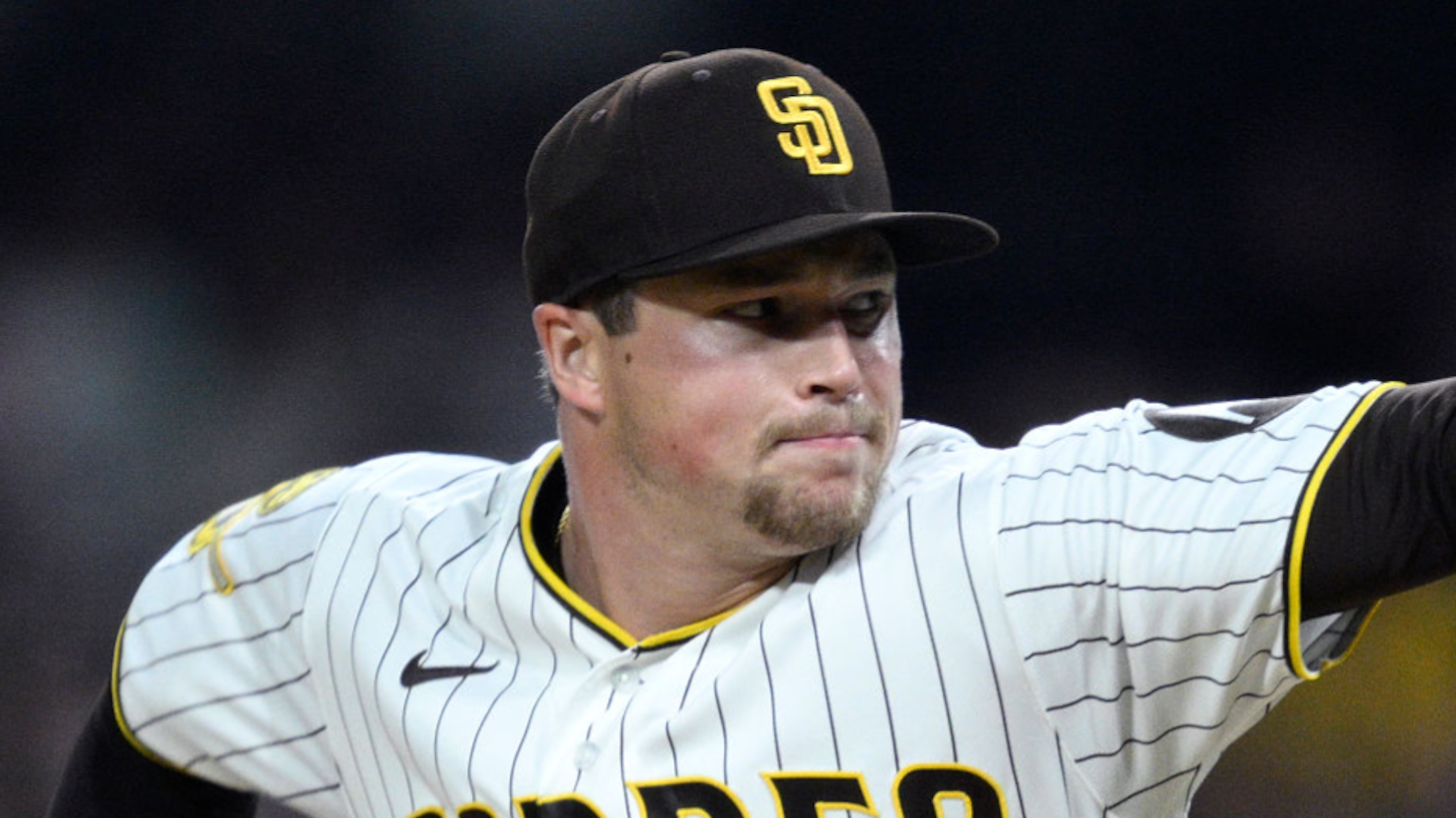
San Diego Padres
23 of 30Grade: C
Yes, this is basically the same as the San Diego Padres regular-season cap.
I guess some organizations don't do well with change.
San Francisco Giants
24 of 30Grade: A-
I'm a big fan of the black and orange color combination, so I don't have much bad to say here. The look doesn't depart much from their regular-season cap, but that's fine.
Plus, they're the World Series champs, so lets not argue with their decision making.
Seattle Mariners
25 of 30Grade: A-
I was a big fan of the Seattle Mariners' team colors when they went with the royal blue and yellow, but the change to their most recent colors hasn't been bad either.
Bringing back the trident from their throwbacks would be a nice touch, but I love this color combination, so I won't complain.
St. Louis Cardinals
26 of 30Grade: B+
I tend to like the traditional St. Louis Cardinals red cap with white logo, and while the spring training cap here isn't anything like it, it still looks pretty sweet.
The crimson and navy combination is a recurring theme in the caps we've seen, but this might be the best utilization of it.
Tampa Bay Rays
27 of 30Grade: B-
When a team is relatively new to the league (in the grand scheme of things) like the Tampa Bay Rays, there's no doubt some tweaking to the look and feel of a team's uniform.
The random beam of light in the middle of this cap is somewhat odd, though their colors are great, and we should really all just be glad that they're no longer using the devil ray in their logo.
Texas Rangers
28 of 30Grade: B
Not really sure what to make of this cap. The standard "T" and colors are close enough to their regular uniform look, but the addition of the state flag adds an element that's relatively new in terms of MLB caps.
The more you look at it, though, the more it grows on you.
Toronto Blue Jays
29 of 30Grade: C
This cap may not contain Canada's flag, but the easily identifiable maple leaf is close enough.
The Toronto Blue Jays logos that feature the bird are by far their best, and while this definitely achieves something different, I'd rather see the Blue Jay.
Washingon Nationals
30 of 30Grade: B+
What better color scheme for a team calling the nation's capital home than the good old red, white and blue.
With a pretty even amount of each color on the cap, the clean look of the Washington Nationals cap is easy to like.


_0.png?w=3840 "Summer League Takeaways ✍️")


.jpg?w=3840 "1 Word to Describe Pre-Camp Vibe of All 32 NFL Teams")