
MLB City Connect Jersey Power Rankings for Every New Edition in 2025
Eight teams—the Arizona Diamondbacks, Boston Red Sox, Chicago White Sox, Colorado Rockies, Houston Astros, Miami Marlins, San Francisco Giants and Washington Nationals—have unveiled new City Connect uniforms in 2025.
For each of those clubs, it's their second City Connect design since the Nike-led alternate uniform program began in 2021.
From worst to first, we've ranked all eight of the new CC uniforms for 2025.
8. Miami Marlins
1 of 8
Last summer, B/R ranked all of the City Connect uniforms, with the Havana Sugar Kings-inspired Marlins threads checking in at No. 1:

Rest assured that the next time we ranked all the active concepts, the Fish won't come anywhere close to the top spot.
For all that was unique about the first design, the second one represents everything fans have disliked about the City Connect program. That includes a statement that the Marlins gave describing what they call their "Retrowave" uniforms.
"Our new Retrowave uniform combines the Marlins' rich history with an innovative, forward-thinking approach that mirrors our organization's trajectory."
Barf. First of all, it seems a stretch to say the Marlins have a "rich history," even when you account for their two World Series wins. Secondly, this statement could be given about any City Connect uniform.
The horizontal pinstripes and combination of colors feel like a cheap knockoff of the "Vice City" alternate uniforms the Miami Heat have made popular.
But by far the worst part of the Marlins' 2.0 City Connect uniforms are the hats:
Putting 305—the area code—on the cap is lazy. Designing it in a way that makes it look like "SOS" is the cherry on top.
7. Chicago White Sox
2 of 8
It's worth pointing out that the "Southside" City Connect uniforms the White Sox wore from 2021 to 2024 were well-received.

Things didn't go as well for the team in its second CC design.
The idea of a White Sox x Bulls crossover uniform is the type of thing that would be interesting to see on your social media timeline. But as far as in an MLB game is concerned, it's not really something anyone was asking for.
Jerry Reinsdorf does own both teams, but he's not exactly a celebrated owner, particularly in baseball circles. Michael Jordan, of course, won six NBA titles with the Bulls and played in the minors for the White Sox, but didn't get higher than the Double-A level.

The execution feels like a missed opportunity not to go with the cursive script the Bulls used on their road jerseys from 1979-1985.

Also, once you see how much the hat/sleeve logo looks like Goodyear's, it's hard to unsee it.
Perhaps this was a creative idea, but some concepts should be left on the cutting room floor.
6. Washington Nationals
3 of 8
These aren't awful, but it's hard to shake the feeling they are just a worse version of the original Nationals' City Connect uniforms, which paid homage to the cherry blossom that covers D.C. every spring:

Anyway, these City Connects are "District Blueprint" theme, which MLB.com's Jessica Camerato noted:
"The denim color jerseys depict the design of the city street grid. On the chest is an interlocking 'DC' logo, worn by the Nats from 2006-10. The logo's 3D treatment is a reference to the 1956 Washington Senators. The circular arm patch reads 'The District of Columbia' with the block 'W' and Capitol Dome design."
The cherry blossoms did stay on the caps/batting helmets. What's perplexing is while the batting helmets seem to match the uniforms, the primary color of the caps is a shade of gray that's just different enough from the denim jerseys to bother you:

The most frustrating part here is that when teams nail their original CC, as the Nationals did, they are still discarded after a few years. And the second design, while not awful, isn't nearly as good as the first.


5. Colorado Rockies
4 of 8
Here's another team that retired a great City Connect jersey after the 2024 season, and it's hard not to compare the two:

One of the few things the Rockies currently have going for them is the beauty of Coors Field. We don't have a metric for actually judging this, but it feels like some of baseball's most beautiful sunsets come in Colorado. And so, the Rockies went with the theme of "from sunrise to sunset" for their second City Connect design:
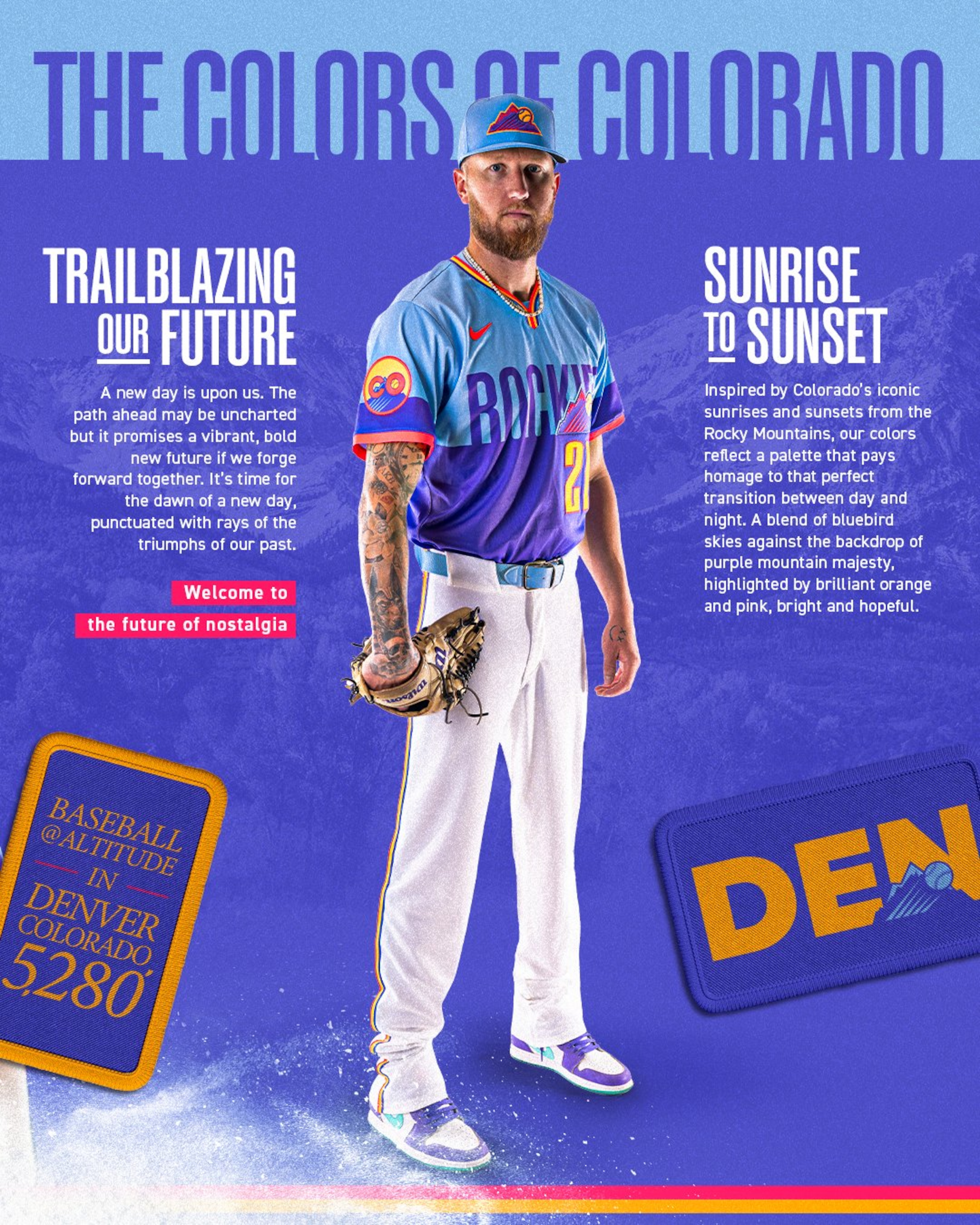
The concept is interesting, no doubt. However, the first City Connects uniforms felt like you were watching a team from Colorado, even if they broke from the traditional color scheme of the Rockies. These colors give off desert vibes, like something you'd see from a Double-A team playing in New Mexico.
There are much bigger fish to fry in Colorado, but it's hard not to miss the license plate City Connects, which looked good with both green and white pants.
4. San Francisco Giants
5 of 8
The Giants are probably the first team on this list where their second City Connect is a definite upgrade over the initial design.

As much as the foggy Golden Gate Bridge theme was a cool idea, the execution left much to be desired.
In a city that has produced legendary acts such as The Grateful Dead and Santana, the second CC design the Giants have unveiled pays homage to the music culture of San Francisco:
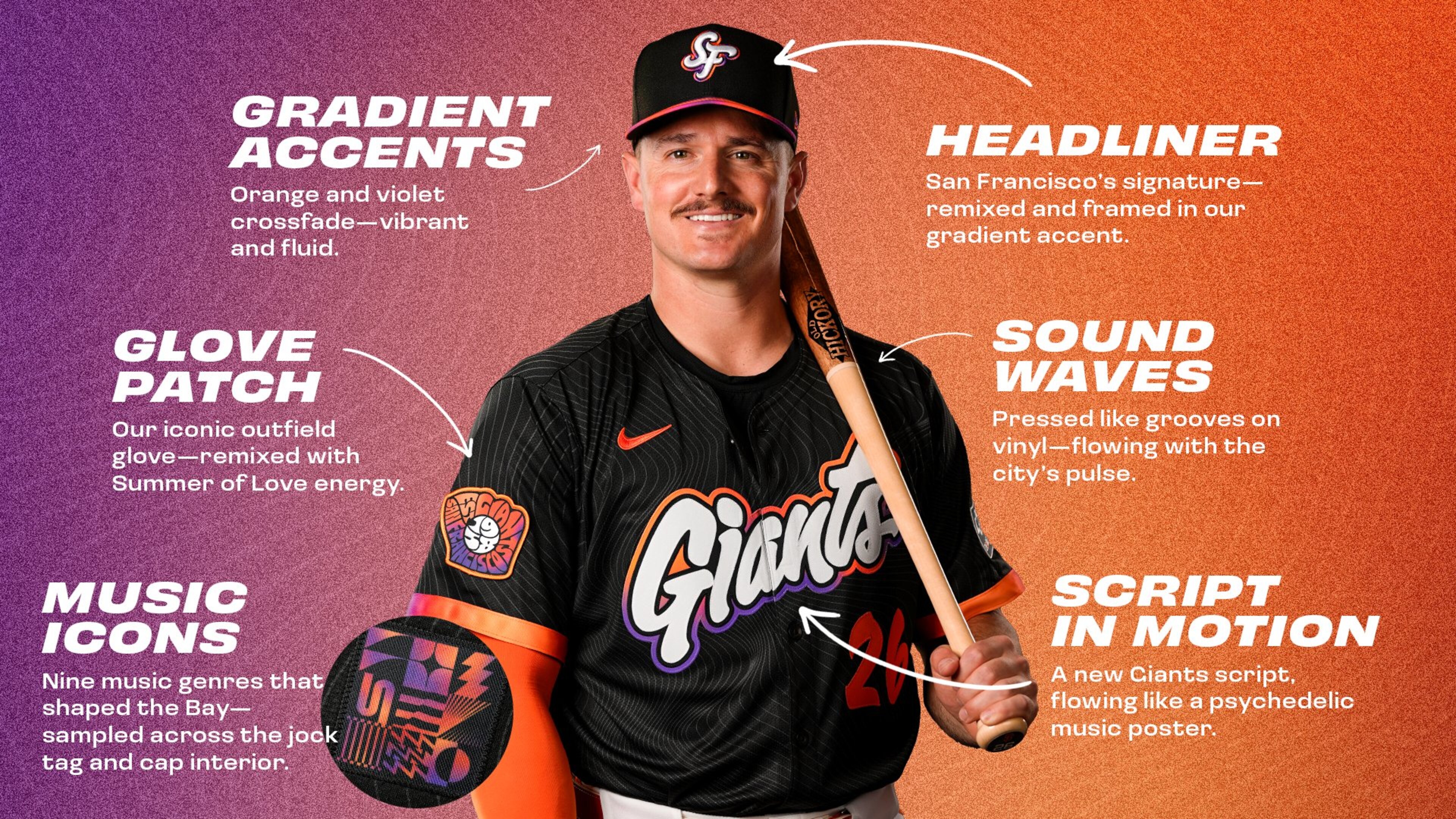
Are these fun? Yes. Are they better than the first City Connects that the Giants had? Also yes. Were they necessary for a team that has excellent orange-and-black alternate tops with classic cream home uniform? Probably not. But the jerseys are pretty cool.
The biggest complaint here is that the Giants didn't find a way to make the classic interlocking "SF" logo work for these caps. It just doesn't feel like anything else should be on their hats.
3. Arizona Diamondbacks
6 of 8
The Diamondbacks have taken their original desert sand-colored "Serpientes" City Connect uniforms and infused them with the purple and teal that were their primary colors from their inception in 1998-2006.
To be clear, the original CCs the Diamondbacks used were very good, but so too are these. It can be argued they should have stuck with the "A" caps or the classic snake contorted into a "D," but the "S" logo works pretty well too.
This shade of purple is louder than what the Diamondbacks wore during what we'll call the Randy Johnson Era:

Here's hoping these new City Connect uniforms are the first step towards the D-backs eventually ditching "Sedona Red" and returning to purple and teal on a full-time basis.
2. Houston Astros
7 of 8
The Astros have drastically upgraded from their first "Space City" City Connect uniforms (first picture below), which turned into a repetitive navy-blue look that was very similar to the alternate tops they already had (second picture below):


The new City Connects keep the space theme, but did a better job this time with a white-on-white look that feels much more appropriate for what is a home alternate.
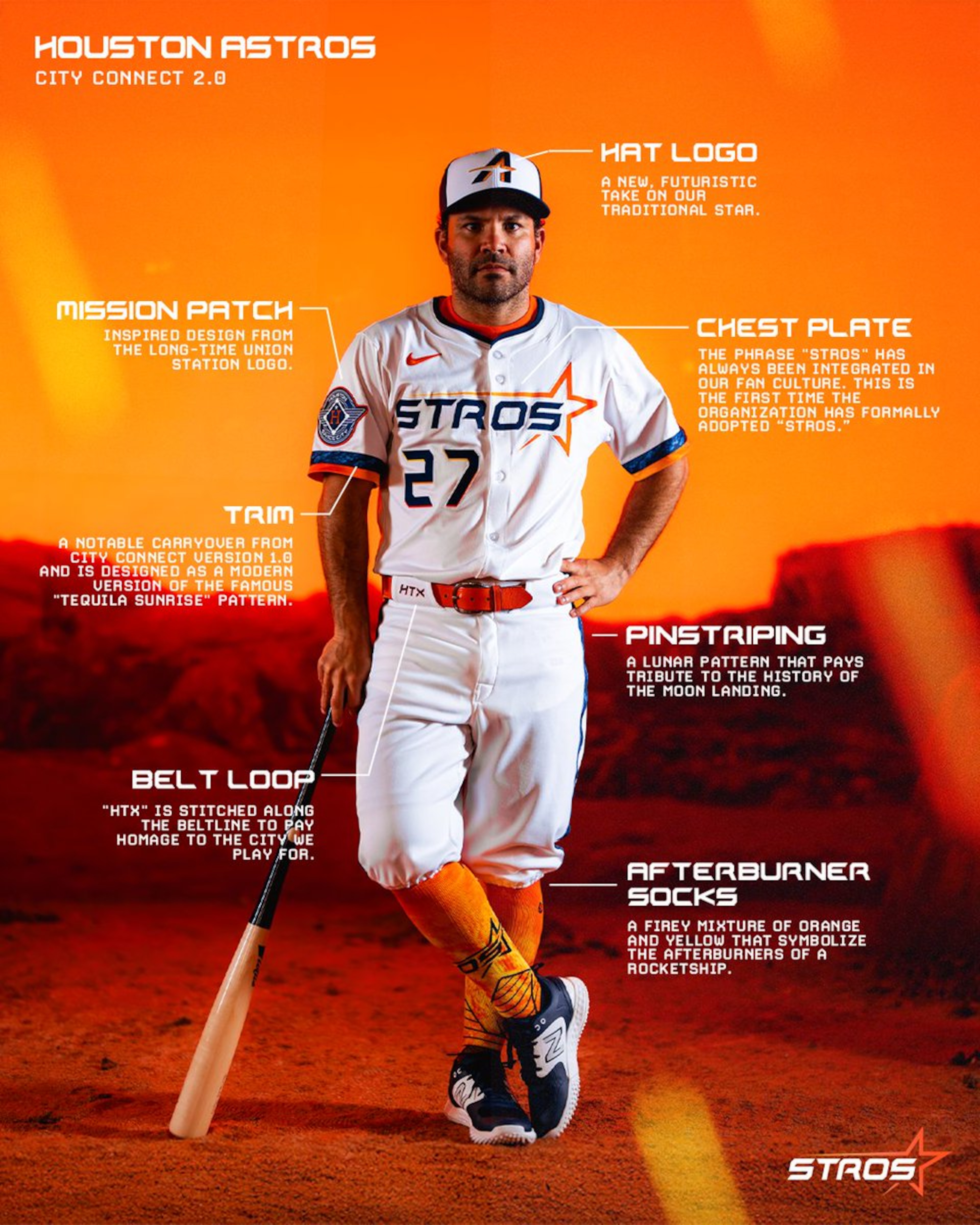
Another cool touch is the Union Station logo on the left sleeve, paying homage to the train that used to run through what's now the Crawford Boxes at Daikin Park.
The script of these jerseys reminds you of what the Astros wore from 1994-1999.

It's often difficult to blend different eras, but the Astros have struck a nice balance here.
1. Boston Red Sox
8 of 8
*Chef's kiss*
Sometimes, the simplest idea is the best one. What the Red Sox have done here is create a modern classic with their second City Connect design, one that everyone who knows even a little about baseball knows is a tribute to the Green Monster at Fenway Park.
You might be inclined to think the yellow numbers are some sort of tribute to the Boston marathon—which the Red Sox's first CC design, now a regular alternate, was based on—but it actually is meant to represent the color of Pesky's Pole, among other features of one of baseball's most iconic cathedrals:
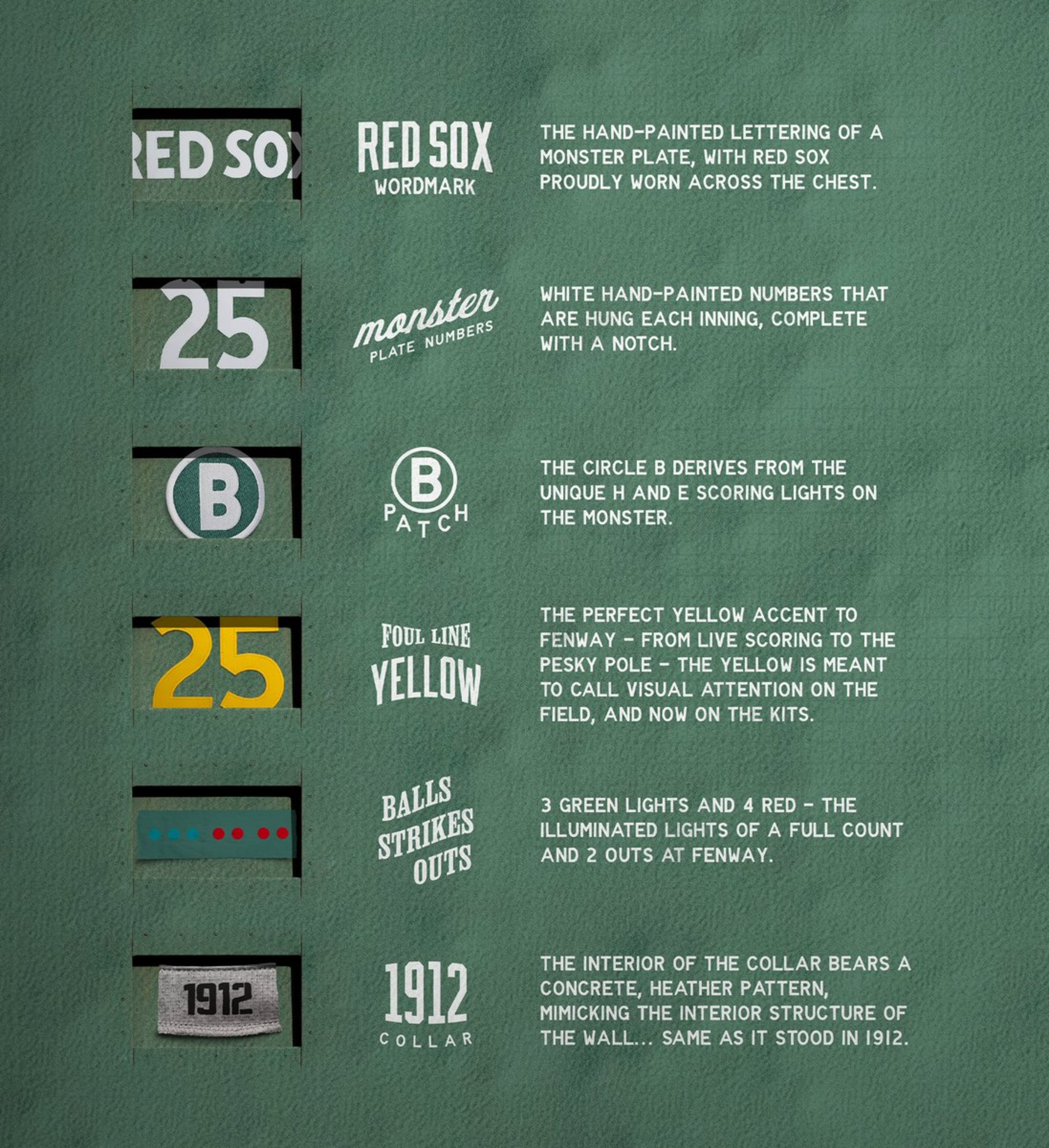
This is such a pleasing shade of green, and the Red Sox didn't try to get too cute with the hat. It's a different color than usual, but the iconic "B" remains.
This is one of the best uniforms the City Connect program has produced. It's also the rare hit on a modern refresh from a historic franchise.


