")
NFL: The 20 Most Hideous Uniforms in League History
Everyone is currently on their toes biting their nails impatiently waiting for the collective bargaining mess agreement to be sorted out. We’re all wondering whether or not there will be a lockout and forced to miss our beloved football action in the fall. As we frantically make minimal changes to our NFL mock drafts after obtaining any little bit of info we can on each and every prospect to keep our minds off a potential NFL doomsday, it’s time to lighten the mood.
The uniform is present throughout sports, but there is nothing quite like the NFL uniform.
We love watching the player’s suit up, bruise and batter their bodies, rip and shred jerseys, dirty pants and dent helmets. We love to wear our favorite players and team jerseys, but it’s time we take a look at the top 25 most hideous uniforms in NFL history. Should there be a lockout, at least we won’t miss these current and potential throwback uniforms!
20. Chicago Bears Alternate Orange
1 of 20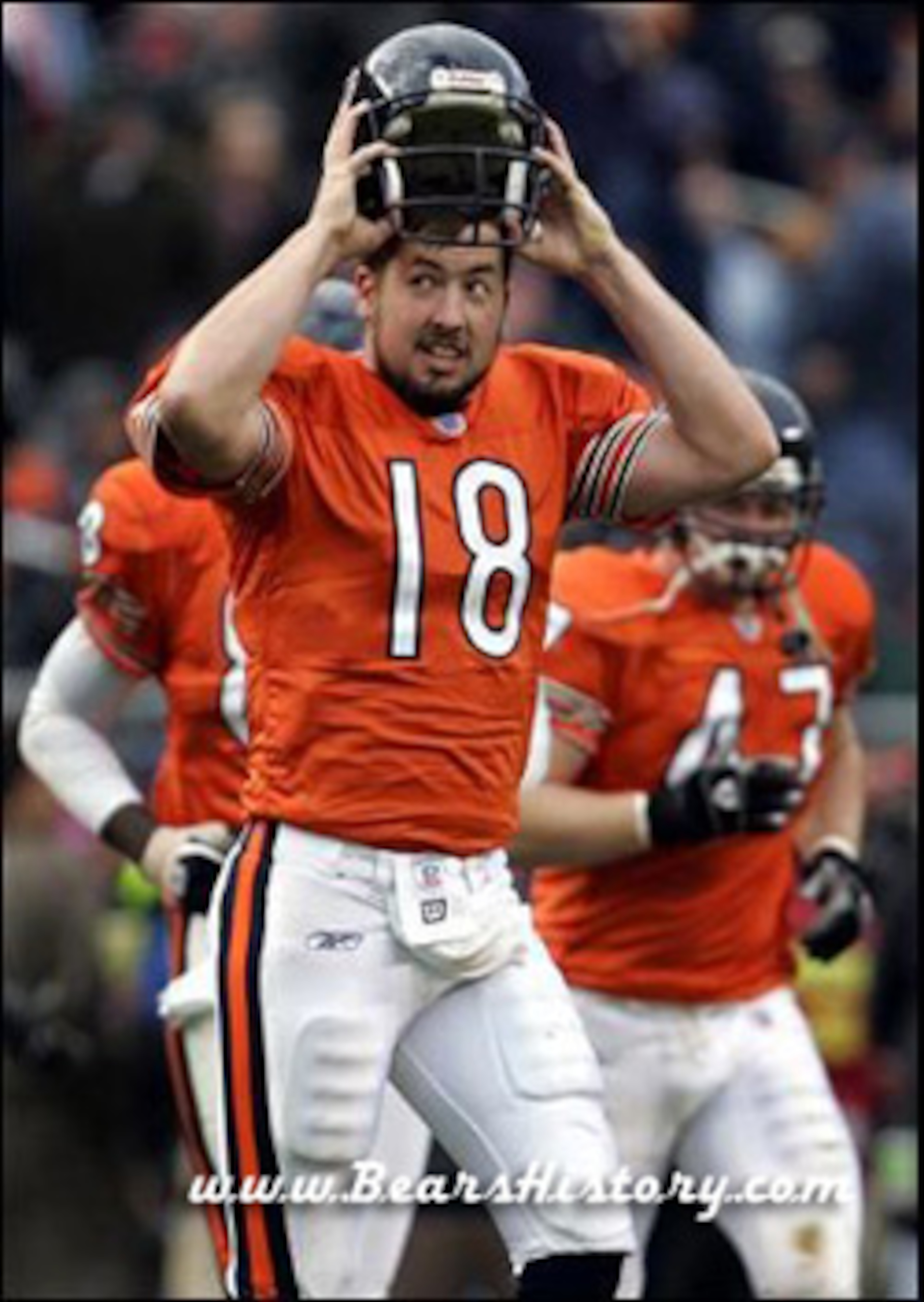
The Bears boast one of the nicest and most recognizable jerseys in all of sports. There is great tradition in Chicago and the Bears represent it well by not changing their uniforms up too much.
Personally, though, I absolutely hate it when the Bears wear their alternate orange jerseys. I think it looks terrible on them and has no place being worn—ever. It’s either the white or the blue. That’s it; that’s my extent with the Bears.
19. San Francisco 49ers, 1950s
2 of 20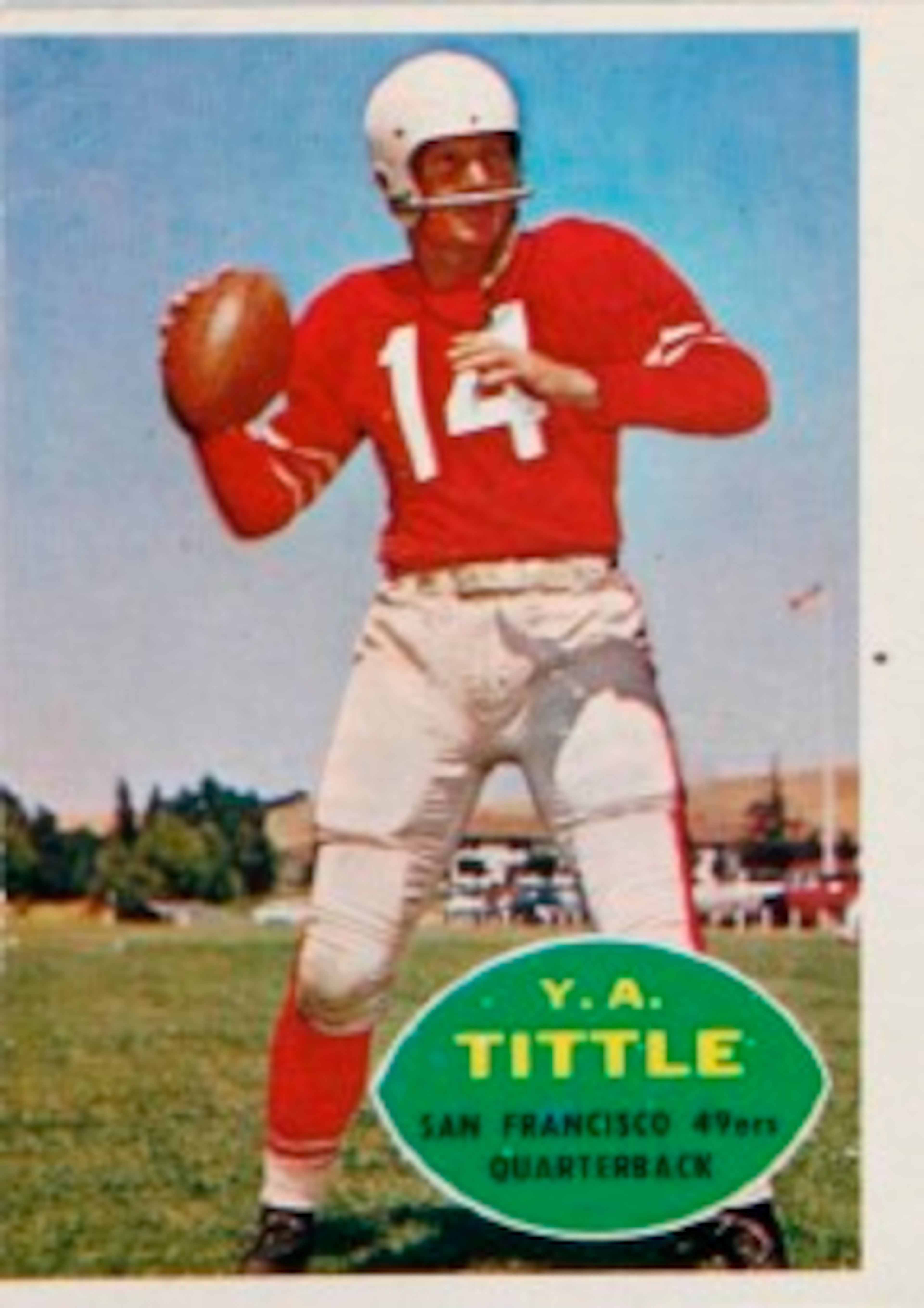
Not the greatest picture, I know, but you can get the gist of it.
One would think—you know, logically—that the San Francisco 49ers would actually have gold somewhere on every single one of their uniforms. Maybe it’s just me, but that makes sense given the team.
Somehow, they forgot about that.
18. New York Jets
3 of 20
I like the Jets team, but I absolutely hate their jerseys. They’re so bland, boring and ugly. The green doesn’t even look all that good either!
Please, please, please do something with these immediately!
I much prefer the throwback New York Titans jerseys to these current abominations.

.jpg?w=3840 "Ravens Football")
.jpg?w=3840 "Browns Football")
17. Seattle Seahawks
4 of 20")
The Seahawks jerseys are some of the dreariest jerseys in all of sports. Yeah, I guess they’re fitting for the rainy days of Seattle, but that doesn’t make them appealing.
They’re so gloomy that it’s actually a shame the Seahawks have seen successful over the past decade because we’ve been forced to see them in the postseason!
16. Miami Dolphins Alternate Orange
5 of 20
Perhaps it's because I loathe the Miami Dolphins. But nonetheless, I loathe these jerseys even more. The teal jerseys are nice compared to these horrific ones. Miami needs to stop wearing these and stick to the teal and white—they match better.
15. Jacksonville Jaguars, Throwback
6 of 20
Today, the Jaguars have nice jerseys—especially their black uniforms.
It wasn't always the case. These white uniforms are the worst in their team history. They're so bad that the stripe down the side of the obliques don't even match the stripe down the leg!
14. San Diego Chargers, 1974
7 of 20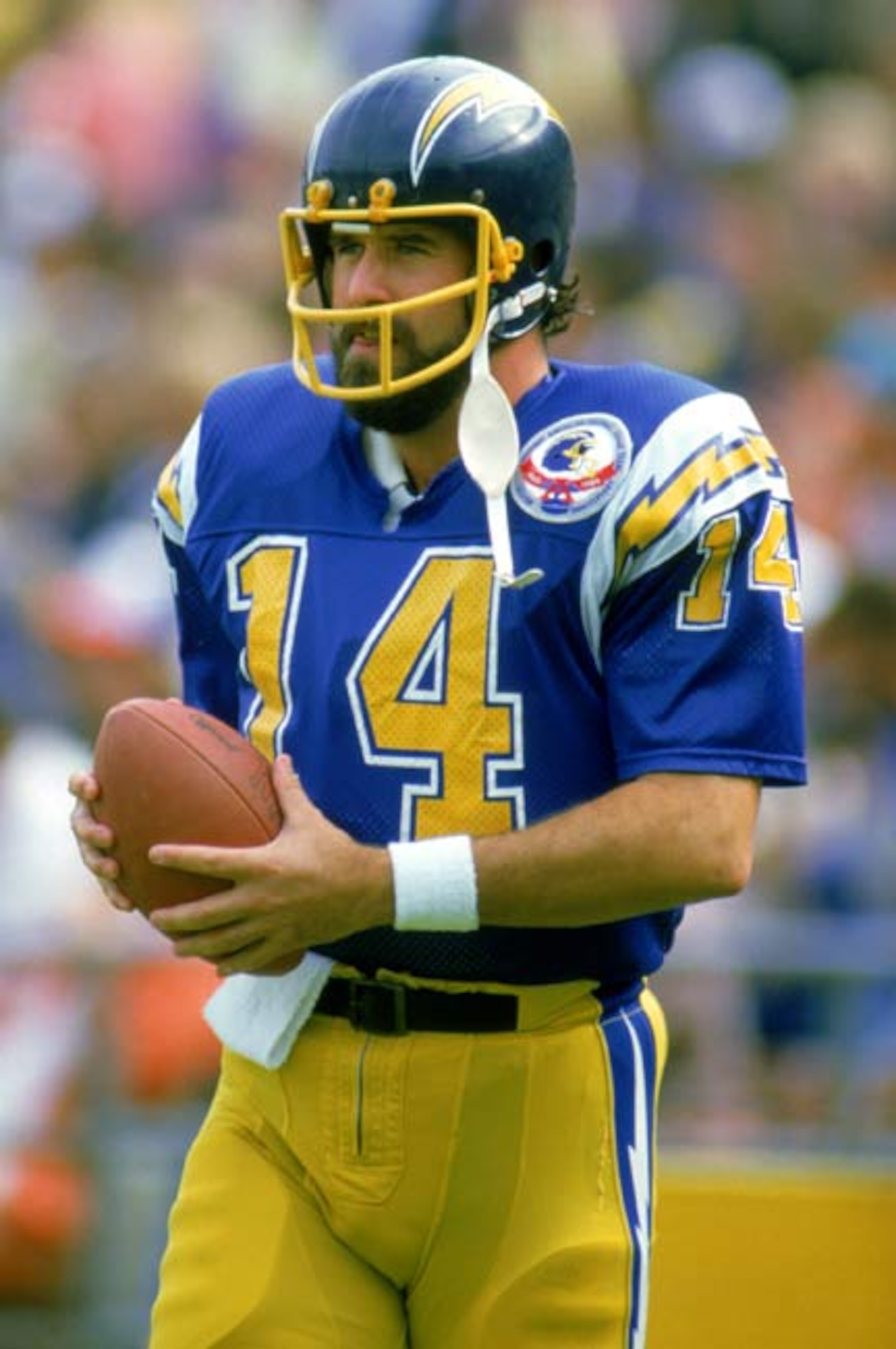
Isn't it amazing that a franchise can have both one of the best and one of the worst looking uniforms in sports history?
The powder blue jerseys with white pants and hint of yellow are the greatest uniforms ever, in my opinion. How they could possibly go from that to this horrific blue-and-yellow disgrace is beyond me.
13. Cleveland Browns
8 of 20
The Browns' uniforms are beyond pathetic.
Look, I don't even mind the brown. At least it's different. Yet the team doesn't even have a logo. They have—get this—an orange helmet! The orange makes no sense for a team called the Browns!
Make some sense and you won't end up on a list of worst uniforms.
12. New England Patriots, 1995
9 of 20
Look, I’m all for logos. I also think the Patriots have one of the best logos in all of sports. Yet there’s a place for everything, and it’s just on the side of the Patriots helmet as far as their logo goes.
The mammoth logo on the shoulder pads were so unnecessary that they made the jerseys look childish instead of intimidating.
11. New York Giants Alternate Red
10 of 20
Maybe it’s just me, but the blue is just synonymous with the New York Giants—so much so that they actually call the Giants “Big Blue.”
As a Giants fan, I cringe every time they were these horrific red jerseys. They don’t go with the team at all and need to be banned immediately.
10. Buffalo Bills
11 of 20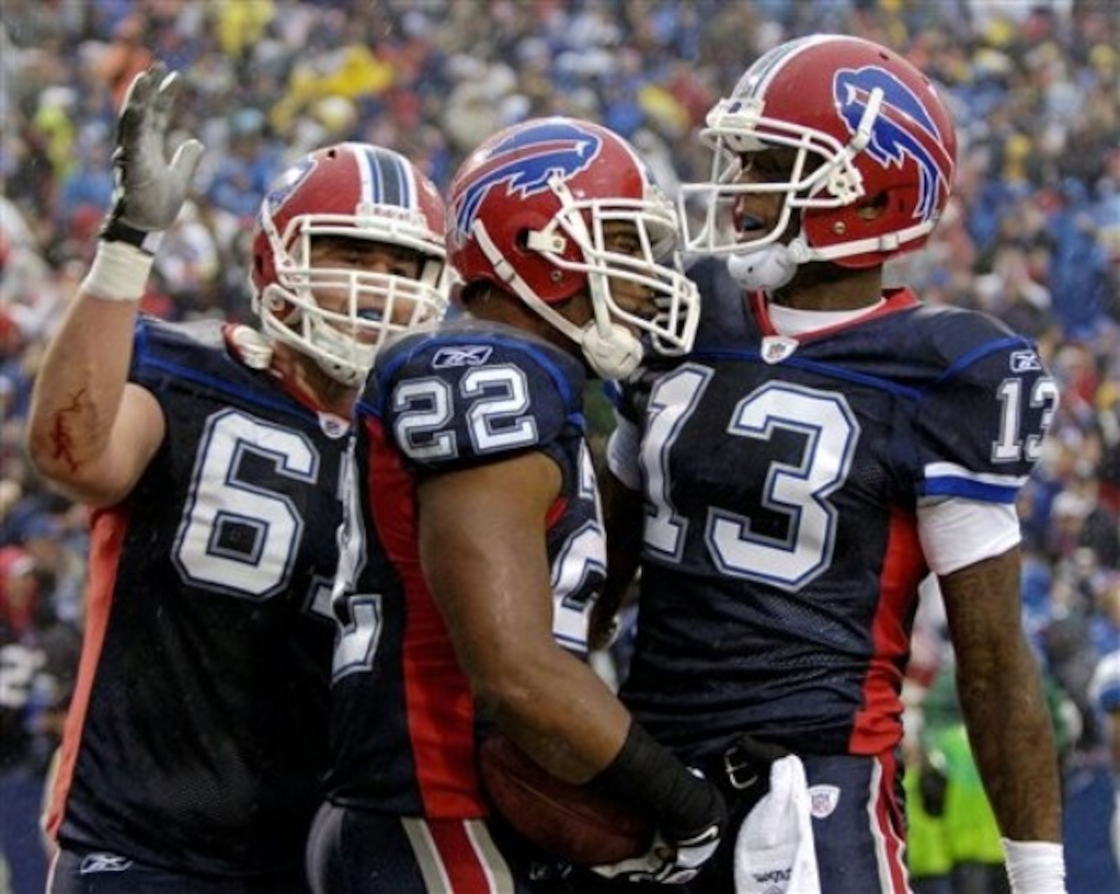
It’s a shame how pathetic the Bills jerseys are. Everything about them are just bland and boring, especially considering the Bills’ old school jerseys are some of the nicest in sports. It’s mind-boggling how teams can go from great to worse.
Actually, it’s extremely fitting that the Bills of all teams have ugly jerseys.
9. Cleveland Browns Alternate Orange
12 of 20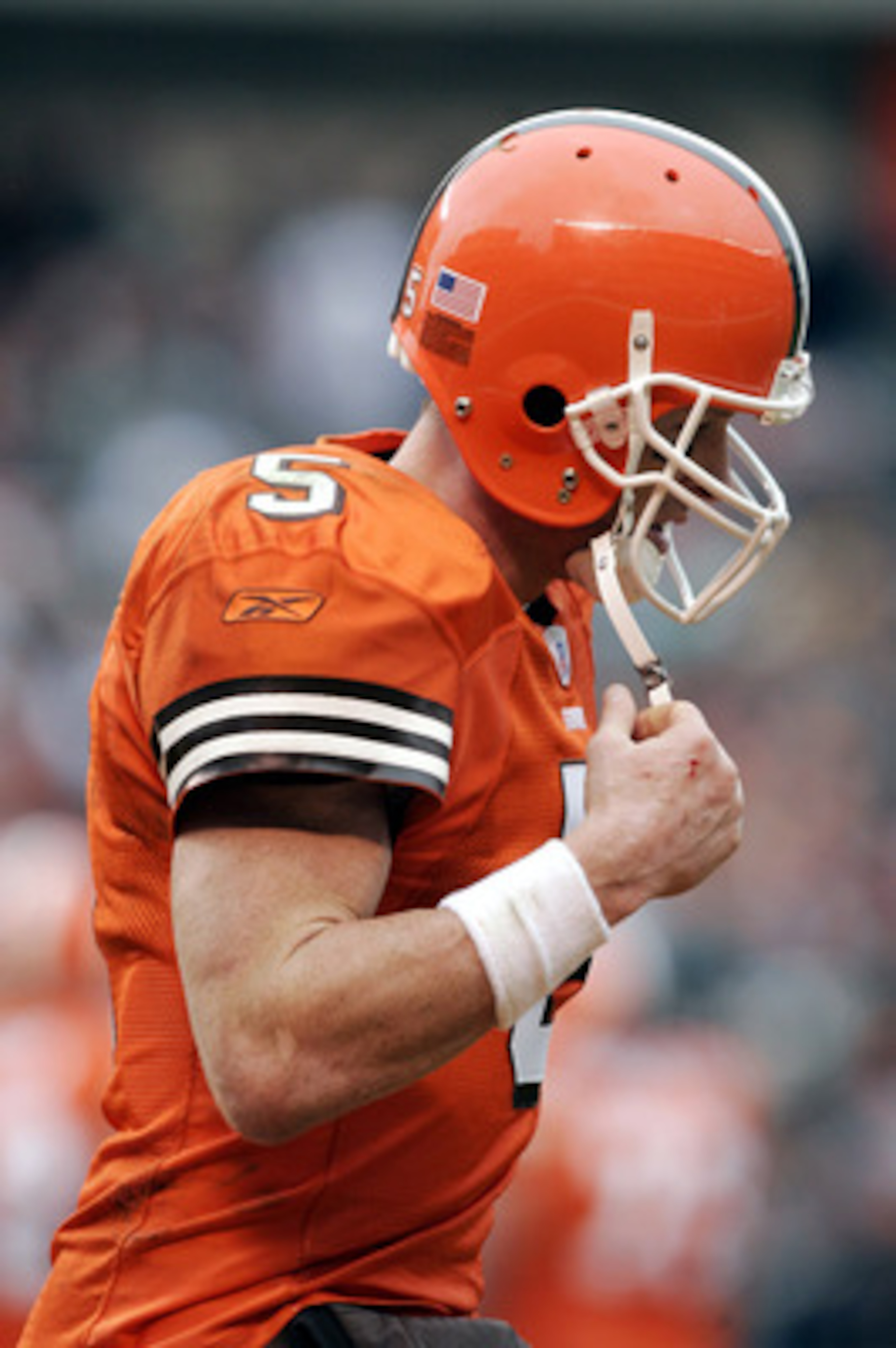
What's worse than a Cleveland Browns jersey? A Cleveland Browns jersey that doesn't even make sense. The Cleveland Browns wore an orange jersey. Let that sink in...
8. Green Bay Packers, 1994 Throwbacks
13 of 20
These 1994 throwbacks are simply hideous, especially when you compare them to the 2010 throwbacks they wore. Those 2010 throwbacks were awesome; I wouldn’t mind seeing them every year.
These yellow and blue things they want to call a uniform though is just dreadful.
The all-yellow helmet (not shown here, for your sake) is a complete eyesore and the jersey itself is one of the worst I’ve ever seen.
7. Pittsburgh Steelers 1933 Throwbacks
14 of 20
Wow. Rugby style?
There’s a reason we Americans like football and not rugby! I’m glad this never caught on and we haven’t seen it since 1994!
Just wow…Everything about this just screams tacky.
6. Seattle Seahawks Alternate Lime
15 of 20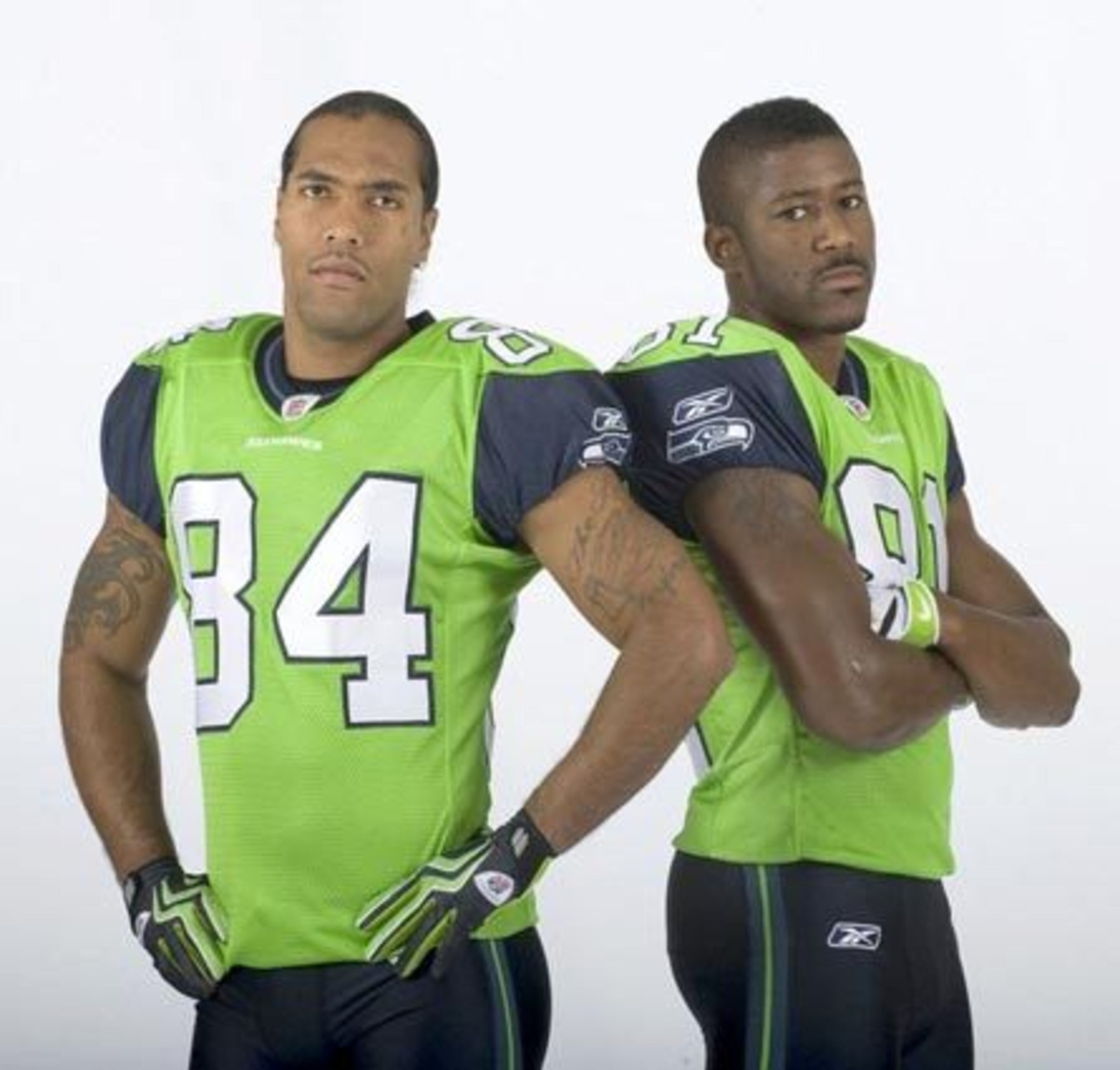
And you thought the Seahawks jerseys couldn’t get any worse!?
I’m almost positive the bright lime-green blinded a couple of unlucky souls. Those who were able to dim their television sets quickly escaped with minimal injuries to their retinas.
T.J. Houshmandzadeh does not look happy about wearing this jersey. Could you blame him?
5. Cincinnati Bengals Inaugural Uniforms
16 of 20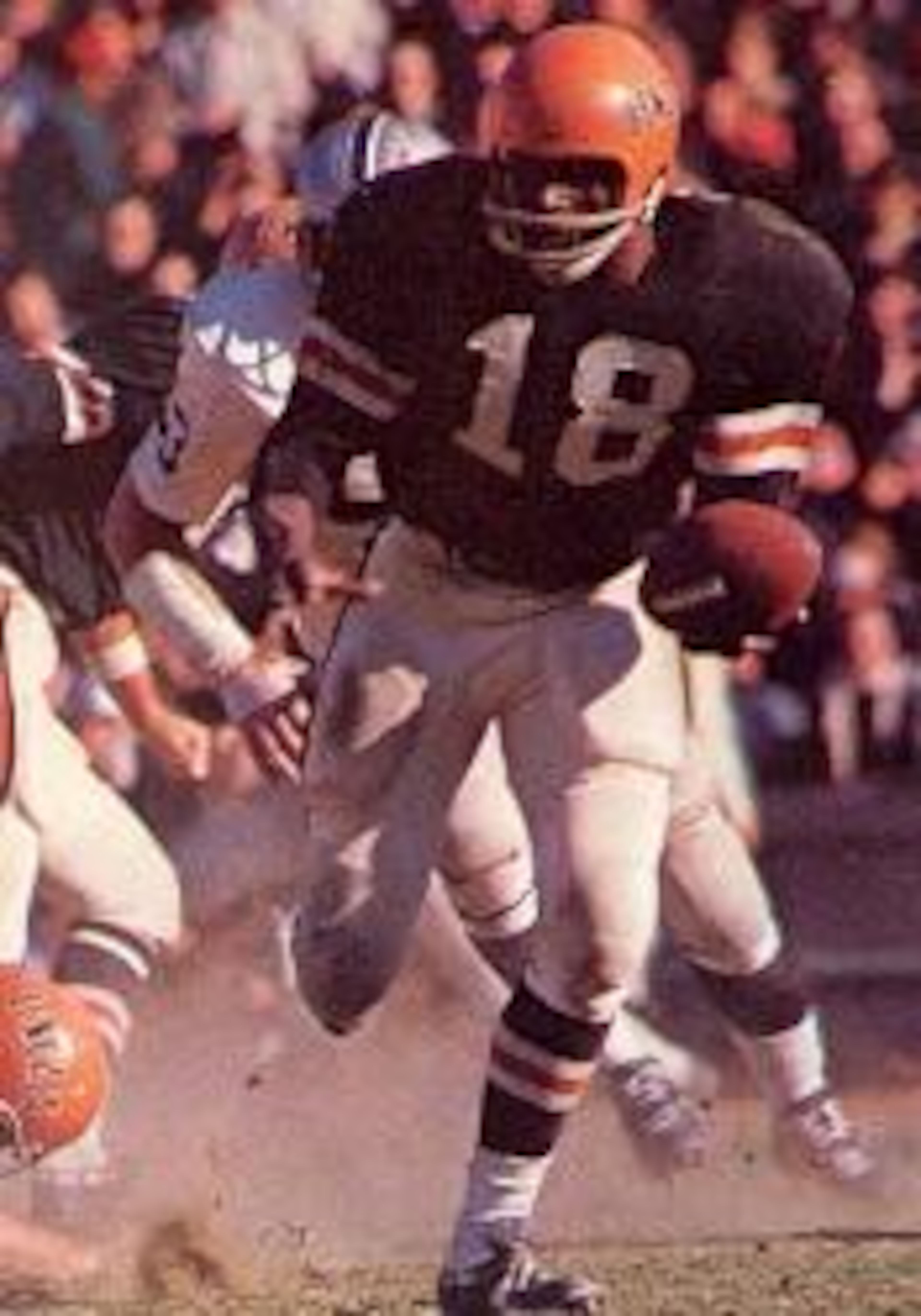
What’s worse than the Cleveland Browns uniforms? A team impersonating the Cleveland Browns’ horrific uniforms!
4. Denver Broncos, 1960
17 of 20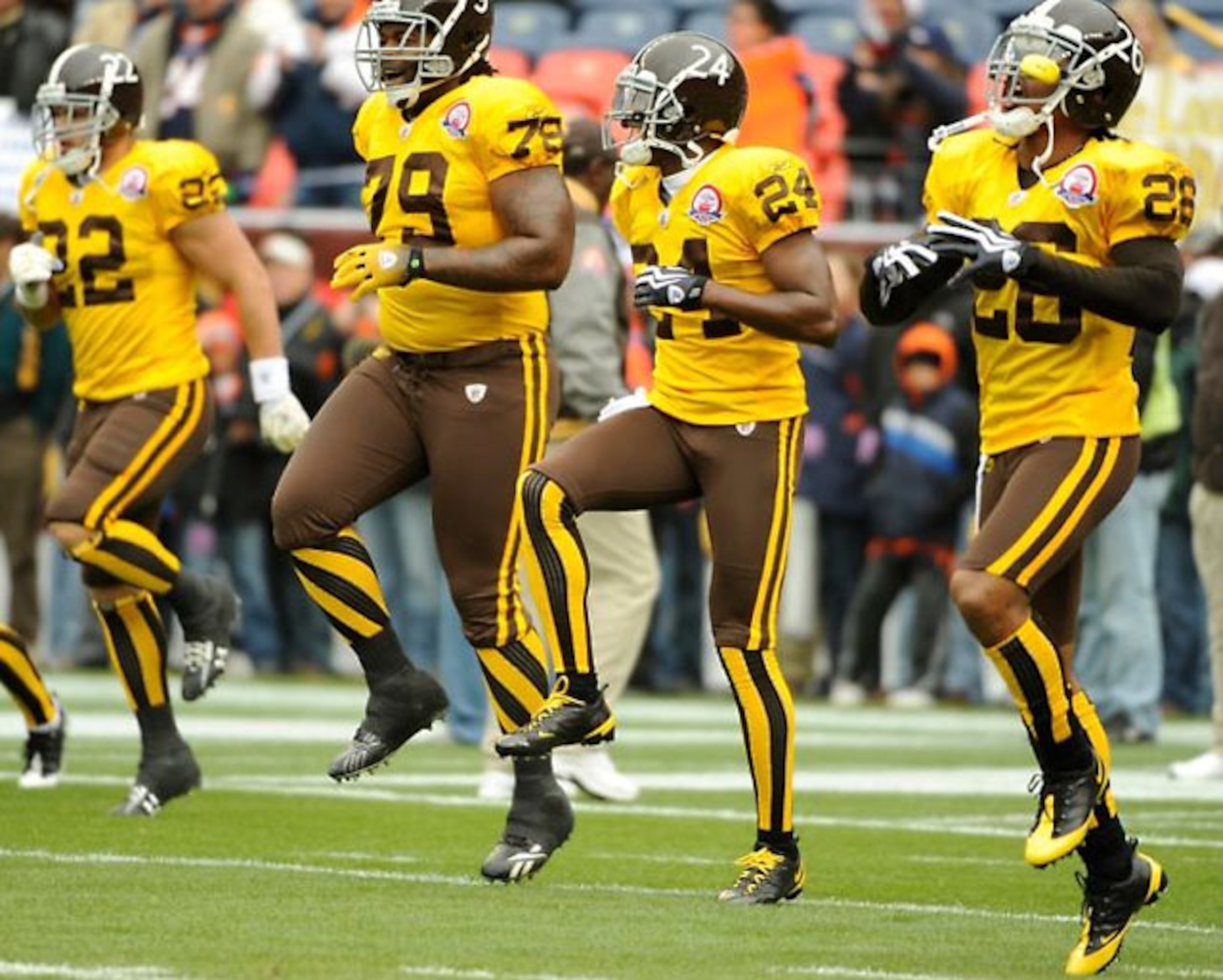
I actually don’t mind the concept, but these colors do NOT mesh well together AT ALL. It makes you wonder what people were on when they created some of these uniforms.
I mean, what are these uniforms supposed to represent— a football team or the local low budget carnival?
Hey look, they even do a little jig!
3. Chicago Bears, 1925
18 of 20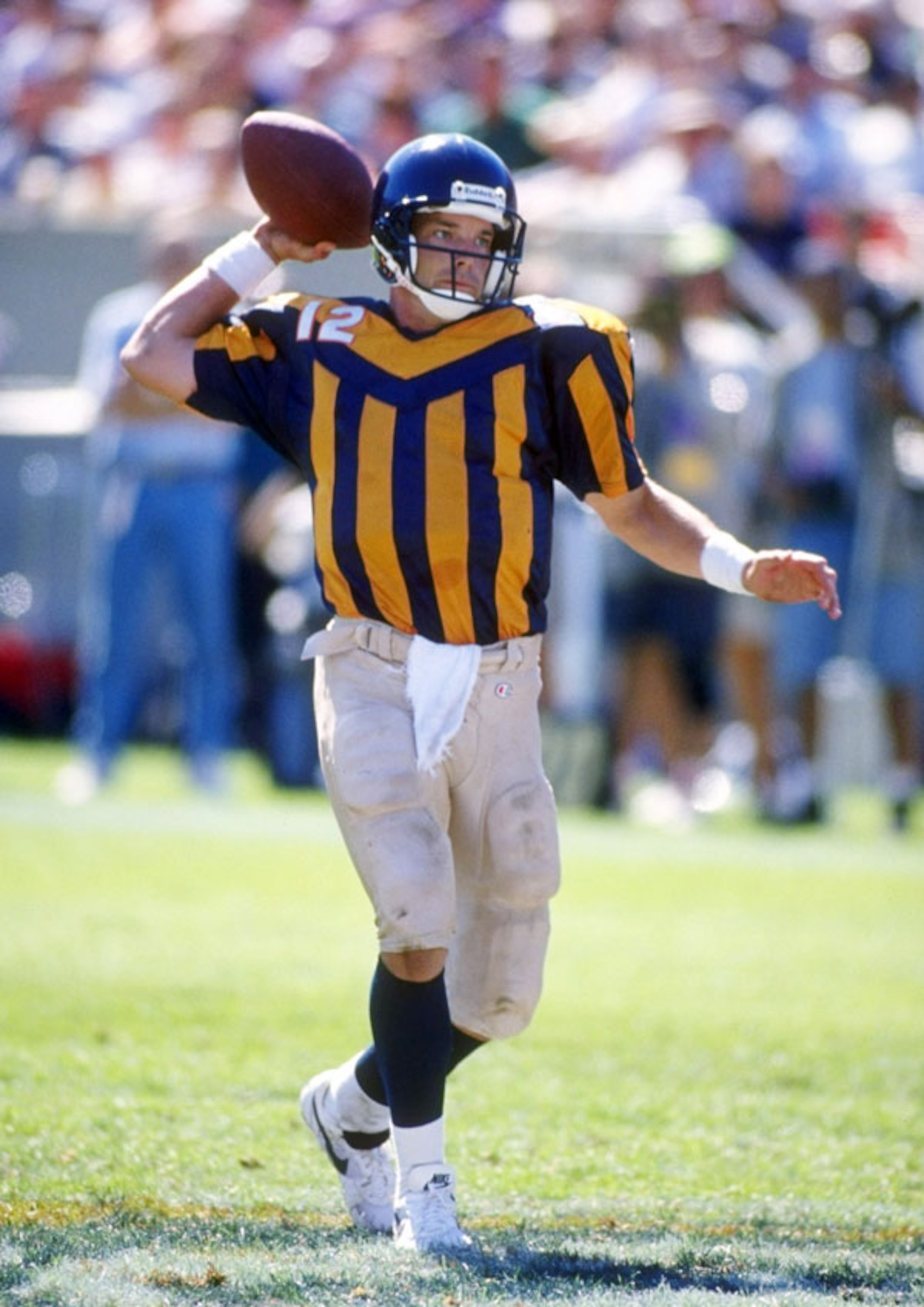
These might be the funniest jerseys I’ve ever seen. They’re so bad it makes me chuckle. The yellow stripes are dreadful! There is not one thing appealing about this jersey. I even hate how the number is by the shoulder and not in the center.
2. Philadelphia Eagles, 1933
19 of 20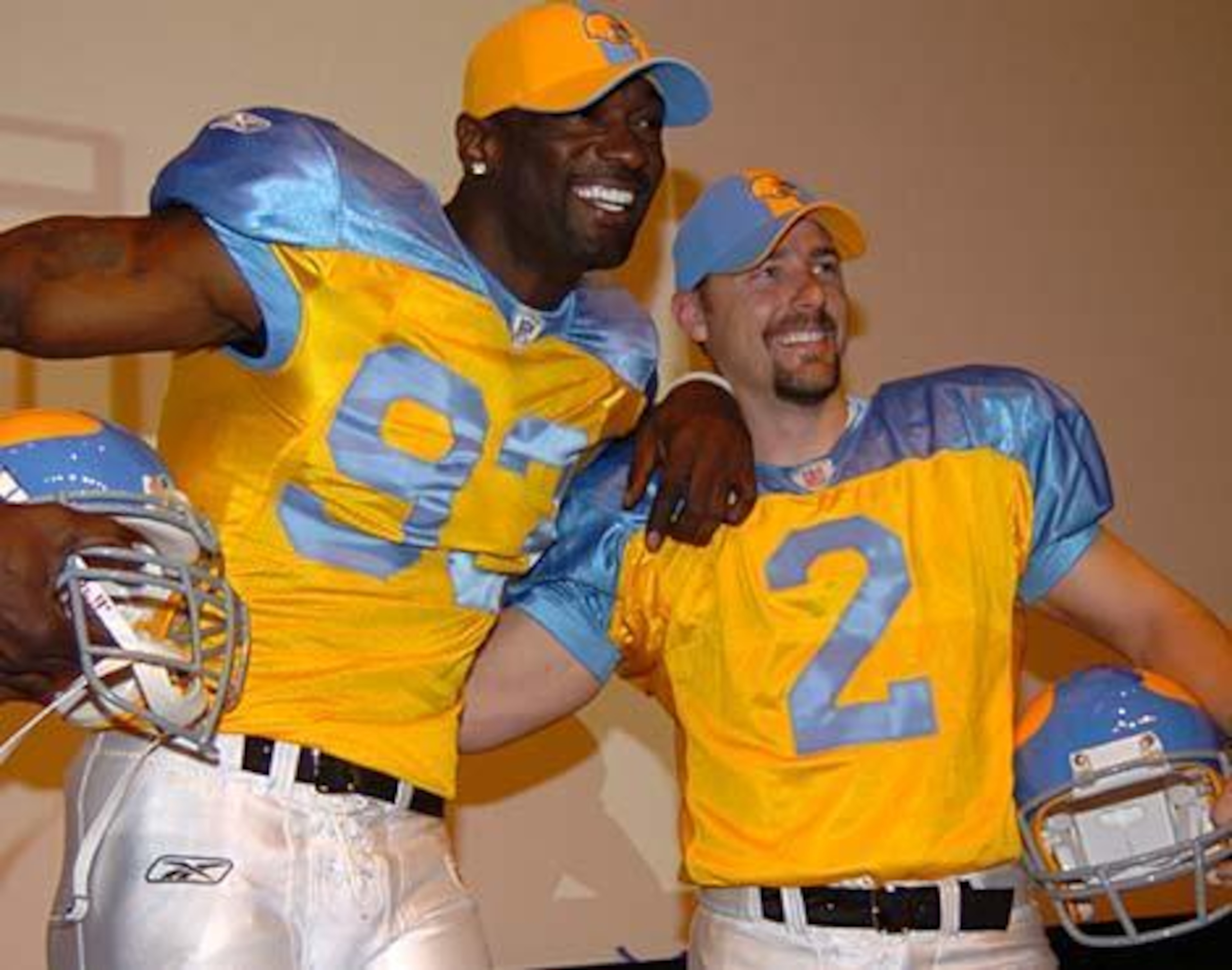
These jerseys deserve to be No. 1, so I’ll just call them 1B. I’m, like, speechless. I don’t even know how to describe how pathetic these jerseys are.
What were they even doing here!? Lookin' like a bunch of clowns!
I…I must move on.
1. Tampa Bay Buccaneers, 1976
20 of 20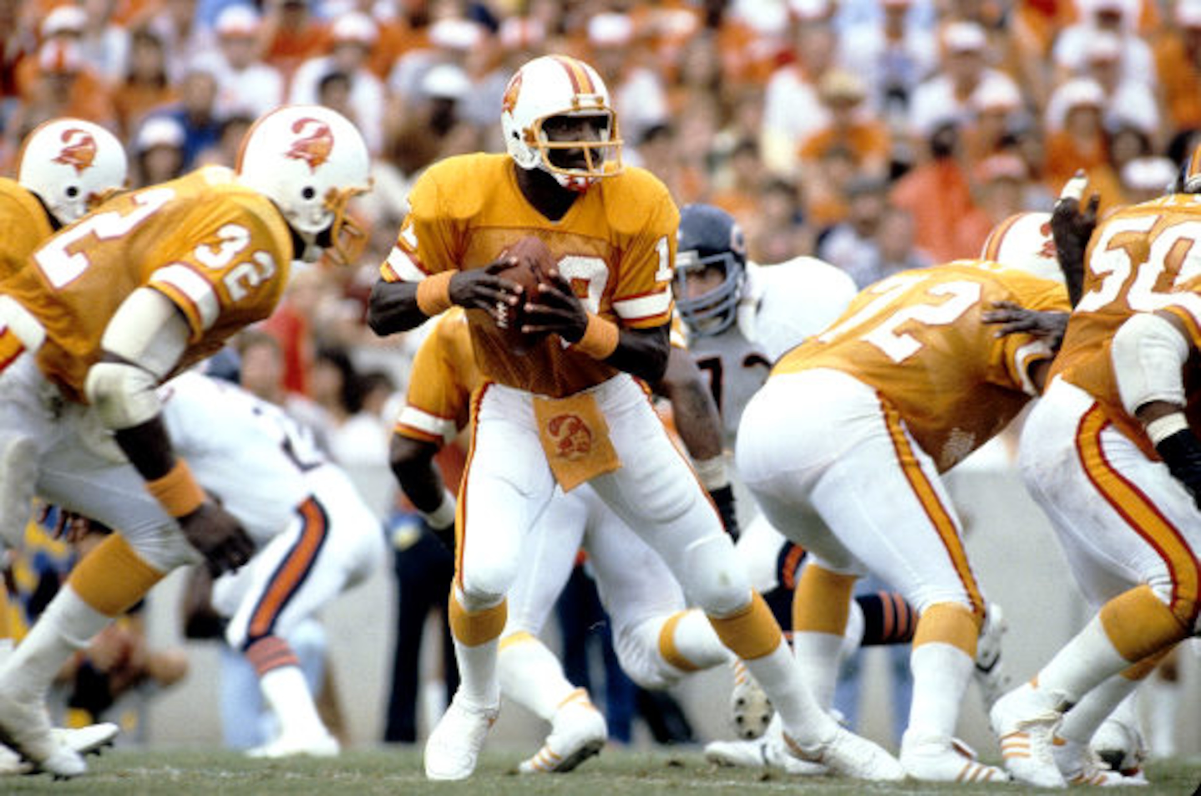
Absolutely hideous and horrific uniforms. Even the logo is awful and doesn’t fit. I hope whoever decided to use this color was fired. I would have loved to put the 1933 Eagles jerseys No. 1, but this is extremely fitting.
They are a complete eyesore and it is only fitting they were one of the worst teams ever for choosing to wear such an abomination.
These jerseys should be burned and never seen again.
.jpg?w=3840 "Pro Bowl Football")
.jpg?w=3840 "Chiefs Raiders Football")


