
Old NHL Jerseys or Logos We Wish Teams Would Bring Back
It's one of things hockey fans love about hockey.
No sports league is as in tune with its game-day attire as the NHL, and teams are forever reconfiguring old designs and recycling former logos to refresh their looks—and generate more traffic at the merchandise shop.
In fact, all 31 teams will include so-called Reverse Retro jerseys as part of their rotations for the 2020-21 season, which put modern spins on designs with historical significance to the franchises.
Being the 24/7 hockey nuts we are—and flush with excitement with the imminent arrival of training camps and games—the B/R ice team took the redesign project a step further and concocted a list of 10 more logos or jerseys we wish teams would bring back the next time they roll out a new collection.
Scroll through to see what we came up with, and let us know your favorites in the comments section.
Honorable Mention: Minnesota Fighting Saints (1972-76, 1976-77)
1 of 10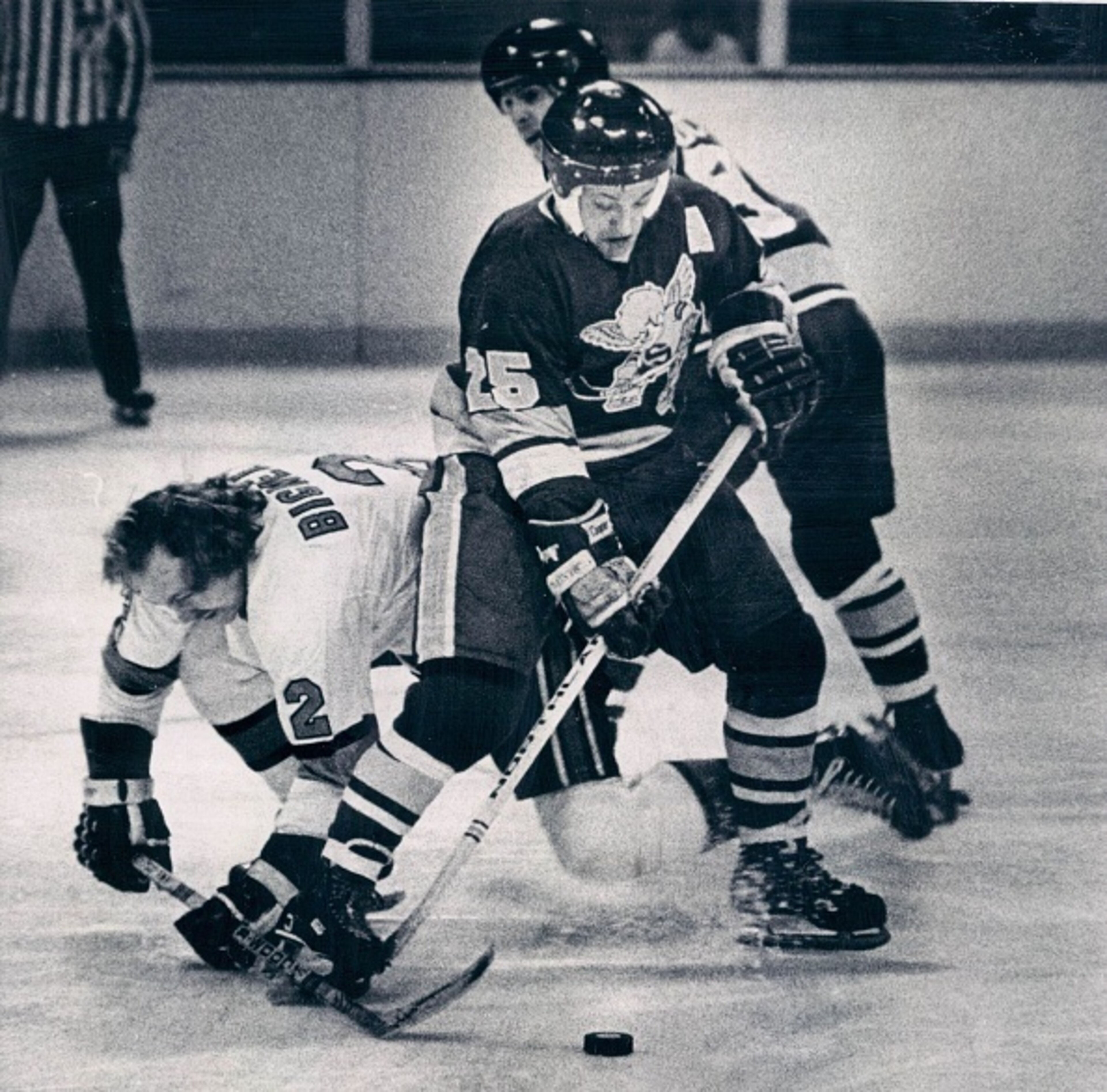
OK, we're stepping outside prescribed headline boundaries here.
The Minnesota Fighting Saints were not an NHL team. And in truth, they weren't most successful of WHA teams, either—having failed midway through the final season of both their original incarnation (1972-76) and their second life as the relocated Cleveland Crusaders (1972-77).
But if the nickname alone doesn't get you on board, the logo will.
Surrounded by the team colors of royal blue, white and gold, the logo consisted of a mischievous looking "little saint" in full game gear, accompanied by a handsome set of wings. A halo was part of the package in the team's promotional and advertising materials but never made it to the jersey.
It's a tenuous connection at best to the NHL's Minnesota Wild, but if they decide to put in on a merchandise rack anytime soon, we'll be first in line.
9. Cleveland Barons (1976-78)
2 of 10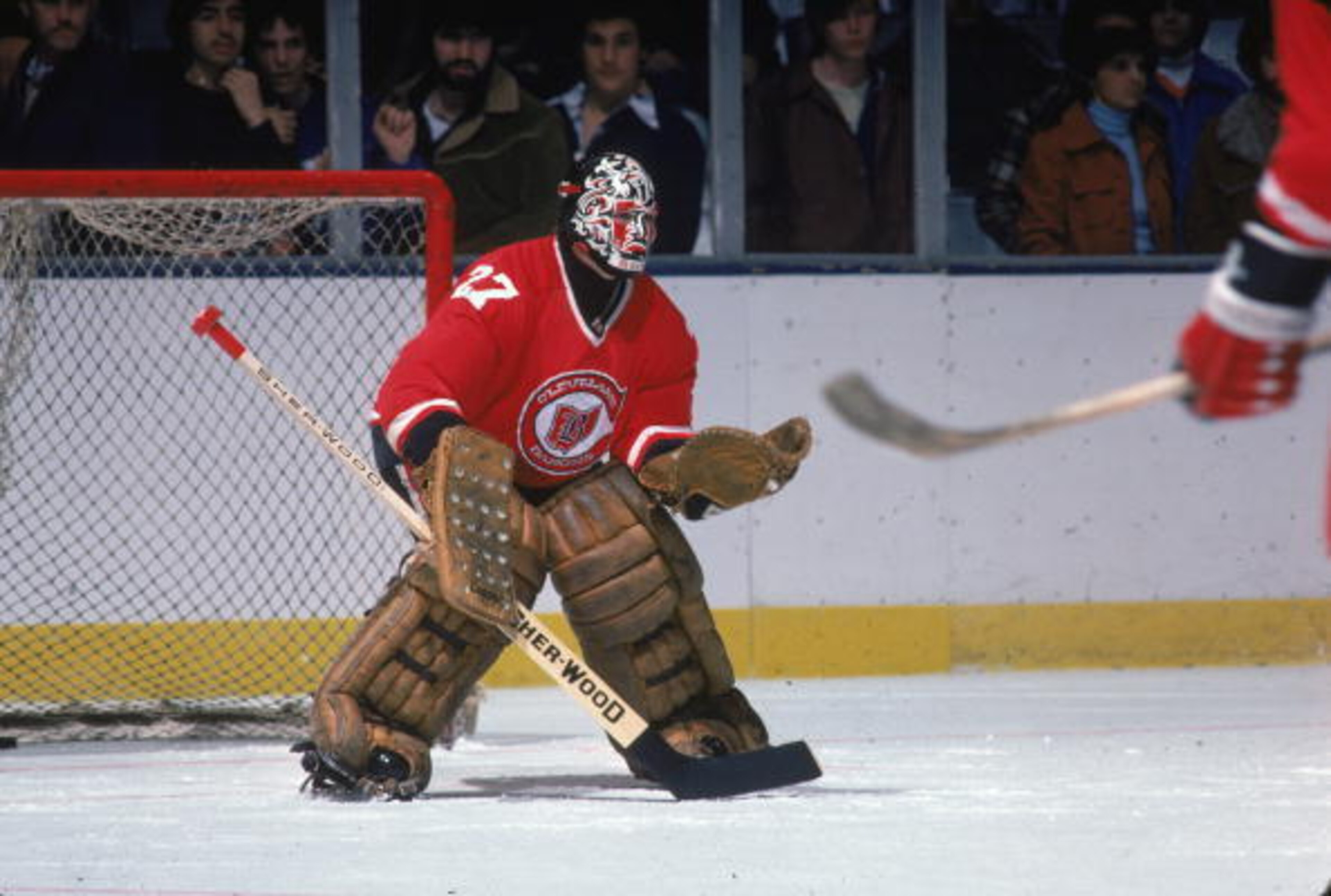
It's an ignominious record, to say the least.
More than 40 years after their demise, the Cleveland Barons remain the last franchise among the four major North American professional sports leagues to cease operations.
The Barons, in fact, managed just two seasons in the NHL between their birth—following the relocation of the California Golden Seals—and their demise, when their players were absorbed by the Minnesota North Stars.
But darn it, they were stylish while they were there.
The jerseys were red, with a primary logo that consisted of the team name within a capital "C" that was wrapped around a silhouette of the state of Ohio, labeled with "B" in Old English font.
Sleeve numbers were similarly contained within Ohio outlines in some designs, with black stripes.
The NHL returned to the state in 2000, but the Columbus Blue Jackets have never looked as good.
8. Kansas City Scouts (1974-76)
3 of 10
Show of hands. How many people know the NHL had a team in Kansas City?
It's a forgivable oversight, to be sure.
The Scouts joined the league with the Washington Capitals in 1974 but lasted just two seasons before heading to Colorado to become the Rockies and then on to New Jersey, where they have since resided as the Devils.
And while fans didn't exactly flock to Kemper Arena to watch them play, they did create quite a sartorial statement, with the team colors' being blue, red, yellow and white, and a memorable logo featuring a depiction of The Scout—a 10-foot statue of a Sioux native on horseback that overlooks downtown Kansas City.
No mention of the Scouts or Rockies is included in New Jersey's media guides these days, but we would contend that a nod to the Scouts on a throwback jersey night would generate clicks for days.


7. Detroit Red Wings (2009 Winter Classic)
4 of 10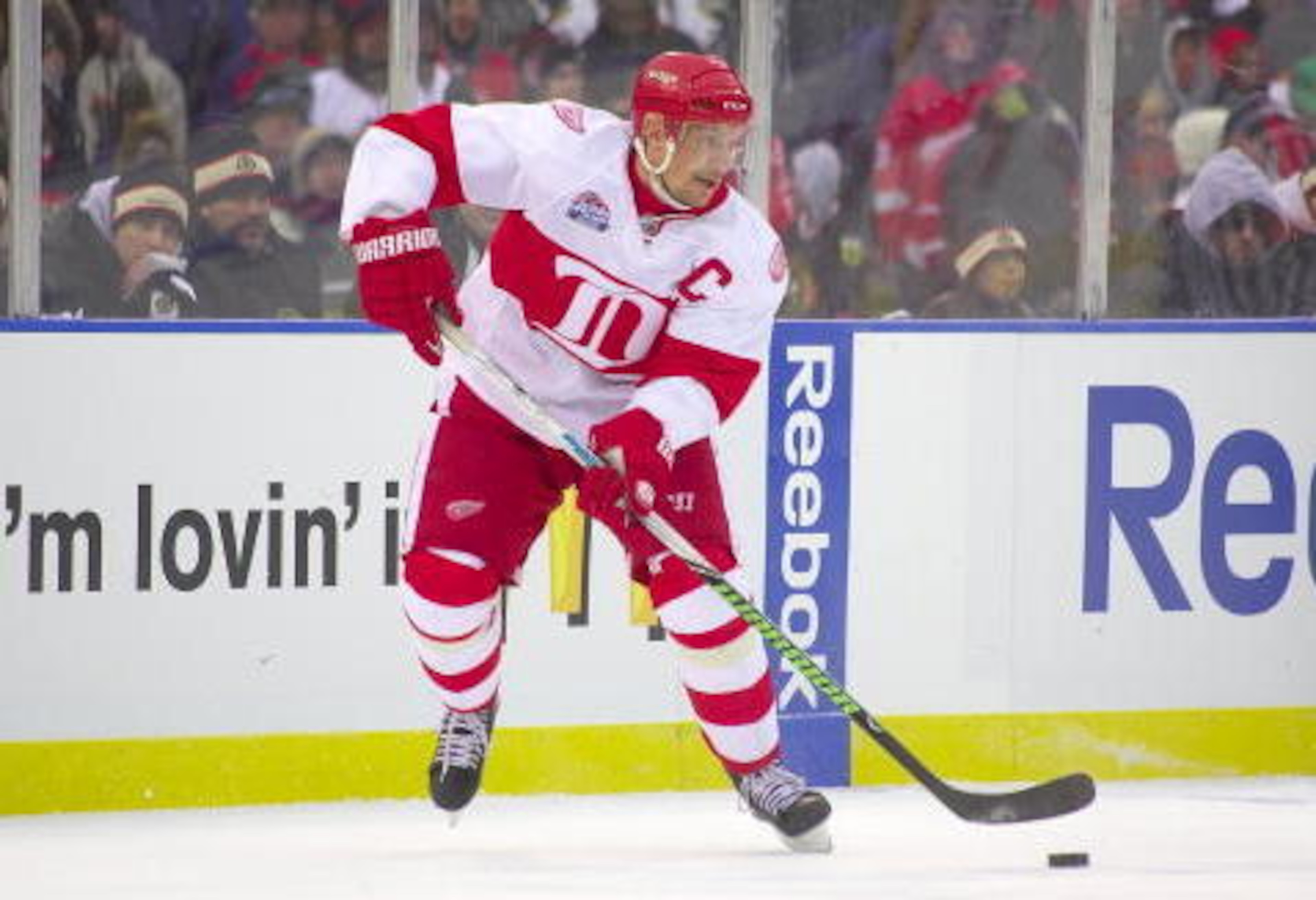
The Detroit Red Wings have a classic look, no matter the season.
But the changes they made for their outdoor game with the Chicago Blackhawks in 2009 were captivating.
Dispatched from the chest to the shoulders was the winged wheel in favor of a simple, crisp white "D" in the middle of a thick red stripe.
We're not suggesting the traditional design should be tossed, but if you're compelled to switch things up for a few games at a time, it would be hard not to love this one as the alternative.
6. Montreal Canadiens (NHL 100 Classic)
5 of 10
Perfection is often imitated, rarely duplicated.
So when the Montreal Canadiens veer off course when it comes to jerseys, it doesn't always work as well on the ice as it does in the sketchbook. But when it came to their NHL 100 Classic game with the Ottawa Senators in 2017, thumbs went up.
The logo stayed true to tradition, but the red shoulder pads were jettisoned for a clean all white look that helped the crest to pop even more than usual.
Don't expect a full-time turn away from what could be French-speaking Canada's national flag, but if this one makes an appearance even every now and then, we would be satisfied.
5. Atlanta Thrashers (1999-2006)
6 of 10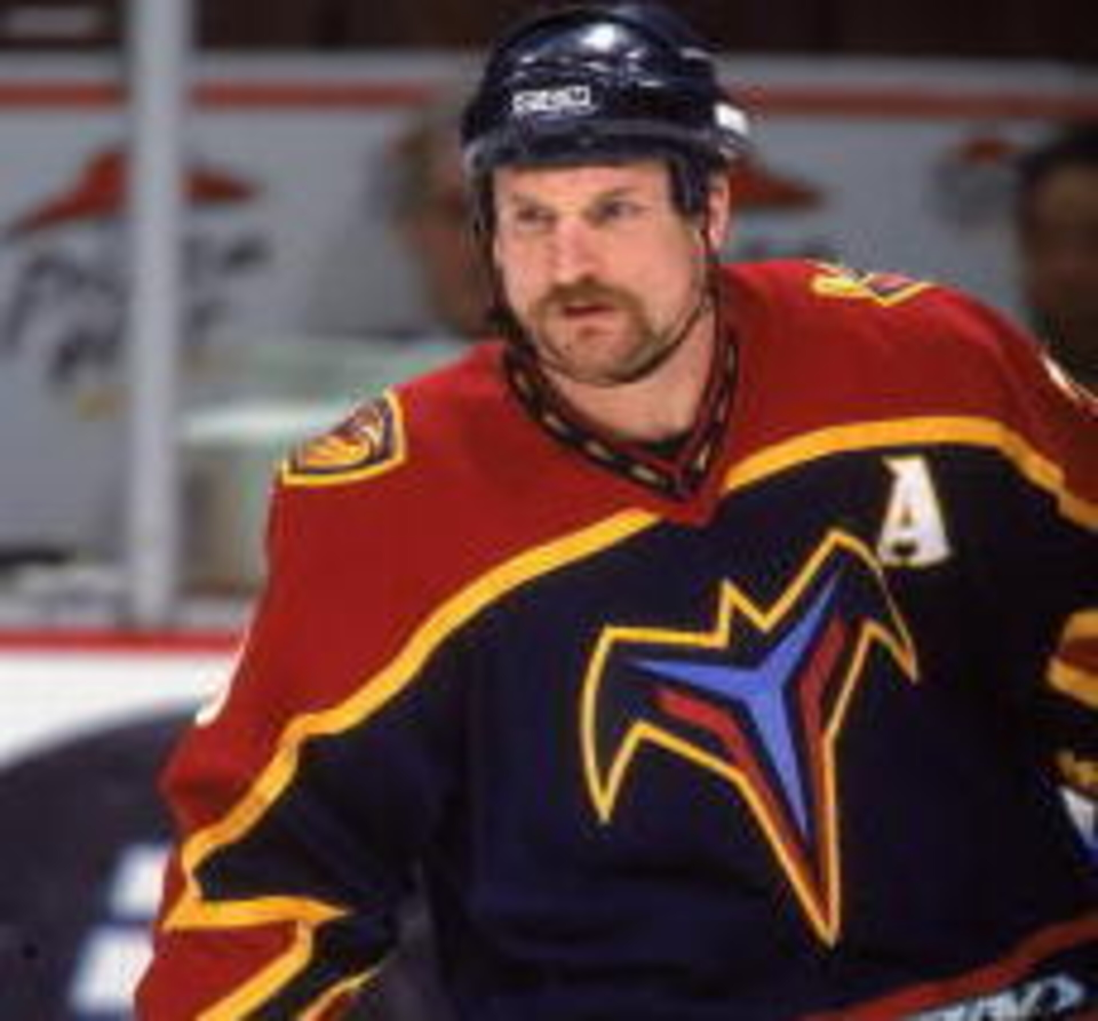
The Winnipeg Jets have a good thing going.
Their standard logo has gone fundamentally unchanged since their days in the WHA, and the Reverse Retro project took a successful stab at mixing up some colors for a fresh look.
But if you want to go past the simply cosmetic, might we suggest an angry bird?
Lest anyone forget, this iteration of the Jets franchise was one that took flight in Atlanta as the Thrashers—honoring the Brown Thrasher, Georgia's state bird.
A particularly fierce version of the bird was prominent on Thrashers jerseys from 1999 to 2006, and its return would be a drastic and fun shift from the standard Winnipeg issue.
4. Tampa Bay Lightning (2008-14)
7 of 10
Hits and misses have been signature elements of the Tampa Bay Lightning jersey story.
When they're good, they're good. And when they're bad, they're awful.
Fortunately, the alternates they wore for a multiyear stretch ending in 2014 leaned big toward the former.
Colored blue with silver and white accents, this one goes with the colloquial "Bolts" lettered diagonally from top left to bottom right. To make room, the then-primary logo lightning bolt design was relocated to the shoulders.
It's a cleaner and less busy offering than nearly any of the logo-heavy designs the team has used since its inception, and we believe it would be the best option for the Lightning's full-time look.
3. Boston Bruins (2008-16)
8 of 10
You can't go wrong with a Boston Bruins jersey.
The spoked-wheel "B" on black is as old-school as the NHL gets, while the giant bear head on a yellow background is visually appealing and a nice diversion from the routine.
But the choices don't stop there for fans in New England.
Rather than just changing the "B" to a different style, this one incorporates the bear in a more fearsome prowling stance on a horizontal Boston, with an all-caps Bruins arcing over the top.
It keeps the tradition with the colors and the mascot but has just enough of a change to keep things fresh.
2. Nashville Predators (2009-11)
9 of 10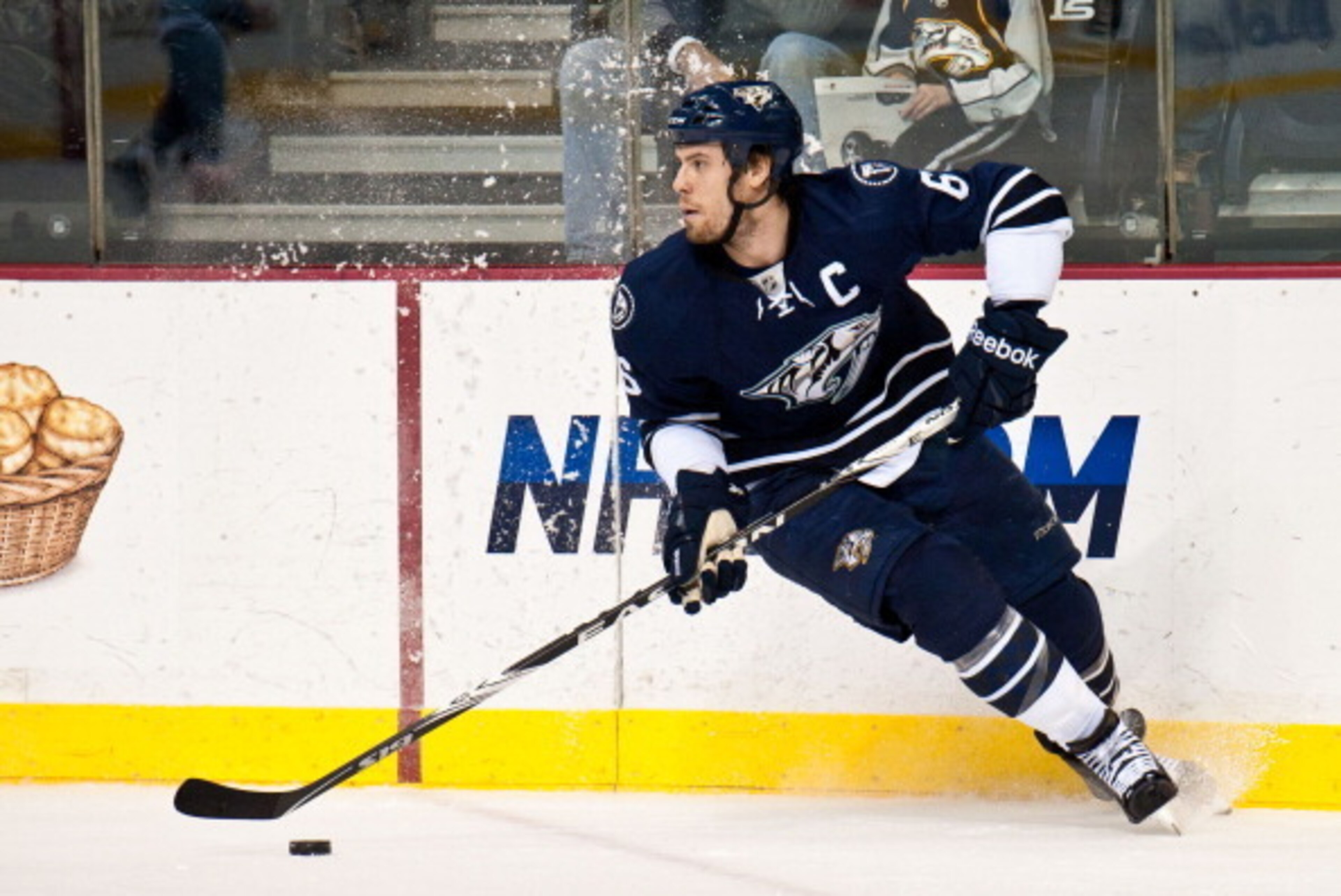
You're a Nashville Predators fan? You're into yellow?
Good for you.
But for those hoping for a less garish color in their closet, we steer toward an ever-so-brief period when the Predators looked elsewhere on the color spectrum.
A simple navy and white look with drawstrings and just a splash of yellow in the logo, this alternate jersey looks like it ought to be worn by a big-league sports franchise rather than in the local beer league.
Save the yellow for the special occasions. Like Halloween costumes.
1. Edmonton Oilers (2001-07)
10 of 10
Wanna start a brawl with an Edmonton Oilers fan? Suggest Wayne Gretzky was a pampered product of a beneficial system.
And if that doesn't work, suggest ditching the classic oil drop logo for something edgy.
Not everyone in Alberta loved the Todd McFarlane design of the early 2000s, but count us among its fans.
The team's inaugural third jersey changed the signature shade of blue, added silver, ditched the orange and copper and went with a retooled oil drop that was surrounded by rivets and gears—five of each to represent the team's five Stanley Cup triumphs.
McFarlane, a comic book designer and then a part-owner of the team, designed it for free.
The jersey went away in 2007 but retains a following among Oilers loyalists.
"The dream of recreating the Oilers legacy of the '80s was not bearing fruit for the team we were rebuilding,” said Patrick Larforge, then the team's president and CEO. "... [Fans] loved the Oilers but didn't live the traditional lifestyle of their parents. They were very loyal to the oil but needed a different flag for their nation, so to speak."


.png?w=3840 "New NFL Power Rankings 📊")


.jpg?w=3840 "Derek Carr Had 'Multiple' Suitors")


.jpg?w=3840 "8 Men Indicted in Planned UFC White House Attack (AP)")
.png?w=3840 "Mitch Responds to Josh Hart 💀")
