

After ranking the NHL's home jerseys recently, we had to tackle the road sweaters as well. Just as we've seen with the home jerseys, the road jerseys haven't changed since last season (except for sponsorships in a few cases).
For some of you, the road white jerseys are seen as boring because their plain white base makes them uninteresting. Au contraire. For a lot of teams, the white jerseys allow more colors to breathe, other bits of creativity to shine, and stripes to pop.
We would love to see white jerseys return to being worn by home teams so fans in those cities could soak in the visiting teams' color palettes, rather than seeing the same setup night after night at home.
However, in ranking which teams have the best (and worst) away jerseys, we learned that there are no truly bad ones, but there are some that are just so much better than the rest.
It's time to get mad (or proud), because 1 to 32, we're slotting them all in.
32. Washington Capitals
1 of 32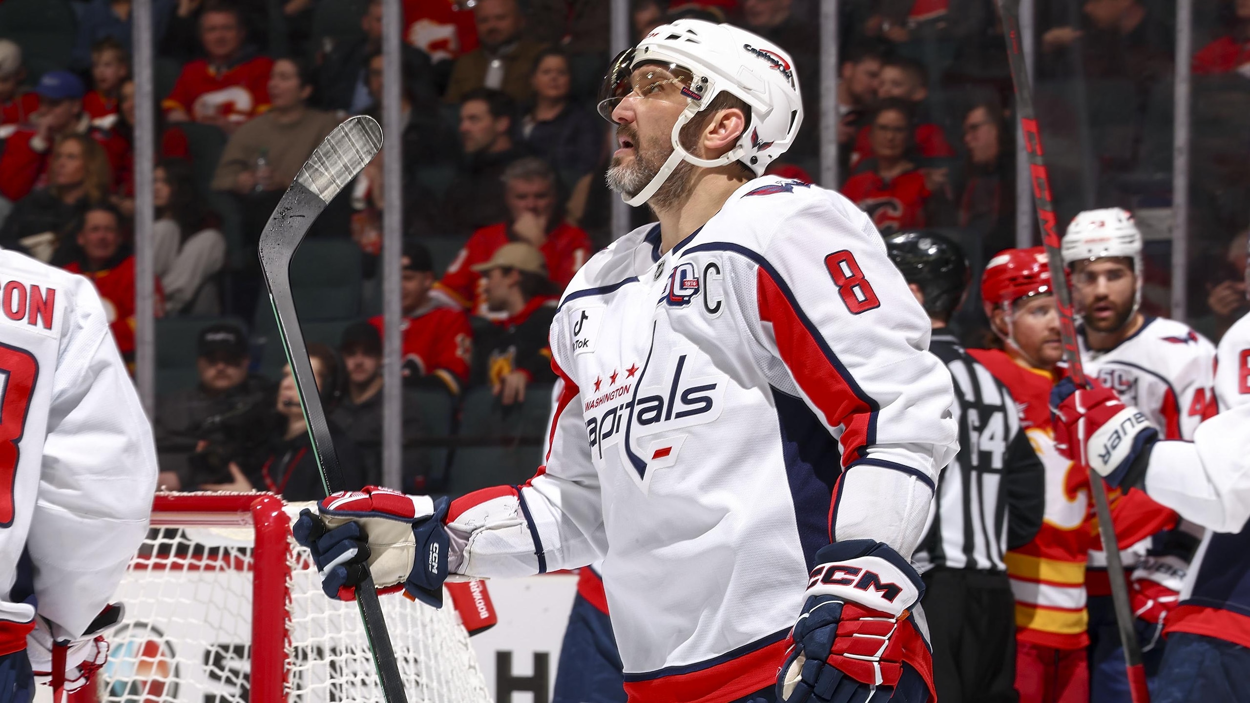
Just like the Capitals' home red jerseys, the white road shirts suffer from the Reebok redesign from the 2000s. There's too much piping, colors in odd places, and a jersey design that detracts from the good elements (the crest logo and secondary shoulder logos) it contains. The fonts for the numbers and letters are great, but it's just so needlessly busy otherwise. One day we'll see a change, and it'll be way more fun (hopefully).
31. Florida Panthers
2 of 32
While we like Florida's home reds more than the road whites, they still rank just above last place in our rankings.
The stripes are good, the crest logo is strong, but the busy patches and logos on the sleeves are too much, and the numbers on the shoulders read as football when we wanted hockey.
The colors are good, and this style is unique to the Panthers, so they've got that going for them, but it's still just not hitting right for us.
30. Utah Mammoth
3 of 32
When the Mammoth unveiled their new logo last season, along with their new home sweaters featuring it, it was a sign that great things can happen with a good-looking logo. Unfortunately, the Mammoth hung on to one part of their first season as the Utah Hockey Club with the road white sweaters, and that minimalist style just doesn't do it for us.
The diagonal UTAH in team colors is fine, and putting the team logo on the shoulders was the right idea, but it feels like there were some possibilities left on the table to, ahem, jazz things up a bit.
-(1).jpg?w=2560 "Bleacher Report")

29. Nashville Predators
4 of 32
The Predators' road white jerseys are perfectly fine for what they need to be, but the whole look is screaming for a little more color on the sleeves. Stripes, perhaps?
The shoulder yoke and the cuffs are doing the heavy lifting, but all that white space between the body and sleeves could use a punch-up somewhere.
It's a total nitpick, but maybe they wanted to give fans a break from all that gold their home jerseys provide.
28. Tampa Bay Lightning
5 of 32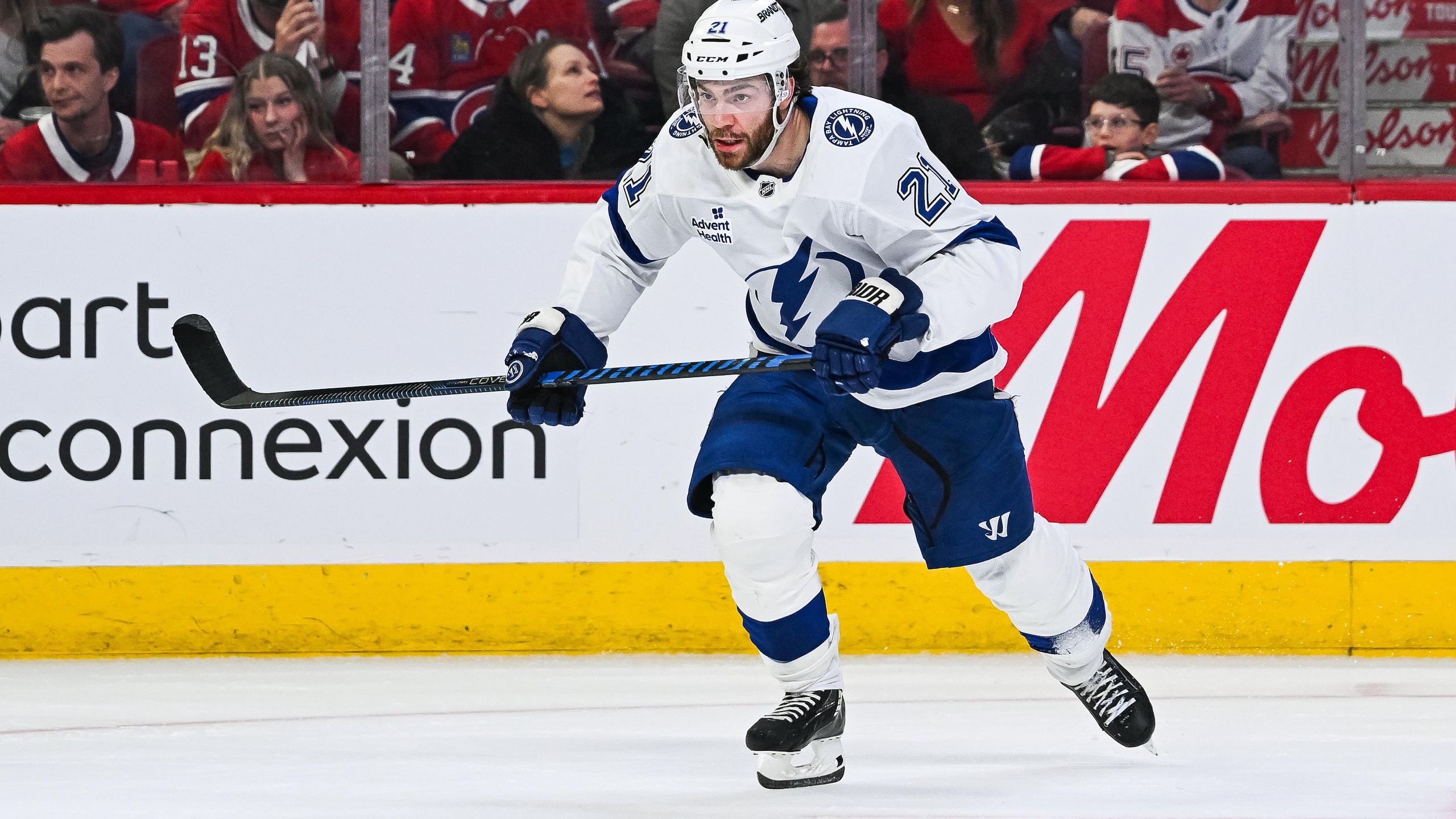
If we have to choose between the Lightning home and road jerseys, we're probably taking the road whites as the best. Yes, the look is simple for both of them, but the blue logos, stripes, numbers, and lettering get a chance to pop on the white background.
Both jerseys are clean, and that's always good, but there's something about Tampa Bay's road jerseys that hits a little bit harder.
27. Carolina Hurricanes
6 of 32
Even though we're always down on what the Hurricanes do with their jerseys, they upgraded their road look last season by taking their Stadium Series jerseys and changing them from black to white while keeping all the same elements.
The way the coloring on their logo is changed makes it look meaner, and that's half the battle when wearing a white sweater on the road.
It's a much better look than they used to have, and for that we're all thankful.
26. Dallas Stars
7 of 32
It's kind of nutty to be this low in the rankings and have to make it clear that we don't dislike a shirt at all, but here we are with the Dallas Stars' road jerseys.
The road whites are simple and clean, with the green prominently in focus on the shoulders, sleeves, numbers, and names. Having the black pants and sleeve stripes to help the jersey pop more helps, but the Stars logo front and center looks great, and the shoulder logos anchor things up top.
Good, easy on the eyes, and flowing great on the ice is just what you want to see.
25. Seattle Kraken
8 of 32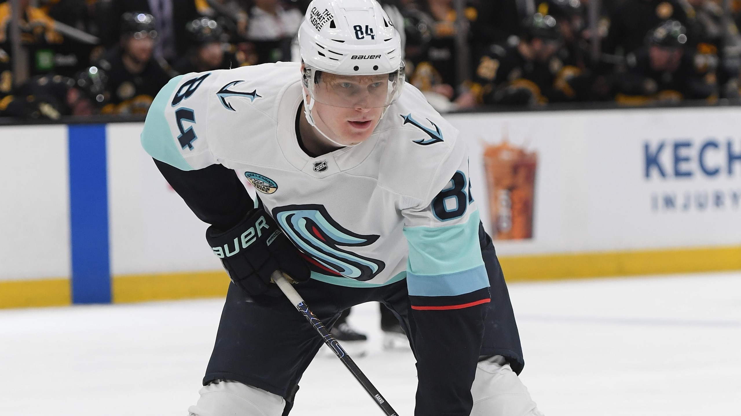
The Kraken have a solid and understated home and road set, and for a new team in the league to come in looking so fresh was a huge relief.
With their logo front and center, huge on the white jersey, and the layers of blue, green, and red stripes up the sleeves, it gives us all the feel of the sea.
With the anchor/Space Needle logo on the shoulders, it's very Seattle without having to make use of Kurt Cobain or Jimi Hendrix.
24. Anaheim Ducks
9 of 32
It would've been easy enough for the Ducks to cut down on the amount of orange on their road white jerseys, but we're happy they didn't because that's not a color you hide anywhere.
The Ducks went heavy on orange on the shoulders and sleeves, as well as on the numbers on the road jersey. With the newly styled throwback logo on the front, you know you're dealing with the Ducks, and they're proud of that.
With the black and gold mixed in with the orange and white, they might be the most distinct team to see on the road, whether you like it or not.
23. Columbus Blue Jackets
10 of 32
For all the things we didn't like about the Blue Jackets' home jerseys, we really enjoy their road jerseys all the more.
Although it's tough to be your namesake on the road and have to wear white, the blue sleeves with red and white accents look good, and the team crest on the front shows off nicely. We love seeing the circular logos with the cannon displayed proudly as a reminder that things would be much worse for opponents if they were in Columbus, having to endure cannon blasts after goals.
Even though the home jerseys would be better with a simpler design, the road jerseys look great because of those same quirks.
22. Minnesota Wild
11 of 32
Where the Nashville Predators' road jersey needed help, the Minnesota Wild's road jersey does the opposite.
The Wild have sleeve stripes and double stripes at the waist to match the green shoulders. It's a solid look, if a bit basic.
If there's a knock here, it's that they only used green in the stripes on the white jersey, which doesn't totally make it pop. Then again, using any amount of red would've made people wonder why the Wild celebrated Christmas year-round, so... we get it.
The red numbers break up the look a little, but they don't totally alter the view.
21. Ottawa Senators
12 of 32
The best part of the Senators bringing back their original look was seeing their brilliant white jerseys back on the ice again.
The original logo on the front with the original shoulder logos back in place, along with the red and black sleeve stripes, got us in our feelings again about Peter Sidorkiewicz and Norm Maciver all over again.
It's a perfect look for Ottawa and pays homage to their history as well as allowing room for their current stars like new captain Thomas Chabot, Tim Stützle, Jake Sanderson, and William Eklund to make it their own as well.
20. Vegas Golden Knights
13 of 32
While Vegas' home gold jerseys are divisive, to say the least, their road white sweaters can get everyone to agree they're quite good.
The white jerseys let the team colors of pewter gray, gold, and red stand out proudly, and the intricate design woven into the gold on the sleeves grabs your attention if you're into cool details.
While the gold is still all glittery and sparkling, everything else grabs attention equally thanks to the white background. Even the secondary logo on the shoulders looks proper because of it.
19. Colorado Avalanche
14 of 32
Much like the Avalanche's home jersey, the road jersey, despite how clean it looks, would benefit from a straightforward throwback to its original 1995 style.
The sleeve of burgundy and gray could use a different color than gray, although the shade of blue they've been using more of wouldn't be the next choice either.
It's still a good-looking road sweater despite our grumping on some of the details, but it could be so much more.
18. New York Islanders
15 of 32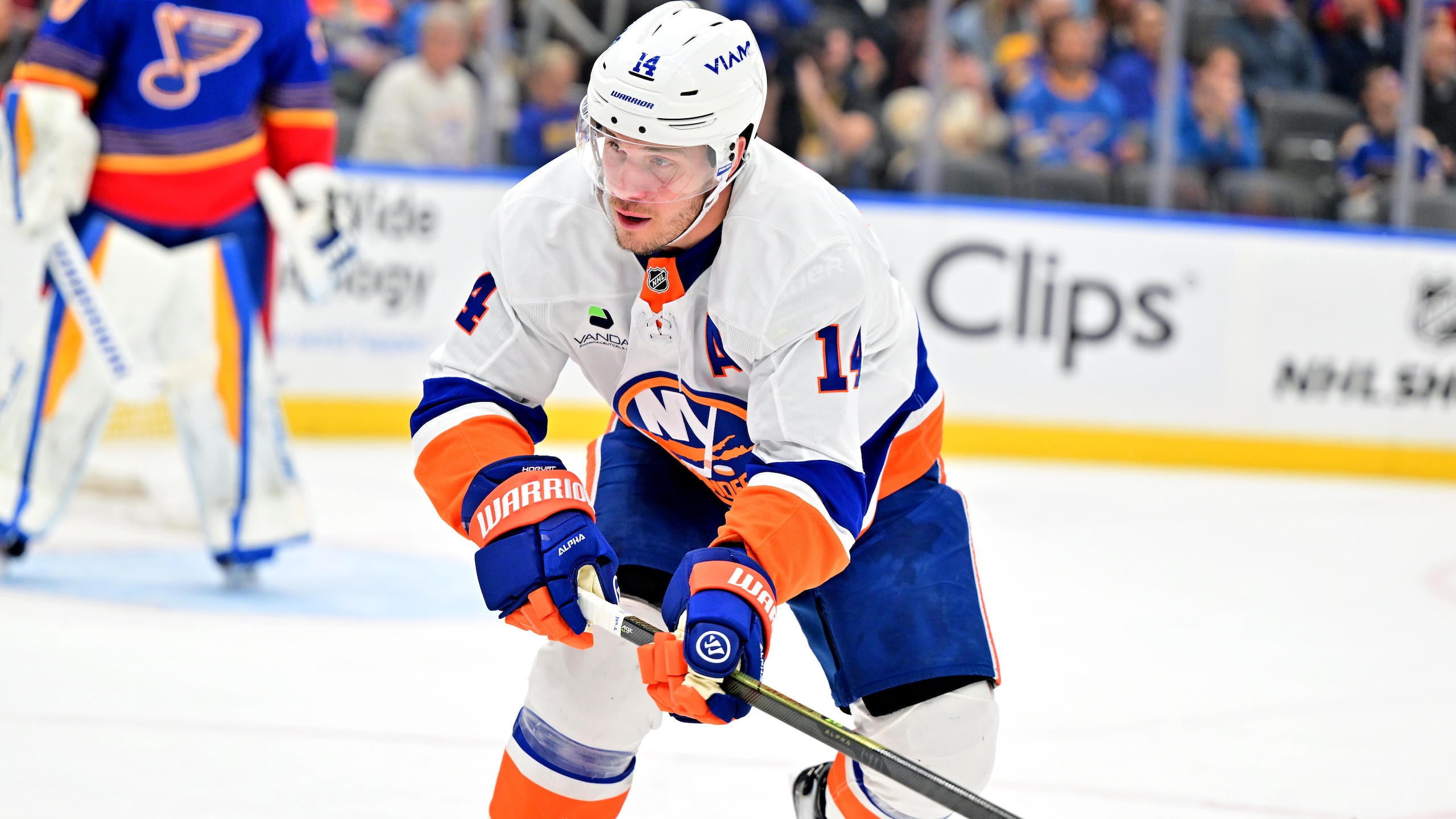
Just like with the Islanders' iconic blue home jerseys, their road whites are just as good thanks to their simplicity. The team's fantastic crest on the front, with the straightforward blue and orange stripes and the blue collar, is unmistakably from Long Island.
Wanting the Islanders to have more going on with either of their home or road jerseys is asking to mess with perfection, and after doing that long enough ago, they won't do it again. Nor should they.
17. San Jose Sharks
16 of 32
We're big fans of the Sharks' 2022 rebrand, and their road jerseys are exemplary of what it means to deliver a clean look.
While the design pays homage to their original 1990s jerseys with a modernized crest and shoulder logos, the teal-and-black stripes on the sleeves and waist help set it apart.
Their '90s jerseys had gray in the striping, and that's gone now, giving them a starker appearance. They managed to make the Sharks look meaner and yet make the teal more omnipresent at once, and that's a real accomplishment.
16. Toronto Maple Leafs
17 of 32
The Maple Leafs' iconic jersey is hard to beat, and its simple style, with the crest logo and blue stripes on the white jersey, is something they've had in some iteration for nearly a century. When a look is that good, you try not to mess with it too much, and fortunately the Leafs have left well enough alone.
Although they've tinkered with different styles for alternate and special-event jerseys, the beauty of their road whites should always remain simple, evoking the past while connecting it to the present and future.
15. Vancouver Canucks
18 of 32
The beauty of the Canucks' road jerseys lies in how well the blue and green complement their overall look.
From the orca logo on the front to the original rink-and-stick logos on the shoulders to the striping on the sleeves and waist, it is a true work of art that belongs on the Pacific coast.
What's most amazing about Vancouver's jerseys is that they got 100 times better when they removed the city wordmark from above the logo on the home and road set back in 2019.
This style has been around since 2007, but was only made perfect in 2019.
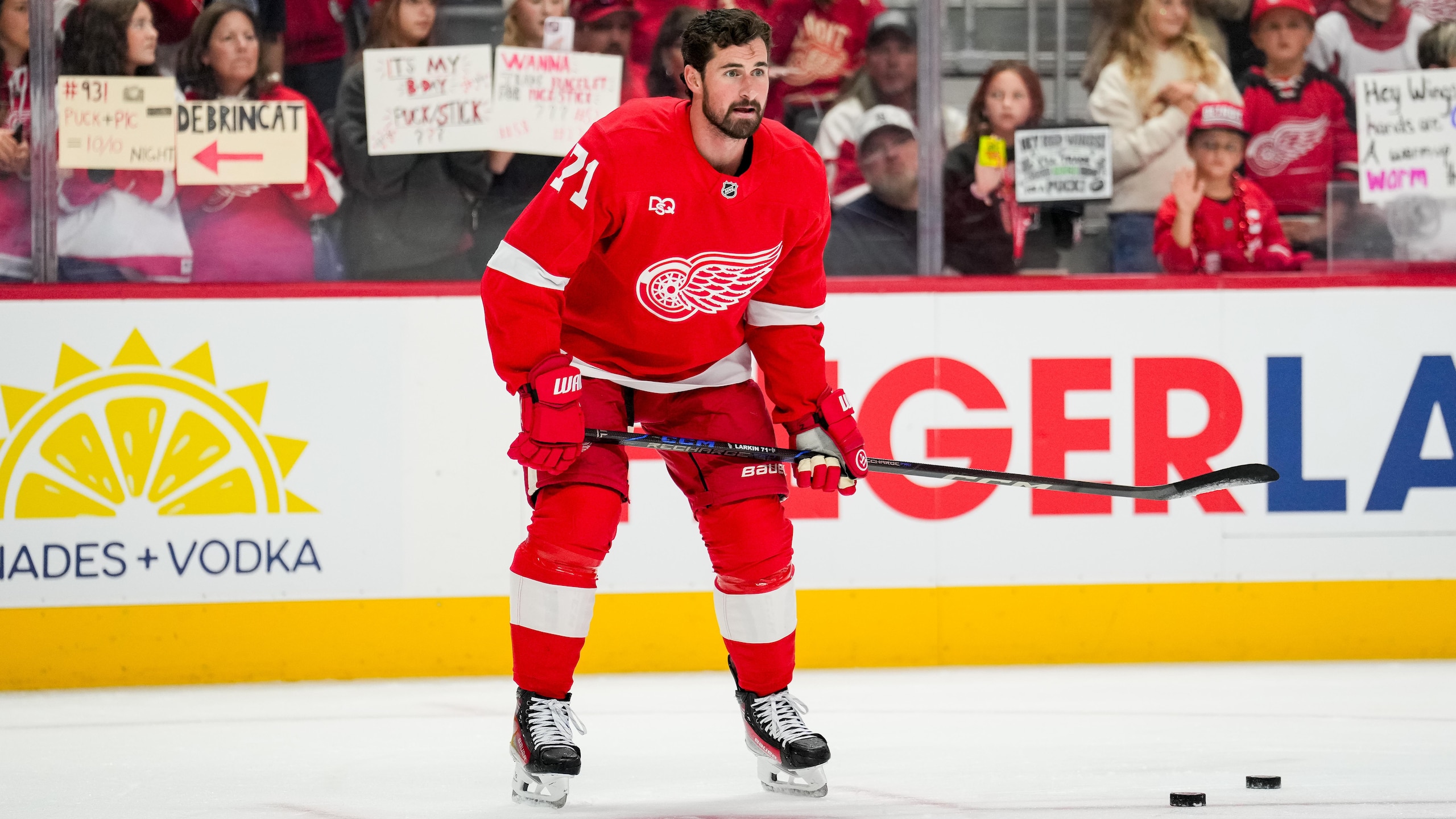
14. Detroit Red Wings
19 of 32
As much as Detroit's home red sweaters stand out, there's something about their road white jerseys that makes the whole look work so much better.
The white jersey with the red sleeves and white stripe is a look they've had since 1956, and it's a style that's spawned countless imitators at all levels. Of course, none of those teams have the winged wheel logo on the front to grab attention and make it known who you're dealing with.
13. Winnipeg Jets
20 of 32
We're almost embarrassed by how much we used to dislike the Winnipeg Jets' home and road set.
Maybe it had to do with debuting the look during the Reebok years and not once altering it under Adidas or Fanatics, despite all the little Reebok touches that have gone by the wayside over time.
Whatever it was that made us love them initially and fall out of love with them, we've stopped being haters, and the Jets' road jersey just works really well.
With the white jersey featuring dark blue sleeves and unique sky blue and silver striping around the elbows, framing the Jets logo on the front, it's a genuinely good-looking jersey overall.
The colors are aeronautical, the logo is strong, and the shoulder logos are homey in their own way.
12. New Jersey Devils
21 of 32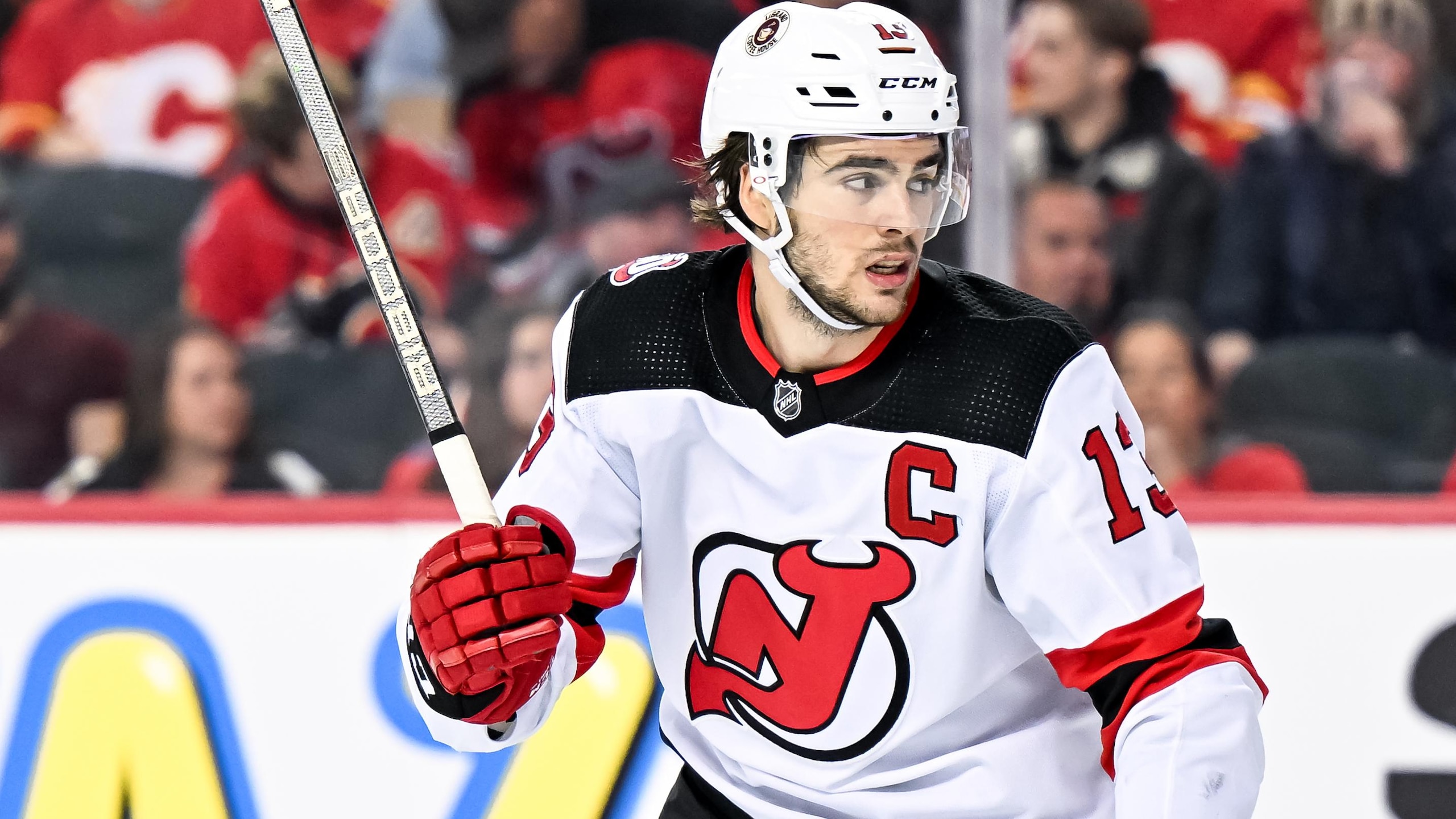
While the shoulder style might be a little different, the Devils' road white jerseys have been essentially the same, a perfect style for 35 years. New Jersey doesn't need to oversell being the Devils.
The perfect logo on the front, with black shoulders and red-and-black stripes on the sleeves, tells the story. That, and how they've rocked this style since they stopped being a Mickey Mouse team and won multiple Stanley Cups.
11. Los Angeles Kings
22 of 32
The Kings' rebrand in 2024 threw it back to the 90s, when Wayne Gretzky, Jari Kurri, and Luc Robitaille patrolled the ice and nearly won a Stanley Cup in 1993. Doing that was a great way to get people back on board after the style they had when they won the Cup in 2012 and 2014 grew tired.
The revamped version of the 1990s logo with the silver-and-black color scheme screams Los Angeles, and as much as we would all love to see them bring back purple and gold a little more often, you cannot go wrong with an iconic '90s style like this.
The silver sparkles now, but don't let that distract you from how clean they look wearing these beauties.
10. Philadelphia Flyers
23 of 32
When the Flyers changed up their home and road jerseys ever so slightly in 2023 by calling on elements from their past jerseys, they managed to create a virtually ideal set that would make everyone remember the Broad Street Bullies while also giving the current team something to build on.
The Flyers' road white jersey, with burnt orange and black sleeves and a black stripe around the waist, with their iconic logo at the heart of it all, is one of the best looks in all of hockey.
Even fans who might not know much about hockey know what the Flyers look like and that it's probably about to be a really tough night.
9. Pittsburgh Penguins
24 of 32
What do you think of first when you see the Penguins rocking the white road jerseys they wore as their home jerseys in the 1990s? Is it Mario Lemieux and Jaromír Jágr? Is it The Igloo? Is it the movie Sudden Death starring Jean-Claude Van Damme and Powers Boothe? Or is it Sidney Crosby and Evgeni Malkin, now that they've been wearing these since 2016?
Whatever it is, you're right to recall them fondly. They're as good as it gets, with the skating penguin logo and black-and-gold colors on the white jersey.
8. Chicago Blackhawks
25 of 32
While Chicago's home and road set remains one of the most identifiable and iconic jersey sets in all of sports, as clean as their road white jerseys are, they're in tough competition with their home jersey for the title of best.
In this case, it's one where iron sharpens iron, and has done so since 1955, when this style of sweater became their standard.
7. Boston Bruins
26 of 32
The Bruins threw it back to the 1980s last year with their home and road sets, helping them modernize one of their most streamlined and perfect looks in team history.
With the black and gold stripes on the white jersey and the spoked "B" logo front and center, the Bruins got their iconic appearance back, which got us all thinking about Ray Bourque and Cam Neely roaring around the Boston Garden. Although the shoulder logo is a throwback to the franchise's earliest days, the Bruins' road white jersey is unmistakably Boston all over.
6. St. Louis Blues
27 of 32
The Blues changing their home and road sets to a throwback to their inaugural jerseys was one of the best rebrands by a team in a long time.
Although St. Louis has used both their blue and white jerseys in outdoor games over the past few years, combining them into a single regular jersey set has turned them from one of the less attractive sets to one of the best.
The Blues' white road jersey with blue-and-gold stripes and shoulders, along with their incredible logo, is straight-up gorgeous. It has an old-school look but in a modern time, and a design that could've stayed with them forever and been OK had they done it.
5. Calgary Flames
28 of 32
Although the Flames don't rank quite as high for their road jerseys as they do for their home shirts, they're still one of the best in the league for a few great reasons.
The Flames' logo pops even more in its own colors on the white jersey, and with the red shoulders and the red-and-yellow stripes on the sleeves and waist, their throwback style, made new again, is a true work of art.
If you want to take points off for it being a direct throwback, that's on you, but we love any style that makes us think about Al MacInnis ripping clappers from the blue line as well as the brilliance of Johnny Gaudreau.
4. New York Rangers
29 of 32
The Rangers might struggle at times, but they're always going to look good, win or lose, and they'll look their absolute best on the road. Even though they're called the Blueshirts, it's the white sweaters that make them unforgettable.
The Rangers' road white sweaters with red, white, and blue striping on the shoulders, sleeves, and waist are iconic in every way. With the diagonal drop-shadowed "Rangers" on the front and the drop-shadowed numbers and letters on the back, they announce their presence everywhere they play in unmistakable style.
That this look has been virtually unchanged since the early 1950s (apart from a few years in the '70s) is what helps make it even more special.
3. Buffalo Sabres
30 of 32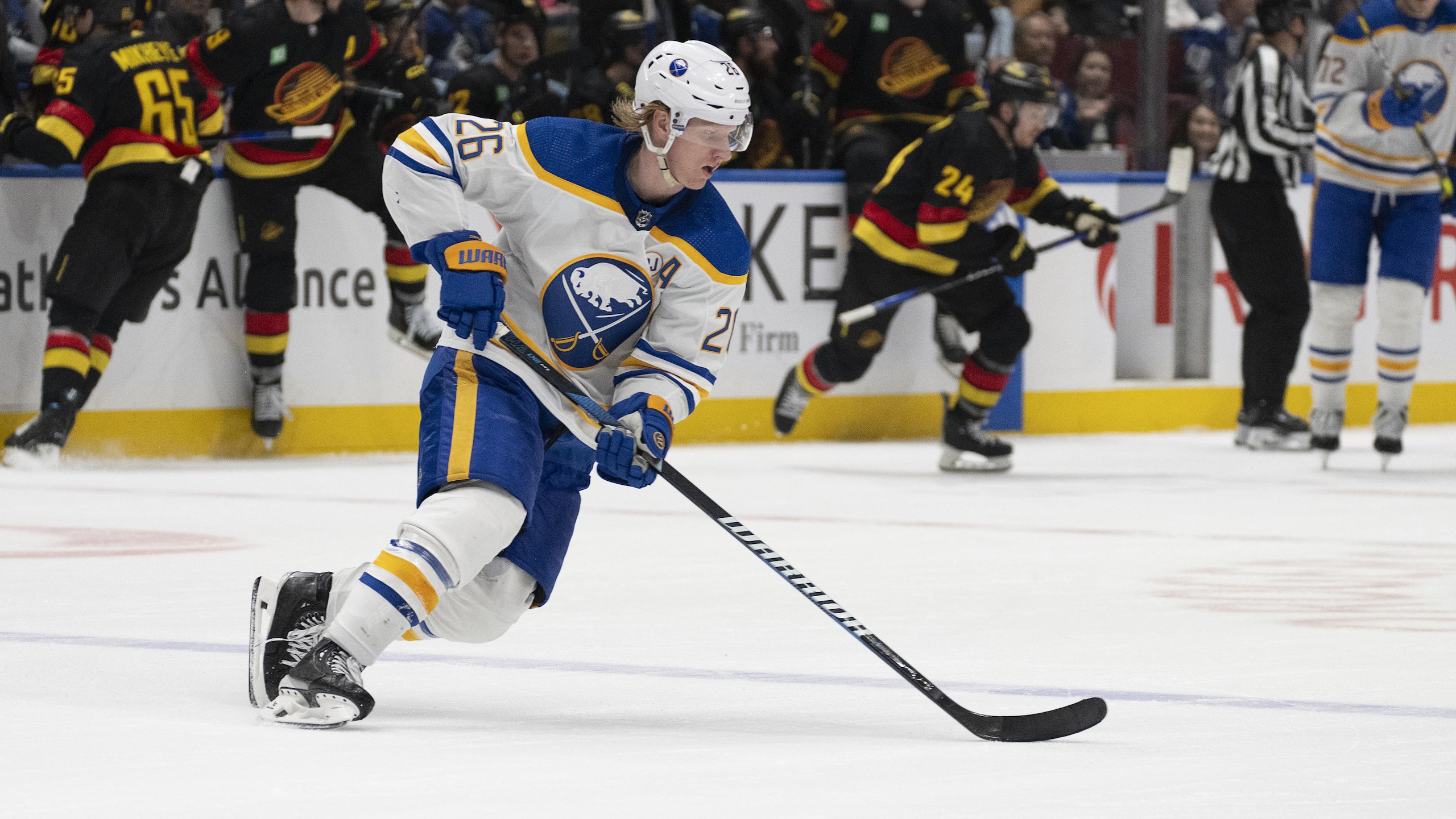
It's hard to imagine that the Sabres ever went away from the look and style they had when they started playing in 1970, but every team tries to do something different now and again and almost always finds their way back home.
The Sabres going back to a modernized version of their original uniform set in 2021 was the best thing they could've done while things were still grim on the ice.
As good as the Sabres' home royal blue jerseys are, their road white sweaters with the blue and gold shoulder yoke and sleeve stripes are what a hockey jersey is supposed to look like (especially if you grew up in the 1970s or '80s).
The way the blue and gold pops off the white jersey along with the Sabres' incredible logo makes them one of the best-looking teams to come to your town.
2. Montréal Canadiens
31 of 32
History goes a long way in these kinds of rankings, and when history and beauty combine, it's always something special. As perfect as the Canadiens' red home sweaters are, their white road jerseys are virtually just as good.
The white jersey with the red shoulder yoke, the red cuffs, and the bleu, blanc et rouge stripes around the waist, with the Canadiens logo at the center, is what hockey history is about.
Montréal hasn't changed its road jersey since 1947, apart from the NHL mandating last names on jerseys in the 1970s, and for good reason. It's perfect, but among road jerseys, they're outdone by only one other team...
1. Edmonton Oilers
32 of 32
For everything that makes Buffalo Sabres road jerseys great, the Edmonton Oilers' road sweaters have that and then some, along with more than a few Stanley Cups to back it up.
The Oilers' white jersey with the blue and orange shoulders, as well as stripes on the sleeves and waist, is iconic thanks to Wayne Gretzky, Paul Coffey, Mark Messier, and all the other legends that brought the Cup to Alberta in the 80s and 1990s. The orange, blue, and white numbers even stand out on these beauties, and it's a wonder the organization ever went away from this style at home and on the road.
Fortunately, those in charge came to their senses and brought them back again, and hopefully for good, because there are few greater thrills than seeing Connor McDavid and Leon Draisaitl roaring around the ice in these jerseys when they come to town.




.jpg?w=2560 "A.J.'s Message to Hurts 🙏")