")
Ranking Every MLB Team's City Connect Jerseys
The best part of talking about uniforms is how almost everyone has an opinion on them, but no one really gets to be right.
Even when there's popularity or perceived consensus on particular gear, everyone is still entitled to their own sense of taste and fashion style.
So much of what we discuss in baseball is cut-and-dry, with nuances to help us understand either the bigger picture or more granular topics.
This, where we rank every team's current City Connect gear, is looser. Have fun with the rankings and rail against them if you disagree.
Usually, we rank from worst to first, but I wanted to celebrate to good ones before slamming the ones that don't hold up as well.
1. Chicago White Sox
1 of 19")
The White Sox were one of the first teams to reveal their City Connect uniforms two years ago and there still hasn't been a better one produced.
All black with an emphasis on Chicago's Southside community. The gray Gothic font, plus being the first to go away from white pants with pinstripes instead, makes a strong fashion.
White Sox shortstop Tim Anderson talked about the authenticity and relatability of the jerseys with the fan base.
What I like most about it is how it represents the second team in a two-baseball city, but remains unique and specific to its fan base. Very well done.
2. San Diego Padres
2 of 19")
Might be in the minority here, but I'm a sucker for colorful uniforms, bright colors especially. Think Seattle Seahawks, Oregon Ducks, or even the all-blue Boise State football field. Big fan.
So the Padres' City Connect uniform is truly after my own heart.
The idea is to highlight San Diego's beautiful pink-and-yellow sunsets beyond the Pacific Ocean. So the uniforms feature pink and mint sleeves with "San Diego" in the same colors across the chest. The yellow outlines around the fonts represent the sun. It's creatively exceptional.
Then there's the cultural aspect, acknowledging how much of the fanbase comes from nearby Tijuana, Mexico with nods to certain landscapes and San Diego artwork.
The best part of the uniform is the mint cap. While the White Sox have the best overall City Connect unis, the Padres' mint cap is the single coolest uniform piece in baseball right now.
3. Miami Marlins
3 of 19")
Most are familiar with Miami's connection to Cuban culture. What they might be less familiar with is the history of the upstart Cuban baseball team that inspired the Marlins' City Connect uniforms.
The Cuban Sugar Kings once had eyes in the 1950s on becoming the first MLB franchise outside the United States. As noted by MLB.com, "the Sugar Kings were one of the first to field a multi-national team with players from all over Latin America along with African American ballplayers."
So the Marlins remixed the Sugar Kings uniforms with their own twist, the idea being that the legacy could live on through Miami's current MLB franchise.
It's a slick look, with what they call "Miami Blue" hats with a red bill; red jerseys with the same blue font, which is the same as the original Sugar Kings jerseys; and wide pinstripes.


4. Colorado Rockies
4 of 19")
This is the first controversial pick in my friend group, having the Rockies this high on the list. For what it's worth, ESPN's Joon Lee ranked the Rockies' City Connect uniforms as the best about a month ago.
I have them lower, but am still very fond of pretty much everything about the uni. My friends' vague criticism is that it just doesn't look like a major league uni; more college, little league or select ball vibes.
While I can see that line of thinking, it doesn't take away from the quality of this design.
Let's start with the colors, going with the classic green to reflect the state's mountains and license plate. Then there are the seamlessly designed mountains across the chest, with "Colorado" displayed right under it.
They also mixed in the purple trim on sleeves, pants and numbers on the back of the jerseys, which represents the row of purple seats at Coors Field that designates exactly one mile above sea level.
Thoughtful and stylish.
5. Boston Red Sox
5 of 19")
Here is one I truly wrestled with, because the style itself doesn't align with my personal taste.
But the meaning here is just so much bigger than that. The color scheme is a nod to the Boston Marathon, which captured the heart of America a decade ago after the tragic bombing.
From that standpoint, it's hard not to understand the sentimental value. There is also something to the idea that Boston's have looked the same across multiple generations.
It's somewhat jarring to see them play in different colors, but once you consider the inspiration, you have to respect the intent. The change of style is also a welcomed look, as universally beloved as the classic Red Sox unis may be.
6. Houston Astros
6 of 19")
Houston sports, outside of football, have consistently leaned into the aeronautics and space themes.
This is because of the city's rich history as NASA's home for human space flight, hence the Astros, Rockets, now defunct Comets (WNBA) and Aeros (hockey).
The NFL's Texans, for example, once considered the name "Apollos" for the Apollo missions from the Johnson Space Center.
The Astros' City Connect jerseys stick with the space idea having NASA's trademark font dubbed Houston as "Space City."
The navy blue color rush is a nice touch, made even stronger with the pant legs up and orange socks as the complimentary color.
7. Cincinnati Reds
7 of 19")
Similar to the White Sox, it's hard to go wrong with all-black. The red accents are the perfect compliment to the black-on-black jersey-pants pairing.
Perhaps most notable about the Reds' City Connect uniforms is the revamping of the "C" on the logo. It's a similar classic to the Red Sox' "B" but Cincinnati went the extra step in changing it.
This is in part because of how much Cincinnati is changing as a city: it's seen the largest share of growth due to immigration into the United States and the change is meant to reflect that point.
"We wanted to make this about the future," Reds vice president Ralph Mitchell said, via ESPN. "This is the Reds' uniform for today, in today's city. It's not the sleepy Midwest."
8. Los Angeles Angels
8 of 19")
The Angels' design is inspired by California beach culture. Last year, when they unveiled the City Connect uniforms, players like Mike Trout and then Angels pitcher Noah Syndergaard, were photographed in the uniforms with matching surfboards on the beach.
Even the "Angels" font across the chest takes inspiration from surf brands, as do the stripes on the sleeves.
The cream, or off-white base is a nice and unique switch from either the customary white or gray uniforms we're used to seeing in baseball.
There is a fair criticism that the alternates are too similar to the everyday uniforms, but my response would be that the everyday uniforms are actually pretty good-looking, too.
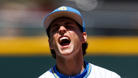
9. Kansas City Royals
9 of 19")
This was a uniform designed to balance tradition, and consistency within a uniform portfolio and also make it edgy enough to attract a younger, more diverse fan.
Considering this balancing act, the Royals did well with the City Connect edition, which debuted last year.
The design detail acknowledges the team's previous uniform history and the navy blue is a nod to the city's past baseball squads: the Monarchs, Blue Sox, Athletics, Packers and Blues.
I'm generally a fan of the color rush schemes, but the navy blue on top of white pants with powder blue accents looks very slick.
10. Washington Nationals
10 of 19 walks off the field wearing the Nationals gray and pink Cherry Blossom City Connect alternate uniform during the Miami Marlins versus Washington Nationals MLB game at Nationals Park on July 2, 2022 in Washington, D.C.. (Photo by Randy Litzinger/Icon Sportswire via Getty Images)")
Focusing on Washington D.C.'s distinct cherry blossom trees is not something I was expecting, but turned out to look pretty good as a uniform with this color scheme.
The jersey is described as an anthracite base color with a cherry blossom print and pink on the trims. They went with the "WSH" graphic on the front of jerseys with the cherry blossom stems placed underneath the "H."
The District of Columbia flag is placed as a patch on the left sleeve and socks.
This is the type of gear, like the others in the top 10, that's worth purchasing and wearing places other than a baseball game.
11. Milwaukee Brewers
11 of 19")
These look partly like baseball uniforms, but also like they could just as easily be working at a fast food restaurant. That sounds like a dig, but I still kind of like it.
How could you love baseball and not appreciate a jersey that subtly pays homage to foaming beer?
That's what the Brewers represent in these unis: Milwaukee's rich brewing background. The yellow and white piping along the side of the jerseys gives the foaming beer vibes. The most visible nod to the beer culture is the "Brew Crew" nickname emblazoned across the front of the jersey.
The "MKE" on the caps, which abbreviates Milwaukee's General Mitchell International Airport, also subtly includes the city's "414" area code within it.
12. Atlanta
12 of 19")
Atlanta's City Connect uniform is essentially an updated throwback. They took the design from 1974, when Hank Aaron broke Babe Ruth's home run record, and added a few elements to pay homage to that era.
There is a crown on the sleeves acknowledging Aaron's pursuit to become the home run king. "The" is placed next to the "A" on the jerseys. Atlanta is colloquially and affectionately referred to in some circles as "The A."
It's hard to argue with history, especially when it is as rich as Atlanta's with Aaron. Fewer fans are able to recall 1970s baseball, but this is a good enough team to create new memories in similar threads with a tremendous baseball backstory.
13. Baltimore Orioles
13 of 19")
Notable with these uniforms is the name on the front of the jerseys. Outfielder Austin Hays, who's been with the big league team since 2017, noted this is the first time he's worn "Baltimore" across his chest instead of "Orioles."
Likewise with the cap, instead of it saying "O's" or having a mascot emblem, it's a fresh script "B" logo, which also appears on the sleeve.
There is a mosaic design lining the inside the uniform, the bottom of the sleeves and on the top of the socks, which takes inspiration from Baltimore's neighborhoods.
It looks clean and has some creativity in the concept, but doesn't quite measure up with others from around the league.
14. Arizona Diamondbacks
14 of 19")
The Diamondbacks' uniform is a tribute to the Sonoran Desert and the local Latin culture. "Serpientes" is the Spanish translation for snakes, such as the Diamondback rattlesnake that carries so much respect in Arizona.
This is not a bad uniform, but it's one of the few that's far less fashionable than the regular uniforms, despite aiming to be similar.
The creativity, outside of the Serpientes name, is lacking. It feels like they participated simply because they had to.
But with the Diamondbacks turning things around, currently leading the NL West, Arizona fans are taking this brand of baseball no matter what uniforms they wear.
15. San Francisco Giants
15 of 19")
This is the Golden Gate Bridge-themed uniform no one really asked for, but received anyway.
The iconic bridge makes appearances in several places on this outfit: across the sleeves, the side of the orange cap, and even the "G" on the front of the jersey is inspired by it.
The orange-and-white color scheme is fine. But if you haven't noticed a theme here, I like either black, or loud, bold colors. Going away from black seems like a mistake here.
The uniforms did not appear to be a big hit amongst the fan base when they were revealed two years ago.
16. Chicago Cubs
16 of 19")
This is one of the least imaginative of the City Connect series.
The navy blue design with the light blue accents only slightly deviates from the Cubs' typical concept. Adding "Wrigleyville" might resonate locally, which perhaps is all that should matter, but comes off corny to this particular outsider.
It's an overall boring design, even with nods to the city's history like the Chicago River and Wrigley Field itself.
What makes it worse is how the crosstown rival White Sox absolutely nailed their City Connect uniforms, almost as if one side of town understood the assignment and the other did not.
17. Los Angeles Dodgers
17 of 19 looks on after scoring a run during the MLB game between the New York Mets and the Los Angeles Dodgers on August 20, 2021 at Dodger Stadium in Los Angeles, CA. (Photo by Brian Rothmuller/Icon Sportswire via Getty Images)")
I would say the Dodgers and Cubs appeared to work together on unimaginative concepts, but the Dodgers make the Cubs look like fashion gurus.
It's a color rush almost exactly like their everyday classics. If there is a uniform that does not need adjusting, across all of sports, it's the Dodgers. But they leaned into that entirely too much with the City Connect threads, simply adding "Los" Dodgers to connect with their Latin fanbase.
Why not a new design, or something that really dives into LA culture beyond beaches, to which at least the Angels made an attempt?
Los Angeles and Chicago, as two-team baseball towns, are both underrepresented culturally because a team from each city failed to hold up their end of the bargain.
18. Seattle Mariners
18 of 19")
Credit the Mariners for trying, but this one is a whiff. The black pants deserve black jerseys. The font looks immature.
What they are going for is honoring Seattle's baseball past, and this font acknowledges the Pilots, who soon became the Milwaukee Brewers.
The issue here is that the font never looked good. Not then, now. The trident logo on the caps is strong, and would help if the uniform had a better font. Between that and the pants, it's still not a ton to work with.
The effort is commendable but it leaves me wondering if I'd feel stronger about it if the Mariners had gone all black.
19. Texas Rangers
19 of 19")
The Rangers could've kept these. Even as a native Texan, the reference to the state's independence day does not do a lot for me. The uniforms are inspired by a pair of area minor league teams, a "peagle" for the Fort Worth Panthers and Dallas Eagles.
It feels like they are all over the place in trying to connect Dallas and Fort Worth to Arlington, the midway point.
The dark pants and light jersey would look better flipped. The red numbers don't compliment anything.
Overall, the Rangers nailed the history part, but did poorly with the fashionable aspect. It's not the gear I would advise wearing unless you're a diehard Rangers fan who would wear anything the team sells.


.png?w=480)


.png?w=600 "World Cup Highlights and Reaction")
