After waiting (mostly) patiently for the past few months, the NHL unveiled their Hometown Remix jerseys. All 32 teams represented with their own takes on what makes them stand out.
Team names, locales, regional pride and history are all on display in their own unique ways... for the most part at least anyway and when it comes to jerseys, we've all got opinions. Some teams went all the way out to impress while others could've used a bit more consultation.
Whatever the case, we've got grades to hand out for each team. As far as league-wide releases go, this one is a banger and there's a lot to like. Fortunately, there's a lot to roast as well so it won't just be all roses for everyone. Let's get the red pens out and dish out the grades.
Anaheim Ducks
1 of 32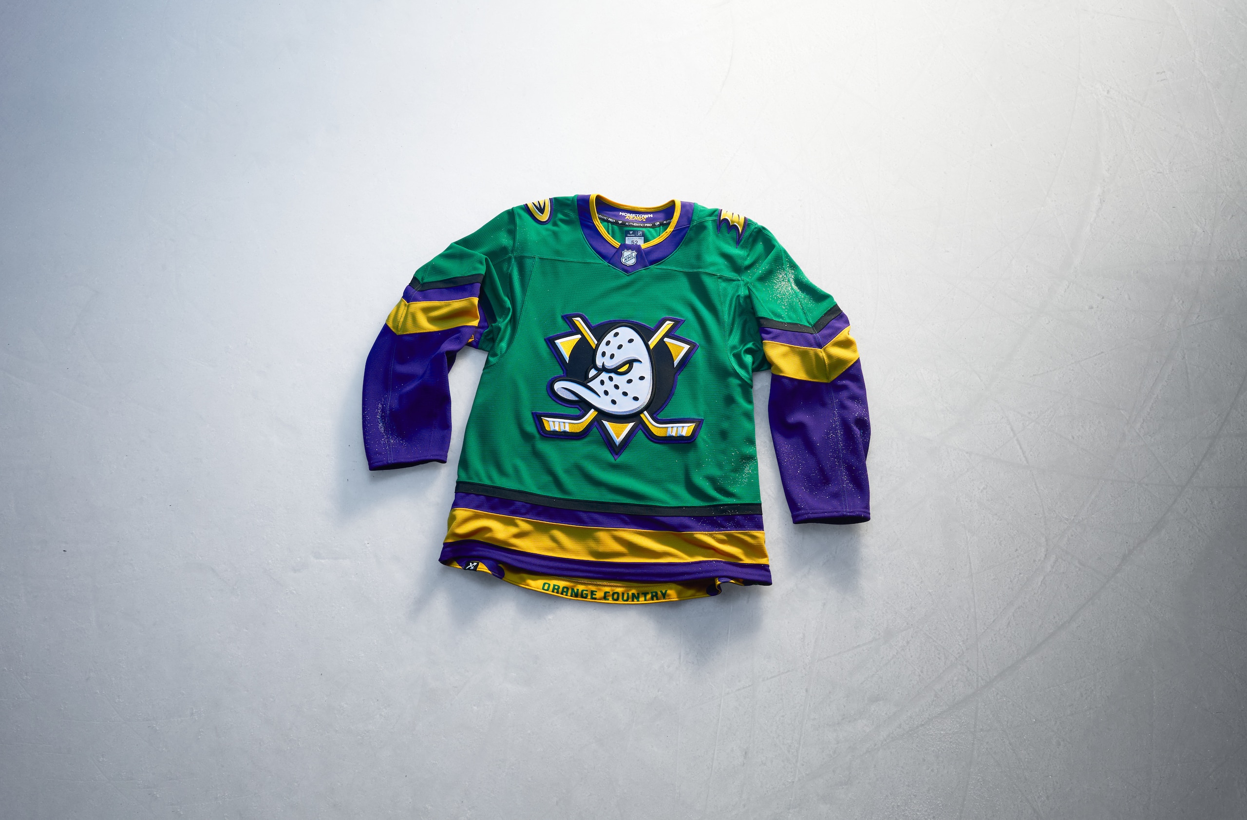
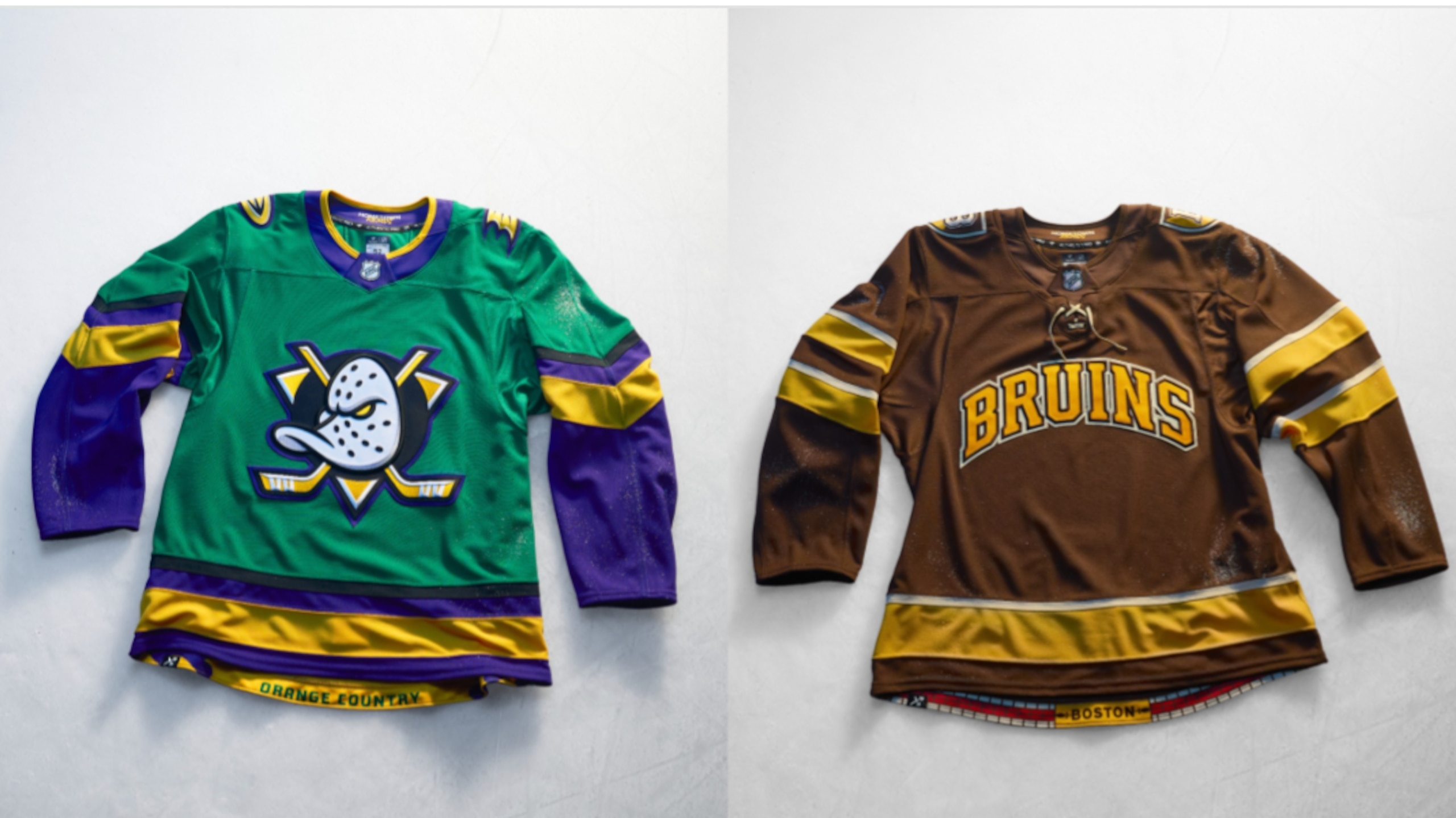
An absolute knock-out of a jersey for the Ducks.
Anaheim threw it all the way back to the movie that helped bring about the name of the franchise and used the jersey style from the film "The Mighty Ducks" and put their own masked duck crest on the front.
You can complain about how the colors aren't the Ducks all you want to, but the jersey is very much about the Mighty Ducks. It's a spot perfect jersey that fully embraced the spirit of what doing a Hometown Remix was supposed to be.
Grade: A+
Boston Bruins
2 of 32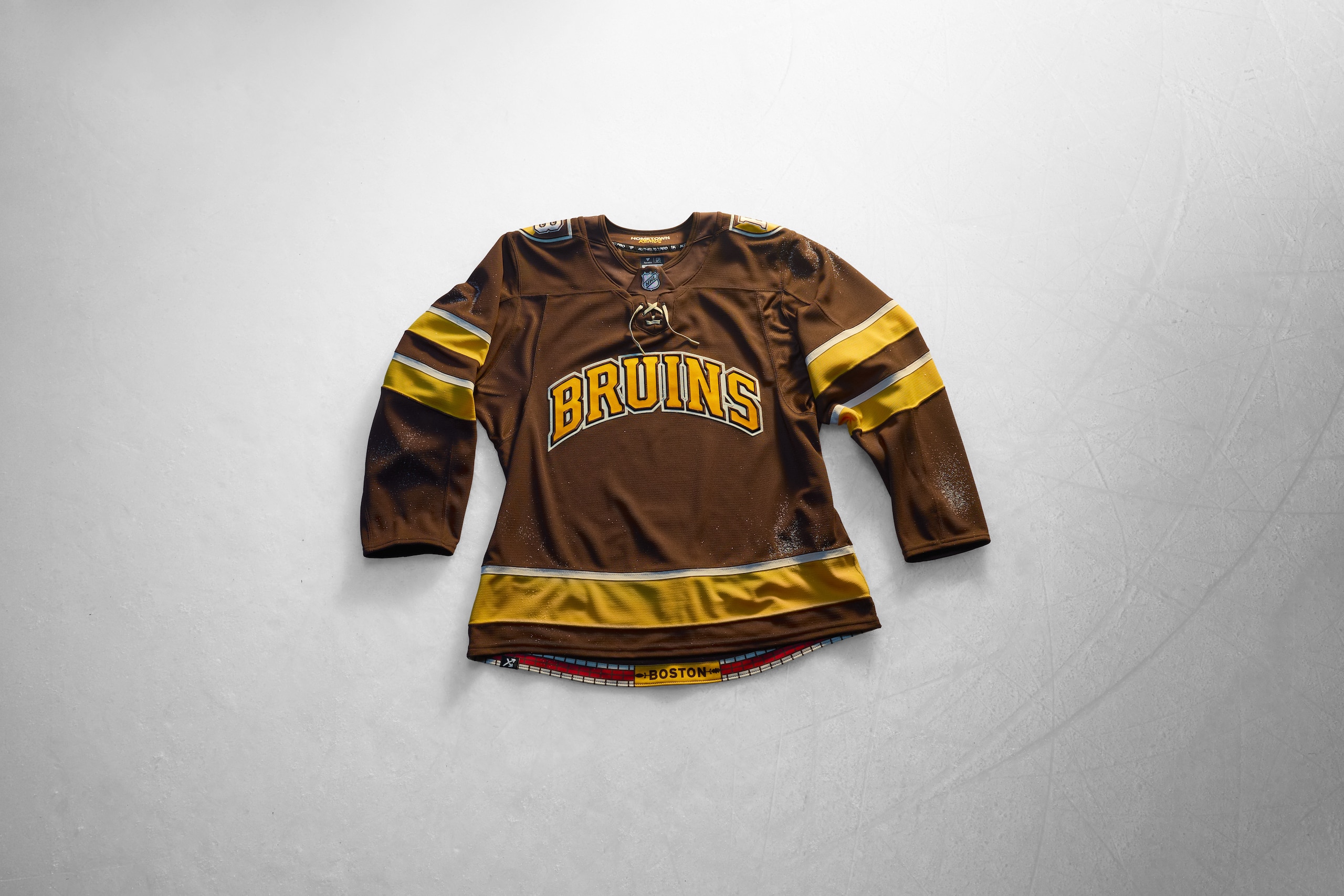
The Bruins took it back to school for their Hometown Remix and it made for a great idea.
A brown and gold jersey with "BRUINS" in block letters across the front is wholly in the spirit of any college hockey jersey you'll find from any of the NCAA teams in the Boston-area. Be it BU, BC, Northeastern, Harvard or points beyond in the region, this style of jersey has been done in kind.
The Bruins embracing college hockey style like this is a fun idea even if it comes off a bit bland at first blush. That said, throwing it back with the old team colors and the college-style shield on the shoulders is great.
Grade: A
Buffalo Sabres
3 of 32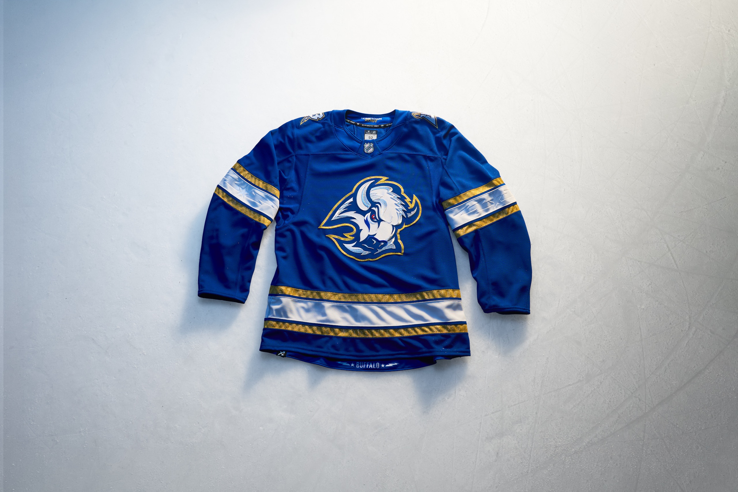
When the Sabres had a white "goathead" jersey for the Reverse Retro program years ago that used blue and gold highlights, fans in Buffalo wondered when, if ever, there might be a blue and gold "goathead" added to the mix. Now is that time and it's done with a lot of special Buffalo touches.
The electric gold on the blue jersey with gold and white stripes plays well into the Sabres color scheme and the shoulder logo that originally had a sabre piercing the letter "B" is altered with a electric bolt sabre through the "B." The white stripe on the jersey's sleeves and waist has a star and electric bolt design through it that ties into the City of Buffalo's flag.
Buffalo is known as the "City of Light" and that's what this beautiful jersey represents so well.
Grade: A

Calgary Flames
4 of 32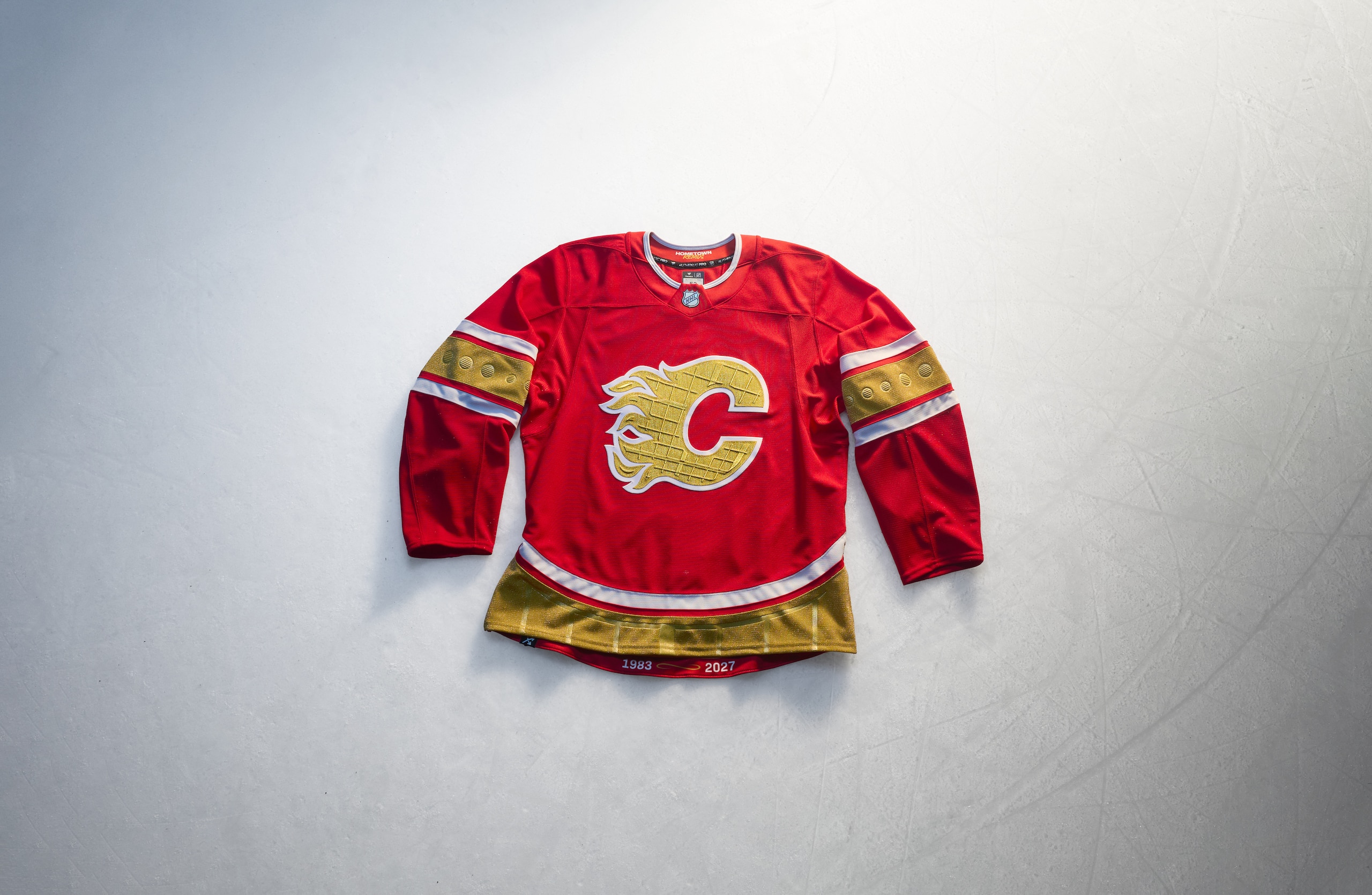
The thing with Flames jerseys is you don't want to mess with a good thing. The team logo is perfect and so are the colors. Making the flaming "C" gold with a saddle-shaped waistline hem not only puts a new shine on the Flames but it also pays homage to the Saddledome, Calgary's home arena which is in its final season.
There are details included in the Flames' logo and in the sleeve stripes that take into account the texture of the Saddledome's ceiling on the logo and the Dome's windows on the sleeves. It is honestly such a deep cut of a detail it's as unexpected as it is impressive.
This is a jersey made with love for the home arena and respect for such a perfect logo and jersey.
Grade: B+
Carolina Hurricanes
5 of 32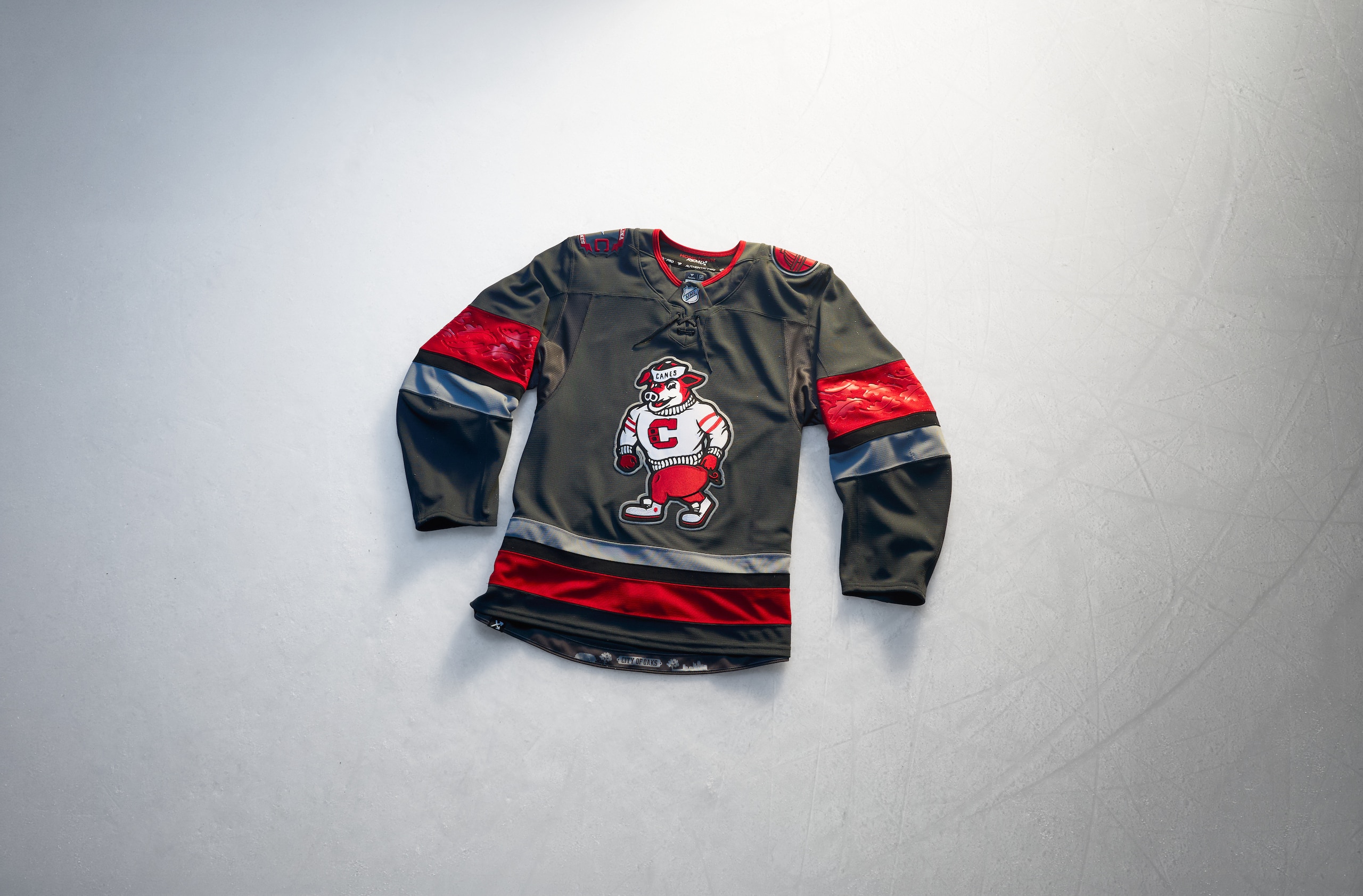
A lot of fans are deeply confused about seeing the team's mascot, Stormy, on the front decked out in a classic varsity sweater and a porkpie hat out of the 1950s. If you know ball (or jerseys, rather) you're familiar with this iteration of Stormy and if you've read our takes, you know we've wanted to see it on a jersey front and center.
Wishes do come true and you know what? We dig it. It's different, it's new, and it's having fun. The shoulder logos highlight parts of North Carolina's flag as well as a nod to the architecture in Raleigh. The sleeves have oak leaf details in the red stripes since Raleigh is the City of Oaks.
This jersey is definitely not for everyone, but it's very specifically for Hurricanes fans in Raleigh, and that kind of appreciation probably isn't as well met outside of the Research Triangle.
Grade: B
Chicago Blackhawks
6 of 32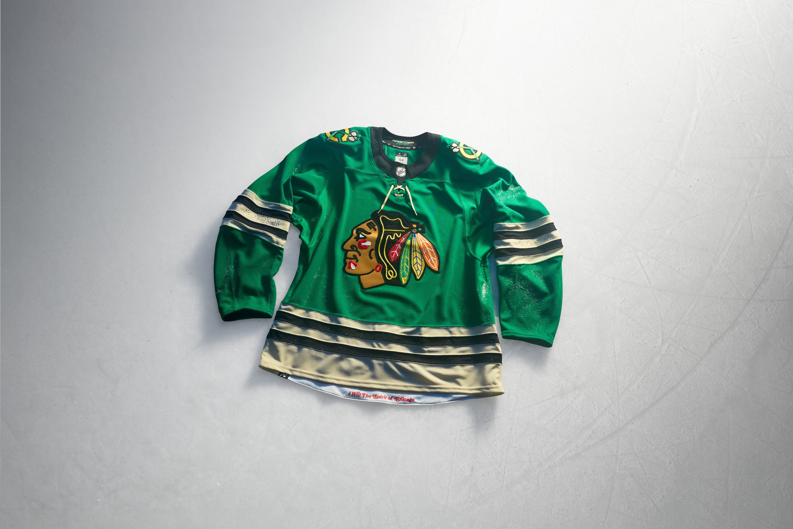
We have a lot of questions here that, thankfully, the marketing details give us answers.
The green Blackhawks jersey is meant to give the fans what they've wanted since the past St. Patrick's Day special jerseys made fans want to see it more often. Of course, a green Blackhawks jersey is almost an exact replica of a University of North Dakota jersey before they changed the name of the team. Those jerseys were big hits in Chicago thanks to Jonathan Toews being a North Dakota alum and 'Hawks star but seeing this for the NHL team is rather jarring.
They say the green is meant to represent progress, and the sleeves have four six-pointed stars embedded into it to represent the City of Chicago flag and that's a cool touch, but you can't help but wonder if using the flag itself as an inspiration for a jersey might work so much better.
Grade: C
Colorado Avalanche
7 of 32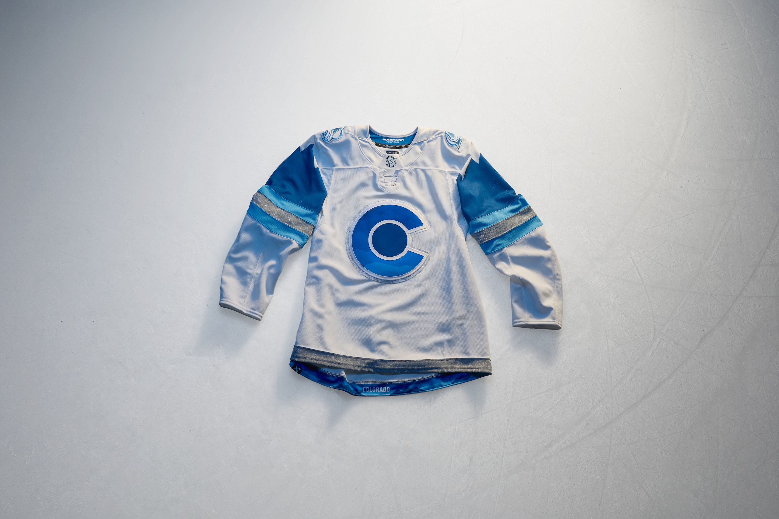
The Avalanche opted to better represent their namesake for the Hometown Remix and an icy, snowy-looking team from Colorado really hits hard.
The white jersey with the icy blue sleeve stripes and a darker cold blue to represent the mountains higher up on the arms is a fun design touch and using their alternate jersey logo as a crest, which comes from the Colorado state flag, works well for this, particularly with the frosted Avalanche logos on the shoulders.
The silver stripes on the sleeves shimmer which adds to the icy effect they want this jersey to embody. These look simple, but they're eye-catching all the same.
Grade: B+
Columbus Blue Jackets
8 of 32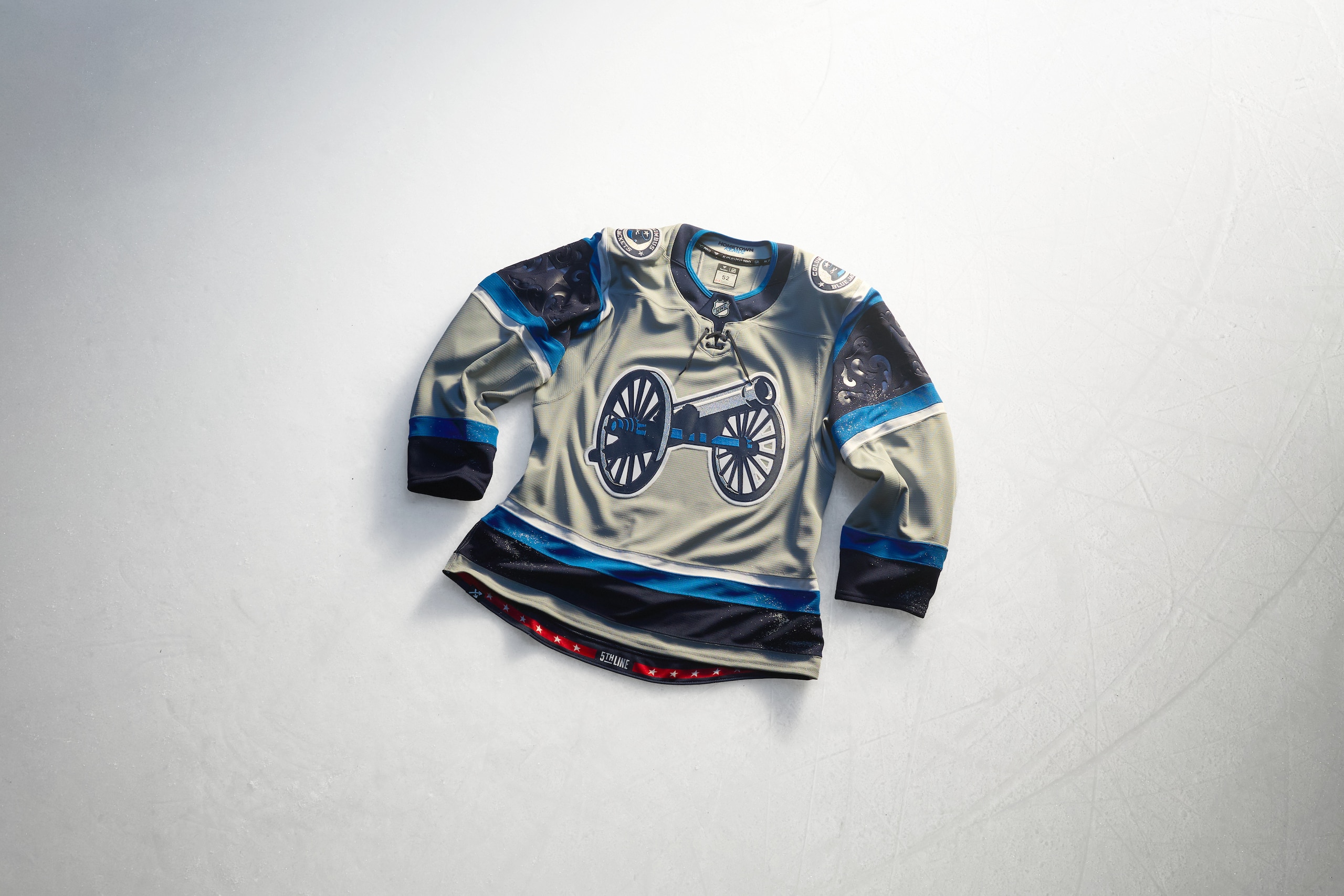
The trouble with being named after a color is it kind of holds you to needing to use that color all the time. For the Columbus Blue Jackets, finding new ways to use blue is undoubtedly a challenge. But being called the Blue Jackets presents another issue in that, thanks to the sourcing of the American Civil War for the team's nickname, it would also eliminate the color of the opposition. In this case, the color gray should be a no-go.
Should be. Instead, the Blue Jackets used their fantastic Stadium Series jerseys and flipped around the colors and, unfortunately, that's made gray the main color and blue a highlight color. The gray is meant to help the cannon on the front stand out proudly...but it's gray! The antithesis color for the reason for the team's name!
Sigh. We want to love this because it's a great looking jersey, but it just couldn't be gray and it very much is. That's not even taking into account how gray hockey jersey just don't do so well in the first place, but especially when the team is called the Blue Jackets.
Grade: D-minus
Dallas Stars
9 of 32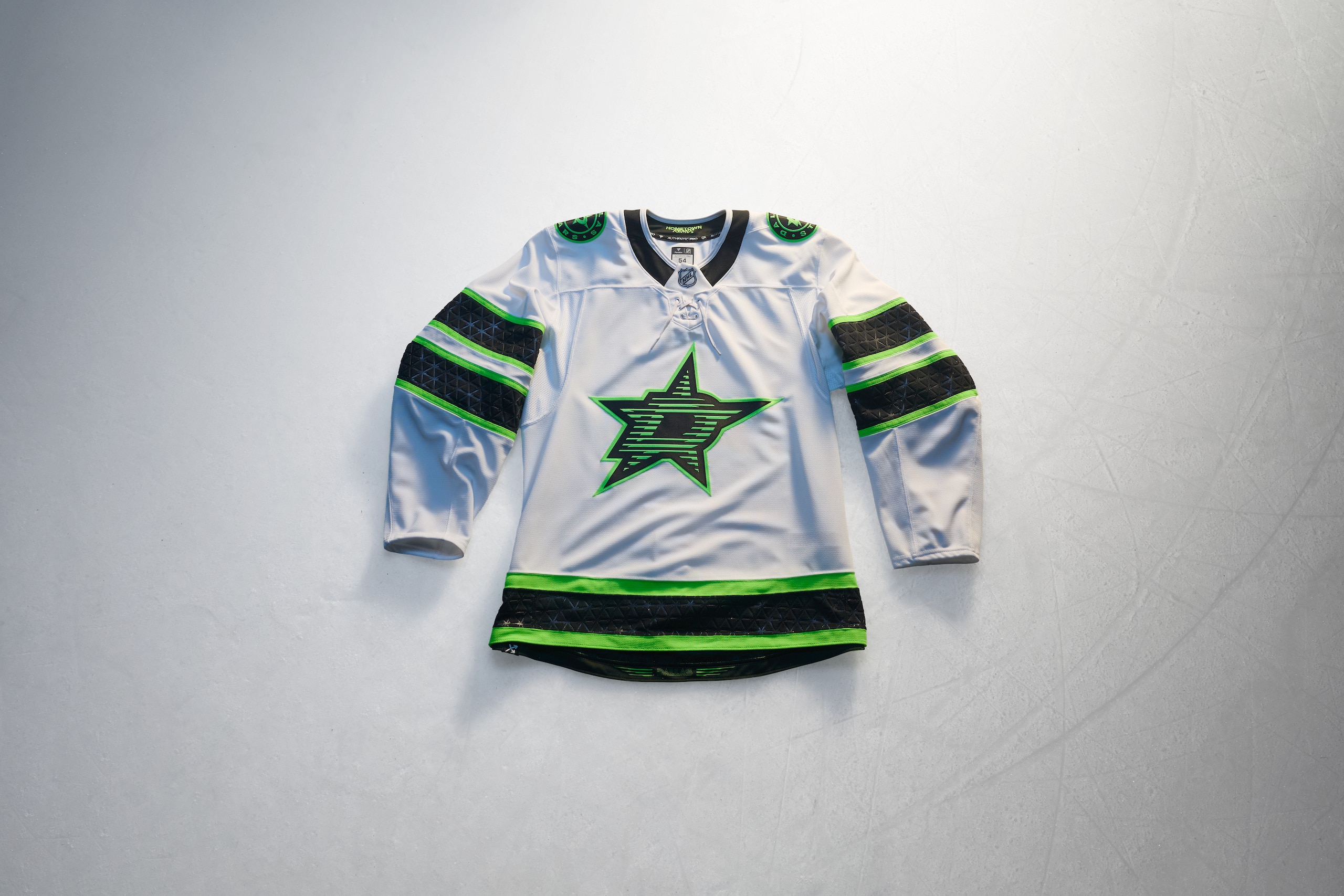
The Stars' Hometown Remix jersey is meant to represent the city skyline and the nightlife of Dallas. With a white-based jersey to help the livened-up Stars logo as well as the gussied-up sleeve stripes, it's got a lot of modern-esque pizzaz to it.
The logo on the front is textured, and the sleeves have designs debossed within the black stripes. This jersey feels almost like a total flip on the "blackout" alternate they had until recently that had neon green for stripes, name, number and logo but with a few more little touches to make it stand out better.
This is a fine jersey if not underwhelming. We understand that throwing stars all over it might've been a bit over the top.
Grade: C
Detroit Red Wings
10 of 32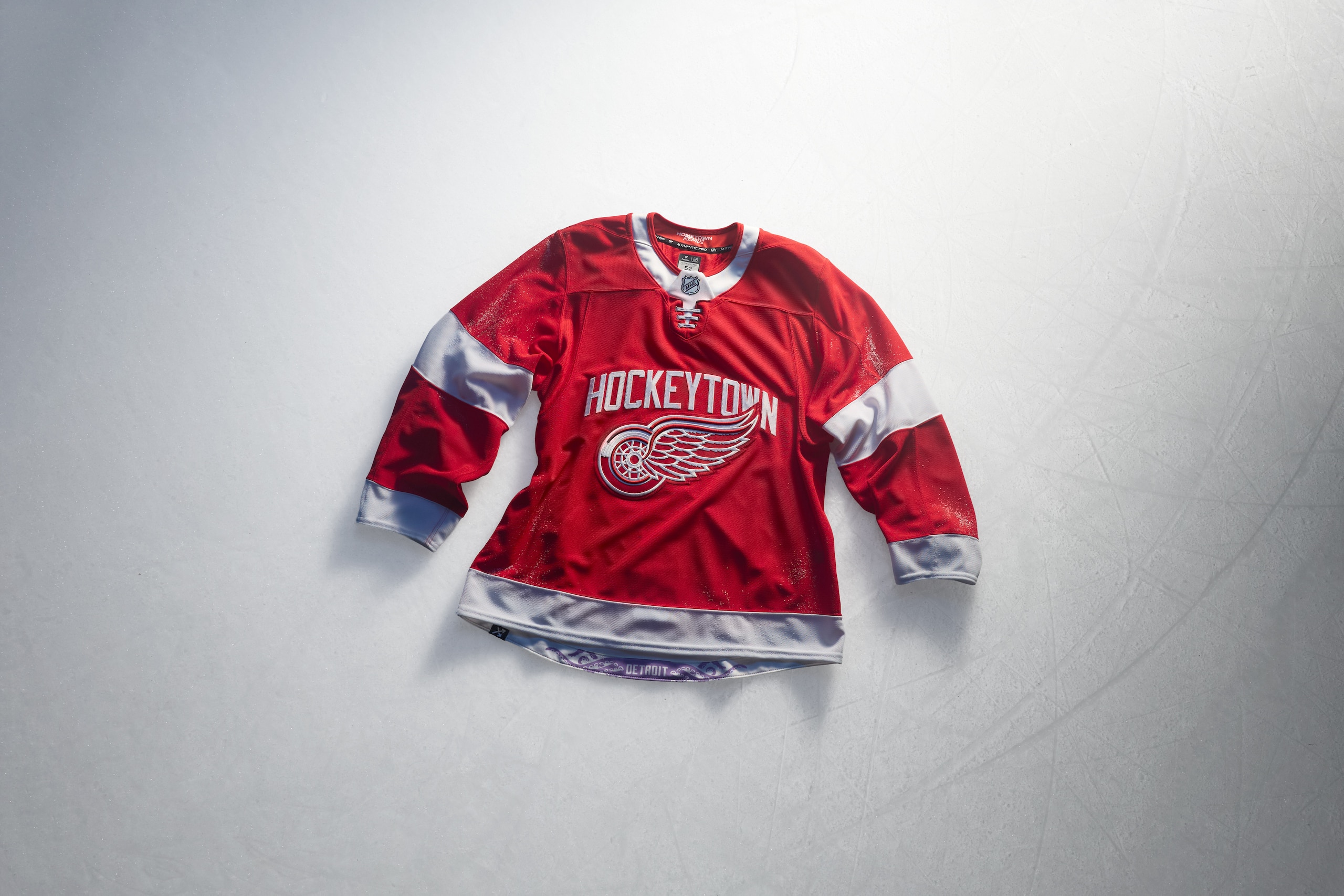
Haven't Red Wings fans been through enough?
After hitting a grand slam with their centennial jersey last year (which became their alternate this season), the Hometown Remix falls desperately flat. It's simple, which is what the Red Wings' standard jerseys are and that's fine. But taking that jersey and throwing "Hockeytown" above the winged wheel and calling it a day is so dull it's almost unhinged.
The most fun thing about this are the octopus tentacles on the hem on the inside of the jersey. If you buy one, you'll see it. If you don't, you'll probably never know it's there. For a team with a great legacy with their jerseys, seeing alternates so regularly end up disappointing is a huge let-down.
Grade: F
Edmonton Oilers
11 of 32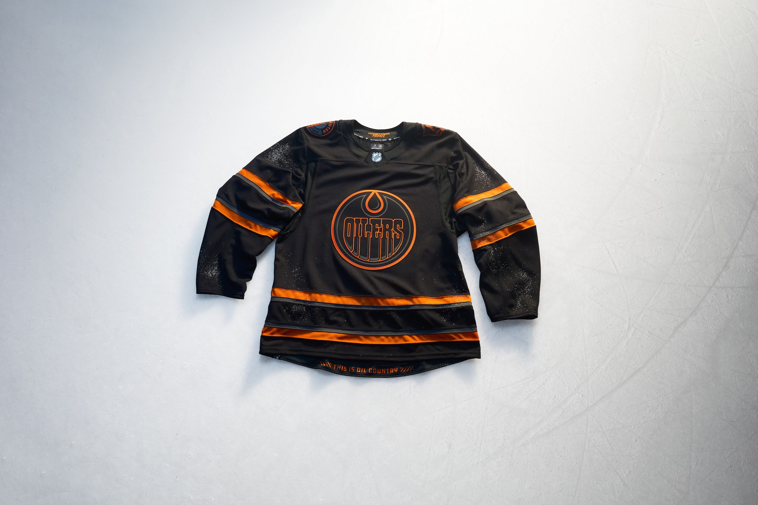
You want to dislike this jersey, but seeing the Oilers embrace the color of oil (black) and then add a couple of fan-friendly touches to it to go along with the great logo, this jersey goes sneaky hard.
The Oilers Hometown Remix design gives it a kind of neon sign appearance by accident and with the orange and blue stripes being a bit of a darker shade, they don't pop loudly and that works with this. The shoulder logos featuring the oil driller shoulder logo used in the late 90s/early 2000s along with newer "Oil Country" circular logo with an oil derrick on are new and fun.
The eerie callback this jersey initially gave to their muted dark blue alternates from recent years made us worry about the similarity, but this one is discernably different, and the new (and old) touches make it a real nice look.
Grade: B+
Florida Panthers
12 of 32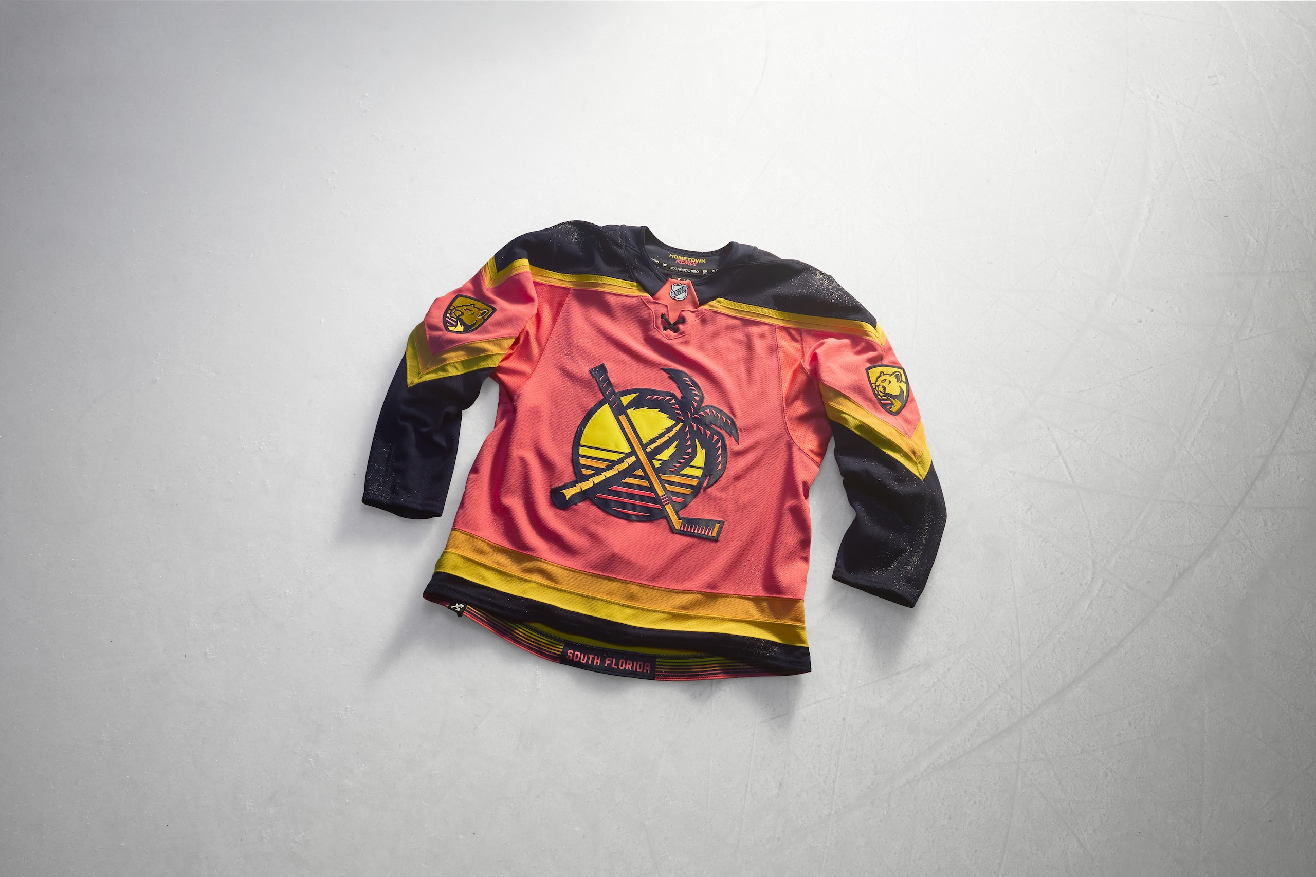
Of all the Hometown Remix jerseys, this one might seem like old news given it was one of the first ones to be leaked months ago. Fortunately, that leak didn't lead to any drastic changes because the Panthers leaning into the Miami Beach vibes means it's going to be a winner.
The jazzed up former shoulder logo with the crossed palm tree and hockey stick getting a sunset behind it and the hem stripes playing out like a sunset are fantastic. The sleeves coming off like their original jerseys in the design are great as is the golden version of the Panthers logo on the sleeves.
A team wearing a pink jersey might be a bold call, but for a team out of South Florida wearing it? That's perfect. It even has us thinking about Grand Theft Auto 6 coming out for some reason...
Grade: A+
Los Angeles Kings
13 of 32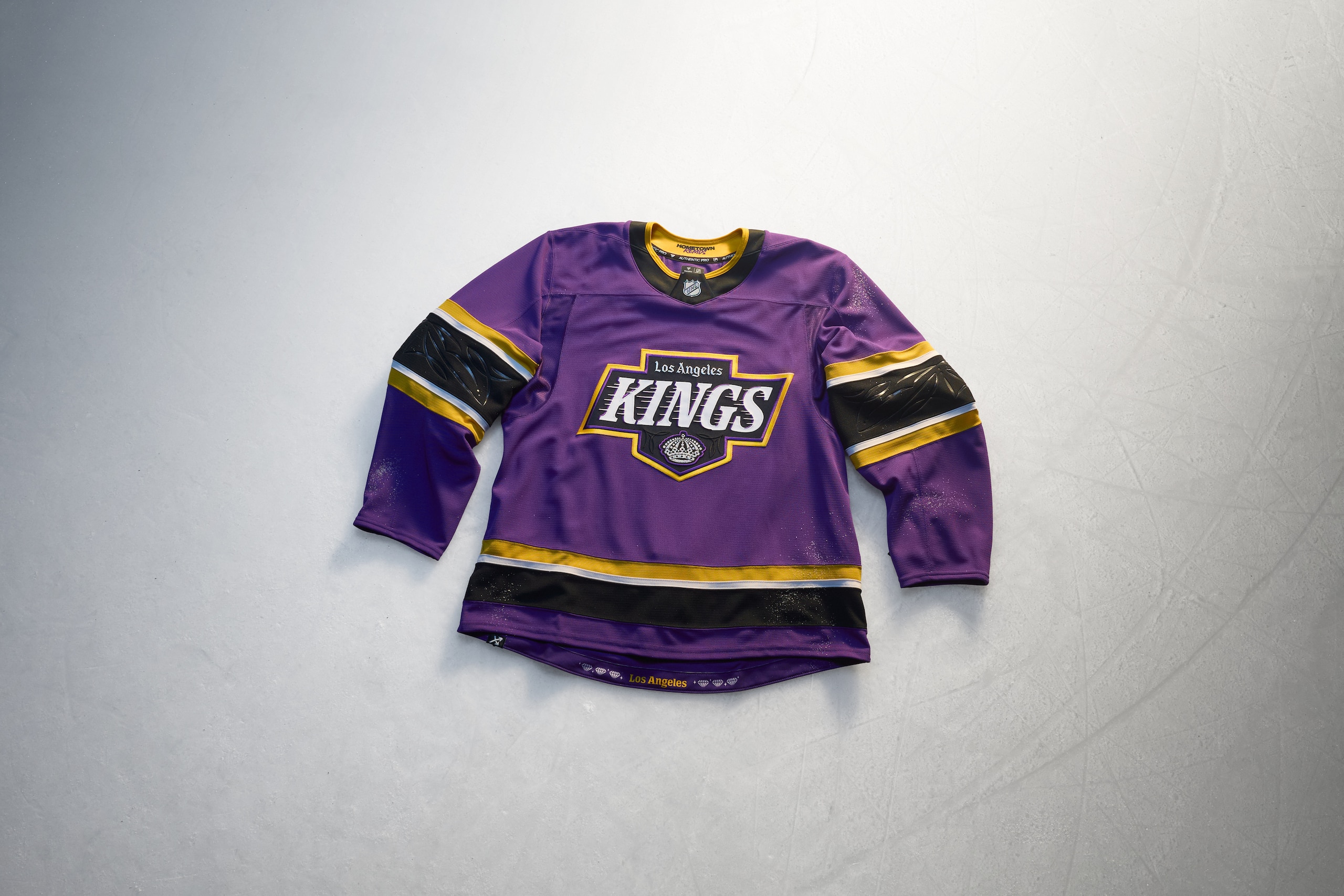
We sort of got our wish for a new Kings jersey. We were looking for something new in purple and gold and, yes, L.A.'s Hometown Remix has that, but it's got a funky mix of black in there as well and as jarring as it may look up front, this jersey might cook on ice.
The purple jersey has a blacked out Kings logo surrounded in gold with gold, white and black sleeve stripes. Within the sleeves are palm tree designs debossed within it and the textural touches to the crown in the Kings logo and other bits of whimsy make it a real get-your-hands-on-it kind of jersey to appreciate it.
The color balance is striking and not like anything we've really seen before and that's not always a bad thing. We're eager to see this one in action all the same to see how it really hits us. For now, we dig it for trying to be different.
Grade: B-minus
Minnesota Wild
14 of 32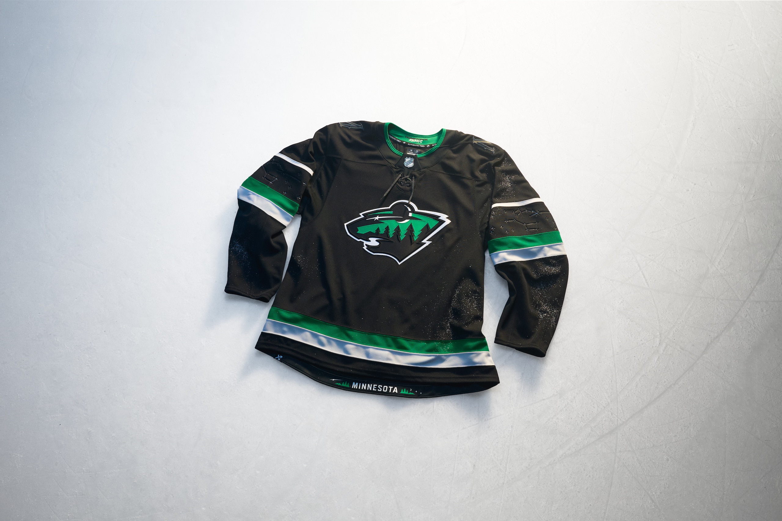
We love our hockey fans in Minnesota and we love them because they care so hard for the Wild and what they used to have in the North Stars. The Wild's Hometown Remix brings back the colors of the Norm Green era of the North Stars and reclaims it for themselves.
We like how the black, green and white colors play out here with the Wild logo (featuring a crescent moon) and the stripes and the addition of starlight spots in the numbers on the jersey is fun. What's even better are the debossed constellation star charts in the sleeves.
This jersey is meant to represent being in the wilderness at night and it nails that entire idea. It's another of the Remix jerseys that looks plain at first blush but when you dig into it, it's doing a lot of great things.
Grade: A
Montréal Canadiens
15 of 32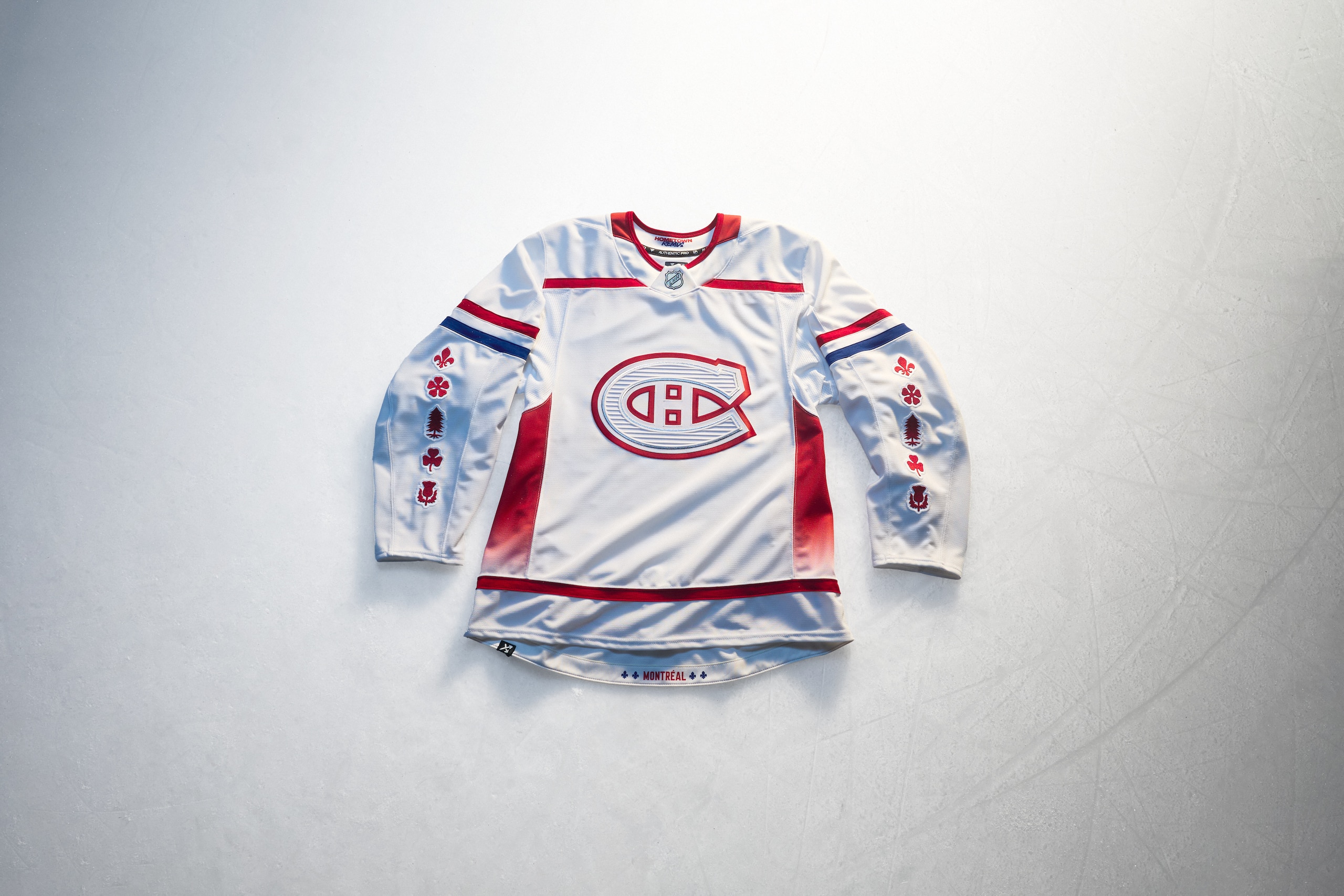
The problem with creating something new for the Montréal Canadiens is that your doing something different than their already perfect jerseys. That's really tough! What the Canadiens' Hometown Remix jersey was going to do was always going to fall short of what they've already got, but they've opted to lean hard into imagery and designs that play into the city itself.
The washed-out Canadiens logo on the front features designs meant to evoke the city's architecture and the red gradient on the sides are meant to represent Mount Royal. The symbols on the sleeves may make you wonder what in the world is going on there, but they're the symbols contained within the crest of the City of Montréal. These touches are nerdy and neat and a lot of fun... but we're not sure any of this is at all coherently done.
Grade: D
Nashville Predators
16 of 32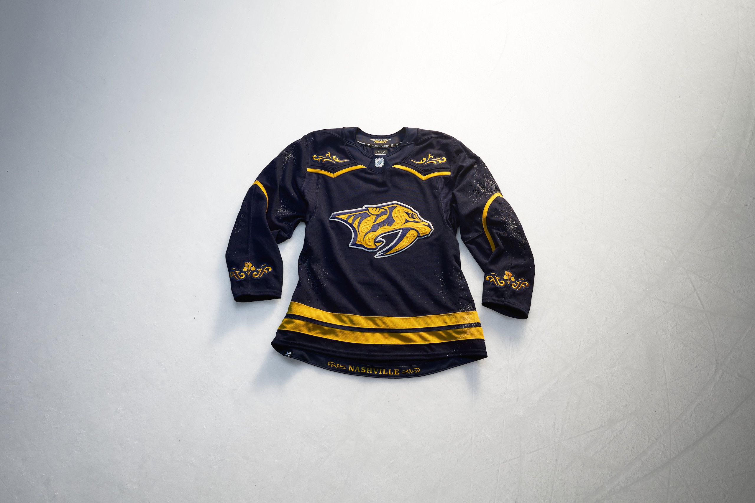
Ooh-wee baby, this here is some honky-tonk.
This might be the most classically country music sports jersey ever made and we're kind of into it. It's got a dark denim blue color and the design choices on the front of the shoulders, sleeves and cuffs smack of something you'd see someone at the Grand Ole Opry wearing.
The Predators logo on the front has details within it that pay homage to classic country music stage designs and the flowers on the sleeves are irises, the state flower of Tennessee. The numbers on the sleeves and back of the jersey will add even more country flavor to this design as well and we love that.
These jerseys are meant to be representative of the hometowns and their history and the Preds crushed it in doing that with these.
Grade: A
New Jersey Devils
17 of 32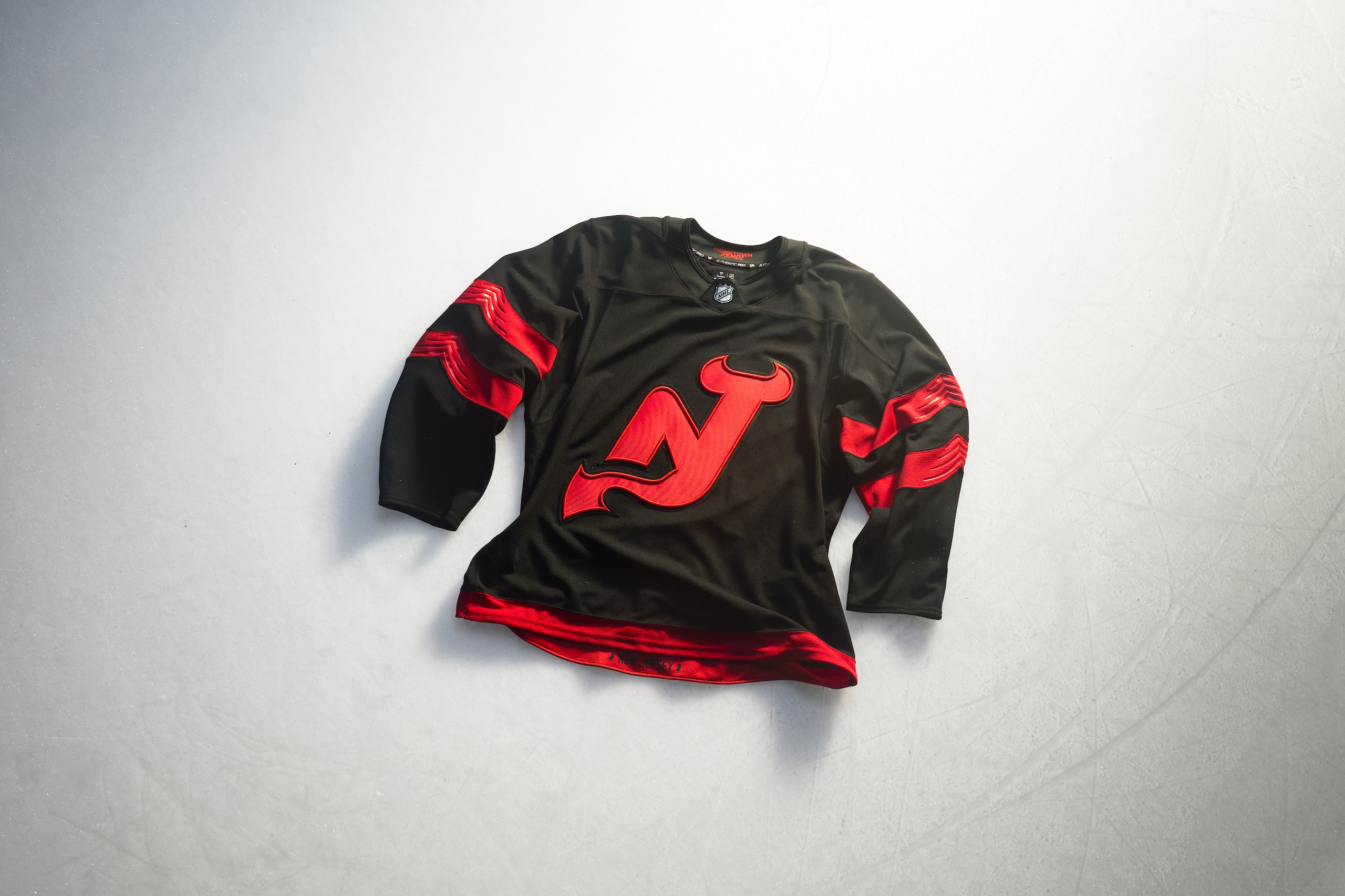
The good thing about the Devils' Hometown Remix jersey is that it made sure to keep the "NJ" logo with the devil's tail prominently involved. The design of the logo gives it a raised edge around the logo that has a distinctly bold look and feel all the same.
The sleeves are simple with some wavy design etched into them, but it's hard to not feel like we've seen these before from the Stadium Series in 2024, but color swapped. That said, a blackout Devils jersey is something new and different for them and this style is going to look slick on the ice.
Grade: C
New York Islanders
18 of 32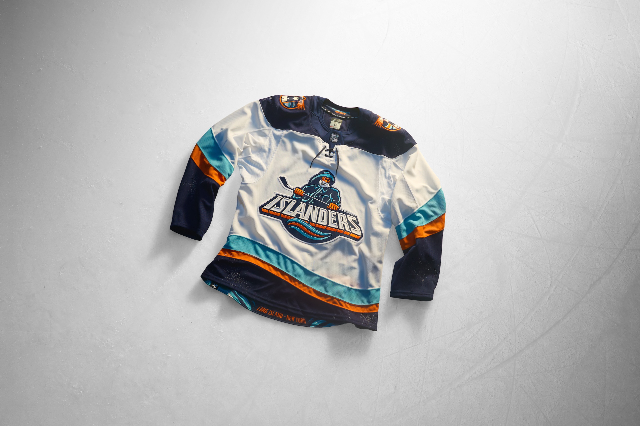
Ah yes, old friend, we meet again.
The fisherman is back and bolder than ever and so are the lighter colors of an era many Islanders fans would like to forget when it comes to logos, jerseys and probably management, too.
The wavy hems are a throwback to the original Islanders fisherman jerseys as are the lighthouse logos on the shoulders. If anything, these are a more tolerable version of the "fish sticks" jerseys from the 90s that were reviled by Isles fans and mocked by others.
But time heals, doesn't it? After all, the fisherman logo's reputation was healed with time and seeing fans decked out in the old jerseys at games. Seeing it back and done (mostly) anew is fun to see and considering how dull their Reverse Retro jerseys were done as well as their Stadium Series sweater, seeing this iteration of the fisherman back is oddly heartwarming. We're positive, however, that Isles fans will have a lot to say about that though.
Grade: B
New York Rangers
19 of 32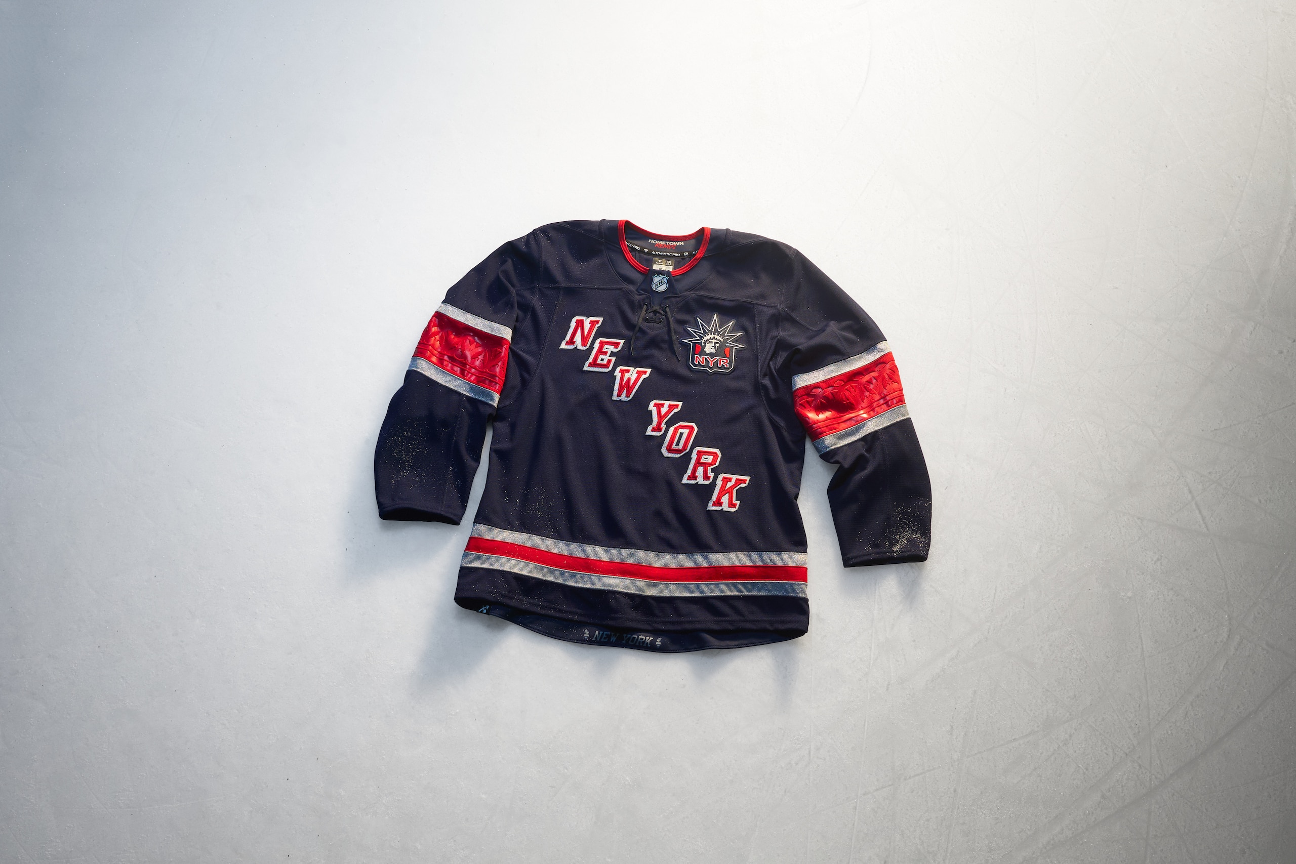
We know it can be tough to be an Original Six team and to do something different, but the Rangers tried to put a touch of everything into their Hometown Remix.
The dark blue jersey is something we've seen from them in the recent past with their Heritage jersey from 2010 to 2017. Spelling out "New York" diagonally in the Rangers' drop shadowed font was something we saw with their 9/11 tribute jerseys back on Oct. 7, 2001. The "Lady Liberty" logo high up on the chest came from their alternate jerseys from the 90s and 2000s.
The red stripes on the sleeves have the design from the torch of the Statue of Liberty debossed in it which is something new and a cool touch. But even with all of these throwback design nods, it feels like well-worn territory for a Rangers sweater and that's too bad.
Grade: C
Ottawa Senators
20 of 32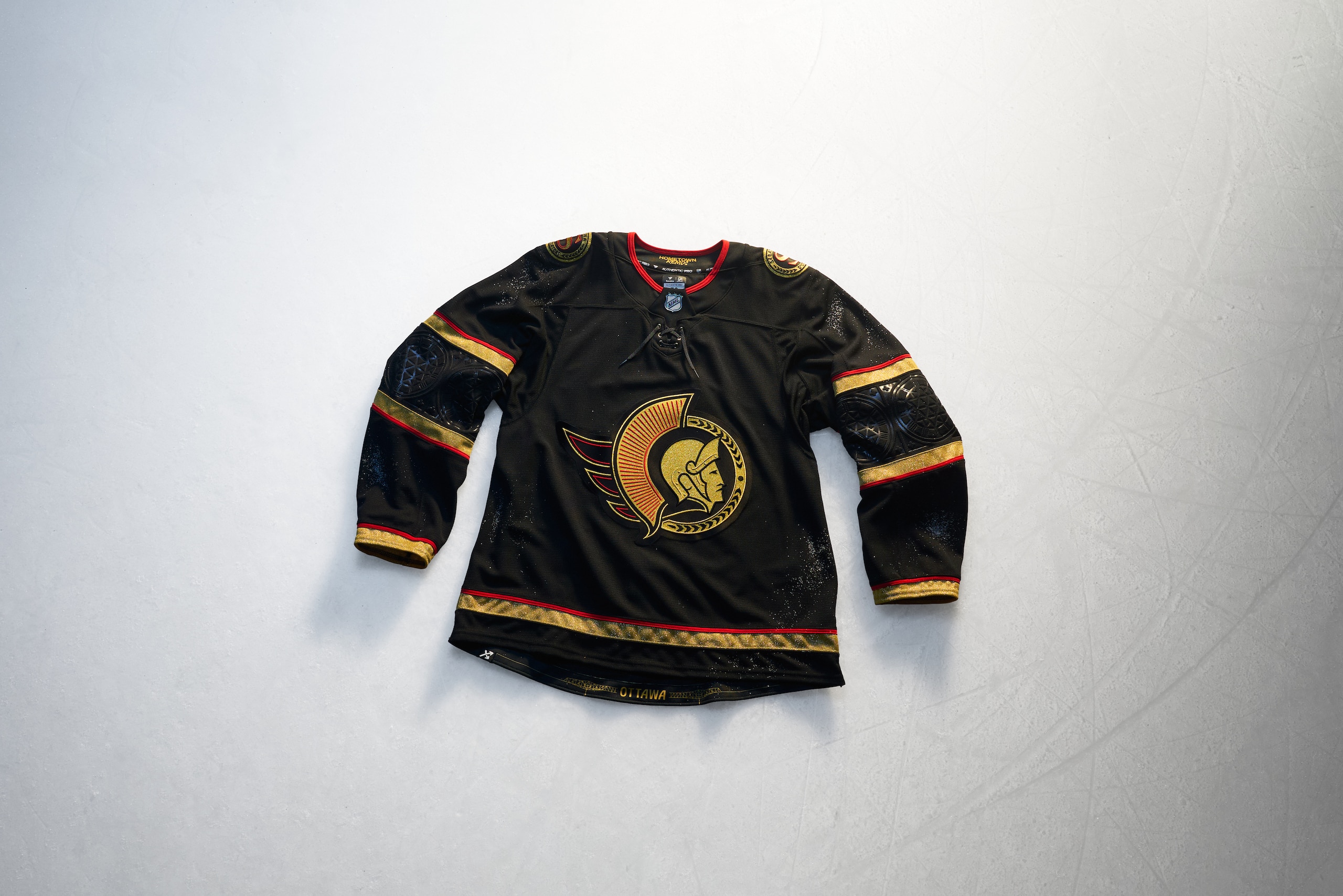
We don't often think of the color gold being associated with the Ottawa Senators, but we will now thanks to the Hometown Remix jersey.
The jersey is essentially a blacked out and turned gold version of their home jersey. Any white that exists in the home sweater is wiped out and gold takes over as the main highlight.
There are architectural designs tied to the City of Ottawa within the black sleeve stripes and it's almost unfortunate so much of this jersey is so dark because touches like that get lost. Even with all that gold, it's not enough to bring attention to them. It's a nice jersey but it feels like there could've been more to be had here apart from gilding up the designs.
Grade: C
Philadelphia Flyers
21 of 32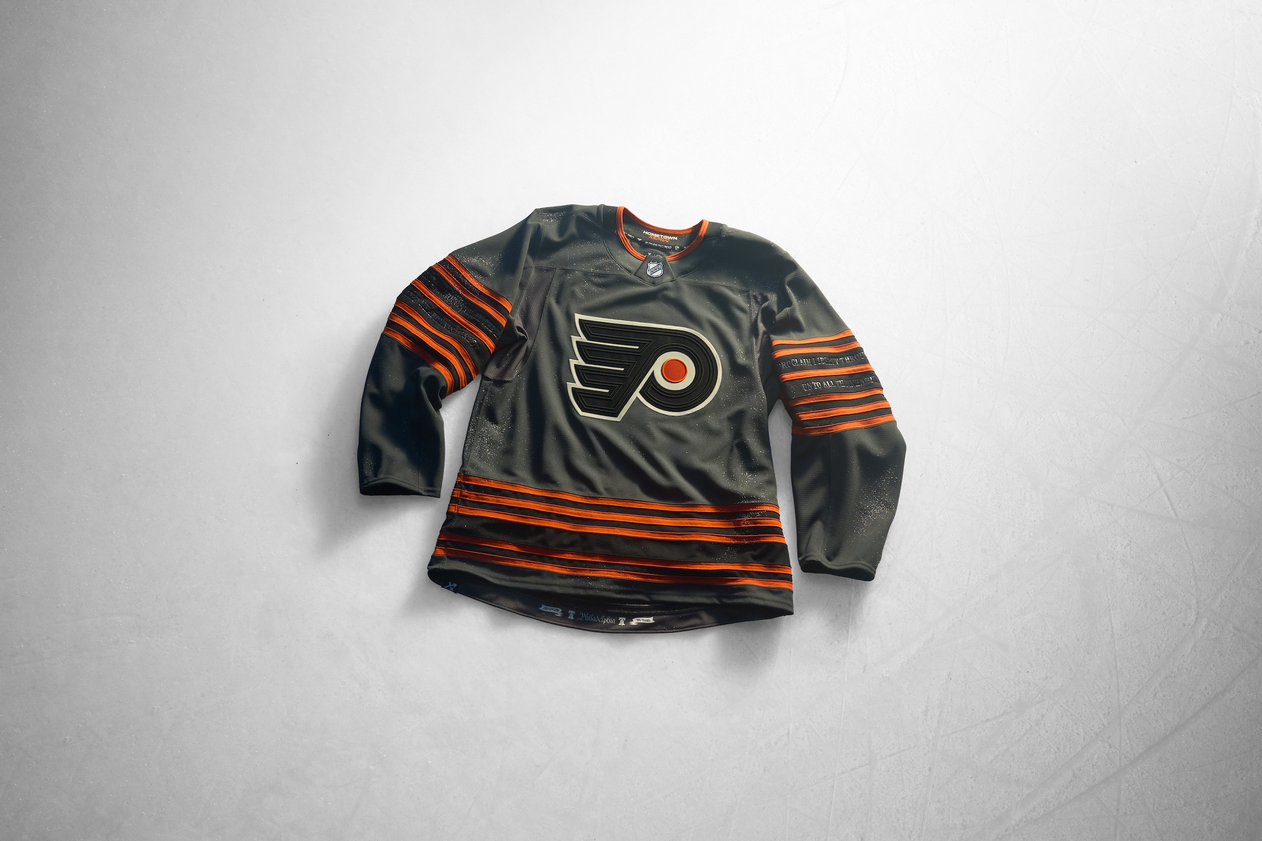
The Flyers' Hometown Remix is a classic example of "I see what you're aiming for, I'm just not totally sold on it."
Yes, the jersey is gray but it's "Liberty Gray" as in the Liberty Bell whose home is within downtown Philadelphia and serves as a symbol to not just America, but everything in Philly itself. Gray is a tough color to work in hockey, and even with the Flyers having black and orange there to support it, as a jersey it doesn't feel totally right.
Now there are other touches that make it work better. The orange numbers will have a "crack" in them as a further nod to the Liberty Bell and that's fun. The striping on the sleeves is meant to echo the design of the Liberty Bell as well and the inscription on the Liberty Bell is debossed in the sleeve stripes as well.
Maybe this one will grow on us over time, but for right now, the look isn't quite ringing for us.
Grade: C+
Pittsburgh Penguins
22 of 32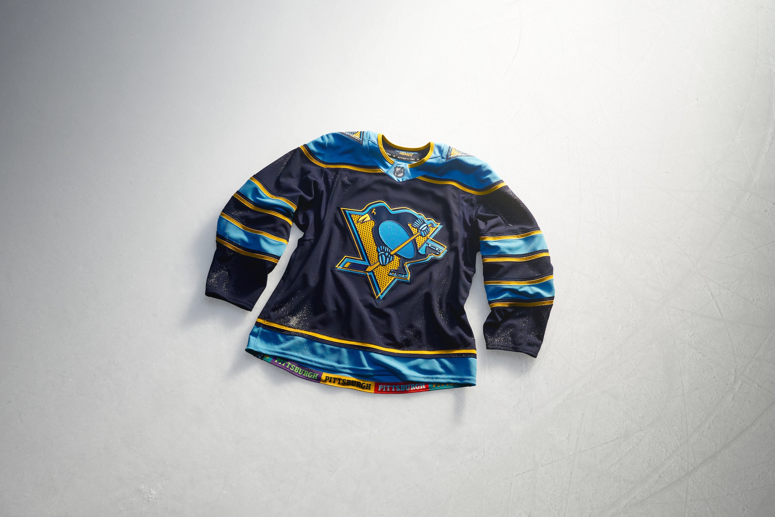
The description given for the Penguins Hometown Remix makes note of its "pop art" touches and doing something to pay homage to Andy Warhol and tying it to hockey would undoubtedly be seen as risky.
Not this time though. This jersey absolutely rocks.
The Pens logo getting the Warhol treatment is meant to make you adjust your eyes and view it through a different kind of lens. The colors are all reminiscent of the Penguins' past, particularly the early years with the dark and light blues. There's gold weaving its way through it and the triangular igloo logo that appears on their gold alternate jerseys is back on the shoulders of the Remix.
This jersey is a treat and the numbers on the back get the same Warhol treatment as well which gives it a kind of showtime dazzle to it. Jerseys aren't art but this one comes really close to it.
Grade: A+
San Jose Sharks
23 of 32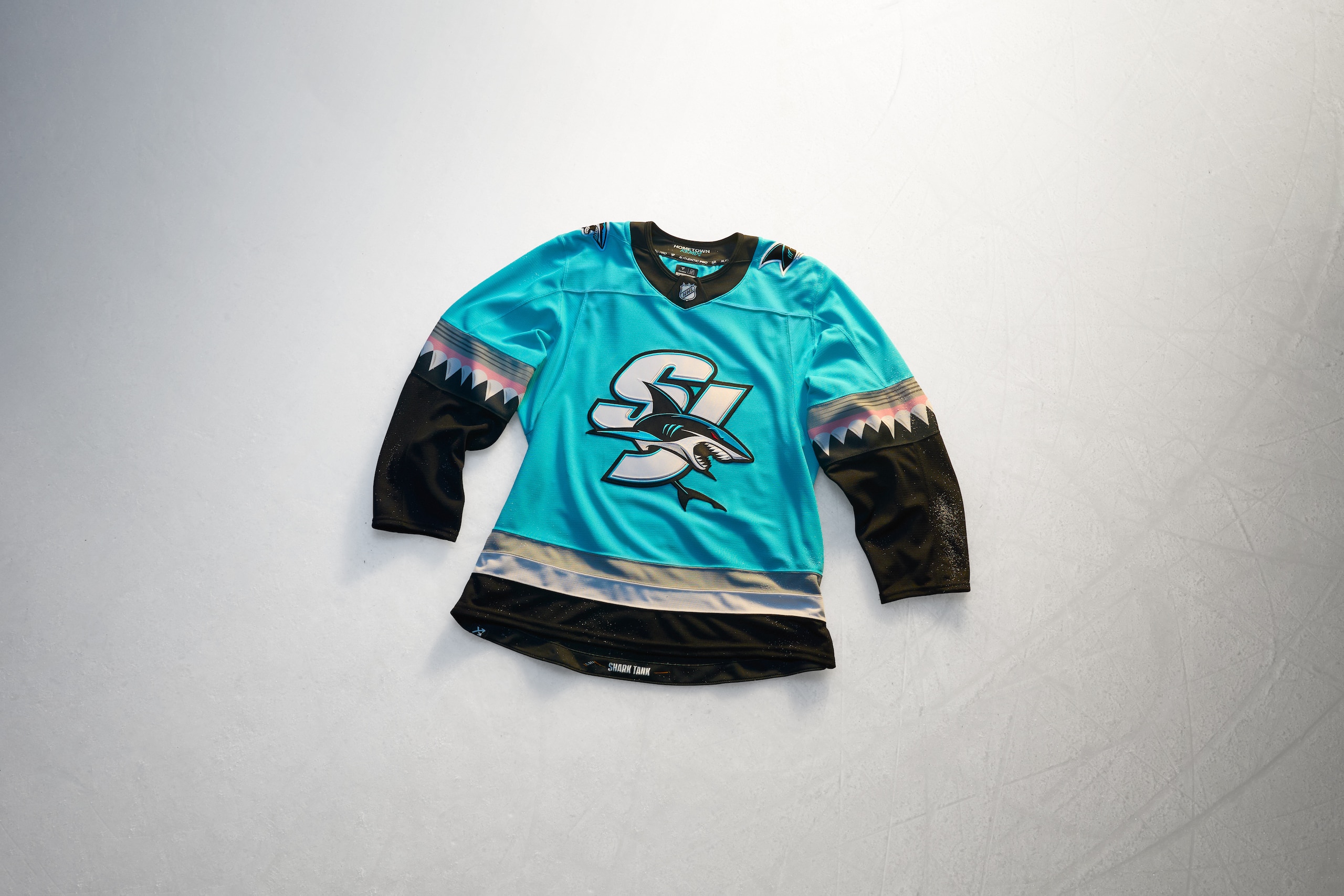
What's the most popular part of a shark? Sure, it might be the dorsal fin, but sharks' teeth are in the running, and they figure prominently on the San Jose Sharks Hometown Remix jersey.
The sleeves on the light teal jersey show off the razor-sharp teeth of a shark, gums and all, that flow into blackness from the elbows down. The body of the jersey has a bold "SJ" with a shark roaring around it for the crest, a mostly new design that would look great on a hat while a shark head logo rests on the shoulders.
This is a bright and fun jersey which is what Sharks hockey is meant to be and we like that.
Grade: A-minus
Seattle Kraken
24 of 32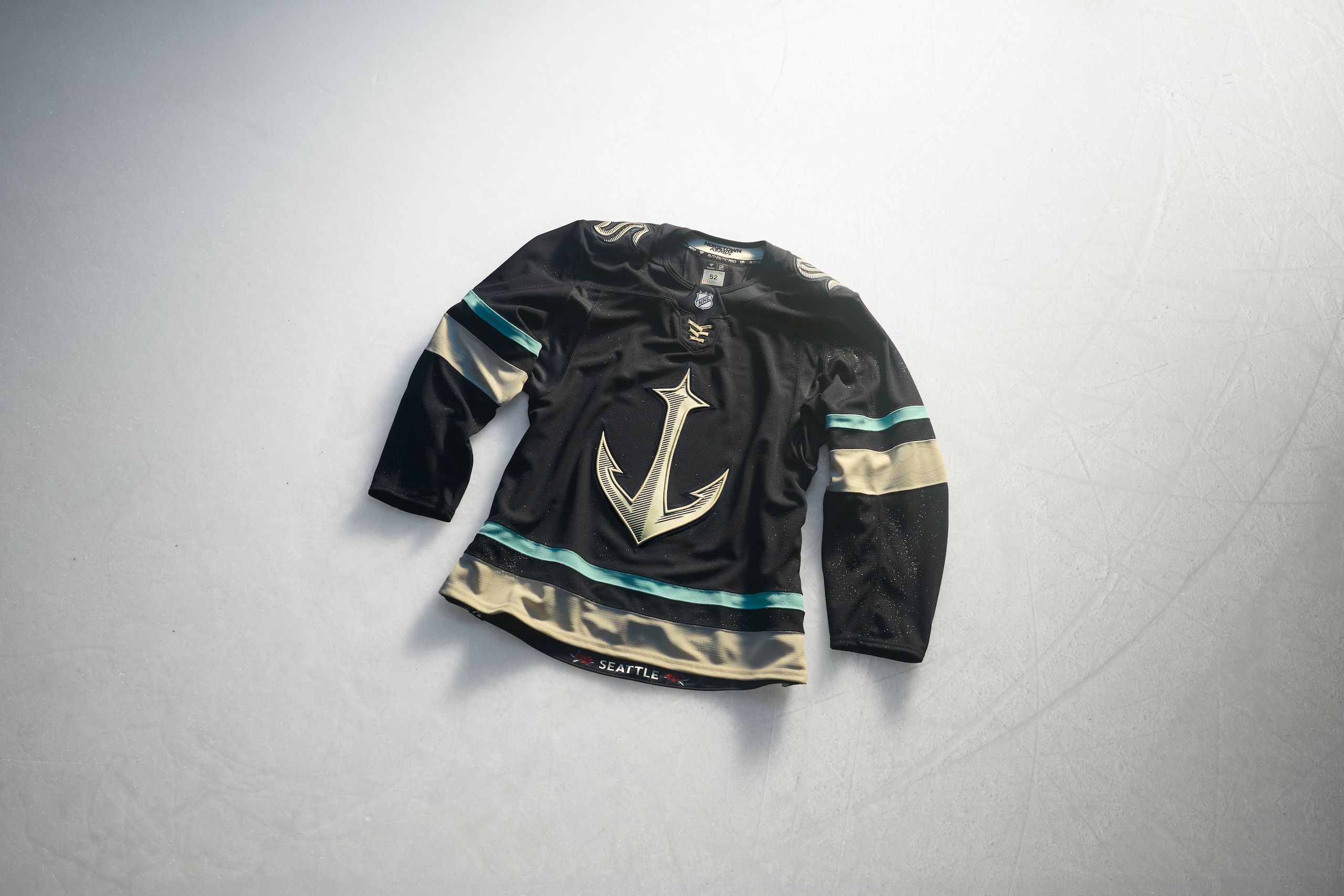
The Kraken have a great primary logo, but they also introduced a great secondary logo when they began playing years ago with the ship anchor that has the space needle woven into the design. Using that logo for a jersey was something we hoped to see one day and now that time is here.
The Kraken's Hometown Remix goes hard with the navy-blue jersey and the anchor/Space Needle logo while the main logo sits on the shoulders. While the team colors are very much in play on this jersey, it also makes us think a little bit of the Seattle Mariners as well with the design and that's not a bad thing.
The numbers and Kraken logo on the shoulder as well as the main logo have designs in it meant to evoke scrimshaw design, a style used for art and maps centuries ago. What a deep pull! This jersey is incredible and the Kraken keep killing it with their styles.
Grade: A+
St. Louis Blues
25 of 32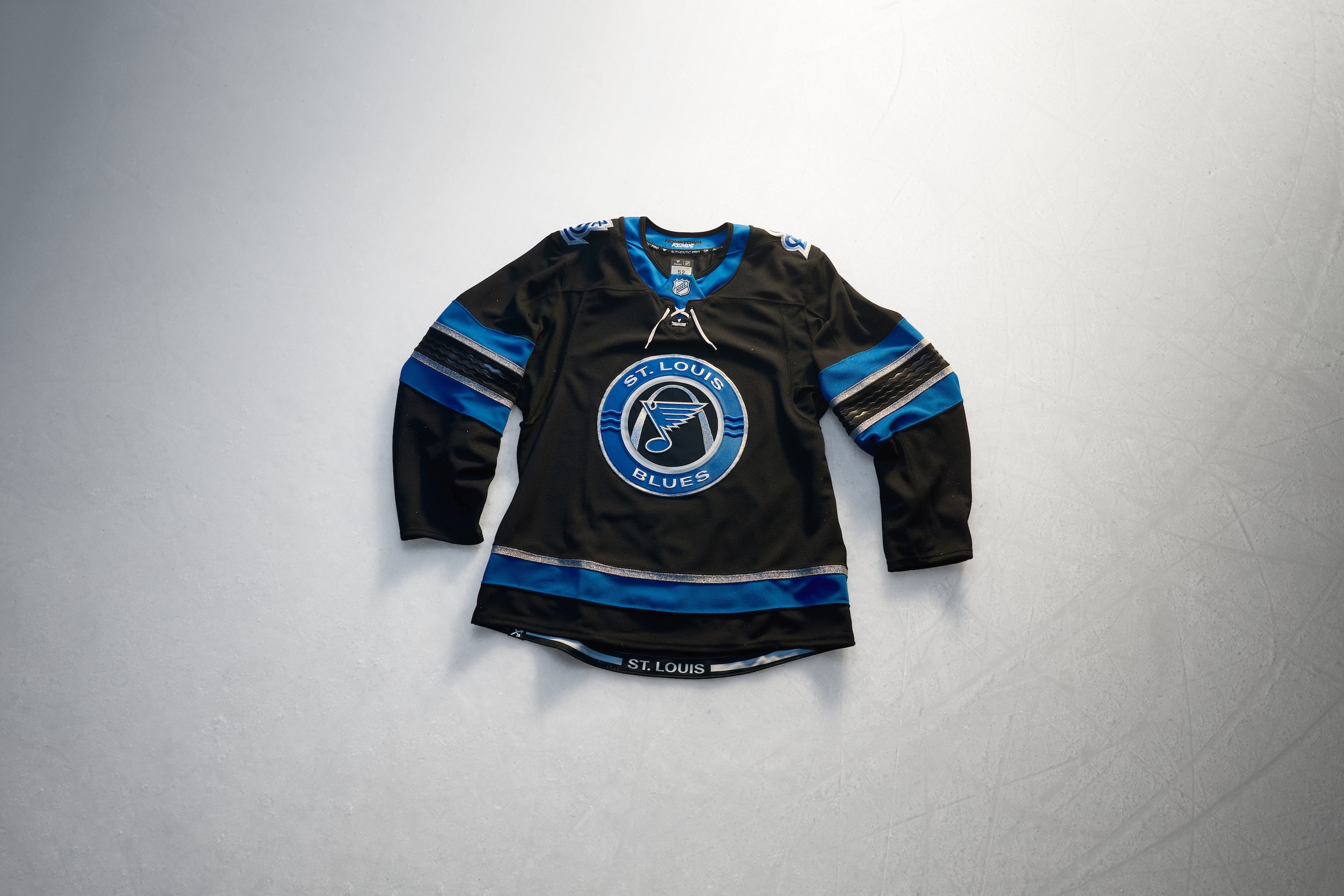
The Blues busted out a kind of redesign of a former third-jersey logo to be the centerpiece of their Hometown Remix.
The circular logo featuring the classic Blue Note logo as well as the St. Louis arch is similar to one that adorned their alternate jerseys from 2008 to 2016. The one change to it are three wavy lines on each side of the circle meant to represent the Mississippi River that borders the city.
A black jersey with blue stripes and silver outlines was a bit unexpected. The sleeves have a debossed wavy pattern to again lean into the Mighty Mississippi's presence. While a black jersey can be interesting, this jersey falls short despite all of the local nods.
Grade: D
Tampa Bay Lightning
26 of 32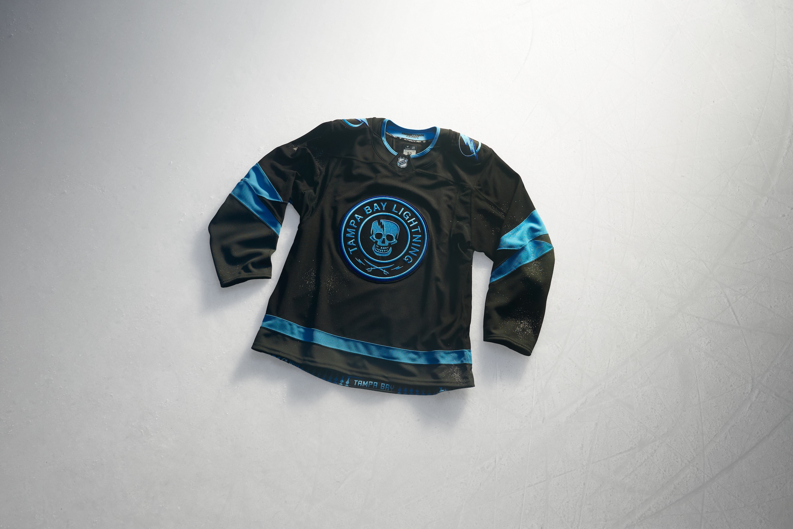
One of the parts of the Lightning's Stadium Series jersey we really liked was the circular skull logo with a lightning-shaped crack in it and we've been rewarded with it taking the spot as the primary crest of their Hometown Remix jersey.
With such an obvious nod to Gasparilla and the city's attachment to pirates, getting that logo back in a bigger way is a lot of fun. While that's got a loose attachment to actual lightning, fear not, the lightning shaped sleeve stripes fill that need.
It's a black jersey with sky blue logos and stripes and that's always a happy combination of colors. While this one might seem subdued because of the coloring, it's a great jersey nonetheless.
Grade: A
Toronto Maple Leafs
27 of 32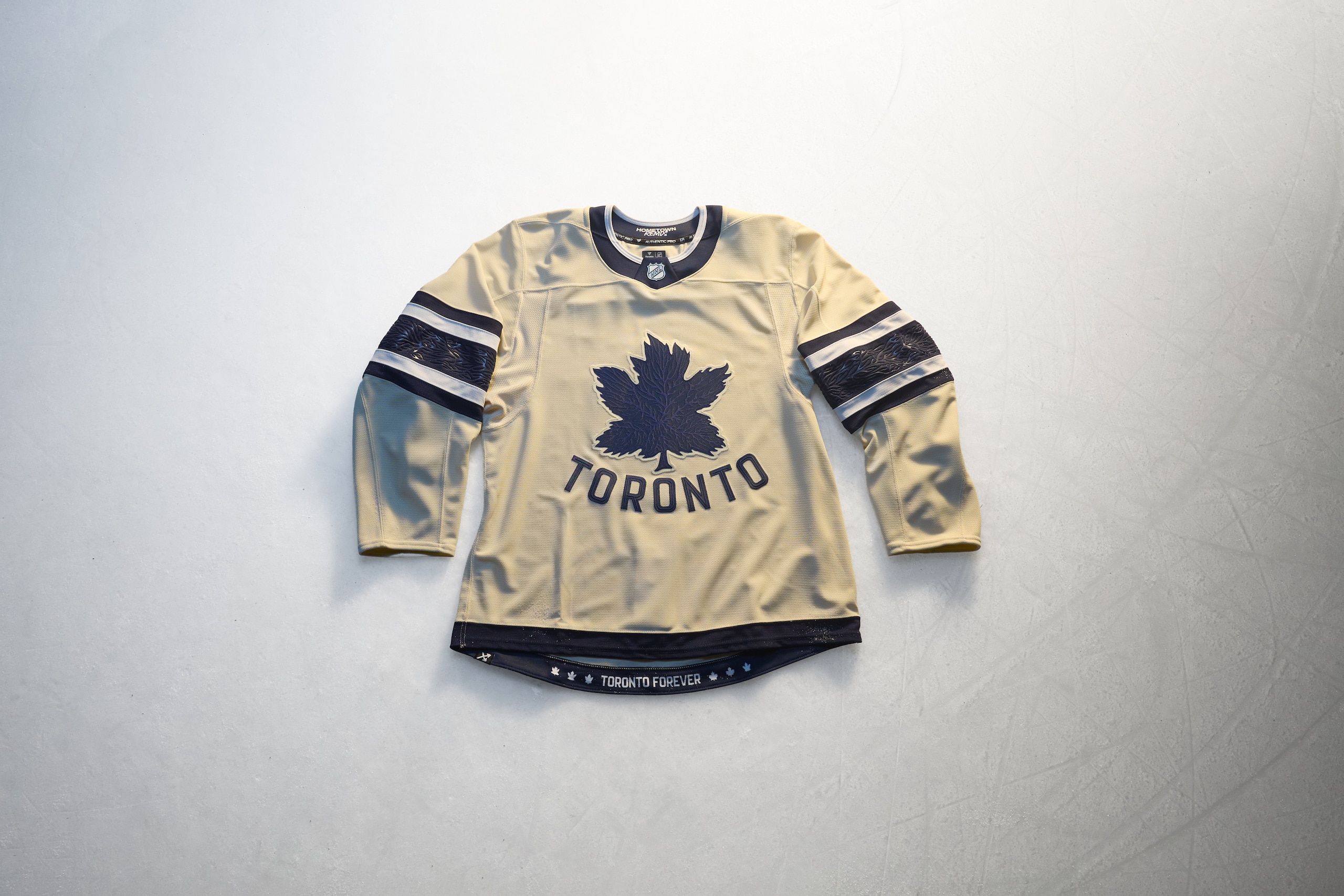
The beauty of being called the Maple Leafs is that you can style up an actual leaf from a maple tree and go to town and that's just what Toronto has done.
The blue old-timey looking leaf on the front with "TORONTO" in an old-style font underneath it on a cream white jersey evokes the past and classic feel but is entirely something new. The stripe sleeves are fascinating given that they're blue and white, but not the same shade of white as the jersey. It's eye-catching in an odd way, but it's a way to make sure you don't mistake this jersey for being something meant for a Heritage or Winter Classic.
This gear will assuredly be a hit with older fans, but seeing Auston Matthews and Gavin McKenna ripping around the ice in them should be enough to make everyone want to add these to their collection.
Grade: B+
Utah Mammoth
28 of 32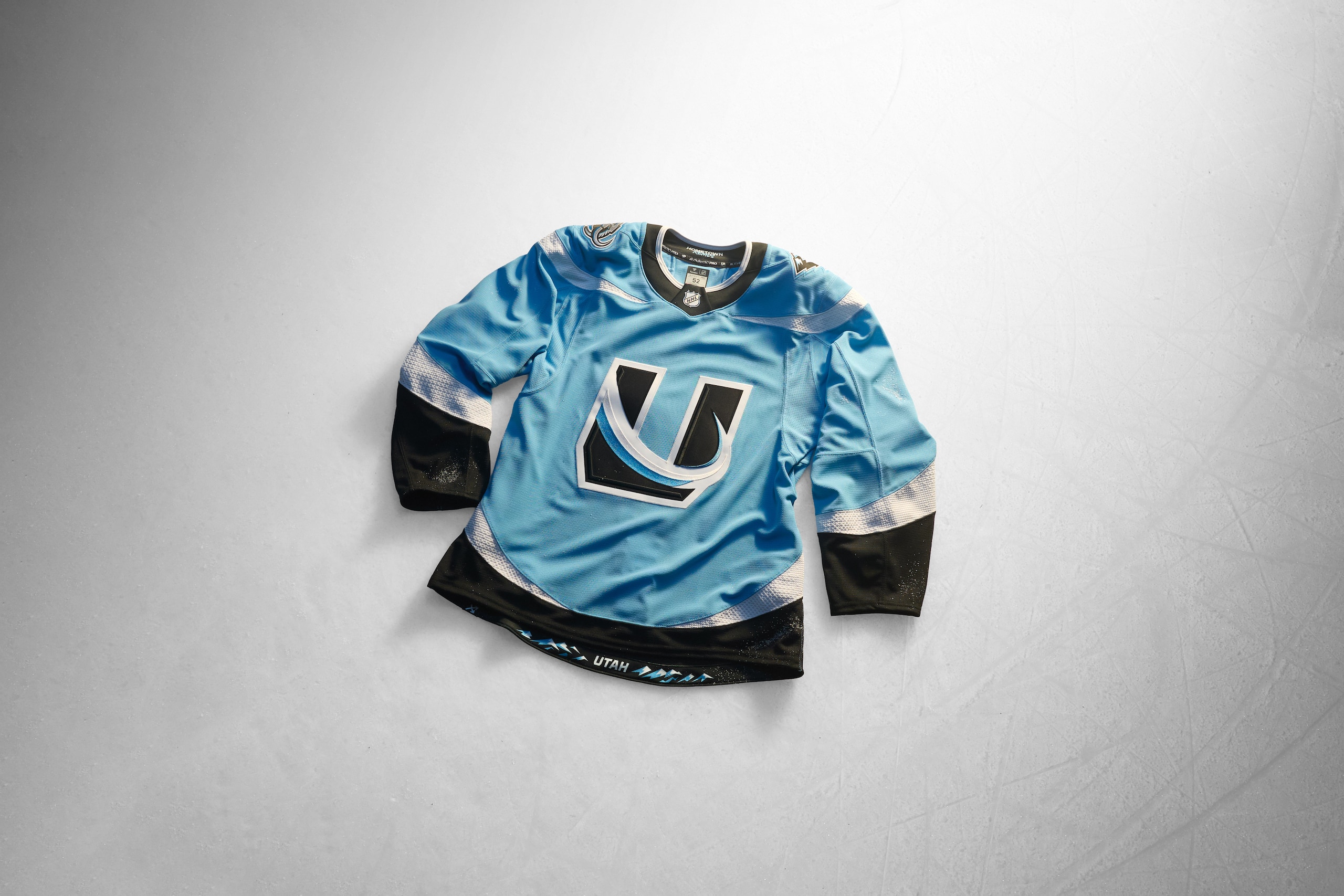
We've been anxious for when the Utah Mammoth would add a baby blue third jersey ever since they unveiled their color scheme as a franchise and their Hometown Remix jersey grants our wish.
Given that the Mammoth don't have much of a history to work with, the world was their oyster for how to draw this one up and while they didn't mail it in, they didn't stretch their legs out too much either.
The Mammoth used one of their secondary logos for the crest and the tusked-out "U" is a cool logo and the looping tusk-shaped stripes on the shoulders, waist and sleeves are also cool. The Mammoth logo on the shoulders checks out but this feels like it could just be a regular alternate jersey...which could be in its future if it winds up being popular.
But for this project, we like when teams push boundaries and this one feels very safely done, which is understandable.
Grade: C+
Vancouver Canucks
29 of 32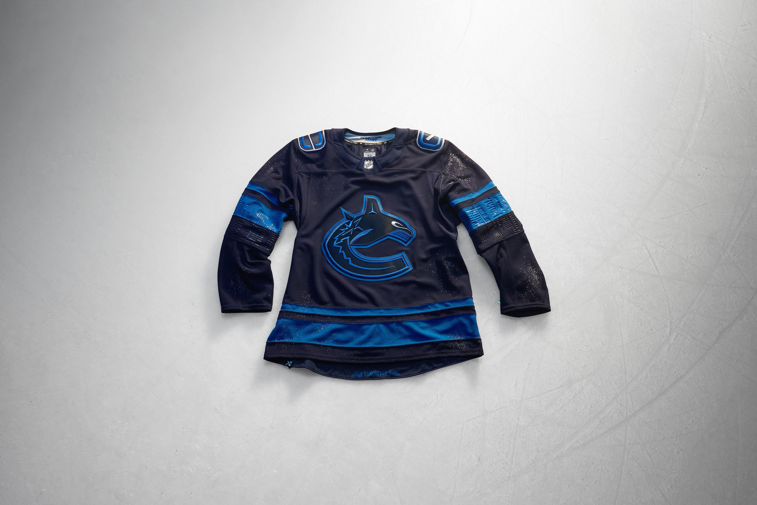
Another black jersey with dark blue as the primary color comes through here for Vancouver and, man, this is a let-down.
Given everything wild we've seen from Vancouver for the alternates, Reverse Retros, and all throughout the franchise's history, getting this for the Hometown Remix is deflating.
The theme for this one is "Vancouver at Night" and while the blacked-out orca in the crest logo is cool, especially with the glowing eye, all of the debossed designs of the city skyline and bay in the sleeves still can't win us over. We could've had more Johnny Canuck or the V's or even more of the "Flying Skate" and instead we just get the Canucks with the lights off. Bummer.
Grade: D
Vegas Golden Knights
30 of 32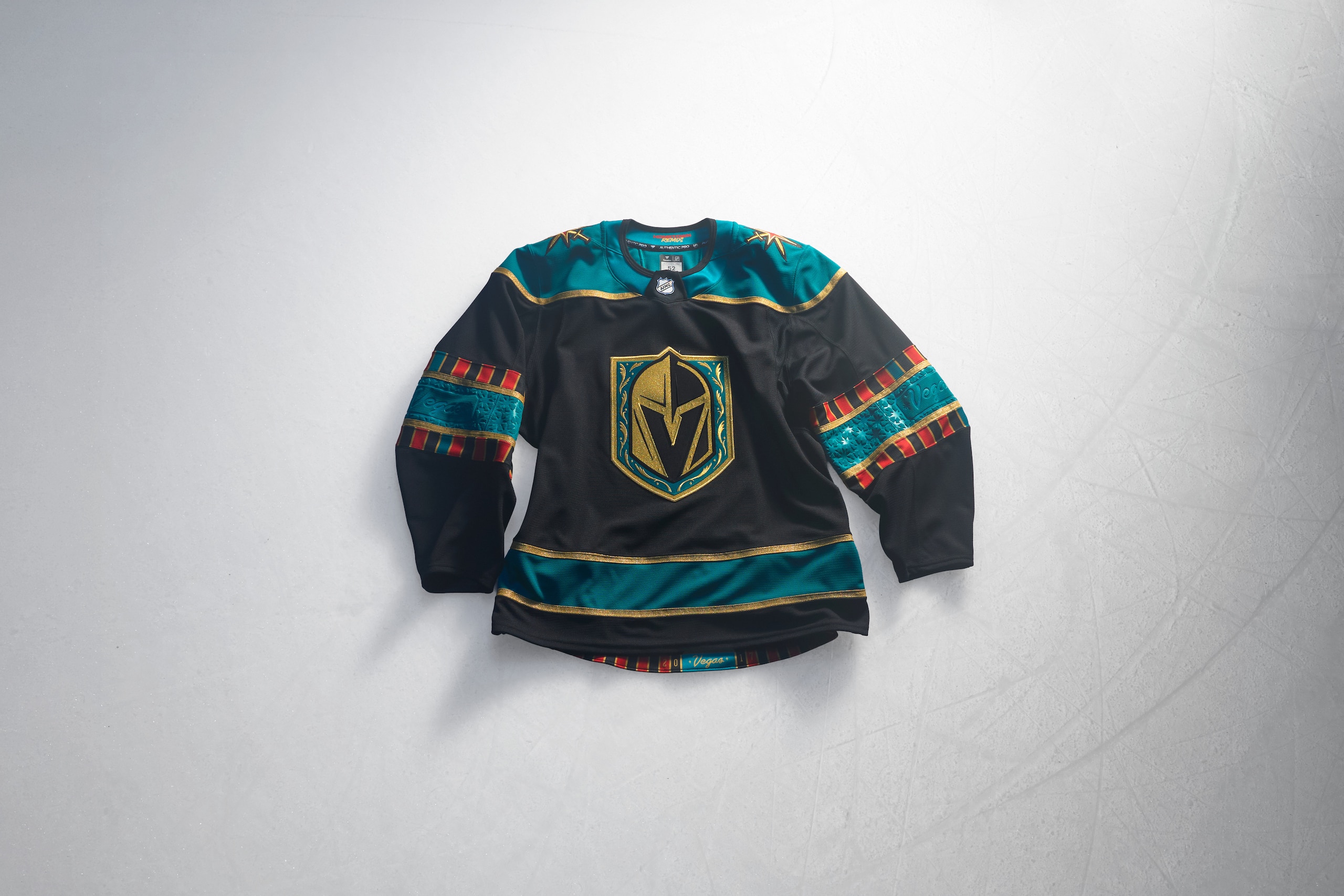
You might say you're going to Las Vegas for the shows or to watch the Golden Knights, but we know for sure you're stopping by a casino somehow and the tables will call to you. Vegas' Hometown Remix makes us want to heed that call and play our favorite number on the roulette wheel.
The felt green stripes and shoulder yoke with the black base for the jersey screams "casino night" and if that didn't do it, the red and black design on the sleeves will tell you what's up. The gold outline on the logo and sleeves gives it more of the Vegas touch as does the debossed "Vegas" sign style within the sleeves.
Vegas leaning into being in Las Vegas for their designs is always a winner and this jersey fits right into that.
Grade: A
Washington Capitals
31 of 32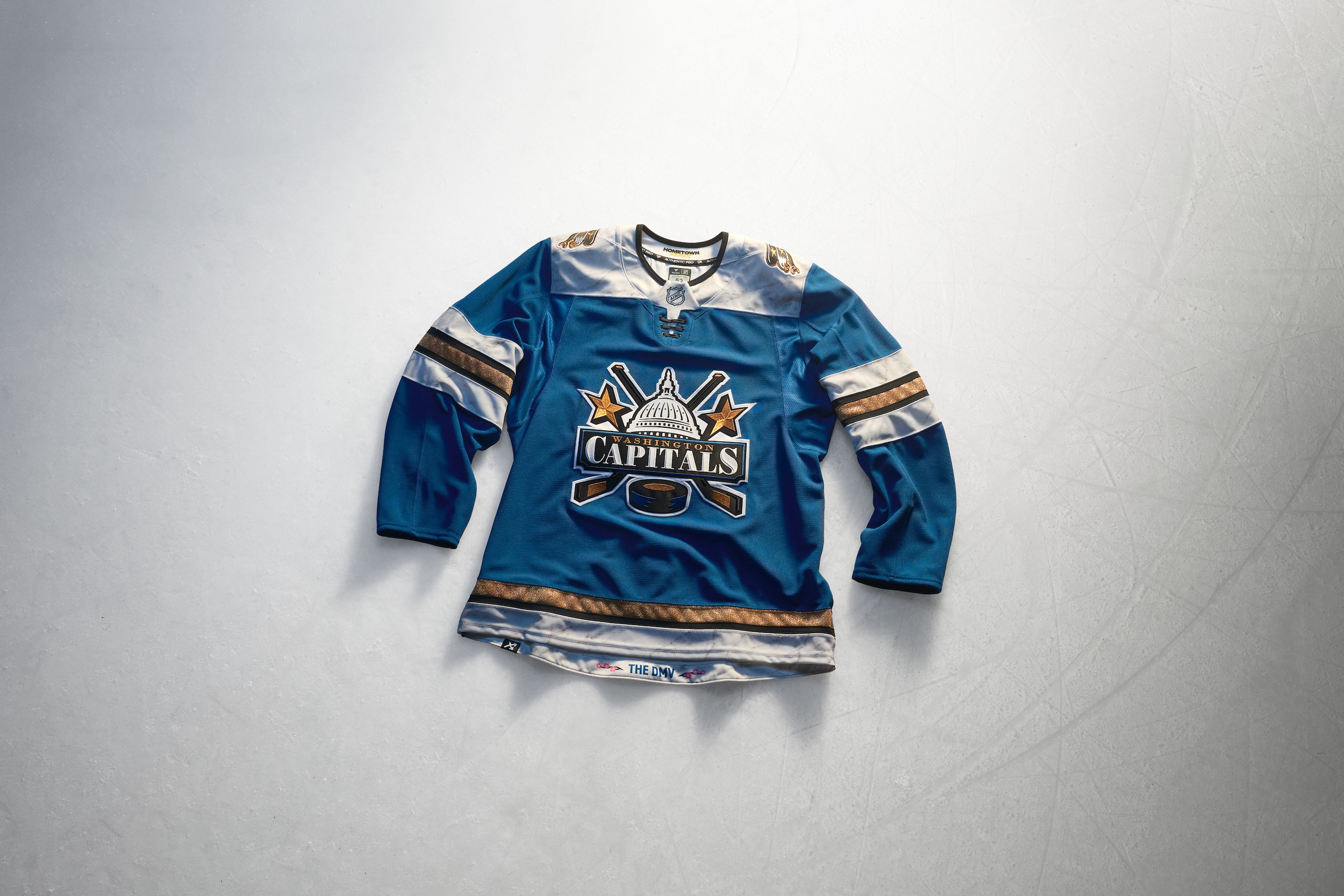
The Capitals Hometown Remix jersey answers the question of "What if you took their old alternate logo and put it on the blue screaming eagle jersey instead?" That's assuredly a very real question that's been asked and now it's been answered with a great response.
The Caps' U.S. Capitol logo from the 90s/00s gets the primary treatment on jersey that's reminiscent of their current red alternate only it's the same teal-blue color the Capitals used during the 90s instead.
This jersey is great to look at and the color scheme from back in the day was a very good one. Seeing it again in this style of jersey with the screaming eagles on the shoulders is a nostalgia party while being something very new yet still familiar. The white, gold and black stripes are done in a way that's unique and the numbers are designed in a way similar to the monuments around D.C. with marble texturing and everything. Phenomenal work.
Grade: A+
Winnipeg Jets
32 of 32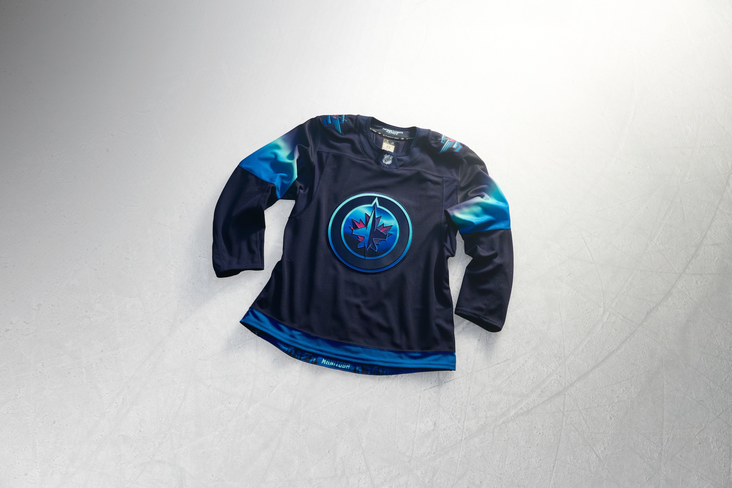
If you've never seen the Aurora Borealis, you can get an idea of what it's like with the Winnipeg Jets Hometown Remix sweater.
It's a wonder to see a jersey weave the wispy colors of the aurora into sleeve striping to give it the look of the Northern Lights on fabric. The way that same color effect is weaved into the Jets logos on the crest and shoulders with the nighttime sky background of the jersey is really fun.
Getting this kind of an artistic take with a jersey and to use the Aurora Borealis as the subject is inspired stuff and we love that.
Grade: A+