Featured Video
Wild-Canucks Highlights

NHL Logos: The Good, the Bad, and the Ugly
Jim Cowan
In honor of the 2009 Stanley Cup Playoffs, I’ve compiled my top five seeds of NHL logos. And what would a top five list be without a bottom five to hit if off? For the sake of balance, I’ve added five mediocre logos, as well.
The Good
Maybe it's the history, maybe it's the color, or maybe just badass!

.jpg?w=2560 "Golden Knights Blues Hockey")
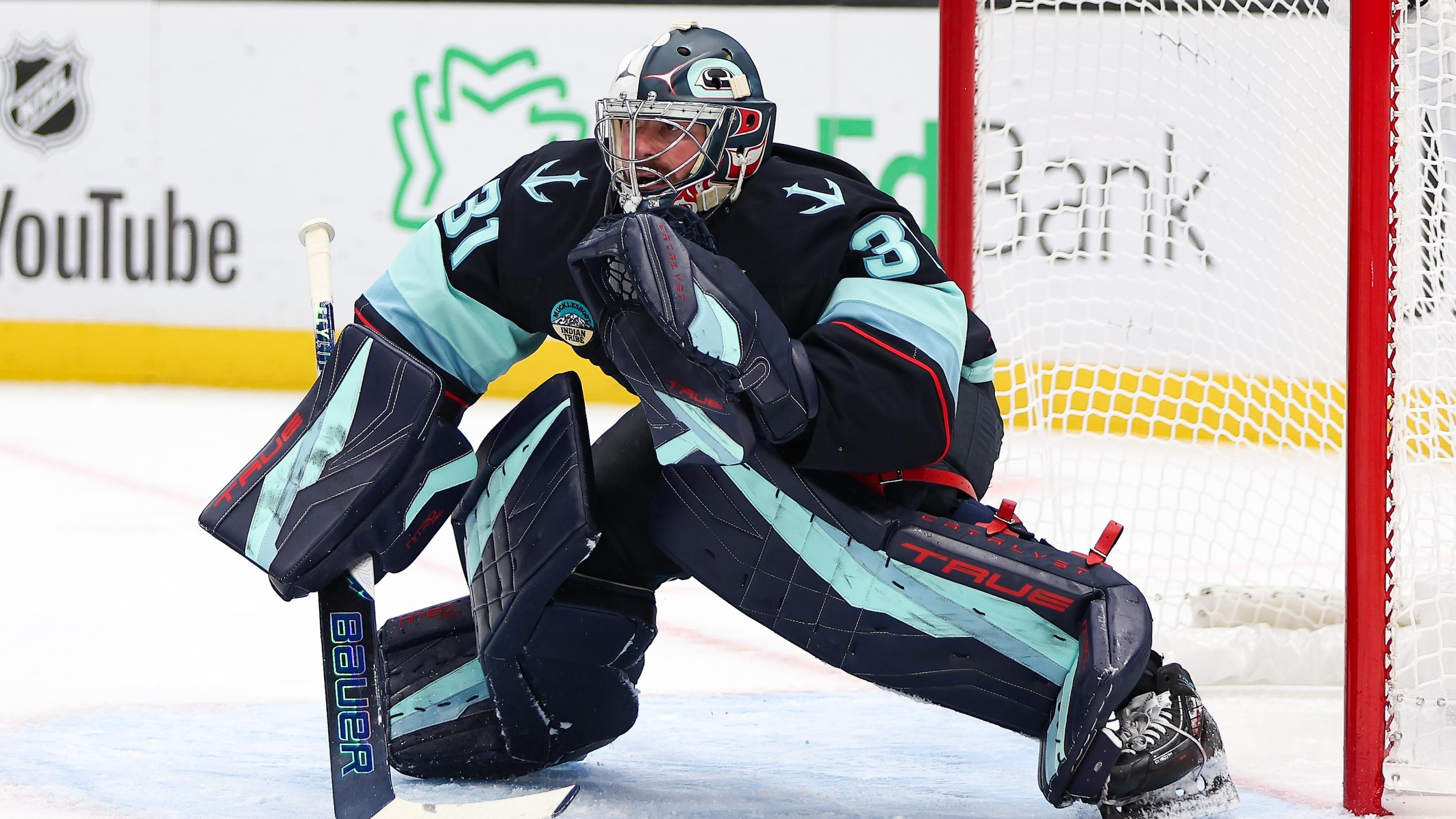
5. The Original Six: Although I’m not a fan of any of these six teams, I cannot argue against the fact that these logos are time tested and still impress.
4. Montreal Wanderers: Unlike most of the defunct teams of the early teens, Montreal at least had the wherewithal to roll with a W on a shield. Right on!
Wanderers: Unlike most of the defunct teams of the early teens, Montreal at least had the wherewithal to roll with a W on a shield. Right on!3. Colorado Rockies: Thought by many to be ugly, this logo is, in my eyes, a 70s classic! It’s got a blue mountain, a red C, and a little orange circle in the mix. How can you go wrong?
2. Kansas City Scouts: It's not really PC, but this isn’t a politeness list, it’s a list of cool! It shows a Sioux warrior scouting out the ice, planning for his next attack. Yeah, buddy!
1. Buffalo Sabres (Old School): This isn't a surprise, here. The Sabres logo is and will always be the best logo of any sports team—of all time! Yes, I said it: All time!
The Bad
These aren't necessarily ugly, but head scratchers, nonetheless.
5. Dallas Stars: I’ve added the ole Stars because, well, I don’t like them first of all. Also, it just doesn’t make sense. You take a team from “hockey country,” Minnesota, rightly named the NorthStars, move them to Dallas, and drop the North. Senseless move, senseless name.
4. Quebec Nordiques: It's intriguing at first; then again, I'm not really sure what its supposed to be. Is it an elephant with a stick? A red hump with a stick? It’s just something else from the French we don’t understand?
3. California/Oakland Golden/Seals: Much like Al Davis’ Raiders, for cryin’ out loud, pick a name already! The logo is kind of cool and kind of weird, with a cute little seal face on a bird-like shaped body thing. Enough said.
2. Minnesota Wild: This one would be on the Ugliest list but it's creative, if nothing else. A picture in a picture. It's ugly yet cool, I guess.
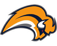
1. Buffalo Sabres (2nd generation): For reasons unknown, the Sabres took the greatest jerseys/logos of all time, changed the colors to red and black, and decided to roll out with a big buffalo head. Potential? Yes. Execution? No. Fail.
The Ugly
They're not only ugly, but f-ugly!
 5. Tampa Bay Lightning: I get it—Tampa, storms, lightning. But the logo sucks, plain and simple.
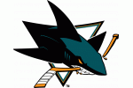
4. San Jose Sharks: Triangle + stick-eating shark + horrible colors = recipe for a sucky logo.
3. Vancouver Canucks: This is maybe one of the just plain ugliest of all time, on par with the 70s/early 80s Houston Astros. They get the ultimate WTF!

2. Buffalo Sabres (current): The most painful on the list is the Buffa-slug, the snot-rocket, Donald Trump’s hair. It has many names, indeed, none of which are awesome.
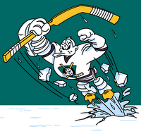
1. Anaheim Mighty Ducks: Worst franchise in history, meet worst logo in history! It's a team that never should have been. Yes they’ve had success, but they’ve got to go!

.jpg?w=2560 "Chiefs, Steelers Eye WR Trades")